Sucker Bet

Vegas casinos love the sucker bet.  Nothing makes the accountants happier than seeing someone playing the Wheel of Fortune, or betting on “12, the hard way” in craps, or taking insurance in blackjack.  While the house always maintains a slim advantage, these bets really stack the deck in the house’s favor.

And just as I don’t feel guilty for leaving Caesar’s Palace without playing the Wheel of Fortune, I don’t feel a bit of guilt for not taking this bet from Nate Silver:

1. For each day that the high temperature in your hometown is at least 1 degree Fahrenheit above average, as listed by Weather Underground, you owe me $25. For each day that it is at least 1 degree Fahrenheit below average, I owe you $25.

I presume Silver is a smart guy and knows what he is doing, because in fact this is not a bet on future warming, but on past warming.  Even without a bit of future warming, he wins this bet.  Why?

I am sitting in my hotel room, and so I don’t have time to dig into the Weather Underground’s data definitions, but my guess is that their average temperatures are based on historic data, probably about a hundred years worth on average.

Over the last 100 years the world has on average warmed about 1F.  This means that today, again on average, most locations will sit on a temperature plateau about 0.5F higher than the average.  So by structuring this bet like this, he is basically asking people  to take “red” in roulette while he takes black and zero and double zero.   He has a built in 0.5F advantage.  Even with zero future warming.

Now, the whole point of this bet may be to take money from skeptics who don’t bother to educate themselves on climate and believe Rush Limbaugh or whoever that there has never been any change in world temperatures.  Fine.  I have little patience with either side of the debate that want to be vocal without educating him or herself on the basic facts.  But to say this is a bet on future warming is BS.

The other effect that may exist here (but I am less certain of the science, commenters can help me out) is that by saying “your hometown” we put the bet into the domain of urban heat islands and temperature station siting issues.  Clearly UHI has substantially increased temperatures in many cities, but that is because average temperatures are generally computed as the average of the daily minimum and maximum.  My sense is that UHI has a much bigger effect on Tmin than Tmax – such that my son and I found a 10 degree F UHI in Phoenix in the evening, but I am not sure if we could find one, or as large of one, at the daily maximum.  Nevertheless, to the extent that such an effect exists for Tmax, most cities that have grown over the last few years will be above their averages just from the increasing UHI component.

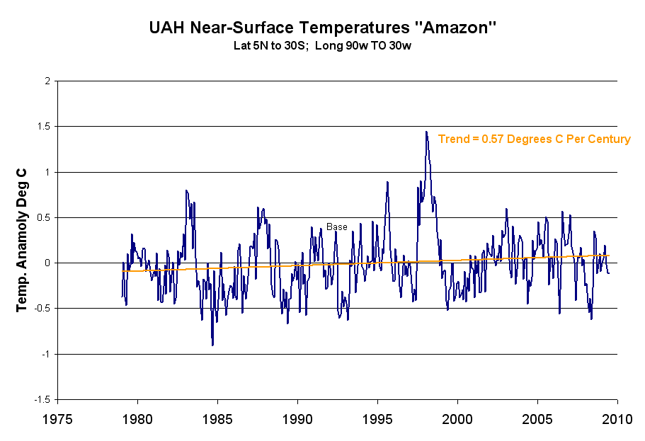
I don’t have the contents of my computer hard drive here with me, but a better bet would be from a 10-year average of some accepted metric  (I’d prefer satellites but Hadley CRUT would be OK if we just had to use the old dinosaur surface record).  Since I accept about 1-1.2C per century, I’d insist on this trend line and would pay out above it and collect below it  (all real alarmists consider a 1.2C per century future trend to be about zero probability, so I suspect this would be acceptable).

Wow, Look at that Science

The Thin Green Line blog really wants to mix it up and debunk those scientific myths propounded by skeptics.  I had my hopes up for an interesting debate, until I clicked through and saw that the author spent the entire post fact-checking Sen. Inhofe’s counts of scientists who are skeptical.  Barf.  I wrote back in the comments:

I just cannot believe that your “best” argument is to get into this stupid scientist headcount scoreboard thing.  Never has any argument had less to do with science than counting heads and degrees.  Plenty of times the majority turns out to be correct, but on any number of issues lone wolfs have prevailed after decades of being reviled by the majority of scientists (plate tectonics theory comes to mind).

If you want to deal with the best arguments from the scientific rather than political wing of the skeptic community, address this next:  It is  very clear in the IPCC reports (if one reads them) that in fact catastrophic warming forecasts are based on not one but two independent theories.  The first is greenhouse gas theory, and I agree that it is a fairly thin branch to try to deny that greenhouse gas theory is wrong.  The IPCC says that greenhouse gas effects in isolation will cause about 1-1.2C of warming by 2100, and I am willing to agree to that.

However, this is far short of popular forecasts, which range from 3C and up (and up and up).   The rest of the warming comes from a second independent theory, that the world’s climate is dominated by positive feedbacks.  Over 2/3 of the IPCC’s warming forecasts, and a higher percentage of more aggressive forecasts, come from this second order feedback effect rather than directly from greenhouse gas warming.

There is a reason we never hear much of this second theory.  It’s because it is very, very weak.  So weak that honest climate scientists will admit they are not even sure of the sign (positive or negative) of key feedbacks (e.g. clouds) or which feedbacks dominate.  It is also weak because many of the modelers have chosen assumptions for positive feedbacks on the far end of believability.  Recent forecasts of 15F of warming imply a feedback percentage of positive 85%**, and when people talk of “tipping points” they are implying feedbacks greater than 100%.

There is just no evidence that feedbacks are this high, and even some evidence they are net negative.  In fact, just a basic reality check would make any physical scientist suspicious of a long-term stable system with a 70-85% positive net feedback fraction.  Really?

When global warming alarmists try to cut off debate, they claim the science is settled, but this is half disingenuous.  It is fairly strong and I am willing to accept it for the greenhouse effect and 1C per century.  But the science behind net positive climate feedback is weak, weak, weak, particularly when trying to support a 15F forecasts.

I would love to see this addressed.

(**note for readers new to feedback issues.  The initial warming from CO2 is multiplied by a feedback F.  F=1/(1-f), where f is the fraction of the initial input that is fed back in the first round of a recursive process.  Numbers above like 70%, 85%, and 100% refer to f.  For example, an f of 75% makes F=4, which would increase a warming forecast from 1C in 2100 from CO2 alone to a total of 4C.)

What A Real Global Warming Insurance Policy Would Look Like

It is frustrating to see the absolutely awful Waxman-Markey bill creeping through Congress.  Not only will it do almost nothing measurable to world temperatures, but it would impose large costs on the economy and is full of pork and giveaways to favored businesses and constituencies.

It didn’t have to be that way.   I think readers know my position on global warming science, but the elevator version is this:  Increasing atmospheric concentrations of CO2 will almost certainly warm the Earth — absent feedback effects, most scientists agree it will warm the Earth about a degree C by the year 2100.  What creates the catastrophe, with warming of 5 degrees or more, are hypothesized positive feedbacks in the climate.  This second theory of strongly net positive feedback in climate is poorly proven, and in fact evidence exists the sign may not even be positive.  As a result, I believe warming from man’s Co2 will be small and manageable, and may even been unnoticeable in the background noise of natural variations.

I get asked all the time – “what if you are wrong?  What if the climate is, unlike nearly every other long-term stable natural process, dominated by strong positive feedbacks?  You buy insurance on your car, won’t you buy insurance on the earth?”

Why, yes, I answer, I do buy insurance on my car.  But I don’t pay $20,000 a year for a policy with a $10,000 deductible on a car worth $11,000.  That is Waxman-Markey.

In fact, there is a plan, proposed by many folks including myself and even at least one Congressman, that would act as a low-cost insurance policy.  It took 1000+ pages to explain the carbon trading system in Waxman-Markey– I can explain this plan in two sentences:  Institute a federal carbon excise tax on fuels whose rate increases with the carbon content per btu of the fuel.  All projected revenues of this carbon tax shall be offset with an equivalent reduction in payroll (social security) taxes. No exemptions, offsets, exceptions, special rates, etc.  Everyone gets the same fuel tax rate, everyone gets the same payroll tax rate cut.

Here are some of the advantages:

  • Dead-easy to administer.  The government overhead to manage an excise tax would probably be shockingly large to any sane business person, but it is at least two orders of magnitude less than trying to administer a cap and trade system.  Just compare the BOE to CARB in California.
  • Low cost to the economy.  This plan may hurt the economy or may even boost it, but either effect is negligible compared to the cost of Waxman-Markey.  Politically it would fly well, as most folks would accept a trade of increasing the cost of fuel while reducing the cost of employment.
  • Replaces one regressive (or at least not progressive) tax with a different one.  In net should not increase or decrease how progressive or regressive the tax code is.
  • Does not add any onerous carbon tracking or reporting to businesses

Here are why politicians will never pass this plan:

  • They like taxes that they don’t have to call taxes.  Take Waxman-Markey — supporters still insist it is not a tax.  This is grossly disingenuous.  Either it raises the cost of electricity and fuel or it does not.  If it does not, it has absolutely no benefits on Co2 production.  If it does, then it is a tax.
  • The whole point is to be able to throw favors at powerful campaign supporters.  A carbon tax leaves little room for this.  A cap and trade bill is a Disneyland for lobbyists.

Here are three problems, which are minor compared to those of Waxman-Market:

  • We don’t know what the right tax rate is.  But almost any rate would have more benefit, dollar for dollar, than Waxman-Market.  And if we get it wrong, it can always be changed.  And it we get it too high, the impacts are minimized because that results in a higher tax cut in employment taxes.
  • Imports won’t be subject to the tax.  I would support just ignoring this problem, at least at first.  We don’t worry about changing import duties based on any of our other taxes, and again this will affect the mix but likely not the overall volumes by much
  • Making the government dependent on a declining revenue source.  This is probably the biggest problem — if the tax is successful, then the revenue source for the government dries up.  This is the problem with sin taxes in general, and why we find the odd situation of states sometimes doing things that promote cigarette sales because they can’t afford declining cigarette taxes, the decline in which was caused by the state’s efforts to tax and reduce cigarette use.

Postscript: The Meyer Energy Plan Proposal of 2007 actually had 3 planks:

  1. large federal carbon tax, offset by reduction in income and/or payroll taxes
  2. streamlined program for licensing new nuclear reactors
  3. get out of the way

A Window Into the IPCC Process

I thought this article by Steve McIntyre was an interesting window on the IPCC process.  Frequent readers of this site know that I believe that feedbacks in the climate are the key issue of anthropogenic global warming, and their magnitude and sign separate mild, nearly unnoticeable warming from catastrophe.  McIntyre points out that the IPCC fourth assessment spent all of 1 paragraph in hundreds of pages on the really critical issue:

As we’ve discussed before (and is well known), clouds are the greatest source of uncertainty in climate sensitivity. Low-level (“boundary layer”) tropical clouds have been shown to be the largest source of inter-model difference among GCMs. Clouds have been known to be problematic for GCMs since at least the Charney Report in 1979. Given the importance of the topic for GCMs, one would have thought that AR4 would have devoted at least a chapter to the single of issue of clouds, with perhaps one-third of that chapter devoted to the apparently thorny issue of boundary layer tropical clouds.

This is what an engineering study would do – identify the most critical areas of uncertainty and closely examine all the issues related to the critical uncertainty. Unfortunately, that’s not how IPCC does things. Instead, clouds are treated in one subsection of chapter 8 and boundary layer clouds in one paragraph.

It turns out that this one paragraph was lifted almost intact from the work of the lead author of this section of the report.  The “almost” is interesting, though, because every single change made was to eliminate or tone down any conclusion that cloud feedback might actually offset greenhouse warming.  He has a nearly line by line comparison, which is really fascinating.  One sample:

Bony et al 2006 had stated that the “empirical” Klein and Hartmann (1993) correlation “leads” to a substantial increase in low cloud cover, which resulted in a “strong negative” cloud feedback. Again IPCC watered this down: “leads to” became a “suggestion” that it “might be” associated with a “negative cloud feedback” – the term “strong” being dropped by IPCC.

Remember this is in the context of a report that generally stripped out any words that implied doubt or lack of certainty on the warming side.

Airports Are Getting Warmer

It is always struck me as an amazing irony that the folks at NASA (the GISS is part of NASA) is at the vanguard of defending surface temperature measurement  (as embodied in the GISS metric) against measurement by NASA satellites in space.

For decades now, the GISS surface temperature metric has diverged from satellite measurement, showing much more warming than have the satellites.   Many have argued that this divergence is in large part due to poor siting of measurement sites, making them subject to urban heat island biases.  I also pointed out a while back that much of the divergence occurs in areas like Africa and Antarctica where surface measurement coverage is quite poor compared to satellite coverage.

Anthony Watt had an interesting post where he pointed out that

This means that all of the US temperatures – including those for Alaska and Hawaii – were collected from either an airport (the bulk of the data) or an urban location

I will remind you that my son’s urban heat island project (which got similar results as the “professionals”) showed a 10F heat island over Phoenix, centered approximately on the Phoenix airport.  And don’t forget the ability of scientists to create warming through measurement adjustments in the computer, a practice on which Anthony has an update (and here).

Worrying About the Amazon

Kevin Drum posted on what he called a “frightening” study about global warming positive feedback effects from drought in the Amazon.   Paul Brown writes about a study published by Oliver Phillips in Science recently:

Phillips’s findings, which were published earlier this year in the journal Science, are sobering. The world’s forests are an enormous carbon sink, meaning they absorb massive quantities of carbon dioxide, through the processes of photosynthesis and respiration. In normal years the Amazon alone absorbs three billion tons of carbon, more than twice the quantity human beings produce by burning fossil fuels. But during the 2005 drought, this process was reversed, and the Amazon gave off two billion tons of carbon instead, creating an additional five billion tons of heat-trapping gases in the atmosphere. That’s more than the total annual emissions of Europe and Japan combined….

Phillips’s findings, which were published earlier this year in the journal Science, are sobering. The world’s forests are an enormous carbon sink, meaning they absorb massive quantities of carbon dioxide, through the processes of photosynthesis and respiration. In normal years the Amazon alone absorbs three billion tons of carbon, more than twice the quantity human beings produce by burning fossil fuels. But during the 2005 drought, this process was reversed, and the Amazon gave off two billion tons of carbon instead, creating an additional five billion tons of heat-trapping gases in the atmosphere. That’s more than the total annual emissions of Europe and Japan combined.

As if that’s not enough bad news, new research presented in March at a conference organized by the University of Copenhagen, with the support of the Intergovernmental Panel on Climate Change, says that as much as 85 percent of the Amazon forests will be lost if the temperature in the region increases by just 7.2 degrees Fahrenheit.

There are several questions I had immediately, which I won’t dwell on too much in this article because I have yet to get a copy of the actual study.  However, some immediate thoughts:

  • Studies like this are interesting, but a larger question for climate science is at what point does continuing to study only positive feedback effects in climate without putting similar effort into understanding and scaling negative feedback effects become useless?  After all, it is the net of positive and negative feedback effects that matter.  Deep understanding of one isolated effect in a wildly complex and chaotic system only has limited utility.
  • I am willing to believe that a 2005 drought led to a 2005 reduction or even reversal of the Amazon’s ability to consume carbon.  But what has happened since?  It seems to me quite possible that when the rains returned, there was a year of faster than average growth, and that much of the carbon emitted in 2005 may well have been re-absorbed in the subsequent years.
  • I am always suspicious of studies focusing on one area that simultaneously draw conclusions about links to certain climate effects.  For example, did the biologists measuring forest growth really put an equal quality effort into showing that the drought was not caused by el Nino or other ENSO variations and was instead caused by global warming?  I doubt it.  I have not seen the study in question, but in every one I have seen like this the connection of the effect measured to anthropogenic global warming is gratuitous and unproven, but accepted in a peer-reviewed journal nonetheless because the core findings (in this case on forest growth) were well studied and the global warming conclusion fit the pre-conceived notions of the reviewers.

But should we worry?  Will the Amazon warm 7.2F (4C) and be wiped out?  Well, I thought I would look.  I was prompted to run the numbers because I know that most global temperature metrics show little or no warming over the last 30 years in the tropics, but I had never seen numbers just for the Amazon area.

To get these numbers, I went to the KNMI climate explorer and pulled the UAH satellite near-surface data for the Amazon and nearby oceans.  I know some folks have problems with satellite because they are only near-surface, but 30 years of history has shown that this data comes very close to following surface temperature changes, and all the surface measurement databases for this area are so riddled with holes and data gaps that they are virtually useless (trying to use the surface temperature record outside of the US and Europe and some small parts of Asia and Australia is very dangerous).

I used latitude 5N to 30S and Longitude 90W to 30W as shown on the box below:

amazon-temp-map

Pulling the data and graphing it, this is what we see (click to enlarge):

amazon-graph-1a

Over the last 30 years, the area has seen a temperature trend of about a half degree C (less than one degree F) per century.  I included the more recent trend in green because the first thing I always hear back is “well, the trend may have been low in the past, but it is accelerating!” In fact, most of this warming trend was in the first half of the period — since 1995 the trend has been negative more than a degree per century.

So how much are we in danger of hitting anywhere close to 7.2F?

amazon-graph-2

I am personally worried about man destroying the Amazon, but not by CO2.  My charity of choice is private land trusts that purchase land in the Amazon for preservation.  I still think that is a better approach to saving the Amazon than worrying about US tailpipe emissions.

Bad Legislation

I would like to say that Waxman-Markey (the recently passed house bill to make sure everyone has new clothes just like the Emperor’s) is one of the worst pieces of legislation ever, resulting from one of the worst legislative processes in memory.  But I am not sure I can, with recent bills like TARP and the stimulus act to compete with.  Nevertheless, it will be bad law if passed, a giant back door step towards creating a European-style corporate state.  The folks over at NRO have read some of the bill (though probably not all) and have 50 low-lights.  Read it all, it is impossible to excerpt — just one bad provision after another.

I found this bit from Bruce McQuain similar in spirit to the rest of the bill, but hugely ironic:

Consider the mundane topic of shade trees:

SEC. 205. TREE PLANTING PROGRAMS.

(a) Findings- The Congress finds that–

(1) the utility sector is the largest single source of greenhouse gas emissions in the United States today, producing approximately one-third of the country’s emissions;

(2) heating and cooling homes accounts for nearly 60 percent of residential electricity usage in the United States;

(3) shade trees planted in strategic locations can reduce residential cooling costs by as much as 30 percent;

(4) shade trees have significant clean-air benefits associated with them;

(5) every 100 healthy large trees removes about 300 pounds of air pollution (including particulate matter and ozone) and about 15 tons of carbon dioxide from the air each year;

(6) tree cover on private property and on newly-developed land has declined since the 1970s, even while emissions from transportation and industry have been rising; and

(7) in over a dozen test cities across the United States, increasing urban tree cover has generated between two and five dollars in savings for every dollar invested in such tree planting.

So now the federal government will issue guidelines and hire experts to ensure you plant shade trees properly:

(4) The term ‘tree-siting guidelines’ means a comprehensive list of science-based measurements outlining the species and minimum distance required between trees planted pursuant to this section, in addition to the minimum required distance to be maintained between such trees and–

(A) building foundations;

(B) air conditioning units;

(C) driveways and walkways;

(D) property fences;

(E) preexisting utility infrastructure;

(F) septic systems;

(G) swimming pools; and

(H) other infrastructure as deemed appropriate

Why is this ironic?  Well, this is the same Federal government that cannot spare a dime (or more than 0.25 FTE) for bringing up its temperature measurement sites (whose output help drive this whole bill) to its own standards, allowing errors and biases in the measurements 2-3 times larger than the historic warming signal we are trying to measure.  See more here.

Willful Blindness

Paul Krugman writes in the NY Times:

And as I watched the deniers make their arguments, I couldn’t help thinking that I was watching a form of treason — treason against the planet.

To fully appreciate the irresponsibility and immorality of climate-change denial, you need to know about the grim turn taken by the latest climate research….

Well, sometimes even the most authoritative analyses get things wrong. And if dissenting opinion-makers and politicians based their dissent on hard work and hard thinking — if they had carefully studied the issue, consulted with experts and concluded that the overwhelming scientific consensus was misguided — they could at least claim to be acting responsibly.

But if you watched the debate on Friday, you didn’t see people who’ve thought hard about a crucial issue, and are trying to do the right thing. What you saw, instead, were people who show no sign of being interested in the truth. They don’t like the political and policy implications of climate change, so they’ve decided not to believe in it — and they’ll grab any argument, no matter how disreputable, that feeds their denial….

Still, is it fair to call climate denial a form of treason? Isn’t it politics as usual?

Yes, it is — and that’s why it’s unforgivable.

Do you remember the days when Bush administration officials claimed that terrorism posed an “existential threat” to America, a threat in whose face normal rules no longer applied? That was hyperbole — but the existential threat from climate change is all too real.

Yet the deniers are choosing, willfully, to ignore that threat, placing future generations of Americans in grave danger, simply because it’s in their political interest to pretend that there’s nothing to worry about. If that’s not betrayal, I don’t know what is.

So is it fair to call it willful blindness when Krugman ignores principled arguments against catastrophic anthropogenic global warming theory in favor of painting all skeptics as unthinking robots driven by political goals? Yes it is.

I am not entirely sure how Krugman manages to get into the head of all 212 “no” voters, as well as all the rest of us skeptics he tars with the same brush, to know so much about our motivations.  He gives one example of excessive rhetoric on the floor of Congress by a skeptic — and certainly we would never catch a global warming alarmist using excessive rhetoric, would we?

Mr. Krugman, that paragon of thinking all of us stupid brutes should look up to, buys in to a warming forecast as high as 9 degrees (Celsius I think, but the scientist Mr. Krugman cannot be bothered to actually specify units).  In other words, he believes there will be about 1 degree per decade warming, where we saw exactly zero over the last decade.  Even in the panicky warming times of the eighties and nineties we never saw more than about 0.2C per decade.  Mr. Krugman by implication believes the the Earth’s climate is driven by strong positive feedback (a must to accept such a high forecast) — quite an odd assumption to make about a long-term stable stystem without any good study showing such feedback and many showing the opposite.

But, more interestingly, Mr. Krugman also used to be a very good, Nobel-prize winning economist before he entered his current career as political hack.  (By the way, this makes for extreme irony – Mr. Krugman is accusing others of ignoring science in favor of political motivations.  But he is enormously guilty of doing the same in his own scientific field).   It is odd that Mr. Krugman would write

But in addition to rejecting climate science, the opponents of the climate bill made a point of misrepresenting the results of studies of the bill’s economic impact, which all suggest that the cost will be relatively low.

Taking this statement at face value, a good economist would know that if the costs of a cap-and-trade system are low, then the benefits will be low as well.  Cap-and-trade systems or more direct carbon taxes only work if they are economically painful for energy consumers.  It is this pain that changes behaviors and reduces emissions.  A pain-free emissions reduction plan is also a useless one.  And in fact, the same studies that show the bill would have little economic impact also show it will have little emissions impact.  And thus it is particularly amazing Krugman can play the “traitor” card on 212 people who voted against a bill nearly everyone on the planet (including the ones who voted for the bill) know will not be effective.

I remember the good old days when Democrats thought it was bad when Republicans called folks who did not agree with them on Iraq “traitors.”  After agreeing with Democrats at the time, I am disapointed that they have adopted the same tactic now that they are in power.

Take A Deep Breath…

A lot of skeptics’ websites are riled up about the EPA’s leadership decision not to forward comments by EPA staffer Alan Carlin on the Endangerment issue and global warming because these comments were not consistent with where the EPA wanted to go on this issue.   I reprinted the key EPA email here, which I thought sounded a bit creepy, and some of the findings by the CEI which raised this issue.

However, I think skeptics are getting a bit carried away.  Let’s try to avoid the exaggeration and hype of which we often accuse global warming alarmists.  This decision does not reflect well on the EPA, but let’s make sure we understand what it was and was not:

  • This was not a “study” in the sense we would normally use the word.  These were comments submitted by an individual to a regulatory decision and/or a draft report.  The  authors claimed to only have 4 or 5 days to create these comments.  To this extent, they are not dissimilar to the types of comments many of us submitted to the recently released climate change synthesis report (comments, by the way, which still have not been released though the final report is out — this in my mind is a bigger scandal than how Mr. Carlin’s comments were handled).  Given this time frame, the comments are quite impressive, but nonetheless not a “study.”
  • This was not an officially sanctioned study that was somehow suppressed.  In other words, I have not seen anywhere that Mr. Carlin was assigned by the agency to produce a report on anthropogenic global warming.  This does not however imply that what Mr. Carlin was doing was unauthorized.  This is a very normal activity — staffers from various departments and background submitting comments on reports and proposed regulations.  He was presumably responding to an internal call for comments by such and such date.
  • I have had a number of folks write me saying that everyone is misunderstanding the key email — that it should be taken on its face — and read to mean that Mr. Carlin commented on issues outside of the scope of the study or based document he was commenting on.  An example might be submitting comments saying man is not causing global warming to a study discussing whether warming causes hurricanes.   However, his comments certainly seem relevant to Endangerment question — the background, action, and proposed finding the comments were aimed at is on the EPA website here.  Note in particular the comments in Carlin’s paper were totally relevant and on point to the content of the technical support document linked on that page.
  • The fourth email cited by the CEI, saying that Mr. Carlin should cease spending any more time on global warming, is impossible to analyze without more context.  There are both sinister and perfectly harmless interpretations of such an email.  For example, I could easily imagine an employee assigned to area Y who had a hobbyist interest in area X and loved to comment on area X being asked by his supervisor to go back and do his job in area Y.  I have had situations like that in the departments I have run.

What does appear to have happened is that Mr. Carlin responded to a call for comments, submitted comments per the date and process required, and then had the organization refuse to forward those comments because they did not fit the storyline the EPA wanted to put together.  This content-based rejection of his submission does appear to violate normal EPA rules and practices and, if not, certainly violates the standards we would want such supposedly science-based regulatory bodies to follow.  But let’s not upgrade this category 2 hurricane to category 5 — this was not, as I understand it, an agency suppressing an official agency-initiated study.

I may be a cynical libertarian on this, but this strikes me more as a government issue than a global warming issue.  Government bureaucracies love consensus, even when they have to impose it.  I don’t think there is a single agency in Washington that has not done something similar — ie suppressed internal concerns and dissent when the word came down from on high what the answer was supposed to be on a certain question they were supposed to be “studying.”**  This sucks, but its what we get when we build this big blundering bureaucracy to rule us.

Anyway, Anthony Watt is doing a great job staying on top of this issue.  His latest post is here, and includes an updated version of Carlin’s comments.   Whatever the background, Carlin’s document is well worth a read.  I have mirrored the document here.

**Postscript: Here is something I have observed about certain people in both corporate and government beauracracies.  I appologize, but I don’t really have the words for this and I don’t know the language of psychology.   There is a certain type of person who comes to believe, really believe, their boss’s position on an issue.  We often chalk this up from the outside to brown-nosing or an “Eddie Haskell” effect where people fake their beliefs, but I don’t think this is always true.  I think there is some sort of human mental defense mechanism that people have a tendency to actually adopt (not just fake) the beliefs of those in power over them.  Certainly some folks resist this, and there are some issues too big or fundamental for this to work, but for many folks their mind will reshape itself to the beaucracracy around it.  It is why sometimes organizations cannot be fixed, and can only be blown up.

Update: The reasons skeptics react strongly to stuff like this is that there are just so many examples:

Over the coming days a curiously revealing event will be taking place in Copenhagen. Top of the agenda at a meeting of the Polar Bear Specialist Group (set up under the International Union for the Conservation of Nature/Species Survival Commission) will be the need to produce a suitably scary report on how polar bears are being threatened with extinction by man-made global warming….

Dr Mitchell Taylor has been researching the status and management of polar bears in Canada and around the Arctic Circle for 30 years, as both an academic and a government employee. More than once since 2006 he has made headlines by insisting that polar bear numbers, far from decreasing, are much higher than they were 30 years ago. Of the 19 different bear populations, almost all are increasing or at optimum levels, only two have for local reasons modestly declined.

Dr Taylor agrees that the Arctic has been warming over the last 30 years. But he ascribes this not to rising levels of CO2 – as is dictated by the computer models of the UN’s Intergovernmental Panel on Climate Change and believed by his PBSG colleagues – but to currents bringing warm water into the Arctic from the Pacific and the effect of winds blowing in from the Bering Sea….

Dr Taylor had obtained funding to attend this week’s meeting of the PBSG, but this was voted down by its members because of his views on global warming. The chairman, Dr Andy Derocher, a former university pupil of Dr Taylor’s, frankly explained in an email (which I was not sent by Dr Taylor) that his rejection had nothing to do with his undoubted expertise on polar bears: “it was the position you’ve taken on global warming that brought opposition”.

Dr Taylor was told that his views running “counter to human-induced climate change are extremely unhelpful”. His signing of the Manhattan Declaration – a statement by 500 scientists that the causes of climate change are not CO2 but natural, such as changes in the radiation of the sun and ocean currents – was “inconsistent with the position taken by the PBSG”.

Creepy, But Unsurprising

I am late on this, so you probably have seen it, but the EPA was apparently working hard to make sure that the settled science remained settled, but shutting up anyone who dissented from its conclusions.

wp-content_images_epa-memo3

From Odd Citizen.  More at Watts Up With That.

Though less subtle than I would have expected, this should come as no surprise to readers of my series on the recent government climate report.  All even-handed discussion or inclusion of data that might muddy the core message have been purged from a document that is far more like an advocacy group press release than a scientific document.

Update: More here.

Update #2: I understand those who are skeptical of this, and feel this may have been some kind of entirely justified rebuff.  I have folks all the time sending me emails begging me to post their articles as guest authors on this blog and I say no to them all, and there is no scandal to that.  Thomas Fuller, and environmental writer for the San Francisco Examiner, was skeptical at first as well.  His story here.

Land vs. Space

Apropos of my last post, Bob Tisdale is beginning a series analyzing the differences between the warmest surface-based temperature set (GISTEMP) and a leading satellite measurement series (UAH).  As I mentioned, these two sets have been diverging for years.  I estimated the divergence at around 0.1C per decade  (this is a big number, as it is about equal to the measured warming rate in the second half of the 20th century and about half the IPCC predicted warming for the next century).   Tisdale does the math a little more precisely, and gets the divergence at only 0.035C per decade.   This is lower than I would have expected and seems to be driven a lot by the GISS’s under-estimation of the 1998 spike vs. UAH.  I got the higher number with a different approach, by putting the two anamolies on the same basis using 1979-1985 averages and then comparing recent values.

Here are the differences in trendline by area of the world (he covers the whole world by grouping ocean areas with nearby continents).  GISS trend minus UAH trend, degrees C per decade:

Arctic:  0.134

North America:  -0.026

South America: -0.013

Europe:  0.05

Africa:  0.104

Asia:  0.077

Australia:  -0.02

Antarctica:  0.139

So, the three highest differences, each about an order of magnitude higher than differences in other areas, are in 1.  Antarctica;  2. Arctic; and 3. Africa.  What do these three have in common?

Well, what the have most in common is the fact that these are also the three areas of the world with the poorest surface temperature coverage.  Here is the GISS coverage showing color only in areas where they have a thermometer record within a 250km box:

ghcn_giss_250km_anom1212_1991_2008_1961_1990

The worst coverage is obviously in the Arctic, Antarctica and then Africa.  Coincidence?

Those who want to argue that the surface temperature record should be used in preference to that of satellites need to explain why the three areas in which the two diverge the most are the three areas with the worst surface temperature data coverage.  This seems to argue that flaws in the surface temperature record drive the differences between surface and satellite, and not the other way around.

Apologies to Tisdale if this is where he was going in his next post in the series.

GCCI #12: Ignoring the Data That Doesn’t Fit the Narrative

Page 39 of the GCCI  Report discusses retreating Arctic sea ice.  It includes this chart:

arctic_ice

The first thing I would observe is that the decline seems exaggerated through some scaling and smoothing gains.    The raw data, from the Cyrosphere Today site   (note different units, a square mile = about 2.6 sq. km).

currentanom

But the most interesting part is what is not mentioned, even once, in this section of the report:  The Earth has two poles.  And it turns out that the south pole has actually been gaining sea ice, such that the total combined sea ice extent of the entire globe is fairly stable (click for larger version).

globaldailyiceareawithtrend

Now, there are folks who are willing to posit a model that allows for global warming and this kind of divergence between the poles.  But the report does not even go there.  It demonstrates an inferiority complex I see in many places of the report, refusing to even hint that reality is messy in fear that it might cloud their story.

Someone Really Needs to Drive A Stake In This

Isn’t there someone credible in the climate field that can really try to sort out the increasing divergence of satellite vs. surface temperature records?  I know there are critical studies to be done on the effect of global warming on acne, but I would think actually having an idea of how much the world is currently warming might be an important fact in the science of global warming.

The problem is that surface temperature records are showing a lot more warming than satellite records.  This is a screen cap. from Global Warming at a Glance on JunkScience.com.  The numbers in red are anomalies, and represent deviations from a arbitrary period whose average is set to zero  (this period is different for the different metrics).  Because the absolute values of the anamolies are not directly comparable, look at the rankings instead:

temps

Here is the connundrum — the two surface records (GISTEMP and Hadley CRUT3) showed May of 2009 as the fifth hottest in over a century of readings.  The two satellite records showed it as only the 16th hottest in 31 years of satellite records.  It is hard to call something settled science when even a basic question like “was last month hotter or colder than average” can’t be answered with authority.

Skeptics have their answer, which have been shown on this site multiple times.  Much of the surface temperature record is subject to site location biases, urban warming effects, and huge gaps in coverage.  Moreover, instrumentation changes over time have introduced biases and the GISS and Hadley Center have both added “correction” factors of dubious quality that they refuse to release the detailed methodology or source code behind.

There are a lot of good reasons to support modern satellite measurement.  In fact, satellite measurement has taken over many major climate monitoring functions, such as measurement of arctic ice extent and solar irradiance.  Temperature measurement is the one exception.  One is left with a suspicion that the only barrier to acceptance of the satellite records is that alarmists don’t like the answer they are giving.

If satellite records have some fundamental problem that exceeds those documented in the surface temperature record, then it is time to come forward with the analysis or else suck it up and accept them as a superior measurement source.

Postscript: It is possible to compare the absolute values of the anamolies if the averages are adjusted to the same zero for the same period.  When I did so, to compare UAH and Hadley CRUT3, I found the Hadley anamoly had to be reduced by about 0.1C to get them on the same basis.  This implies Hadley is reading about 0.2C more warming over the last 20-25 years, or about 0.1C/decade.

Update #2 On GCCI Electrical Grid Disruption Chart

Update: Evan Mills, apparently one author of the analysis, responds and I respond back.

Steve McIntyre picks up my critique on the electrical grid disruption chart (here and here) and takes it further.  Apparently, this report (which I guess I should be calling the Climate Change Synthesis Report or CCSP) set rules for itself that all the work in the report had to be from peer-reviewed literature.  McIntyre makes a grab at the footnotes for this section of the report for any peer-reviewed basis, but comes up only with air.   He also references a hurricane chart in the report apparently compiled by the same person who compiled the grid outage report.  Roger Pielke rips up this hurricane report, and I have it on my list to address in a future post as well.

GCCI #11: Changing Wet and Dry Weather

From the GCCI report on page 24:

Increased extremes of summer dryness and winter wetness are projected for much of the globe, meaning a generally greater risk of droughts and floods. This has already been observed, and is projected to continue. In a warmer world, precipitation tends to be concentrated into heavier events, with longer dry periods in between.

Later in the report they make the same claims for the US only.  I can’t speak for the rest of the world, but I don’t know what data they are using.  This is from the National Climate Data Center, run by the same folks who wrote this report:

dry_2

wet

Maybe my Mark I eyeball is off, but it sure doesn’t look like any trend here, or that there we are currently at any particularly unprecedented levels today.  Of course, the main evidence they have of increasing extreme rainfall is in this chart — but of course this is “simulated” history, rather than actual, you know, observations.

GCCI #10: Extreme Example of Forcing Observation to Fit the Theory

In the last post, I discussed forcing observations to fit the theory.  Generally, this takes the form either of ignoring observations or adding “adjustment” factors to the data.  But here is an even more extreme example from page 25:

simulation

A quick glance at this chart, and what do we see?  A line historically rising surprisingly in parallel with global temperature history, and then increasing in the future.

But let’s look at that chart legend carefully.  The green “historic” data is actually nothing of the sort – it is simulation!  The authors have created their own history.  This entire chart is the output of some computer model programmed to deliver the result that temperature drives heavy precipitation, and so it does.

GCCI #9: Forcing Observation to Fit the Theory

Let me digress a bit.  Just over 500 years ago, Aristotelian physics and mechanical models still dominated science.  The odd part about this was not that people were still using his theories nearly 2000 years after his death — after all, won’t people still know Isaac Newton’s contributions a thousand years hence?  The strange part was that people had been observing natural effects for centuries that were entirely inconsistent with Aristotle’s mechanics, but no one really questioned the underlying theory.

But folks found it really hard to question Aristotle.  The world had gone all-in on Aristotle.  Even the Church had adopted Aristotle’s description of the universe as the one true and correct model.  So folks assumed the observations were wrong, or spent their time shoe-horning the observations into Aristotle’s theories, or just ignored the offending observations altogether.  The Enlightenment is a complex phenomenon, but for me the key first step was the willingness of people to start questioning traditional authorities (Aristotle and the church) in the light of new observations.

I am reminded of this story a bit when I read about “fingerprint” analyses for anthropogenic warming.  These analyses propose to identify certain events in current climate (or weather) that are somehow distinctive features of anthropogenic rather than natural warming.  From the GCCI:

The earliest fingerprint work focused on changes in surface and atmospheric temperature. Scientists then applied fingerprint methods to a whole range of climate variables, identifying human-caused climate signals in the heat content of the oceans, the height of the tropopause (the boundary between the troposphere and stratosphere, which has shifted upward by hundreds of feet in recent decades), the geographical patterns of precipitation, drought, surface pressure, and the runoff from major river basins.

Studies published after the appearance of the IPCC Fourth Assessment Report in 2007 have also found human fingerprints in the increased levels of atmospheric moisture (both close to the surface and over the full extent of the atmosphere), in the decline of Arctic sea ice extent, and in the patterns of changes in Arctic and Antarctic surface temperatures.

This is absolute caca.  Given the complexity of the climate system, it is outright hubris to say that things like the “geographical patterns of precipitation” can be linked to half-degree changes  in world average temperatures.  But it is a lie to say that it can be linked specifically to human-caused warming, vs. warming from other causes, as implied in this statement.   A better name for fingerprint analysis would be Rorschach analysis, because they tend to result in alarmist scientists reading their expectation to find anthropogenic causes into every single weather event.

But there is one fingerprint prediction that was among the first to be made and is still probably the most robust of this genre:  that warming from greenhouse gasses will be greatest in the upper troposphere above the tropics.  This is demonstrated by this graph on page 21 of the GCCI

fingerprint

This has always been a stumbling block, because satellites, the best measures we have on the troposphere, and weather balloons have never seen this heat bubble over the tropics.  Here is the UAH data for the mid-troposphere temperature — one can see absolutely no warming in a zone where the warming should, by the models, be high:

mid-trop

Angell in 2005 and Sterin in 2001 similarly found from Radiosonde records about 0.2C of warming since the early 1960s, below the global surface average warming when models say it should be well above.

But fortunately, the GCCI solves this conundrum:

For over a decade, one aspect of the climate change story seemed to show a significant difference between models and observations.

In the tropics, all models predicted that with a rise in greenhouse gases, the troposphere would be expected to warm more rapidly than the surface. Observations from weather balloons, satellites, and surface thermometers seemed to show the opposite behavior (more rapid warming of the surface than the troposphere). This issue was a stumbling block in our understanding of the causes of climate change. It is now largely resolved.   Research showed that there were large uncertainties in the satellite and weather balloon data. When uncertainties in models and observations are properly accounted for, newer observational data sets (with better treatment of known problems) are in agreement with climate model results.

What does this mean?  It means that if we throw in some correction factors that make observations match the theory, then the observations will match the theory.  This statement is a pure out and out wishful thinking.  The charts above predict a 2+ degree F warming in the troposphere from 1958-1999, or nearly 0.3C per decade.  No study has measured anything close to this  – Satellites show 0.0C per decade and radiosondes about 0.05C per decade.    The correction factors to make reality match the theory would have to be 10 times the measured anomaly.  Even if this were the case, the implied signal to noise ratio would be so low as to render the analysis meaningless.

Frankly, the statement by these folks that weather balloon data and satellites have large uncertainties is hilarious.  While this is probably true, these uncertainties and inherent biases are DWARFED by the biases, issues, uncertainties and outright errors in the surface temperature record.  Of course, the report uses this surface temperature record absolutely uncritically, ignoring a myriad of problems such as these and these.  Why the difference?  Because observations from the flawed surface temperature record better fit their theories and models.  Sometimes I think these guys should have put a picture of Ptolemy on their cover.

GCCI #8: A Sense of Scale

In this post I want to address a minor point on chartsmanship.  Everyone plays this game with scaling and other factors to try to make his or her point more effective, so I don’t want to make too big of a deal about it.   But at some point the effort becomes so absurd it simply begs to be highlighted.

Page 13 of the GCCI report has this chart I have already seen circulating around the alarmist side of the web:

co2

There are two problems here.

One, the compression of the X axis puts the lower and upper scenario lines right on top of each other.  This really causes the higher scenario  (which, at 900ppm, really represents a number higher than we are likely to see even in a do-nothing case) to visually dominate.

The other issue is that the Y-axis covers a very, very small range, such that small changes are magnified visually.  The scale runs from 0% of the atmosphere up to 0.09% of the atmosphere.  If one were to run the scale to cover a more reasonable range, he would get this  (with orange being the high emissions case and blue being the lower case):

co2a

Even this caps out at just 1% of the atmosphere.  If we were to look at the total composition of the atmosphere, we would get this:

co2b

GCCI #7: A Ridiculously Narrow Time Window – The Sun

In a number of portions of the report, graphs appear trying to show climate variations in absurdly narrow time windows.  This helps the authors  either a) blame long-term climate trends on recent manmade actions or b) convert natural variation on decadal cycles into a constant one-way trend.  In a previous post I showed an example, with glaciers, of the former.  In this post I want to discuss the latter.

Remember that the report leaps out of the starting gate by making the amazingly unequivocal statement:

1. Global warming is unequivocal and primarily human-induced. Global temperature has increased over the past 50 years. This observed increase is due primarily to human induced emissions of heat-trapping gases.

To make this statement, they must dispose of other possible causes, with variations in the sun being the most obvious.  Here is the chart they use on page 20:

sun-short

Wow, this one is even shorter than the glacier chart.  I suppose they can argue that it is necessarily so, as they only have satellite data since 1978.  But there are other sources of data prior to 1978 they could have used**.

I will show the longer view of solar activity in a minute, but let’s take a minute to think about the report’s logic.  The chart tries to say that the lack of a trend in the rate of solar energy reaching Earth is not consistent with rising temperatures.  They are saying – See everyone, flat solar output, rising temperatures.  There can’t be a relationship.

Really?  Did any of these guys take basic thermodynamics?  Let’s consider a simple example from everyone’s home — a pot on a stove.  The stove is on low, and the water has reached an equilibrium temperature, well below boiling.  Now we turn the stove up — what happens?

water-stove1

In this chart, the red is the stove setting, and we see it go from low to high.  Prior to the change in stove setting, the water temperature in the pot, shown in blue, was stable.  After the change in burner setting, the water temperature begins to increase over time.

If we were to truncate this chart, so we only saw the far right side, as the climate report has done with the sun chart, we would see this:

water-stove2

Doesn’t this look just a little like the solar chart in the report?  The fact is that the chart from the report is entirely consistent both with a model where the sun is causing most of the warming and one where it is not.  The key is whether the level of the sun’s output from 1987 to present is a new, higher plateau that is driving temperature increases over time (like the higher burner setting) or whether the sun’s output recently is consistent with, and no higher than, its level over the last 100 years.  What we want to look for, in seeking the impact of the sun, is a step-change in output near when temperature increases of the last 50 years began.

Does such a step-change exist?  Yes.  One way to look at the sun’s output is to use sunspots as a proxy for output – the more spots in a given 11 year cycle, the greater the sun’s activity and likely output.  Here is what we see for this metric:

sunspot2-500x310

And here is the chart for total solar irradiance (sent to me, ironically, by someone trying to disprove the influence of the sun).

unsync

Clearly the sun’s activity and output experienced an upwards step-change around 1950.  The average monthly sunspots in the second half of the century were, for example, 50% higher than in the first half of the century.

The real question, of course, is whether these changes result in large or small rates of temperature increase.  And that is still open for debate, with issues like cloud formation thrown in for complexity.  But it is totally disingenuous, and counts on readers to be scientifically illiterate, to propose that the chart in the report “proves” that the sun is not driving temperature changes.

**By this logic, they should only have temperature data since 1978 for the same reason, though by one of those ironies I am starting to find frequent in this report, all the charts, including this one, use flawed surface temperature records rather than satellite data.  Why didn’t they use satellite data for the temperature as well as the solar output for this chart?  Probably because the satellite data does not include upward biases and thus shows less warming.  Having four or five major temperature indices to choose from, the team writing this paper chose the one that gives the highest modern warming number.

GCCI #6: A Ridiculously Narrow Time Window – Glaciers

In a number of portions of the report, graphs appear trying to show climate variations in absurdly narrow time windows.  This helps the authors of this scientific report advocacy press release either a) blame long-term climate trends on recent manmade actions or b) convert natural variation on decadal cycles into a constant one-way trend.  In this post we will look at an example of the former, while in the next post we will look at the latter.

Here is the melting glacier chart from right up front on page 18, in the section on sea level rise (ironic, since if you really read the IPCC report closely, sea level rise comes mainly from thermal expansion of the oceans – glacier melting is offset in most models by increased snow in Antarctica**).

glaciers-recent

Wow, this looks scary.  Of course, it is clever chartsmanship, making it look like they have melted down to zero by choice of scale.   How large is this compared to the total area of glaciers?  We don’t know from the chart — percentages would have been more helpful.

Anyway, I could criticize these minor chartsmanship games throughout the paper, but on glaciers I want to focus on the selected time frame.  What, one might ask, were glaciers doing before 1960?  Well, if we accept the logic of the caption that losses are driven by temperature, then I guess it must have been flat.  But why didn’t they show that?  Wouldn’t that be a powerful chart, showing flat glacier size with this falloff to the right?

Well, as you may have guessed, the truncated time frame on the left side of this chart is not flat.  I can’t find evidence that Meier et al looted back further than 1960, but others have, including Oerlemans as published in Science in 2005.  (The far right hand side really should be truncated by 5-10 years, as they are missing a lot of datapoints in the last 5 years, making the results odd and unreliable).

glaciers-long

OK, this is length rather than volume, but they should be closely related.  The conclusion is that glaciers have been receding since the early 19th century, LONG before any build-up of CO2, and coincident with a series of cold decades in the last 18th century  (think Valley Forge and Napoleon in Russia).

I hope you can see why it is unbelievably disingenuous to truncate the whole period from 1800-1960 and call this trend a) recent and b) due to man-made global warming.  If it is indeed due to man-made global warming since 1960, then there must have been some other natural effect shrinking glaciers since 1825 that fortuitously shut off at the precise moment anthropogenic warming took over.  Paging William of Occam, call your office please.

Similarly, sea levels have been rising steadily for hundreds, even thousands of years, and current sea level increases are not far off their average pace for the last 200 years.

** The climate models show warming of the waters around Antarctica, creating more precipitation over the climate.  This precipitation falls and remains as snow or ice, and is unlikely to melt even at very high numbers for global warming as Antarctica is so freaking cold to begin with.