Apropos of my last post, Bob Tisdale is beginning a series analyzing the differences between the warmest surface-based temperature set (GISTEMP) and a leading satellite measurement series (UAH). As I mentioned, these two sets have been diverging for years. I estimated the divergence at around 0.1C per decade (this is a big number, as it is about equal to the measured warming rate in the second half of the 20th century and about half the IPCC predicted warming for the next century). Tisdale does the math a little more precisely, and gets the divergence at only 0.035C per decade. This is lower than I would have expected and seems to be driven a lot by the GISS’s under-estimation of the 1998 spike vs. UAH. I got the higher number with a different approach, by putting the two anamolies on the same basis using 1979-1985 averages and then comparing recent values.
Here are the differences in trendline by area of the world (he covers the whole world by grouping ocean areas with nearby continents). GISS trend minus UAH trend, degrees C per decade:
Arctic: 0.134
North America: -0.026
South America: -0.013
Europe: 0.05
Africa: 0.104
Asia: 0.077
Australia: -0.02
Antarctica: 0.139
So, the three highest differences, each about an order of magnitude higher than differences in other areas, are in 1. Antarctica; 2. Arctic; and 3. Africa. What do these three have in common?
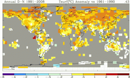
Well, what the have most in common is the fact that these are also the three areas of the world with the poorest surface temperature coverage. Here is the GISS coverage showing color only in areas where they have a thermometer record within a 250km box:
The worst coverage is obviously in the Arctic, Antarctica and then Africa. Coincidence?
Those who want to argue that the surface temperature record should be used in preference to that of satellites need to explain why the three areas in which the two diverge the most are the three areas with the worst surface temperature data coverage. This seems to argue that flaws in the surface temperature record drive the differences between surface and satellite, and not the other way around.
Apologies to Tisdale if this is where he was going in his next post in the series.


The impression I get is that GISS uses some sort of interpolation/extrapolation model to fill in the gaps. And then calculates a global average using all of the data. Intuitively, it seems like they are trying to get something for nothing.
In any event, I’m sure that the gap-filling algorithm gives lots of opportunities for mischief.
This leads one to suspect there could be some relationship between rigor and error level, too. In the Arctic and Antarctic, one might well want to locate measurement equipment rather closer to living spaces as one might well want to minimize exposure to an unpleasant environment…hence increasing the chances of exposure of those instruments to heat from those sources themselves. The same could possibly apply to African stations, for a variety of different types of environmental reasons. It’s speculative, but suggestive and plausible, at any rate.
I understand the reasons for discussing land-versus-space.
But I also feel that the topic of land-versus-ocean is also a rich area of discussion. Look at http://vortex.nsstc.uah.edu/data/msu/t2lt/uahncdc.lt
Ocean temperatures as measured by satellites are back to where they were in 1980. Land temperatures are up, and that would not be surprising given land use changes and UHI. It is not quickly obvious to me how this divergence supports the CO2 theory of global warming.