Today will actually be fun, because it involves criticism of some of my writing around what I find to be the most interesting issue in climate, that of feedback effects. I have said for a while that greenhouse gas theory is nearly irrelevant to the climate debate, because most scientists believe that the climate sensitivity to CO2 acting along without feedbacks is low enough (1.2C per doubling) to not really be catastrophic. So the question whether man-made warming will be catastrophic depends on the assumption of strong net positive feedbacks in the climate system. B Kalafut believes I have the wrong mental model for thinking about feedback in climate, and I want to review his post in depth.
Naming positive feedbacks is easy. In paleoclimate, consider the effect of albedo changes at the beginning of an ice age or the “lagging CO2” at the end. In the modern climate, consider water vapor as a greenhouse gas, or albedo changes as ice melts. In everyday experience, consider convection’s role in sustaining a fire. Consider the nucleation of raindrops or snowflakes or bubbles in a pot of boiling water. At the cellular level, consider the voltage-gated behavior of the sodium channels in a nerve axon or the “negative damping” of hair cells in the cochlea.
I am assuming he is refuting my statement that “it is hard to find systems dominated by strong net positive feedbacks that are stable over long periods of time.” I certainly never said individual positive feedbacks don’t exist, and even mentioned some related to climate, such as ice albedo and increases in water vapor in air. I am not sure we are getting anywhere here, but his next paragraph is more interesting.
On to the meat of Meyer’s argument: he seizes on one word (“feedback”) and runs madly, from metaphor to mental model. Metaphor: “like in an ideal amplifier”. Model: The climate experiences linear feedback as in an amplifier–see the math in his linked post or in the Lindzen slides from which he gets the idea. And then he makes the even worse leap, to claiming that climate models (GCMs) “use” something called “feedback fractions”. They do not–they take no such parameters as inputs but rather attempt to simulate the effects of the various feedback phenomena directly. This error alone renders Meyer’s take worthless–it’s as though he enquires about what sort of oats and hay one feeds a Ford Mustang. Feedback in climate are also nonlinear and time-dependent–consider why the water vapor feedback doesn’t continue until the oceans evaporate–so the ideal amplifier model cannot even be “forced” to apply.
First, I don’t remember ever claiming that climate models used a straight feedback-amplification method. And I am absolutely positive I never said GCM’s use feedback fractions. I would not expect them to. This is a total straw man. I am using a simple feedback amplification model as an abstraction to represent the net results of the models in a way layman might understand, and backing into an implied fraction f from published warming forecasts and comparing them to the 1.2C non-feedback number. Much in the same way that scientists use the concept of climate sensitivity to shortcut a lot of messy detail and non-linearity. I am, however, open to the possibility that mine is a poor mental model, so lets think about it.
Let’s start with an analogy. There are very complicated electronic circuits in my stereo amplifier. Nowadays, when people design those circuits, they have sophisticated modeling programs that can do a time-based simulation of voltage and current at every point in the circuit. For a simulated input, the program will predict the output, and show it over time, even if it is messy and non-linear. These models are in some ways like climate models, except that we understand electronic components better so our parametrization is more precise and reliable. All that being said, it does not change the fact that a simple feedback-gain model for sections of the complex amplifier circuitry is still a useful mental model for the process at some level of abstraction, as long as one understands the shortcomings that come from any such simplification.
The author is essentially challenging the use of Gain = 1/ (1-f) to represent the operation of the feedbacks here. So let’s think about if this is appropriate. Let’s begin with thinking about a single feedback, ice albedo. The theory is that there is some amount of warming from CO2, call it dT. This dT will cause more ice to melt than otherwise would have (or less ice to form in the winter). The ice normally reflects more heat and sunlight back into space than open ocean or bare ground, so when it is reduced, the Earth gets a small incremental heat flux that will result in an increase in temperatures. We will call this extra increase in temperature f*dT where f is most likely a positive number less than one. So now our total increase, call it dT’ is dT+f*dT. But this increase of f*dT will in turn cause some more ice to melt. By the same logic as above, this increase will be f*f*dT. And so on in an infinite series. The solution to this series for a constant value of f is dT’ = dT/(1-f) … thus the formula above.
So the underlying operation of the feedback is the same: Input –> output –> output modifies input. There are not somehow different flavors or types of feedback that operate in radically different ways but have the same name (as in his Mustang joke).
The author claims the climate models are building up the affects of the processes like ice albedo from its pieces, ie rather than abstracting in to the gain formula, the models are adding up all the individual pieces, on a grid, over time. I am sure that is true. The question is not whether they use the simplified feedback formula, but whether it is a useful abstraction. I see nothing from my description of the ice albedo process to say it is not.
What happens if there are time delays? Well, as long as f is less than 1, the system will reach steady state at some point and this formula should apply. What happens if the feedback is non-liner? Well, in most natural systems, it is almost certainly non-linear. In our ice albedo example, f is almost certainly different at different temperatures levels (for example, a change from -30C to -31C has a lot less effect on ice albedo than a change from 0C to 1C. The factor f is probably also dependent on the amount of ice remaining, since in the limit when all the ice is melted there should be no further effect. But I would argue that when we pull back and look at the forest instead of the trees, a critical skill for modelers who too often get buried in their minutia while losing the ability to reality-check their results, that the 1/(1-f) is still an interesting if imperfect abstraction for the results, particularly since we are looking at tenths of a degree, and its hard for me to believe that it is wildly non-linear over that kind of range. (By the way, it is not at all unusual for mainstream alarmist scientists to use this same feedback formula as a useful though imperfect abstraction, for example in Gerard H. Roe and Marcia B. Baker, “Why Is Climate Sensitivity So Unpredictable?”, Science 318 (2007): 629–632 Not free but summarized here.)
To determine if it is a useful abstraction, I would ask the author what conclusions I draw that fall apart. I really only made two points with the use of feedback anyway.
- I used the discussion to educate people that feedback is the main source of catastrophic warming, so that it should be the main focus of the scientific replication. We can argue all day about time delays and non-linearity, but if the IPCC says the warming from CO2 alone is going to be 1.2C per doubling and the warming with all feedbacks considered is going to be, say, 4.8C per doubling (the author says himself that the models all converge at constant CO2), then we can say feedback is amplifying the initial man-made input by 4, or alternatively, 75% of the warming is from feedback effects, so these are probably where we need to focus. I struggle to see how one can argue with this.
- I used the simple gain formula to say if feedback were quadrupling temperatures, this implies a feedback factor of 0.75, and that this number is pretty dang high for a long-term stable system. Yes, the feedback is non-linear, but I don’t think this is an unreasonable reality check on the models to see what sorts of average feedbacks are being produced by the parameters.
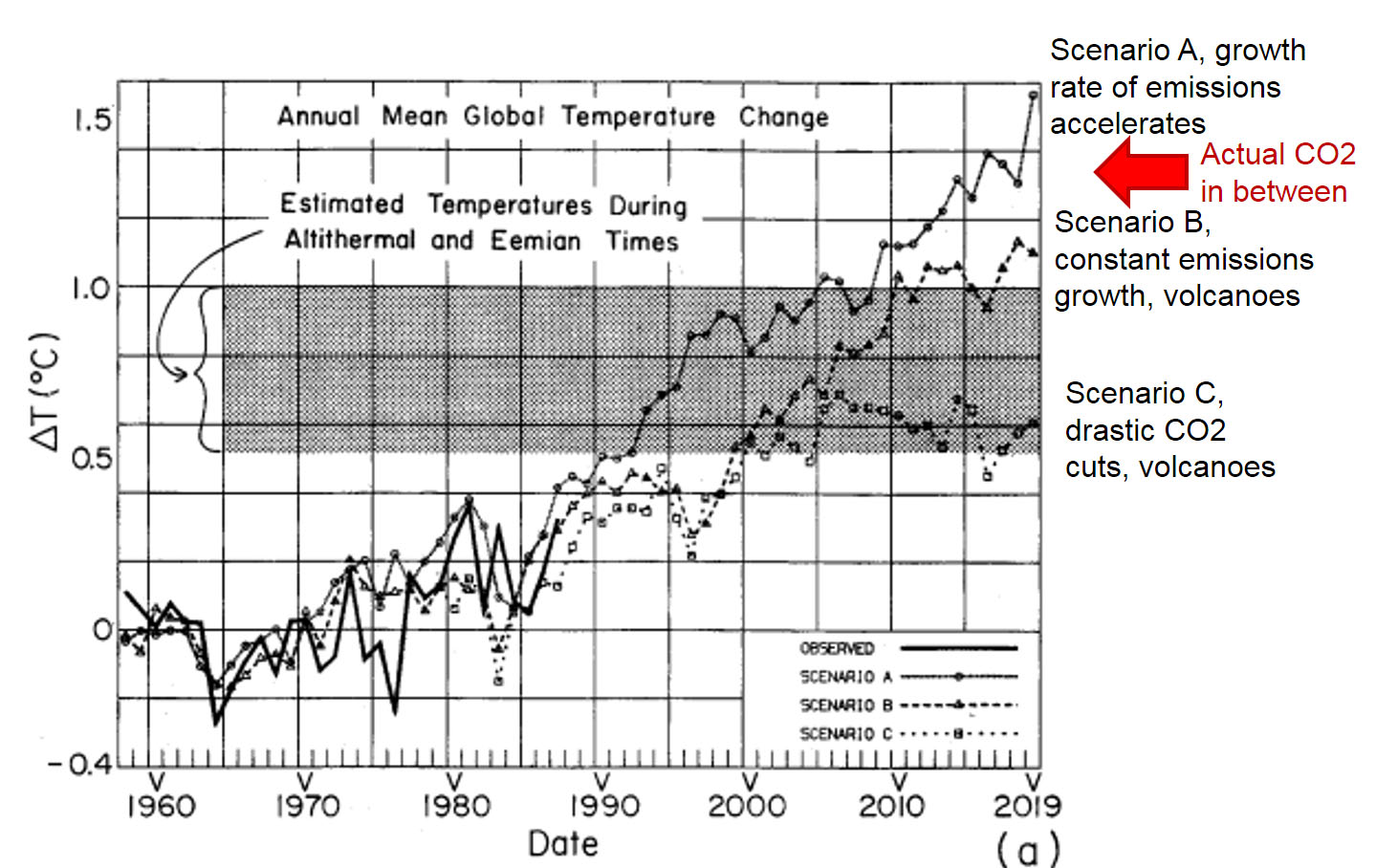
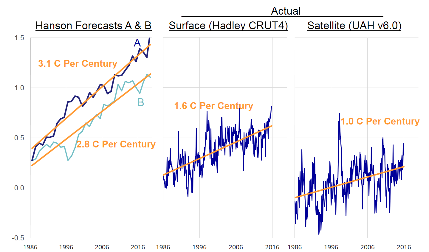
The author’s points on non-linearity and time delays are actually more relevant to the discussion in other presentations when I talked about whether the climate models that show high future sensitivities to CO2 are consistent with past history, particularly if warming in the surface temperature record is exaggerated by urban biases. But even forgetting about these, it is really hard to reconcile sensitivities of, say, four degrees per doubling with history, where we have had about 0.6C (assuming irrationally that its all man-made) of warming in about 42% of a doubling (the effect, I will add, is non-linear, so one should see more warming in the first half than the second half of a doubling). Let’s leave out aerosols for today (those are the great modeler’s miracle cure that allows every model, even those of widely varying CO2 sensitivities and feedback effects, all exactly back-cast to history). These time delays and non-linearities could help reconcile the two, though my understanding is that the time delay is thought to be on the order of 12 years, which would not reconcile things at all. I suppose one could assume non-linearity such that the feedback effects accelerate with time past some tipping point, but I will say I have yet to see any convincing physical study that points to this effect.
Well, the weather is lovely outside so I suppose I should get on with it:
Meyer draws heavily from a set of slides from a talk by Richard Lindzen before a noncritical audience. These slides are full of invective and conspiracy talk, and their scientific content is lousy. Specifically, Lindzen supposedly estimates effective linear feedbacks for various GCMs and finds some greater than one. The mathematics presented by Lindzen in his slides does not allow that, and he doesn’t provide details of how such things even could be inferred. An effective linear feedback greater than one implies a runaway process, yet GCMs are always run for finite time, so there cannot be divergence to infinity. Moreover, as far as I know, all of the GCMs are known to converge once CO2 is stabilized.
I draw on Lindzen and Lindzen is wrong about a bunch of stuff and Lindzen uses invective and conspiracy talk so, what? Lindzen can answer all of this stuff. I used one chart from Lindzen, and it wasn’t even about feedback (I will reproduce it below).
I did mention that in theory, if the feedback factor is greater than one, in other words, if the first order feedback addition to input is greater than the original input, then the function rapidly runs away to infinity. Which it does. I don’t know what Lindzen has to say about this or what the author is referring to. My only point is that when folks like Al Gore talk about runaway warming and Earth becoming Venus, they are really implying runaway positive feedback effects with feedback factors greater than one. Since I really don’t go anywhere with this and in reality the author is debating Lindzen over an argument or analysis I am not even familiar with, I will leave this alone. The only thing I will say is that his last sentence seems on point, but his second to last is double talk. All he is saying is that by only solving a finite number of terms in a a divergent infinite series his calculations don’t go to infinity. Duh.
I am open to considering whether I have the correct mental model. But I reject the notion that it is wrong to try to simplify and abstract the operation of climate models. I have not modeled the climate, but I have modeled complex financial, economic, and mechanical systems. And here is what I can tell you from that experience — the more people tell me that they have modeled a system in the most minute parametrization, and that the models in turn are not therefore amenable to any abstraction, the less I trust their models. These parameters are guesses, because there just isn’t enough understanding of the complex and chaotic climate system to parse out their different values, or to even be clear about cause and effect in certain processes (like cloud formation).
I worry about the hubris of climate modelers, telling me that I am wrong and impossible to try to tease out one value for net feedback for the entire climate, and instead I should be thinking in terms of teasing out hundreds or thousands of parameters related to feedback. This is what I call knowledge laundering:
These models, whether forecasting tools or global temperature models like Hansen’s, take poorly understood descriptors of a complex system in the front end and wash them through a computer model to create apparent certainty and precision. In the financial world, people who fool themselves with their models are called bankrupt (or bailed out, I guess). In the climate world, they are Oscar and Nobel Prize winners.
This has incorrectly been interpreted as my saying these folks are wrong for trying to model the systems. Far from it — I have spend a lot of my life trying to model less complex systems. I just want to see some humility.
Postscript: Here is the only chart that I know of in my presentation from Lindzen, and its not even in the video he links to, it is in this longer and more comprehensive video

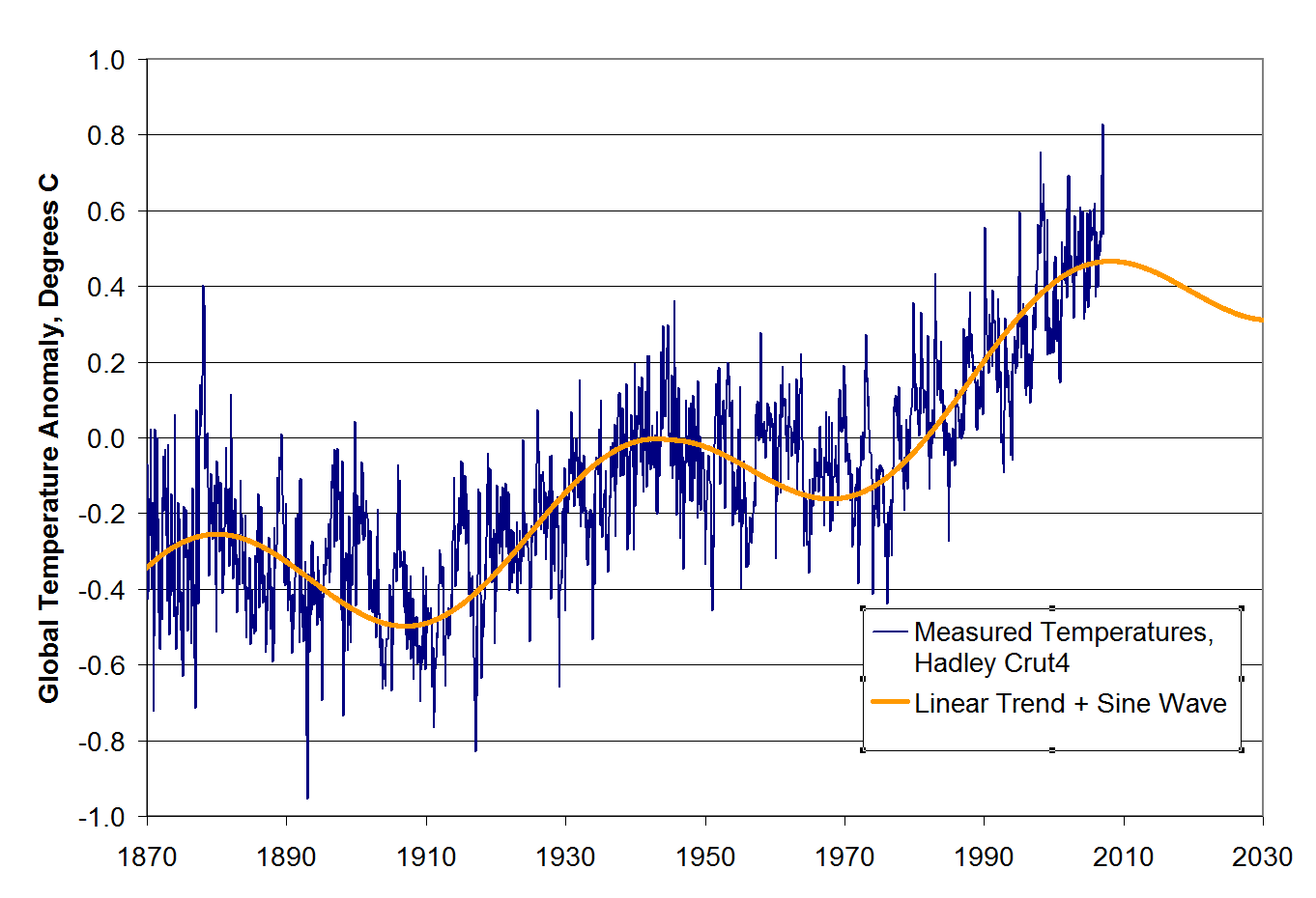
That seems a reasonable enough challenge to me, particularly given the data in this post and this quote from Judith Currey, certainly not a skeptic:
They don’t disprove anthropogenic global warming, but we can’t airbrush them away. We need to incorporate them into the overall story. We had two bumps—in the ’90s and also in the ’30s and ’40s—that may have had the same cause. So we may have exaggerated the trend in the later half of the 20th century by not adequately interpreting these bumps from the ocean oscillations. I don’t have all the answers. I’m just saying that’s what it looks like.
Again, as I have said before, man’s CO2 is almost certainly contributing to a warming trend. But when we really look at history objectively and tease out measurement problems and cyclical phenomena, we are going to find that this trend is entirely consistent with a zero to negative feedback assumption for the climate as a whole, meaning that man’s CO2 is driving 1.2C or less of warming per doubling of CO2 concentrations.


