Skipping A Step

Here is a little glimpse of how climate alarmism works.  Check out this article in the NewScientist (I don’t know anything about this particular publication, but my general assumption is that most periodicals use “New” in the context of such a title as a synonym for “socialist.”):

Rather than spreading out evenly across all the oceans, water from melted Antarctic ice sheets will gather around North America and the Indian Ocean. That’s bad news for the US East Coast, which could bear the brunt of one of these oceanic bulges.

It goes on and on with more detail, which sounds really scary:

First, Jerry Mitrovica and colleagues from the University of Toronto in Canada considered the gravitational attraction of the Antarctic ice sheets on the surrounding water, which pulls it towards the South Pole. As the ice sheet melts, this bulge of water dissipates into surrounding oceans along with the meltwater. So while the sea level near Antarctica will fall, sea levels away from the South Pole will rise.

Once the ice melts, the release of pressure could also cause the Antarctic continent to rise by 100 metres. And as the weight of the ice pressing down on the continental shelf is released, the rock will spring back, displacing seawater that will also spread across the oceans.

Redistributing this mass of water could even change the axis of the Earth’s spin. The team estimates that the South Pole will shift by 500 metres towards the west of Antarctica, and the North Pole will shift in the opposite direction. Since the spin of the Earth creates bulges of oceanic water in the regions between the equator and the poles, these bulges will also shift slightly with the changing axis….

The upshot is that the North American continent and the Indian Ocean will experience the greatest changes in sea level – adding 1 or 2 metres to the current estimates. Washington DC sits squarely in this area, meaning it could face a 6.3-metre sea level rise in total. California will also be in the target zone.

Spotting the skipped logic step does not require one to be a climate skeptic.  Anyone familiar with the most recent IPCC report should see it too.  Specifically, the authors simply posit — without even bothering to mention it as an assumption! — that tons of land-based ice (remember, sea ice melting has no effect on sea levels) is going to melt in Antarctica.  But just about everyone, even the alarmists at the IPCC, predict just the opposite, even in 3C per century global warming scenarios.

Why?  Well, for a couple of reasons.  The first is that Antarctica is so cold that several degrees of warming will not bring most of the continent above freezing, even in the summer.  The exception is probably the Antarctic Peninsula, which sticks out north of the rest of the continent and accounts for 2% of the land mass and a much smaller percentage of the total ice pack.

The other reason is that if the world warms, the seas around Antarctica will warm and the models show the warming surrounding seas increasing precipitation on the continent and actually increasing snow pack.  In fact, increases in Antarctic ice pack actually exceed decreases forecast in ice packs around the rest of the world.  The entirety of the IPCC ocean rise scenario is driven by the thermal expansion of water, not net ice melting.

By the way, I presume these guys have their math right, but it seems astonishing to me that the ice mass (or lack of it) could really exert enough gravitational pull to change sea levels in the northern hemisphere by a meter or two.  Gravity is an astonishingly weak force — does this reality check?  I had always thought differences in ocean levels (say for example the fact that the Atlantic and Pacific are not the same height on either side of the Panama Canal)  had more to do with differentials in evaporation rates.

PS- Is telling me global warming will flood Washington DC supposed to make me be against global warming?  Because that sounds pretty good to me. ;=)

Why I Don’t Post This Stuff

I get emails asking why I haven’t reported on this or than nose count survey of climate scientists, or such and such declaring himself a skeptic, or whatever.  Someone in Senator Inofe’s office constantly spams me with that stuff.

The answer is that I don’t think headcounts are a particularly relevent or interesting way to conduct science.  Interestingly, Russel Roberts answered a similar but different question in much the same way I would have:

A number of people have asked why my name was missing from the petition against the spending package [which appeared as an ad in the NY Times].  The simple answer is that I didn’t know about it. But I probably wouldn’t have signed it anyway. I decided a while back not to sign these kind of petitions. First, there’s usually something I don’t agree with in the text, and second, the whole thing is a little weird about the whole thing–the idea that people should care that there are a bunch of economists who feel this way, especially given that there are a bunch of economists on the other side of the political spectrum who feel the exact opposite. So is the idea that we have more Nobel Laureates than they do? But what if it’s fewer?

More Thoughts on Tree Mortality Study

I got a copy of the Science article by Van Mantgem et. al. on tree mortality referred to in my previous post here.  I have not done a comprehensive review, but I have now read it and its supplements and have a few immediate reactions.

This article struck me as an absolutely classic academic study, for the following reason:   The study can be broken up into two parts – measurement of a natural phenomenon and possible explanations for the measurements. The meat of the effort and real work is in the first part, the measurement of tree mortality, with very weak work on the second part, on the links to global warming.  Many academic studies are guilty of this to some extent.  I once had a professor tell me every study was a year of intensive data gathering and analysis followed by 2 hours of a group of grad students trying to brainstorm causes and implications, the more exciting the better.  Unfortunately, the press releases and media attention in climate tend to focus on this hypothesizing as if it had as much credibility as the actual data analysis.  Let me be specific.

The first part of the study, the measurement of tree die-off rates, appears to be where the bulk of the work is, and their findings seem fairly reasonable — that tree die-off rates seem to have gone up over the last several decades in the western US, and that this die-off seems to be consistent across geography, tree size, and tree type.   My only complaint is that their data shows a pretty clear relationship between study plot size and measured mortality.   Most of the measured tree mortality is in plots 1 hectare or less (about 2.5 acres, or the size of a large suburban home lot).  There is not nearly as much mortality in the larger study plots — I would have liked to see the authors address this issue as a possible methodological problem.

Anyway, the finding of large and spatially diverse increases in mortality of trees is an important finding, and one for which the authors should feel proud to identify.  The second part of the study, the hypothesized causes of this mortality, is far far weaker than the first, though this is not atypical of academic studies.  Remember, in the press summaries, the authors claimed that global warming had to be the cause because they had eliminated everything else it could possibly be.  So here is what their Science article mentions that they considered and rejected as possible causes:

  • Changes in forest density and fire exclusion policies
  • Old trees falling and crushing new trees
  • Ozone levels (they claim they look at “pollution” but ozone is the only chemical discussed)
  • Activity of fungal pathogen, Cronartium ribicola, in certain pines
  • Forest fragmentation

Wow, well that certainly seems comprehensive.  Can’t think of a single other thing that could be causing it.  By the way, the last one is interesting to me, because I suggested forest fragmentation and micro-climate issues in my first post.  So, just to give you an idea of the kind of scholarship that passes peer review, let’s see how they tested for forest fragmentation:  they compared mortality of trees inside national parks vs. mortality of trees outside of national parks.  The logic is that National Park trees would see less fragmentation over time since they are protected from logging, but that of course is a supposition.

This is really weak.  I guess it’s not a bad test if you had to come up with such a test in an afternoon without the time to do any extra work, but it is a very course macro test of a very micro problem.  For example, the top of Kilimanjaro is protected as  a National Park, but evidence is pretty strong that snow on the mountain is being reduced by land-use-related changes in precipitation and local climate due to logging outside the national park.

A lot of folks in the comments of the last post mentioned, reasonably, the massive infestations of western pine bark beetles.  The only mention of the  bark beetle infestations was, interestingly, in their last paragraph, where they said:

First, increasing mortality rates could presage substantial changes in forest structure, composition, and function (7, 25), and in some cases could be symptomatic of forests that are stressed and vulnerable to abrupt dieback (5). Indeed, since their most recent censuses, several of our plots in the interior region experienced greatly accelerated mortality due to bark beetle outbreaks, and in some cases nearly complete mortality of large trees

I guess that is a handy way to deal with an exogenous factor you don’t want to admit drove some of your observations – just reverse the causality.  So now mortality is not caused in part by beetles, beetles are caused by mortality!

By the way, before I head into temperature, I had a question for those of you who may know trees better than I.  Do trees have demographics and generations, like human populations?  For example, we expect a rise in mortality among humans over the next 30 years because there was a spike in birth rates 50 years ago.  Do forests have similar effects?  It struck me that humans cleared a lot of western forests from 1860-1920, and since then the total forested area in the US has expanded.  Is there some sort of baby boomer generation of trees born around 1900 that are now dying off?

Anyway, on to temperature.   Here is the key statement from the Science article:

We suggest that regional warming may be the dominant contributor to the increases in tree mortality rates. From the 1970s to 2006 (the period including the bulk of our data; table S1), the mean annual temperature of the western United States increased at a rate of 0.3° to 0.4°C decade−1, even approaching 0.5°C decade−1 at the higher elevations typically occupied by forests (18). This regional warming has contributed to widespread hydrologic changes, such as declining fraction of precipitation falling as snow (19), declining snowpack water content (20), earlier spring snowmelt and runoff (21), and a consequent lengthening of the summer drought (22). Specific to our study sites, mean annual precipitation showed no directional trend over the study period (P = 0.62, LMM), whereas both mean annual temperature and climatic water deficit (annual evaporative demand that exceeds available water) increased significantly (P < 0.0001, LMM) (10). Furthermore, temperature and water deficit were positively correlated with tree mortality rates (P ≤ 0.0066, GNMM; table S4).

The footnotes reference that the temperature and water correlations are in the supplementary online material, but I have access to that material and there is nothing there.  I may be unfair here, but it really looks to me like some guys did some nice work on tree mortality, couldn’t get it published, and then tacked on some stuff about global warming to increase the interest in it.   Note that Science recognizes what the study is about, when it titles the article “Widespread Increase of Tree Mortality Rates in the Western United States,” without mention of global warming.  But when it moves to the MSM, it is about global warming, despite the fact that none of the warming and drought data and regressions are considered important enough or persuasive enough to make the article or even the supplementary material.

OK, if this paragraph is all we have, what can we learn from it?  Well, the real eye-catcher for me is this:

From the 1970s to 2006…the mean annual temperature of the western United States increased at a rate of 0.3° to 0.4°C decade−1, even approaching 0.5°C decade−1 at the higher elevations typically occupied by forests

They are saying that for the period 1971-2006 the temperature of the Western US increased 1.1°C to 1.4°C, or 2-2.5°F.  And it increased as much as 6.3°F in the higher elevations.    This seems really high to me, so I wondered at the source.  Apparently, it is coming from something called the PRISM data base.  These guys seem to have some sort of spacial extrapolation program that takes discreet station data and infills data for the area between the stations, mainly using a linear regression of temperature vs. altitude.  I have zero idea if their methodology makes any sense, but knowing the quality of some of the station data they are using, it may be GIGO.  (By the way, someone at Oregon State, who apparently runs this site, needs to hire a better business manager.  Their web site repors that in an academic environment awash with money for climate research, their climate data base work has been suspended for lack of funding).

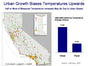
As a back check on this number, LaDochy in 2007 looked at California temporal and spatial temperature trends in some depth.  He found that when one pulls out the urban stations, California rural areas experienced a 0.034C per decade temperature increase from 1950-2000, an order of magnitude lower than the numbers this study is using (click to expand slide below):
ladochy

Satellite data from UAH, which does not have the same urban bias problems, shows near-surface temperatures rising 0.1-0.3C per decade from 1978-2006 in the study areas, higher than the LaDochy numbers but still well below the study numbers.

This is a real problem with the study.  If you really want to measure the impact of temperature and participation on a 2.5 acre lot, you have to actually measure the temperature and precipitation, and even better things like the soil moisture content, somewhere near the 2.5 acre lot, and not look at western averages or computer interpolated values.

The study authors conclude:

Warming could contribute to increasing mortality rates by (i) increasing water deficits and thus drought stress on trees, with possible direct and indirect contributions to tree mortality (13, 23); (ii) enhancing the growth and reproduction of insects and pathogens that attack trees (6); or (iii) both. A contribution from warming is consistent with both the apparent role of warming in episodes of recent forest dieback in western North America (5, 6) and the positive correlation between short-term fluctuations in background mortality rates and climatic water deficits observed in California and Colorado (13, 24).

I guess I won’t argue with the word “consistent,” and I suppose it is unfair to hammer these guys too hard for the way the MSM over-interprets the conclusions and latches on to the global warming hypothesis, but really, isn’t that why the warming material is included in the paper, to get attention for the authors?  Because this paragraph would be a nice summary in a paper proposing a new study, and the hypothesis is a reasonable one to test, but it certainly isn’t proven by this study.

Postscript: From the map, some of the test plots are almost right on top of the California bristlecone pines used for climate reconstruction.  Remember, Mann and company begin with the assumption that tree growth is positively correlated with temperature.  This article argues that warming is stunting tree growth and causing trees to die.  While these are not impossible to reconcile  (though its hard considering the authors of this study said their findings were consistent across tree age, size, and variety) I would love to see how the RealClimate folks do so.

Update: Note that I still have not read the complete study itself, so I am sure there are climate regressions and such that did not make the publication or the online exhibits in Science.  So this quick reading may still be missing something.

Update #2: The best reconciliation I have received on this study vs. dendro-climatology work is the following, and is suggested on this page.   Certain trees seem to be growth-limited by temperatures, and certain trees are growth limited by water  (I presume there are other modes as well).  Trees that are temperature-limited will have their growth gated by temperature.  Trees that are water-limited will have growth controlled primarily by precipitation levels.  Grassino-Mayer states:

…sites useful to dendrochronology can be identified and selected based on criteria that will produce tree-ring series sensitive to the environmental variable being examined. For example, trees that are especially responsive to drought conditions can usually be found where rainfall is limiting, such as rocky outcrops, or on ridgecrests of mountains. Therefore, a dendrochronologist interested in past drought conditions would purposely sample trees growing in locations known to be water-limited. Sampling trees growing in low-elevation, mesic (wet) sites would not produce tree-ring series especially sensitive to rainfall deficits. The dendrochronologist must select sites that will maximize the environmental signal being investigated. In the figure below, the tree on the left is growing in an environment that produced a complacent series of tree rings.

So I suppose that while most trees are suffering from higher temperatures via the moisture mechanism, so may be benefiting, and the key is to pick the right trees.

Of course, given that bristlecones were selected as much for the fact that they are old as the fact their growth is driven by one thing or another, the problem is how one knows a particular tree’s  is temperature or moisture driven, and how one can have confidence that this “mode” has not changed for a thousand or more years.

Are bristlecones driven by temperature (as they are at fairly high altitude) or by precipitation (as they are in a very arid region of the southwest).  One might expect that given divergence issues in the bristlecone proxies, the Mannian answer of “temperature” might be wrong.  The NASA site offers this answer on the bristlecones:

Douglas’ [bristlecone] rings [from the White Mountains of CA, the same ones Mann uses] tell about rainfall in the southwestern United States, but trees also respond to changes in sunlight, temperature, and wind, as well as non-climate factors like the amount of nutrients in the soil and disease. By observing how these factors combine to affect tree rings in a region today, scientists can guess how they worked in the past. For example, rainfall in the southwestern United States is the factor that affects tree growth most, but in places where water is plentiful, like the Pacific Northwest, the key factor affecting tree ring growth may be temperature. Once scientists know how these factors affect tree ring formation, scientists can drill a small core from several trees in an area (a process that does not harm the tree) and determine what the climate was in previous years. The trees may also record things like forest fires by bearing a scar in a ring.

We Eliminated Everything We Could Think Of, So It Has To Be Warming

I am still trying to get a copy of the article in Science on which this is based, but the AZ Republic writes:

Western forests that withstood wildfire, insect attacks and drought are now withering under an even greater menace.

Heat.

Rising temperatures are wiping out trees faster than the forests can replace them, killing pines, firs, hemlocks and almost every other kind of tree at almost every elevation from northern Arizona to southwestern Canada.

Writing today in the journal Science, a team of 11 researchers says global warming is almost certainly the culprit behind a sharp spike in tree deaths over the past several decades. The higher death rates, which doubled in as few as 17 years in some areas, coincide with a regional increase in temperature and appear unrelated to other outside factors.

Perhaps this question is answered somewhere in the unreported details, but my first reaction was to want to ask “Dendroclimatologists like Michael Mann reconstruct history from tree rings based on the assumption that increasing temperatures correlates linearly and positively with tree growth and therefore tree ring width.  Your study seems to indicate the correlation between tree growth and temperature is negative and probably non-linear.  Can you reconcile these claims?’    Seriously, there may be an explanation (different kinds of trees?) but after plastering the hockey stick all over the media for 10 years, no one even thinks to ask?

Normally, I just ignore the flood of such academic work  (every study nowadays has global warming in it — if these guys had just wanted to study the forest, they would have struggled for grant money, but make it about forest and global warming and boom, here’s your money).  The reasons I picked it out was because I just love the quote below — I can’t tell you how often I see this in climate science-related work:

Scientists combed more than 50 years of data that included tree counts and conditions. The sharp rise in tree mortality was apparent quickly. Researchers then eliminated possible causes for the tree deaths, such as air pollution, fire suppression or overgrowth. They concluded the most likely culprit was heat.

Again, I need to see the actual study, but this would not be the first time a climate study said “well, we investigated every cause we could think of, and none of them seemed to fit, so it must be global warming.”  It’s a weird way to conduct science, assuming Co2 and warming are the default cause for every complex natural process.  No direct causal relationship is needed with warming, all that is required is to eliminate any other possible causes.  This means that the less well we understand any complex system, the more likely we are to determine changes in the system are somehow anthropogenic.

Speaking of anthropogenic, I am fairly certain that the authors have not even considered the most likely anthropogenic cause, if the source of the forest loss is even man-made at all.  From my reading of the literature, nearby land use changes (clearing forests for agriculture, urbanization, etc) have a much greater affect on local climates and particularly moisture patterns than does a general global warming trend.  If you clear all the surrounding forest, it is likely that the piece that is left is not as healthy as it would have been in the midst of other forested land.

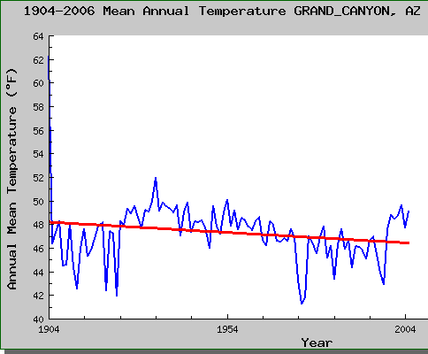
The article, probably because it is making an Arizona connection, makes a big deal about the role of a study forest near Flagstaff in the study.  But if the globe is warming, the area around Norther Arizona has not really been participating.  The nearest station to the forest is the USHCN station at the Grand Canyon, a pretty decent analog because it is nearby, rural, and forested as well.  Here is the plot of temperatures from that station:

grand_canyon_temp

Its hard to tell from the article, but my guess is that there is actually a hidden logic leap embedded.  Likely, their finding is that drought has stressed trees and reduced growth.  They then rely on other studies to say that this drought is due to global warming, so then they can get to the grant-tastic finding that global warming is hurting the forest.   But the “western drought caused mainly by anthropogenic warming” is not a well proven connection.  Warming likely has some contribution to it, but the west has been through wet-dry cycles for tens of thousands of years, and has been through much worse and longer droughts long before the Clampetts started pumping black gold from the ground.

The Magic Correlation

This discussion, including the comments, over at Climate Audit, really is amazing.  Just when you think all the procedural errors that could be mined from the Mann hockey stick have been pulled to the surface, another gem emerges.

Here is how I understand it (please correct me if I am wrong in the comments):  Michael Mann uses a variety of proxies to reconstruct history  (he actually pre-screens them to only use the ones that will give him the answer he wants, but that is another problem that has been detailed in other posts).  To be able to tell temperature with these proxies (since their original measurements are things like mm of tree ring width, not degrees) they must be scaled based on periods in which the thermometer-measured surface temperature record overlaps the proxy record.

Apparently, when making these calibrations, he used the surface temperature record from 1850-1995, but also did other runs with sub-periods of this, such as 1850-1949 and 1896-1995.  OK so far.  Well, McIntyre believes he has found that when running these correlations, the sign of the correlation factor for a single proxy actually changes.

What does this mean?  Well, lets assume proxy 1 is tree ring width from a particular tree, and a calibration based on 1850-1995 has such-and-such ring width data correlated at x per degree.   This means that an increase in ring width of X implies a temperature increase of one.  But, when calibrating on one of the other periods, the exact same proxy has a calibration of -Y.  This means that an increase in the ring width of Y yields a temperature DECREASE of one.

I had a professor of physics back in undergrad who used to just drive me crazy with his insistence on good error estimations in the lab  (which he was right to emphasize, just proving I was not meant for the lab).  He used to say that if your error range crossed zero, in other words, if your range of possible answers included both positive and negative numbers, then you really did not understand a process.  You don’t understand a relationship, he would say, if you don’t even know the sign.  Well, Mann has gotten over this little problem, I guess, because he is perfectly able to have the same physical process have exactly opposite relationships with temperature depending on what 50 year period he is working with.

OK, so Steve caught him with one bad proxy.  Heck, he has over a thousand others.  But now McIntyre is reporting in the comments he has found 308 such cases, where Mann has correlations that change signs like this.  Wow.

Postscript: By the way, one of the most fundamental rules of regression analysis is that when you throw a variable into the regression, you should have some theoretical reason for doing so.  This is because every single variable you add, no matter how spurious, is going to improve the fit of a regression (trust me on this, it’s in the math).

In the case of proxy regressions, it is simply unacceptable to rely on the regression for the sign.  You rely on physics for the sign, not the regression.   If you don’t even know the sign of the relationship between your proxy and temperature, then you don’t understand the proxy well enough physically to justify even calling it a proxy.

This is a big, big deal in financial modelling.  I can’t tell you how often it is emphasized in financial modelling to make sure you have a working theory as to how and why a variable should affect a regression, and then when you get the result, you need to test it against your original theory.  And if they are too far apart, you need to doubt the computer result.  Because in financial modelling, if you get too much confidence in regressions against spurius data, you can go bankrupt  (in climate, it instead seems to lead to fame, large grants, and hanging out with vice-presidents).

Update: Oops, I missed the first post on this at Climate Audit, which discusses the issues in my postscript in more depth.  This is a good example, and it is not surprising they revert to a financial example as I did, as financial modelers have the greatest immediate incentives not to fool themselves.

We (the authors of this paper) have identified a weather station whose temperature readings predict daily changes in the value of a specific set of stocks with a correlation of r=-0.87. For $50.00, we will provide the list of stocks to any interested reader. That way, you can buy the stocks every morning when the weather station posts a drop in temperature, and sell when the temperature goes up. Obviously, your potential profits here are enormous. But you may wonder: how did we find this correlation? The figure of -.87 was arrived at by separately computing the correlation between the readings of the weather station in Adak Island, Alaska, with each of the 3315 financial instruments available for the New York Stock Exchange (through the Mathematica function FinancialData) over the 10 days that the market was open between November 18th and December 3rd, 2008. We then averaged the correlation values of the stocks whose correlation exceeded a high threshold of our choosing, thus yielding the figure of -.87. Should you pay us for this investment strategy? Probably not: Of the 3,315 stocks assessed, some were sure to be correlated with the Adak Island temperature measurements simply by chance – and if we select just those (as our selection process would do), there was no doubt we would find a high average correlation. Thus, the final measure (the average correlation of a subset of stocks) was not independent of the selection criteria (how stocks were chosen): this, in essence, is the non-independence error. The fact that random noise in previous stock fluctuations aligned with the temperature readings is no reason to suspect that future fluctuations can be predicted by the same measure, and one would be wise to keep one’s money far away from us, or any other such investment advisor

Update #2: I guess I have to issue a correction.  I have argued that climate scientists tend to be unique in trying to avoid criticism by labeling critics as “un-scientific”.  In retrospect, it does not appear climate scientists are unique:

The iconoclastic tone have attracted coverage on many blogs, including that of Newsweek. Those attacked say they have not had the chance to argue their case in the normal academic channels. “I first heard about this when I got a call from a journalist,” comments neuroscientist Tania Singer of the University of Zurich, Switzerland, whose papers on empathy are listed as examples of bad analytical practice. “I was shocked — this is not the way that scientific discourse should take place.”

The Wrong Tree

I don’t really understand how this discussion at the Reference Frame is relevant to anything.  A study says that the clustering of high temperatures at the end of the last 100 years cannot be just random statistical chance, while Lubos argues that the chance of it happening is low but not nearly as low as the authors state.

I guess this may be an interesting exercise in probability theory for autocorrellated functions, but that is about it.  I mean, does anyone really doubt that there has been some sort of upward trend in world temperatures?

More relevent are the questions

Can you have a consensus if no one agrees what the consensus is?

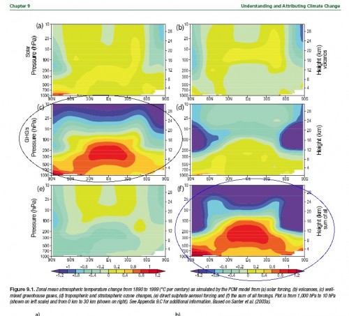
Over at the Blackboard, Lucia has a post with a growing set of comments about anthropogenic warming and the tropical, mid-tropospheric hotspot.  Unlike many who are commenting on the topic, I have actually read most of the IPCC AR4 (painful as that was), and came to the same conclusion as Lucia:  that the IPCC said the climate models predicted a hot spot in the mid-troposphere, and that this hot spot was a unique fingerprint of global warming (“fingerprint” being a particularly popular word among climate scientists).  Quoting Lucia:

I have circled the plates illustrating the results for well mixed GHG’s and those for all sources of warming combined. As you see, according to the AR4– a consensus document written for the UN’s IPCC and published in 2007 — models predict the effect of GHG’s as distinctly different from that of solar or volcanic forcings. In particular: The tropical tropospheric hotspots appears in the plate discussing heating by GHG’s and does not appear when the warming results from other causes.

hotspotar9_fordeepclimate

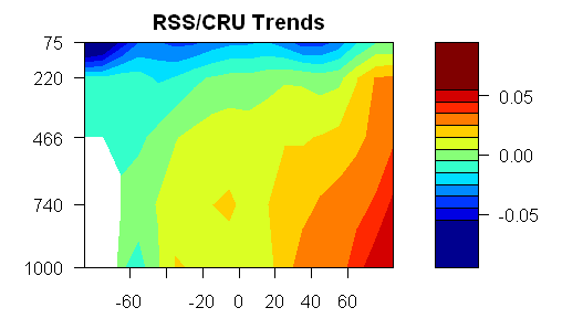
OK, pretty straight-forward.   The problem is that this hot spot has not really appeared.  In fact, the pattern of warming by altitude and latitude over the last thirty years looks nothing like the circled prediction graphs.  Steve McIntyre does some processing of RSS satellite data and produces this chart of actual temperature anomalies for the last 30 years by attitude and altitude  (Altitude is measured in these graphs by atmospheric pressure, where 1000 millibars is the surface and 100 millibars is about 10 miles up.

bigred50

The scientists at RealClimate (lead defenders of the climate orthodoxy) are not unaware that the hot spot is not appearing.  They responded about a year ago that 1)  The hot spot is not an anthropogentic-specific fingerprint at all, but will result from all new forcings

the pattern really has nothing to do with greenhouse gas changes, but is a more fundamental response to warming (however caused). Indeed, there is a clear physical reason why this is the case – the increase in water vapour as surface air temperature rises causes a change in the moist-adiabatic lapse rate (the decrease of temperature with height) such that the surface to mid-tropospheric gradient decreases with increasing temperature (i.e. it warms faster aloft). This is something seen in many observations and over many timescales, and is not something unique to climate models.

and they argued 2) that we have not had enough time for the hot spot to appear and they argued 3) all that satellite data really has a lot of error in it anyway.

Are the Real Climate guys right on this?  I don’t know.  That’s what they suck up all my tax money for, to figure this stuff out.

But here is what makes me crazy:  It is quite normal in science for scientists to have a theory, make a prediction based on this theory, and then go back and tweak the theory when data from real physical processes does not match the predictions.  There is certainly no shame in being wrong.  The whole history of science is about lurching from failed hypothesis to the next, hopefully improving understanding with each iteration.

But the weird thing about climate science is the sort of Soviet-era need to rewrite history.  Commenters on both Lucia’s site and at Climate Audit argue that the IPCC never said the hot spot was a unique fingerprint.  The fingerprint has become an un-person.

Why would folks want to do this?  After all, science is all about hypothesis – experimentation – new hypothesis.  Well, most science.  The problem is that climate science has been declared to be 1)  A Consensus and 2) Settled.    But settled consensus can’t, by definition, have disagreements and falsified forecasts.  So history has to be rewritten to protect the infallibility of the Pope the Presidium the climate consensus.  It’s a weird way to conduct science, but a logical outcome when phrases like “the science is settled” and  “consensus” are used as clubs to silence criticism.

“Anti-Scientific”

From Joe Romm, via Tom Nelson

The finalist list is out for the 2008 Weblog awards “Best Science Blog,” and two of the ten finalists are anti-scientific websites primarily devoted to spreading disinformation (and noninformation) on global warming– just like 2007.

The 2007 “competition” ended up being yet another classic exercise in the right wing perverting an otherwise reasonable web idea — online voting for the best science blog. As Desmogblog explained in a post titled, The “Vast Right Wing Conspiracy” beating “Vast Left Wing” Voting for Best Science Weblog, the right wing voted en masse for Climate Audit and the rational people all voted for Discover magazine’s excellent Bad Astronomy Blog. In the end, the process was so controverisal that the Awards folk simply called it a tie — saying each blog ended up with exactly 20,000 votes.

The Weblog Awards should not be legitimizing anti-scientific denialism.

As a student of history, I try really hard to never use the word “unprecedented.”  For example, those who think the partisan bickering we have today is somehow at a peak should go back to any American paper in 1855 and take a gander at the vitriol that flew back and forth.

But I must say I do find it difficult to find a good historical analog for this whole “anti-scientific” knock on climate skeptics.  I can understand accusing others of being wrong on a topic in science.   For example, it took decades for plate tectonics theory to catch on outside of small fringes of the geologic community, but I don’t remember folks accusing others of being anti-scientific.

This is particularly true in the case of the two blogs Mr. Romm mentions.   Here are a couple of quick thoughts:

  • Steve McIntyre, at Climate Audit, spends most of his time trying (in great, statistical depth) trying to replicate work by scientists such as Michael Mann and James Hansen, and critiques their work when he thinks he finds flaws.  Mann and Hansen spend much of their time trying to stonewall Mr. McIntyre and prevent him from having access to their data (most of which was collected and analyzed at taxpayer expense, either directly or through government grants).  Which of these parties seems closer to the spirit of science.
  • Anthony Watt argued for years with the government operators of the surface temperature measurement network that their system had location biases that were not being taken into account, and that were much large than being acknowledged.  When the operators of these systems were uninterested in pursuing the matter, Watt started a volunteer effort to survey and photograph these stations to the location biases, where they may exist, would be visible and available for anyone who wished to see.
  • Only one side in this debate ever argues that the other should be banned from even speaking or being heard.  I think you know which one that is.  So which side is the one that is “anti-science” — the one that is happy to mix it up in open debate or the one that is trying to get its opposition silenced?

Again, Watt and McIntyre could be wrong, but their sites are often scientific.  I could easily name 10 climate skeptic sites that, while I wouldn’t call them anti-science, are certainly a-scientific, focusing more on polemic than data.  But I could do the exact same on the alarmist side.  Certainly Watt and McIntyre’s sites are not in this category.

Here is the best analogy I can come up with (one which, not being religious myself, hopefully I can portray with a bit of detachment).   During the reformation, the Catholic Church accused critics of the Church of being anti-Christian.  But the religious skeptics were not anti-Christian per se, they merely contested the Church’s (and the Pope’s) ability to speak with absolute authority on religious matters.  In this case, the priests of the Church were upset that their monopoly to speak for Church doctrine was being challenged. They challenged their opposition as being anti-religious, but what they were was actually against the established Church, doctrine, and priesthood.

And by the way, is any actual adult human being with more than a year experience blogging really surprised that voting on the Internet