Who is Being Facile?

I very seldom go wallowing about responding to comments in my comment threads.  As I have posted before, I try to learn from criticisms in the comments and improve or modify my positions next time I post on a similar subject.  Besides, I would lose my life to playing the troll game on climate issues.

However, I am sitting at home with some time on my hands and thought I would address a representative critical comment, from this post on the sun.  Take this post as evidence, I guess, that I am perfectly capable of responding in depth to criticisms in the comments, had I this much time to spend with every one.

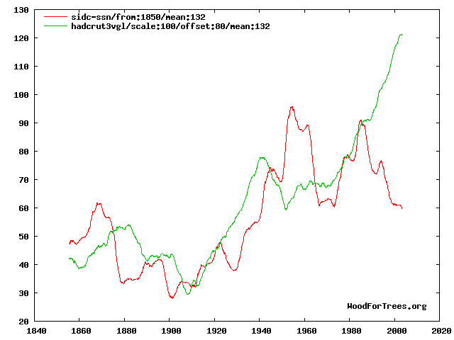
Staggering. You obviously haven’t read a single scholarly paper on this, or even looked at the data. This graph should dispel all your wrong-headed thinking. It’s the temperature, and monthly sunspot numbers, both plotted as 11 year running means (and scaled so that they roughly align). How, exactly, did rising temperatures in 1920 trigger increased solar activity 10 years later? Why did a peak in solar activity in the 1950s not correspond to a rise in temperatures then? Why do the green line and the red line diverge so wildly after 1985? Why is there basically hardly any correlation between solar activity and temperatures, over the last 150 years?

You betray a great immaturity on this web page, regurgitating the same nonsense time and again, calling people ‘morons’ and never even having the courtesy to respond when people tell you you’re wrong. When a fellow denialist tells you you’ve misrepresented him, and you don’t even bother to reply, let alone correct your error, what becomes crystal clear is that you’re simply dishonest.

A couple of responses:

  1. One of the great things about WordPress is that I have a nifty and powerful site search plugin (called Search Regex).  I just searched every post on this site.  The word “moron” has never, ever appeared on this site in text I have written.   She puts moron in quotes, but I am fairly certain she is not quoting me.  According to a Google search of this site, “moron” does appear 20-30 times in the comment section, usually wielded by my critics.
  2. When folks email me that I have made a mistake in quoting them, I post an update 100% of the time.  However, I occasionally miss such notifications if they are posted the comments and not emailed to me.  Believe it or not, I can go days without even glancing at this site or thinking about climate when the real job intervenes.  But that is what comments are for.  Unlike other climate sites that will remain nameless, *cough* realclimate *cough* I don’t moderate any comments, good, bad, or indifferent, except to eliminate outright spam.  If you disagree or I screwed up, that’s what the comments are there for.
  3. The commenter argues that I am simplistic and immature in this post.  I find this odd, I guess, for the following reason:  One group out there tends to argue that the sun is largely irrelevant to the past century’s temperature increases.  Another argues that the sun is the main or only driver.  I argue that the evidence seems to point to it being a mix, with the sun explaining some but not all of the 20th century increase, and I am the one who is simplistic?  Just for the record, I actually began the post with this:

    “I wouldn’t say that I am a total sun hawk, meaning that I believe the sun and natural trends are 100% to blame for global warming. I don’t think it unreasonable to posit that once all the natural effects are unwound, man-made CO2 may be contributing a 0.5-1.0C a century trend”

  4. The commenter links to this graph, which I will include.  It is a comparison of the Hadley CRUT3 global temperature index (green) and sunspot numbers (red):

    mean-1321

    Since I am so ridiculously immature, I guess I don’t trust myself to interpret this chart, but I would have happily used this chart myself had I had access to it originally (The chart uses a trailing 12 average of temperature as well as sunspots, which is why the line does not flatten and fall at the end.  I have to think a bit if I accept this metric as the correct comparison).

    It is wildly dangerous to try to visually interpret data and data correlations, but I don’t think it is unreasonable to say that there might be a relationship between these two data sets.  Certainly not 100%, but then again the same could easily be said of the relationship of temperature to Co2.  The same type of inconsistencies the commenter points out in this correlation could easily be made for Co2 (e.g., why, if CO2 was increasing, and in fact accelerating, were temps in 1980 lower than 1940?The answer, of course, is that climate is complicated.  But I see nothing in this chart that is inconsistent with the hypothesis that the sun might have been responsible for perhaps half of the 20th century warming.  And if Co2 is left with credit for just 0.3-0.4C warming over the last century, it is a very tough road to get from this past warming to sensitivities as high as 3C or greater.  I have all along contended that Co2 will likely drive 0.5-1.0C warming over the next century, and see nothing in this chart that makes me want to change that prediction.

  5. I was playing around a bit more, and found adding in PDO cycles fairly interesting (really this should be some combined AMO/PDO metric, and the exact dates of PDO reversals can be argued about, but I was going for quick and dirty).  Here is what I got:

    temp_spots_with_pdo

    If I wanted to make the same kind of observations as the commenter, I could say that temperature outpaced the sun during PDO warm phases and lagged the sun during cool phases, about what one would expect.  Again, I firmly believe there is still a positive warming trend when you take out cycles like the PDO and effects of the sun and other such influences — but that trend, even if all due to CO2, appears to be far below catastrophic sensitivity levels.

  6. It is kind of ironic that the post was actually not an in-depth analysis of solar cycles, but merely a statement of a hypothesis that solar activity level rather than the trend in solar activity should be regressed against temperature changes.  This seems like a fair hypothesis — one only has to think of a burner on a stove to understand it — but the commenter ignored it.  In fact, the divergence she points to in the late 1990’s is really exactly to the point.   Should a decreased solar output yield decreased temperatures?  Or, if that output is still higher than a historical average, will it still drive temperatures higher?  The answer likely boils down to how fast equilibrium is reached, and I don’t know the answer, nor do I think anyone else does either.
  7. I ask that people use their terms carefully.  I am not a “denialist” if that is meant to mean that I deny any anthropogenic effects on temperature or climate.  I am a denialist if that is meant to mean that I deny that warming from anthropogenic Co2 will cause catastrophic impacts that will outweigh the cost of Co2 abatement.

Updates: OK, I see that in the post in question, one of the quotes from another source used the word “morons.”  For those not experienced with reading blogs, indented text is generally quoted material from another source.  I guess I now understand the confusion — I stand by my statement, though, that I never use such terms in my own writing.  It is not the style I try to adopt on this blog.  Writers I quote have their own style, and my quoting them does not necesarily mean I totally agree with them, merely that the point they are making is somehow thought-provoking or one I want to comment on, extend, or rebut.

More on the Sun

I wouldn’t say that I am a total sun hawk, meaning that I believe the sun and natural trends are 100% to blame for global warming. I don’t think it unreasonable to posit that once all the natural effects are unwound, man-made CO2 may be contributing a 0.5-1.0C a century trend (note this is far below alarmist forecasts).

But the sun almost had to be an important fact in late 20th century warming. Previously, I have shown this chart of sunspot activity over the last century, demonstrating a much higher level of solar activity in the second half than the first (the 10.8 year moving average was selected as the average length of a 20th century sunspot cycle).
sunspot2

Alec Rawls has an interesting point to make about how folks are considering the sun’s effect on climate:

Over and over again the alarmists claim that late 20th century warming can’t be caused by the solar-magnetic effects because there was no upward trend in solar activity between 1975 and 2000, when temperatures were rising. As Lockwood and Fröhlich put it last year:

Since about 1985,… the cosmic ray count [inversely related to solar activity] had been increasing, which should have led to a temperature fall if the theory is correct – instead, the Earth has been warming. … This should settle the debate.

Morons. It is the levels of solar activity and galactic cosmic radiation that matter, not whether they are going up or down. Solar activity jumped up to “grand maximum” levels in the 1940’s and stayed there (averaged across the 11 year solar cycles) until 2000. Solar activity doesn’t have to keep going up for warming to occur. Turn the gas burner under a pot of stew to high and the stew will heat. You don’t have to keep turning the flame up further and further to keep getting heating!

Update: A commenter argues that I am simplistic and immature in this post.  I find this odd, I guess, for the following reason.  One group tends to argue that the sun is largely irrelevant to the past century’s temperature increases.  Another argues that the sun is the main or only driver.  I argue that the evidence seems to point to it being a mix, with the sun explaining some but not all of the 20th century increase, and I am the one who is simplistic?

The commenter links to this graph, which I will include.  It is a comparison of the Hadley CRUT3 global temperature index (green) and sunspot numbers (red):

mean-132

Since I am so ridiculously immature, I guess I don’t trust myself to interpret this chart, but I would have happily used this chart myself had I had access to it originally.  Its wildly dangerous to try to visually interpret data and data correlations, but I don’t think it is unreasonable to say that there might be a relationship between these two data sets.  Certainly not 100%, but then again the same could easily be said of the relationship of temperature to Co2.  The same type of inconsistencies the commenter points out in this correlation could easily be made for Co2 (e.g., why, if CO2 was increasing, and in fact accelerating, were temps in 1980 lower than 1940?

The answer, of course, is that climate is complicated.  But I see nothing in this chart that is inconsistent with the hypothesis that the sun might have been responsible for half of the 20th century warming.  And if Co2 is left with just 0.3-0.4C warming over the last century, it is a very tough road to get from past warming to sensitivities as high as 3C or greater.  I have all along contended that Co2 will likely drive 0.5-1.0C warming over the next century, and see nothing in this chart that makes me want to change that prediction.

Update #2: I guess I must be bored tonight, because commenter Jennifer has inspired me to go beyond my usual policy of not mixing it up much in the comments section.  A lengthy response to her criticism is here.

Whew! Done.

OK, I think I have finally, successfully migrated both my blogs from the Typepad ASP service to self-hosted WordPress. Many of you on feeds may have gotten a one-time slug of about 10 old posts in your feed (sorry). This was an artifact of the change of feed sources toFeedburner and should not happen again. Overall, I am very pleased with the results. The sites look better , they are easier to modify, they run faster, and the back-end interface is MUCH better. Most of you don’t care, but I will post on the process I followed to migrate as a repayment to others whose past such posts helped me through the process.

If you are getting this post, you should not have to change any of your settings. Enjoy.

Site Migration

If you are reading this, it means that you have found my new WordPress site for Climate-Skeptic.com.  You may find that permalinks or some images don’t function quite right — I learned from migrating my other blog that it takes about 24-48 hours for all these problems to settle out.  If you are using the feed at feeds.feedburner.com/ClimateSkeptic, you should be fine and that feed should still work.  If you are using a different feed, I will soon post instructions on how to switch.

Climate Model Validation

I am sorry that posting has been light, but I am currently working to migrate this site to WordPress from hosted Typepad.  This is a real hassle, as described at my other blog where I just completed a succesful migration.  I hope to have this blog moved over this weekend.

In the mean time, I thought my readers might need some help understanding James Hansen’s recent comments that flat world temperatures over the last 10 years and substantially cooler temperatures in 2008 were entirely consistent with the climate models that forecast  0.2-0.3C (or more) warming for this decade.  Most other natural sciences are stuck in the old and outdated practice of questioning forecasts when actual observational data diverges from the forecast by several standard deviations.  Not so modern, enlightened, consensus-based climate science.  Below is my graphical representation of how climate scientists evaluate their models in light of new data.

forestast_validation

Global Warming Is Caused by Computers

In particular, a few computers at NASA’s Goddard Institute seem to be having a disproportionate effect on global warming.  Anthony Watt takes a cut at an analysis I have tried myself several times, comparing raw USHCN temperature data to the final adjusted values delivered from that data by the NASA computers.  My attempt at this compared the USHCN adjusted to raw for the entire US:

temperature_adjustments1

Anthony Watt does this analysis from USHCN raw all the way through to the GISS adjusted number  (the USHCN adjusts the number, and then the GISS adds their own adjustments on top of these adjustments).  The result:  100%+ of the 20th century global warming signal comes from the adjustments.  [Update: I was not very clear on this — this is merely an example for one single site — it is not for the USHCN or GISS index as a whole.  This is merely an example of the low signal to noise ratio in much of the surface temperature record]  There is actually a cooling signal in the raw data:

temperature_adjustments21

Now, I really, really don’t want to be misinterpreted on this, so a few notes are necessary:

  1. Many of the adjustments are quite necessary, such as time of observation adjustments, adjustments for changing equipment, and adjustments for changing site locations and/or urbanization.  However, all of these adjustments are educated guesses.  Some, like the time of observation adjustment, probably are decent guesses.  Some, like site location adjustments, are terrible (as demonstrated at surfacestations.org).The point is that finding a temperature change signal over time with current technologies is a measurement subject to a lot of noise.  We are looking for a signal on the order of magnitude of 0.5C where adjustments to individual raw instrument values might be 2-3C.  It is a very low signal-noise environment, and one that is inherently subject to biases  (researches who expect to find a lot of warming will, not surprisingly, adjust a lot of measurements higher).
  2. Warming has occurred in the 20th century.  The exact number is unclear, but we have much better data via satellites now that have shown a warming trend since 1979, though that trend is lower than the one that results from surface temperature measurements with all these discretionary adjustments.

Steve Chu: “Climate More Sensitive Than We Thought”

The quote in the title comes from Obama’s nominee to become energy secretary, Steven Chu.  Specifically,

Chu’s views on climate change would be among the most forceful ever held by a cabinet member. In an interview with The Post last year, he said that the cost of electricity was “anomalously low” in the United States, that a cap-and-trade approach to limiting greenhouse gases “is an absolutely non-partisan issue,” and that scientists had come to “realize that the climate is much more sensitive than we thought.”

I will leave aside of why hard scientists typically make bad government officials (short answer:  they have a tendency towards hubris in their belief in a technocrats ability to optimize complex systems.  If one thinks they can assign a 95% probability that a specific hurricane is due to man-made CO2, against the backdrop of the unimaginable chaos of the Earth’s climate, then they will often have similar overconfidence in regulating the economy and/or individual behavior).

However, I want to briefly touch on his “more sensitive” comment.

Using assumptions from the last IPCC report, we can disaggregate climate forecasts into two components:  the amount of warming from CO2 alone, and the multiplication of this warming by feedbacks in the climate.  As I have pointed out before, even by the IPCC’s assumptions, most of the warming comes not from CO2 alone, but from assumed quite large positive feedbacks.

feedback1

This is based on the formula used by the IPCC (which may or may not be exaggerated)

T = F(C2) – F(C1) Where F(c) = Ln(1+1.2c+0.005c2+0.0000014c3)

Plotting this formula, we get the blue no-feedback line above (which leads to about a degree of warming over the next century).  We then apply the standard feedback formula of Multiplier = 1/(1-feedback%)  to get the other lines with feedback.  It requires a very high 60% positive feedback number to get a 3C per century rise, close to the IPCC base forecast, and nutty 87% feedback to get temperature rises as high as 10C, which have been quoted breathlessly in the press.  It is amazing to me that any natural scientist can blithely accept such feedback numbers as making any sense at all, particularly since every other long-term stable natural process is dominated by negative rather than positive feedback.

By saying that climate is “more sensitive than we thought” means essentially that Mr. Chu and others are assuming higher and higher levels of positive feedback.  But even the lower feedback numbers are almost impossible to justify given past experience.  If we project these sensitivity numbers backwards, we see:

feedback2

The higher forecasts for the future imply that we should have seen 2-4C of warming over the last century, which we clearly have not.  Even if all the past warming of the last century is attributable to man’s CO2  (a highly unlikely assumption) past history only really justifies the zero feedback case  (yes, I know about damping and time delays and masking and all that — but these adjustments don’t come close to closing the gap).

In fact, there is good evidencethat at most, man’s CO2 is responsible for about half the past warming, or 0.3-0.4C.  But if that is the case, as the Reference Frame put it:

The authors looked at 750 years worth of the local ice core, especially the oxygen isotope. They claim to have found a very strong correlation between the concentration of this isotope (i.e. temperature) on one side and the known solar activity in the epoch 1250-1850. Their data seem to be precise enough to determine the lag, about 10-30 years. It takes some time for the climate to respond to the solar changes.

It seems that they also have data to claim that the correlation gets less precise after 1850. They attribute the deviation to CO2 and by comparing the magnitude of the forcings, they conclude that “Our results are in agreement with studies based on NH temperature reconstructions [Scafetta et al., 2007] revealing that only up to approximately 50% of the observed global warming in the last 100 years can be explained by the Sun.”…

Note that if 0.3 °C or 0.4 °C of warming in the 20th century was due to the increasing CO2 levels, the climate sensitivity is decisively smaller than 1 °C. At any rate, the expected 21st century warming due to CO2 would be another 0.3-0.4 °C (the effect of newer CO2 molecules is slowing down for higher concentrations), and this time, if the solar activity contributes with the opposite sign, these two effects could cancel.

Not surprisingly, then, given enough time to measure against them, alarmist climate forecasts, such as James Hansen’s below, tend over-estimate actual warming.  Which is probably why the IPCC throws out their forecasts and redoes them every 5 years, so no one can call them on their failures (click to enlarge chart below)

hansen

Because, at the end of the day, for whatever reason, warming has slowed or stopped over the last 10 years, even as CO2 concentrations have increased faster than ever in the modern period.  So it is hard to say what physical evidence one can have that tenperature sensitivity to CO2 is increasing.

last10

Update: First, to answer a couple of questions, the data above is from the UAH, not Hansen’s GISS.  To be fair to Hansen, it has been adjusted to be re-centered on his data for the period before 1988 (since all of the major data sets use different zero centers for their anomalies, they have to be re-centered to be compared, a step many often forget to take).

I have a number of issues with the quality and reliability of surface temperature data, and the GISS data in particular, so I think the satellite data is a better source (just as we abandoned observations by passing ships in favor of satellite measurement of sea ice extent, it is probably time to do the same for surface temperature measurement).    Second, if I understand one of the comments correctly, there is some implication that I am being nefarious is cutting off the data in August of 2008.   Hardly.  Unlike those who work at this full time, I do this as a hobby between crises in my day job,  so I tend to reuse charts for a few months until I have time to create new ones.  Certainly there is nothing in the Sep-Nov UAH temperature data, though, that magically validates Hansen’s forecast.  I think November was a few tenths higher than August (making it just about even with June 1988) but well short of Hansen’s forecast.

One thing I didn’t mention, but Hansen and his enablers are often dishonest in trying to explain away the above forecast.  They will say, well, the A case was extreme and not meant to conform to reality.  But the only differences between the forecasts was in their CO2 output assumptions, and in fact Hansen A actually understated CO2 production and growth since 1988.  If anything, it was conservative!

New Climate Video – RCRC Climate Debate

I have finally been able to publish a video of my presentation at the climate debate held by the Regional Council of Rural Counties last September.  The entire video is about an hour long.  As usual, I am offering several ways to view it.  First, it has been posted on YouTube but had to be broken into seven parts.  The playlist of all seven parts is below:

The playlist link is here:  RCRC Climate Debate (Skeptic's Side)

Unfortunately, YouTube crushes the resolution so many of the charts are hard to read.  You can download the full resolution windows media version (about 96MB) as long as my bandwidth holds out by right-clicking and downloading form this link:  Download RCRC Climate Debate (wmv)

Also, you can stream higher resolution version of this film (and all my other climate films) at this site.  The resolution is not as good as the downloadable version but is much better than YouTube.  Again, bandwidth pending.

Finally, you can download the actual powerpoint presentation shown in this video here or you can view the presentation online here.

In the future, all of my videos and presentations will be available via the links just under the banner for this site.

Linear Regression Doesn’t Work if the Underlying Process is not Linear

Normally, I would have classified the basic premise of Craig Loehle's recent paper, as summarized at Climate Audit, as a blinding glimpse of the obvious.  Unfortunately, the climate science world is in desperate need of a few BGO's, so the paper is timely.  I believe his premise can be summarized as follows:

  1. Many historical temperature reconstructions, like Mann's hockey stick, use linear regressions to translate tree ring widths into past temperatures
  2. Linear regressions don't work when the underlying relationship, here between tree rings and temperature, is not linear.

The relationship between tree ring growth and temperature is almost certainly non-linear.  For example, tree ring growth does not go up forever, linearly, with temperature.  A tree that grows 3mm in a year at 80F and 4mm at 95F is almost certainly not going to grow 6mm at 125F. 

However, most any curve, over a sufficiently narrow range, can be treated as linear for the purposes of most analyses.  The question here is, given the relationship between tree ring growth and temperatures, do historical temperatures fall into such a linear region?  I think it is increasingly obvious the answer is "no," for several reasons:

  1. There is simply not very good, consistent data on the behavior of tree ring growths with temperature from folks like botanists rather than climate scientists.  There is absolutely no evidence whether we can treat ring widths as linear with temperatures over a normal range of summer temperatures.
  2. To some extent, folks like Mann (author of the hockey stick) are assuming their conclusion.  They are using tree ring analysis to try to prove the hypothesis that historic temperatures stayed in a narrow band (vs. current temperatures that are, they claim, shooting out of that band).  But to prove this, they must assume that temperatures historically remained in a narrow band that is the linear range of tree ring growth.  Essentially, they have to assume their conclusion to reach their conclusion.
  3. There is strong evidence that tree rings are not very good, linear measurements of temperature due to the divergence issue.  In short — Mann's hockey stick is only hockey stick shaped if one grafts the surface temperature record onto the tree ring history.  Using only tree ring data through the last few decades shows no hockey stick.  Tree rings are not following current rises in temperatures, and so it is likely they underestimate past rises in temperature.  Much more here.

  4. Loehle's pursues several hypotheticals, and demonstrates that a non-linear relationship of tree rings to temperature would explain the divergence problem and would make the hockey stick a completely incorrect reconstruction.