Many of us have argued for years that much of the measured surface temperature increase has actually been from manual adjustments made for opaque and largely undisclosed reasons by a few guys back in their offices. (Update— corrected, I accidently grabbed the old version of the post that did not have the degree C/F conversion right.)
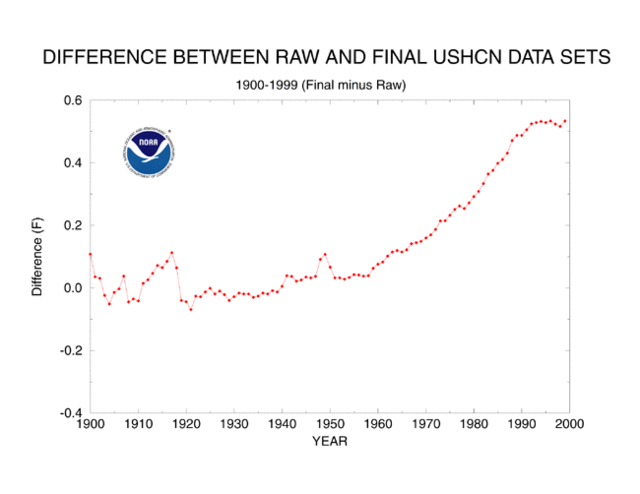
The US Historical Climate Network (USHCN) reports about a 0.6C temperature increase in the lower 48 states since about 1940. There are two steps to reporting these historic temperature numbers. First, actual measurements are taken. Second, adjustments are made after the fact by scientists to the data. Would you like to guess how much of the 0.6C temperature rise is from actual measured temperature increases and how much is due to adjustments of various levels of arbitrariness? Here it is, for the period from 1940 to present in the US:
| Actual Measured Temperature Increase: |
0.3C |
| Adjustments and Fudge Factors: |
0.3C |
| Total Reported Warming: |
0.6C |
Yes, that is correct. About half the reported warming in the USHCN data base, which is used for nearly all global warming studies and models, is from human-added fudge factors, guesstimates, and corrections.
I know what you are thinking – this is some weird skeptic’s urban legend. Well, actually it comes right from the NOAA web page which describes how they maintain the USHCN data set. Below is the key chart from that site showing the sum of all the plug factors and corrections they add to the raw USHCN measurements:

I concluded that while certain adjustments like the one for time of observation make sense, many of the adjustments, such as the one for siting, seem crazy. Against all evidence, the adjustment for siting implies a modern cooling bias, which is crazy given urbanization around sites and the requirement that modern MMTS stations (given maximum wire lengths) be nearer buildings than any manual thermometer had to be 80 years ago.
Even if we thought these guys were doing their best effort, can we really trust our ability to measure a signal that is substantially smaller than the noise we have to filter out?
Anyway, in the last week a similar example has been found in New Zealand, via Anthony Watts:
The New Zealand Government’s chief climate advisory unit NIWA is under fire for allegedly massaging raw climate data to show a global warming trend that wasn’t there.
The scandal breaks as fears grow worldwide that corruption of climate science is not confined to just Britain’s CRU climate research centre.
In New Zealand’s case, the figures published on NIWA’s [the National Institute of Water and Atmospheric research] website suggest a strong warming trend in New Zealand over the past century:

The caption to the photo on the NiWA site reads:
From NIWA’s web site — Figure 7: Mean annual temperature over New Zealand, from 1853 to 2008 inclusive, based on between 2 (from 1853) and 7 (from 1908) long-term station records. The blue and red bars show annual differences from the 1971 – 2000 average, the solid black line is a smoothed time series, and the dotted [straight] line is the linear trend over 1909 to 2008 (0.92°C/100 years).
But analysis of the raw climate data from the same temperature stations has just turned up a very different result:

Gone is the relentless rising temperature trend, and instead there appears to have been a much smaller growth in warming, consistent with the warming up of the planet after the end of the Little Ice Age in 1850.
The revelations are published today in a news alert from The Climate Science Coalition of NZ:
Again, even before we consider the quality of the adjustment, we see the signal to noise — the adjustments for noise are equal to or greater than the signal they think exists in the data.
The obvious response is that these adjustments are somehow justified based on site location and instrumentation changes. But we know from looking at US temeprature stations that the typical station has a warming bias over time due to urbanization and the warm bias of some modern temperature instruments, thus requiring a cooling adjustment and not a warming adjustment. Watts provides such evidence for one New Zealand site here.
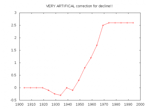
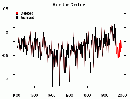
Update: Boy, this is certainly becoming a familiar curve shape. It seems the main hockey stick curve is the shape of temperature adjustments coming out of these guys. ESR (via TJIC) took this code from a Briffa North American proxy reconstruction
;<p> ; Apply a VERY ARTIFICAL correction for decline!!<p> ;<p> yrloc=[1400,findgen(19)*5.+1904]<p> valadj=[0.,0.,0.,0.,0.,-0.1,-0.25,-0.3,0.,- 0.1,0.3,0.8,1.2,1.7,2.5,2.6,2.6,2.6,2.6,2.6]*0.75 ; fudge factor<p> if n_elements(yrloc) ne n_elements(valadj) then message,’Oooops!’<p> ;<p> yearlyadj=interpol(valadj,yrloc,timey)
and reproduced this curve, representing the “fudge factor” Briffa added, apparently to get the result he wanted:
