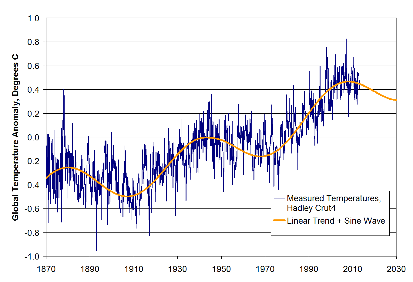
I want to discuss the recent Kaufman study which purports to reconcile flat temperatures over the last 10-12 years with high-sensitivity warming forecasts. First, let me set the table for this post, and to save time (things are really busy this week in my real job) I will quote from a previous post on this topic
Nearly a decade ago, when I first started looking into climate science, I began to suspect the modelers were using what I call a “plug” variable. I have decades of experience in market and economic modeling, and so I am all too familiar with the temptation to use one variable to “tune” a model, to make it match history more precisely by plugging in whatever number is necessary to make the model arrive at the expected answer.
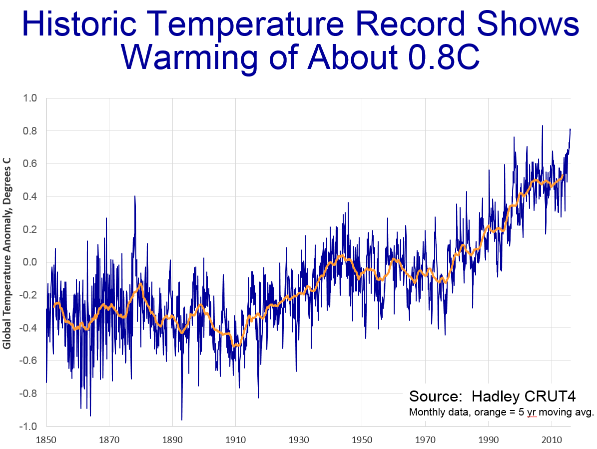
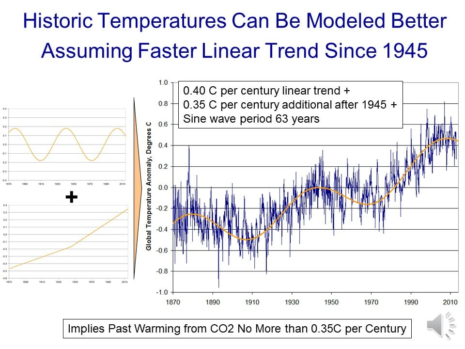
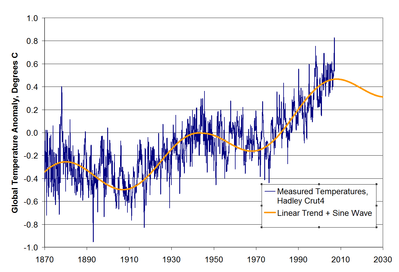
When I looked at historic temperature and CO2 levels, it was impossible for me to see how they could be in any way consistent with the high climate sensitivities that were coming out of the IPCC models. Even if all past warming were attributed to CO2 (a heroic acertion in and of itself) the temperature increases we have seen in the past imply a climate sensitivity closer to 1 rather than 3 or 5 or even 10 (I show this analysis in more depth in this video).
My skepticism was increased when several skeptics pointed out a problem that should have been obvious. The ten or twelve IPCC climate models all had very different climate sensitivities — how, if they have different climate sensitivities, do they all nearly exactly model past temperatures? If each embodies a correct model of the climate, and each has a different climate sensitivity, only one (at most) should replicate observed data. But they all do. It is like someone saying she has ten clocks all showing a different time but asserting that all are correct (or worse, as the IPCC does, claiming that the average must be the right time).
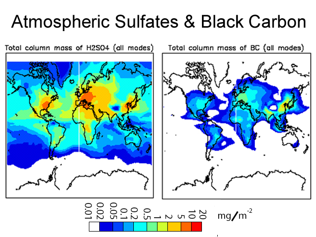
The answer to this paradox came in a 2007 study by climate modeler Jeffrey Kiehl. To understand his findings, we need to understand a bit of background on aerosols. Aerosols are man-made pollutants, mainly combustion products, that are thought to have the effect of cooling the Earth’s climate.
What Kiehl demonstrated was that these aerosols are likely the answer to my old question about how models with high sensitivities are able to accurately model historic temperatures. When simulating history, scientists add aerosols to their high-sensitivity models in sufficient quantities to cool them to match historic temperatures. Then, since such aerosols are much easier to eliminate as combustion products than is CO2, they assume these aerosols go away in the future, allowing their models to produce enormous amounts of future warming.
Specifically, when he looked at the climate models used by the IPCC, Kiehl found they all used very different assumptions for aerosol cooling and, most significantly, he found that each of these varying assumptions were exactly what was required to combine with that model’s unique sensitivity assumptions to reproduce historical temperatures. In my terminology, aerosol cooling was the plug variable.
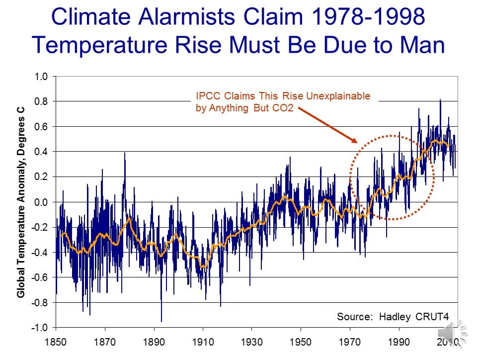
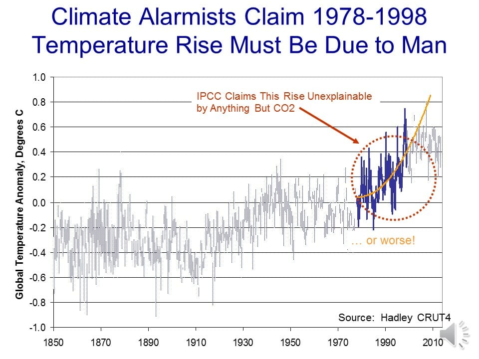
So now we can turn to Kaufman, summarized in this article and with full text here. In the context of the Kiehl study discussed above, Kaufman is absolutely nothing new.
Kaufmann et al declare that aerosol cooling is “consistent with” warming from manmade greenhouse gases.
In other words, there is some value that can be assigned to aerosol cooling that offsets high temperature sensitives to rising CO2 concentrations enough to mathematically spit out temperatures sortof kindof similar to those over the last decade. But so what? All Kaufman did is, like every other climate modeler, find some value for aerosols that plugged temperatures to the right values.
Let’s consider an analogy. A big Juan Uribe fan (plays 3B for the SF Giants baseball team) might argue that the 2010 Giants World Series run could largely be explained by Uribe’s performance. They could build a model, and find out that the Giants 2010 win totals were entirely consistent with Uribe batting .650 for the season.
What’s the problem with this logic? After all, if Uribe hit .650, he really would likely have been the main driver of the team’s success. The problem is that we know what Uribe hit, and he batted under .250 last year. When real facts exist, you can’t just plug in whatever numbers you want to make your argument work.
But in climate, we are not sure what exactly the cooling effect of aerosols are. For related coal particulate emissions, scientists are so unsure of their effects they don’t even know the sign (ie are they net warming or cooling). And even if they had a good handle on the effects of aerosol concentrations, no one agrees on the actual numbers for aerosol concentrations or production.
And for all the light and noise around Kaufman, the researchers did just about nothing to advance the ball on any of these topics. All they did was find a number that worked, that made the models spit out the answer they wanted, and then argue in retrospect that the number was reasonable, though without any evidence.
Beyond this, their conclusions make almost no sense. First, unlike CO2, aerosols are very short lived in the atmosphere – a matter of days rather than decades. Because of this, they are poorly mixed, and so aerosol concentrations are spotty and generally can be found to the east (downwind) of large industrial complexes (see sample map here).
Which leads to a couple of questions. First, if significant aerosol concentrations only cover, say, 10% of the globe, doesn’t that mean that to get a 0.5 degree cooling effect for the whole Earth, there must be a 5 degree cooling effect in the affected area. Second, if this is so (and it seems unreasonably large), why have we never observed this cooling effect in the regions with high concentrations of manmade aerosols. I understand the effect can be complicated by changes in cloud formation and such, but that is just further reasons we should be studying the natural phenomenon and not generating computer models to spit out arbitrary results with no basis in observational data.
Judith Currey does not find the study very convincing, and points to this study by Remer et al in 2008 that showed no change in atmospheric aerosol depths through the heart of the period of supposed increases in aerosol cooling.

So the whole basis for the study is flawed – its based on the affect of increasing aerosol concentrations that actually are not increasing. Just because China is producing more does not apparently mean there is more in the atmosphere – it may be reductions in other areas like the US and Europe are offsetting Chinese emissions or that nature has mechanisms for absorbing and eliminating the increased emissions.
By the way, here was Curry’s response, in part:
This paper points out that global coal consumption (primarily from China) has increased significantly, although the dataset referred to shows an increase only since 2004-2007 (the period 1985-2003 was pretty stable). The authors argue that the sulfates associated with this coal consumption have been sufficient to counter the greenhouse gas warming during the period 1998-2008, which is similar to the mechanism that has been invoked to explain the cooling during the period 1940-1970.
I don’t find this explanation to be convincing because the increase in sulfates occurs only since 2004 (the solar signal is too small to make much difference). Further, translating regional sulfate emission into global forcing isnt really appropriate, since atmospheric sulfate has too short of an atmospheric lifetime (owing to cloud and rain processes) to influence the global radiation balance.
Curry offers the alternative explanation of natural variability offsetting Co2 warming, which I think is partly true. Though Occam’s Razor has to force folks at some point to finally question whether high (3+) temperature sensitivities to CO2 make any sense. Seriously, isn’t all this work on aerosols roughly equivalent to trying to plug in yet more epicycles to make the Ptolemaic model of the universe continue to work?
Postscript: I will agree that there is one very important affect of the ramp-up of Chinese coal-burning that began around 2004 — the melting of Arctic Ice. I strongly believe that the increased summer melts of Arctic ice are in part a result of black carbon from Asia coal burning landing on the ice and reducing its albedo (and greatly accelerating melt rates). Look here when Arctic sea ice extent really dropped off, it was after 2003. Northern Polar temperatures have been fairly stable in the 2000’s (the real run-up happened in the 1990’s). The delays could be just inertia in the ocean heating system, but Arctic ice melting sure seems to correlate better with black carbon from China than it does with temperature.
I don’t think there is anything we could do with a bigger bang for the buck than to reduce particulate emissions from Asian coal. This is FAR easier than CO2 emissions reductions — its something we have done in the US for nearly 40 years.


