A Cautionary Tale About Models Of Complex Systems

I have often written warming about the difficulty of modeling complex systems.  My mechanical engineering degree was focused on the behavior and modeling of dynamic systems.  Since then, I have spent years doing financial, business, and economic modeling.  And all that experienced has taught me humility, as well as given me a good knowledge of where modelers tend to cheat.

Al Gore has argued that we should trust long-term models, because Wall Street has used such models successfully for years  (I am not sure he has been using this argument lately, lol).  I was immediately skeptical of this statement.  First, Wall Street almost never makes 100-year bets based on models (they may be investing in 30-year securities, but the bets they are making are much shorter term).  Second, my understanding of Wall Street history is that lower Manhattan is littered with the carcasses of traders who bankrupted themselves following the hot model of the moment.  It is ever so easy to create a correlation model that seems to back-cast well.  But no one has ever created one that holds up well going forward.

A reader sent me this article about the Gaussian copula, apparently the algorithm that underlay the correlation models Wall Streeters used to assess mortgage security and derivative risk.

Wall Streeters have the exact same problem that climate modelers have.  There is a single output variable they both care about (security price for traders, global temperature for modelers).  This variable’s value changes in a staggeringly complex system full of millions of variables with various levels of cross-correlation.  The modelers challenge is to look at the historical data, and to try to tease out correlation factors between their output variable and all the other input variables in an environment where they are all changing.

The problem is compounded because some of the input variables move on really long cycles, and some move on short cycles.  Some of these move in such long cycles that we may not even recognize the cycle at all.  In the end, this tripped up the financial modelers — all of their models derived correlation factors from a long and relatively unbroken period of home price appreciation.  Thus, when this cycle started to change, all the models fell apart.

Li’s copula function was used to price hundreds of billions of dollars’ worth of CDOs filled with mortgages. And because the copula function used CDS prices to calculate correlation, it was forced to confine itself to looking at the period of time when those credit default swaps had been in existence: less than a decade, a period when house prices soared. Naturally, default correlations were very low in those years. But when the mortgage boom ended abruptly and home values started falling across the country, correlations soared.

I never criticize people for trying to do an analysis with the data they have.  If they have only 10 years of data, that’s as far as they can run the analysis.  However, it is then important that they recognize that their analysis is based on data that may be way too short to measure longer term trends.

As is typical when models go wrong, early problems in the model did not cause users to revisit their assumptions:

His method was adopted by everybody from bond investors and Wall Street banks to ratings agencies and regulators. And it became so deeply entrenched—and was making people so much money—that warnings about its limitations were largely ignored.

Then the model fell apart. Cracks started appearing early on, when financial markets began behaving in ways that users of Li’s formula hadn’t expected. The cracks became full-fledged canyons in 2008—when ruptures in the financial system’s foundation swallowed up trillions of dollars and put the survival of the global banking system in serious peril.

A couple of lessons I draw out for climate models:

  1. Limited data availability can limit measurement of long-term cycles.  This is particularly true in climate, where cycles can last hundreds and even thousands of years, but good reliable data on world temperatures is only available for our 30 years and any data at all for about 150 years.  Interestingly, there is good evidence that many of the symptoms we attribute to man-made global warming are actually part of climate cycles that go back long before man burned fossil fuels in earnest.  For example, sea levels have been rising since the last ice age, and glaciers have been retreating since the late 18th century.
  2. The fact that models hindcast well has absolutely no predictive power as to whether they will forecast well
  3. Trying to paper over deviations between model forecasts and actuals, as climate scientists have been doing for the last 10 years, without revisiting the basic assumptions of the model can be fatal.

A Final Irony

Do you like irony?  In the last couple of months, I have been discovering I like it less than I thought.  But here is a bit of irony for you anyway.  The first paragraph of Obama’s new budget read like this:

This crisis is neither the result of a normal turn of the business cycle nor an accident of history, we arrived at this point as a result of an era of profound irresponsibility that engulfed both private and public institutions from some of our largest companies’ executive suites to the seats of power in Washington, D.C.

As people start to deconstruct last year’s financial crisis, most of them are coming to the conclusion that the #1 bit of “irresponsibility” was the blind investment of trillions of dollars based on solely on the output of correlation-based computer models, and continuing to do so even after cracks appeared in the models.

The irony?  Obama’s budget includes nearly $700 billion in new taxes (via a cap-and-trade system) based solely on … correlation-based computer climate models that predict rapidly rising temperatures from CO2.  Climate models in which a number of cracks have appeared, but which are being ignored.

Postscript: When I used this comparison the other day, a friend of mine fired back that the Wall Street guys were just MBA’s, but the climate guys were “scientists” and thus presumably less likely to err.  I responded that I didn’t know if one group or the other was more capable (though I do know that Wall Street employs a hell of a lot of top-notch PhD’s).  But I did know that the financial consequences for Wall Street traders having the wrong model was severe, while the impact on climate modelers of being wrong was about zero.  So, from an incentives standpoint, I know who I would more likely bet on to try to get it right.

The Plug

I have always been suspicious of climate models, in part because I spent some time in college trying to model chaotic dynamic systems, and in part because I have a substantial amount of experience with financial modeling.   There are a number of common traps one can fall into when modeling any system, and it appears to me that climate modelers are falling into most of them.

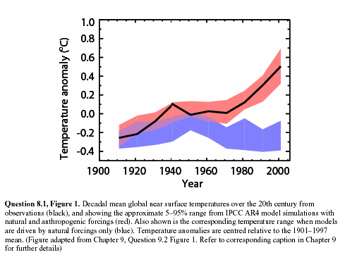
So a while back (before I even created this site) I was suspicious of this chart from the IPCC.  In this chart, the red is the “backcasting” of temperature history using climate models, the black line is the highly smoothed actuals, while the blue is a guess from the models as to what temperatures would have looked like without manmade forcings, particularly CO2.

ipcc1

As I wrote at the time:

I cannot prove this, but I am willing to make a bet based on my long, long history of modeling (computers, not fashion).  My guess is that the blue band, representing climate without man-made effects, was not based on any real science but was instead a plug.  In other words, they took their models and actual temperatures and then said “what would the climate without man have to look like for our models to be correct.”  There are at least four reasons I strongly suspect this to be true:

  1. Every computer modeler in history has tried this trick to make their models of the future seem more credible.  I don’t think the climate guys are immune.
  2. There is no way their models, with our current state of knowledge about the climate, match reality that well.
  3. The first time they ran their models vs. history, they did not match at all.  This current close match is the result of a bunch of tweaking that has little impact on the model’s predictive ability but forces it to match history better.  For example, early runs had the forecast run right up from the 1940 peak to temperatures way above what we see today.
  4. The blue line totally ignores any of our other understandings about the changing climate, including the changing intensity of the sun.  It is conveniently exactly what is necessary to make the pink line match history.  In fact, against all evidence, note the blue band falls over the century.  This is because the models were pushing the temperature up faster than we have seen it rise historically, so the modelers needed a negative plug to make the numbers look nice.

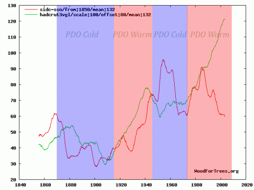
As you can see, the blue band, supposedly sans mankind, shows a steadily declining temperature. This never made much sense to me, given that, almost however you measure it, solar activity over the last half of the decade was stronger than the first half, but they show the natural forcings to be exactly opposite from what we might expect from this chart of solar activity as measured by sunspots (red is smoothed sunspot numbers, green is Hadley CRUT3 temperature).

temp_spots_with_pdo

By the way, there is a bit of a story behind this chart.  It was actually submitted by a commenter to this site of the more alarmist persuasion  (without the PDO bands), to try to debunk the link between temperature and the sun  (silly rabbit – the earth’ s temperature is not driven by the sun, but by parts per million changes in atmospheric gas concentrations!).  While the sun still is not the only factor driving the mercilessly complex climate, clearly solar activity in red was higher in the latter half of the century when temperatures in green were rising.  Which is at least as tight as the relation between CO2 and the same warming.

Anyway, why does any of this matter?  Skeptics have argued for quite some time that climate models assume too high of a sensitivity of temperature to CO2 — in other words, while most of us agree that Co2 increases can affect temperatures somewhat, the models assume temperature to be very sensitive to CO2, in large part because the models assume that the world’s climate is dominated by positive feedback.

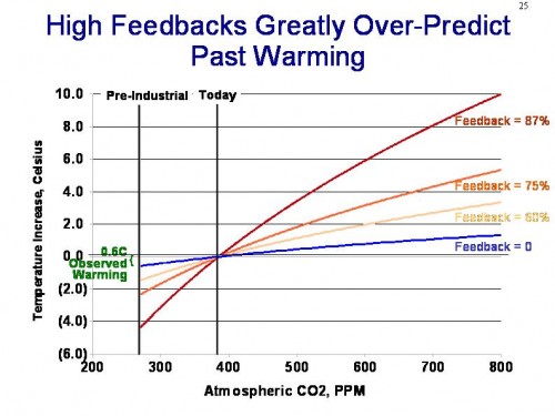
One way to demonstrate that these models may be exaggerated is to plot their predictions backwards.  A relationship between Co2 and temperature that exists in the future should hold in the past, adjusting for time delays  (in fact, the relationship should be more sensitive in the past, since sensitivity is a logarithmic diminishing-return curve).  But projecting the modelled sensitivities backwards (with a 15-year lag) result in ridiculously high predicted historic temperature increases that we simply have never seen.  I discuss this in some depth in my 10 minute video here, but the key chart is this one:

feedback_projection

You can see the video to get a full explanation, but in short, models that include high net positive climate feedbacks have to produce historical warming numbers that far exceed measured results.  Even if we assign every bit of 20th century warming to man-made causes, this still only implies 1C of warming over the next century.

So the only way to fix this is with what modelers call a plug.  Create some new variable, in this case “the hypothetical temperature changes without manmade CO2,” and plug it in.  By making this number very negative in the past, but flat to positive in the future, one can have a forecast that rises slowly in the past but rapidly in the future.

Now, I can’t prove that this is what was done.  In fact, I am perfectly willing to believe that modelers can spin a plausible story with enough jargon to put off most layman, as to how they created this “non-man” line and why it has been decreasing over the last half of the century.   I have a number of reasons to disbelieve any such posturing:

  1. The last IPCC report spent about a thousand pages on developing the the “with Co2” forecasts.  They spent about half a page discussing the “without Co2” case.  These is about zero scientific discussion of how this forecast is created, or what the key elements are that drive it
  2. The IPCC report freely admits their understanding of cooling factors is “low”
  3. The resulting forecasts is WAY to good.  We will see this again in a moment.  But with such a chaotic system, your first reaction to anyone who shows you a back-cast that nicely overlays history almost exactly should be “bullshit.”  Its not possible, except with tuning and plugs
  4. The sun was almost undeniably stronger in the second half of the 20th century than the first half.  So what is the countervailing factor that overcomes both the sun and CO2?

The IPCC does not really say what is making the blue line go down, it just goes down (because, as we can see now, it has to to make their hypothesis work).  Today, the main answer to the question of what might be offsetting warming  is “aerosols,” particularly sulfur and carbon compounds that are man-made pollutants (true pollutants) from burning fossil fuels.  The hypothesis is that these aerosols reflect sunlight back to space and cool the earth  (by the way, the blue line above in the IPCC report is explicitly only non-anthropogenic effects, so at the time it went down due to natural effects – the manmade aerosol thing is a newer straw to grasp).

But black carbon and aerosols have some properties that create some problems with this argument, once you dig into it.  First, there are situations where they are as likely to warm as to cool.  For example, one reason the Arctic has been melting faster in the summer of late is likely due to black carbon from Chinese coal plants that land on the ice and warm it faster.

The other issue with aerosols is that they disperse quickly.  Co2 mixes fairly evenly worldwide and remains in the atmosphere for years.  Many combustion aerosols only remain in the air for days, and so they tend to be concentrated regionally.   Perhaps 10-20% of the earth’s surface might at any one time have a decent concentration of man-made aerosols.  But for that to drive a, say, half degree cooling effect that offsets CO2 warming, that would mean that cooling in these aerosol-affected areas would have to be 2.5-5.0C in magnitude.  If this were the case, we would see those colored global warming maps with cooling in industrial aerosol-rich areas and warming in the rest of the world, but we just don’t see that.  In fact, the vast, vast majority of man-made aerosols can be found in the northern hemisphere, but it is the northern hemisphere that is warming much faster than the southern hemisphere.  If aerosols were really offsetting half or more of the warming, we should see the opposite, with a toasty south and a cool north.

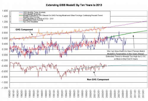
All of this is a long, long intro to a guest post on WUWT by Bill Illis.  He digs into one of the major climate models, GISS model E, and looks at the back-casts from this model.  What he finds mirrors a lot of what we discussed above:

modeleextraev0

Blue is the GISS actual temperature measurement.  Red is the model’s hind-cast of temperatures.  You can see that they are remarkably, amazingly, staggeringly close.  There are chaotic systems we have been modelling for hundreds of years (e.g. the economy) where we have never approached the accuracy this relative infant of a science seems to achieve.

That red forecasts in the middle is made up of a GHG component, shown in orange, plus a negative “everything else” component, shown in brown.  Is this starting to seem familiar?  Does the brown line smell suspiciously to anyone else like a “plug?”  Here are some random thoughts inspired by this chart:

  1. As with any surface temperature measurement system, the GISS system is full of errors and biases and gaps.  Some of these their proprietors would acknowledge, and such have been pointed out by outsiders.  Never-the-less, the GISS metric is likely to have an error of at least a couple tenths of a degree.  Which means the climate model here is perfectly fitting itself to data that isn’t even likely correct.  It is fitting closer to the GISS temperature number than the GISS temperature number likely fits to the actual world temperature anomaly, if such a thing could be measured directly.  Since the Hadley Center or the satellite guys at UAH and RSS get different temperature histories for the last 30-100 years, it is interesting that the GISS model exactly matches the GISS measurement but not these others.  Does that make anyone suspicious?  When the GISS makes yet another correction of its historical data, will the model move with it?
  2. As mentioned before, the sum total of time spent over the last 10 years trying to carefully assess the forcings from other natural and man-made effects and how they vary year-to-year is minuscule compared to the time spent looking at CO2.  I don’t think we have enough knowledge to draw the Co2 line on this chart, but we CERTAINLY don’t have knowledge to draw the “all other” line (with monthly resolution, no less!).
  3. Looking back over history, it appears the model is never off by more than 0.4C in any month, and never goes more than about 10 months before re-intersecting the “actual” line.  Does it bother anyone else that this level of precision is several times higher than the model has when run forward?  Almost immediately, the model is more than 0.4C off, and goes years without intercepting reality.

Relax — A Statement About Comment Policy

Anthony Watts is worried about the time it takes to moderate comments

Lately I’ve found that I spend a lot of time moderating posts that are simply back and forth arguments between just a few people whom have inflexible points of view. Often the discussion turns a bit testy. I’ve had to give some folks (on both sides of the debate) a time out the last couple of days. While the visitors of this blog (on both sides of the debate) are often more courteous than on some other blogs I’ve seen, it still gets tiresome moderating the same arguments between the same people again and again.

This does not surprise me, as I have emailed back and forth to Anthony during a time he was stressed about a particular comment thread.   I told him then what I say now:  Relax.

It might have been that 10 years ago or even 5 that visitors would be surprised and shocked by the actions of certain trolls on the site.  But I would expect that anyone, by now, who spends time in blog comment sections knows the drill — that blog comments can be a free-for-all and some folks just haven’t learned how to maturely operate in an anonymous environment.

I have never tried to moderate my comments (except for spam, which is why you might have  a comment with embedded links held for moderation — I am looking to filter people selling male enhancement products, not people who disagree with me.)  In fact, I relish buffoons who disagree with me when they make an ass of themselves – after all, as Napoleon said, never interrupt an enemy when he is making a mistake.  And besides, I think it makes a nice contrast with a number of leading climate alarmist sites that do not accept comments or are Stalinist in purging dissent from them.

In fact, I find that the only danger in my wide open policy is the media.  For you see, the only exception to my statement above, the only group on the whole planet that seems not to have gotten the message that comment threads don’t necessarily reflect the opinions of the domain operator, is the mainstream media.  I don’t know if this is incompetence or willful, but they still write stories predicated on some blog comment being reflective of the blog’s host.

By the way, for Christmas last year I bought myself an autographed copy of this XKCD comic to go over my desk:

duty_calls

Global Warming “Accelerating”

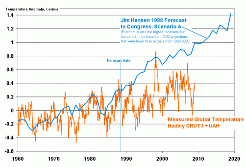
I have written a number of times about the “global warming accelerating” meme.  The evidence is nearly irrefutable that over the last 10 years, for whatever reason, the pace of global warming has decelerated (click below to enlarge)

hansenjan20091

This is simply a fact, though of course it does not necessarily “prove” that the theory of catastrophic anthropogenic global warming is incorrect.  Current results continue to be fairly consistent with my personal theory, that man-made CO2 may add 0.5-1C to global temperatures over the next century (below alarmist estimates), but that this warming may be swamped at times by natural climactic fluctuations that alarmists tend to under-estimate.

Anyway, in this context, I keep seeing stuff like this headline in the WaPo

Scientists:  Pace of Climate change Exceeds Estimates

This headline seems to clearly imply that the measured pace of actual climate change is exceeding previous predictions and forecasts.   This seems odd since we know that temperatures have flattened recently.  Well, here is the actual text:

The pace of global warming is likely to be much faster than recent predictions, because industrial greenhouse gas emissions have increased more quickly than expected and higher temperatures are triggering self-reinforcing feedback mechanisms in global ecosystems, scientists said Saturday.

“We are basically looking now at a future climate that’s beyond anything we’ve considered seriously in climate model simulations,” Christopher Field, founding director of the Carnegie Institution’s Department of Global Ecology at Stanford University, said at the annual meeting of the American Association for the Advancement of Science.

So in fact, based on the first two paragraphs, in true major media tradition, the headline is a total lie.  In fact, the correct headline is:

“Scientists Have Raised Their Forecasts for Future Warming”

Right?  I mean, this is all the story is saying, is that based on increased CO2 production, climate scientists think their forecasts of warming should be raised.  This is not surprising, because their models assume a direct positive relationship between CO2 and temperature.

The other half of the statement, that “higher temperatures are triggering self-reinforcing feedback mechanisms in global ecosystems” is a gross exaggeration of the state of scientific knowledge.  In fact, there is very little good understanding of climate feedback as a whole.  While we may understand individual pieces – ie this particular piece is a positive feedback – we have no clue as to how the whole thing adds up.  (see my video here for more discussion of feedback)

In fact, I have always argued that the climate models’ assumptions of strong positive feedback (they assume really, really high levels) is totally unrealistic for a long-term stable system.  In fact, if we are really seeing runaway feedbacks triggered after the less than one degree of warming we have had over the last century, it boggles the mind how the Earth has staggered through the last 5 billion years without a climate runaway.

All this article is saying is “we are raising our feedback assumptions higher than even the ridiculously high assumptions we were already using.”  There is absolutely no new confirmatory evidence here.

But this creates a problem for alarmists

For you see, their forecasts have consistently demonstrated themselves to be too high.  You can see above how Hansen’s forecast to Congress 20 years ago has played out (and the Hansen A case was actually based on a CO2 growth forecast that has turned out to be too low).  Lucia, who tends to be scrupulously fair about such things, shows the more recent IPCC models just dancing on the edge of being more than 2 standard deviations higher than actual measured results.

But here is the problem:  The creators of these models are now saying that actual CO2 production, which is the key input to their model, is far exceeding their predictions.  So, presumably, if they re-ran their predictions using actual CO2 data, they would get even higher temperature forecasts. Further, they are saying that the feedback multiplier in their models should be higher as well.  But the forecasts of their models are already high vs. observations — this will even cause them to diverge further from actual measurements.

So here is the real disconnect of the model:  If you tell me that modelers underestimated the key input (CO2) in their models,  and have so far overestimated the key output (Temperature), I would have said the conclusion to this article is that climate sensitivity must be lower than what was embedded in the models.  But they are saying exactly the opposite.  How is this possible?

Postscript: I hope readers understand this, but it is worth saying because clearly reporters do not understand this:  There is no way that climate change from CO2 can be accelerating if global warming is not accelerating.  There is no mechanism I have ever heard by which CO2 can change the climate without the intermediate step of raising temperatures.  Co2–>temperature increase–>changes in the climate.

Update: Chart originally said 1998 forecast.  Has been corrected to 1988.

Update#2: I am really tired of having to re-explain the choice of using Hansen’s “A” forecast, but I will do it again.  Hansen had forecasts A, B, C, with A being based on more CO2 than B, and B with more CO2 than C.  At the time, Hansen said he thought the A case was extreme.  This is then used by his apologists to say that I am somehow corrupting Hansen’s intent or taking him out of context by using the A case, because Hansen himself at the time said the A case was probably high.

But the only difference between A, B, and C were not the model assumptions of climate sensitivity or any other variable — they only differed in the amount of Co2 growth and the number of volcano eruptions (which have a cooling effect via aerosols).  We can go back and decide for ourselves which case turned out to be the most or least conservative.   As it turns out, all three cases UNDERESTIMATED the amount of CO2 man produced in the last 20 years.  So, we should not really use any of these lines as representative, but Scenario A is by far the closest.  The other two are way, way below our actual CO2 history.

The people arguing to use, say, the C scenario for comparison are being disingenuous.  The C scenario, while closer to reality in its temperature forecast, was based on an assumption of a freeze in Co2 production levels, something that obviously did not occur.

Most Useless Phrase in the Political Lexicon: “Peer Reviewed”

Last week, while I was waiting for my sandwich at the deli downstairs, I was applying about 10% of my consciousness to CNN running on the TV behind the counter.  I saw some woman, presumably in the Obama team, defending some action of the administration as being based on “peer reviewed” science.

This may be a legacy of the climate debate.  One of the rhetorical tools climate alarmists have latched onto is to inflate the meaning of peer review.  Often, folks, like the person I saw on TV yesterday, use “peer review” as a synonym for “proven correct and generally accepted in its findings by all right-thinking people who are not anti-scientific wackos.”  Sort of the scientific equivalent of “USDA certified.”

Here is a great example of that, from the DailyKos via Tom Nelson:

Contact NBC4 and urge them to send weatherman Jym Ganahl to some climate change conferences with peer-reviewed climatologists. Let NBC4 know that they have a responsibility to have expert climatologists on-air to debunk Ganahl’s misinformation and the climate change deniers don’t deserve an opportunity to spread their propaganda:

NBC 4 phone # 614-263-4444

NBC 4 VP/GM Rick Rogala email: rrogala(ATSIGN)wcmh.com

By the way, is this an over-the-top attack on heresy or what?  Let’s all deluge a TV station with complaints because their weatherman has the temerity to have a different scientific opinion than ours?  Seriously guys, its a freaking local TV weatherman in central Ohio, and the fate of mankind depends on burning this guy at the stake?  I sometimes get confused about what leftists really think about free speech, but this sure sounds more like a bunch of good Oklahoma Baptists reacting to finding out their TV minister is pro-abortion.   But it is we skeptics who are anti-science?

Anyway, back to peer review, you can see in this example again the use of “peer review” as some kind of impremateur of correctness and shield against criticism.   The author treats it as if it were a sacrament, like baptism or ordination.   This certification seems to be so strong in their mind that just having been published in a peer-reviewed journal seems to be sufficient to complete the sacrament — the peer review does not necessarily seem to even have to be on the particular topic being discussed.

But in fact peer review has a much narrower function, and certainly is not, either in intent or practice,  any real check or confirmation of the study in question.  The main goals of peer review are:

  • Establish that the article is worthy of publication and consistent with the scope of the publication in question.  They are looking to see if the results are non-trivial, if they are new (ie not duplicative of findings already well-understood), and in some way important.  If you think of peer-reviewers as an ad hoc editorial board for the publication, you get closest to intent
  • Reviewers will check, to the extent they can, to see if the methodology  and its presentation is logical and clear — not necessarily right, but logical and clear.  Their most frequent comments are for clarification of certain areas of the work or questions that they don’t think the authors answered.  They do not check all the sources, but if they are familiar with one of the sources references, may point out that this source is not referenced correctly, or that some other source with which they are familiar might be referenced as well.  History has proven time and again that gross and seemingly obvious math and statistical errors can easily clear peer review.
  • Peer review is not in any way shape or form a proof that a study is correct, or even likely to be correct.  Enormous numbers of incorrect conclusions have been published in peer-reviewed journals over time.  This is demonstrably true.  For example, at any one time in medicine, for every peer-reviewed study I can usually find another peer-reviewed study with opposite or wildly different findings.  The fraud in the “peer reviewed” Lancet on MMR vaccines and autism by Andrew Wakefield is a good example.
  • Studies are only accepted as likely correct a over time after the community has tried as hard as it can to poke holes in the findings.  Future studies will try to replicate the findings, or disprove them.  As a result of criticism of the methodology, groups will test the findings in new ways that respond to methodological criticisms.  It is the accretion of this work over time that solidifies confidence  (Ironically, this is exactly the process that climate alarmists want to short-circuit, and even more ironically, they call climate skeptics “anti-scientific” for wanting to follow this typical scientific dispute and replication process).
So, typical peer review comments might be:
  • I think Smith, 1992 covered most of this same ground.  I am not sure what is new here
  • Jones, 1996 is fairly well accepted and came up with opposite conclusions.  The authors need to explain why they think they got different results from Jones.
A typical peer review comment would not be:
  • The results here looked suspicious so I organized a major effort here at my university and we spent 6 months trying to replicate their work and cuold not duplicate their findings.

That latter is a follow-up article, not a peer review comment.

Further, the quality and sharpness of peer review depends a lot on the reviewers chosen.  For example, a peer review of Rush Limbaugh by the folks at LGF, Free Republic, and Powerline might not be as compelling as a peer review by Kos or Kevin Drum.

But instead of this, peer review is used by folks, particularly in political settings, as a shield against criticism, usually for something they don’t understand and probably haven’t even read themselves.  Here is an example dialog:

Politician or Activist:  “Mann’s hockey stick proves humans are warming the planet”

Critic:  “But what about Mann’s cherry-picking of proxy groups; or the divergence problem  in the data; or the fact that he routinely uses proxy’s as a positive correlation in one period and different, even negative, correlation in another; or the fact that the results are most driven by proxys that have been manually altered; or the fact that trees really make bad proxies, as they seldom actually display the assumed linear positive relationship between growth and temperature?”

Politician or Activist, who 99% of the time has not even read the study in question and understands nothing of what critic is saying:  “This is peer-reviewed science!  You can’t question that.”

Postscript: I am not trying to offend anyone or make a point about religion per se in the comparisons above.  I am not religious, but I don’t have a problem with those that are.  However, alarmists on the left often portray skepticism as part-and-parcel of what they see as anti-scientific ideas tied to the religious right.  I get this criticism all the time, which is funny since I am not religious and not a political conservative.  But I find parallels between climate alarmist and religion to be interesting, and a particularly effective criticism given some of the left’s foaming-at-the-mouth disdain for religion.

What Other Discipline Does This Sound Like?

Arnold Kling via Cafe Hayek on macro-economic modelling:

We badly want macroeconometrics to work.  If it did, we could resolve bitter theoretical disputes with evidence.  We could achieve better forecasting and control of the economy.  Unfortunately, the world is not set up to enable macroeconometrics to work.  Instead, all macroeconometric models are basically simulation models that use data for calibration purposes.  People judge these models based on their priors for how the economy works.  Imposing priors related to rational expectations does not change the fact that macroeconometrics provides no empirical information to anyone except those who happen to share all of the priors of the model-builder.

Skipping A Step

Here is a little glimpse of how climate alarmism works.  Check out this article in the NewScientist (I don’t know anything about this particular publication, but my general assumption is that most periodicals use “New” in the context of such a title as a synonym for “socialist.”):

Rather than spreading out evenly across all the oceans, water from melted Antarctic ice sheets will gather around North America and the Indian Ocean. That’s bad news for the US East Coast, which could bear the brunt of one of these oceanic bulges.

It goes on and on with more detail, which sounds really scary:

First, Jerry Mitrovica and colleagues from the University of Toronto in Canada considered the gravitational attraction of the Antarctic ice sheets on the surrounding water, which pulls it towards the South Pole. As the ice sheet melts, this bulge of water dissipates into surrounding oceans along with the meltwater. So while the sea level near Antarctica will fall, sea levels away from the South Pole will rise.

Once the ice melts, the release of pressure could also cause the Antarctic continent to rise by 100 metres. And as the weight of the ice pressing down on the continental shelf is released, the rock will spring back, displacing seawater that will also spread across the oceans.

Redistributing this mass of water could even change the axis of the Earth’s spin. The team estimates that the South Pole will shift by 500 metres towards the west of Antarctica, and the North Pole will shift in the opposite direction. Since the spin of the Earth creates bulges of oceanic water in the regions between the equator and the poles, these bulges will also shift slightly with the changing axis….

The upshot is that the North American continent and the Indian Ocean will experience the greatest changes in sea level – adding 1 or 2 metres to the current estimates. Washington DC sits squarely in this area, meaning it could face a 6.3-metre sea level rise in total. California will also be in the target zone.

Spotting the skipped logic step does not require one to be a climate skeptic.  Anyone familiar with the most recent IPCC report should see it too.  Specifically, the authors simply posit — without even bothering to mention it as an assumption! — that tons of land-based ice (remember, sea ice melting has no effect on sea levels) is going to melt in Antarctica.  But just about everyone, even the alarmists at the IPCC, predict just the opposite, even in 3C per century global warming scenarios.

Why?  Well, for a couple of reasons.  The first is that Antarctica is so cold that several degrees of warming will not bring most of the continent above freezing, even in the summer.  The exception is probably the Antarctic Peninsula, which sticks out north of the rest of the continent and accounts for 2% of the land mass and a much smaller percentage of the total ice pack.

The other reason is that if the world warms, the seas around Antarctica will warm and the models show the warming surrounding seas increasing precipitation on the continent and actually increasing snow pack.  In fact, increases in Antarctic ice pack actually exceed decreases forecast in ice packs around the rest of the world.  The entirety of the IPCC ocean rise scenario is driven by the thermal expansion of water, not net ice melting.

By the way, I presume these guys have their math right, but it seems astonishing to me that the ice mass (or lack of it) could really exert enough gravitational pull to change sea levels in the northern hemisphere by a meter or two.  Gravity is an astonishingly weak force — does this reality check?  I had always thought differences in ocean levels (say for example the fact that the Atlantic and Pacific are not the same height on either side of the Panama Canal)  had more to do with differentials in evaporation rates.

PS- Is telling me global warming will flood Washington DC supposed to make me be against global warming?  Because that sounds pretty good to me. ;=)