
I have been getting inquiries from folks asking me what I think about stories like this one, where Paul Homewood has been looking at the manual adjustments to raw temperature data and finding that the adjustments actually reverse the trends from cooling to warming. Here is an example of the comparisons he did:
Raw, before adjustments;
After manual adjustments
I actually wrote about this topic a few months back, and rather than rewrite the post I will excerpt it below:
I believe that there is both wheat and chaff in this claim [that manual temperature adjustments are exaggerating past warming], and I would like to try to separate the two as best I can. I don’t have time to write a well-organized article, so here is just a list of thoughts
- At some level it is surprising that this is suddenly news. Skeptics have criticized the adjustments in the surface temperature database for years.
- There is certainly a signal to noise ratio issue here that mainstream climate scientists have always seemed insufficiently concerned about. For example, the raw data for US temperatures is mostly flat, such that the manual adjustments to the temperature data set are about equal in magnitude to the total warming signal. When the entire signal one is trying to measure is equal to the manual adjustments one is making to measurements, it probably makes sense to put a LOT of scrutiny on the adjustments. (This is a post from 7 years ago discussing these adjustments. Note that these adjustments are less than current ones in the data base as they have been increased, though I cannot find a similar chart any more from the NOAA discussing the adjustments)
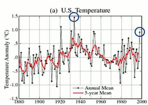
- The NOAA HAS made adjustments to US temperature data over the last few years that has increased the apparent warming trend. These changes in adjustments have not been well-explained. In fact, they have not really be explained at all, and have only been detected by skeptics who happened to archive old NOAA charts and created comparisons like the one below. Here is the before and after animation (pre-2000 NOAA US temperature history vs. post-2000). History has been cooled and modern temperatures have been warmed from where they were being shown previously by the NOAA. This does not mean the current version is wrong, but since the entire US warming signal was effectively created by these changes, it is not unreasonable to act for a detailed reconciliation (particularly when those folks preparing the chart all believe that temperatures are going up, so would be predisposed to treating a flat temperature chart like the earlier version as wrong and in need of correction.
- However, manual adjustments are not, as some skeptics seem to argue, wrong or biased in all cases. There are real reasons for manual adjustments to data — for example, if GPS signal data was not adjusted for relativistic effects, the position data would quickly get out of whack. In the case of temperature data:
- Data is adjusted for shifts in the start/end time for a day of measurement away from local midnight (ie if you average 24 hours starting and stopping at noon). This is called Time of Observation or TOBS. When I first encountered this, I was just sure it had to be BS. For a month of data, you are only shifting the data set by 12 hours or about 1/60 of the month. Fortunately for my self-respect, before I embarrassed myself I created a spreadsheet to monte carlo some temperature data and play around with this issue. I convinced myself the Time of Observation adjustment is valid in theory, though I have no way to validate its magnitude (one of the problems with all of these adjustments is that NOAA and other data authorities do not release the source code or raw data to show how they come up with these adjustments). I do think it is valid in science to question a finding, even without proof that it is wrong, when the authors of the finding refuse to share replication data. Steven Goddard, by the way, believes time of observation adjustments are exaggerated and do not follow NOAA’s own specification.
- Stations move over time. A simple example is if it is on the roof of a building and that building is demolished, it has to move somewhere else. In an extreme example the station might move to a new altitude or a slightly different micro-climate. There are adjustments in the data base for these sort of changes. Skeptics have occasionally challenged these, but I have no reason to believe that the authors are not using best efforts to correct for these effects (though again the authors of these adjustments bring criticism on themselves for not sharing replication data).
- The technology the station uses for measurement changes (e.g. thermometers to electronic devices, one type of electronic device to another, etc.) These measurement technologies sometimes have known biases. Correcting for such biases is perfectly reasonable (though a frustrated skeptic could argue that the government is diligent in correcting for new cooling biases but seldom corrects for warming biases, such as in the switch from bucket to water intake measurement of sea surface temperatures).
- Even if the temperature station does not move, the location can degrade. The clearest example is a measurement point that once was in the country but has been engulfed by development (here is one example — this at one time was the USHCN measurement point with the most warming since 1900, but it was located in an open field in 1900 and ended up in an asphalt parking lot in the middle of Tucson.) Since urban heat islands can add as much as 10 degrees F to nighttime temperatures, this can create a warming signal over time that is related to a particular location, and not the climate as a whole. The effect is undeniable — my son easily measured it in a science fair project. The effect it has on temperature measurement is hotly debated between warmists and skeptics. Al Gore originally argued that there was no bias because all measurement points were in parks, which led Anthony Watts to pursue the surface station project where every USHCN station was photographed and documented. The net result was that most of the sites were pretty poor. Whatever the case, there is almost no correction in the official measurement numbers for urban heat island effects, and in fact last time I looked at it the adjustment went the other way, implying urban heat islands have become less of an issue since 1930. The folks who put together the indexes argue that they have smoothing algorithms that find and remove these biases. Skeptics argue that they just smear the bias around over multiple stations. The debate continues.
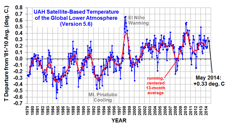
- Overall, many mainstream skeptics believe that actual surface warming in the US and the world has been about half what is shown in traditional indices, an amount that is then exaggerated by poorly crafted adjustments and uncorrected heat island effects. But note that almost no skeptic I know believes that the Earth has not actually warmed over the last 100 years. Further, warming since about 1980 is hard to deny because we have a second, independent way to measure global temperatures in satellites. These devices may have their own issues, but they are not subject to urban heat biases or location biases and further actually measure most of the Earth’s surface, rather than just individual points that are sometimes scores or hundreds of miles apart. This independent method of measurement has shown undoubted warming since 1979, though not since the late 1990’s.
- As is usual in such debates, I find words like “fabrication”, “lies”, and “myth” to be less than helpful. People can be totally wrong, and refuse to confront their biases, without being evil or nefarious.
To these I will add a #7: The notion that satellite results are somehow pure and unadjusted is just plain wrong. The satellite data set takes a lot of mathematical effort to get right, something that Roy Spencer who does this work (and is considered in the skeptic camp) will be the first to tell you. Satellites have to be adjusted for different things. They have advantages over ground measurement because they cover most all the Earth, they are not subject to urban heat biases, and bring some technological consistency to the measurement. However, the satellites used are constantly dieing off and being replaced, orbits decay and change, and thus times of observation of different parts of the globe change [to their credit, the satellite folks release all their source code for correcting these things]. I have become convinced the satellites, net of all the issues with both technologies, provide a better estimate but neither are perfect.


