

Monthly Archives: October 2008
Another Urban Heat Island Example
I do not claim that urban heat island effects are the only cause of measured surface warming — after all, satellites are largely immune to UHI and have measured a (small) warming trend since they began measuring temperature in 1979.
But I do think that the alarmist efforts to argue that UHI has no substantial, uncorrectable effect on surface temperature measurement is just crazy. Even if one tries to correct for it, the magnitude can be so substantial (up to 10 degrees or more F) that even a small error in correcting for the effect yields big errors in trying to detect an underlying warming signal.
Just as a quick example, let’s say the urban heat island effect in a city can be up to 10 degrees F. And, let’s say by some miracle you came up with a reliable approach to correct for 95% of this effect (and believe me, no one has an approach this good). This means that there would still be a 0.5F warming bias or error from the UHI effect, an amount roughly of the order of magnitude of the underlying warming signal we are trying to detect (or falsify).
When my son and I ran a couple of transects of the Phoenix area around 10PM one winter evening, we found the city center to be 7 to 10 degrees F warmer than the outlying rural areas. Anthony Watts did a similar experiment this week in Reno (the similarity is not surprising, since he suggested the experiment to me in the first place). He too found about a 10 degree F variation. This experiment was a follow-on to this very complete post showing the range of issues with surface temperature measurement, via one example in Reno.
By the way, in the latter article he had this interesting chart with the potential upward bias added by an instrumentation switch at many weather stations

This kind of thing happens in the instrumentation world, and is why numbers have to be adjusted from the raw data (though these adjustments, even if done well, add error, as described above). What has many skeptics scratching their heads is that despite this upward bias in the instrumentation switch, and the upward bias from many measurement points being near growing urban areas, the GISS and NOAA actually have an increasingly positive adjustment factor for the last couple of decades, not a negative one (net of red, yellow, and purple lines here). In other words, the GISS and NOAA adjustment factors imply that there is a net growing cooling bias in the surface temperature record in the last couple of decades that needs to be corrected. This makes little sense to anyone whose main interest is not pumping up the official numbers to try to validate past catastrophic forecasts.
Update: The NOAA’s adjustment numbers imply a net cooling bias in station locations, but they do have a UHI correction component. That number is about 0.05C, or 0.03F. This implies the average urban heat island effect on measurement points over the last 50 years is less than 1/300th of the UHI effect we measured in Reno and Phoenix. This seems really low, especially once one is familiar with the “body of work” of NOAA measurement stations as surveyed at Anthony’s site.
Sun, PDO, and CO2
For those who have not seen it, Roy Spencer has a new paper on the PDO, clouds and temperature history.
I have never explicitly stated this, but my sense is that medium to long scale 20th century temperature trends can be explained mostly through three drivers:
1. A cyclical variation driven by multi-decade oceanic cycles like the Pacific Decadal Oscillation (PDO):

2. Changes in solar output, either directly as increased heating or indirectly via a variety of theories on things like cosmic rays and cloud formation:

3. A long term trend of up to +0.05C per decade that may include a CO2-warming component.
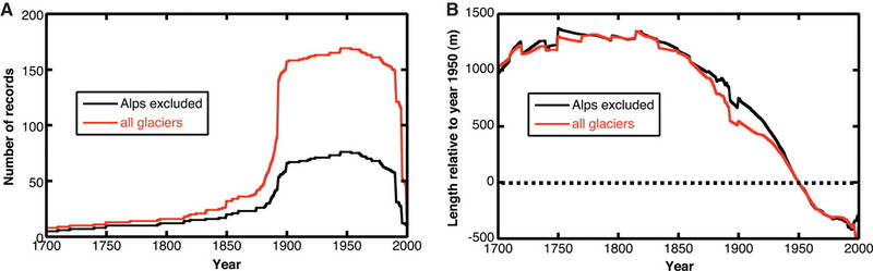
I am willing to posit a CO2 impact net of feedbacks of perhaps 0.5-1.0C over the next century. This may appear low, but is the only scale of number reasonably supported by history. Any higher number would result in temperatures way too high historically. And even assuming a number this high runs into the following problem: There was probably a trend of about this magnitude emerging from the little ice age 200+ years ago and extending into the 20th century. You can see it in the glacier numbers below: (source)

Those that want to assign the temperature trend, once the sun and the PDO are removed, post-1950 to CO2, need to explain what effect was causing the nearly exact same trend from 1800-1950, and why that trend conveniently switched off at the exact moment man's CO2 takes over. In the context of the glacier chart, what was causing the glaciers to retreat in 1880, and why is that effect not the one at work today?
Global Warming … Accelerating?
A week or two ago a “study” by the World Wildlife Fund got a lot of play in the media. Its key conclusion:
The report says that the 2007 report from the Intergovernmental Panel on Climate Change (IPCC) – a study of global warming by 4,000 scientists from more than 150 countries which alerted the world to the possible consequences of global warming – is now out of date.
WWF’s report, Climate Change: Faster, stronger, sooner, has updated all the scientific data and concluded that global warming is accelerating far beyond the IPCC’s forecasts.
As an example it says the first tipping point may have already been reached in the Arctic where sea ice is disappearing up to 30 years ahead of IPCC predictions and may be gone completely within five years – something that hasn’t occurred for 1m years. This could result in rapid and abrupt climate change rather than the gradual changes forecast by the IPCC.
This is not at all an uncommon meme. If one searches “global warming accelerating” on Google, one gets 1,100,000 hits. The #1 hit says:
I actually believe there is a small upward temperature trend due to CO2, on the order of 0.05 – 0.1C per decade. But it is staggering to me that so many people can insist, with a straight face, that warming is “accelerating” or, crazier, that it is “worse than forecast.”
Let’s take the acceleration first. Here is the recent temperature trend from the UAH satellite data (all the smoothed lines you will see are 36-month moving averages centered on the middle month).

It is possible to argue that there is a warming trend here, but never-the-less it is impossible to see “acceleration,” particularly since 2001. There is an implication in the article that the acceleration has occurred since the last couple of IPCC reports, so let’s zoom into the period since the 3rd and 4th IPCC reports:

No acceleration. Not even any warming (for 8 years! where is that story in the press?)
But how about the proposition that temperatures are rising faster than forecasts? This is patently absurd. We can go back to just about every IPCC and alarmist projection and show that temperatures are well less than forecast, but lets use James Hansen’s forecasts to Congress in 1988 because it gives us 20 years of data to work with (actual data is a blend of Hadley CRUT3 and UAH satellite as discussed here.)

I always get folks who insist that I am making a mistake by using the Hansen A scenario because Hansen at the time described it as extreme. But in fact, world CO2 production has been even greater than the Hansen A scenario. Hansen A underestimates the inputs, and still grossly overestimates the output. The only real discussion one can find on the IPCC forecasts is whether one can argue the actuals are barely poking their nose up into the low end of the forecast confidence intervals or not.
The one piece of evidence most of these folks making the “accelerating” argument use is sea ice extent in the North Pole. The media has been full of stories about disappearing sea ice, and in fact in 2007 the North Pole had the lowest sea ice extent in the last 30 years, though coincidently in the same year the South Pole had the highest sea ice extent in 30 years. But there is a logical fallacy here. The fact that the statement “global warming causes sea ice to retreat” is true does not mean the statement “sea ice retreat means the globe is warming” has to be true. And in fact, we see from the data above, this is not true. It is amazing to me that in the conflict between “thermometers” and “sea ice extent at one pole” as measures for global temperature, sea ice extent seems to trump thermometer readings. Particularly when this sea ice signal only exists at one of the two poles.
There is no question that the Arctic has warmed more than the rest of the planet. In fact, much of the rise in global averages is driven by the Arctic (and all of it is driven by the norther hemisphere above the tropics — the rest of the world has no warming signal over the last 30 years). Below we can see the satellite measurement of the temperature anomaly in the Arctic:

A one degree rise over a couple of decades is indeed substantial. In fact, though, during the last couple of years, we have actually seen either flat temperatures or, perhaps, a cooling trend. Here is a closeup:
So it might be that we should look for other explanations of unusually large sea ice retreats in the summers of 2007 and 2008. It has been suggested by NASA that winds and ocean currents are in part to blame, and by others that black carbon deposits on the ice from Chinese coal plants may also be increasing summer melt.
Whatever the case, there are a lot of good reasons to believe we are not seeing an “acceleration” in global warming. And a lot of very, very good reasons to believe we are not reaching a “tipping point.” Tipping point implies that we have entered a regime where the climate is dominated by runaway positive feedback. I have addressed this topic many times, and will not address it right now, but in short all of the catastrophe in climate models is due not to the assumption of CO2 as a greenhouse gas (which actually tends to yield modest warming in models) but the assumption that the Earth’s climate is dominated by substantial positive feedbacks. I discuss the entire topic of positive feedbacks and climate forecasts in the video below:
Update – if we add glaciers here in addition to sea ice, we see the same slow retreating trend. However, the trend goes back 200 years! That’s 150 years longer than man has been producing substantial CO2 emissions. (source)
New Typepad Editor Bugged
I am working on several new posts, but the new Typepad editor is really buggy. For some reason, Typepad put this particular blog (but not my others) on the new editor, probably as an involuntary beta. The new editor is much, much slower, and has fatal bugs that make use of images in posts virtually impossible.
This is actually a problem with online applications I had not considered before. When I heard iTunes 8 was initially bugged or learned to hate Vista, I would just avoid making the "upgrade." But with online services, I have no choice but to accept the new version, even if I consider it worse (as is so often the case nowadays in software).
Arctic and Greenland Ice
Arctic Sea ice and Greenland glaciers have been on a slow retreating trend for decades, perhaps centuries (at least since the little ice age). This should not be surprising. First, glaciers all around the world have been steadily retreating since 1800:

Also, the Arctic has been the hot spot of the world over the last 30 years or so:

Increasing far more than global averages:

So the question is not necessarily why Arctic Sea ice continues to retreat – this appears part of a long term trend that in fact pre-dates things like, say, man’s production of substantial amounts of CO2. But the more worrisome question has been, why has this retreat seemed to have accelerated the past several years:

Its hard to fully correlate recent activity with Arctic temperatures. In fact, in the last three or four years (see above) we have seen decreasing Attic temperatures, not increasing ones. But never-the-less, this ice picture is often used as exhibit #1 to prove anthropogenic warming. The "tipping point is near" cry supporters of the theory that Earth’s climate, unlike nearly every other long-term stable natural system, is dominated by positive feedback (and ignoring anecdotal evidence that the Arctic experienced similar melting in the 1930s).
Well, last year, there was some preliminary findings form NASA that said that the unusual low ice pack in 2008 may have been due to shifting wind patterns. Now, Anthony Watts points us to two new studies that both conclude something other than global warming and CO2 may be behind recent ice pack trends in the Arctic.
Observations over the past decades show a rapid acceleration of several outlet glaciers in Greenland and Antarctica1. One of the largest changes is a sudden switch of Jakobshavn Isbræ, a large outlet glacier feeding a deep-ocean fjord on Greenland’s west coast, from slow thickening to rapid thinning2 in 1997, associated with a doubling in glacier velocity3. Suggested explanations for the speed-up of Jakobshavn Isbræ include increased lubrication of the ice-bedrock interface as more meltwater has drained to the glacier bed during recent warmer summers4 and weakening and break-up of the floating ice tongue that buttressed the glacier5. Here we present hydrographic data that show a sudden increase in subsurface ocean temperature in 1997 along the entire west coast of Greenland, suggesting that the changes in Jakobshavn Isbræ were instead triggered by the arrival of relatively warm water originating from the Irminger Sea near Iceland. We trace these oceanic changes back to changes in the atmospheric circulation in the North Atlantic region. We conclude that the prediction of future rapid dynamic responses of other outlet glaciers to climate change will require an improved understanding of the effect of changes in regional ocean and atmosphere circulation on the delivery of warm subsurface waters to the periphery of the ice sheets.
When Computer Models Are Treated Like Reality
On April 28, 2004, the SEC made a significant change in policy in the regulation of large investment banks. On that day, they "decided to allow the five largest US investment banks to substitute advanced mathematical risk models for traditional capital requirements." Al Gore has touted the "success" of such models as a reason to feel confident that computer models can accurately predict long-term climate trends.
But it turns out, as everyone is discovering this week, that computer models are not reality. In fact, computer models are extraordinarily sensitive to their inputs, and small changes in their inputs, or the narrowing of models to ignore certain factors, can make them worse than useless. Computer models are also very easy to force to a preferred conclusion.
Why Kyoto Used 1990 as a Base Year
I have made this point several times, but the 1990 reference date for Kyoto was not just picked randomly. In fact, on its face, it was a bit odd for a treaty negotiated in 1997 to use a 1990 base year. But 1990 allowed signatory countries to claim credit for alot of improvements in CO2 output that had nothing to do with the treaty. For example, in Germany, 1990 was after unification but before wildly inefficient east German factories had been shut down. In England, 1990 was just before a concerted effort to substitute North Sea oil and nuclear to shut down Midlands coal use. In France and Japan, 1990 was the beginning of a period of slow economic growth (and, as an added special bonus, punished the US because it was the beginning of strong economic growth here).
In an odd twist on market economics, Europe’s ex-communist states are starting to exploit a new market. Thanks to the Kyoto climate-change agreement, they can, in effect, now make money off the pollution their onetime central planners were willing to tolerate as the price for rapid industrialization and universal employment.
Ukraine, Hungary, the Czech Republic and other countries of the region not exactly renowned for clean air have made or are close to signing deals to sell the rights to emit greenhouse gases, and their main customer is environmentally friendly Japan.
This carbon windfall dropped into Central and East Europe’s lap because the Kyoto Protocol sets 1990 as the reference year for future reductions in greenhouse gas emissions. The socialist states at that time were producing gargantuan amounts of CO2 and other gases implicated in global warming from unfiltered coal-fired power plants and factories; when those unprofitable industries withered, countless thousands of workers went on the dole — but the air got cleaner. In the coming years, in line with European Union mandates, would-be members gradually adopted better environmental policies. It’s the difference between the often unspeakably bad air of 1990 and the comparatively clean air of today that allows them to sell "carbon credits" potentially worth billions of euros.
In effect, signatory countries are still making their Kyoto goals with actions that had nothing to do with Kyoto, in this case the modernization and/or shut down of communist-era industry. This continues the charade that a) Europe is actually making real progress on CO2 emissions, which it is not and b) emissions reductions are cheap.
Update: Before the treaty, but for which the treaty supporters claim credit by selecting 1990 as the base year, signatory countries had large CO2 reductions due to the forces at work detailed above:
CO2 Emissions Changes, 1990-1995
EU -2.2% Former Communist -26.1% Germany -10.7% UK -6.9% Japan 7.2% US 6.4%
Since the treaty was actually signed, from 1997 to 2005, countries that ratified the treaty had emissions rise 21%. When the treaty was signed in 1997, they signatories knew they had this pool of 1990-1995 emissions reductions to draw on to claim victory. To this day, this is the only improvement they can show, improvement that occured before the treaty and through steps unrelated, in the main, to CO2 abatement.