Archive for the ‘Effects of Warming’ Category.

Its a Floor Wax and A Desert Topping

It is not hard to find juxtapositions of news articles with the media blaming man-made global warming for two contradictory effects – e.g. more snow / less snow.  But this is one of the most stark, with articles within a year of each other blaming global warming for both more and less fog in San Francisco.  When the global warming fear finally collapses, I think the lesson that will be retained by future activitsts will be this “heads I win, Tails you lose” form of alarmism.

The Madness of Prince Charles

Charleses have not had the best of luck on the English throne.  And the current Prince of Wales does not seem to be doing much to change that tradition.  The other day he said:

“Well, if it is but a myth, and the global scientific community is involved in some sort of conspiracy, why is it then that around the globe sea levels are more than six inches higher than they were 100 years ago?

“This isn’t an opinion – it is a fact.”

He added: “And, ladies and gentlemen please be in no doubt that the evidence of long-term and potentially irreversible changes to our world is utterly overwhelming.”

Here is the deal with sea levels.  Yes, they were rising in 2009.  And they were rising in 2000.  And they were rising in 1950.  And they were rising in 1900.  And they were rising in 1850.   In fact, sea levels have been rising (due to thermal expansion of water and perhaps some melting land ice**) since the end of the little ice age  (and longer, see WUWT)

slide81

In fact, I would argue that this extended sea level rise helps disprove, rather than prove, the strong anthropogenic hypothesis.   The influence of manmade CO2 had to be small from 1850 to 1900 or even 1950.  Therefore, for the 1950-2000 sea level rise to be due to man, it means the natural warming had to stop at the exact same moment that anthropogenic effects took over.  Occam’s Razor says a better answer is that the end of the little ice age around 1800 has led to a general recovery of temperatures ever since.  We see the exact same pattern in glaciers melting

slide79

So many people are obsessed over whether or not current temperatures are the highest in the last 100o years or not, they forget that the temperatures in the little ice age were in fact lower than at any time in perhaps the last 5000 years.  It was very cold.

slide50

Postscript: By the way, I love the carbon footprint for me, but not for thee angle of the Prince Charles story:

Charles spoke after arriving in Manchester by Royal Train pulled by a coal-fired steam locomotive, named the Tornado, which was rebuilt from a 1948 design.

** Footnote: We know glaciers around the world have retreated since 1850, as shown above, but 90% of the world’s land ice is in Antarctica and we don’t fully understand what has happened there.  Some climatologists believe that warming weather actually increases the ice pack in Antarctica because it never will cause much melting but it increases  snowfall.

The Power of Branding

This last week we saw the power of branding in the political arena.  By rebranding anthorpogenic global warming as “climate change,” alarmists are able to say things like this (this is White House spokesman Robert Gibbs commenting on recent very cold weather)

Gibbs: “I think that one only has to step outside here or visit where I used to work in Chicago to understand that climate change, and the record temperature that climate change is likely causing, is with us….I would say that eve in places that are used to getting very cold weather, record cold…our weather patterns have been affected by change in our climate”

Wow, I guess its all about the science.  Except for the following problem:  no living human being has suggested any credible mechanism by which CO2 can cause climate change without the intermediate step of warming.  CO2 causes warming, which in turn might or might not cause more, say, severe storms.  But there is no evidence of CO2 causing more temperature volatility  (particularly extremes to the cold side) and even those who have suggested that global warming might lead to more volatility would be forced to admit, if they are being honest, that this is more volatility around a higher mean, such that there still should not be a lot more record lows.

Severe Weather and Anthropogenic Global Warming

As I put together an updated version of my climate movie and powerpoint deck, I am constantly amazed how alarmist claims that man is causing [fill in the blank severe weather] via his CO2 emissions simply never pan out.  I am not saying they don’t pan out because there is no causality proof – that goes without saying.  No one has ever been able to or likely will ever be able to link a specific weather event like Katrina directly to CO2 emissions — but of course that does not stop them from trying and does not prevent a credulous media from lapping it up  (and in fact there is a class action suit as we speak against oil and power companies for “causing” Katrina).

No, what I mean is that the supposed weather trend seldom if ever exists.  What is happening is that alarmists are latching onto individual events in the tail ends of the normal distribution for weather and claiming that these events signal a shift in the mean.  But they never actually publish data for the mean, and there is a reason for that.  Time and time again, with hurricanes, US floods and droughts, severe storms, and tornados, when we look at the data we see no shift in the mean.

Here is a good example form Warwich Hughes.  The Western Australia Premier says back in 2007″

Mr A.J. CARPENTER (WA Premier): “..It has stopped raining in the south west of Western Australia. The rain no longer falls from the sky in sufficient quantities to fill the dams to fill the pipes to fill the cups for people to drink…”

The reality:  A one year drought in 2006 is being used to argue that the mean rainfall has shifted.  It clearly has not.

percatch09

Katrina Victims Have Standing To Sue Over Global Warming

From the WSJ:

The suit was brought by landowners in Mississippi, who claim that oil and coal companies emitted greenhouse gasses that contributed to global warming that, in turn, caused a rise in sea levels, adding to Hurricane Katrina’s ferocity. (See photo of Bay St. Louis, Miss., after the storm.)

For a nice overview of the ruling, and its significance in the climate change battle, check out this blog post by J. Russell Jackson, a Skadden Arps partner who specializes in mass tort litigation. The post likens the Katrina plaintiffs’ claims, which set out a chain of causation, to the litigation equivalent of “Six Degrees of Kevin Bacon.”

The central question before the Fifth Circuit was whether the plaintiffs had standing, or whether they could demonstrate that their injuries were “fairly traceable” to the defendant’s actions. The defendants predictably assert that the link is “too attenuated.”

But the Fifth Circuit held that at this preliminary stage in the litigation, the plaintiffs had sufficiently detailed their claims to earn a day in court.

The Green Hell Blog wrote:

I can’t wait to hear the plaintiffs argument as to why U.S. CO2 emissions versus Chinese were the proximate cause of the damage..

I would add that it will be interesting to see how oil companies will be held at fault rather than their customers who actually burned the oil and created the CO2.

It will also be interesting to see plaintiffs explain this graph of accumulated cyclone energy in the light of their theory that man-made global warming is increasing hurricane strengths and frequencies  (ACE is a sort of integration of hurricane and tropical storm strengths over time).  (from here via WUWT)

ace

Data Splices

Splicing data sets is a virtual necessity in climate research.  Let’s think about how I might get a 500,000 year temperature record.  For the first 499,000 years I probably would use a proxy such as ice core data to infer a temperature record.  From 150-1000 years ago I might switch to tree ring data as a proxy.  From 30-150 years ago I probably would use the surface temperature record.  And over the last 30 years I might switch to the satellite temperature measurement record.  That’s four data sets, with three splices.

But there is, obviously, a danger in splices.  It is sometimes hard to ensure that the zero values are calibrated between two records (typically we look at some overlap time period to do this).  One record may have a bias the other does not have.  One record may suppress or cap extreme measurements in some way (example – there is some biological limit to tree ring growth, no matter how warm or cold or wet or dry it is).  We may think one proxy record is linear when in fact it may not be linear, or may be linear over only a narrow range.

We have to be particularly careful at what conclusions we draw around the splices.  In particular, one would expect scientists to be very, very skeptical of inflections or radical changes in the slope or other characteristic of the data that occur right at a splice.  Occam’s Razor might suggest the more logical solution is that such changes are related to incompatibilities with the two data sets being spliced, rather than any particular change in the physical phenomena being measured.

Ah, but not so in climate.  A number of the more famous recent findings in climate have coincided with splices in data sets.  The most famous is in Michael Mann’s hockey stick, where the upward slope at the end of the hockey stick occurs exactly at the point where tree ring proxy data is spliced to instrument temperature measurements.  In fact, if looking only at the tree ring data brought to the present, no hockey stick occurs (in fact the opposite occurs in many data sets he uses).   The obvious conclusion would have been that the tree ring proxy data might be flawed, and that it was not directly comparable with instrumental temperature records.  Instead, Al Gore built a movie around it.  If you are interested, the splice issue with the Mann hockey stick is discussed in detail here.

Another example that I have not spent as much time with is the ocean heat content data, discussed at the end of this post.  Heat content data from the ARGO buoy network is spliced onto older data.  The ARGO network has shown flat to declining heat content every year of its operation, except for a jump in year one from the old data to the new data.  One might come to the conclusion that the two data sets did not have their zero’s matched well, such that the one year jump is a calibration issue in joining the data sets, and not the result of an actual huge increase in ocean heat content of a magnitude that has not been observed before or since.  Instead, headline read that the ARGO network has detected huge increases in ocean heat content!

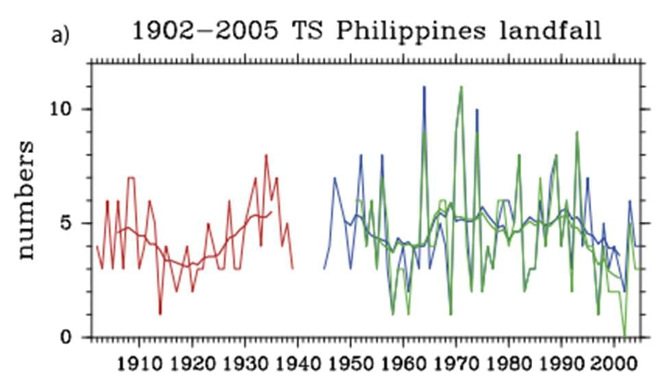
So this brings us to today’s example, probably the most stark and obvious of the bunch, and we have our friend Michael Mann to thank for that.  Mr. Mann wanted to look at 1000 years of hurricanes, the way he did for temperatures.  He found some proxy for hurricanes in years 100-1000, basically looking at sediment layers.  He uses actual observations for the last 100 years or so as reported by a researcher named Landsea  (one has to adjust hurricane numbers for observation technology bias — we don’t miss any hurricanes nowadays, but hurricanes in 1900 may have gone completely unrecorded depending on their duration and track).  Lots of people argue about these adjustments, but we are not going to get into that today.

Here are his results, with the proxy data in blue and the Landsea adjusted observations in red.  Again you can see the splice of two very different measurement technologies.

mannlandseaunsmoothed

Now, you be the scientist.  To help you analyze the data, Roger Pielke via Anthony Watt has calculated to basic statistics for the blue and red lines:

The Mann et al. historical predictions [blue] range from a minimum of 9 to a maximum of 14 storms in any given year (rounding to nearest integer), with an average of 11.6 storms and a standard deviation of 1.0 storms. The Landsea observational record [red] has a minimum of 4 storms and a maximum of 28 with and average of 11. 7 and a standard deviation of 3.75.

The two series have almost dead-on the same mean but wildly different standard deviations.  So, junior climate scientists, what did you conclude?  Perhaps:

  • The hurricane frequency over the last 1000 years does not appear to have increased appreciably over the last 100, as shown by comparing the two means.  or…
  • We couldn’t conclude much from the data because there is something about our proxy that is suppressing the underlying volatility, making it difficult to draw conclusions

Well, if you came up with either of these, you lose your climate merit badge.  In fact, here is one sample headline:

Atlantic hurricanes have developed more frequently during the last decade than at any point in at least 1,000 years, a new analysis of historical storm activity suggests.

Who would have thought it?  A data set with a standard deviation of 3.75 produces higher maximum values than a data set with the same mean but with the standard deviation suppressed down to 1.0.  Unless, of course, you actually believe that the data volatility in the underlying natural process suddenly increase several times coincidental in the exact same year as the data splice.

As Pielke concluded:

Mann et al.’s bottom-line results say nothing about climate or hurricanes, but what happens when you connect two time series with dramatically different statistical properties. If Michael Mann did not exist, the skeptics would have to invent him.

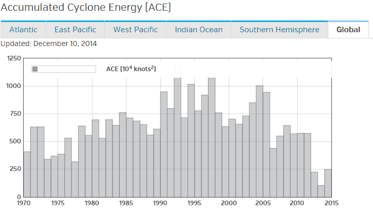
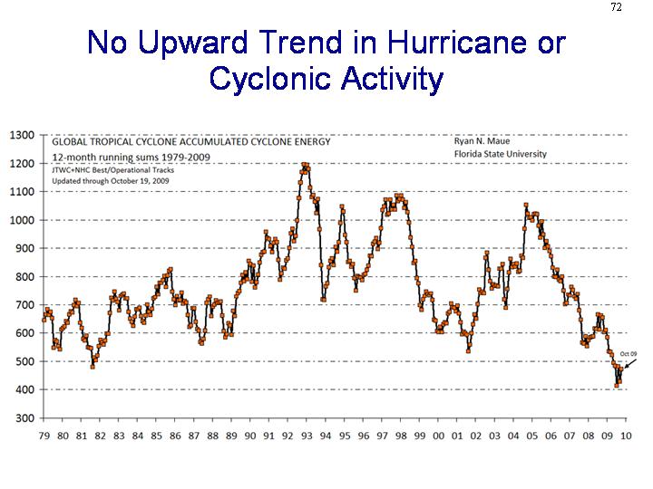
Postscript #1: By the way, hurricane counts are a horrible way to measure hurricane activity (hurricane landfalls are even worse).  The size and strength and duration of hurricanes are also important.  Researchers attempt to factor these all together into a measure of accumulated cyclone energy.  This metric of world hurricanes and cyclones has actually be falling the last several years.

global_running_ace2

Postscript #2: Just as another note on Michael Mann, he is the guy who made the ridiculously overconfident statement that “there is a 95 to 99% certainty that 1998 was the hottest year in the last one thousand years.”   By the way, Mann now denies he ever made this claim, despite the fact that he was recorded on video doing so.  The movie Global Warming:  Doomsday Called Off has the clip.  It is about 20 seconds into the 2nd of the 5 YouTube videos at the link.

Warm Weather and Prosperity

I get it that a 15F increase in global temperatures would not be good for agriculture.  Of course, I think 15F is absurd, at least from anthropogenic CO2.

However, for the types of warming we are seeing (in the tenths of a degree), such warming has always been a harbinger of prosperity through history.  The medieval warm period in Europe was a time of expanding populations driven by increasing harvests.  When the medieval warm period ended and decades of cooler weather ensued, the Great Famine resulted — a famine which many blame for weakening the population and making later plague outbreaks more severe.

I read a lot of history, and take a number of history courses (both on tape and live).  Its so funny when the professor gets to these events, because she/he always has to preface his remarks with “I know you have been tought that warming is universally bad, but…”

2009 may rank as a below average year for American agriculture, not because of heat, but because of late frosts and an unusually cool summer.

Worrying About the Amazon

Kevin Drum posted on what he called a “frightening” study about global warming positive feedback effects from drought in the Amazon.   Paul Brown writes about a study published by Oliver Phillips in Science recently:

Phillips’s findings, which were published earlier this year in the journal Science, are sobering. The world’s forests are an enormous carbon sink, meaning they absorb massive quantities of carbon dioxide, through the processes of photosynthesis and respiration. In normal years the Amazon alone absorbs three billion tons of carbon, more than twice the quantity human beings produce by burning fossil fuels. But during the 2005 drought, this process was reversed, and the Amazon gave off two billion tons of carbon instead, creating an additional five billion tons of heat-trapping gases in the atmosphere. That’s more than the total annual emissions of Europe and Japan combined….

Phillips’s findings, which were published earlier this year in the journal Science, are sobering. The world’s forests are an enormous carbon sink, meaning they absorb massive quantities of carbon dioxide, through the processes of photosynthesis and respiration. In normal years the Amazon alone absorbs three billion tons of carbon, more than twice the quantity human beings produce by burning fossil fuels. But during the 2005 drought, this process was reversed, and the Amazon gave off two billion tons of carbon instead, creating an additional five billion tons of heat-trapping gases in the atmosphere. That’s more than the total annual emissions of Europe and Japan combined.

As if that’s not enough bad news, new research presented in March at a conference organized by the University of Copenhagen, with the support of the Intergovernmental Panel on Climate Change, says that as much as 85 percent of the Amazon forests will be lost if the temperature in the region increases by just 7.2 degrees Fahrenheit.

There are several questions I had immediately, which I won’t dwell on too much in this article because I have yet to get a copy of the actual study.  However, some immediate thoughts:

  • Studies like this are interesting, but a larger question for climate science is at what point does continuing to study only positive feedback effects in climate without putting similar effort into understanding and scaling negative feedback effects become useless?  After all, it is the net of positive and negative feedback effects that matter.  Deep understanding of one isolated effect in a wildly complex and chaotic system only has limited utility.
  • I am willing to believe that a 2005 drought led to a 2005 reduction or even reversal of the Amazon’s ability to consume carbon.  But what has happened since?  It seems to me quite possible that when the rains returned, there was a year of faster than average growth, and that much of the carbon emitted in 2005 may well have been re-absorbed in the subsequent years.
  • I am always suspicious of studies focusing on one area that simultaneously draw conclusions about links to certain climate effects.  For example, did the biologists measuring forest growth really put an equal quality effort into showing that the drought was not caused by el Nino or other ENSO variations and was instead caused by global warming?  I doubt it.  I have not seen the study in question, but in every one I have seen like this the connection of the effect measured to anthropogenic global warming is gratuitous and unproven, but accepted in a peer-reviewed journal nonetheless because the core findings (in this case on forest growth) were well studied and the global warming conclusion fit the pre-conceived notions of the reviewers.

But should we worry?  Will the Amazon warm 7.2F (4C) and be wiped out?  Well, I thought I would look.  I was prompted to run the numbers because I know that most global temperature metrics show little or no warming over the last 30 years in the tropics, but I had never seen numbers just for the Amazon area.

To get these numbers, I went to the KNMI climate explorer and pulled the UAH satellite near-surface data for the Amazon and nearby oceans.  I know some folks have problems with satellite because they are only near-surface, but 30 years of history has shown that this data comes very close to following surface temperature changes, and all the surface measurement databases for this area are so riddled with holes and data gaps that they are virtually useless (trying to use the surface temperature record outside of the US and Europe and some small parts of Asia and Australia is very dangerous).

I used latitude 5N to 30S and Longitude 90W to 30W as shown on the box below:

amazon-temp-map

Pulling the data and graphing it, this is what we see (click to enlarge):

amazon-graph-1a

Over the last 30 years, the area has seen a temperature trend of about a half degree C (less than one degree F) per century.  I included the more recent trend in green because the first thing I always hear back is “well, the trend may have been low in the past, but it is accelerating!” In fact, most of this warming trend was in the first half of the period — since 1995 the trend has been negative more than a degree per century.

So how much are we in danger of hitting anywhere close to 7.2F?

amazon-graph-2

I am personally worried about man destroying the Amazon, but not by CO2.  My charity of choice is private land trusts that purchase land in the Amazon for preservation.  I still think that is a better approach to saving the Amazon than worrying about US tailpipe emissions.

GCCI #12: Ignoring the Data That Doesn’t Fit the Narrative

Page 39 of the GCCI  Report discusses retreating Arctic sea ice.  It includes this chart:

arctic_ice

The first thing I would observe is that the decline seems exaggerated through some scaling and smoothing gains.    The raw data, from the Cyrosphere Today site   (note different units, a square mile = about 2.6 sq. km).

currentanom

But the most interesting part is what is not mentioned, even once, in this section of the report:  The Earth has two poles.  And it turns out that the south pole has actually been gaining sea ice, such that the total combined sea ice extent of the entire globe is fairly stable (click for larger version).

globaldailyiceareawithtrend

Now, there are folks who are willing to posit a model that allows for global warming and this kind of divergence between the poles.  But the report does not even go there.  It demonstrates an inferiority complex I see in many places of the report, refusing to even hint that reality is messy in fear that it might cloud their story.

GCCI #11: Changing Wet and Dry Weather

From the GCCI report on page 24:

Increased extremes of summer dryness and winter wetness are projected for much of the globe, meaning a generally greater risk of droughts and floods. This has already been observed, and is projected to continue. In a warmer world, precipitation tends to be concentrated into heavier events, with longer dry periods in between.

Later in the report they make the same claims for the US only.  I can’t speak for the rest of the world, but I don’t know what data they are using.  This is from the National Climate Data Center, run by the same folks who wrote this report:

dry_2

wet

Maybe my Mark I eyeball is off, but it sure doesn’t look like any trend here, or that there we are currently at any particularly unprecedented levels today.  Of course, the main evidence they have of increasing extreme rainfall is in this chart — but of course this is “simulated” history, rather than actual, you know, observations.

GCCI #4: I Am Calling Bullsh*t on this Chart

Update#2: Evan Mills, apparently one author of the analysis, responds and I respond back.

UPDATE: I obtained more information from the EIA.  My hypothesis below is correct.   Update here.

For this next post, I skip kind of deep into the report because Kevin Drum was particularly taken with the power of this chart from page 58.

electrical-outage

I know that skepticism is a lost art in journalism, so I will forgive Mr. Drum.  But in running a business, people put all kinds of BS analyses in front of me trying to get me to spend my money one way or another.  And so for those of us for whom data analysis actually has financial consequences, it is a useful skill to be able to recognize a steaming pile of BS when one sees it.  (Update: I regret the snarky comment about Kevin Drum — though I disagree with him a lot, he is one of the few folks on either side of the political aisle who is willing to express skepticism for studies and polls even when they support his position.  Mr. Drum has posted an update to his original post after I emailed him this information).

First, does anyone here really think that we have seen a 20-fold increase in electrical grid outages over the last 15 years but no one noticed?  Really?

Second, let’s just look at some of the numbers.  Is there anyone here who thinks that if we are seeing 10-20 major outages from thunderstorms and tornadoes (the yellow bar) in the last few years, we really saw ZERO by the same definition in 1992?  And 1995?  And 1996?  Seriously?  This implies there has been something like a 20-fold increase in outages from thunderstorms and tornadoes since the early 1990’s.  But tornado activity, for example, has certainly not increased since the early 1990’s and has probably decreased (from the NOAA, a co-author of the report):

tornadotrend

All the other bars have the same believability problem.  Take “temperature extremes.”  Anyone want to bet that is mostly cold rather than mostly hot extremes?  I don’t know if that is the case, but my bet is the authors would have said “hot” if the data had been driven by “hot.”  And if this is proof of global warming, then why is the damage from cold and ice increasing as fast as other severe weather causes?

This chart screams one thing at me:  Basis change.  Somehow, the basis for the data is changing in the period.  Either reporting has been increased, or definitions have changed, or there is something about the grid that makes it more sensitive to weather, or whatever  (this is a problem in tornado charts, as improving detection technologies seem to create an upward incidence trend in smaller tornadoes where one probably does not exist).   But there is NO WAY the weather is changing this fast, and readers should treat this whole report as a pile of garbage if it is written by people who uncritically accept this chart.

Postscript: By the way, if I want to be snarky, I should just accept this chart.  Why?  Because here is the US temperature anomaly over the same time period (using the UAH satellite data as graphed by Anthony Watt, degrees C):

usa-temp

From 1998 to today, when the electrical outage chart was shooting up, the US was actually cooling slightly!

This goes back to the reason why alarmists abandoned the “global warming” term in favor of climate change.   They can play this bait and switch, showing changes in climate (which always exist) and then blaming them on CO2.  But there is no mechanism ever proposed by anyone where CO2 can change the climate directly without going through the intermediate step of warming.  If climate is changing but we are not seeing warming, then the change can’t be due to CO2. But you will never see that fact in this helpful government propaganda piece.

More Thoughts on Tree Mortality Study

I got a copy of the Science article by Van Mantgem et. al. on tree mortality referred to in my previous post here.  I have not done a comprehensive review, but I have now read it and its supplements and have a few immediate reactions.

This article struck me as an absolutely classic academic study, for the following reason:   The study can be broken up into two parts – measurement of a natural phenomenon and possible explanations for the measurements. The meat of the effort and real work is in the first part, the measurement of tree mortality, with very weak work on the second part, on the links to global warming.  Many academic studies are guilty of this to some extent.  I once had a professor tell me every study was a year of intensive data gathering and analysis followed by 2 hours of a group of grad students trying to brainstorm causes and implications, the more exciting the better.  Unfortunately, the press releases and media attention in climate tend to focus on this hypothesizing as if it had as much credibility as the actual data analysis.  Let me be specific.

The first part of the study, the measurement of tree die-off rates, appears to be where the bulk of the work is, and their findings seem fairly reasonable — that tree die-off rates seem to have gone up over the last several decades in the western US, and that this die-off seems to be consistent across geography, tree size, and tree type.   My only complaint is that their data shows a pretty clear relationship between study plot size and measured mortality.   Most of the measured tree mortality is in plots 1 hectare or less (about 2.5 acres, or the size of a large suburban home lot).  There is not nearly as much mortality in the larger study plots — I would have liked to see the authors address this issue as a possible methodological problem.

Anyway, the finding of large and spatially diverse increases in mortality of trees is an important finding, and one for which the authors should feel proud to identify.  The second part of the study, the hypothesized causes of this mortality, is far far weaker than the first, though this is not atypical of academic studies.  Remember, in the press summaries, the authors claimed that global warming had to be the cause because they had eliminated everything else it could possibly be.  So here is what their Science article mentions that they considered and rejected as possible causes:

  • Changes in forest density and fire exclusion policies
  • Old trees falling and crushing new trees
  • Ozone levels (they claim they look at “pollution” but ozone is the only chemical discussed)
  • Activity of fungal pathogen, Cronartium ribicola, in certain pines
  • Forest fragmentation

Wow, well that certainly seems comprehensive.  Can’t think of a single other thing that could be causing it.  By the way, the last one is interesting to me, because I suggested forest fragmentation and micro-climate issues in my first post.  So, just to give you an idea of the kind of scholarship that passes peer review, let’s see how they tested for forest fragmentation:  they compared mortality of trees inside national parks vs. mortality of trees outside of national parks.  The logic is that National Park trees would see less fragmentation over time since they are protected from logging, but that of course is a supposition.

This is really weak.  I guess it’s not a bad test if you had to come up with such a test in an afternoon without the time to do any extra work, but it is a very course macro test of a very micro problem.  For example, the top of Kilimanjaro is protected as  a National Park, but evidence is pretty strong that snow on the mountain is being reduced by land-use-related changes in precipitation and local climate due to logging outside the national park.

A lot of folks in the comments of the last post mentioned, reasonably, the massive infestations of western pine bark beetles.  The only mention of the  bark beetle infestations was, interestingly, in their last paragraph, where they said:

First, increasing mortality rates could presage substantial changes in forest structure, composition, and function (7, 25), and in some cases could be symptomatic of forests that are stressed and vulnerable to abrupt dieback (5). Indeed, since their most recent censuses, several of our plots in the interior region experienced greatly accelerated mortality due to bark beetle outbreaks, and in some cases nearly complete mortality of large trees

I guess that is a handy way to deal with an exogenous factor you don’t want to admit drove some of your observations – just reverse the causality.  So now mortality is not caused in part by beetles, beetles are caused by mortality!

By the way, before I head into temperature, I had a question for those of you who may know trees better than I.  Do trees have demographics and generations, like human populations?  For example, we expect a rise in mortality among humans over the next 30 years because there was a spike in birth rates 50 years ago.  Do forests have similar effects?  It struck me that humans cleared a lot of western forests from 1860-1920, and since then the total forested area in the US has expanded.  Is there some sort of baby boomer generation of trees born around 1900 that are now dying off?

Anyway, on to temperature.   Here is the key statement from the Science article:

We suggest that regional warming may be the dominant contributor to the increases in tree mortality rates. From the 1970s to 2006 (the period including the bulk of our data; table S1), the mean annual temperature of the western United States increased at a rate of 0.3° to 0.4°C decade−1, even approaching 0.5°C decade−1 at the higher elevations typically occupied by forests (18). This regional warming has contributed to widespread hydrologic changes, such as declining fraction of precipitation falling as snow (19), declining snowpack water content (20), earlier spring snowmelt and runoff (21), and a consequent lengthening of the summer drought (22). Specific to our study sites, mean annual precipitation showed no directional trend over the study period (P = 0.62, LMM), whereas both mean annual temperature and climatic water deficit (annual evaporative demand that exceeds available water) increased significantly (P < 0.0001, LMM) (10). Furthermore, temperature and water deficit were positively correlated with tree mortality rates (P ≤ 0.0066, GNMM; table S4).

The footnotes reference that the temperature and water correlations are in the supplementary online material, but I have access to that material and there is nothing there.  I may be unfair here, but it really looks to me like some guys did some nice work on tree mortality, couldn’t get it published, and then tacked on some stuff about global warming to increase the interest in it.   Note that Science recognizes what the study is about, when it titles the article “Widespread Increase of Tree Mortality Rates in the Western United States,” without mention of global warming.  But when it moves to the MSM, it is about global warming, despite the fact that none of the warming and drought data and regressions are considered important enough or persuasive enough to make the article or even the supplementary material.

OK, if this paragraph is all we have, what can we learn from it?  Well, the real eye-catcher for me is this:

From the 1970s to 2006…the mean annual temperature of the western United States increased at a rate of 0.3° to 0.4°C decade−1, even approaching 0.5°C decade−1 at the higher elevations typically occupied by forests

They are saying that for the period 1971-2006 the temperature of the Western US increased 1.1°C to 1.4°C, or 2-2.5°F.  And it increased as much as 6.3°F in the higher elevations.    This seems really high to me, so I wondered at the source.  Apparently, it is coming from something called the PRISM data base.  These guys seem to have some sort of spacial extrapolation program that takes discreet station data and infills data for the area between the stations, mainly using a linear regression of temperature vs. altitude.  I have zero idea if their methodology makes any sense, but knowing the quality of some of the station data they are using, it may be GIGO.  (By the way, someone at Oregon State, who apparently runs this site, needs to hire a better business manager.  Their web site repors that in an academic environment awash with money for climate research, their climate data base work has been suspended for lack of funding).

As a back check on this number, LaDochy in 2007 looked at California temporal and spatial temperature trends in some depth.  He found that when one pulls out the urban stations, California rural areas experienced a 0.034C per decade temperature increase from 1950-2000, an order of magnitude lower than the numbers this study is using (click to expand slide below):

ladochy

Satellite data from UAH, which does not have the same urban bias problems, shows near-surface temperatures rising 0.1-0.3C per decade from 1978-2006 in the study areas, higher than the LaDochy numbers but still well below the study numbers.

This is a real problem with the study.  If you really want to measure the impact of temperature and participation on a 2.5 acre lot, you have to actually measure the temperature and precipitation, and even better things like the soil moisture content, somewhere near the 2.5 acre lot, and not look at western averages or computer interpolated values.

The study authors conclude:

Warming could contribute to increasing mortality rates by (i) increasing water deficits and thus drought stress on trees, with possible direct and indirect contributions to tree mortality (13, 23); (ii) enhancing the growth and reproduction of insects and pathogens that attack trees (6); or (iii) both. A contribution from warming is consistent with both the apparent role of warming in episodes of recent forest dieback in western North America (5, 6) and the positive correlation between short-term fluctuations in background mortality rates and climatic water deficits observed in California and Colorado (13, 24).

I guess I won’t argue with the word “consistent,” and I suppose it is unfair to hammer these guys too hard for the way the MSM over-interprets the conclusions and latches on to the global warming hypothesis, but really, isn’t that why the warming material is included in the paper, to get attention for the authors?  Because this paragraph would be a nice summary in a paper proposing a new study, and the hypothesis is a reasonable one to test, but it certainly isn’t proven by this study.

Postscript: From the map, some of the test plots are almost right on top of the California bristlecone pines used for climate reconstruction.  Remember, Mann and company begin with the assumption that tree growth is positively correlated with temperature.  This article argues that warming is stunting tree growth and causing trees to die.  While these are not impossible to reconcile  (though its hard considering the authors of this study said their findings were consistent across tree age, size, and variety) I would love to see how the RealClimate folks do so.

Update: Note that I still have not read the complete study itself, so I am sure there are climate regressions and such that did not make the publication or the online exhibits in Science.  So this quick reading may still be missing something.

Update #2: The best reconciliation I have received on this study vs. dendro-climatology work is the following, and is suggested on this page.   Certain trees seem to be growth-limited by temperatures, and certain trees are growth limited by water  (I presume there are other modes as well).  Trees that are temperature-limited will have their growth gated by temperature.  Trees that are water-limited will have growth controlled primarily by precipitation levels.  Grassino-Mayer states:

…sites useful to dendrochronology can be identified and selected based on criteria that will produce tree-ring series sensitive to the environmental variable being examined. For example, trees that are especially responsive to drought conditions can usually be found where rainfall is limiting, such as rocky outcrops, or on ridgecrests of mountains. Therefore, a dendrochronologist interested in past drought conditions would purposely sample trees growing in locations known to be water-limited. Sampling trees growing in low-elevation, mesic (wet) sites would not produce tree-ring series especially sensitive to rainfall deficits. The dendrochronologist must select sites that will maximize the environmental signal being investigated. In the figure below, the tree on the left is growing in an environment that produced a complacent series of tree rings.

So I suppose that while most trees are suffering from higher temperatures via the moisture mechanism, so may be benefiting, and the key is to pick the right trees.

Of course, given that bristlecones were selected as much for the fact that they are old as the fact their growth is driven by one thing or another, the problem is how one knows a particular tree’s  is temperature or moisture driven, and how one can have confidence that this “mode” has not changed for a thousand or more years.

Are bristlecones driven by temperature (as they are at fairly high altitude) or by precipitation (as they are in a very arid region of the southwest).  One might expect that given divergence issues in the bristlecone proxies, the Mannian answer of “temperature” might be wrong.  The NASA site offers this answer on the bristlecones:

Douglas’ [bristlecone] rings [from the White Mountains of CA, the same ones Mann uses] tell about rainfall in the southwestern United States, but trees also respond to changes in sunlight, temperature, and wind, as well as non-climate factors like the amount of nutrients in the soil and disease. By observing how these factors combine to affect tree rings in a region today, scientists can guess how they worked in the past. For example, rainfall in the southwestern United States is the factor that affects tree growth most, but in places where water is plentiful, like the Pacific Northwest, the key factor affecting tree ring growth may be temperature. Once scientists know how these factors affect tree ring formation, scientists can drill a small core from several trees in an area (a process that does not harm the tree) and determine what the climate was in previous years. The trees may also record things like forest fires by bearing a scar in a ring.

We Eliminated Everything We Could Think Of, So It Has To Be Warming

I am still trying to get a copy of the article in Science on which this is based, but the AZ Republic writes:

Western forests that withstood wildfire, insect attacks and drought are now withering under an even greater menace.

Heat.

Rising temperatures are wiping out trees faster than the forests can replace them, killing pines, firs, hemlocks and almost every other kind of tree at almost every elevation from northern Arizona to southwestern Canada.

Writing today in the journal Science, a team of 11 researchers says global warming is almost certainly the culprit behind a sharp spike in tree deaths over the past several decades. The higher death rates, which doubled in as few as 17 years in some areas, coincide with a regional increase in temperature and appear unrelated to other outside factors.

Perhaps this question is answered somewhere in the unreported details, but my first reaction was to want to ask “Dendroclimatologists like Michael Mann reconstruct history from tree rings based on the assumption that increasing temperatures correlates linearly and positively with tree growth and therefore tree ring width.  Your study seems to indicate the correlation between tree growth and temperature is negative and probably non-linear.  Can you reconcile these claims?’    Seriously, there may be an explanation (different kinds of trees?) but after plastering the hockey stick all over the media for 10 years, no one even thinks to ask?

Normally, I just ignore the flood of such academic work  (every study nowadays has global warming in it — if these guys had just wanted to study the forest, they would have struggled for grant money, but make it about forest and global warming and boom, here’s your money).  The reasons I picked it out was because I just love the quote below — I can’t tell you how often I see this in climate science-related work:

Scientists combed more than 50 years of data that included tree counts and conditions. The sharp rise in tree mortality was apparent quickly. Researchers then eliminated possible causes for the tree deaths, such as air pollution, fire suppression or overgrowth. They concluded the most likely culprit was heat.

Again, I need to see the actual study, but this would not be the first time a climate study said “well, we investigated every cause we could think of, and none of them seemed to fit, so it must be global warming.”  It’s a weird way to conduct science, assuming Co2 and warming are the default cause for every complex natural process.  No direct causal relationship is needed with warming, all that is required is to eliminate any other possible causes.  This means that the less well we understand any complex system, the more likely we are to determine changes in the system are somehow anthropogenic.

Speaking of anthropogenic, I am fairly certain that the authors have not even considered the most likely anthropogenic cause, if the source of the forest loss is even man-made at all.  From my reading of the literature, nearby land use changes (clearing forests for agriculture, urbanization, etc) have a much greater affect on local climates and particularly moisture patterns than does a general global warming trend.  If you clear all the surrounding forest, it is likely that the piece that is left is not as healthy as it would have been in the midst of other forested land.

The article, probably because it is making an Arizona connection, makes a big deal about the role of a study forest near Flagstaff in the study.  But if the globe is warming, the area around Norther Arizona has not really been participating.  The nearest station to the forest is the USHCN station at the Grand Canyon, a pretty decent analog because it is nearby, rural, and forested as well.  Here is the plot of temperatures from that station:

grand_canyon_temp

Its hard to tell from the article, but my guess is that there is actually a hidden logic leap embedded.  Likely, their finding is that drought has stressed trees and reduced growth.  They then rely on other studies to say that this drought is due to global warming, so then they can get to the grant-tastic finding that global warming is hurting the forest.   But the “western drought caused mainly by anthropogenic warming” is not a well proven connection.  Warming likely has some contribution to it, but the west has been through wet-dry cycles for tens of thousands of years, and has been through much worse and longer droughts long before the Clampetts started pumping black gold from the ground.

Retreating Glaciers

One of the panicky claims of global warming catastrophists is that some sort of "unprecedented" melting and retreat of glaciers is occurring tied to anthropogenic global warming.  I have seen anecdotal evidence for a while that this melting of glaciers began long before the 1950-present "anthropogenic" era, but I had not seen anything systematic on the topic until I discovered this study by  L. Oerlemans et al as published in Science in 2005.  Download Oerlemans 2005 as pdf.  His results look like this (click to enlarge):

Glacier_length_2_2

His data for the last decade is a little squirrelly because the data sets he uses are slow to update, but the overall picture is pretty clear — a pretty steady 150+ year history of steady retreat, with the only change is slope being a flattening rather than an acceleration of the curve.  Here are a few individual glaciers he highlights:

Glacier_length

One is again left in a quandary – if recent glacial retreats are due to anthropogenic warming, then what cased the retreats before 1950 or so?  And, whatever caused the earlier retreats, what made this natural effect "switch off" at the exact same instant that anthropogenic effects took over?   

Update:  Here is a piece of annecdotal evidence to match, a map from Alaska Geogrpahic on the retreat of the glaciers at Glacier Bay

Image054

No Trend in Drought or Floods

It is often said by warming alarmists that a) global warming will increase both extremes of droughts and floods and b) that we already see these conditions accelerating  (ie with California droughts and this year’s midwestern floods).  The recent NOAA/NASA draft CCSP climate change report I commented on last week said

Temperature and precipitation have increased over recent decades, along with some extreme weather events such as heat waves and heavy downpours…

Widespread increases in heavy precipitation events have occurred, even in places where total amounts have decreased. These changes are associated with the fact that warmer air holds more water vapor evaporating from the world’s oceans and land surface. Increases in drought are not uniform, and some regions have seen increases in the occurrences of both droughts and floods

The Antiplanner, in an article on firefighting, shares this data at the National Climate Data Center that I had never seen before.  It is the monthly estimate of the percent of US land area subject to extremes of wet or dry weather.  First, the dry weather:

Dry_2

Then the wet weather:

Wet

There is no trend here, and certainly no acceleration** of a trend, merely what is obviously a cyclical phenomenon.   

** I am constantly amazed at the ability of alarmists to dedice the second derivitive of natural phenomenon (eg an acceleration in a rate of change) from single data points (e.g. 2008 flooding in the Midwest).

Update:  Since the claim is an increase in total extreme weather, to be fair I also looked at the history of the two data sets above combined:

Wetanddry

Thre is a slight trend here, on the order of about a 2-3 percentage point increase per century.  I am fairly certain this does not clear the margin of error. 

This Too Shall Pass (By Popular Demand)

In perhaps the largest batch of email I have ever gotten on one subject, readers are demanding more coverage of the effect of trace atmospheric gasses on kidney function.  So here you go:

In early July, when a former government employee accused Dick Cheney’s office of deleting from congressional testimony key statements about the impact of climate change on public health, White House staff countered that the science just wasn’t strong enough to include. Not two weeks later, however, things already look different. University of Texas researchers have laid out some of the most compelling science to date linking climate change with adverse public-health effects: scientists predict a steady rise in the U.S. incidence of kidney stones — a medical condition largely brought on by dehydration — as the planet continues to warm.

I am certainly ready to believe that this is "the most compelling science to date" vis a vis the negative effects of global warming, though I thought perhaps the study about global warming increasing acne was right up there as well.

Here are 48,900 other things that "global warming will cause."  More from Lubos Motl.  And here is the big list of global warming catastrophe claims.

Update:  I am not sure I would have even bothered, but Ryan M actually dives into the "science" of the kidney stone finding

Today’s Exercise

Using this chart from the NOAA:

Marchmay2008conus

Explain how midwestern flooding in 2008 is due to global warming.  For those who wish to make the argument that global temperatures, not just US temperatures, matter because the world is one big interelated climate system, you may use this chart of global temperatures instead in your explanation:

Rss_may_08520

For extra credit, also blame 2008 spike in tornadoes on global warming.  Thanks for charts to Anthony Watt.

The Missing Storms

Increasing cyclonic storms is one of the bogeymen most cited by global warming alarmists as a negative impact of warming.  The problem is, despite a world that is several tenths of a degree warmer than it was 30-40 years ago, no one can find any increasing trend in such storms:

We have written so much about the link between climate change and hurricanes (a.k.a., tropical cyclones, TCs) that we sometimes wonder if there could be anything new to report. No sooner than we have such a thought, yet another article on the subject appears in some leading scientific journal. A sentence in the abstract from this new article really caught our eye as we read “For the 1981/82 to 2005/06 TC seasons, there are no apparent trends in the total numbers and cyclone days of TCs, nor in numbers and cyclone days of severe TCs with minimum central pressure of 970 hPa or lower.”

This latest research gem appears in a recent issue of Geophysical Research Letters, and the work was conducted by a team of climatologists employed in Melbourne at the National Climate Centre of the Australian Bureau of Meteorology. Kuleshov et al. note that “Concern about the enhanced greenhouse effect affecting TC frequency and intensity has grown over recent decades. Recently, trends in global TC activity for the period 1970 to 2004 have been examined by Webster et al. [2005]. They concluded that no global trend has yet emerged in the total number of tropical storms and hurricanes.”…

Had these scientists found an increase in the total number of tropical cyclones in the Southern Hemisphere, they would need to hire press agents to handle the global coverage. Their work would be front page news all over the world, Time and Newsweek would be all over the story, and thousands of web pages would trumpet the results. However, they found no trends, or even downward trends, in total tropical cyclone frequency over a huge area of the planet – coverage at World Climate Report is about all they can expect.

There is one problem with this in my mind that makes the findings less powerful.  The problem is that the southern hemisphere really has not experienced much warming in the last 30 years, and the tropics have experienced no warming.  So perhaps this study does not say much for the link between warming and cyclonic activity.  But of course, if there has been no warming, who cares?

What Really Drives Weather Deaths?

While this may seem an odd statement, the main driver behind weather deaths is probably not weather:

For tornadoes, since peaking in the early decades of the 20th century, deaths declined by over 80% while death rates declined by 92% (based on 10-year moving averages for 1916-2006) . [See Figures 6 and 7.]

For other extreme events — lightning, floods and hurricanes – US deaths and death rates are also below their peak levels of a few decades ago. Their declines in annual mortality range from 62 to 80%, while mortality rates declined 75 to 95%.

Globally, mortality and mortality rates have declined by 95% or more since the 1920s. The largest improvements came from declines in mortality due to droughts and floods, which apparently were responsible for 93% of all deaths caused by extreme events during the 20th Century. For windstorms, which, at 6%, contributed most of the remaining fatalities, mortality rates are also lower today but there are no clear trends for mortality.

Deaths1

Imagine three regressions, each between the declining deaths above and some variable.  The first is against CO2 and/or temperature.  Many global warming alarmists argue that increasing temperatures leads to more severe weather and weather deaths, but clearly this is not even the right sign. 

The second variable is total severe weather events, which is a line that is relatively flat over time with a lot of noise.  Again, clearly this does not have much explanatory power. 

The third variable is global wealth and development, which is growing strongly.  I think the best correlation you would find is with this latter, or rather, with its inverse, which can be thought of as the reduction of poverty.  As people get wealthier, they are better able to either escape or survive severe weather events.

The reason I bring this up is because it is interesting to see the preferred solutions being offered for supposed man-made climate change.  All of these proposals, whether they admit it or not, sacrifice wealth and development for reductions in CO2.  They all reduce the one variable proven to decrease mortality from weather (ie welath) and substitute a focus on a variable (CO2) that has absolutely no explanatory power for the historical data, except perhaps in its inverse.