In a number of portions of the report, graphs appear trying to show climate variations in absurdly narrow time windows. This helps the authors either a) blame long-term climate trends on recent manmade actions or b) convert natural variation on decadal cycles into a constant one-way trend. In a previous post I showed an example, with glaciers, of the former. In this post I want to discuss the latter.
Remember that the report leaps out of the starting gate by making the amazingly unequivocal statement:
1. Global warming is unequivocal and primarily human-induced. Global temperature has increased over the past 50 years. This observed increase is due primarily to human induced emissions of heat-trapping gases.
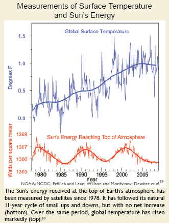
To make this statement, they must dispose of other possible causes, with variations in the sun being the most obvious. Here is the chart they use on page 20:
Wow, this one is even shorter than the glacier chart. I suppose they can argue that it is necessarily so, as they only have satellite data since 1978. But there are other sources of data prior to 1978 they could have used**.
I will show the longer view of solar activity in a minute, but let’s take a minute to think about the report’s logic. The chart tries to say that the lack of a trend in the rate of solar energy reaching Earth is not consistent with rising temperatures. They are saying – See everyone, flat solar output, rising temperatures. There can’t be a relationship.
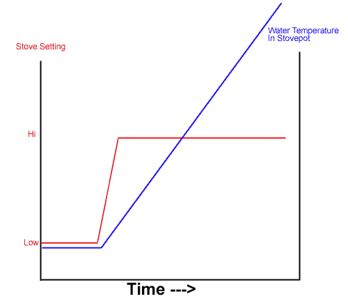
Really? Did any of these guys take basic thermodynamics? Let’s consider a simple example from everyone’s home — a pot on a stove. The stove is on low, and the water has reached an equilibrium temperature, well below boiling. Now we turn the stove up — what happens?
In this chart, the red is the stove setting, and we see it go from low to high. Prior to the change in stove setting, the water temperature in the pot, shown in blue, was stable. After the change in burner setting, the water temperature begins to increase over time.
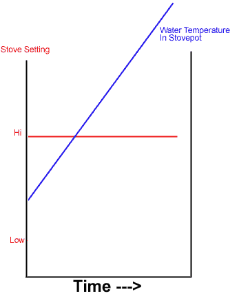
If we were to truncate this chart, so we only saw the far right side, as the climate report has done with the sun chart, we would see this:
Doesn’t this look just a little like the solar chart in the report? The fact is that the chart from the report is entirely consistent both with a model where the sun is causing most of the warming and one where it is not. The key is whether the level of the sun’s output from 1987 to present is a new, higher plateau that is driving temperature increases over time (like the higher burner setting) or whether the sun’s output recently is consistent with, and no higher than, its level over the last 100 years. What we want to look for, in seeking the impact of the sun, is a step-change in output near when temperature increases of the last 50 years began.
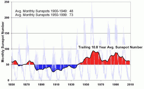
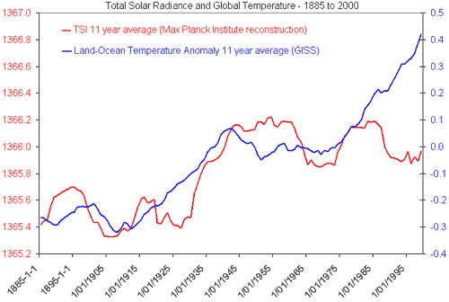
Does such a step-change exist? Yes. One way to look at the sun’s output is to use sunspots as a proxy for output – the more spots in a given 11 year cycle, the greater the sun’s activity and likely output. Here is what we see for this metric:
And here is the chart for total solar irradiance (sent to me, ironically, by someone trying to disprove the influence of the sun).
Clearly the sun’s activity and output experienced an upwards step-change around 1950. The average monthly sunspots in the second half of the century were, for example, 50% higher than in the first half of the century.
The real question, of course, is whether these changes result in large or small rates of temperature increase. And that is still open for debate, with issues like cloud formation thrown in for complexity. But it is totally disingenuous, and counts on readers to be scientifically illiterate, to propose that the chart in the report “proves” that the sun is not driving temperature changes.
**By this logic, they should only have temperature data since 1978 for the same reason, though by one of those ironies I am starting to find frequent in this report, all the charts, including this one, use flawed surface temperature records rather than satellite data. Why didn’t they use satellite data for the temperature as well as the solar output for this chart? Probably because the satellite data does not include upward biases and thus shows less warming. Having four or five major temperature indices to choose from, the team writing this paper chose the one that gives the highest modern warming number.

As always, one ~must~ remember: The effect can ~never~ overcome the cause.
Why are they saying temperatures have increased for 50 years? There are temperature records over 100 years old, and temperatures have increased since the end of the Little Ice Age.
Highlander, thanks, we get it. Now please move on.
Great work. This report reeks of propaganda. The co-author is an infamous fear monger.
The report’s assertions are bogus on their surface, but what you are doing is important- a claim-by-claim analysis.
Thanks for doing this.
Thanks for doing these analyses of this stuff – I read them often and was disappointed that you had stopped posting!
I love to read about how the global warming alarmists are using lies and propaganda to try to force their point across and spend all our tax money on their own agendas – but that’s where it gets depressing 🙁 – How can they keep doing it when the ‘science’ is so blatently false? – and the media and governments just keep nodding and putting their stuff out there!!!
Just thought I’d post to encourage you in your work and let you know that there are many of of us reading your stuff who are grateful for all your hard work 🙂
I’ve made the same point with people who get excited by the current solar minimum. Trying to equate the Maunder Miinimum with the current solar cycle ignores the fact that the Maunder Minimum occured over a period of 70 years, and was part of a larger solar cycle -The Gleisberg Cycle- which included the Sporer, Maunder, and Dalton Minimums. Add in the fact that global temps began falling around 1320 (about 300 years prior to the Maunder Minimum), and one gets the idea that both solar and climate parameters cover decades and centuries instead of years. The coldest decades of the LIA did occur during the Maunder Minimum, but global temps were already going in a negative direction. The current solar activity, while fascinating in and of itself, has occured over a time interval of only 18 months. The Maunder Minimum was 70 years in length.
I find it frustrating that climate alarmists (and some sceptics) use yards sticks now as short as seaons in order to justify thier narratives. Many years ago, climate scientists rarely looked time intervals less than 100 years. I hear that now it is 30 years, but many use yearly and seasonal intervals. What’s next, hourly?
JP,
I like to use the measure of whether my exposed skin is heating or cooling in realtime!!
Why is PMOD simply taken as fact and no mention ever made of ACRIM? Why? I simply don’t understand the intellectual dishonesty of claiming that solar irradiance simply “hasn’t increased” when are many who say this is not the case?
They should all see this:
http://yosemite.epa.gov/ee/epa/wkshp.nsf/vwpsw/84E74F1E59E2D3FE852574F100669688#video
The mental backwardness in this post is perhaps the most spectacular instance of it on this blog – and there’s a crowded field of competing examples. So you think that if you turn up a stove, the water temperature goes up without stopping? Test this out using a stove and a thermometer. Get an adult to help you.
And you think this pathetic and invalid analogy has anything to do with the climate? Good one! Denialist stupidity doesn’t get much worse.
And you can’t even see that the graph shows very clearly the minor influence of the Sun on climate over the past 100 years? It takes a very special calibre of retard to think that the TSI rise that stopped in 1950 would cause temperatures to start rising twenty years later.
“The mental backwardness in this post is perhaps the most spectacular instance of it on this blog – and there’s a crowded field of competing examples. So you think that if you turn up a stove, the water temperature goes up without stopping? Test this out using a stove and a thermometer. Get an adult to help you.”
LOL 😀 – Perhaps you haven’t done this nbit at school yet ‘H’unter (as opposed to ‘h’unter! 😉 )
What happens is… when you turn up the heat on the stove – the water temperature will increase untill it reaches its new set point where the heat being applied balances the amount of heat being lost! – If there is sufficient heat being applied to reach boiling point then the temperature will rise to boiling point (a clue – it varies with temperature and pressure 😉 ) until all the water is boiled away and the the temperature of the container will continue to increase again!
Hope this helps for a homework you may have to hand in later 😀
Hunter,
how many posts in a row are you allowed to make with no facts and filled with ad homs???
So you think that if you turn up a stove, the water temperature goes up without stopping?
You drew a conclusion in the complete absence of evidence.
Congratulations, you have hoisted yourself by your own petard.