In this post I want to address a minor point on chartsmanship. Everyone plays this game with scaling and other factors to try to make his or her point more effective, so I don’t want to make too big of a deal about it. But at some point the effort becomes so absurd it simply begs to be highlighted.
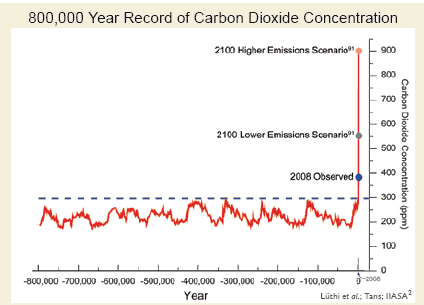
Page 13 of the GCCI report has this chart I have already seen circulating around the alarmist side of the web:

There are two problems here.
One, the compression of the X axis puts the lower and upper scenario lines right on top of each other. This really causes the higher scenario (which, at 900ppm, really represents a number higher than we are likely to see even in a do-nothing case) to visually dominate.
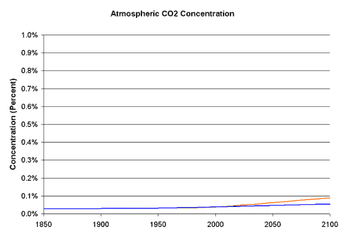
The other issue is that the Y-axis covers a very, very small range, such that small changes are magnified visually. The scale runs from 0% of the atmosphere up to 0.09% of the atmosphere. If one were to run the scale to cover a more reasonable range, he would get this (with orange being the high emissions case and blue being the lower case):

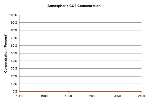
Even this caps out at just 1% of the atmosphere. If we were to look at the total composition of the atmosphere, we would get this:


I am really enjoying this series of posts, but I think you are way off on this one.
Why would you think that the total percentage of atmosphere is the relevant quantity? Would you say the same thing for other pollutants or poisons? (e.g. these paint chips are only .1% lead, so I don’t know why everyone is so upset that kids are eating them!)
The first graph, if accurate, simply shows that current and projected CO2 concentrations are way higher than they have been for hundreds of thousands of years, which is exactly what it is trying to show. The message is that we are entering terra incognita as far as CO2 levels. What’s the problem with that? Wouldn’t you agree?
Again, good work overall, but you missed badly on this one, as far as I can see. Am I missing something?
This page is titled “Planetary Temperatures and Atmospheric CO2” ; it has a useful chart showing how both have varied over the last 600 million years. I can’t vouch for the details but, from what I’ve read over the years, this looks valid. There’s also a link to a more extended presentation.
While Ed’s point above is valid (on % composition), we don’t actually appear to be entering “terra incognita”, just moving back up the slope of CO2 concentration to where it was roughly at the time of the dinosaurs’ extinction – just a few days ago, geologically speaking.
OT, but thinking about “deep time” reminded me of a helpful time scale chart that adds some perspective to discussions about “the way things are”; I found it at an economics site called The Sceptical Optimist:
Ed,
“The first graph, if accurate, simply shows that current and projected CO2 concentrations are way higher than they have been for hundreds of thousands of years, which is exactly what it is trying to show.”
The data on CO2 concentrations for the last few hundreds of thousands of years is not in agreement. That is, it is contentious with different factions believing in different max and min numbers based on different proxies. This group simply assumes the IPCC/Ice Core faction is correct and then makes a chart with the best propaganda techniques.
With what is reasonably supported from other proxies, the idea that the earth’s CO2 level would have been virtually monotonic between 200 and 280 ppm while the earth went through multiple ice ages with warm interregnums with temps comparable to now is simply ludicrous.
This graph uses a favorite alarmist trick that you havent mentioned – measure something one way for 800,000 years. Then measure it in a different and quite incomparable way for the last 50 years. This is regularly done with temperatures (the infamous spliced hockey stick) and CO2 by the IPCC (see my pages). The point is that any short-term spikes in CO2 in the past are smoothed out by diffusion in the ice cores, so you wouldn’t see them. In fact the graph is thoroughly dishonest, because the caption does not make it clear that the graph is from different methods. You have to look closely at note 2 and the references to see this.
ed, I’m afraid it is you who is way off with your lead analogy. Lead is poisonous, CO2 isn’t. And the first graph is not accurate, for the reason I’ve explained.
kuhnkat and PaulM,
Perhaps you are right, but the post was not about problems with the underlying data, it was about “chartmanship.” And I don’t see anything wrong with the chart at all as a clear and accurate presentation of the data.
Whether the data itself is faulty is another issue, entirely separate from any issues of poor “chartmanship” addressed in the post.
The issue with the chart is that it is designed to scare people in to taking an action they normally would not. Few people are going to re chart the data nor are they going to ask about data before 800,00 years ago.
A great example is the Wilkins ice shelf in Antarctica. The ice self is often portrayed as 1/5 of Antarctica and is about to break free of the continent. This done again to scare people in to thinking their favorite tropical island is about to be flooded. But how would people react when the correct picture is presented. Lets use the US as an example. I report that 1/5th of the US is about to fall in to the ocean. This area is called Cape Cod but it’s not the whole cape but just the tip. Americans wouldn’t take my claim seriously since most people know or can look at a US map and see Cape Cod isn’t 1/5th of the US. People aren’t going to do this with Antarctica.
Claims of ‘chartsmanship’ are just the infantile rantings of a pig-ignorant retard with a closed mind. Pathetic.
Ed,
since there are two data points tacked on your, assumed accurate, historic data that are, at the best, fictions of the imagination of the charters, you are wrong on that account also.
I’m a bit late in this conversation – but I would agree with Ed and I’m not sure I understand Hunter’s outburst. The lead analogy is accurate if you understand the the CO2/warming correlation factor and that small changes can lead to big effects – like with lead. 1% is extremely high and traps much more heat than say .5% since the amount of heat trapped is based on a logarithmic scale, not linear.
The second chart makes a small change look insignificant, when in fact it’s quite significant in terms of it’s ability to trap heat. The point here is that small changes in the relative percentage of CO2 concentration have significant impacts – the scales in the first chart are not alarmist at all – they are simply showing a scale where you can visualize the data.
Reference for warming rates: http://earthguide.ucsd.edu/globalchange/global_warming/03.html