Category Archives: Temperature Measurement

The Missing Heat

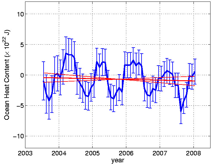
From Josh Willis, of the JPL, at Roger Pielke’s Blog:

we assume that all of the radiative imbalance at the top of the atmosphere goes toward warming the ocean (this is not exactly true of course, but we think it is correct to first order at these time scales).

This is a follow-up to Pielke’s discussion of ocean heat content as a better way to test for greenhouse warming, where he posited:

Heat, unlike temperature at a single level as used to construct a global average surface temperature trend, is a variable in physics that can be assessed at any time period (i.e. a snapshot) to diagnose the climate system heat content. Temperature  not only has a time lag, but a single level represents an insignificant amount of mass within the climate system.

It is greenhouse gas effects that might create a radiative imbalance at the top of the atmosphere.  Anyway, here is Willis’s results for ocean heat content.

Fig11  click to enlarge

Where’s the warming? 

Phoenix Sets Temperature Record. Kindof. Sortof.

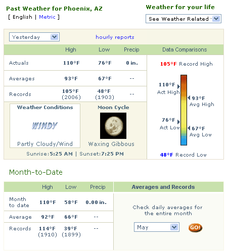
Yesterday, Phoenix set a new temperature record of 110F for May 19, exceeding the old record of 105F but well short of the May record (set in 1910) of 114F.

Temp2

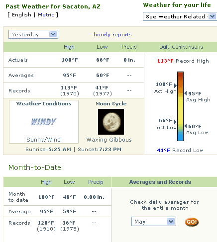
The media of course wants to blame it on CO2, but, if one really wants to assign a cause other than just normal random variation, it would be more correct to blame "pavement."  My son and I ran a series of urban heat island tests in Phoenix, and found evening temperatures at the official temperature measurement point in the center of town (at the airport) to be 8-10F higher than the outlying areas.  The daytime UHI effect is probably less, but could easily be 5F or higher.  As further evidence, a small town just outside of the Phoenix urban heat island, called Sacaton, was well short of any temperature records yesterday (Sacaton was the end point of our second, southerly, UHI temperature run).

Temp3

Here, by the way, is the site survey my son and I conducted on the Sacaton temperature measurement station.  Bruce Hall has a great analysis demonstrating that, contrary to what one might expect, we have actually been setting fewer new state temperature records than we have in the past.

Urban Heat Biases in Surface Temperature Measurement

One of my favorite bits of irony is that the primary defenders of using surface temperature measurement over space-based satellite measurements is … the Goddard Institute of Space Studies at NASA, and James Hansen (its director and friend-of-Al) in particular.  If find it amazing that people still want to use the GISS surface temperature numbers in preference to satellite figures, despite their proven biases and lack of consistent coverage.  But the GISS numbers give a higher number for warming (since they are biased upwards both by measurement biases and GISS-added adjustment factors) and that is what is important to global warming alarmists.  Its the "fake but accurate" meme brought to the realm of science.

But, since we do have to keep reminding people of the problems in surface temperature measurement, here is a study by Ren et al in 2008:

What was done
Noting that "a major divergence of views exists in the international climatological community on whether the urbanization effect still remains in the current global and regional average surface air temperature series," the authors employed a dataset obtained from 282 meteorological stations, including all of the ordinary and national basic and reference weather stations of north China, in order to determine the urbanization effect on surface air temperature trends of that part of the country over the period 1961-2000, dividing the stations into the following categories based on city size expressed in millions of people: rural (<0.05), small city (0.01-0.10), medium city (0.10-0.50), large city (0.50-1.00) and metropolis (>1.00).

What was learned
Ren et al. report that mean annual surface air temperature trends for the various station groups of north China over the 1961-2000 period — in degrees C per decade — were 0.18 (rural), 0.25 (small city), 0.28 (medium city), 0.34 (large city), 0.26 (metropolis), and 0.29 (national), which makes the urban-induced component of the warming trend equal to 0.07 (small city), 0.10 (medium city), 0.16 (large city), 0.08 (metropolis), and 0.11 (national), all of which results are significant at the 0.01 level.

The Zen and the Art of Surface Temperature Measurement

Readers of this blog will be familiar with the many problems of surface temperature measurement –  the measurement points are geographically spotty, of uneven quality, and are subject to a number of biases, the greatest of which is probably the encroachment of man-made urban environments on the measurement locations.  I have discussed these issues many places, including at the 1:00 minute mark of this video, in my book, and in posts here, here, and here.

I have not posted much of late on this topic, becuase I am not sure there is a lot of new news.  Satellites still make more sense than surface measurement, and the GISS still is working to tweak its numbers to show more and more warming, and Anthony Watts still finds a lot of bad measurement points.

In the last week, though, the story seems to be getting out further than just the online skeptic’s community.  Steven Goddard has a good article in the UK Register online.  I don’t think any of the issues he covers will be new to our readers, but it is a decent summary.  He focuses in particular on the GISS restatements of history:

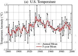
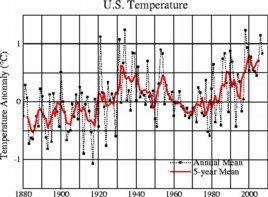
One clue we can see is that NASA has been reworking recent temperatures upwards and older temperatures downwards – which creates a greater slope and the appearance of warming. Canadian statistician Steve McIntyre has been tracking the changes closely on his Climate Audit site, and reports that NASA is Rewriting History, Time and Time Again. The recent changes can be seen by comparing the NASA 1999 and 2007 US temperature graphs. Below is the 1999 version, and below that is the reworked 2007 version.

US temperatures: NASA's 1999 version

NASA’s original data: 1999

US temperatures: NASA's 2007 version

NASA’s reworked data: 2007

This restatement is particularly hard to justify as direct inspection of the temperature measurement points reveals growing urban heat biases, which should imply, if anything, adjustments up in the past and/or down in the present, exactly opposite of the GISS work.  I have written a number of letters and inquiries asking the GISS what systematic bias they are finding/assuming that biased measurements upwards in rural times but downwards in urban times, but I have never gotten a response, nor seen one anywhere online.

HT:  Anthony Watts

Update:  Similar article here

"Particularly troubling are the years from 1986-1998. In the 2007 version of the graph, the 1986 data was adjusted upwards by 0.4 degrees relative to the 1999 graph. In fact, every year except one from 1986-1998 was adjusted upwards, by an average of 0.2 degrees. If someone wanted to present a case for a lot of recent warming, adjusting data upwards would be an excellent way to do it.

What is the Temperature?

It seems like a simple question:  What is the temperature.  Well, we know now that surface temperature measurement is really hard, since its hard to get good geographic coverage when oceans cover 3/4 of the world and biases are a huge problem when most of the measurement points we had in the year 1900 have been engulfed by cities and their urban heat islands.

But John Goetz brings us a new answer to the question, what is the temperature?  Answer:  Whatever the GISS wants it to be, and they seem to change their minds a lot.  He only has the last 2-1/2 years of GISS data but finds an astounding amount of variation in the data over these couple of years.  Excerpt:

On average 20% of the historical record was modified 16 times in the last 2 1/2 years. The largest single jump was 0.27 C. This occurred between the Oct 13, 2006 and Jan 15, 2007 records when Aug 2006 changed from an anomoly of +0.43C to +0.70C, a change of nearly 68%.

I was surprised at how much of the pre-Y2K temperature record changed! My personal favorite change was between the August 16, 2007 file and the March 29, 2008 file. Suddenly, in the later file, the J-D annual temperature for 1880 could now be calculated. In all previous versions the temperature could not be determined.

Spreading Peanut Butter

NASA’s GISS claims to have a statistical methodology to identify and remove urban biases.  After dealving into the numbers, it looks more like they are not removing urban biases, but spreading their effect around multiple stations like peanut butter.  My kids have a theory that I will not notice the fact they have not eaten their [fill in the blank] food if they spread it around the plant in a thin layer rather than leaving it in a single pile.  This seems to be NASA’s theory on urban measurement biases.  In addition, the GISS statistical methodology seems to be finding an unusual number of stations with a cooling bias, meaning that for some reason the instruments are actually less urbanized than say 50 years ago.

Steve McIntyre digs into some of these issues:

In my previous post, I calculated the total number of positive and negative NASA adjustments. Based on present information, I see no basis on which anything other than a very small proportion of negative urban adjustments can be assigned to anything other than “false local adjustments”. Perhaps there are a few incidents of vegetative cooling resulting in a true physically-based urban cooling event, but surely this would need to be proved by NASA, if that’s their position. Right now, as a first cut, let’s estimate that 95% of all negative urban adjustments in the ROW are not due to “true urban” effects i.e. about 1052 out of 1108 are due to “false local adjustments”….

If the purpose of NASA adjustments was to do station history homogenizations (a la USHCN), then this wouldn’t matter. But the purpose of the NASA adjustments was to adjust for the “true urban” effect”. On this basis, one can only conclude that the NASA adjustment method is likely to be completely ineffective in achieving its stated goal. As other readers have observed (and anticipated), it appears highly likely that, instead of accomplishing an adjustment for the “true urban effect”, in many, if not most cases, the NASA adjustment does little except coerce the results of one poorly documented station to results from other equally poorly documented stations, with negligible improvement to the quality of whatever “signal” may be in the data.

This does not imply that the NASA adjustment introduces trends into the data – it doesn’t. The criticism is more that any expectation of using this methodology to adjust for urban effect appears to be compromised by the overwhelming noise in station histories. Needless to say, the problems are exacerbated by what appears to be poor craftsmanship on NASA’s part – pervasive use of obsolete station versions, many of which have not been updated since 1989 or 1990(!), and use of population data that is obsolete (perhaps 1980 vintage) and known to be inaccurate.

This is the second part of this post, where Mcintyre first quantified the number of the "nreverse" urban bias adjustments:

negative urban adjustments are not an exotic situation. In the ROW, there are almost the same number of negative adjustments as positive adjustments. In the U.S., there are about 50% more positive adjustments as negative adjustments – again a noticeable difference to the ROW. Some commenters on my Peruvian post seemed to think that negative urban adjustments were an oddball and very anomalous situation. In fact, that’s not the case, negative adjustments are nearly as common as positive adjustments.

A Timely Post on Phoenix UHI

Steve McIntyre, in a timely post for this site given the recent project on Phoenix urban heat islands, has a post on the Phoenix adjustment in the GISS database and Hansen’s dicussion of Phoenix UHI in his 1999 paper. 

One is left to wonder whether a station that has a 2.5C error-corection adjustment tacked on should even be included in a data set that is attempting to measure a warming signal on the order of magnitude of 0.5C, particularly since any reasonable person would argue that the 2.5C adjustment likely has an error bar of at least plus or minus 0.5C.  I stand by my point that the signal to noise ratio in surface temperature measurement is terrible.

However, many GISS adjustments for site location and urbanization are negative, meaning urbanization has been reduced at the location since 1900, certainly an odd proposition.  In fact, if memory serves, the total net adjustment of all stations in the GISS system is negative for site location and urbanization.  I know, from here, the net USHCN adjustment for combined site location and urbanization is negative, adding 0.15F to current temperatures as compared to those in 1900, implying that site location quality has improved over time.  Anyway, McIntyre promises to tackle this issue tomorrow, which I look forward to.

It’s like a Whole New Post

If you have not visited my post lately on my son’s experiment on urban heat islands, go check it out, its like a whole new post.  Sixty comments and at least five updates.

I appologize to all the climate alarmist posters who have found my son’s project (to measure the Phoenix urban heat island) to be insufficiently rigorous.  I am sure all your baking-soda-and-vinegar volcanoes in 8th grade were much better done.

Measuring the Phoenix Urban Heat Island

Note Updates at the Bottom.  Could we please agree to actually read the whole post and the updates before commenting?  All commenters welcome, and I never delete comments except in the case of outright advertisement spam

This is a project my son did for Science Fair to measure the urban heat island effect in Phoenix.  The project could also be called "Disproving the IPCC is so easy, a child could do it."  The IPCC claims that the urban heat island effect has a negligible impact, even on surface temperature stations located within urban areas.  After seeing our data, this claim will be very hard to believe.

In doing the test, we tried to follow as closely as possible the process used in the Nyuk Hien Wong and Chen Yu study of Singapore as published in Habitat International, Volume 29, Issue 3 , September 2005, Pages 547-558.  We used a LogTag temperature data logger.  My son used a map and a watch to mark our times, after synchronizing clocks with the data logger, so he could match times to get temperature at each location.  I called out intersections as we passed them and he wrote down the times.  At the same time, I actually had a GPS data logger where I gathered GPS data for location vs. time, but I did not share this with him because he wanted to track locations himself on the map.  My data below uses the GPS data, which was matched with the temperature data in an Excel spreadsheet using simple Vlookup calls.

To protect the data logger from the 60mph wind  (we tried to drive at exactly 60 so my son could interpolate distances between intersections) we put the datalogger in a PVC Tee:

Temp2

We added some insulation to reduce the effect of heat from the car’s roof, and then strapped the assembly to the roof with the closed part of the Tee facing forward (the nose of the car is to the left in this picture).

Temp1

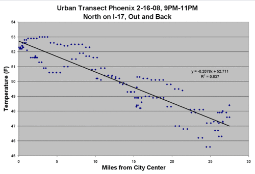
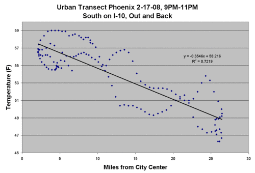
We drove transects two nights in a row.  Both nights were cloudless with winds below 5 mph.  Ideally, we would have driven between midnight and 6 AM, but this was my kid’s science project and he needs to get to bed so we did it from about 9PM to 11PM.  We were concerned that the air might still be cooling during the test, such that as we drove out from town, it might be easy to mix up cooling with time and cooling with location.  Our idea for correcting this was to drive and gather data on an entire loop, starting in the center of town, going about 30 miles out, and then returning to the starting point.  That way, with data taken in both directions, the results could be averaged and the cooling rate would cancel out.  As it turned out, we didn’t even bother to do the averaging.  The two trips can be seen in the plots, but the urban heat island shows through pretty clearly in the data and the slope of the line between temperature and distance was about the same on the inbound and outbound legs.

I used the GPS lat/long points to calculate the distance (as the crow flies) from the center of town (My son did it the hard way, using a tool on Google maps).

The first night we went north (click to enlarge):
Phoenixrun1

The second night we went south.  The urban profile going south is a little squirrellier, as the highway we were traveling tends to dip in and out of the urbanization.
Phoenixrun2

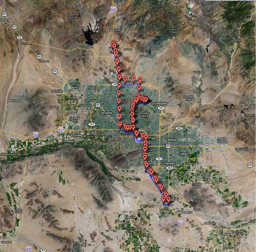
Here is the total route over the two nights.  I’m still trying to figure out the best way to plot the temperatures on the map (again, click to enlarge)
Gpsmap1

You can see the results.  Even at the too-early time of 9-11PM, the temperature fell pretty linearly by about 0.2-0.3 degrees F per mile from the city center (as the crow flies).

I would really love to do is to go down to Tucson and run this same test starting at the USHCN weather station there and driving outwards.  That may have to wait a few weeks until my job calms down a bit.

Update:  Per some emails I have received, it is theoretically possible for the urban heat island effect to be real and to have integrity in the surface temperature record.  The first way this could happen is if the official measurement stations are well sited and outside of growing urban heat islands.  I know for a fact by direct observation that this is not the case.  A second way this might be the case is if one argues that urban heat islands exist but their effect is static over time, so that they may bias temperatures but not the warming signal.  I also don’t think this is very credible, give growth of urban areas over the last 50 years.

A better argument might be that because most US temperature stations are arriving at daily temperature averages from just measuring daily min and max temperatures.  It might be arguable that while urban temperatures cool more slowly at night, they still reach the same Tmin in the early morning as the surrounding countryside.  Unfortunately, I do not think this is the case — studies like this one taken at 5AM have seen the same results.  But this is something I may pursue later, redoing the results at whatever time of day Phoenix usually hits its minimum temperature.

A good argument for the integrity of the surface temperature measurement system is NOT that scientists blind to local station installation details can use statistical tools to correct for urban biases.  After looking at two stations in the Arizona area, one urban (Tucson) and one rural (Grand Canyon) it appears the GISS statistical method, whatever this double-secret process may be [insert rant about government-funded research by government employees being kept secret] it actually tends to average biased sites with non-biased sites, which does nothing to get the urban bias out of the measured surface warming signal – it just spreads it around a little.  It reminds me a lot of my kids spreading the food they don’t like in a thin layer all over the plate, hoping that it will be less noticeable than when it sits in one place in a big pile. 

Again, I have not inspected their procedure, but looking at the results there seems to be a built-in assumption in the GISS algorithms that they expect an equal chance of a site being biased upwards vs. downwards.  In fact, I seem to see more GISS corrections fixing imagined downwards biases than upwards biases.  I just don’t see how this is a valid assumption.  The reality is that biases in outdoor temperature measurement are much more likely to be upwards than downwards, particularly over the last 50 years of urbanization and even more particularly given the fact that the preferred measuremnt technology, the MMTS station, has a very very short cable length that nearly gaurantees an installation near buildings, pavement, etc.

Update #2:  To this last point, consider this situation:  Thermometer one in the city shows 2 degrees of warming.  Thermometer two a few hundred kilometers away shows no warming.  Someone aware of urban biases without a dog in the hunt would, without other data to guide them, likely put their money on the rural site being correct and the urban site exaggerated or biased.  The urban site should be thrown out, not averaged in.  However, the folks putting the GISS numbers together are strong global warming believers.  They EXPECT to find warming, so when looking at the same situation, absolutely sure in their hearts there should be warming, the site with the 2 degrees of warming looks correct to them and the no warming site looks anomalous.  It is for this reason that the GISS methodology should be as public as possible, subject to full criticism by everyone.

Update #3:  I know that many commenters see one line or even a title to a post and jump to the comment section to bang out their rebuttal without reading the post. I typcally do not respond to such folks, but there are just so many here I feel the need to say:  Yes, the IPCC knows urban heat islands exist.  What I said, and I think it is true, is that the IPCC does not believe urban heat islands substantially bias the surface temperature record, and, if they do, their effect can be statistically corrected by approaches like that used by the GISS and discussed above in Update #1.  I admit that this experiment alone, even if the quality was perfect, would not disprove that notion, but it has to make one suspicious (skeptical, even?)  By the way, if you want to yell "Peterson!" at this point, see here.  The volume of interest, pro and con, on this post I think is going to motivate me to go down to Tucson and run the same test with this USHCN station as the urban starting point, and then we’ll see.

By the way, my point is clearly not, as some skeptical supporters might make out, that urban heat biases in surface temperature measurement account for all historical warming.  Clearly that is not true, as satellites, which do not have this urban bias problem, have measured real global warming, though at a lower rate than the surface temperature record.

Update #4:  To some of you commenters:  give me a break.  This is a junior high school science project funded with a $65 temperature logger and a half tank of gas.  I am sure the error bars are enormous and the R-squared probably has little meaning  (to tell the truth, Excel just put it there when I asked it to draw a trend line through the data).  Some of the data on the second run in particular looks weird to me and I would want to do a lot more work with it before I presented it to my PhD review board.  That being said, I would be happy to put it in front of said board next to the typical junior high baking soda and vinegar volcano project.

Given our constraints, I think we did a moderately thoughtful job of structuring the project– better, in fact, than the published Singapore study we emulated.  In particular, the fact that we did the run both ways tends to help us weed out the evening cooling effect as well as any progressive heating effect from the car itself.  I honestly had zero idea what we would find when we downloaded the data to the computer.  I kind of thought it would be a mess — remember, we were not really doing this at the right time of day.   It was not until my son did the charts using his position log he took by hand that I thoughy, "wow, there is a big effect here."   That is when I decanted the data from my GPS logger to check his results using a little more accurate position vs. time data and produced the charts here.  As I said, I really should have averaged position data for the forward and reverse runs, but I think the charts were fairly compelling.

Update #5:  The other half of my son’s project was to participate in the SurfaceStations.org survey of USHCN temperature stations.  He did a photo survey of two sites.  Below is a picture from the USHCN station at Miami, AZ.  Left as an exercise to the commenters who are defending the virtue of the US surface temperature netork:  Explain how siting the temperature instrument within six feet of a reflective metal building that is perfectly positioned to reflect the afternoon sun from the SW onto the instrument does not introduce any measurement biases.  As extra credit, explain why the black gravel and asphalt road and the concrete building 6 feet away don’t store heat in the day to then to warm up the air around the instrument at night as the heat re-radiates.

Miamifacingnorth1

More Surface Temperature Measurement Goofiness

I am still stunned that mainstream climate scientists continue to defend the suface temperature measurement record over much more sensible satellite measurement (mainly because the surface temperature readings give them the answer they want, rather than the answer that is correct).  However, since they do, we have to keep criticising until they change coarse.

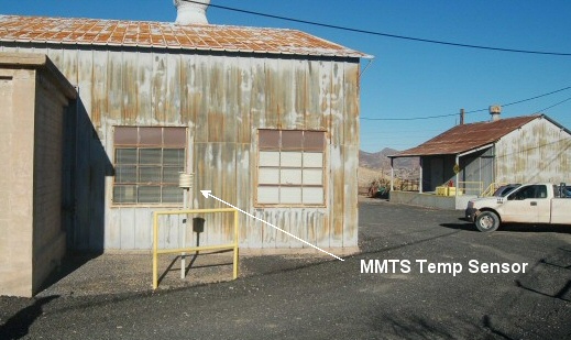
Via Anthony Watt is this temperature station in Lampassas, Texas, part of the USHCN and GISS data bases (meaning it is part of the official global warming record).

Lampasas_tx_ushcn

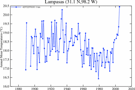
The temerpature instrument is in the white louvred cylindar in teh center.  This installation is wrong in so many ways:  in the middle of a urban heat island, near asphalt, next to a building, near car radiators, near airconditiong unit exhausts.  Could we possibly expect this unit to read correctly?  Well, here is the temperature plot:

Lampasas_tx_ushcn_plot

The USHCN data base says that this station moved here in the year 2000.  Hmmm, do you think that the temperature spike after 2000 is due to this site, or global warming.  By the way, the GISS calls it global warming.

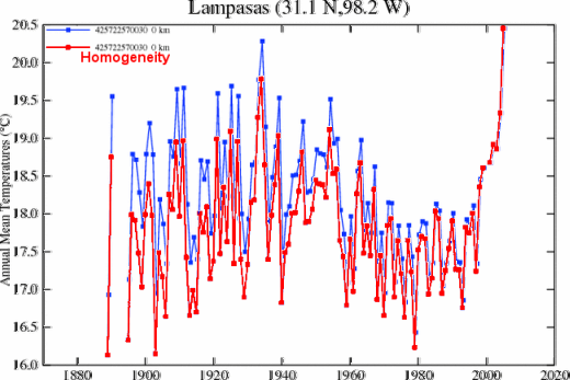
But James Hansen and others at the GISS defend this station and others to the death.  In fact, the GISS extrapolates temeprature trends not only for Lampassas but for hundreds of kilometers around this location from this one station.  Hansen has opposed Anthony Watt’s efforts to do a photo-survey of these stations, saying that his sophisticated statistical models can correct for such station biases without even seeing the station.  OK, let’s see how the adjust this station.  Their adjustment is in red:

Lampasas_giss_rawhomogen

According to the GISS, the temperatures since 2000 have been just fine and without any bias that needs correcting.  However, they seem to think that the temperature measurement in Lampassas in the 1920’s and1930’s (when Lampassas was a one horse town with no urbanization) was biased upwards somehow.  Why?  Well, we don’t know, but based on this adjustment, the GISS thinks this site has LESS urbanization today in this picture than in 1900.   The GISS adjustments have INCREASED the warming seen at this site.  Uh, right.

I think there is some bias that needs correcting, and the place to start may be in the GISS management.

A Junior High Science Project That Actually Contributes A Small Bit to Science

Tired of build-a-volcano junior high science fair projects, my son and I tried to identify something he could easily do himself (well, mostly, you know how kids science projects are) but that would actually contribute a small bit to science.  This year, he is doing a project on urban heat islands and urban biases on temperature measurement.   The project has two parts:  1) drive across Phoenix taking temperature measurements at night, to see if there is a variation and 2) participate in the surfacestations.org survey of US Historical Climate Network temperature measurement sites, analyzing a couple of sites for urban heat biases. 

The results of #1 are really cool (warm?) but I will save posting them until my son has his data in order.  Here is a teaser:  While the IPCC claims that urban heat islands have a negligible effect on surface temperature measurement, we found a nearly linear 5 degree F temperature gradient in the early evening between downtown Phoenix and the countryside 25 miles away.  I can’t wait to try this for myself near a USHCN site, say from the Tucson site out to the countryside.

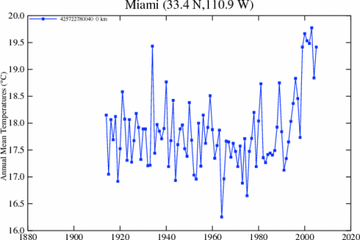
For #2, he has posted two USHCN temperature measurement site surveys here and here.  The fun part for him is that his survey of the Miami, AZ site has already led to a post in response at Climate Audit.  It turns out his survey adds data to an ongoing discussion there about GISS temperature "corrections."

Miami_az_mmts

Out-of-the-mouth-of-babes moment:  My son says, "gee, dad, doesn’t that metal building reflect a lot of heat on the thermometer-thing."  You can bet it does.  This is so obvious even a 14-year-old can see it, but don’t tell the RealClimate folks who continue to argue that they can adjust the data for station quality without ever seeing the station.

This has been a very good science project, and I would encourage others to try it.  There are lots of US temperature stations left to survey, particularly in the middle of the country.  In a later post I will show you how we did the driving temperature transects of Phoenix.

Update:  Here is the temperature history from this station, which moved from a more remote location away from buildings about 10 years ago.  I am sure the recent uptick in temperatures has nothing to do with the nearby building and asphalt/black rock ground cover.  It must be global warming.

Miami_az_giss_raw520

Irony

A few days ago, I wrote about sattelite temperature measurement:

Satellite temperature measurement makes immensely more sense – it has full coverage (except for the poles) and is not subject to local biases.  Can anyone name one single reason why the scientific community does not use the satellite temps as the standard EXCEPT that the "answer" (ie lower temperature increases) is not the one they want?  Consider the parallel example of measurement of arctic ice area.  My sense is that before satellites, we got some measurements of arctic ice extent from fixed observation stations and ship reports, but these were spotty and unreliable.  Now satellites make this measurement consistent and complete.  Would anyone argue to ignore the satellite data for spotty surface observations?  No, but this is exactly what the entire climate community seems to do for temperature.

Today in the Washington Post, Gavin Schmidt of NASA is pushing his GISS numbers that 2007 was really hot — a finding only his numbers support, since every other land and space-based temperature rollup for the earth shows lower numbers than his do.  As Tom Nelson points out, the Washington Post goes along with Schmidt in only using numbers from this one, flawed, surface temperature rollup and never mentions the much lower numbers coming from satellites.

But here is the real irony — does anyone else find it hilarious that #1 person trying to defend flawed surface measurement against satellite measurement is the head of the Goddard Institute for Space Studies at NASA?

Thoughts on Satelite Measurement

From my comments to this post on comparing IPCC forecasts to reality, I had a couple of thoughts on satellite temperature measurement that I wanted to share:

  1. Any convergence of surface temperature measurements with satellite should be a source of skepticism, not confidence.  We know that the surface temperature measurement system is immensely flawed:  there are still many station quality issues in the US like urban biases that go uncorrected, and the rest of the world is even worse.  There are also huge coverage gaps (read:  oceans).  The fact this system correlates with satellite measurement feels like the situation where climate models, many of which take different approaches, some of them demonstrably wrong or contradictory, all correlate well with history.  It makes us suspicious the correlation is a managed artifact, not a real outcome.
  2. Satellite temperature measurement makes immensely more sense – it has full coverage (except for the poles) and is not subject to local biases.  Can anyone name one single reason why the scientific community does not use the satellite temps as the standard EXCEPT that the "answer" (ie lower temperature increases) is not the one they want?  Consider the parallel example of measurement of arctic ice area.  My sense is that before satellites, we got some measurements of arctic ice extent from fixed observation stations and ship reports, but these were spotty and unreliable.  Now satellites make this measurement consistent and complete.  Would anyone argue to ignore the satellite data for spotty surface observations?  No, but this is exactly what the entire climate community seems to do for temperature.

Possibly the Most Important Climate Study of 2007

I have referred to it before, but since I have been posting today on surface temperature measurement, I thought I would share a bit more on "Quantifying the influence of anthropogenic surface processes and inhomogeneities on gridded global climate data" by Patrick Michaels and Ross McKitrick that was published two weeks ago in Journal of Geophysical Research – Atmospheres (via the Reference Frame).

Michaels and McKitrick found what nearly every sane observer of surface temperature measurement has known for years:  That surface temperature readings are biased by urban growth.  The temperature measurement station I documented in Tucson has been reading for 100 years or so.  A century ago, it was out alone in the desert in a one horse town.  Today, it is in the middle of an asphalt parking lot dead center of a town of over 500,000 people.

Here is what they did and found:

They start with the following thesis. If the temperature data really measure the climate and its warming and if we assume that the warming has a global character, these data as a function of the station should be uncorrelated to various socioeconomic variables such as the GDP, its growth, literacy, population growth, and the trend of coal consumption. For example, the IPCC claims that less than 10% of the warming trend over land was due to urbanization.

However, Michaels and McKitrick do something with the null hypothesis that there is no correlation – something that should normally be done with all hypotheses: to test it. The probability that this hypothesis is correct turns out to be smaller than 10-13. Virtually every socioeconomic influence seems to be correlated with the temperature trend. Once these effects are subtracted, they argue that the surface warming over land in the last 25 years or so was about 50% of the value that can be uncritically extracted from the weather stations.

Moreover, as a consistency check, after they subtract the effects now attributed to socioeconomic factors, the data from the weather stations become much more compatible with the satellite data! The first author thinks that it is the most interesting aspect of their present paper and I understand where he is coming from.

What they are referring to in this last paragraph is the fact that satellites have been showing a temperature anomaly in the troposphere about half the size of the surface temperature readings, despite the fact that the theory of global warming says pretty clearly that the troposphere should warm from CO2 more than the surface.

I will repeat what I said before:  The ONLY reason I can think of that climate scientists still eschew satellite measurement in favor of surface temperature measurement is because the surface readings are higher.  Relying on the likely more accurate satellite data would only increase the already substantial divergence problem they have between their models and reality.

Temperature Measurement Fact of the Day

Climate scientists know this of course, but there is something I learned about surface temperature measurement that really surprised me when I first got into this climate thing.  Since this is a blog mainly aimed at educating the layman, I thought some of you might find this surprising as well.

Modern temperatures sensors, like the MMTS that is used at many official USHCN climate stations, can theoretically read temperatures every hour or minute or even continuously.  I originally presumed that these modern devices arrived at a daily temperature reading by continuously integrating the temperature over a 24-hour day, or at worst averaging 24 hourly readings.

WRONG!  While in fact many of the instruments could do this, in reality they do not.  The official daily temperature in the USHCN and most other databases is based on the average of that day’s high and low temperatures.  "Hey, that’s crazy!" You say.  "What if the temperature hovered at 50 degrees for 23 hours, and then a cold front comes in the last hour and drops the temperature 10 degrees.  Won’t that show the average for the day around 45 when in fact the real average is 49.8 or so?"  Yes.  All true.  The method is course and it sucks. 

Surface temperature measurements are often corrected if the time of day that a "day" begins and ends changes.  Apparently, a shift form a midnight to say a 3PM day break can make a several tenths of degree difference in the daily averages.  This made no sense to me.  How could this possibly be true?  Why should an arbitrary begin or end of a day make a difference, assuming that one is looking at a sufficiently long number of days.  That is how I found out that the sensors were not integrating over the day but just averaging highs and lows.  The latter methodology CAN be biased by the time selected for a day to begin and end (though I had to play around with a spreadsheet for a while to prove it to myself).  Stupid. Stupid. Stupid.

It is just another reason why the surface temperature measurement system is crap, and we should be depending on satellites instead.  Can anyone come up with one single answer as to why climate scientists eschew satellite measurements for surface temperatures EXCEPT that the satellites don’t give the dramatic answer they want to hear?  Does anyone for one second imagine that any climate scientist would spend 5 seconds defending the surface temperature measurement system over satellites if satellites gave higher temperature readings?

Postscript:  Roger Pielke has an interesting take on how this high-low average method introduces an upwards bias in surface temperatures.

Surface Temperature Measurement Bias

Frequent readers will know that I have argued for a while that substantial biases exist in surface temperature records.  For example, I participated in a number of measurement site photo surveys, and snapped this picture of the measurement station in Tucson that has gotten so much attention:

Tucson1

Global warming catastrophists do not want to admit this bias, because it would undermine their headlines-grabbing forecasts.  In particular, they have spent the last year or two bragging that their climate models must be right because they do such a good job of predicting history.  So what becomes of this argument if it is demonstrated that the "history" to which their models correlate so well is wrong?  (In fact, their models correlate with history only because they are fudged and plugged to do so, as described here).

Ross McKitrick, a Canadian economist, performs a fairly simple and compelling test on recent surface temperature records.  The chief suspected source of bias is from urbanization.  The weather station above has existed in Tucson in one form or another for 100 years.  When it was first in place, it sat in a rural setting near a small town characterized by horses and dirt roads.  Now it sits in an asphalt parking lot near cars and buildings, a block away from a power station, in the center of a town of a half million people.

McKitrick looked at the statistical correlation between economic growth and local temperature records.  What he found was that where there was growth, there was warming;  where there was less growth, there was less warming.  He has demonstrated that the surface temperature warming signal correlates strongly with urbanization and growth:

Our new paper presents a new, larger data set with a more complete set of socioeconomic indicators. We showed that the spatial pattern of warming trends is so tightly correlated with indicators of economic activity that the probability they are unrelated is less than one in 14 trillion. We applied a string of statistical tests to show that the correlation is not a fluke or the result of biased or inconsistent statistical modelling. We showed that the contamination patterns are largest in regions experiencing real economic growth. And we showed that the contamination patterns account for about half the surface warming measured over land since 1980.

The half figure is an interesting one.  For years, it has been known that satellite temperature records, which look at the whole surface of the earth, both land and sea, have been showing only about half the warming as the surface temerpature records.  McKitrick’s work seems to show that the difference may well be in urban contamination of the surface data.

So how has the IPCC reacted to his work?  For years, the IPCC ignored his work and his comments on their reports.  Finally, in the last IPCC report they responded:

McKitrick and Michaels (2004) and [Dutch meteorologists] de Laat and Maurellis (2006) attempted to demonstrate that geographical patterns of warming trends over land are strongly correlated with geographical patterns of industrial and socioeconomic development, implying that urbanization and related land surface changes have caused much of the observed warming. However, the locations of greatest socioeconomic development are also those that have been most warmed by atmospheric circulation changes (Sections 3.2.2.7 and 3.6.4), which exhibit large-scale coherence. Hence, the correlation of warming with industrial and socioeconomic development ceases to be statistically significant. In addition, observed warming has been, and transient greenhouse-induced warming is expected to be, greater over land than over the oceans (Chapter 10), owing to the smaller thermal capacity of the land.

So the IPCC argues that yes, areas of high industrial and socioeconomic development do show more warming, but that is not because of urban biases on measurement but because of "atmospheric circulation changes" that happen to warm these same urban areas.  Now, this is suspicious, since Occam’s Razor would tell us to assume the most obvious result, that urbanization puts upwards bias on temperature readings, rather than on natural circulation patterns that happen to coincide with urban areas. 

But it is more than suspicious.  It is a complete fabrication.  The report, particularly at the cited sections, has nothing about these circulation patterns either showing that they coincide with areas of economic growth or that they tend to preferentially warm these areas.   And does this answer really make any sense anyway?  A recent study in California showed warming in the cities, but not in the rural areas.  Does the IPCC really want to argue that wind patterns are warming just LA and San Francisco but not areas just 100 miles away? 

Urban vs. Rural Warming

CO2 Science links to this study.  Climate catastrophists bend over backwards to try to argue that there are no such thing as urban heat islands.  But of course, whenever anyone gathers actual data rather than trying to use goofy computer model approaches, the answer is always the same:

To assess the validity of this assumption, LaDochy et al. "use temperature trends in California climate records over the last 50 years [1950-2000] to measure the extent of warming in the various sub-regions of the state." Then, "by looking at human-induced changes to the landscape, [they] attempt to evaluate the importance of these changes with regard to temperature trends, and determine their significance in comparison to those caused by changes in atmospheric composition," such as atmospheric CO2 concentration….

The three researchers found that "most regions showed a stronger increase in minimum temperatures than with mean and maximum temperatures," and that "areas of intensive urbanization showed the largest positive trends, while rural, non-agricultural regions showed the least warming." In fact, they report that the Northeast Interior Basins of the state actually experienced cooling. Large urban sites, on the other hand, exhibited rates of warming "over twice those for the state, for the mean maximum temperatures, and over five times the state’s mean rate for the minimum temperature."

I would have thought the following conclusion would have been a blinding glimpse of the obvious, but I guess it still needs to be said over and over:

LaDochy et al. write that "if we assume that global warming affects all regions of the state, then the small increases seen in rural stations can be an estimate of this general warming pattern over land," which implies that "larger increases," such as those found in areas of intensive urbanization, "must then be due to local or regional surface changes."