Category Archives: Temperature Measurement

Anthony Watts With Another Valuable Study

One of the oddities about climate science is just how hard it is to get research that actually goes out and gathers new empirical data.  Every climate scientist seems firmly rooted in the office tweaking their computer models, perhaps as an over-reaction to meteorology being historically mostly an observational science.  Whatever the reason, study after study masticates the same old 30 or 40 historical proxies, or tries to devine new information out of existing surface temperature records.  If you ever read Isaac Asimov’s book Foundation, you might remember a similar episode where a character is amazed that scientists no longer seek out new empirical data, but just manipulate data from previous studies.

The issue of how much urban heat islands bias surface temperature records is a case in point.  The two most prominent studies cited by the IPCC and the RealClimate.org folks to "prove" that urban heat islands don’t really exist are Peterson and Parker.  Parker in particular really bent over backwards to draw conclusions without actually gathering any new data:

One of the main IPCC creeds is that the urban heat island effect has a negligible impact on large-scale averages such as CRU or GISS. The obvious way of proving this would seem to be taking measurements on an urban transect and showing that there is no urban heat island. Of course, Jones and his associates can’t do that because such transects always show a substantial urban heat island. So they have to resort to indirect methods to provide evidence of “things unseen”, such as Jones et al 1990, which we’ve discussed in the past.

The newest entry in the theological literature is Parker (2004, 2006), who, once again, does not show the absence of an urban heat island by direct measurements, but purports to show the absence of an effect on large-scale averages by showing that the temperature trends on calm days is comparable to that on windy days. My first reaction to this, and I’m sure that others had the same reaction was: well, so what? Why would anyone interpret that as evidence one way or the other on UHI?

I have always wondered, why can’t someone just go out and measure?  It can’t be that expensive to send a bunch of grad students out with identical calibrated temperature instruments and simultaneously measure temperatures both inside and outside of a city.  At the same time, one could test temperatures on natural terrain vs. temperatures on asphalt.  A lot of really good data that would be critical to better correction of surface temperature records could be gathered fairly cheaply.

Well, no one is doing it, so it is left to an amateur, Anthony Watts, to do it on his own time.  Watts is the same person who, in frustration that the government bodies who maintained the surface historical temperature network kept no good information on instrument siting, set up a data base and a volunteer effort to fill the gap.  The project continues to go well and grow at SurfaceStations.org, but it could still use your help.

Anyway, here is what Anthony is doing:

My experiment plan is this; by simultaneously logging temperature data and GPS readings on my laptop, I’ll be able the create a transect line. The Gill shield has a custom window clip which allows me to mount on the passenger window. The shield will be “aspirated” by driving. Should I have to stop for a signal. the GPS data will indicate a pause, and any temp data from that spot due to heat from the vehicle or others nearby can be excluded.

The temperature sensor and A/D converter for it both have NIST calibration, making them far better than the accuracy of an MMTS, but with the same resolution, 0.1°F.

The reason for the setup now is that I’m heading to Indianapolis next week, which was one of the cities presented in a study at Pielke’s conference.  Plus that, Indianapolis is nearly perfectly flat and has transect roads that match the cardinal compass points.

According to Parker 2006, “The main impact of any urban warming is expected to be on Tmin on calm nights (Johnson et al. 1991)” so that’s what I’ll be testing. Hopefully the weather will cooperate.

Unfortunately, this need for amateurs to actually gather empirical data because the climate scientists are all huddled around the computer screen is not unique in this case.  One of the issues with proxy data like tree rings, which are used to infer past temperatures, is that past proxy studies are not getting updated over time.  Over the last several decades, proxy measures of temperatures have diverged from actual temperatures, raising the specter that these proxies may not actually do a very good job of reporting temperatures.  To confirm this, climate scientists really need to update these proxy studies, but they have so far resisted.  In part, they just don’t want to expend the effort, and in part I think they are afraid the data they get will cause them to have to reevaluate their past findings.

So, Steve McIntyre, another amateur famous for his statistical criticisms of the Mann Hockey Stick, went and did it himself.

Signal to Noise Ratio in Measuring Temperature

Well, posting has a been a bit light for what I hope is now a fairly obvious reason:  I have been working overtime just to get my climate video published.  Now that the video is out, I can get back to my backlog of climate material I want to post.

For a while, I have been fascinated with the topic of signal to noise ratio in climate measurement.  For most purposes, the relevent "signal" we are trying to tease out is the amount of warming we have seen over the last decades or century.  The "noise" consists of measurement inacuracies and biases.

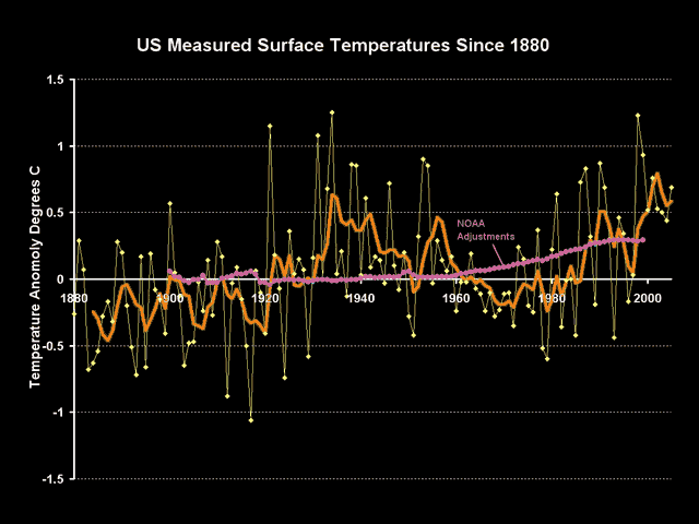
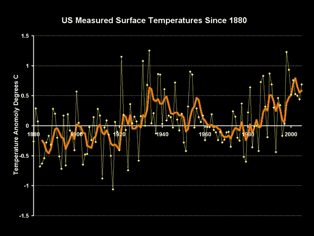
Here are the NASA GISS numbers for US temperature over the last century or so:

Adjust1

The warming trend is hard to read, with current temperatures relatively elevated vs. the last 120 years but still lower than the peaks of the 1930’s.  But we can learn something by going below the surface of these numbers.

These numbers, and in fact all numbers you will ever see in the press, are not the raw instrument measurements – they include a number of manual adjustments made by climate scientists to correct for both time of observation as well as changing quality of the measurement site itself.  These numbers include adjustments both from the NOAA, which maintains the US Historical Climate Network on which the nubmers are based, and from NASA’s GISS.  All of these numbers are guesstimates at best.

Though the GISS is notoriously secretive about revealing much about its temperature correction and aggregation methodologies, but the NOAA reveals theirs here.  The sum total of these adjustments are shown on the following chart in purple:

Adjust2

There are a couple observations we can make about these adjustments.  First, we can be relatively astonished that the sign on these adjustments is positive.  The positive sign implies that modern temerpature measurement points are experiencing some sort of cooling bias vs. history which must be corrected with a positive add-on.  It is quite hard to believe that creeping urbanization and poor site locations, as documented for example here, really net to a cooling bias rather than a warming bias (also see Steve McIntyre’s recut of the Peterson urban data here).

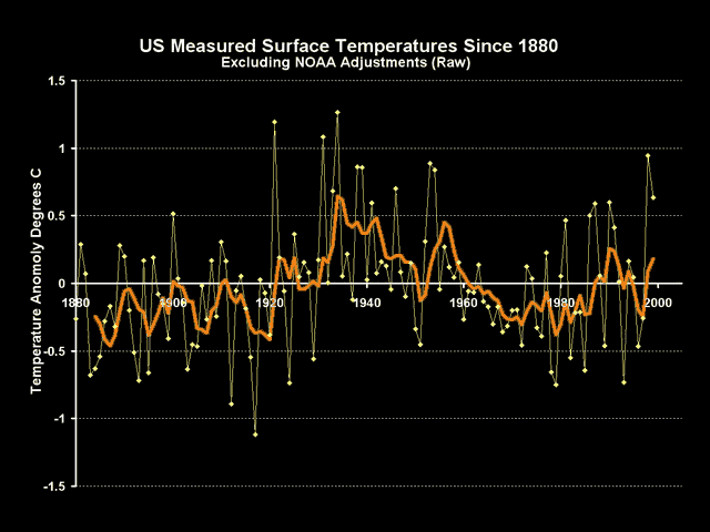
The other observation we can make is that the magnitude of these adjustments are about the same size as the warming signal we are trying to measure.  Backing into the raw temperature measurements by subtracting out these adjustments, we get this raw signal:

Adjust3

When we back out these adjustments, we see there is basically no warming signal at all.  Another way of putting this is that the entirety of the warming signal in the US is coming not from actual temeprature measurements, but from adjustments of sometimes dubious quality being made by scientists back in their offices.  Even if these adjustments are justifiable, and some like the time of observation adjustment are important, the fact is that the noise in the measurement is at least as large as the signal we are trying to measure, which should substantially reduce our confidence that we really know what is going on.

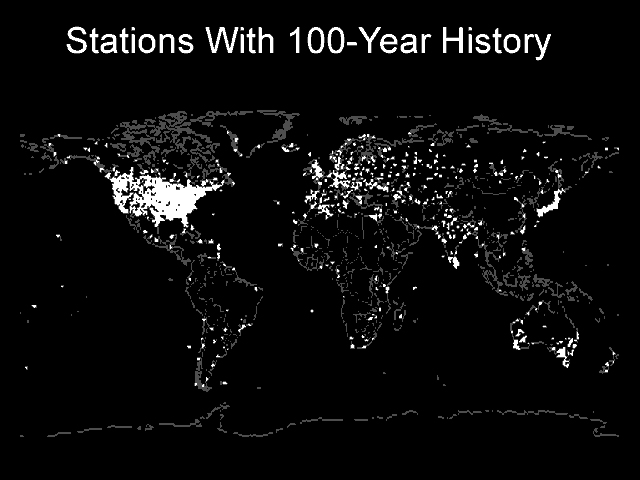
Postscript:  Yes, I know the US is just one part of the world.  But the US is the one part of the world with the best, highest quality temperature measurement system.  If signal to noise ratios are low here, then how bad are they in the rest of the world?  After all, we in the US do have some rural sites with 100 year temperature measurement histories.  No one in 1900 was measuring temperatures in rural Africa or China or Brazil.

World_100_yr_history_2

Temperature Measurement Integrity

If you aren’t worried about the integrity of historical temperature data under the care of folks like James Hansen, then you will be after reading this at Climate Audit.

Since August 1, 2007, NASA has had 3 substantially different online versions of their 1221 USHCN stations (1221 in total.) The third and most recent version was slipped in without any announcement or notice in the last few days – subsequent to their code being placed online on Sept 7, 2007. (I can vouch for this as I completed a scrape of the dset=1 dataset in the early afternoon of Sept 7.)

We’ve been following the progress of the Detroit Lakes MN station and it’s instructive to follow the ups and downs of its history through these spasms. One is used to unpredictability in futures markets (I worked in the copper business in the 1970s and learned their vagaries first hand). But it’s quite unexpected to see similar volatility in the temperature “pasts”.

For example, the Oct 1931 value (GISS dset0 and dset1 – both are equal) for Detroit Lakes began August 2007 at 8.2 deg C; there was a short bull market in August with an increase to 9.1 deg C for a few weeks, but its value was hit by the September bear market and is now only 8.5 deg C. The Nov 1931 temperature went up by 0.8 deg (from -0.9 deg C to -0.1 deg C) in the August bull market, but went back down the full amount of 0.8 deg in the September bear market. December 1931 went up a full 1.0 deg C in the August bull market (from -7.6 deg C to -6.6 deg C) and has held onto its gains much better in the September bear market, falling back only 0.1 deg C -6.7 deg C.

Note the volatility of historic temperature numbers.  Always with a steady bias – recent temepratures are adjusted up, older temperatures are adjusted down, giving a net result of more warming.  By the way, think about what these adjustments mean — adjusting recent temperatures down means that our growing urban society and hot cities are somehow introducing a recent cooling bias in measurement.  And adjusting older temepratures down means that in the more rural society of 50 years ago we had more warming biases than we have today.  Huh?

Grading US Temperature Measurement Sites

Anthony Watts has initiated a nationwide effort to photo-document the climate stations in the US Historical Climate Network (USHCN).  His database of documented sites continues to build at SurfaceStations.org.  Some of my experiences contributing to his effort are here and here.

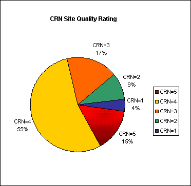
Using criteria and a scoring system devised years ago based on the design specs of the USHCN and use in practice in France, he has scored the documented stations as follows, with 1 being a high-conforming site and 5 being a site with many local biaes and issues.  (Full criterea here)

Crnrating

Note that category 3-5 stations can be expected to exhibit errors from 1-5 degrees C, which is huge both because these stations make up 85% of the stations surveyed to date and because this error is so much greater than the "signal."  The signal we are trying to use the USHCN to detect is global warming, which over the last century is currently thought to be about 0.6C.  This means that the potential error may be 2-8 times larger than the signal.  And don’t expect these errors to cancel out.  Because of the nature of these measurement problems and biases, almost all of these errors tend to be in the same direction – biasing temperatures higher – creating a systematic error that does not cancel out.  Also note that though this may look bad, this situation is probably far better than the temperature measurement in the rest of the world, so things will only get worse when Anthony inevitably turns his attention overseas.

Yes, scientists try to correct for these errors, but so far they have done so statistically without actually inspecting the individual installations.  And Steve McIntyre is doing a lot of work right now demonstrating just how haphazard these measurement correction currently are, though there is some recent hope that things may improve.

USA Only 2% of Earth’s Surface, But…

Several weeks ago, NASA was forced to restate downwards recent US temperature numbers due to an error found by Steve McIntyre (and friends).  The restatement reinforced the finding that the US really has not had much warming over the last 100 years.  James Hansen, emporer of the NASA data for whom the rest of us are just "court jesters" dismissed both the restatement and the lack of warming trend in the US as irrelevent because the US only makes up about 2% of the world’s surface. 

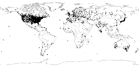
This is a fairly facile statement, and Hansen has to know it.  Three quarters of the earth’s surface is water for which we have no real long term temperature record of any quality.  Large masses like Antarctica, South America, and Africa have very few places where temperature has been measured for any long period of time.  In fact, via Anthony Watts, here is the world map of temperature measurement points that have data for all of the 20th century (of whatever quality):

Ghcn1900_4

So the US is irrelevent, is it?  There is some danger in trying to eyeball such things, but I would say that the US is about one-half to one-third of the world’s landmass that has continuous temperature coverage.  I won’t get into this today, but for all the quality issues that have been identified in US measurements (particularly upwards urban biases) these problems are much greater in the rest of the world.

Further to Hansen’s point that the US does not matter, here is a quote from Hansen last week (emphasis added)

Another favorite target of those who would raise doubt about the reality of global warming is the lack of quality data from South America and Africa, a legitimate concern. You will note in our maps of temperature change some blotches in South America and Africa, which are probably due to bad data. Our procedure does not throw out data because it looks unrealistic, as that would be subjective. But what is the global significance of these regions of exceptionally poor data? As shown by Figure 1, omission of South America and Africa has only a tiny effect on the global temperature change. Indeed, the difference that omitting these areas makes is to increase the global temperature change by (an entirely insignificant) 0.01C.

Look at the map!  He is now saying that the US, South America, and Africa are irrelevent to world temperatures.  And with little ocean coverage and almost no coverage in Antarctica before 1960, what are we left with?  What does matter?  How is he weighting his temperature aggregations if none of these matter?  Fortunately, the code is finally in the open, so we may find out.

A Good First Step: Hansen & GISS Release the Code

One of the bedrock principles of scientific inquiry is that when publishing results, one should also publish enough information about the experimental process so that others can attempt to replicate the results.  Bedrock principle everywhere, that is, except in climate science of course.  Climate researchers routinely refuse to release key aspects of their research that would allow others to replicate their findings — Mann’s refusal to release information about his famous "hockey stick" analysis even in the face of FOIA’s is just the most famous example.

A few weeks ago, after Steven McIntyre and a group of more-or-less amateurs discovered apparent issues in the NASA GISS temperature data, James Hansen and the GISS were forced to admit a programming error and restate some recent US temperatures (downwards).  As I wrote at Coyote Blog, the key outcome of this incident was not the magnitude of the restatement, but the presure it might put on Hansen to release the software code NASA uses to aggregate and adjust historical temperature measurements:

For years, Hansen’s group at GISS, as well as other leading climate scientists such as Mann and Briffa (creators of historical temperature reconstructions) have flaunted the rules of science by holding the details of their methodologies and algorithm’s secret, making full scrutiny impossible.  The best possible outcome of this incident will be if new pressure is brought to bear on these scientists to stop saying "trust me" and open their work to their peers for review.  This is particularly important for activities such as Hansen’s temperature data base at GISS.  While measurement of temperature would seem straight forward, in actual fact the signal to noise ration is really low.  Upward "adjustments" and fudge factors added by Hansen to the actual readings dwarf measured temperature increases, such that, for example, most reported warming in the US is actually from these adjustments, not measured increases.

I concluded:

NOAA and GISS both need to release their detailed algorithms and computer software code for adjusting and aggregating USHCN and global temperature data.  Period.  There can be no argument.  Folks at RealClimate.org who believe that all is well should be begging for this to happen to shut up the skeptics.  The only possible reason for not releasing this scientific information that was created by government employees with taxpayer money is if there is something to hide.

The good news is that Hansen has released what he claims to be the complete source code.  Hansen, with extraordinarily bad grace, has always claimed that he has told everyone all they need to know, and that it is other people’s fault if they can’t figure out what he is doing from his clear instructions.  But just read this post at Steve McIntyre’s site, and see the detective work that folks were having to go through trying to replicate NASA’s temperature adjustments without the code.

The great attention that Hansen has garnered for himself among the politically correct glitterati, far beyond what a government scientist might otherwise expect, seems to have blown his mind.  Of late, has has begun to act the little Caeser, calling his critic’s "court jesters," with the obvioius implication that he is the king.  Even in releasing the code he can’t resist a petulent swipe at his critics (emphasis added):

Reto Ruedy has organized into a single document, as well as practical on a short time scale, the programs that produce our global temperature analysis from publicly available data streams of temperature measurements. These are a combination of subroutines written over the past few decades by Sergej Lebedeff, Jay Glascoe, and Reto. Because the programs include a variety of
languages and computer unique functions, Reto would have preferred to have a week or two to combine these into a simpler more transparent structure, but because of a recent flood of demands for the programs, they are being made available as is. People interested in science may want to wait a week or two for a simplified version.

LOL.  The world is divided into two groups:  His critics, and those who are interested in science.

This should be a very interesting week.

Signal to Noise Ratio in Climate Measurement

There is a burgeoning grass roots movement (described here, in part) to better document key temperature measurement stations both to better correct past measurements as well as to better understand the quality of the measurements we are getting.

Steve McIntyre
has had some back and forth conversations with Eli Rabbett about temperature measurement points, each accusing the other of cherry-picking their examples of bad and good installations.  McIntyre therefore digs into one of the example temperature measurement points Rabbett offers as a cherry-picked example of a good measurement point.  For this cherry-picked good example of a historical temperature measurement point, here are the adjustments that are made to this site’s measurements before it is crunched up into the official historic global warming numbers:

Corrections have been made for:
– relocation combined with a transition of large open hut to a wooden Stevenson screen (September 1950) [ed:  This correction was about 1°C]
– relocation of the Stevenson screen (August 1951).
– lowering of Stevenson screen from 2.2 m to 1.5 m (June 1961).
– transition of artificial ventilated Stevenson screen to the current KNMI round-plated screen (June 1993).
– warming trend of 0.11°C per century caused by urban warming.

Note that these corrections, which are by their nature guesstimates, add up to well over 1 degree C, and therefore are larger in magnitude than the global warming that scientists are trying to measure.  In other words, the noise is larger than the signal.

Postscript:
  0.11C per century is arguably way too low an estimate for urban warming.