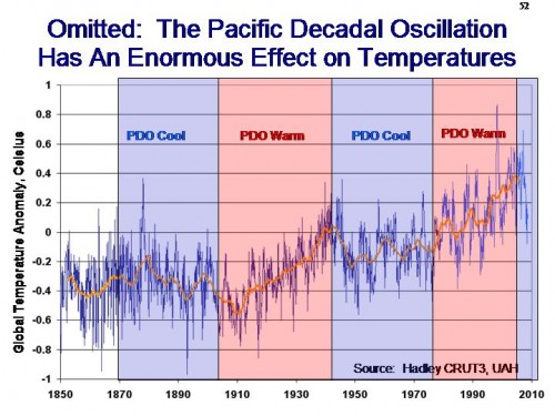
I have always been fascinated with the chart below, and the apparent strong correlation of global temperature changes and ocean cycles — particularly considering that ocean cycles are not included in climate cycles but never-the-less climate scientists act as if these models are accurate.
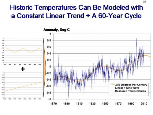
So, just for the fun of it, I tried to see if I could fit a linear trend plus a sine wave to historic temperature (similar to Klyashtorin and Lyubushin, 2003). This is what we might see if temperature were a function of a constant recovery from the little ice age plus ocean cycles. It is not the fit we would expect from an anthropogenic-driven model. This is what I got (temperature history a blend of Hadley CRUT3 and UAH satellite as shown here):
I didn’t spend a lot of time on it, and this is what I got — about 0.04C per decade linear trend plus a cycle. This is one of those things that I can’t figure out if it is insightful or meaningless, but I thought I would share it with you this holiday week, since things are slow around the office here.
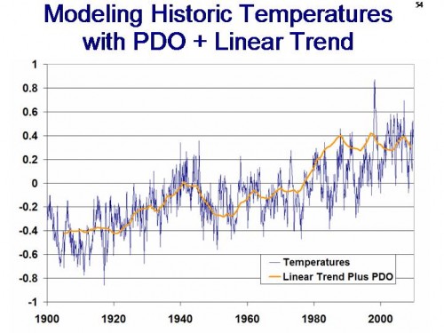
As a final set, I tried it again with a linear trend plus the PDO.
Update: The formula for the first chart is -0.55+0.005*(year-1861)+0.145*cos((2*pi*(year-1861)/64.1453)-1.8)
The formula for the second chart is -0.05+0.008*(year-1900)+0.2*PDO


If you could figure out how this graph indicates that the earth is in danger, you modeling skills could make you very rich.
Just wondering about the PDO cycles.
Where does this data come from?
It looks to be somewhat at variance with previous PDO numbers I have seen.
Something related that might interest you is David Stockwell’s EMD work over at Niche Modeling, just in case you haven’t seen it have a look at:
http://landshape.org/enm/emd-and-natural-variation/
Tony Hansen – I assume the PDO numbers are from http://jisao.washington.edu/pdo/
But they look different due to the linear trend which was added here.
I saw the same thing in the data. One thing to be aware of is that you need to have an equal number of full cycles or the trend will be biased. This is why the temp data looks like it’s rising so fast. The start points for even the sat data are near the bottom of the cycle. Same goes for data sets starting in 1900.
For a back of the envelope check look at the change in peak values on the 60 yr cycle. from about 1950 till now it changes by eyeball about .3 or thereabouts. That give you about .05 per decade.
OTOH, the peak to trough (including the trend) is about .1 over 30 yrs. So we should see a minimum occur at about .2 in about 2030. assuming there are no longer cycles/
What are the correlation values?
The stench grows – Lord Stern has his snout deep in the trough:
http://climategatestuff.wordpress.com/