To some extent, 1000-year temperature histories are moderately irrelevent to modern global warming discussions. In fact, it is fairly amazing that the evidence of tree rings and such over 1000 years is discussed more than the instrumental record of the last 100, which tends to undercut most catastrophic warming forecasts. However, catastrophists have attempted to use these past temperature reconstructions to make the argument that temperatures were incredibly stable and low right up to the point that man has made them higher and less stable in the last 100 years. For this reason it is worth discussing them, if only to refute this conclusion.
I won’t go into a lengthy discussion of historical reconstructions, as I alread have in my book and in my movie (both free online). In this post I just want to talk about one issue: the splice.
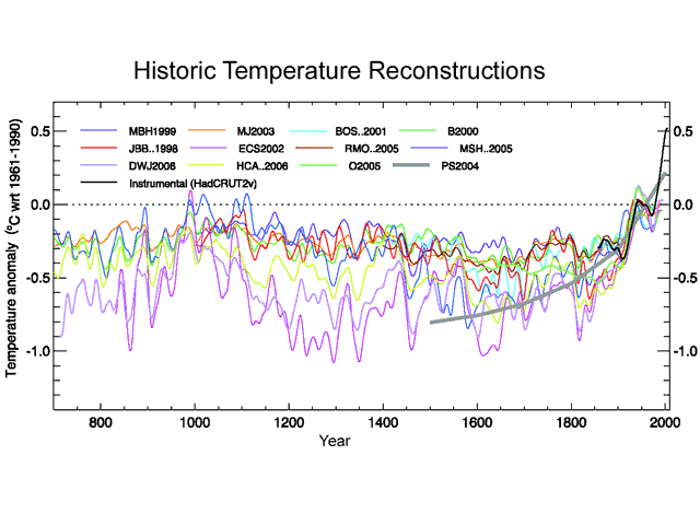
Below is the 1000-year temperature reconstruction (from proxies like tree rings and ice cores) in the Fourth IPCC Assessment. It shows the results of twelve different studies, one of which is the Mann study famously named "the hockey stick."
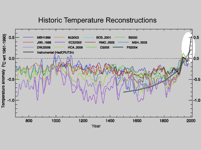
Among many issues, I pointed out the fact that this chart appends or splices the black line, actual measured temepratures, onto the colored lines, which are the historical temperature reconstructions from proxies.
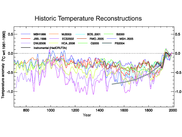
I made the point that this offended by scientific training: When one gets an inflection point right at the place where two data sources are spliced, as is the case here, one should be suspicious that maybe the inflection is an artifact of mismatches in the data sources, and not representative of a natural phenomenon. And, in fact, when one removes the black line from measured temperatures and looks at only proxies, the hockey stick shape goes away:
The other day I discovered that this inflection point is a fairly old criticism (no surprise, I never claim to be original). Old enough, in fact, that Michael Mann and the folks at realclimate.org have fired back:
No researchers in this field have ever, to our knowledge, "grafted the thermometer record onto" any reconstruction. It is somewhat disappointing to find this specious claim (which we usually find originating from industry-funded climate disinformation websites) appearing in this forum.
The guys at realclimate are just so cute with the "industry-funded climate disinformation" attack — they remind me of the Soviets and how they used to blame everything on CIA plots. I can say that 1) I recognized this problem on my very own after about 20 seconds of looking at the graph and 2) I have yet to recieve my check from the industry cabal.
It turns out, however, that this is wildly disingenuous. What they mean is that none of the colored lines include gauge measures grafted onto older proxy data. But I never really accused them of that. Interestingly, Steve McIntyre argues that even this claim is wrong, and some of the colored lines do include spliced-on gauge measures.
But my point, which Mann has never refuted or addressed, is that whether the proxy lines themselves include grafted data or not, the proxy lines are NEVER shown to the public or to policy makers without the gauge temperature line added to the chart. Have you ever seen the proxy lines as they are in my third chart above without the 20th century gauge temperature line? If in policy discussions and media reports, this gauge temperature line is always included on the graphs in a way that it looks like an extention of the proxy series, then effectively they are grafting the data sets together in every discussion that really matters.
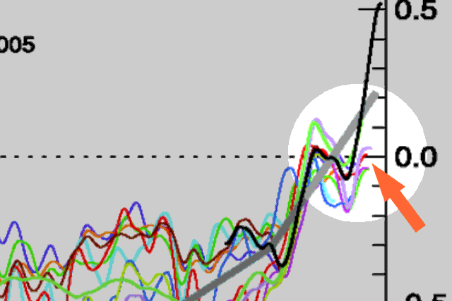
By the way, it is fairly easy to demonstrate that the proxy studies and the gauge temperature measurements do not represent consistent and therefore mergeable data sets. Over hundreds of years, we have developped a lot of confidence that the linear thermal expansion of mercury in a glass tube is a good proxy for temperatures. We have not, however, developped similar confidence in bristle cone pine tree rings, whose thickness can be influenced by everything from soil and atmospheric composition to precipitation. Lets look at a closeup of the graph above:
You can see that almost all of the proxy data we have in the 20th century is actually undershooting gauge temperature measurements. Scientists call this problem divergence, but even this is self-serving. It implies that the proxies have accurately tracked temperatures but are suddenly diverting for some reason this century. What is in fact happening are two effects:
-
Gauge temperature measurements are probably reading a bit high, due to a number of effects including urban biases
-
Temperature proxies, even considering point 1, are very likely under-reporting historic variation. This means that the picture they are painting of past temperature stability is probably a false one.
All of this just confirms that we cannot trust any conclusions we draw from grafting these two data sets together.
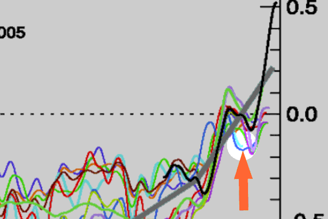
By the way, here is a little lesson about the integrity of climate science. See that light blue line? Here, let’s highlight it:
For some reason, the study’s author cut the data off around 1950. Is that where his proxy ended? No, in fact he had decades of proxy data left. However, his proxy data turned sharply downwards in 1950. Since this did not tell the story he wanted to tell, he hid the offending data by cutting off the line, choosing to conceal the problem rather than have an open scientific discussion about it.
The study’s author? Keith Briffa, who the IPCC named to lead this section of their Fourth Assessment.
More discussion on this topic can be found in my book and in my movie (both free online).

What keeps scientists honest is the fact that if they lie about an experimental result, they risk my repeating the experiment and proving them wrong. But Climate Science isn’t a science in the sense of having controlled experiments; it depends on mere observations. So to keep the “scientists” honest, their observations must be made openly available for auditing. It’s so fundamental a point that one would be justified in rejecting all “data” that fails to meet this test in a reasonable time.
i agree with the above commetn climate science is observations and if scientists arent truly honest with wat they report then people wont trust scientists anymore
Excellent article. I’m going to link it.