I thought this post by Steve McIntyre at Climate Audit was pretty amazing, even by the standards of climate science.
We begin with a felt need by fear mongers to link CO2 and global warming to bad stuff, in this case a decline of growth or calcification rates on the Great Barrier Reef. So, abracadabra, some scientist-paladins generate this, which is eaten up by the media:
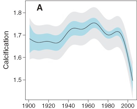
Wow, that looks bad. And if we stop there, we can write a really nice front-page article full of doom and gloom. Or we can do some actual science. First, lets pull back and look at a longer trend:
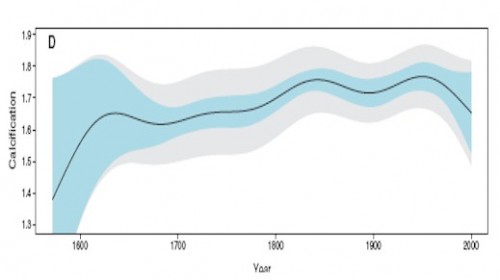
Hmmm. That looks kind of different. Like the recent decline is by no means unprecedented, and that in fact one might call the 1850-1950 levels, rather than the recent drop, the anomaly. This latter is a tough question, of course, in all of climate science. Just what is normal?
Anyway, we can go further. McIntyre notices the plot looks awfully smooth. What if we were to move out of USA Today mode and look at the raw data rather than a pleasantly smooth graph. This is what we would see:
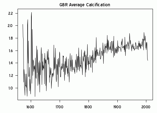
Wow, that looks really different. That must be some amazing smoothing algorithm they used. Because what I see is a generally increasing trend in reef growth, with a single low number in 2005. Rather than being some change in slope in the whole trend, as portrayed in the smoothing, this is a single one-year low data point. (It turns out there are several smoothing approaches one can take that put inordinate value on the end point — this was a trick first found in Mann’s hockey stick trying to make hay of the 1998 high temperature anomaly).
I think just looking at the raw data would cause any reasonable person to shake their head and determine that the author’s were grossly disingenuous in their smoothing and conclusions. But, as they say on TV, “Wait, there’s more.”
Because it turns out the 2005 drop seems to be less a function of any real drop but in fact due to serious gaps in the data set. The black line is a close-up of the raw growth data, while the pink area is the size of the measurement data set used, with its scale on the right.
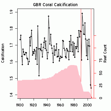
Just by the strangest of coincidences, the large drop in 2005 occurs at the same time the number of data points in the data set drops down to 2! While most of the data has been driven by measurement of 40 or more reefs, the key two years that drive the entire conclusion come from just 2 reefs? This is the worst possible science. Most real scientists would have dropped out the last several years and probably would have dropped all the data since about 1990. Or else go out and get themselves some more freaking data. It is easily possible, in fact quite likely, that the 2005 drop was due to mix, as high growth measurement site were dropped out of the data set, leaving only lower growth sites in the average. These changes in mix say absolutely nothing about underlying growth rates.
I am just visually integrating the pink curve, but its reasonable to guess that there are about 600 measurements in the post 1980 period when the averaged trend in the first chart above turns down. Somehow these guys have come up with a methodology that allows 4-5 measurements in 2004-5 to grossly outweigh the other 600 and pull the whole curve down. Unless there is something I do not understand, this borders on outright fraud. This can’t be accidental – the authors simply had to understand the game they were playing here.
Update: Here is another interesting one — An apparent increase spike in ocean heat content:
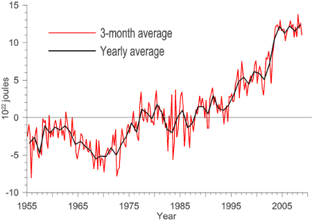
Just coincidentally turns out to exactly coincide with a change in the source for the data. The jump occurs exactly at the splice between two data sets. And everyone just blithely accepts this jump as a physical fact??

This is particularly hard to accept, as the ARGO data set (the newer data) has shown flat to declining ocean heat content since the day it was turned on. So what is the justification for the spike at the splice?

Assume fraud. This is about politics. Remember, the hockey stick was produced in response to an e-mail request that “we have to get rid of the MWP”. We haven’t gotten an honest presentation of the facts on a political issue in decades. Pick an issue and note that the pitch is just one lie after another — health care, global warming, the “stimulus” bill, gitmo torture, quagmire in Iraq, “jobless” recovery, tax cuts for the rich, women “earn only 70 cents”, 3 million homeless, etc, etc, etc. — the hits just keep on coming.
Why should global warming propaganda be any different than the presentation for every other political issue?
I saw Steve’s post on this Sunday but was not quite sure what he was getting at. Your explanation makes it clear what Steve discovered and the significance of it. Thanks.
AGW is dumbing down science, and rather badly.
This coral issue is an example of how, if every answer to every question is “AGW”, then many questions are not really researched very deeply.
Linky Linky!
There is no link to the Climate Audit article… which would be nice. Of course… it probably takes less effort to search for it than write this post.
And it certainly was!
http://www.climateaudit.org/?p=6189
There is no opinion, however absurd, which men will not readily embrace as soon as they can be brought to the conviction that is is generally adopted.
(Schopenhauer , Die Kunst Recht zu Behalten )
For a erudite appraisal may I commend An Appeal to Reason
A Cool Look at Global Warming 2008 Nigel Lawson Former UK Chancellor Of the Exchequer and Secretary of State for Energy. ISBN 978-0-7156-3786-9 (UK) 978-1-5902-0084-1 (US)
I have a serious question concerning climate warming in the last few hundred years, that has been unable to be refuted at various global warming websites. It appears to explain a great deal about T trends, and concerns heat lag effects following a peak of solar activity in the mid 20 century:
1) Average daily heat lags are around 2 hours after peak solar incoming rays (about 2-3pm, after a peak around noon). This relates to a lag around 20-25% of total time of warming from dawn.
2) Average annual highest T occurs about 6 weeks after the longest day of the year, again around 20-25% of total warming trend since the winter solstice.
My question is: when this 20-25% is applied to the total warming trend of the sun from around 1750-1950, suggests a lag heat effect of T of around 40-60 years, peaking around the early 2000s, which is exactly what is observed.
This seems to me a simple and powerful explanation of the entire solar warming trend, inclduing the T flattening that is currently occurring, withouth needing to invoke C02.
Also, the lag effect of 40-60 years after peak solar activity shows more warming in the latter 20th century in the northern hemisphere, which is expected since there is less ocean in the northern hemisphere.
Also, from this model, predictions can be made over the next 20 years, at least, since the sun has now waned slightly
1) Northern hemisphere should not warm much over the next 20 years (well below IPCC forecasts). Current T flattening suggests ocean-land equilibrium has been reached in the northern hemisphere.
2) Southern hemisphere T may continue to warm slightly, since the larger area of ocean may still exhibit a heat lag effect.
3) Overall T should not increase much over the next few decades, if the sun is dominating climate change since ~1750-2000s.
Note also: flattening of T around the 1950-70s relates to absorption by the oceans, paralleling a flattened, sustained peak in solar activity. Lag heat then kicked in from the 1980s-2000s. This heat lag effect should be now, largely over.
I have never seen this conceptual model mentioned or debated, that is:
that the lag heat effect in the latter 20th century relates to the ENTIRE warming trend of solar activity since ~1750-1950, ie, the total area under the curve of rising solar activity since 1750, ( and including flatenned solar activity since 1950), and not short term solar activity peaks and troughs, as depicted in various research papers (eg Usoskin 2005, Haigh 2003 etc).
This model could explain much, including why many global warming websites point to the period 1978-1998 as being unexplanable by flattened solar activity, withouth examining the longer term heat lag effect on earth of about 40-60 years, from the ENTIRE warming trend from ~1750-1950.
Could a serious scientists have a look at this. Every day on earth this time lag of 20-25% occurs, in average daily peak