
Cross-posted from Coyoteblog
At Real Science, Steven Goddard claims this is the coolest summer on record in the US.
The NOAA reports that both May and June were the hottest on record.
It used to be the the media would reconcile such claims and one might learn something interesting from that reconciliation, but now all we have are mostly-crappy fact checks with Pinocchio counts. Both these claims have truth on their side, though the NOAA report is more comprehensively correct. Still, we can learn something by putting these analyses in context and by reconciling them.
The NOAA temperature data for the globe does indeed show May and June as the hottest on record. However, one should note a couple of things
- The two monthly records do not change the trend over the last 10-15 years, which has basically been flat. We are hitting records because we are sitting on a plateau that is higher than the rest of the last century (at least in the NOAA data). It only takes small positive excursions to reach all-time highs
- There are a number of different temperature data bases that measure the temperature in different ways (e.g. satellite vs. ground stations) and then adjust those raw readings using different methodologies. While the NOAA data base is showing all time highs, other data bases, such as satellite-based ones, are not.
- The NOAA database has been criticized for manual adjustments to temperatures in the past which increase the warming trend. Without these adjustments, temperatures during certain parts of the 1930’s (think: Dust Bowl) would be higher than today. This was discussed here in more depth. As is usual when looking at such things, some of these adjustments are absolutely appropriate and some can be questioned. However, blaming the whole of the warming signal on such adjustments is just wrong — satellite data bases which have no similar adjustment issues have shown warming, at least between 1979 and 1999.
The Time article linked above illustrated the story of these record months with a video partially on wildfires. This is a great example of how temperatures are indeed rising but media stories about knock-on effects, such as hurricanes and fires, can be full of it. 2014 has actually been a low fire year so far in the US.
So the world is undeniably on the warm side of average (I won’t way warmer than normal because what is “normal”?) So how does Goddard get this as the coolest summer on record for the US?
Well, the first answer, and it is an important one to remember, is that US temperatures do not have to follow global temperatures, at least not tightly. While the world warmed 0.5-0.7 degrees C from 1979-1999, the US temperatures moved much less. Other times, the US has warmed or cooled more than the world has. The US is well under 5% of the world’s surface area. It is certainly possible to have isolated effects in such an area. Remember the same holds true the other way — heat waves in one part of the world don’t necessarily mean the world is warming.
But we can also learn something that is seldom discussed in the media by looking at Goddard’s chart:
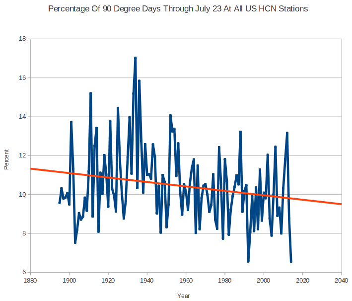
First, I will say that I am skeptical of any chart that uses “all USHCN” stations because the number of stations and their locations change so much. At some level this is an apples to oranges comparison — I would be much more comfortable to see a chart that looks at only USHCN stations with, say, at least 80 years of continuous data. In other words, this chart may be an artifact of the mess that is the USHCN database.
However, it is possible that this is correct even with a better data set and against a backdrop of warming temperatures. Why? Because this is a metric of high temperatures. It looks at the number of times a data station reads a high temperature over 90F. At some level this is a clever chart, because it takes advantage of a misconception most people, including most people in the media have — that global warming plays out in higher daytime high temperatures.
But in fact this does not appear to be the case. Most of the warming we have seen over the last 50 years has manifested itself as higher nighttime lows and higher winter temperatures. Both of these raise the average, but neither will change Goddard’s metric of days above 90F. So it is perfectly possible Goddard’s chart is right even if the US is seeing a warming trend over the same period. Which is why we have not seen any more local all-time daily high temperature records set recently than in past decades. But we have seen a lot of new records for high low temperature, if that term makes sense. Also, this explains why the ratio of daily high records to daily low records has risen — not necessarily because there are a lot of new high records, but because we are setting fewer low records. We can argue about daytime temperatures but nighttime temperatures are certainly warmer.
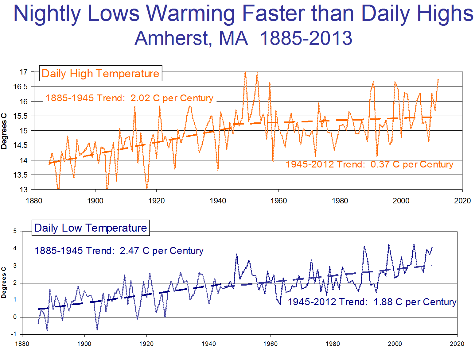
This chart shows an example with low and high temperatures over time at Amherst, MA (chosen at random because I was speaking there). Note that recently, most warming has been at night, rather than in daily highs.
http://www.gizmag.com/suns-activity-influences-natural-climate-change/33409/
Do you mind if I quote a few of your articles as long as I provide credit and sources back to your weblog?
My blog is in the very same area of interest as yours and my users would definitely benefit from some of the information you present here.
Please let me know if this okay with you. Many thanks!
Awesome article.
Today, I went to the beachfront with my kids. I found a
sea shell and gave it to my 4 year old daughter and said “You can hear the ocean if you put this to your ear.” She placed the shell to her ear and screamed.
There was a hermit crab inside and it pinched her ear.
She never wants to go back! LoL I know this is totally off topic but I had to
tell someone!
Howdy, i read your blog from time to time and i own a similar one and i was just wondering if you get a lot of spam responses?
If so how do you protect against it, any plugin or anything you can recommend?
I get so much lately it’s driving me crazy so any support is very much appreciated.
Nice blog here! Also your web site loads up fast!
What host are you using? Can I get your affiliate link to your host?
I wish my site loaded up as fast as yours lol
magnificent points altogether, you just gained a new reader.
What could you recommend in regards to your submit that
you just made some days in the past? Any sure?
I like what you guys are up too. This sort of clever work and coverage!
Keep up the wonderful works guys I’ve you guys to blogroll.
Great post. I was checking constantly this blog and I am impressed!
Extrmely useful information specifically the last part 🙂
I care for suich information a lot. I was looking for this
particular info for a very long time. Thank you and good luck.
I for all time emailed this web site post page to all my associates, as if like to read it
afterward my friends will too.
Awesome post.
Incredible story there. What happened after? Thanks!
Do you mind if I quote a couple of your articles as long
as I provide credit and sources back to your
site? My website is in the very same area of interest as yours and my
users would certainly benefit from some of the information you present here.
Please let me know if this alright with you.
Cheers!
Thanks for sharing your thoughts about baby depot.
Regards
Asking questions are actually nice thing if you are not understanding anything
totally, except this post presents fastidious understanding
yet.
I like the helpful information you provide in your articles.
I will bookmark your blog and check again here regularly.
I’m quite sure I’ll learn a lot of new stuff right here!
Best of luck for the next!
That is really attention-grabbing, You are a very professional blogger.
I’ve joined your rss feed and look ahead to looking for extra of
your magnificent post. Also, I’ve shared your website in my social networks
It is actually a great and helpful piece of info.
I am happy that you shared this useful info with
us. Please keep us informed like this. Thanks for sharing.
Various studies have been conducted to understand the different motives that drive
a person to success. This can help uncover any issues that may
be demotivating to team members. The person may think to themselves, I need motivation to work out,
but where can I get it from.