This issue will be familiar to anyone who has spent time with temperature graphs. We can ask ourselves if 1 degree of global warming is a lot, when it is small compared to seasonal variations, or even intra-day variation, you would find in most locations. That is not a trick question. It might be important, but certainly how important an audience considers it may be related to how one chooses to graph it. Take this example form an entirely unrelated field:
Last spring, Adnan sent me a letter about … something, I can’t even remember exactly what. But it included these two graphs that he’d drawn out in pencil. With no explanation. There was just a Post-it attached to the back of one of the papers that said: “Could you please hold these 2 pages until we next speak? Thank you.”
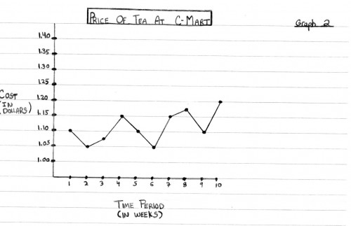
Here’s what he sent:
Price of tea at 7-11
Price of tea at C-Mart
This was curious. It crossed my mind that Adnan might be … off his rocker in some way. Or, more excitingly, that these graphs were code for some top-secret information too dangerous for him to send in a letter.
But no. These graphs were a riddle that I would fail to solve when we next spoke, a couple of days later.
Adnan: Now, so would you prefer, as a consumer, would you rather purchase at a store where prices are consistent or items from a store where the prices fluctuate?
Sarah: I would prefer consistency.
Adnan: That makes sense. Especially in today’s economy. So if you had to choose, which store would you say has more consistent prices?
Sarah: 7-11 is definitely more consistent.
Adnan: As compared to…?
Sarah: As compared to C-Mart, which is going way up and down.
Look again, Adnan said. Right. Their prices are exactly the same. It’s just that the graph of C-Mart prices is zoomed way in — the y-axis is in much smaller cost increments — so it looks like dramatic fluctuations are happening. And he made the pencil lines much darker and more striking in the C-Mart graph, so it looks more…sinister or something.
4 thoughts on “Those Who Follow Climate Will Definitely Recognize This”
I do a lot of presentations – both slides and print – and I use a lot of graphs – and I want to make a point – so I change the scale of the graphs to show the point I want to make and get oohs and ahhs.
Very good.
For all the talk of hide the decline and Mike’s Nature trick, I think the real trick in AR4 and elsewhere is where they put instrumental temperatures in a bright red, both hiding the end of the proxies and really emphasizing an incline.
It’s a question that is not raised enough. The random yearly variation in temperature is over a degree in most places, and so significantly larger than the overall trends being debated.
Similarly, the seasonal variation is well over 10 degrees. If life can tolerate that degree of temperature change, year in and year out, then it seems likely to be okay with a degree or two over the course of a century.
I expected you to show different graphs to discuss this point, though. The issue is one of smoothing. People constantly post temperature graphs that are smoothed averages with a 5- or 10-year window. If you post the actual recorded temperature, the trend is much less exciting, and indeed difficult to spot.