Sudden Acceleration

For several years, there was an absolute spate of lawsuits charging sudden acceleration of a motor vehicle — you probably saw such a story:  Some person claims they hardly touched the accelerator and the car leaped ahead at enormous speed and crashed into the house or the dog or telephone pole or whatever.  Many folks have been skeptical that cars were really subject to such positive feedback effects where small taps on the accelerator led to enormous speeds, particularly when almost all the plaintiffs in these cases turned out to be over 70 years old.  It seemed that a rational society might consider other causes than unexplained positive feedback, but there was too much money on the line to do so.

Many of you know that I consider questions around positive feedback in the climate system to be the key issue in global warming, the one that separates a nuisance from a catastrophe.  Is the Earth’s climate similar to most other complex, long-term stable natural systems in that it is dominated by negative feedback effects that tend to damp perturbations?  Or is the Earth’s climate an exception to most other physical processes, is it in fact dominated by positive feedback effects that, like the sudden acceleration in grandma’s car, apparently rockets the car forward into the house with only the lightest tap of the accelerator?

I don’t really have any new data today on feedback, but I do have a new climate forecast from a leading alarmist that highlights the importance of the feedback question.

Dr. Joseph Romm of Climate Progress wrote the other day that he believes the mean temperature increase in the “consensus view” is around 15F from pre-industrial times to the year 2100.  Mr. Romm is mainly writing, if I read him right, to say that critics are misreading what the consensus forecast is.  Far be it for me to referee among the alarmists (though 15F is substantially higher than the IPCC report “consensus”).  So I will take him at his word that 15F increase with a CO2 concentration of 860ppm is a good mean alarmist forecast for 2100.

I want to deconstruct the implications of this forecast a bit.

For simplicity, we often talk about temperature changes that result from a doubling in Co2 concentrations.  The reason we do it this way is because the relationship between CO2 concentrations and temperature increases is not linear but logarithmic.  Put simply, the temperature change from a CO2 concentration increase from 200 to 300ppm is different (in fact, larger) than the temperature change we might expect from a concentration increase of 600 to 700 ppm.   But the temperature change from 200 to 400 ppm is about the same as the temperature change from 400 to 800 ppm, because each represents a doubling.   This is utterly uncontroversial.

If we take the pre-industrial Co2 level as about 270ppm, the current CO2 level as 385ppm, and the 2100 Co2 level as 860 ppm, this means that we are about 43% through a first doubling of Co2 since pre-industrial times, and by 2100 we will have seen a full doubling (to 540ppm) plus about 60% of the way to a second doubling.  For simplicity, then, we can say Romm expects 1.6 doublings of Co2 by 2100 as compared to pre-industrial times.

So, how much temperature increase should we see with a doubling of CO2?  One might think this to be an incredibly controversial figure at the heart of the whole matter.  But not totally.  We can break the problem of temperature sensitivity to Co2 levels into two pieces – the expected first order impact, ahead of feedbacks, and then the result after second order effects and feedbacks.

What do we mean by first and second order effects?  Well, imagine a golf ball in the bottom of a bowl.  If we tap the ball, the first order effect is that it will head off at a constant velocity in the direction we tapped it.  The second order effects are the gravity and friction and the shape of the bowl, which will cause the ball to reverse directions, roll back through the middle, etc., causing it to oscillate around until it eventually loses speed to friction and settles to rest approximately back in the middle of the bowl where it started.

It turns out the the first order effects of CO2 on world temperatures are relatively uncontroversial.  The IPCC estimated that, before feedbacks, a doubling of CO2 would increase global temperatures by about 1.2C  (2.2F).   Alarmists and skeptics alike generally (but not universally) accept this number or one relatively close to it.

Applied to our increase from 270ppm pre-industrial to 860 ppm in 2100, which we said was about 1.6 doublings, this would imply a first order temperature increase of 3.5F from pre-industrial times to 2100  (actually, it would be a tad more than this, as I am interpolating a logarithmic function linearly, but it has no significant impact on our conclusions, and might increase the 3.5F estimate by a few tenths.)  Again, recognize that this math and this outcome are fairly uncontroversial.

So the question is, how do we get from 3.5F to 15F?  The answer, of course, is the second order effects or feedbacks.  And this, just so we are all clear, IS controversial.

A quick primer on feedback.  We talk of it being a secondary effect, but in fact it is a recursive process, such that there is a secondary, and a tertiary, etc. effects.

Lets imagine that there is a positive feedback that in the secondary effect increases an initial disturbance by 50%.  This means that a force F now becomes F + 50%F.  But the feedback also operates on the additional 50%F, such that the force is F+50%F+50%*50%F…. Etc, etc.  in an infinite series.  Fortunately, this series can be reduced such that the toal Gain =1/(1-f), where f is the feedback percentage in the first iteration. Note that f can and often is negative, such that the gain is actually less than 1.  This means that the net feedbacks at work damp or reduce the initial input, like the bowl in our example that kept returning our ball to the center.

Well, we don’t actually know the feedback fraction Romm is assuming, but we can derive it.  We know his gain must be 4.3 — in other words, he is saying that an initial impact of CO2 of 3.5F is multiplied 4.3x to a final net impact of 15.  So if the gain is 4.3, the feedback fraction f must be about 77%.

Does this make any sense?  My contention is that it does not.  A 77% first order feedback for a complex system is extraordinarily high  — not unprecedented, because nuclear fission is higher — but high enough that it defies nearly every intuition I have about dynamic systems.  On this assumption rests literally the whole debate.  It is simply amazing to me how little good work has been done on this question.  The government is paying people millions of dollars to find out if global warming increases acne or hurts the sex life of toads, while this key question goes unanswered.  (Here is Roy Spencer discussing why he thinks feedbacks have been overestimated to date, and a bit on feedback from Richard Lindzen).

But for those of you looking to get some sense of whether a 15F forecast makes sense, here are a couple of reality checks.

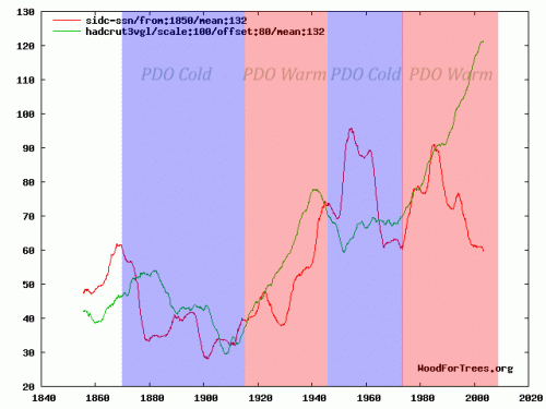
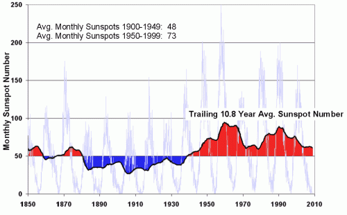
First, we have already experienced about .43 if a doubling of CO2 from pre-industrial times to today.  The same relationships and feedbacks and sensitivities that are forecast forward have to exist backwards as well.  A 15F forecast implies that we should have seen at least 4F of this increase by today.  In fact, we have seen, at most, just 1F  (and to attribute all of that to CO2, rather than, say, partially to the strong late 20th century solar cycle, is dangerous indeed).  But even assuming all of the last century’s 1F temperature increase is due to CO2, we are way, way short of the 4F we might expect.  Sure, there are issues with time delays and the possibility of some aerosol cooling to offset some of the warming, but none of these can even come close to closing a gap between 1F and 4F.  So, for a 15F temperature increase to be a correct forecast, we have to believe that nature and climate will operate fundamentally different than they have over the last 100 years.

Second, alarmists have been peddling a second analysis, called the Mann hockey stick, which is so contradictory to these assumptions of strong positive feedback that it is amazing to me no one has called them on the carpet for it.  In brief, Mann, in an effort to show that 20th century temperature increases are unprecedented and therefore more likely to be due to mankind, created an analysis quoted all over the place (particularly by Al Gore) that says that from the year 1000 to about 1850, the Earth’s temperature was incredibly, unbelievably stable.  He shows that the Earth’s temperature trend in this 800 year period never moves more than a few tenths of a degree C.  Even during the Maunder minimum, where we know the sun was unusually quiet, global temperatures were dead stable.

This is simply IMPOSSIBLE in a high-feedback environment.  There is no way a system dominated by the very high levels of positive feedback assumed in Romm’s and other forecasts could possibly be so rock-stable in the face of large changes in external forcings (such as the output of the sun during the Maunder minimum).  Every time Mann and others try to sell the hockey stick, they are putting a dagger in teh heart of high-positive-feedback driven forecasts (which is a category of forecasts that includes probably every single forecast you have seen in the media).

For a more complete explanation of these feedback issues, see my video here.

It’s Not Zero

I have been meaning to link to this post for a while, but the Reference Frame, along with Roy Spencer, makes a valuable point I have also made for some time — the warming effect from man’s CO2 is not going to be zero.  The article cites approximately the same number I have used in my work and that was used by the IPCC:  absent feedback and other second order effects, the earth should likely warm about 1.2C from a doubling of CO2.

The bare value (neglecting rain, effects on other parts of the atmosphere etc.) can be calculated for the CO2 greenhouse effect from well-known laws of physics: it gives 1.2 °C per CO2 doubling from 280 ppm (year 1800) to 560 ppm (year 2109, see below). The feedbacks may amplify or reduce this value and they are influenced by lots of unknown complex atmospheric effects as well as by biases, prejudices, and black magic introduced by the researchers.

A warming in the next century of 0.6 degrees, or about the same warming we have seen in the last century, is a very different prospect, demanding different levels of investment, than typical forecasts of 5-10 degrees or more of warming from various alarmists.

How we get from a modest climate sensitivity of 1.2 degrees to catastrophic forecasts is explained in this video:

Seriously?

In study 1, a certain historic data set is presented.  The data set shows an underlying variation around a fairly strong trend line.  The trend line is removed, for a variety of reasons, and the data set is presented normalized or de-trended.

In study 2, researches take the normalized, de-trended data and conclude … wait for it … that there is no underlying trend in the natural process being studied.  Am I really understanding this correctly?  I think so:

The briefest examination of the Scotland speleothem shows that the version used in Trouet et al had been previously adjusted through detrending from the MWP [Medievil Warm Period] to the present. In the original article (Proctor et al 2000), this is attributed to particularities of the individual stalagmite, but, since only one stalagmite is presented, I don’t see how one can place any confidence on this conclusion. And, if you need to remove the trend from the MWP to the present from your proxy, then I don’t see how you can use this proxy to draw to conclusions on relative MWP-modern levels.

Hope and change, climate science version.

Postscript: It is certainly possible that the underlying data requires an adjustment, but let’s talk about why the adjustment used is not correct.  The scientists have a hypothesis that they can look at the growth of stalagmites in certain caves and correlate the annual growth rate with climate conditions.

Now, I could certainly imagine  (I don’t know if this is true, but work with me here) that there is some science that the volume of material deposited on the stalagmite is what varies in different climate conditions.  Since the stalagmite grows, a certain volume of material on a smaller stalagmite would form a thicker layer than the same volume on a larger stalagmite, since the larger body has a larger surface area.

One might therefore posit that the widths could be corrected back to the volume of the material deposited based on the width and height of the stalagmite at the time (if these assumptions are close to the mark, it would be a linear, first order correction since surface area in a cone varies linearly with height and radius).  There of course might be other complicating factors beyond this simple model — for example, one might argue that the deposition rate might itself change with surface area and contact time.

Anyway, this would argue for a correction factor based on geometry and the physics / chemistry of the process.  This does NOT appear to be what the authors did, as per their own description:

This band width was signal was normalized and the trend removed by fitting an order 2 polynomial trend line to the band width data.

That can’t be right.  If we don’t understand the physics well enough to know how, all things being equal, band widths will vary by size of the stalagmite, then we don’t understand the physics well enough to use it confidently as a climate proxy.

Thinking About the Sun

A reader wrote me a while back and asked if I could explain how I thought the sun could be a major driver of climate when temperature and solar metrics appear to have “diverged” as in the following two charts:

unsync

In both charts, red is the solar metric (TSI in the first chart, sunspot number in the second).  The other line, either blue or green, is a global temperature metric.  In both cases, we see a sort of step change in solar output, with the first half of the century at one plateau and the second half on a higher plateau.  This chart of sunspot numbers may better illustrate this:

I had three answers for the reader:

  1. In any sufficiently chaotic and complicated system, no one variable is going to consistently regress perfectly with another variable.  CO2 does not line up with temperature any better.
  2. There are non-solar factors at work.  As I have said on any number of occasions, I agree that the greenhouse effect of CO2 exists and will add about 1C for each doubling of CO2.  What I disagree with is the proposition that the Earth’s climate is dominated by positive feedback that multiplies this temperature increase 3-5 or more times.  The PDO cycle is another example of a process that affects global temperatures.
  3. One should not necessarily expect a linear temperature increase to be driven by a linear increase in the sun’s output.   I will illustrate this with a simplistic example, and then invite further comment.   I believe the following is a correct illustration of one heat source -> temperature phenomenon.  If so, wouldn’t we expect something similar with step-change increases in the sun’s output, and doesn’t this chart look a lot like the charts with which I began the post?

water-stove-climate

Missing in Action

I have been pretty remiss in posting here lately.  One reason is that this is the busy season in my business.  The other reason is that there is just so much going on in the economy and the new administration on which I feel the need to comment, that I have spent most of my time at CoyoteBlog.

Steve McIntyre on the Hockey Stick

I meant to post this a while back, and most of my readers will have already seen this, but in case you missed it, here is Steve McIntyre’s most recent presentation on a variety of temperature reconstruction issues, in particular Mann’s various new attempts at resuscitating the hockey stick.  While sometimes his web site Climate Audit is hard for laymen and non-statisticians to follow, this presentation is pretty accessible.

Two Scientific Approaches

This could easily be a business case:  Two managers.  One sits in his office, looking at spreadsheets, trying to figure out if the factory is doing OK.  The other spends most of his time on the factory floor, trying to see what is going on.  Both approaches have value, and both have shortcomings.

Shift the scene now to the physical sciences:  Two geologists.  One sits at his computer looking at measurement data sets, trying to see trends through regression, interpolation, and sometimes via manual adjustments and corrections.  The other is out in the field, looking at physical evidence.   Both are trying to figure out sea level changes in the Maldives.    The local geologist can’t see global patterns, and may have a tendency to extrapolate too broadly from a local finding.  The computer guy doesn’t know how his measurements may be lying to him, and tends to trust his computer output over physical evidence.

It strikes me that there would be incredible power from merging these two perspectives, but I sure don’t see much movement in this direction in climate.  Anthony Watts has been doing something similar with temperature measurement stations, trying to bring real physical evidence to improve computer modellers correction algorithms, but there is very little demand among the computer guys for this help.  We’ve reached an incredible level of statistical hubris, that somehow we can manipulate tiny signals from noisy and biased data without any knowledge of the physical realities on the ground  (“bias” used here in its scientific, not its political/cultural meaning)

Climate Change = Funding

Any number of folks have achnowleged that, nowadays, the surest road to academic funding is to tie your pet subject in with climate change.  If, for example, you and your academic buddies want funding to study tourist resort destinations (good work if you can get it), you will have a better chance if you add climate change into the mix.

John Moore did a bit of work with the Google Scholar search engine to find out how many studies referencing, say, surfing, also referenced climate change.  It is a lot.  When you click through to the searches, you will find a number of the matches are spurious  (ie matches to random unrelated links on the same page) but the details of the studies and how climate change is sometimes force-fit is actually more illuminating than the summary numbers.

Downplaying Their Own Finding

After years of insisting that urban biases have negligible effect on the the historical temperature record, the IPCC may finally have to accept what skeptics have been saying for years — that:

  1. Most long-lived historical records are from measurement points near cities (no one was measuring temperatures reliably in rural Africa in 1900)
  2. Cities have a heat island over them, up to 8C or more in magnitude, from the heat trapped in concrete, asphalt, and other man made structures.  (My 13-year-old son easily demonstrated this here).
  3. As cities grow, as most have over the last 100 years, temperature measurement points are engulfed by increasingly hotter portions of the heat island.  For example, the GISS shows the most global warming in the US centered around Tucson based on this measurement point, which 100 years ago was rural.

Apparently, Jones et al found recently that a third to a half of the warming reported in the Hadley CRUT3 database in China may be due to urban heat island effects rather than any broader warming trend.  This particularly important since it was a Jones et al letter to Nature years ago that previously gave the IPCC cover to say that there was negligible uncorrected urban warming bias in the major surface temperature records.

Interestingly, Jones et al can really hs to be treated as a hostile witness on this topic.  Their abstract states:

We show that all the land-based data sets for China agree exceptionally well and that their residual warming compared to the SST series since 1951 is relatively small compared to the large-scale warming. Urban-related warming over China is shown to be about 0.1°C decade−1 over the period 1951–2004, with true climatic warming accounting for 0.81°C over this period

By using the words “relatively small” and using a per decade number for the bias but an aggregate number for the underlying warming signal, they are doing everything possible to downplay their own finding (see how your eye catches the numbers 0.1 and 0.81 and compares them, even though they are not on a comparable basis — this is never an accident).  But in fact, the exact same numbers restate this way:  .53C, or 40% of the total measured warming of 1.34C was due to urban biases rather than any actual global warming signal.

Since when is a 40% bias or error “relatively small?”

So why do they fight their own conclusion so hard?  After all, the study still shows a reduced, but existent, historic warming signal.  As do satellites, which are unaffected by this type of bias.  Even skeptics like myself admit such a signal still exists if one weeds out all the biases.

The reason why alarmists, including it seems even the authors themselves, resist this finding is that reduced historic warming makes their catastrophic forecasts of future even more suspect.  Already, their models do not back cast well against history (without some substantial heroic tweaking or plugs), consistently over-estimating past warming.  If the actual past warming was even less, it makes their forecasts going forward look even more absurd.

A few minutes looking at the official US temperature measurement stations here will make one a believer that biases likely exist in historic measurements, particularly since the rest of the world is likely much worse.

Making Science Proprietary

I have no idea what is driving this, whether it be a crass payback for campaign contributions (as implied in the full article) or a desire to stop those irritating amateur bloggers from trying to replicate “settled science,” but it is, as a reader said who sent it to me, “annoying:”

There are some things science needs to survive, and to thrive: eager, hardworking scientists; a grasp of reality and a desire to understand it; and an open and clear atmosphere to communicate and discuss results.

That last bit there seems to be having a problem. Communication is key to science; without it you are some nerd tinkering in your basement. With it, the world can learn about your work and build on it.

Recently, government-sponsored agencies like NIH have moved toward open access of scientific findings. That is, the results are published where anyone can see them, and in fact (for the NIH) after 12 months the papers must be publicly accessible. This is, in my opinion (and that of a lot of others, including a pile of Nobel laureates) a good thing. Astronomers, for example, almost always post their papers on Astro-ph, a place where journal-accepted papers can be accessed before they are published.

John Conyers (D-MI) apparently has a problem with this. He is pushing a bill through Congress that will literally ban the open access of these papers, forcing scientists to only publish in journals. This may not sound like a big deal, but journals are very expensive. They can cost a fortune: The Astrophysical Journal costs over $2000/year, and they charge scientists to publish in them! So this bill would force scientists to spend money to publish, and force you to spend money to read them.

I continue to be confused how research funded with public monies can be “proprietary,” but interestingly this seems to be a claim pioneered in the climate community, more as a way to escape criticism and scrutiny than to make money (the Real Climate guys have, from time to time, argued for example that certain NASA data and algorithms are proprietary and cannot be released for scrutiny – see comments here, for example.)

Worth Your Time

I really like to write a bit more about such articles, but I just don’t have the time right now.  So I will simply recommend you read this guest post at WUWT on Steig’s 2009 Antarctica temperature study.  The traditional view has been that the Antarctic Peninsula (about 5% of the continent) has been warming a lot while the rest of the continent has been cooling.  Steig got a lot of press by coming up with the result that almost all of Antarctica is warming.

But the article at WUWT argues that Steig gets to this conclusion only by reducing all of Antarctic temperatures to three measurement points.  This process smears the warming of the peninsula across a broader swath of the continent.  If you can get through the post, you will really learn a lot about the flaws in this kind of study.

I have sympathy for scientists who are working in a low signal to noise environment.   Scientists are trying to tease 50 years of temperature history across a huge continent from only a handful of measurement points that are full of holes in the data.  A charitable person would look at this article and say they just went too far, teasing out spurious results rather than real signal out of the data.  A more cynical person might argue that this is a study where, at every turn, the authors made every single methodological choice coincidentally in the one possible way that would maximize their reported temperature trend.

By the way, I have seen Steig written up all over, but it is interesting that I never saw this:  Even using Steig’s methodology, the temperature trend since 1980 has been negative.  So whatever warming trend they found ended almost 30 years ago.    Here is the table from the WUWT article, showing the Steign original results and several cuts and recalculating their data using improved methods.

Reconstruction

1957 to 2006 trend

1957 to 1979 trend (pre-AWS)

1980 to 2006 trend (AWS era)

Steig 3 PC

+0.14 deg C./decade

+0.17 deg C./decade

-0.06 deg C./decade

New 7 PC

+0.11 deg C./decade

+0.25 deg C./decade

-0.20 deg C./decade

New 7 PC weighted

+0.09 deg C./decade

+0.22 deg C./decade

-0.20 deg C./decade

New 7 PC wgtd imputed cells

+0.08 deg C./decade

+0.22 deg C./decade

-0.21 deg C./decade

Here, by the way, is an excerpt from Steig’s abstract in Nature:

Here we show that significant warming extends well beyond the Antarctic Peninsula to cover most of West Antarctica, an area of warming much larger than previously reported. West Antarctic warming exceeds 0.1 °C per decade over the past 50 years, and is strongest in winter and spring.

Hmm, no mention that this trend reversed half way through the period.  A bit disengenuous, no?  Its almost as if there is a way they wanted the analysis to come out.

The First Rule of Regression Analysis

Here is the first thing I was ever taught about regression analysis — never, ever use multi-variable regression analysis to go on a fishing expedition.  In other words, never throw in a bunch of random variables and see what turns out to have the strongest historical relationship.  Because the odds are that if you don’t understand the relationship between the variables and why you got the answer that you did, it is very likely a spurious result.

The purpose of a regression analysis is to confirm and quantify a relationship that you have a theoretical basis for believing to exist.  For example, I might think that home ownership rates might drop as interest rates rose, and vice versa, because interest rate increases effectively increase the cost of a house, and therefore should reduce the demand.  This is a perfectly valid proposition to test.  What would not be valid is to throw interest rates, population growth, regulatory levels, skirt lengths,  superbowl winners, and yogurt prices together into a regression with housing prices and see what pops up as having a correlation.   Another red flag would be, had we run our original regression between home ownership and interest rates and found the opposite result than we expected, with home ownership rising with interest rates, we need to be very very suspicious of the correlation.  If we don’t have a good theory to explain it, we should treat the result as spurious, likely the result of mutual correlation of the two variables to a third variable, or the result of time lags we have not considered correctly, etc.

Makes sense?  Well, then, what do we make of this:  Michael Mann builds temperature reconstructions from proxies.  An example is tree rings.  The theory is that warmer temperatures lead to wider tree rings, so one can correlate tree ring growth to temperature.  The same is true for a number of other proxies, such as sediment deposits.

In the particular case of the Tiljander sediments, Steve McIntyre observed that Mann had included the data upside down – meaning he had essentially reversed the sign of the proxy data.  This would be roughly equivalent to our running our interest rate – home ownership regression but plugging the changes in home ownership with the wrong sign (ie decreases shown as increases and vice versa).

You can see that the data was used upside down by comparing Mann’s own graph with the orientation of the original article, as we did last year. In the case of the Tiljander proxies, Tiljander asserted that “a definite sign could be a priori reasoned on physical grounds” – the only problem is that their sign was opposite to the one used by Mann. Mann says that multivariate regression methods don’t care about the orientation of the proxy.

The world is full of statements that are strictly true and totally wrong at the same time.  Mann’s statement in bold is such a case.  This is strictly true – the regression does not care if you get the sign right, it will still get a correlation.  But it is totally insane, because this implies that the correlation it is getting is exactly the opposite of what your physics told you to expect.  It’s like getting a positive correlation between interest rates and home ownership.  Or finding that tree rings got larger when temperatures dropped.

This is a mistake that Mann seems to make a lot — he gets buried so far down into the numbers, he forgets that they have physical meaning.  They are describing physical systems, and what they are saying in this case makes no sense.  He is essentially using a proxy that is essentially behaving exactly the opposite of what his physics tell him it should – in fact behaving exactly opposite to the whole theory of why it should be a proxy for temperature in the first place.  And this does not seem to bother him enough to toss it out.

PS-  These flawed Tiljander sediments matter.  It has been shown that the Tiljander series have an inordinate influence on Mann’s latest proxy results.  Remove them, and a couple of other flawed proxies  (and by flawed, I mean ones with manually made up data) and much of the hockey stick shape he loves so much goes away

The Dividing Line Between Nuisance and Catastrophe: Feedback

I have written for quite a while that the most important issue in evaluating catastrophic global warming forecasts is feedback.  Specifically, is the climate dominated by positive feedbacks, such that small CO2-induced changes in temperatures are multiplied many times, or even hit a tipping point where temperatures run away?  Or is the long-term stable system of climate more likely dominated by flat to negative feedback, as are most natural physical systems?  My view has always been that the earth will warm at most a degree for a doubling of CO2 over the next century, and may warm less if feedbacks turn out to be negative.

I am optimistic that this feedback issue may finally be seeing the light of day.  Here is Professor William Happer of Princeton in US Senate testimony:

There is little argument in the scientific community that a direct effect of doubling the CO2 concentration will be a small increase of the earth’s temperature — on the order of one degree. Additional increments of CO2 will cause relatively less direct warming because we already have so much CO2 in the atmosphere that it has blocked most of the infrared radiation that it can. It is like putting an additional ski hat on your head when you already have a nice warm one below it, but your are only wearing a windbreaker. To really get warmer, you need to add a warmer jacket. The IPCC thinks that this extra jacket is water vapor and clouds.

Since most of the greenhouse effect for the earth is due to water vapor and clouds, added CO2 must substantially increase water’s contribution to lead to the frightening scenarios that are bandied about. The buzz word here is that there is “positive feedback.” With each passing year, experimental observations further undermine the claim of a large positive feedback from water. In fact, observations suggest that the feedback is close to zero and may even be negative. That is, water vapor and clouds may actually diminish the already small global warming expected from CO2, not amplify it. The evidence here comes from satellite measurements of infrared radiation escaping from the earth into outer space, from measurements of sunlight reflected from clouds and from measurements of the temperature the earth’s surface or of the troposphere, the roughly 10 km thick layer of the atmosphere above the earth’s surface that is filled with churning air and clouds, heated from below at the earth’s surface, and cooled at the top by radiation into space.

When the IPCC gets to a forecast of 3-5C warming over the next century (in which CO2 concentrations are expected to roughly double), it is in two parts.  As professor Happer relates, only about 1C of this is directly from the first order effects of more Co2.  This assumption of 1C warming for a doubling of Co2 is relatively stable across both scientists and time, except that the IPCC actually reduced this number a bit between their 3rd and 4th reports.

They get from 1C to 3C-5C with feedback.  Here is how feedback works.

Lets say the world warms 1 degree.  Lets also assume that the only feedback is melting ice and albedo, and that for every degree of warming, the lower albedo from melted ice reflecting less sunlight back into space adds another 0.1 degree of warming.  But this 0.1 degree extra warming would in turn melt a bit more ice, which would result in 0.01 degree 3rd order warming.  So the warming from an initial 1 degree with such 10% feedback would be 1+0.1+0.01+0.001 …. etc.   This infinite series can be calculated as   dT * (1/(1-g))  where dT is the initial first order temperature change (in this case 1C) and g is the percentage that is fed back (in this case 10%).  So a 10% feedback results in a gain or multiplier of the initial temperature effect of 1.11 (more here).

So how do we get a multiplier of 3-5 in order to back into the IPCC forecasts?  Well, using our feedback formula backwards and solving for g, we get feedback percents of 67% for a 3 multiplier and 80% for a 5 multiplier.  These are VERY high feedbacks for any natural physical system short of nuclear fission, and this issue is the main (but by no means only) reason many of us are skeptical of catastrophic forecasts.

[By the way, to answer past criticisms, I know that the models do not use this simplistic feedback methodology in their algorithms.  But no matter how complex the details are modeled, the bottom line is that somewhere in the assumptions underlying these models, a feedback percent of 67-80% is implicit]

For those paying attention, there is no reason that feedback should apply in the future but not in the past.  Since the pre-industrial times, it is thought we have increased atmospheric Co2 by 43%.  So, we should have seen, in the past, 43% of the temperature rise from a doubling, or 43% of 3-5C, which is 1.3C-2.2C.  In fact, this underestimates what we should have seen historically since we just did a linear interpolation.  But Co2 to temperature is a logarithmic diminishing return relationship, meaning we should see faster warming with earlier increases than with later increases.  Never-the-less, despite heroic attempts to posit some offsetting cooling effect which is masking this warming, few people believe we have seen any such historic warming, and the measured warming is more like 0.6C.  And some of this is likely due to the fact that the solar activity was at a peak in the late 20th century, rather than just Co2.

I have a video discussing these topics in more depth:

This is the bait and switch of climate alarmism.  When pushed into the corner, they quickly yell “this is all settled science,”  when in fact the only part that is fairly well agreed upon is the 1C of first order warming from a doubling.  The majority of the warming, the amount that converts the forecast from nuisance to catastrophe, comes from feedback which is very poorly understood and not at all subject to any sort of consensus.

A Cautionary Tale About Models Of Complex Systems

I have often written warming about the difficulty of modeling complex systems.  My mechanical engineering degree was focused on the behavior and modeling of dynamic systems.  Since then, I have spent years doing financial, business, and economic modeling.  And all that experienced has taught me humility, as well as given me a good knowledge of where modelers tend to cheat.

Al Gore has argued that we should trust long-term models, because Wall Street has used such models successfully for years  (I am not sure he has been using this argument lately, lol).  I was immediately skeptical of this statement.  First, Wall Street almost never makes 100-year bets based on models (they may be investing in 30-year securities, but the bets they are making are much shorter term).  Second, my understanding of Wall Street history is that lower Manhattan is littered with the carcasses of traders who bankrupted themselves following the hot model of the moment.  It is ever so easy to create a correlation model that seems to back-cast well.  But no one has ever created one that holds up well going forward.

A reader sent me this article about the Gaussian copula, apparently the algorithm that underlay the correlation models Wall Streeters used to assess mortgage security and derivative risk.

Wall Streeters have the exact same problem that climate modelers have.  There is a single output variable they both care about (security price for traders, global temperature for modelers).  This variable’s value changes in a staggeringly complex system full of millions of variables with various levels of cross-correlation.  The modelers challenge is to look at the historical data, and to try to tease out correlation factors between their output variable and all the other input variables in an environment where they are all changing.

The problem is compounded because some of the input variables move on really long cycles, and some move on short cycles.  Some of these move in such long cycles that we may not even recognize the cycle at all.  In the end, this tripped up the financial modelers — all of their models derived correlation factors from a long and relatively unbroken period of home price appreciation.  Thus, when this cycle started to change, all the models fell apart.

Li’s copula function was used to price hundreds of billions of dollars’ worth of CDOs filled with mortgages. And because the copula function used CDS prices to calculate correlation, it was forced to confine itself to looking at the period of time when those credit default swaps had been in existence: less than a decade, a period when house prices soared. Naturally, default correlations were very low in those years. But when the mortgage boom ended abruptly and home values started falling across the country, correlations soared.

I never criticize people for trying to do an analysis with the data they have.  If they have only 10 years of data, that’s as far as they can run the analysis.  However, it is then important that they recognize that their analysis is based on data that may be way too short to measure longer term trends.

As is typical when models go wrong, early problems in the model did not cause users to revisit their assumptions:

His method was adopted by everybody from bond investors and Wall Street banks to ratings agencies and regulators. And it became so deeply entrenched—and was making people so much money—that warnings about its limitations were largely ignored.

Then the model fell apart. Cracks started appearing early on, when financial markets began behaving in ways that users of Li’s formula hadn’t expected. The cracks became full-fledged canyons in 2008—when ruptures in the financial system’s foundation swallowed up trillions of dollars and put the survival of the global banking system in serious peril.

A couple of lessons I draw out for climate models:

  1. Limited data availability can limit measurement of long-term cycles.  This is particularly true in climate, where cycles can last hundreds and even thousands of years, but good reliable data on world temperatures is only available for our 30 years and any data at all for about 150 years.  Interestingly, there is good evidence that many of the symptoms we attribute to man-made global warming are actually part of climate cycles that go back long before man burned fossil fuels in earnest.  For example, sea levels have been rising since the last ice age, and glaciers have been retreating since the late 18th century.
  2. The fact that models hindcast well has absolutely no predictive power as to whether they will forecast well
  3. Trying to paper over deviations between model forecasts and actuals, as climate scientists have been doing for the last 10 years, without revisiting the basic assumptions of the model can be fatal.

A Final Irony

Do you like irony?  In the last couple of months, I have been discovering I like it less than I thought.  But here is a bit of irony for you anyway.  The first paragraph of Obama’s new budget read like this:

This crisis is neither the result of a normal turn of the business cycle nor an accident of history, we arrived at this point as a result of an era of profound irresponsibility that engulfed both private and public institutions from some of our largest companies’ executive suites to the seats of power in Washington, D.C.

As people start to deconstruct last year’s financial crisis, most of them are coming to the conclusion that the #1 bit of “irresponsibility” was the blind investment of trillions of dollars based on solely on the output of correlation-based computer models, and continuing to do so even after cracks appeared in the models.

The irony?  Obama’s budget includes nearly $700 billion in new taxes (via a cap-and-trade system) based solely on … correlation-based computer climate models that predict rapidly rising temperatures from CO2.  Climate models in which a number of cracks have appeared, but which are being ignored.

Postscript: When I used this comparison the other day, a friend of mine fired back that the Wall Street guys were just MBA’s, but the climate guys were “scientists” and thus presumably less likely to err.  I responded that I didn’t know if one group or the other was more capable (though I do know that Wall Street employs a hell of a lot of top-notch PhD’s).  But I did know that the financial consequences for Wall Street traders having the wrong model was severe, while the impact on climate modelers of being wrong was about zero.  So, from an incentives standpoint, I know who I would more likely bet on to try to get it right.

The Plug

I have always been suspicious of climate models, in part because I spent some time in college trying to model chaotic dynamic systems, and in part because I have a substantial amount of experience with financial modeling.   There are a number of common traps one can fall into when modeling any system, and it appears to me that climate modelers are falling into most of them.

So a while back (before I even created this site) I was suspicious of this chart from the IPCC.  In this chart, the red is the “backcasting” of temperature history using climate models, the black line is the highly smoothed actuals, while the blue is a guess from the models as to what temperatures would have looked like without manmade forcings, particularly CO2.

ipcc1

As I wrote at the time:

I cannot prove this, but I am willing to make a bet based on my long, long history of modeling (computers, not fashion).  My guess is that the blue band, representing climate without man-made effects, was not based on any real science but was instead a plug.  In other words, they took their models and actual temperatures and then said “what would the climate without man have to look like for our models to be correct.”  There are at least four reasons I strongly suspect this to be true:

  1. Every computer modeler in history has tried this trick to make their models of the future seem more credible.  I don’t think the climate guys are immune.
  2. There is no way their models, with our current state of knowledge about the climate, match reality that well.
  3. The first time they ran their models vs. history, they did not match at all.  This current close match is the result of a bunch of tweaking that has little impact on the model’s predictive ability but forces it to match history better.  For example, early runs had the forecast run right up from the 1940 peak to temperatures way above what we see today.
  4. The blue line totally ignores any of our other understandings about the changing climate, including the changing intensity of the sun.  It is conveniently exactly what is necessary to make the pink line match history.  In fact, against all evidence, note the blue band falls over the century.  This is because the models were pushing the temperature up faster than we have seen it rise historically, so the modelers needed a negative plug to make the numbers look nice.

As you can see, the blue band, supposedly sans mankind, shows a steadily declining temperature. This never made much sense to me, given that, almost however you measure it, solar activity over the last half of the decade was stronger than the first half, but they show the natural forcings to be exactly opposite from what we might expect from this chart of solar activity as measured by sunspots (red is smoothed sunspot numbers, green is Hadley CRUT3 temperature).

temp_spots_with_pdo

By the way, there is a bit of a story behind this chart.  It was actually submitted by a commenter to this site of the more alarmist persuasion  (without the PDO bands), to try to debunk the link between temperature and the sun  (silly rabbit – the earth’ s temperature is not driven by the sun, but by parts per million changes in atmospheric gas concentrations!).  While the sun still is not the only factor driving the mercilessly complex climate, clearly solar activity in red was higher in the latter half of the century when temperatures in green were rising.  Which is at least as tight as the relation between CO2 and the same warming.

Anyway, why does any of this matter?  Skeptics have argued for quite some time that climate models assume too high of a sensitivity of temperature to CO2 — in other words, while most of us agree that Co2 increases can affect temperatures somewhat, the models assume temperature to be very sensitive to CO2, in large part because the models assume that the world’s climate is dominated by positive feedback.

One way to demonstrate that these models may be exaggerated is to plot their predictions backwards.  A relationship between Co2 and temperature that exists in the future should hold in the past, adjusting for time delays  (in fact, the relationship should be more sensitive in the past, since sensitivity is a logarithmic diminishing-return curve).  But projecting the modelled sensitivities backwards (with a 15-year lag) result in ridiculously high predicted historic temperature increases that we simply have never seen.  I discuss this in some depth in my 10 minute video here, but the key chart is this one:

feedback_projection

You can see the video to get a full explanation, but in short, models that include high net positive climate feedbacks have to produce historical warming numbers that far exceed measured results.  Even if we assign every bit of 20th century warming to man-made causes, this still only implies 1C of warming over the next century.

So the only way to fix this is with what modelers call a plug.  Create some new variable, in this case “the hypothetical temperature changes without manmade CO2,” and plug it in.  By making this number very negative in the past, but flat to positive in the future, one can have a forecast that rises slowly in the past but rapidly in the future.

Now, I can’t prove that this is what was done.  In fact, I am perfectly willing to believe that modelers can spin a plausible story with enough jargon to put off most layman, as to how they created this “non-man” line and why it has been decreasing over the last half of the century.   I have a number of reasons to disbelieve any such posturing:

  1. The last IPCC report spent about a thousand pages on developing the the “with Co2” forecasts.  They spent about half a page discussing the “without Co2” case.  These is about zero scientific discussion of how this forecast is created, or what the key elements are that drive it
  2. The IPCC report freely admits their understanding of cooling factors is “low”
  3. The resulting forecasts is WAY to good.  We will see this again in a moment.  But with such a chaotic system, your first reaction to anyone who shows you a back-cast that nicely overlays history almost exactly should be “bullshit.”  Its not possible, except with tuning and plugs
  4. The sun was almost undeniably stronger in the second half of the 20th century than the first half.  So what is the countervailing factor that overcomes both the sun and CO2?

The IPCC does not really say what is making the blue line go down, it just goes down (because, as we can see now, it has to to make their hypothesis work).  Today, the main answer to the question of what might be offsetting warming  is “aerosols,” particularly sulfur and carbon compounds that are man-made pollutants (true pollutants) from burning fossil fuels.  The hypothesis is that these aerosols reflect sunlight back to space and cool the earth  (by the way, the blue line above in the IPCC report is explicitly only non-anthropogenic effects, so at the time it went down due to natural effects – the manmade aerosol thing is a newer straw to grasp).

But black carbon and aerosols have some properties that create some problems with this argument, once you dig into it.  First, there are situations where they are as likely to warm as to cool.  For example, one reason the Arctic has been melting faster in the summer of late is likely due to black carbon from Chinese coal plants that land on the ice and warm it faster.

The other issue with aerosols is that they disperse quickly.  Co2 mixes fairly evenly worldwide and remains in the atmosphere for years.  Many combustion aerosols only remain in the air for days, and so they tend to be concentrated regionally.   Perhaps 10-20% of the earth’s surface might at any one time have a decent concentration of man-made aerosols.  But for that to drive a, say, half degree cooling effect that offsets CO2 warming, that would mean that cooling in these aerosol-affected areas would have to be 2.5-5.0C in magnitude.  If this were the case, we would see those colored global warming maps with cooling in industrial aerosol-rich areas and warming in the rest of the world, but we just don’t see that.  In fact, the vast, vast majority of man-made aerosols can be found in the northern hemisphere, but it is the northern hemisphere that is warming much faster than the southern hemisphere.  If aerosols were really offsetting half or more of the warming, we should see the opposite, with a toasty south and a cool north.

All of this is a long, long intro to a guest post on WUWT by Bill Illis.  He digs into one of the major climate models, GISS model E, and looks at the back-casts from this model.  What he finds mirrors a lot of what we discussed above:

modeleextraev0

Blue is the GISS actual temperature measurement.  Red is the model’s hind-cast of temperatures.  You can see that they are remarkably, amazingly, staggeringly close.  There are chaotic systems we have been modelling for hundreds of years (e.g. the economy) where we have never approached the accuracy this relative infant of a science seems to achieve.

That red forecasts in the middle is made up of a GHG component, shown in orange, plus a negative “everything else” component, shown in brown.  Is this starting to seem familiar?  Does the brown line smell suspiciously to anyone else like a “plug?”  Here are some random thoughts inspired by this chart:

  1. As with any surface temperature measurement system, the GISS system is full of errors and biases and gaps.  Some of these their proprietors would acknowledge, and such have been pointed out by outsiders.  Never-the-less, the GISS metric is likely to have an error of at least a couple tenths of a degree.  Which means the climate model here is perfectly fitting itself to data that isn’t even likely correct.  It is fitting closer to the GISS temperature number than the GISS temperature number likely fits to the actual world temperature anomaly, if such a thing could be measured directly.  Since the Hadley Center or the satellite guys at UAH and RSS get different temperature histories for the last 30-100 years, it is interesting that the GISS model exactly matches the GISS measurement but not these others.  Does that make anyone suspicious?  When the GISS makes yet another correction of its historical data, will the model move with it?
  2. As mentioned before, the sum total of time spent over the last 10 years trying to carefully assess the forcings from other natural and man-made effects and how they vary year-to-year is minuscule compared to the time spent looking at CO2.  I don’t think we have enough knowledge to draw the Co2 line on this chart, but we CERTAINLY don’t have knowledge to draw the “all other” line (with monthly resolution, no less!).
  3. Looking back over history, it appears the model is never off by more than 0.4C in any month, and never goes more than about 10 months before re-intersecting the “actual” line.  Does it bother anyone else that this level of precision is several times higher than the model has when run forward?  Almost immediately, the model is more than 0.4C off, and goes years without intercepting reality.

Relax — A Statement About Comment Policy

Anthony Watts is worried about the time it takes to moderate comments

Lately I’ve found that I spend a lot of time moderating posts that are simply back and forth arguments between just a few people whom have inflexible points of view. Often the discussion turns a bit testy. I’ve had to give some folks (on both sides of the debate) a time out the last couple of days. While the visitors of this blog (on both sides of the debate) are often more courteous than on some other blogs I’ve seen, it still gets tiresome moderating the same arguments between the same people again and again.

This does not surprise me, as I have emailed back and forth to Anthony during a time he was stressed about a particular comment thread.   I told him then what I say now:  Relax.

It might have been that 10 years ago or even 5 that visitors would be surprised and shocked by the actions of certain trolls on the site.  But I would expect that anyone, by now, who spends time in blog comment sections knows the drill — that blog comments can be a free-for-all and some folks just haven’t learned how to maturely operate in an anonymous environment.

I have never tried to moderate my comments (except for spam, which is why you might have  a comment with embedded links held for moderation — I am looking to filter people selling male enhancement products, not people who disagree with me.)  In fact, I relish buffoons who disagree with me when they make an ass of themselves – after all, as Napoleon said, never interrupt an enemy when he is making a mistake.  And besides, I think it makes a nice contrast with a number of leading climate alarmist sites that do not accept comments or are Stalinist in purging dissent from them.

In fact, I find that the only danger in my wide open policy is the media.  For you see, the only exception to my statement above, the only group on the whole planet that seems not to have gotten the message that comment threads don’t necessarily reflect the opinions of the domain operator, is the mainstream media.  I don’t know if this is incompetence or willful, but they still write stories predicated on some blog comment being reflective of the blog’s host.

By the way, for Christmas last year I bought myself an autographed copy of this XKCD comic to go over my desk:

duty_calls

Global Warming “Accelerating”

I have written a number of times about the “global warming accelerating” meme.  The evidence is nearly irrefutable that over the last 10 years, for whatever reason, the pace of global warming has decelerated (click below to enlarge)

hansenjan20091

This is simply a fact, though of course it does not necessarily “prove” that the theory of catastrophic anthropogenic global warming is incorrect.  Current results continue to be fairly consistent with my personal theory, that man-made CO2 may add 0.5-1C to global temperatures over the next century (below alarmist estimates), but that this warming may be swamped at times by natural climactic fluctuations that alarmists tend to under-estimate.

Anyway, in this context, I keep seeing stuff like this headline in the WaPo

Scientists:  Pace of Climate change Exceeds Estimates

This headline seems to clearly imply that the measured pace of actual climate change is exceeding previous predictions and forecasts.   This seems odd since we know that temperatures have flattened recently.  Well, here is the actual text:

The pace of global warming is likely to be much faster than recent predictions, because industrial greenhouse gas emissions have increased more quickly than expected and higher temperatures are triggering self-reinforcing feedback mechanisms in global ecosystems, scientists said Saturday.

“We are basically looking now at a future climate that’s beyond anything we’ve considered seriously in climate model simulations,” Christopher Field, founding director of the Carnegie Institution’s Department of Global Ecology at Stanford University, said at the annual meeting of the American Association for the Advancement of Science.

So in fact, based on the first two paragraphs, in true major media tradition, the headline is a total lie.  In fact, the correct headline is:

“Scientists Have Raised Their Forecasts for Future Warming”

Right?  I mean, this is all the story is saying, is that based on increased CO2 production, climate scientists think their forecasts of warming should be raised.  This is not surprising, because their models assume a direct positive relationship between CO2 and temperature.

The other half of the statement, that “higher temperatures are triggering self-reinforcing feedback mechanisms in global ecosystems” is a gross exaggeration of the state of scientific knowledge.  In fact, there is very little good understanding of climate feedback as a whole.  While we may understand individual pieces – ie this particular piece is a positive feedback – we have no clue as to how the whole thing adds up.  (see my video here for more discussion of feedback)

In fact, I have always argued that the climate models’ assumptions of strong positive feedback (they assume really, really high levels) is totally unrealistic for a long-term stable system.  In fact, if we are really seeing runaway feedbacks triggered after the less than one degree of warming we have had over the last century, it boggles the mind how the Earth has staggered through the last 5 billion years without a climate runaway.

All this article is saying is “we are raising our feedback assumptions higher than even the ridiculously high assumptions we were already using.”  There is absolutely no new confirmatory evidence here.

But this creates a problem for alarmists

For you see, their forecasts have consistently demonstrated themselves to be too high.  You can see above how Hansen’s forecast to Congress 20 years ago has played out (and the Hansen A case was actually based on a CO2 growth forecast that has turned out to be too low).  Lucia, who tends to be scrupulously fair about such things, shows the more recent IPCC models just dancing on the edge of being more than 2 standard deviations higher than actual measured results.

But here is the problem:  The creators of these models are now saying that actual CO2 production, which is the key input to their model, is far exceeding their predictions.  So, presumably, if they re-ran their predictions using actual CO2 data, they would get even higher temperature forecasts. Further, they are saying that the feedback multiplier in their models should be higher as well.  But the forecasts of their models are already high vs. observations — this will even cause them to diverge further from actual measurements.

So here is the real disconnect of the model:  If you tell me that modelers underestimated the key input (CO2) in their models,  and have so far overestimated the key output (Temperature), I would have said the conclusion to this article is that climate sensitivity must be lower than what was embedded in the models.  But they are saying exactly the opposite.  How is this possible?

Postscript: I hope readers understand this, but it is worth saying because clearly reporters do not understand this:  There is no way that climate change from CO2 can be accelerating if global warming is not accelerating.  There is no mechanism I have ever heard by which CO2 can change the climate without the intermediate step of raising temperatures.  Co2–>temperature increase–>changes in the climate.

Update: Chart originally said 1998 forecast.  Has been corrected to 1988.

Update#2: I am really tired of having to re-explain the choice of using Hansen’s “A” forecast, but I will do it again.  Hansen had forecasts A, B, C, with A being based on more CO2 than B, and B with more CO2 than C.  At the time, Hansen said he thought the A case was extreme.  This is then used by his apologists to say that I am somehow corrupting Hansen’s intent or taking him out of context by using the A case, because Hansen himself at the time said the A case was probably high.

But the only difference between A, B, and C were not the model assumptions of climate sensitivity or any other variable — they only differed in the amount of Co2 growth and the number of volcano eruptions (which have a cooling effect via aerosols).  We can go back and decide for ourselves which case turned out to be the most or least conservative.   As it turns out, all three cases UNDERESTIMATED the amount of CO2 man produced in the last 20 years.  So, we should not really use any of these lines as representative, but Scenario A is by far the closest.  The other two are way, way below our actual CO2 history.

The people arguing to use, say, the C scenario for comparison are being disingenuous.  The C scenario, while closer to reality in its temperature forecast, was based on an assumption of a freeze in Co2 production levels, something that obviously did not occur.

Most Useless Phrase in the Political Lexicon: “Peer Reviewed”

Last week, while I was waiting for my sandwich at the deli downstairs, I was applying about 10% of my consciousness to CNN running on the TV behind the counter.  I saw some woman, presumably in the Obama team, defending some action of the administration as being based on “peer reviewed” science.

This may be a legacy of the climate debate.  One of the rhetorical tools climate alarmists have latched onto is to inflate the meaning of peer review.  Often, folks, like the person I saw on TV yesterday, use “peer review” as a synonym for “proven correct and generally accepted in its findings by all right-thinking people who are not anti-scientific wackos.”  Sort of the scientific equivalent of “USDA certified.”

Here is a great example of that, from the DailyKos via Tom Nelson:

Contact NBC4 and urge them to send weatherman Jym Ganahl to some climate change conferences with peer-reviewed climatologists. Let NBC4 know that they have a responsibility to have expert climatologists on-air to debunk Ganahl’s misinformation and the climate change deniers don’t deserve an opportunity to spread their propaganda:

NBC 4 phone # 614-263-4444

NBC 4 VP/GM Rick Rogala email: rrogala(ATSIGN)wcmh.com

By the way, is this an over-the-top attack on heresy or what?  Let’s all deluge a TV station with complaints because their weatherman has the temerity to have a different scientific opinion than ours?  Seriously guys, its a freaking local TV weatherman in central Ohio, and the fate of mankind depends on burning this guy at the stake?  I sometimes get confused about what leftists really think about free speech, but this sure sounds more like a bunch of good Oklahoma Baptists reacting to finding out their TV minister is pro-abortion.   But it is we skeptics who are anti-science?

Anyway, back to peer review, you can see in this example again the use of “peer review” as some kind of impremateur of correctness and shield against criticism.   The author treats it as if it were a sacrament, like baptism or ordination.   This certification seems to be so strong in their mind that just having been published in a peer-reviewed journal seems to be sufficient to complete the sacrament — the peer review does not necessarily seem to even have to be on the particular topic being discussed.

But in fact peer review has a much narrower function, and certainly is not, either in intent or practice,  any real check or confirmation of the study in question.  The main goals of peer review are:

  • Establish that the article is worthy of publication and consistent with the scope of the publication in question.  They are looking to see if the results are non-trivial, if they are new (ie not duplicative of findings already well-understood), and in some way important.  If you think of peer-reviewers as an ad hoc editorial board for the publication, you get closest to intent
  • Reviewers will check, to the extent they can, to see if the methodology  and its presentation is logical and clear — not necessarily right, but logical and clear.  Their most frequent comments are for clarification of certain areas of the work or questions that they don’t think the authors answered.  They do not check all the sources, but if they are familiar with one of the sources references, may point out that this source is not referenced correctly, or that some other source with which they are familiar might be referenced as well.  History has proven time and again that gross and seemingly obvious math and statistical errors can easily clear peer review.
  • Peer review is not in any way shape or form a proof that a study is correct, or even likely to be correct.  Enormous numbers of incorrect conclusions have been published in peer-reviewed journals over time.  This is demonstrably true.  For example, at any one time in medicine, for every peer-reviewed study I can usually find another peer-reviewed study with opposite or wildly different findings.  The fraud in the “peer reviewed” Lancet on MMR vaccines and autism by Andrew Wakefield is a good example.
  • Studies are only accepted as likely correct a over time after the community has tried as hard as it can to poke holes in the findings.  Future studies will try to replicate the findings, or disprove them.  As a result of criticism of the methodology, groups will test the findings in new ways that respond to methodological criticisms.  It is the accretion of this work over time that solidifies confidence  (Ironically, this is exactly the process that climate alarmists want to short-circuit, and even more ironically, they call climate skeptics “anti-scientific” for wanting to follow this typical scientific dispute and replication process).
So, typical peer review comments might be:
  • I think Smith, 1992 covered most of this same ground.  I am not sure what is new here
  • Jones, 1996 is fairly well accepted and came up with opposite conclusions.  The authors need to explain why they think they got different results from Jones.
A typical peer review comment would not be:
  • The results here looked suspicious so I organized a major effort here at my university and we spent 6 months trying to replicate their work and cuold not duplicate their findings.

That latter is a follow-up article, not a peer review comment.

Further, the quality and sharpness of peer review depends a lot on the reviewers chosen.  For example, a peer review of Rush Limbaugh by the folks at LGF, Free Republic, and Powerline might not be as compelling as a peer review by Kos or Kevin Drum.

But instead of this, peer review is used by folks, particularly in political settings, as a shield against criticism, usually for something they don’t understand and probably haven’t even read themselves.  Here is an example dialog:

Politician or Activist:  “Mann’s hockey stick proves humans are warming the planet”

Critic:  “But what about Mann’s cherry-picking of proxy groups; or the divergence problem  in the data; or the fact that he routinely uses proxy’s as a positive correlation in one period and different, even negative, correlation in another; or the fact that the results are most driven by proxys that have been manually altered; or the fact that trees really make bad proxies, as they seldom actually display the assumed linear positive relationship between growth and temperature?”

Politician or Activist, who 99% of the time has not even read the study in question and understands nothing of what critic is saying:  “This is peer-reviewed science!  You can’t question that.”

Postscript: I am not trying to offend anyone or make a point about religion per se in the comparisons above.  I am not religious, but I don’t have a problem with those that are.  However, alarmists on the left often portray skepticism as part-and-parcel of what they see as anti-scientific ideas tied to the religious right.  I get this criticism all the time, which is funny since I am not religious and not a political conservative.  But I find parallels between climate alarmist and religion to be interesting, and a particularly effective criticism given some of the left’s foaming-at-the-mouth disdain for religion.

What Other Discipline Does This Sound Like?

Arnold Kling via Cafe Hayek on macro-economic modelling:

We badly want macroeconometrics to work.  If it did, we could resolve bitter theoretical disputes with evidence.  We could achieve better forecasting and control of the economy.  Unfortunately, the world is not set up to enable macroeconometrics to work.  Instead, all macroeconometric models are basically simulation models that use data for calibration purposes.  People judge these models based on their priors for how the economy works.  Imposing priors related to rational expectations does not change the fact that macroeconometrics provides no empirical information to anyone except those who happen to share all of the priors of the model-builder.