Tag Archives: antarctica

Forgetting About Physical Reality

Sometimes in modeling and data analysis one can get so deep in the math that one forgets there is a physical reality those numbers are supposed to represent.  This is a common theme on this site, and a good example was here.

Jeff Id, writing at Watts Up With That, brings us another example from Steig’s study on Antarctic temperature changes.  In this study, one step Steig takes is to reconstruct older, pre-satellite continental temperature  averages from station data at a few discrete stations.  To do so, he uses more recent data to create weighting factors for the individual stations.  In some sense, this is basically regression analysis, to see what combination of weighting factors times station data since 1982 seems to be fit with continental averages from the satellite.

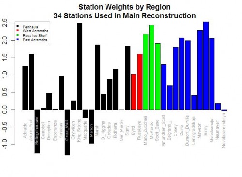
Here are the weighting factors the study came up with:

bar-plot-station-weights

Do you see the problem?  Five stations actually have negative weights!  Basically, this means that in rolling up these stations, these five thermometers were used upside down!  Increases in these temperatures in these stations cause the reconstructed continental average to decrease, and vice versa.  Of course, this makes zero sense, and is a great example of scientists wallowing in the numbers and forgetting they are supposed to have a physical reality.  Michael Mann has been quoted as saying the multi-variable regression analysis doesn’t care as to the orientation (positive or negative) of the correlation.  This is literally true, but what he forgets is that while the math may not care, Nature does.

For those who don’t follow, let me give you an example.  Let’s say we have market prices in a number of cities for a certain product, and we want to come up with an average.  To do so, we will have to weight the various local prices based on sizes of the city or perhaps populations or whatever.  But the one thing we can almost certainly predict is that none of the individual city weights will be negative.  We won’t, for example, ever find that the average western price of a product goes up because one component of the average, say the price in Portland, goes down.  This flies in the face of our understanding of how an arithmetic average should work.

It may happen that in a certain time periods, the price in Portland goes down in the same month as the Western average went up, but the decline in price in Portland did not drive the Western average up — in fact, its decline had to have actually limited the growth of the Western average below what it would have been had Portland also increased.   Someone looking at that one month and not understanding the underlying process might draw the conclusion that prices in Portland were related to the Western average price by a negative coefficient, but that conclusion would be wrong.

The Id post goes on to list a number of other failings of the Steig study on Antarctica, as does this post.  Years ago I wrote an article arguing that while the GISS and other bodies claim they have a statistical method for eliminating individual biases of measurement stations in their global averages, it appeared to me that all they were doing was spreading the warming bias around a larger geographic area like peanut butter.  Steig’ study appears to do the same thing, spreading the warming from the Antarctic Peninsula across the whole continent, in part based on its choice to use just three PC’s, a number that is both oddly small and coincidentally exactly the choice required to get the maximum warming value from their methodology.

Worth Your Time

I really like to write a bit more about such articles, but I just don’t have the time right now.  So I will simply recommend you read this guest post at WUWT on Steig’s 2009 Antarctica temperature study.  The traditional view has been that the Antarctic Peninsula (about 5% of the continent) has been warming a lot while the rest of the continent has been cooling.  Steig got a lot of press by coming up with the result that almost all of Antarctica is warming.

But the article at WUWT argues that Steig gets to this conclusion only by reducing all of Antarctic temperatures to three measurement points.  This process smears the warming of the peninsula across a broader swath of the continent.  If you can get through the post, you will really learn a lot about the flaws in this kind of study.

I have sympathy for scientists who are working in a low signal to noise environment.   Scientists are trying to tease 50 years of temperature history across a huge continent from only a handful of measurement points that are full of holes in the data.  A charitable person would look at this article and say they just went too far, teasing out spurious results rather than real signal out of the data.  A more cynical person might argue that this is a study where, at every turn, the authors made every single methodological choice coincidentally in the one possible way that would maximize their reported temperature trend.

By the way, I have seen Steig written up all over, but it is interesting that I never saw this:  Even using Steig’s methodology, the temperature trend since 1980 has been negative.  So whatever warming trend they found ended almost 30 years ago.    Here is the table from the WUWT article, showing the Steign original results and several cuts and recalculating their data using improved methods.

Reconstruction

1957 to 2006 trend

1957 to 1979 trend (pre-AWS)

1980 to 2006 trend (AWS era)

Steig 3 PC

+0.14 deg C./decade

+0.17 deg C./decade

-0.06 deg C./decade

New 7 PC

+0.11 deg C./decade

+0.25 deg C./decade

-0.20 deg C./decade

New 7 PC weighted

+0.09 deg C./decade

+0.22 deg C./decade

-0.20 deg C./decade

New 7 PC wgtd imputed cells

+0.08 deg C./decade

+0.22 deg C./decade

-0.21 deg C./decade

Here, by the way, is an excerpt from Steig’s abstract in Nature:

Here we show that significant warming extends well beyond the Antarctic Peninsula to cover most of West Antarctica, an area of warming much larger than previously reported. West Antarctic warming exceeds 0.1 °C per decade over the past 50 years, and is strongest in winter and spring.

Hmm, no mention that this trend reversed half way through the period.  A bit disengenuous, no?  Its almost as if there is a way they wanted the analysis to come out.

Skipping A Step

Here is a little glimpse of how climate alarmism works.  Check out this article in the NewScientist (I don’t know anything about this particular publication, but my general assumption is that most periodicals use “New” in the context of such a title as a synonym for “socialist.”):

Rather than spreading out evenly across all the oceans, water from melted Antarctic ice sheets will gather around North America and the Indian Ocean. That’s bad news for the US East Coast, which could bear the brunt of one of these oceanic bulges.

It goes on and on with more detail, which sounds really scary:

First, Jerry Mitrovica and colleagues from the University of Toronto in Canada considered the gravitational attraction of the Antarctic ice sheets on the surrounding water, which pulls it towards the South Pole. As the ice sheet melts, this bulge of water dissipates into surrounding oceans along with the meltwater. So while the sea level near Antarctica will fall, sea levels away from the South Pole will rise.

Once the ice melts, the release of pressure could also cause the Antarctic continent to rise by 100 metres. And as the weight of the ice pressing down on the continental shelf is released, the rock will spring back, displacing seawater that will also spread across the oceans.

Redistributing this mass of water could even change the axis of the Earth’s spin. The team estimates that the South Pole will shift by 500 metres towards the west of Antarctica, and the North Pole will shift in the opposite direction. Since the spin of the Earth creates bulges of oceanic water in the regions between the equator and the poles, these bulges will also shift slightly with the changing axis….

The upshot is that the North American continent and the Indian Ocean will experience the greatest changes in sea level – adding 1 or 2 metres to the current estimates. Washington DC sits squarely in this area, meaning it could face a 6.3-metre sea level rise in total. California will also be in the target zone.

Spotting the skipped logic step does not require one to be a climate skeptic.  Anyone familiar with the most recent IPCC report should see it too.  Specifically, the authors simply posit — without even bothering to mention it as an assumption! — that tons of land-based ice (remember, sea ice melting has no effect on sea levels) is going to melt in Antarctica.  But just about everyone, even the alarmists at the IPCC, predict just the opposite, even in 3C per century global warming scenarios.

Why?  Well, for a couple of reasons.  The first is that Antarctica is so cold that several degrees of warming will not bring most of the continent above freezing, even in the summer.  The exception is probably the Antarctic Peninsula, which sticks out north of the rest of the continent and accounts for 2% of the land mass and a much smaller percentage of the total ice pack.

The other reason is that if the world warms, the seas around Antarctica will warm and the models show the warming surrounding seas increasing precipitation on the continent and actually increasing snow pack.  In fact, increases in Antarctic ice pack actually exceed decreases forecast in ice packs around the rest of the world.  The entirety of the IPCC ocean rise scenario is driven by the thermal expansion of water, not net ice melting.

By the way, I presume these guys have their math right, but it seems astonishing to me that the ice mass (or lack of it) could really exert enough gravitational pull to change sea levels in the northern hemisphere by a meter or two.  Gravity is an astonishingly weak force — does this reality check?  I had always thought differences in ocean levels (say for example the fact that the Atlantic and Pacific are not the same height on either side of the Panama Canal)  had more to do with differentials in evaporation rates.

PS- Is telling me global warming will flood Washington DC supposed to make me be against global warming?  Because that sounds pretty good to me. ;=)