All posts by admin

Explaining the Flaw in Kevin Drum’s (and Apparently Science Magazine’s) Climate Chart

Cross-Posted from Coyoteblog

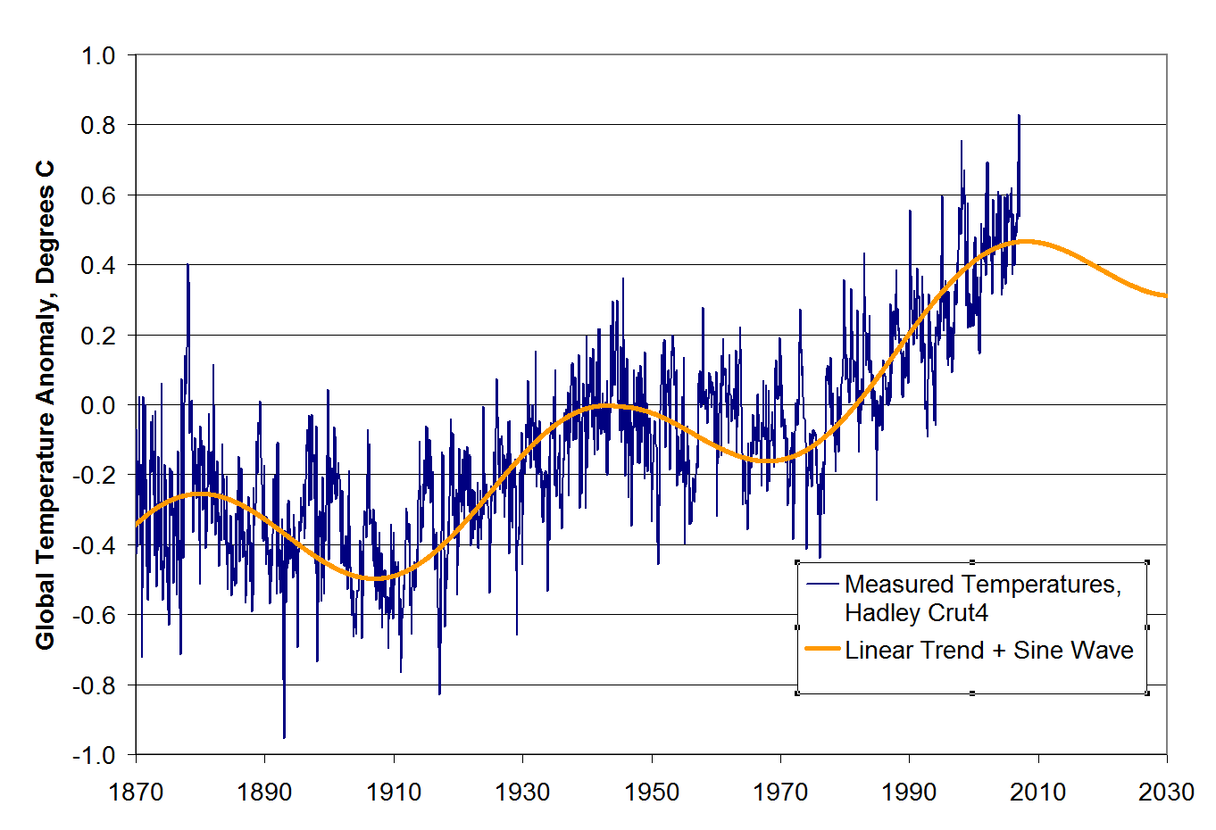
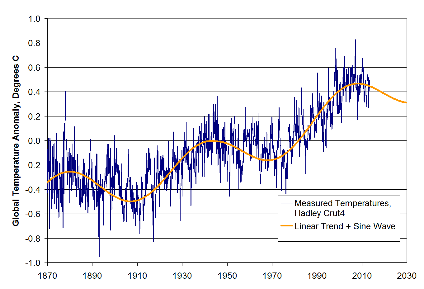
I won’t repeat the analysis, you need to see it here.  Here is the chart in question:

la-sci-climate-warming

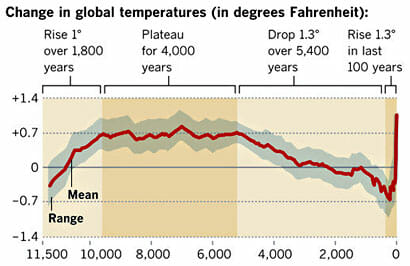
My argument is that the smoothing and relatively low sampling intervals in the early data very likely mask variations similar to what we are seeing in the last 100 years — ie they greatly exaggerate the smoothness of history (also the grey range bands are self-evidently garbage, but that is another story).

Drum’s response was that “it was published in Science.”  Apparently, this sort of appeal to authority is what passes for data analysis in the climate world.

Well, maybe I did not explain the issue well.  So I found a political analysis that may help Kevin Drum see the problem.  This is from an actual blog post by Dave Manuel (this seems to be such a common data analysis fallacy that I found an example on the first page of my first Google search).  It is an analysis of average GDP growth by President.  I don’t know this Dave Manuel guy and can’t comment on the data quality, but let’s assume the data is correct for a moment.  Quoting from his post:

Here are the individual performances of each president since 1948:

1948-1952 (Harry S. Truman, Democrat), +4.82%
1953-1960 (Dwight D. Eisenhower, Republican), +3%
1961-1964 (John F. Kennedy / Lyndon B. Johnson, Democrat), +4.65%
1965-1968 (Lyndon B. Johnson, Democrat), +5.05%
1969-1972 (Richard Nixon, Republican), +3%
1973-1976 (Richard Nixon / Gerald Ford, Republican), +2.6%
1977-1980 (Jimmy Carter, Democrat), +3.25%
1981-1988 (Ronald Reagan, Republican), 3.4%
1989-1992 (George H. W. Bush, Republican), 2.17%
1993-2000 (Bill Clinton, Democrat), 3.88%
2001-2008 (George W. Bush, Republican), +2.09%
2009 (Barack Obama, Democrat), -2.6%

Let’s put this data in a chart:

click to enlarge


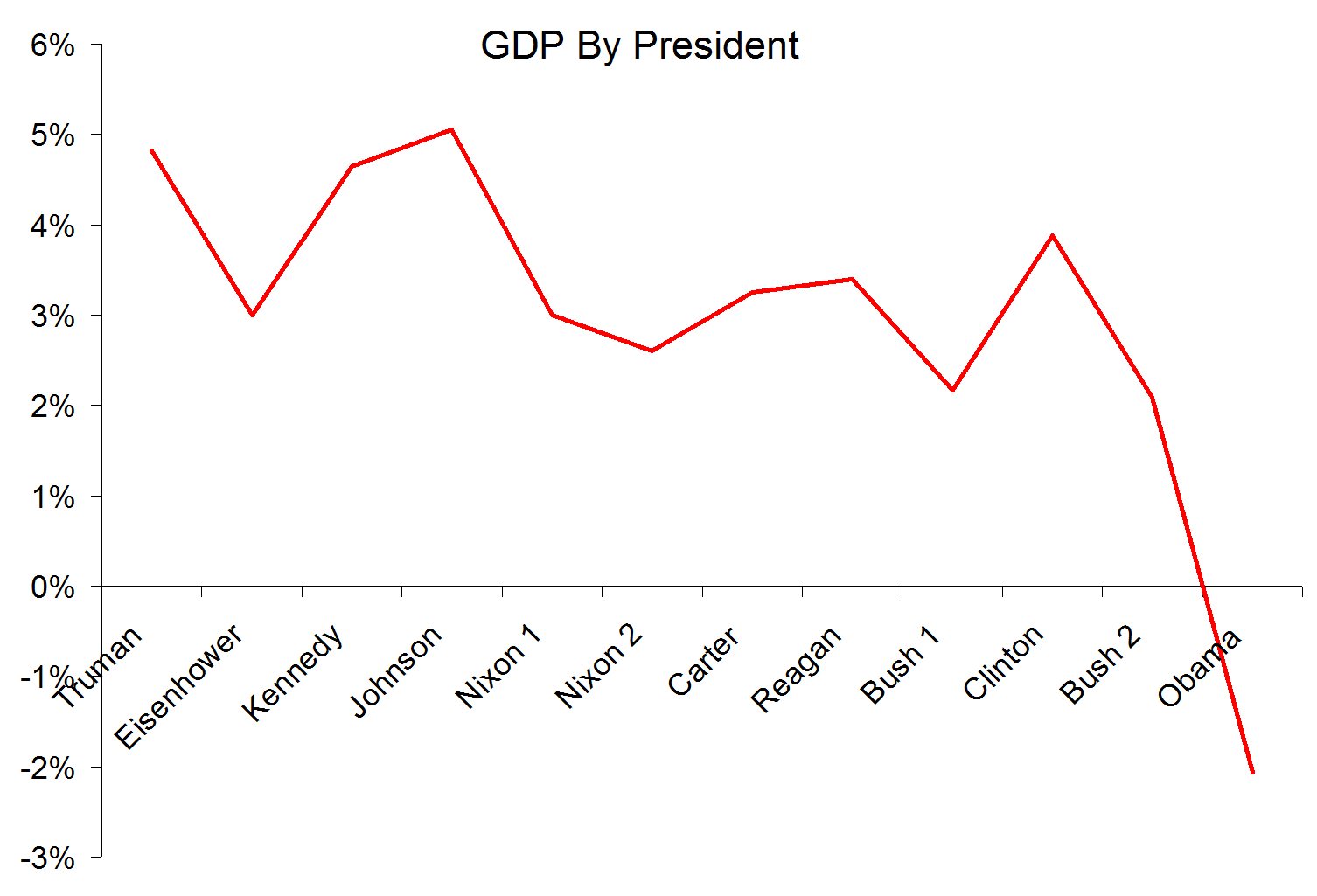
Look, a hockey stick , right?   Obama is the worst, right?

In fact there is a big problem with this analysis, even if the data is correct.  And I bet Kevin Drum can get it right away, even though it is the exact same problem as on his climate chart.

The problem is that a single year of Obama’s is compared to four or eight years for other presidents.  These earlier presidents may well have had individual down economic years – in fact, Reagan’s first year was almost certainly a down year for GDP.  But that kind of volatility is masked because the data points for the other presidents represent much more time, effectively smoothing variability.

Now, this chart has a difference in sampling frequency of 4-8x between the previous presidents and Obama.  This made a huge difference here, but it is a trivial difference compared to the 1 million times greater sampling frequency of modern temperature data vs. historical data obtained by looking at proxies (such as ice cores and tree rings).  And, unlike this chart, the method of sampling is very different across time with temperature – thermometers today are far more reliable and linear measurement devices than trees or ice.  In our GDP example, this problem roughly equates to trying to compare the GDP under Obama (with all the economic data we collate today) to, say, the economic growth rate under Henry the VIII.  Or perhaps under Ramses II.   If I showed that GDP growth in a single month under Obama was less than the average over 66 years under Ramses II, and tried to draw some conclusion from that, I think someone might challenge my analysis.  Unless of course it appears in Science, then it must be beyond question.

If You Don’t Like People Saying That Climate Science is Absurd, Stop Publishing Absurd Un-Scientific Charts

Reprinted from Coyoteblog

science a “myth”.  As is usual for global warming supporters, he wraps himself in the mantle of science while implying that those who don’t toe the line on the declared consensus are somehow anti-science.

Readers will know that as a lukewarmer, I have as little patience with outright CO2 warming deniers as I do with those declaring a catastrophe  (for my views read this and this).  But if you are going to simply be thunderstruck that some people don’t trust climate scientists, then don’t post a chart that is a great example of why people think that a lot of global warming science is garbage.  Here is Drum’s chart:

la-sci-climate-warming

The problem is that his chart is a splice of multiple data series with very different time resolutions.  The series up to about 1850 has data points taken at best every 50 years and likely at 100-200 year or more intervals.  It is smoothed so that temperature shifts less than 200 years or so in length won’t show up and are smoothed out.

In contrast, the data series after 1850 has data sampled every day or even hour.  It has a sampling interval 6 orders of magnitude (over a million times) more frequent.  It by definition is smoothed on a time scale substantially shorter than the rest of the data.

In addition, these two data sets use entirely different measurement techniques.  The modern data comes from thermometers and satellites, measurement approaches that we understand fairly well.  The earlier data comes from some sort of proxy analysis (ice cores, tree rings, sediments, etc.)  While we know these proxies generally change with temperature, there are still a lot of questions as to their accuracy and, perhaps more importantly for us here, whether they vary linearly or have any sort of attenuation of the peaks.  For example, recent warming has not shown up as strongly in tree ring proxies, raising the question of whether they may also be missing rapid temperature changes or peaks in earlier data for which we don’t have thermometers to back-check them (this is an oft-discussed problem called proxy divergence).

The problem is not the accuracy of the data for the last 100 years, though we could quibble this it is perhaps exaggerated by a few tenths of a degree.  The problem is with the historic data and using it as a valid comparison to recent data.  Even a 100 year increase of about a degree would, in the data series before 1850, be at most a single data point.  If the sampling is on 200 year intervals, there is a 50-50 chance a 100 year spike would be missed entirely in the historic data.  And even if it were in the data as a single data point, it would be smoothed out at this data scale.

Do you really think that there was never a 100-year period in those last 10,000 years where the temperatures varied by more than 0.1F, as implied by this chart?  This chart has a data set that is smoothed to signals no finer than about 200 years and compares it to recent data with no such filter.  It is like comparing the annualized GDP increase for the last quarter to the average annual GDP increase for the entire 19th century.   It is easy to demonstrate how silly this is.  If you cut the chart off at say 1950, before much anthropogenic effect will have occurred, it would still look like this, with an anomalous spike at the right (just a bit shorter).  If you believe this analysis, you have to believe that there is an unprecedented spike at the end even without anthropogenic effects.

There are several other issues with this chart that makes it laughably bad for someone to use in the context of arguing that he is the true defender of scientific integrity

  • The grey range band is if anything an even bigger scientific absurdity than the main data line.  Are they really trying to argue that there were no years, or decades, or even whole centuries that never deviated from a 0.7F baseline anomaly by more than 0.3F for the entire 4000 year period from 7500 years ago to 3500 years ago?  I will bet just about anything that the error bars on this analysis should be more than 0.3F, much less the range of variability around the mean.  Any natural scientist worth his or her salt would laugh this out of the room.  It is absurd.  But here it is presented as climate science in the exact same article that the author expresses dismay that anyone would distrust climate science.
  • A more minor point, but one that disguises the sampling frequency problem a bit, is that the last dark brown shaded area on the right that is labelled “the last 100 years” is actually at least 300 years wide.  Based on the scale, a hundred years should be about one dot on the x axis.  This means that 100 years is less than the width of the red line, and the last 60 years or the real anthropogenic period is less than half the width of the red line.  We are talking about a temperature change whose duration is half the width of the red line, which hopefully gives you some idea why I say the data sampling and smoothing processes would disguise any past periods similar to the most recent one.

Update:  Kevin Drum posted a defense of this chart on Twitter.  Here it is:  “It was published in Science.”   Well folks, there is climate debate in a nutshell.   An 1000-word dissection of what appears to be wrong with a particular analysis retorted by a five-word appeal to authority.

Update On My Climate Model (Spoiler: It’s Doing a Lot Better than the Pros)

Cross posted from Coyoteblog

In this post, I want to discuss my just-for-fun model of global temperatures I developed 6 years ago.  But more importantly, I am going to come back to some lessons about natural climate drivers and historic temperature trends that should have great relevance to the upcoming IPCC report.

In 2007, for my first climate video, I created an admittedly simplistic model of global temperatures.  I did not try to model any details within the climate system.  Instead, I attempted to tease out a very few (it ended up being three) trends from the historic temperature data and simply projected them forward.  Each of these trends has a logic grounded in physical processes, but the values I used were pure regression rather than any bottom up calculation from physics.  Here they are:

  • A long term trend of 0.4C warming per century.  This can be thought of as a sort of base natural rate for the post-little ice age era.
  • An additional linear trend beginning in 1945 of an additional 0.35C per century.  This represents combined effects of CO2 (whose effects should largely appear after mid-century) and higher solar activity in the second half of the 20th century  (Note that this is way, way below the mainstream estimates in the IPCC of the historic contribution of CO2, as it implies the maximum historic contribution is less than 0.2C)
  • A cyclic trend that looks like a sine wave centered on zero (such that over time it adds nothing to the long term trend) with a period of about 63 years.  Think of this as representing the net effect of cyclical climate processes such as the PDO and AMO.

Put in graphical form, here are these three drivers (the left axis in both is degrees C, re-centered to match the centering of Hadley CRUT4 temperature anomalies).  The two linear trends:

click to enlarge


And the cyclic trend:

click to enlarge

These two charts are simply added and then can be compared to actual temperatures.  This is the way the comparison looked in 2007 when I first created this “model”

click to enlarge

The historic match is no great feat.  The model was admittedly tuned to match history (yes, unlike the pros who all tune their models, I admit it).  The linear trends as well as the sine wave period and amplitude were adjusted to make the fit work.

However, it is instructive to note that a simple model of a linear trend plus sine wave matches history so well, particularly since it assumes such a small contribution from CO2 (yet matches history well) and since in prior IPCC reports, the IPCC and most modelers simply refused to include cyclic functions like AMO and PDO in their models.  You will note that the Coyote Climate Model was projecting a flattening, even a decrease in temperatures when everyone else in the climate community was projecting that blue temperature line heading up and to the right.

So, how are we doing?  I never really meant the model to have predictive power.  I built it just to make some points about the potential role of cyclic functions in the historic temperature trend.  But based on updated Hadley CRUT4 data through July, 2013, this is how we are doing:

click to enlarge


Not too shabby.  Anyway, I do not insist on the model, but I do want to come back to a few points about temperature modeling and cyclic climate processes in light of the new IPCC report coming soon.

The decisions of climate modelers do not always make sense or seem consistent.  The best framework I can find for explaining their choices is to hypothesize that every choice is driven by trying to make the forecast future temperature increase as large as possible.  In past IPCC reports, modelers refused to acknowledge any natural or cyclic effects on global temperatures, and actually made statements that a) variations in the sun’s output were too small to change temperatures in any measurable way and b) it was not necessary to include cyclic processes like the PDO and AMO in their climate models.

I do not know why these decisions were made, but they had the effect of maximizing the amount of past warming that could be attributed to CO2, thus maximizing potential climate sensitivity numbers and future warming forecasts.  The reason for this was that the IPCC based nearly the totality of their conclusions about past warming rates and CO2 from the period 1978-1998.  They may talk about “since 1950”, but you can see from the chart above that all of the warming since 1950 actually happened in that narrow 20 year window.  During that 20-year window, though, solar activity, the PDO and the AMO were also all peaking or in their warm phases.  So if the IPCC were to acknowledge that any of those natural effects had any influence on temperatures, they would have to reduce the amount of warming scored to CO2 between 1978 and 1998 and thus their large future warming forecasts would have become even harder to justify.

Now, fast forward to today.  Global temperatures have been flat since about 1998, or for about 15 years or so.  This is difficult to explain for the IPCC, since about none of the 60+ models in their ensembles predicted this kind of pause in warming.  In fact, temperature trends over the last 15 years have fallen below the 95% confidence level of nearly every climate model used by the IPCC.  So scientists must either change their models (eek!) or else they must explain why they still are correct but missed the last 15 years of flat temperatures.

The IPCC is likely to take the latter course.  Rumor has it that they will attribute the warming pause to… ocean cycles and the sun (those things the IPCC said last time were irrelevant).  As you can see from my model above, this is entirely plausible.  My model has an underlying 0.75C per century trend after 1945, but even with this trend actual temperatures hit a 30-year flat spot after the year 2000.   So it is entirely possible for an underlying trend to be temporarily masked by cyclical factors.

BUT.  And this is a big but.  You can also see from my model that you can’t assume that these factors caused the current “pause” in warming without also acknowledging that they contributed to the warming from 1978-1998, something the IPCC seems loath to do.  I do not know how the ICC is going to deal with this.  I hate to think the worst of people, but I do not think it is beyond them to say that these factors offset greenhouse warming for the last 15 years but did not increase warming the 20 years before that.

We shall see.  To be continued….

Climate Goundhog Day

I posted something like this over at my other blog but I suppose I should post it here as well.  Folks ask me why I have not been blogging much here on climate, and the reason is that is has just gotten too repetitive.  It is like the movie Groundhog Day, with the same flawed studies being refuted in the same ways.  Or, if you want another burrowing mammal analogy, being a climate skeptic has become a giant game of Wack-a-Mole, with each day bringing a new flawed argument from alarmist that must be refuted.  But we never accumulate any score — skeptics have pretty much killed Gore’s ice core analysis, the hockey stick, the myth that CO2 is reducing snows on Kilamanjaro, Gore’s 20- feet of sea rise — the list goes on an on.  But we get no credit — we are still the ones who are supposedly anti-science.

This is a hobby, and not even my main hobby, so I have decided to focus on what I enjoy best about the climate debate, and that is making live presentations.  To this end, you will continue to see posts here with updated presentations and videos, and possibly a new analysis or two as I find better ways to present the material (by the way, if you have a large group, I am happy to come speak — I do not charge a speaker fee and can often pay for the travel myself).

However, while we are on the subject of climate Groundhog Day (where every day repeats itself over and over), let me tell you in advance what stories skeptic sites like WUWT and Bishop Hill and Climate Depot will be running in the coming months on the IPCC.  I can predict these with absolute certainty because they are the same stories run on the last IPCC report, and I don’t expect those folks at the IPCC to change their stripes.  So here are your future skeptic site headlines:

  1. Science sections of recent IPCC report were forced to change to fit the executive summary written by political appointees
  2. The recent IPCC report contains a substantial number of references to non-peer reviewed gray literature
  3. In the IPCC report, a couple of studies that fend off key skeptic attacks either have not yet even been published or were included despite being released after the cut off date set for studies to be included in the report
  4. In several sections of the recent IPCC report, the lead author ignored most other studies and evidence on the matter at hand and based their chapter mostly on their own research
  5. In its conclusions, the IPCC expresses absolute confidence in a statement about anthropogenic warming so vague that most skeptics might agree with the proposition.  Media then reported this as 97% confidence in 5 degrees of warming per century and 20 feet of sea rise
  6. The hockey stick has been reworked and is still totally flawed
  7. Non-Co2 causes of weather and weather related effects (e.g the sun or anthropocentric contributions like soot) are downplayed or ignored in the most recent IPCC report
  8. The words “urban heat island” appear nowhere in the IPCC report.  There is no consideration of the quality of the surface temperature record, its measurement, or the manual adjustments made to it.
  9. Most of the key studies in the IPCC report have not archived their data and refuse to release their data or software code to any skeptic for replication

Oh, I suppose it will not be all Groundhog Day.  I will predict a new one.  The old headlines were “IPCC ignores ocean cycles as partial cause for 1978-1998 warming”.  This report will be different.  Now stories will read for the new report, “IPCC blames warming hiatus on cooling from ocean cycles, but says ocean cycles have nothing to do with earlier warming”.

Amherst, MA Presentation, March 7

I will be rolling out version 3.0 of my presentation on climate that has already been around the Internet and back a couple of times.  Called “Don’t Panic:  The Science of the Climate Skeptic Position”, it will be given at 7PM in the Pruyne Lecture Hall at Amherst College on March 7, 2013.  Come by if you are in the area.

Topics include:

  • What does it mean when people say “97% of scientists agree with global warming?”   This statement turns out to be substantially less powerful when one understands the propositions actually tested.
  • The greenhouse gas effect of CO2 is a fact (did I surprise you?) but it is a second, unproven theory of strong positive feedbacks in the climate that causes the hypothesized catastrophe.
  • The world has indeed warmed over the last century, but not enough to be consistent with catastrophic forecasts, and not all due to CO2
  • While good science is being done, the science behind knock-on effects of global warming (e.g. global warming causedSandy) is often non-existent or embarrassingly bad.  Too often, the media is extrapolating from single data points
  • The “precautionary principle” ignores real negative effects of carbon rationing, particularly in lesser developed countries.

Speaker Pledge

The tone of the global warming debate is often terrible (on both sides).  The speaker will assume those who disagree are persons of goodwill.   The speaker will not resort to ad hominem attacks or discussion of funding sources and motivations.

Climate De-Bait and Switch

Dealing with facile arguments that are supposedly perfect refutations of the climate skeptics’ position is a full-time job akin to cleaning the Augean Stables.  A few weeks ago Kevin Drum argued that global warming added 3 inches to Sandy’s 14-foot storm surge, which he said was an argument that totally refuted skeptics and justified massive government restrictions on energy consumption (or whatever).

This week Slate (and Desmog blog) think they have the ultimate killer chart, on they call a “slam dunk” on skeptics.  Click through to my column this week at Forbes to see if they really do.

Lame, Desperate Climate Alarm Logic

Via Kevin Drum:

Chris Mooney reports today that there’s also a very simple reason: global warming has raised sea levels by about eight inches over the past century, and this means that when Sandy swept ashore it had eight extra inches of water to throw at us.….So that’s that. No shilly shallying. No caveats. “There is 100 percent certainty that sea level rise made this worse,” says sea level expert Ben Strauss. “Period.”

Hmm, OK.  First, to be clear, sea level rise over the last 100 years has been 17-20cm, which is 6.7-7.7 inches, which the author alarmingly rounded up to 8 inches.  But the real problem is the incredible bait and switch here.  They are talking about the dangers of anthropogenic global warming, but include the sea level rise from all warming effects, most of which occured long before we were burning fossil fuels at anywhere near current rates.  For example, almost half this rise was before 1950, where few argue that warming and sea level rise was due to man.  In fact, sea level rise is really a story of a constant 2-3mm a year rise since about 1850 as the world warms from the little ice age.  There has been no modern acceleration.

Graph—Global mean sea level: 1870–2007(source)

It is pretty heroic to blame all of a trend on an input that really only appeared significantly about 2/3 into the period on this chart.  By this chart, the warming since 1950, the period the IPCC blames warming mostly on man’s CO2, the sea level rise is only 10cm, or about 4 inches.  And to even claim four inches form CO2 since 1950 one would have to make the astonishing claim that whatever natural effect was driving sea levels higher since the mid-19th century suddenly halted at the exact same moment man began burning fossil fuels in earnest.    I’m not sure that the Sandy storm surge could even be measured to a precision of four inches or less.

Assuming three of the four inches are due to anthropogenic CO2, then the storm surge was 1.8%  higher due to global warming (taking 14 feet as the storm surge maximum, a number on which there is little agreement, confirming my hypothesis above that we are arguing in the noise).  Mooney’s argument is that damage goes up exponentially with surge height.  Granting this is true, this means that Sandy was perhaps 3.5% worse due to man-made higher sea levels.

So there you have your stark choice — you can shut down the global economy and throw billions of people in India and China back into horrendous poverty, or your 100-year storms will be 3,5% worse.  You make the call.

I would argue that one could find a far bigger contribution to Sandy’s nastiness in New York’s almost pathological refusal to accept in advance of Sandy that their city might be targeted by an Atlantic storm.  Huge percentages of the affected areas of the city are actually fill areas, and there is absolutely no evidence of sea walls or any sort of storm preparation.  I would have thought it impossible to find a seacoast city worse prepared for a storm than was New Orleans, but New York seems to have surpassed it.

As I wrote before, it is crazy to use Sandy as “proof” of a severe storm trend when in fact we are in the midst of a relative hurricane drought.  There is no evidence that the seas in Sandy’s storm track have seen any warming over the last century.

Extrapolating From A Single Data Point: Climate and Sandy

I have a new article up at Forbes on how crazy it is to extrapolate conclusions about the speed and direction of climate change from a single data point.

Positing a trend from a single database without any supporting historical information has become a common media practice in discussing climate.  As I wrote several months ago, the media did the same thing with the hot summer, arguing frequently that this recent hot dry summer proved a trend for extreme temperatures, drought, and forest fires.  In fact, none of these are the case — this summer was not unprecedented on any of these dimensions and no upward trend is detectable in long-term drought or fire data.   Despite a pretty clear history of warming over the last century, it is even hard to establish any trend in high temperature extremes  (in large part because much of the warming has been in warmer night-time lows rather than in daytime highs).  See here for the data.

As I said in that earlier article, when the media posits a trend, demand a trendline, not just a single data point.

To this end, I try to bring so actual trend data to the trend discussion.

A Great Example of How The Climate Debate is Broken

A climate alarmist posts a “Bet” on a site called Truthmarket that she obviously believes is a dagger to the heart of climate skeptics.  Heck, she is putting up $5,000 of her own money on it.  The amazing part is that the proposition she is betting on is entirely beside the point.  She is betting on the truth of a statement that many skeptics would agree with.

This is how the climate debate has gone wrong.  Alarmists are trying to shift the debate from the key points they can’t prove to facile points they can.  And the media lets them get away with it.

Read about it in my post this week at Forbes.com

I Was Right About Monnett

When the news first came out that Charles Monnett, observer of the famous drowned polar bear, was under investigation by the Obama Administration, I cautioned that:

  1. If you read between the lines in the news articles, we really have no idea what is going on.  The guy could have falsified his travel expense reports
  2. The likelihood that an Obama Administration agency would be trying to root out academic fraud at all, or that if they did so they would start here, seems absurd to me.
  3. There is no room for fraud because the study was, on its face, facile and useless.  The authors basically extrapolated from a single data point.  As I tell folks all the time, if you have only one data point, you can draw virtually any trend line you want through it.  They had no evidence of what caused the bear deaths or if they were in any way typical or part of a trend — it was all pure speculation and crazy extrapolation.  How could there be fraud when there was not any data here in the first place?  The fraud was in the media, Al Gore, and ultimately the EPA treating this with any sort of gravitas.

As I expected, while the investigation looked into the polar bear study, the decision seems to have nothing to do with polar bears or academic fraud.  The most-transparent-administration-ever seems to be upset that Monnett shared some emails that made the agency look bad.  These are documents that, to my eye, appear to be public records that you or I should have been able to FOIA anyway had we known they existed.  But despite all the Bush-bashing (of which I was an enthusiastic participant), Obama has been far more aggressive in punishing and prosecuting leakers.  In fact, Monnett may be able to get himself a payday under whistle-blower statutes.

Lewandowsky et al. Proves Skeptics are Reasonable and Pro-Science

I am not sure it is worth beating this dead horse any further, but I will make one final observation about Lewandowsky.  As a reminder, the study purported to link skeptics with belief in odd conspiracy theories, particularly the theory that the Apollo 11 landings were faked (a conclusion highlighted in the title of the press release).

Apparently the study got this conclusion based on a trivial 10 responses out of hundreds from folks who self-identified as skeptics, but due to the horrible methodology many not actually have been such.

But here is the interesting part.  Even if the data was good, it would mean that less than .2% of the “skeptics” adopted the moon landing conspiracy theory.  Compare this to the general population:

 A 1999 Gallup poll found that a scant 6 percent of Americans doubted the Apollo 11 moon landing happened, and there is anecdotal evidence that the ranks of such conspiracy theorists, fueled by innuendo-filled documentaries and the Internet, are growing.

Twenty-five percent of respondents to a survey in the British magazine Engineering & Technology said they do not believe humans landed on the moon. A handful of Web sites and blogs circulate suspicions about NASA’s “hoax.”

And a Google search this week for “Apollo moon landing hoax” yielded more than 1.5 billion results.  (more here)

By Lewandowsky’s own data, skeptics are 30-100 times less gullible than the average American or Brit.

By the way, I have spent a lot of time debunking silly 9/11 theories.  Here is one example of a science-based response to the Rosie O’Donnell (a famous climate alarmist, by the way) and her claim that burning jet fuel can’t melt steel so therefore the WTC had to have been destroyed by demolition charges set by Dick Cheney, or something like that.

Worst Study Ever?

I have to agree with JoNova, the Lewandowsky study ostensibly linking climate skeptics to moon-landing-deniers is perhaps the worst study I have seen in a really long time.   This is another sign of postmodernism run wild in the sciences, with having the “right” answer being more important than actually being able to prove it.

The whole story is simply delicious, given the atrocious methodology paired is paired with a self-important mission by the authors of supposedly defending science against its detractors.  I can’t do the whole mess justice without just repeating her whole post, so go visit the article.

For the record, I have never seriously doubted that the moon landings really happened or that cigarettes cause cancer.  Also, I will add my name to the list of skeptical bloggers who were not contacted about the study — though I am a small fry, I am pretty easy to find given my URL.

By the way, the article mentions 9/11 truthers only in passing.  This is probably not an accident.  I would bet just about any amount of money that there is a good correlation between 9/11 conspiracy theorists and climate alarmists.

I Was Reading Matt Ridley’s Lecture at the Royal Society for the Arts….

… and it was fun to see my charts in it!  The lecture is reprinted here (pdf) or here (html) over at Anthondy Watts’ site.  The charts I did are around pages 6-7 of the pdf, the ones showing the projected curve of global warming for various climate sensitivities, and backing into what that should imply for current warming.  In short, even if you don’t think warming in the surface temperature record is exaggerated, there still has not been anywhere near the amount of warming one would expect for the types of higher sensitivities in the IPCC and other climate models.  Warming to date, even if not exaggerated and all attributed to man-made and not natural causes, is consistent with far less catastrophic, and more incremental, future warming numbers.

These charts come right out of the IPCC formula for the relationship between CO2 concentrations and warming, a formula first proposed by Michael Mann.  I explained these charts in depth around the 10 minute mark of this video, and returned to them to make the point about past warming around the 62 minute mark.   This is a shorter video, just three minutes, that covers the same ground.  Watching it again, I am struck by how relevant it is as a critique five years later, and by how depressing it is that this critique still has not penetrated mainstream discussion of climate.  In fact, I am going to embed it below:

The older slides Ridley uses, which are cleaner (I went back and forth on the best way to portray this stuff) can be found here.

By the way, Ridley wrote an awesome piece for Wired more generally about catastrophism which is very much worth a read.

On Muller

Kevin Drum approvingly posted this chart from Muller:

I applaud the effort to match theory to actual, you know, observations rather than model results.  I don’t have a ton of time to write currently, but gave some quick comments:

1.  This may seem an odd critique, but the fit is too good.  There is no way that in a complex, chaotic system only two variables explain so much of a key output.    You don’t have to doubt the catastrophic anthropogenic global warming theory to know that there are key variables that have important, measurable effects on world temperatures at these kind of timescales — ocean cycles come to mind immediately — which he has left out.   Industrial-produced cooling aerosols, without which most climate models can’t be made to fit history, are another example.  Muller’s analysis is like claiming that stock prices are driven by just two variables without having considered interest rates or earning in the analysis.

2.  Just to give one example critique of the quality of “science” being held up as an example, any real scientist should laugh at the error ranges in this chart.   The chart shows zero error for modern surface temperature readings.  Zero.  Not even 0.1F.    This is hilariously flawed.  Anyone who went through a good freshman physics or chemistry lab (ie many non-journalists) will have had basic concepts of errors drilled into them.  An individual temperature instrument probably has an error when perfectly calibrated of say 0.2F at best.  In the field, with indifferent maintenance and calibration, that probably raises to 0.5F.  Given bad instrument sitings, that might raise over 1F.  Now, add all those up, with all the uncertainties involved in trying to get a geographic average when, for example, large swaths of the earth are not covered by an official thermometer, and what is the error on the total?  Not zero, I can guarantee you.  Recognize that this press blitz comes because he can’t get this mess through peer review so he is going direct with it.

3. CO2 certainly has an effect on temperatures, but so do a lot of other things. The science that CO2 warms the Earth is solid. The science that CO2 catastrophically warms the Earth, with a high positive feedback climate system driven to climate sensitivities to CO2 of 3C per doubling or higher is not solid. Assuming half of past warming is due to man’s CO2 is not enough to support catastrophic forecasts. If half of past warming, or about .4C is due to man, that means climate sensitivity is around 1C, exactly the no-feedback number that climate skeptics have thought it was near for years. So additional past man-made warming has to be manufactured somehow to support the higher sensitivity, positive feedback cases.

Judith Curry has a number of comments, including links to what she considers best in class for this sort of historic reconstruction.

Update: Several folks have argued that the individual instrument error bars are irrelevant, I suppose because their errors will average. I am not convinced they average down to zero, as this chart seems to imply. But many of the errors are going to be systematic. For example, every single instrument in the surface average have manual adjustments made in multiple steps, from TOBS to corrections for UHI to statistical homogenization. In some cases these can be calculated with fair precision (e.g. TOBS) but in others they are basically a guess. And no one really knows if statistical homogenization approaches even make sense. In many cases, these adjustments can be up to several times larger in magnitude than the basic signal one is trying to measure (ie temperature anomaly and changes to it over time). Errors in these adjustments can be large and could well be systematic, meaning they don’t average out with multiple samples. And even errors in the raw measurements might have a systematic bias (if, for example, drift from calibration over time tended to be in one direction). Anthony Watt recently released a draft of a study I have not read yet, but seems to imply that the very sign of the non-TOBS adjustments is consistently wrong. As a professor of mine once said, if you are unsure of the sign, you don’t really know anything.

Assuming Your Conclusions

I haven’t had a chance to respond to Bill McKibben’s Rolling Stone article on global warming.  After hearing all the accolades for it, I assumed he had some new argument to offer.  I was amazed to find that there was absolutely nothing there.  Essentially, he assumes his conclusion.  He takes it as a proven given that temperature sensitivity to CO2 will be high, over ten degrees F for the likely CO2 increases we will see in the next century, which puts his “proven” climate sensitivity number higher than the range even in the last IPCC report.

Duh, if climate sensitivity is 11F per doubling of CO2 or whatever, we certainly have a big problem.  Spending a few thousand words saying that is totally worthless.  The only thing that matters is new evidence helping to pin down climate sensitivity, and more specifically feedbacks to initial greenhouse warming.

Ah, but its the risk you say?  Well, first, McKibben never talks of risk, this is all absolutely going to happen.  And second, if one were to discuss risks, one would also have to put value on cheap fossil fuels.   Rich nations like ours might be able to afford a changeover to other sources, but such a mandate as he desires would essentially throw back billions of people into subsistence poverty.  He talks about monetary values of the reserves being written off, as if the only cost will be to Exxon (and who cares about Exxon), but that fuel has real value to billions of people — so much so that every time prices tick up a tad, Exxon gets hauled in front of Congress to prove its not somehow holding back production.

By the way, if you want to know the cost of fossil fuel reduction, consider this.  Over the last four years, three dramatic things have happened:

  • The government has poured billions into alternate fuels, from Solyndra to ethanol
  • There has been a revolution in natural gas, shifting a lot of higher carbon coal to lower carbon natural gas
  • We have had the worst economy since the great depression

And still, we are missing the Kyoto Co2 targets.  And McKibben would argue that these are not aggressive enough.  So if Obama-type green energy spending in the hundreds of billions and a near depression only reduced our CO2 output by 5 or 10%, what will it cost to reduced it by McKibben’s 80%?

If you want to understand how McKibben can sound so sure and throw around scientific-sounding facts while missing the key scientific point, I recommend this article I wrote a while back at Forbes.  I am in the process of working on a longer video based on this article.

In the mean time, I watched a lot of this video, which was recommended to me, and it is pretty good at going deeper into the pseudo-science bait-and-switch folks like McKibben are doing:

Site Lockouts

I have been trying to lock down the site better because of some bad behavior over the last several weeks by some odd attempts to penetrate off-limits parts of the site.  If you feel like you were locked out in error, send me an email to the link on the header of the site with your approximate location (e.g. city) and the approximate time of hitting the site and I will unblock you.  Also, any info on the pages or files you were trying to access in vain when you were locked out would help me too.

In other news, I am still waiting for Disqus to get all our old comments loaded and back online.

Disqus Comments

First, I have not changed my comment policy – no moderation except for spam.   But I have decided to force some kind of log-in on comments.  I am going to try Disqus, and am specifically doing so during a quiet period in my blogging to have time to test it.  Note that for a day or so, comments may disappear.  I have them all archived, but it takes a while, apparently, to sync past comments with Disqus.  We shall see how things go.

Well, There is a First Time for Everything

In preparation for blogging more actively again here, I have been doing some security cleanup.  As part of that, I finally decided to delete my first comments ever.  I pride myself on leaving anything in the comments, on the theory that idiots just hurt their own cause by being idiots.  However, I deleted all the comments from the visitor who was using my name.   He/she is by no means the most obnoxious commenter out there, but the tone adopted does not at all match my tone in discussions.  If you see someone trying to spoof me again that I am missing, drop me an email at the link above.  I think I fixed email as well, which has not been working as well as it should.

Computer Generated Global Warming. Edit – Past Special – Add

Way back, I had a number of posts on surface temperature adjustments that seemed to artificially add warming to the historical record, here for example.  Looking at the adjustments, it seemed odd that they implied improving station location quality and reduced warming bias in the measurements, despite Anthony Watts work calling both assumptions into question.

More recently, Steve Goddard has been on a roll, looking at GISS adjustments in the US.   He’s found that the essentially flat raw temperature data:

Has been adjusted upwards substantially to show a warming trend that is not in the raw data.  The interesting part is that most of this adjustment has been added in the last few years.  As recently as 1999, the GISS’s own numbers looked close to those above.   Goddard backs into the adjustments the GISS has made in the last few years:

So, supposedly, some phenomenon has that shape.  After all, surely the addition of this little hockey stick shaped data curve to the raw data is not arbitrary simply to get the answer they want, the additions have to represent the results of some heretofore unaccounted-for bias in the raw data.  So what is it?  What bias or changing bias has this shape?