
Reprinted from Coyoteblog
science a “myth”. As is usual for global warming supporters, he wraps himself in the mantle of science while implying that those who don’t toe the line on the declared consensus are somehow anti-science.
Readers will know that as a lukewarmer, I have as little patience with outright CO2 warming deniers as I do with those declaring a catastrophe (for my views read this and this). But if you are going to simply be thunderstruck that some people don’t trust climate scientists, then don’t post a chart that is a great example of why people think that a lot of global warming science is garbage. Here is Drum’s chart:
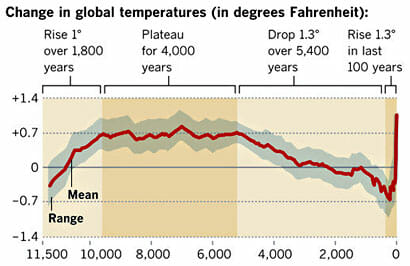
The problem is that his chart is a splice of multiple data series with very different time resolutions. The series up to about 1850 has data points taken at best every 50 years and likely at 100-200 year or more intervals. It is smoothed so that temperature shifts less than 200 years or so in length won’t show up and are smoothed out.
In contrast, the data series after 1850 has data sampled every day or even hour. It has a sampling interval 6 orders of magnitude (over a million times) more frequent. It by definition is smoothed on a time scale substantially shorter than the rest of the data.
In addition, these two data sets use entirely different measurement techniques. The modern data comes from thermometers and satellites, measurement approaches that we understand fairly well. The earlier data comes from some sort of proxy analysis (ice cores, tree rings, sediments, etc.) While we know these proxies generally change with temperature, there are still a lot of questions as to their accuracy and, perhaps more importantly for us here, whether they vary linearly or have any sort of attenuation of the peaks. For example, recent warming has not shown up as strongly in tree ring proxies, raising the question of whether they may also be missing rapid temperature changes or peaks in earlier data for which we don’t have thermometers to back-check them (this is an oft-discussed problem called proxy divergence).
The problem is not the accuracy of the data for the last 100 years, though we could quibble this it is perhaps exaggerated by a few tenths of a degree. The problem is with the historic data and using it as a valid comparison to recent data. Even a 100 year increase of about a degree would, in the data series before 1850, be at most a single data point. If the sampling is on 200 year intervals, there is a 50-50 chance a 100 year spike would be missed entirely in the historic data. And even if it were in the data as a single data point, it would be smoothed out at this data scale.
Do you really think that there was never a 100-year period in those last 10,000 years where the temperatures varied by more than 0.1F, as implied by this chart? This chart has a data set that is smoothed to signals no finer than about 200 years and compares it to recent data with no such filter. It is like comparing the annualized GDP increase for the last quarter to the average annual GDP increase for the entire 19th century. It is easy to demonstrate how silly this is. If you cut the chart off at say 1950, before much anthropogenic effect will have occurred, it would still look like this, with an anomalous spike at the right (just a bit shorter). If you believe this analysis, you have to believe that there is an unprecedented spike at the end even without anthropogenic effects.
There are several other issues with this chart that makes it laughably bad for someone to use in the context of arguing that he is the true defender of scientific integrity
- The grey range band is if anything an even bigger scientific absurdity than the main data line. Are they really trying to argue that there were no years, or decades, or even whole centuries that never deviated from a 0.7F baseline anomaly by more than 0.3F for the entire 4000 year period from 7500 years ago to 3500 years ago? I will bet just about anything that the error bars on this analysis should be more than 0.3F, much less the range of variability around the mean. Any natural scientist worth his or her salt would laugh this out of the room. It is absurd. But here it is presented as climate science in the exact same article that the author expresses dismay that anyone would distrust climate science.
- A more minor point, but one that disguises the sampling frequency problem a bit, is that the last dark brown shaded area on the right that is labelled “the last 100 years” is actually at least 300 years wide. Based on the scale, a hundred years should be about one dot on the x axis. This means that 100 years is less than the width of the red line, and the last 60 years or the real anthropogenic period is less than half the width of the red line. We are talking about a temperature change whose duration is half the width of the red line, which hopefully gives you some idea why I say the data sampling and smoothing processes would disguise any past periods similar to the most recent one.
Update: Kevin Drum posted a defense of this chart on Twitter. Here it is: “It was published in Science.” Well folks, there is climate debate in a nutshell. An 1000-word dissection of what appears to be wrong with a particular analysis retorted by a five-word appeal to authority.
Do you have a problem with paying attention? Or can you just not read. I am not arguing and have never said that the temperature has not risen since 1900, so this is pointless.
How many times to I have to type it to get it past your eyeballs and into your skull? The question here is whether or not the change observed represents a statistically significant change from natural variation.that has occurred over time.
AGW scientists come to the conclusion that it is by comparing a plot of low accuracy, low precision, and low resolution means for several millennia with the very high accuracy, high precision, and high resolution data that you just presented.
What I’m have been saying this entire time is that you cannot make a meaningful comparison of these datasets because the variance around the mean provided by the proxy is unknown even if the mean itself is accurate (which is doubtful). In order to make a 1.4 degree Fahrenheit change statistically significant, you would need a standard deviation of no more than about 0.5 degrees Fahrenheit for 10,000+ years. This assumption is absurd on its face.
Now this is a logical fallacy that’s called “begging the question.” You are trying to prove that the AGW models are correct by using conclusions from the AGW model. This is also known as circular logic.
Regardless, the problem is the same. You see the how both the NAT and internal variability bars are centered on zero with error bars left and right by 0.1 degree? This means that the scientists expect ZERO change from natural forces and variability, but are willing to admit that it might be up to 0.1 degrees. I find it hard to believe that that sounds reasonable to even you. Once again, it’s this assumption that there is no, or is very little natural variability that makes this claim absurd.
YOU HAVE GOT TO BE KIDDING ME. You really think that the scientists contributing to the IPCC report are not paid for their efforts? Universities pay very big bucks to faculty who nab research grants. Go work for one, or better yet go get your Ph.D. and see for yourself as I have. Get real man. Both “sides” have financial incentives so just leave that out and attack the argument, not the source. Since you lack the skills and experience to do the former, I suggest you either seek the skills or stay out of the argument. The only thing you really have to contribute is your opinion on who you trust more, which isn’t (and shouldn’t be) worth squat. I personally never trust anything in emerging science, but I can say I have a particular distrust for the AGW researchers who use statistical charts and graphs in very deceptive ways.
You seem to lack the skills for sourcing your knowledge. Flapping your gums saying you don’t believe it doesn’t change what the reality is. Trying to override reality with your emotion is just that. A useless gesture. Out of a few thousand volunteers about 10 are paid staff. I
The definition of an oscillation is that it revolves around a zero point. ENSO stands for el nino southern oscillation. Notice that the oscillations are getting warmer. Not only do peak temperatures get warmer, b minimum temperatures are getting warmer. That is part of AGW theory.
http://en.wikipedia.org/wiki/Paleothermometer
http://en.wikipedia.org/wiki/Proxy_(climate)
These are compared to the instrumental record. It requires some time and digging that I may not be willing to do at this time. I’ll let you do the work. Show me.
Of course, sourcing is not your strong point. Gum flapping is. You are better at it than I am. 🙂
You are an idiot. You are the only one bringing emotion into this, judging work based on the funding source rather than on the merits of the argument. Also one might participate in the I’ve as a volunteer but the work one does is paid via government grants and research in paid positions at universities.
Oscillation and variability are not the same thing, moron. Go read the definition of Both variables and stop cherry picking components
OK I’m done with you. You have no understanding of science or statistics, and you don’t have the willingness to learn.
I wish you good health so that you can be around to see the embarrassment and scandal for what it is when none of your predictions pan out in 10 years.
I’m able to both judge the source of funding and the merit of the science. Both are important.
When you call people names, you are saying that is not emotional?
If you had anything to teach me this could be more interesting. The deniers just haven’t produced and don’t want to. Come back when you can challenge me with just something worthwhile.
Explain mathematically why the statical method that results in the red line is more valid than the statical method that results in the blue line. Name the methods used. Please show your work so we can all review the data and the results. Thank you.
The first picture is called choosing your end points. Cherry picking would be another term. I do not like the solution to global warming, therefore I will deny it even exists.
Next, but what does the overall picture tell us with 40 years.
30 years is the standard for understanding the clear trend in the climate. From the second frame it is very clear with the naked eye that there is a strong warming trend.
lets take the short blue lines and put year end points on them.
1970 to 1978
1978 to 1987
1987 to 1996
1996 to 2002
2002 to 2012
All of these show no warming atmospheric temperature.
http://www.skepticalscience.com/trend.php
All of these will use the GISS dataset
1970 to 1978
Trend: -0.054 ±0.578 °C/decade (2σ)
1978 to 1987
Trend: -0.009 ±0.323 °C/decade (2σ)
1987 to 1996
Trend: 0.004 ±0.339 °C/decade (2σ)
1996 to 2002
Trend: 0.169 ±0.614 °C/decade (2σ)
2002 to 2012
Trend: -0.013 ±0.246 °C/decade (2σ)
None of the above short term tends are 95% statistically significant.
Yet below it blows the statistical significance out the window. easily, easily within significance.
1970 to 2012
Trend: 0.169 ±0.034 °C/decade (2σ)
“Cherry picking” is not a statistical technique. What does the red line represent? What statistical method?
The reason we use statistics is because the “naked eye” is not adequate–surely Skeptical Science has mentioned that. There’s a thing called “significance” that tells us, if done properly, that the “naked eye” is probably right or probably wrong. One of the very favorite statistics used in climate change is a linear “best fit”. Now, if we get back to “cherry picking”, that could be because it gives the highest value to warming.
Check out Lanzante and Seidel, 2004 “An assessment of three alternatives to linear trends for characterizing global atmospheric temperature changes” which was included in the IPCC 4th report. It indicates that the typical linear line so adored by Skeptical Science may not actually best characterize climate change. The drawing from SkS shows very steep “steps” and is probably not a best fit either. I am not sure where the second graph came from, except on SkS.
http://iopscience.iop.org/1748-9326/6/4/044022
Foster and Rahmstorf correct for noise in temperature record to give us the trend in climate. If you decide to read through the material, they are correcting for ENSO, volcanoes and solar variation. This helps to isolate the global warming signal.