One of the ironies of climate science is that perhaps the most prominent opponent of satellite measurement of global temperature is James Hansen, head of … wait for it … the Goddard Institute for Space Studies at NASA! As odd as it may seem, while we have updated our technology for measuring atmospheric components like CO2, and have switched from surface measurement to satellites to monitor sea ice, Hansen and his crew at the space agency are fighting a rearguard action to defend surface temperature measurement against the intrusion of space technology.
For those new to the topic, the ability to measure global temperatures by satellite has only existed since about 1979, and is admittedly still being refined and made more accurate. However, it has a number of substantial advantages over surface temperature measurement:
- It is immune to biases related to the positioning of surface temperature stations, particularly the temperature creep over time for stations in growing urban areas.
- It is relatively immune to the problems of discontinuities as surface temperature locations are moved.
- It is much better geographic coverage, lacking the immense holes that exist in the surface temperature network.
Anthony Watt has done a fabulous job of documenting the issues with the surface temperature measurement network in the US, which one must remember is the best in the world. Here is an example of the problems in the network. Another problem that Mr. Hansen and his crew are particularly guilty of is making a number of adjustments in the laboratory to historical temperature data that are poorly documented and have the result of increasing apparent warming. These adjustments, that imply that surface temperature measurements are net biased on the low side, make zero sense given the surfacestations.org surveys and our intuition about urban heat biases.
What really got me thinking about this topic was this post by John Goetz the other day taking us step by step through the GISS methodology for "adjusting" historical temperature records (By the way, this third party verification of Mr. Hansen’s methodology is only possible because pressure from folks like Steve McIntyre forced NASA to finally release their methodology for others to critique). There is no good way to excerpt the post, except to say that when its done, one is left with a strong sense that the net result is not really meaningful in any way. Sure, each step in the process might have some sort of logic behind it, but the end result is such a mess that its impossible to believe the resulting data have any relevance to any physical reality. I argued the same thing here with this Tucson example.
Satellites do have disadvantages, though I think these are minor compared to their advantages (Most skeptics believe Mr. Hansen prefers the surface temperature record because of, not in spite of, its biases, as it is believed Mr. Hansen wants to use a data set that shows the maximum possible warming signal. This is also consistent with the fact that Mr. Hansen’s historical adjustments tend to be opposite what most would intuit, adding to rather than offsetting urban biases). Satellite disadvantages include:
- They take readings of individual locations fewer times in a day than a surface temperature station might, but since most surface temperature records only use two temperatures a day (the high and low, which are averaged), this is mitigated somewhat.
- They are less robust — a single failure in a satellite can prevent measuring the entire globe, where a single point failure in the surface temperature network is nearly meaningless.
- We have less history in using these records, so there may be problems we don’t know about yet
- We only have history back to 1979, so its not useful for very long term trend analysis.
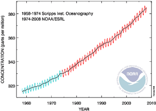
This last point I want to address. As I mentioned above, almost every climate variable we measure has a technological discontinuity in it. Even temperature measurement has one between thermometers and more modern electronic sensors. As an example, below is a NOAA chart on CO2 that shows such a data source splice:
I have zero influence in the climate field, but I would never-the-less propose that we begin to make the same data source splice with temperature. It is as pointless continue to rely on surface temperature measurements as our primary metric of global warming as it is to rely on ship observations for sea ice extent.
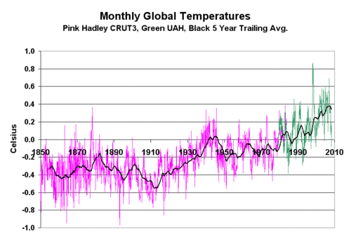
Here is the data set I have begun to use (Download crut3_uah_splice.xls ). It is a splice of the Hadley CRUT3 historic data base with the UAH satellite data base for historic temperature anomalies. Because the two use different base periods to zero out their anomalies, I had to reset the UAH anomaly to match CRUT3. I used the first 60 months of UAH data and set the UAH average anomaly for this period equal to the CRUT3 average for the same period. This added exactly 0.1C to each UAH anomaly. The result is shown below (click for larger view)
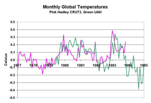
Below is the detail of the 60-month period where the two data sets were normalized and the splice occurs. The normalization turned out to be a simple addition of 0.1C to the entire UAH anomaly data set. By visual inspection, the splice looks pretty good.
One always needs to be careful when splicing two data sets together. In fact, in the climate field I have warned of the problem of finding an inflection point in the data right at a data source splice. But in this case, I think the splice is clean and reasonable, and consistent in philosophy to, say, the splice in historic CO2 data sources.


“the surface temperature measurement network in the US, which one must remember is the best in the world.” Do you treat that as an axiom, or do you have evidence for it? Put otherwise: “Dear God, what must the others be like?”
“..the surface temperature measurement network in the US, which one must remember is the best in the world…”
It all depends on what you mean by ‘best’ – it’s probably the biggest. However, the Central England temperature measurements have a continual run from 1695, if memory serves, and so might be considered the longest?
Though I suspect that if we’re talking about accuracy and precision, a Swiss or German run will beat either of these…
Did orbital and land based measurements agree from 1979 to 1998?
If so, how can Mr. Hansen agrue against the value of orbital data now?
Could you please explain why your first graph (1850 to 2010) in this post show a big upward trend from 1980 to 2010 (the UAH sattelite data), while your graph in the post below, “Accelerated warming” – 1978-2008, apparently also based on UAH data – doesn’t show such spike ? The two graphs, based on the same data are entirely different in shape. What am I misssing ?
It is laughable and idiotic to claim, as you have done repeatedly, that James Hansen is an ‘opponent of satellite measurement of global temperature‘. Please do quote any statement by Hansen that leads you to believe that he actually ‘opposes’ satellite measurements. If you find (as you will) that there are no such statements, then how about you stop coming out with the same bullshit time and time again?
Scientist,
it is certainly easy to get the impression that Mr Hansen would rather see his own product the sole arbiter of temperatures, and that he doesn’t very much like to be scrutinized. The opaqueness surrounding his methods is one indication and his unwillingness to incorporate input is another, but most disturbing is his inability to acknowledge others findings.
temperatur