Category Archives: Temperature Measurement

Russians Accuse CRU of Cherry-Picking Station Data

Many of us are aware of the cherry-picking of proxy series that goes on in the temperature reconstruction world.  This cherry picking is both manual — a thousand plus proxy series exist but the same 20-30 that are known to create hockey sticks are selected over and over; and algorithmic — McIntyre and McKittrick demonstrated how Michael Mann’s algorithms preferentially put high weights on hockey-stick shaped series.

I think a lot of us has suspected something similar in the surface temperature measurement indexes like the Hadley CRUT3, the main metric relied on by the IPCC.

On Tuesday, the Moscow-based Institute of Economic Analysis (IEA) issued a report claiming that the Hadley Center for Climate Change based at the headquarters of the British Meteorological Office in Exeter (Devon, England) had probably tampered with Russian-climate data.

The IEA believes that Russian meteorological-station data did not substantiate the anthropogenic global-warming theory. Analysts say Russian meteorological stations cover most of the country’s territory, and that the Hadley Center had used data submitted by only 25% of such stations in its reports. Over 40% of Russian territory was not included in global-temperature calculations for some other reasons, rather than the lack of meteorological stations and observations.

So, maybe they were chosen because they had higher quality data with fewer data gaps.  Wrong:

The HadCRUT database includes specific stations providing incomplete data and highlighting the global-warming process, rather than stations facilitating uninterrupted observations.

On the whole, climatologists use the incomplete findings of meteorological stations far more often than those providing complete observations.

Maybe they were urban biases in the data that was excluded. No, just the opposite:

IEA analysts say climatologists use the data of stations located in large populated centers that are influenced by the urban-warming effect more frequently than the correct data of remote stations.

So, without the CRU giving any clear set of decision rules for station selection, we are left with this:

The data of stations located in areas not listed in the Hadley Climate Research Unit Temperature UK (HadCRUT) survey often does not show any substantial warming in the late 20th century and the early 21st century.

I am sure it is the purest coincidence that stations excluded from metrics like this show less warming and proxies excluded from temperature reconstructions don’t look like hockey sticks.

Update: McIntyre here and Watts here.

Urban Biases on Surface Temperature Records

I apologize to readers who visit both of my sites for the repetition between them of late, but there is a lot of demand in the community of folks who usually don’t come to climate sites for climate analysis, so I am repeating stuff from here at my other blog.

A kid and his dad manage to do the analysis that NASA, the EPA, the CRU, and the IPCC can’t be convinced to perform. Awesome.

Example #3 of the Need for Replication: Temperature Station Adjustments

I have written a number of times about what appear to be arbitrary or extreme manual adjustments to surface temperature records.  These adjustments are typically positive (ie they make the temperature trend more positive) and often their magnitude outweighs the underlying temperature signal being measured, raising serious issues about the signal to noise ratio in temperature measurement.  Willis Eschenbach on Anthony Watts’ site brings us one of the most extreme examples I have seen, this time from Australia.

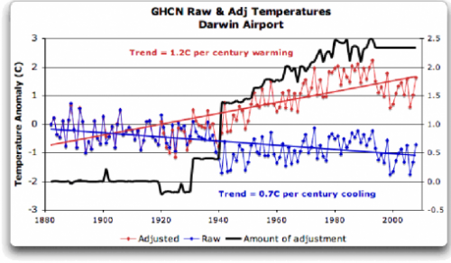
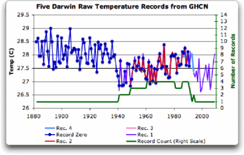
I will leave it to you to click through for the whole story, but here are graphs of the Darwin temperature station before and after adjustments.  First the raw data (this, by the way, is what the CRU so famously threw out, so we can’t do this analysis for CRU adjustments)

darwin_zero5

I would be willing to believe the splice-discontinuity around 1940 is an artifact of the data, and one might either throw out the data before 1940 or re-zero it consistent with later data.  Or it might be real.  We really don’t know, we can only guess.  We need to be careful how frequently we guess, as each guess corrupts the data, no matter how much we are trying to improve things.    We might get clues from other nearby thermometers, which is discussed in the article, but thermometers are few and far between in 1920’s Australia.

The other guess we might make is looking around the town of Darwin, seeing the growth of the urban area, we might want to adjust current temperatures down a bit to correct for the urban heat island effect.  Again, we have to be careful, because we are just guessing.

Here is what the GHCN actually does to adjust the data. The black line is the amount manually added to temperatures, resulting in the red line.

darwin_zero7

Wow! Instant global warming.  We’ve suddenly added 2C per century to the Darwin warming trend.

So, why does the black line look like this?  We don’t know, because climate scientists play these games in secret and claim that anyone trying to audit their fine work is just distracting them from more weighty pursuits.   Nominally, the GHCN claims the adjustments are based on comparisons with other local thermometers, but there are not other local thermometers in their data base and the closest ones (hundreds of kilometers away) do not display any behavior that might justify this adjustment.

It is time that we demand the ability to audit and replicate these adjustments.

Example of Climate Work That Needs to be Checked and Replicated

When someone starts to shout “but its in the peer-reviewed literature” as an argument-ender to me, I usually respond that peer review is not the finish line, meaning that the science of some particular point is settled. It is merely the starting point, where now a proposition is in the public domain and can be checked and verified and replicated and criticized and potentially disproved or modified.

The CRU scandal should, in my mind, be taken exactly the same way. Unlike what more fire-breathing skeptics have been saying, this is not the final nail in the coffin of catastrophic man-made global warming theory. It is merely a starting point, a chance to finally move government funded data and computer code into the public domain where it has always belonged, and start tearing it down or confirming it.

To this end, I would like to share a post from year ago, showing the kind of contortions that skeptics have been going through for years to demonstrate that there appear to be problems in key data models — contortions and questions that could have been answered in hours rather than years if the climate scientists hadn’t been so afraid of scrutiny and kept their inner workings secret. This post is from July, 2007. It is not one of my most core complaints with global warming alarmists, as I think the Earth has indeed warmed over the last 150 years, though perhaps by less than the current metrics say. But I think some folks are confused why simple averages of global temperatures can be subject to hijinx. The answer is that the averages are not simple:

A few posts back, I showed how nearly 85% of the reported warming in the US over the last century is actually due to adjustments and added fudge-factors by scientists rather than actual measured higher temperatures. I want to discuss some further analysis Steve McIntyre has done on these adjustments, but first I want to offer a brief analogy.

Let’s say you had two compasses to help you find north, but the compasses are reading incorrectly. After some investigation, you find that one of the compasses is located next to a strong magnet, which you have good reason to believe is strongly biasing that compass’s readings. In response, would you

  1. Average the results of the two compasses and use this mean to guide you, or
  2. Ignore the output of the poorly sited compass and rely solely on the other unbiased compass?

Most of us would quite rationally choose #2. However, Steve McIntyre shows us a situation involving two temperature stations in the USHCN network in which government researchers apparently have gone with solution #1. Here is the situation:

He compares the USHCN station at the Grand Canyon (which appears to be a good rural setting) with the Tucson USHCN station I documented here, located in a parking lot in the center of a rapidly growing million person city. Unsurprisingly, the Tucson data shows lots of warming and the Grand Canyon data shows none. So how might you correct Tucson and the Grand Canyon data, assuming they should be seeing about the same amount of warming? Would you

average them, effectively adjusting the two temperature readings

towards each other, or would you assume the Grand Canyon data is cleaner

with fewer biases and adjust Tucson only? Is there anyone who would not choose the second option, as with the compasses?

The GISS data set, created by the Goddard Center of NASA, takes the USHCN data set and somehow uses nearby stations to correct for anomalous stations. I say somehow, because, incredibly, these government scientists, whose research is funded by taxpayers and is being used to make major policy decisions, refuse to release their algorithms or methodology details publicly. They keep it all secret! Their adjustments are a big black box that none of us are allowed to look into (and remember, these adjustments account for the vast majority of reported warming in the last century).

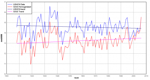
We can, however, reverse engineer some of these adjustments, and McIntyre does. What he finds is that the GISS appears to be averaging the good and bad compass, rather than throwing out or adjusting only the biased reading. You can see this below. First, here are the USHCN data for these two stations with only the Time of Observation adjustment made (more on what these adjustments are in this article).
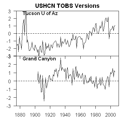
Grand_12

As I said above, no real surprise – little warming out in undeveloped nature, lots of warming in a large and rapidly growing modern city. Now, here is the same data after the GISS has adjusted it:
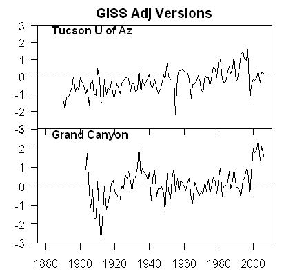
Grand_15

You can see that Tucson has been adjusted down a degree or two, but Grand Canyon has been adjusted up a degree or two (with the earlier mid-century spike adjusted down). OK, so it makes sense that Tucson has been adjusted down, though there is a very good argument to be made that it should be been adjusted down more, say by at least 3 degrees**. But why does the Grand Canyon need to be adjusted up by about a degree and a half? What is biasing it colder by 1.5 degrees, which is a lot? The answer: Nothing. The explanation: Obviously, the GISS is doing some sort of averaging, which is bringing the Grand Canyon and Tucson from each end closer to a mean.

This is clearly wrong, like averaging the two compasses. You don’t average a measurement known to be of good quality with one known to be biased. The Grand Canyon should be held about the same, and Tucson adjusted down even more toward it, or else thrown out. Lets look at two cases. In one, we will use the GISS approach to combine these two stations– this adds 1.5 degrees to GC and subtracts 1.5 degrees from Tucson. In the second, we will take an approach that applies all the adjustment to just the biases (Tucson station) — this would add 0 degrees to GC and subtract 3 degrees from Tucson. The first approach, used by the GISS, results in a mean warming in these two stations that is 1.5 degrees higher than the more logical second approach. No wonder the GISS produces the highest historical global warming estimates of any source! Steve McIntyre has much more.

** I got to three degrees by applying all of the adjustments for GC and Tucson to Tucson. Here is another way to get to about this amount. We know from studies that urban heat islands can add 8-10 degrees to nighttime urban temperatures over surrounding undeveloped land. Assuming no daytime effect, which is conservative, we might conclude that 8-10 degrees at night adds about 3 degrees to the entire 24-hour average.

Postscript: Steve McIntyre comments (bold added):

These adjustments are supposed to adjust for station moves – the procedure is described in Karl and Williams 1988 [check], but, like so many climate recipes, is a complicated statistical procedure that is not based on statistical procedures known off the island. (That’s not to say that the procedures are necessarily wrong, just that the properties of the procedure are not known to statistical civilization.) When I see this particular outcome of the Karl methodology, my mpression is that, net of the pea moving under the thimble, the Grand Canyon values are being blended up and the Tucson values are being blended down. So that while the methodology purports to adjust for station moves, I’m not convinced that the methodology can successfully estimate ex post the impact of numerous station moves and my guess is that it ends up constructing a kind of blended average.

LOL. McIntyre, by the way, is the same gentleman who helped call foul on the Mann hockey stick for bad statistical procedure.

Yet More Stuff We Always Suspected But Its Nice To Have Proof

Many of us have argued for years that much of the measured surface temperature increase has actually been from manual adjustments made for opaque and largely undisclosed reasons by a few guys back in their offices.  (Update— corrected, I accidently grabbed the old version of the post that did not have the degree C/F conversion right.)

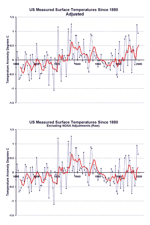
The US Historical Climate Network (USHCN) reports about a 0.6C temperature increase in the lower 48 states since about 1940.  There are two steps to reporting these historic temperature numbers.  First, actual measurements are taken.  Second, adjustments are made after the fact by scientists to the data.  Would you like to guess how much of the 0.6C temperature rise is from actual measured temperature increases and how much is due to adjustments of various levels of arbitrariness?  Here it is, for the period from 1940 to present in the US:

Actual Measured Temperature Increase: 0.3C
Adjustments and Fudge Factors: 0.3C
Total Reported Warming: 0.6C

Yes, that is correct.  About half the reported warming in the USHCN data base, which is used for nearly all global warming studies and models, is from human-added fudge factors, guesstimates, and corrections.

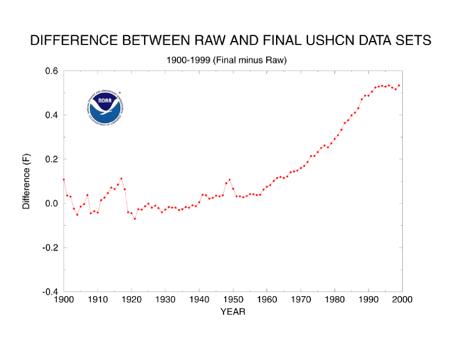
I know what you are thinking – this is some weird skeptic’s urban legend.  Well, actually it comes right from the NOAA web page which describes how they maintain the USHCN data set.  Below is the key chart from that site showing the sum of all the plug factors and corrections they add to the raw USHCN measurements:
Ushcn_corrections

I concluded that while certain adjustments like the one for time of observation make sense, many of the adjustments, such as the one for siting, seem crazy.  Against all evidence, the adjustment for siting implies a modern cooling bias, which is crazy given urbanization around sites and the requirement that modern MMTS stations (given maximum wire lengths) be nearer buildings than any manual thermometer had to be 80 years ago.

Even if we thought these guys were doing their best effort, can we really trust our ability to measure a signal that is substantially smaller than the noise we have to filter out?

Anyway, in the last week a similar example has been found in New Zealand, via Anthony Watts:

The New Zealand Government’s chief climate advisory unit NIWA is under fire for allegedly massaging raw climate data to show a global warming trend that wasn’t there.

The scandal breaks as fears grow worldwide that corruption of climate science is not confined to just Britain’s CRU climate research centre.

In New Zealand’s case, the figures published on NIWA’s [the National Institute of Water and Atmospheric research] website suggest a strong warming trend in New Zealand over the past century:

NIWAtemps

The caption to the photo on the NiWA site reads:

From NIWA’s web site — Figure 7: Mean annual temperature over New Zealand, from 1853 to 2008 inclusive, based on between 2 (from 1853) and 7 (from 1908) long-term station records. The blue and red bars show annual differences from the 1971 – 2000 average, the solid black line is a smoothed time series, and the dotted [straight] line is the linear trend over 1909 to 2008 (0.92°C/100 years).

But analysis of the raw climate data from the same temperature stations has just turned up a very different result:

NIWAraw

Gone is the relentless rising temperature trend, and instead there appears to have been a much smaller growth in warming, consistent with the warming up of the planet after the end of the Little Ice Age in 1850.

The revelations are published today in a news alert from The Climate Science Coalition of NZ:

Again, even before we consider the quality of the adjustment, we see the signal to noise — the adjustments for noise are equal to or greater than the signal they think exists in the data.

The obvious response is that these adjustments are somehow justified based on site location and instrumentation changes.  But we know from looking at US temeprature stations that the typical station has a warming bias over time due to urbanization and the warm bias of some modern temperature instruments, thus requiring a cooling adjustment and not a warming adjustment.  Watts provides such evidence for one New Zealand site here.

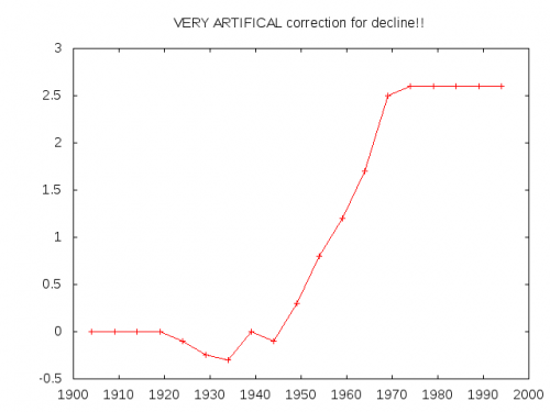
Update: Boy, this is certainly becoming a familiar curve shape.  It seems the main hockey stick curve is the shape of temperature adjustments coming out of these guys.  ESR (via TJIC)  took this code from a Briffa North American proxy reconstruction

;<p> ; Apply a VERY ARTIFICAL correction for decline!!<p> ;<p> yrloc=[1400,findgen(19)*5.+1904]<p> valadj=[0.,0.,0.,0.,0.,-0.1,-0.25,-0.3,0.,- 0.1,0.3,0.8,1.2,1.7,2.5,2.6,2.6,2.6,2.6,2.6]*0.75 ; fudge factor<p> if n_elements(yrloc) ne n_elements(valadj) then message,’Oooops!’<p> ;<p> yearlyadj=interpol(valadj,yrloc,timey)

and reproduced this curve, representing the “fudge factor” Briffa added, apparently to get the result he wanted:

esr_agw_gnuplot

Have You Checked the Couch Cushions?

Patrick Michaels describes some of the long history of the Hadley Center and specifically Phil Jones’ resistance to third party verification of their global temperature data.  First he simply refused to share the data

We have 25 years or so invested in the work. Why should I make the data available to you, when your aim is to try and find something wrong with it?

(that’s some scientist, huh) and then he said he couldn’t share the data and now he says he’s lost the data.

Michaels gives pretty good context to the issues of station siting, but there are many other issues that are perfectly valid reasons for third parties to review the Hadley Center’s methodology.  A lot of choices have to be made in patching data holes and in giving weights to different stations and attempting to correct for station biases.  Transparency is needed for all of these methodologies and decisions.  What Jones is worried about is whenever the broader community (and particularly McIntyre and his community on his web site) have a go at such methodologies, they have always found gaping holes and biases.  Since the Hadley data is the bedrock on which rests almost everything done by the IPCC, the costs of it being found wrong are very high.

Here is an example post from the past on station siting and measurement quality.  Here is a post for this same station on correction and aggregation of station data, and problems therein.

So Why Bother?

I just watched Peter Sinclair’s petty little video on Anthony Watt’s effort to survey and provide some level of quality control on the nation’s surface temperature network.  Having participated in the survey, I was going to do a rebuttal video from my own experience, but I just don’t have the time, but I want to offer a couple of quick thoughts.

  • Will we ever see an alarmist be able to address any skeptics critique of AGW science without resorting to ad hominem attacks?  I guess the whole “oil industry funding” thing is a base requirement for any alarmist article, but this guy really gets extra credit for the tobacco industry comparison.  Seriously, do you guys really think this addresses the issue?
  • I am fairly sure that Mr. Watt would not deny that the world has warmed over the last 100 years, though he might argue that warming has been exaggerated somewhat.  Certainly satellites are immune to the biases and problems Mr. Watt’s group is identifying, and they still show warming  (though less than the surface temperature networks is showing).
  • The video tries to make Watt’s volunteers sound like silly children at camp, but in fact weather measurement and data collection in this country have a long history of involvement and leadership by volunteers and amateurs.
  • The core point that really goes unaddressed is that the government, despite spending billions of dollars on AGW-related projects, is investing about zero in quality control of the single most critical data set to the current public policy decisions.   Many of the sites are absolutely inexcusable, EVEN against the old goals of reporting weather rather than measuring climate change.  I surveyed the Tucson site – it is a joke.
  • Mr. Sinclair argues that the absolute value of the temperatures does not matter as much as their changes over time.  Fine, I would agree.  But again, he demonstrates his ignorance.  This is an issue Anthony and most of his readers discuss all the time.  When, for example, we talk about the really biased site at Tucson, it is always in the context of the fact that 100 years ago Tucson was a one horse town, and so all the urban heat biases we might find in a badly sited urban location have been introduced during the 20th century measurement period.  These growing biases show up in the measurements as increasing temperatures.  And the urban heat island effects are huge.  My son and I personally measured about 10F in the evening.  Even if this was only at Tmin, and was 0 effect at Tmax  (daily average temps are the average of Tmin and Tmax) then this would still introduce a bias of 5F today that was surely close to zero a hundred years ago.
  • Mr. Sinclair’s knowledge about these issues is less than one of our readers might have had 3 years ago.  He says we should be satisfied with the data quality because the government promises that it has adjusted for these biases.  But these very adjustments, and the inadequacy of the process, is one reason for Mr. Watt’s efforts.  If Mr. Sinclair had bothered to educate himself, he would know that many folks have criticized these adjustments because they are done blind, without any reference to actual station quality or details, by statistical processes.  But without the knowledge of which stations have better installations, the statistical processes tend to spread the bias around like peanut butter, rather than really correct for it, as demonstrated here for Tucson and the Grand Canyon (both of these stations I have personally visited).
  • The other issue one runs into in trying to correct for a bad site through adjustments is the signal to noise problem.  The world global warming signal over the last 100 years has been no more than 1 degree F.  If urban heat biases are introducing a 5,8, or 10 degree bias, then the noise, and thus the correction factor, is 5-10 times larger than the signal.   In practical terms, this means a 10-20% error in the correction factor can completely overwhelm the signal one is trying to detect.  And since most of the correction factors are not much better than educated guesses, their errors are certainly higher than this.
  • Overall Mr. Sinclair’s point seems to be that the quality of the stations does not matter.  I find that incredible, and best illustrated with an example.  The government makes decisions about the economy and interest rates and taxes and hundreds of other programs based on detailed economic data.  Let’s say that instead of sampling all over Arizona, they just sampled in one location, say Paradise Valley zip code 85253.  Paradise Valley happens to be (I think) the wealthiest zip code in the state.  So, if by sampling only in Paradise Valley, the government decides that everyone is fine and no one needs any government aid, would Mr. Sinclair be happy?  Would this be “good enough?”  Or would we demand an investment in a better data gathering network that was not biased towards certain demographics to make better public policy decisions involving hundreds of billions of dollars?

Another Reason I Trust Satellite Data over Surface Data

There are a number of reasons to prefer satellite data over surface data for temperature measurement –satellites have better coverage and are not subject to site location  biases.  On the flip side, satellites only have limited history (back to 1979) so it is of limited utility for long-term analyses.  Also,they do not strictly measure the surface, but the lower troposphere (though most climate models expect these to move in tandem).  And since some of the technologies are newer, we don’t fully understand biases or errors that may be in the measurement system (though satellites are not any newer than certain surface temperature measurement devices that are suspected of biases).  In particular, sattelites are subject to some orbital drift and changes in altitude and sensor function over time that must be corrected, perhaps imperfectly to date.

To this latter point, what one would want to see is an open dialog, with a closed loop between folks finding potential problems (like this one) and folks fixing or correcting the problems.  In the case of both the UAH and RSS teams, both have been very responsive to outside criticism of their methodologies, and have improved them over time.  This stands in stark contrast to the GISS and other surface temperature teams, who resist criticism intensely, put few resources into quality control (Hansen says a quarter man year at the GISS) and who refuse to credit outsiders even when changes are made under external presure.

Airports Are Getting Warmer

It is always struck me as an amazing irony that the folks at NASA (the GISS is part of NASA) is at the vanguard of defending surface temperature measurement  (as embodied in the GISS metric) against measurement by NASA satellites in space.

For decades now, the GISS surface temperature metric has diverged from satellite measurement, showing much more warming than have the satellites.   Many have argued that this divergence is in large part due to poor siting of measurement sites, making them subject to urban heat island biases.  I also pointed out a while back that much of the divergence occurs in areas like Africa and Antarctica where surface measurement coverage is quite poor compared to satellite coverage.

Anthony Watt had an interesting post where he pointed out that

This means that all of the US temperatures – including those for Alaska and Hawaii – were collected from either an airport (the bulk of the data) or an urban location

I will remind you that my son’s urban heat island project (which got similar results as the “professionals”) showed a 10F heat island over Phoenix, centered approximately on the Phoenix airport.  And don’t forget the ability of scientists to create warming through measurement adjustments in the computer, a practice on which Anthony has an update (and here).

Land vs. Space

Apropos of my last post, Bob Tisdale is beginning a series analyzing the differences between the warmest surface-based temperature set (GISTEMP) and a leading satellite measurement series (UAH).  As I mentioned, these two sets have been diverging for years.  I estimated the divergence at around 0.1C per decade  (this is a big number, as it is about equal to the measured warming rate in the second half of the 20th century and about half the IPCC predicted warming for the next century).   Tisdale does the math a little more precisely, and gets the divergence at only 0.035C per decade.   This is lower than I would have expected and seems to be driven a lot by the GISS’s under-estimation of the 1998 spike vs. UAH.  I got the higher number with a different approach, by putting the two anamolies on the same basis using 1979-1985 averages and then comparing recent values.

Here are the differences in trendline by area of the world (he covers the whole world by grouping ocean areas with nearby continents).  GISS trend minus UAH trend, degrees C per decade:

Arctic:  0.134

North America:  -0.026

South America: -0.013

Europe:  0.05

Africa:  0.104

Asia:  0.077

Australia:  -0.02

Antarctica:  0.139

So, the three highest differences, each about an order of magnitude higher than differences in other areas, are in 1.  Antarctica;  2. Arctic; and 3. Africa.  What do these three have in common?

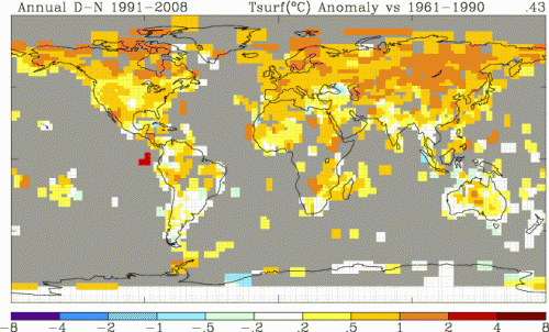
Well, what the have most in common is the fact that these are also the three areas of the world with the poorest surface temperature coverage.  Here is the GISS coverage showing color only in areas where they have a thermometer record within a 250km box:

ghcn_giss_250km_anom1212_1991_2008_1961_1990

The worst coverage is obviously in the Arctic, Antarctica and then Africa.  Coincidence?

Those who want to argue that the surface temperature record should be used in preference to that of satellites need to explain why the three areas in which the two diverge the most are the three areas with the worst surface temperature data coverage.  This seems to argue that flaws in the surface temperature record drive the differences between surface and satellite, and not the other way around.

Apologies to Tisdale if this is where he was going in his next post in the series.

Someone Really Needs to Drive A Stake In This

Isn’t there someone credible in the climate field that can really try to sort out the increasing divergence of satellite vs. surface temperature records?  I know there are critical studies to be done on the effect of global warming on acne, but I would think actually having an idea of how much the world is currently warming might be an important fact in the science of global warming.

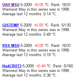
The problem is that surface temperature records are showing a lot more warming than satellite records.  This is a screen cap. from Global Warming at a Glance on JunkScience.com.  The numbers in red are anomalies, and represent deviations from a arbitrary period whose average is set to zero  (this period is different for the different metrics).  Because the absolute values of the anamolies are not directly comparable, look at the rankings instead:

temps

Here is the connundrum — the two surface records (GISTEMP and Hadley CRUT3) showed May of 2009 as the fifth hottest in over a century of readings.  The two satellite records showed it as only the 16th hottest in 31 years of satellite records.  It is hard to call something settled science when even a basic question like “was last month hotter or colder than average” can’t be answered with authority.

Skeptics have their answer, which have been shown on this site multiple times.  Much of the surface temperature record is subject to site location biases, urban warming effects, and huge gaps in coverage.  Moreover, instrumentation changes over time have introduced biases and the GISS and Hadley Center have both added “correction” factors of dubious quality that they refuse to release the detailed methodology or source code behind.

There are a lot of good reasons to support modern satellite measurement.  In fact, satellite measurement has taken over many major climate monitoring functions, such as measurement of arctic ice extent and solar irradiance.  Temperature measurement is the one exception.  One is left with a suspicion that the only barrier to acceptance of the satellite records is that alarmists don’t like the answer they are giving.

If satellite records have some fundamental problem that exceeds those documented in the surface temperature record, then it is time to come forward with the analysis or else suck it up and accept them as a superior measurement source.

Postscript: It is possible to compare the absolute values of the anamolies if the averages are adjusted to the same zero for the same period.  When I did so, to compare UAH and Hadley CRUT3, I found the Hadley anamoly had to be reduced by about 0.1C to get them on the same basis.  This implies Hadley is reading about 0.2C more warming over the last 20-25 years, or about 0.1C/decade.

Reliability of Surface Temperature Records

Anthony Watt has produced a report based on his excellent work at SurfaceStations.org document siting and installation issues at US surface temperature stations that might create errors and biases in the measurements.  The work is important, as these biases don’t tend to be random — they are much more likely to be upwards rather than downwards biases, so that they can’t be assumed to just average out.

We found stations located next to the exhaust fans of air conditioning units, surrounded by asphalt parking lots and roads, on blistering-hot rooftops, and near sidewalks and buildings that absorb and radiate heat. We found 68 stations located at wastewater treatment plants, where the process of waste digestion causes temperatures to be higher than in surrounding areas.

In fact, we found that 89 percent of the stations – nearly 9 of every 10 – fail to meet the National Weather Service’s own siting requirements that stations must be 30 meters (about 100 feet) or more away from an artificial heating or radiating/ reflecting heat source.

In other words, 9 of every 10 stations are likely reporting higher or rising temperatures because they are badly sited. It gets worse. We observed that changes in the technology of temperature stations over time also has caused them to report a false warming trend. We found major gaps in the data record that were filled in with data from nearby sites, a practice that propagates and compounds errors. We found that adjustments to the data by both NOAA and another government agency, NASA, cause recent temperatures to look even higher.

The conclusion is inescapable: The U.S. temperature record is unreliable. The errors in the record exceed by a wide margin the purported rise in temperature of 0.7º C (about 1.2º F) during the twentieth century. Consequently, this record should not be cited as evidence of any trend in temperature that may have occurred across the U.S. during the past century. Since the U.S. record is thought to be “the best in the world,” it follows that the global database is likely similarly compromised and unreliable.

I have performed about ten surveys for the effort, including three highlighted in the report (Gunnison, Wickenberg and the moderately famous Tucson site).  My son did two surveys, including one in the report (Miami) for a school science fair project.

Downplaying Their Own Finding

After years of insisting that urban biases have negligible effect on the the historical temperature record, the IPCC may finally have to accept what skeptics have been saying for years — that:

  1. Most long-lived historical records are from measurement points near cities (no one was measuring temperatures reliably in rural Africa in 1900)
  2. Cities have a heat island over them, up to 8C or more in magnitude, from the heat trapped in concrete, asphalt, and other man made structures.  (My 13-year-old son easily demonstrated this here).
  3. As cities grow, as most have over the last 100 years, temperature measurement points are engulfed by increasingly hotter portions of the heat island.  For example, the GISS shows the most global warming in the US centered around Tucson based on this measurement point, which 100 years ago was rural.

Apparently, Jones et al found recently that a third to a half of the warming reported in the Hadley CRUT3 database in China may be due to urban heat island effects rather than any broader warming trend.  This particularly important since it was a Jones et al letter to Nature years ago that previously gave the IPCC cover to say that there was negligible uncorrected urban warming bias in the major surface temperature records.

Interestingly, Jones et al can really hs to be treated as a hostile witness on this topic.  Their abstract states:

We show that all the land-based data sets for China agree exceptionally well and that their residual warming compared to the SST series since 1951 is relatively small compared to the large-scale warming. Urban-related warming over China is shown to be about 0.1°C decade−1 over the period 1951–2004, with true climatic warming accounting for 0.81°C over this period

By using the words “relatively small” and using a per decade number for the bias but an aggregate number for the underlying warming signal, they are doing everything possible to downplay their own finding (see how your eye catches the numbers 0.1 and 0.81 and compares them, even though they are not on a comparable basis — this is never an accident).  But in fact, the exact same numbers restate this way:  .53C, or 40% of the total measured warming of 1.34C was due to urban biases rather than any actual global warming signal.

Since when is a 40% bias or error “relatively small?”

So why do they fight their own conclusion so hard?  After all, the study still shows a reduced, but existent, historic warming signal.  As do satellites, which are unaffected by this type of bias.  Even skeptics like myself admit such a signal still exists if one weeds out all the biases.

The reason why alarmists, including it seems even the authors themselves, resist this finding is that reduced historic warming makes their catastrophic forecasts of future even more suspect.  Already, their models do not back cast well against history (without some substantial heroic tweaking or plugs), consistently over-estimating past warming.  If the actual past warming was even less, it makes their forecasts going forward look even more absurd.

A few minutes looking at the official US temperature measurement stations here will make one a believer that biases likely exist in historic measurements, particularly since the rest of the world is likely much worse.

Worth Your Time

I really like to write a bit more about such articles, but I just don’t have the time right now.  So I will simply recommend you read this guest post at WUWT on Steig’s 2009 Antarctica temperature study.  The traditional view has been that the Antarctic Peninsula (about 5% of the continent) has been warming a lot while the rest of the continent has been cooling.  Steig got a lot of press by coming up with the result that almost all of Antarctica is warming.

But the article at WUWT argues that Steig gets to this conclusion only by reducing all of Antarctic temperatures to three measurement points.  This process smears the warming of the peninsula across a broader swath of the continent.  If you can get through the post, you will really learn a lot about the flaws in this kind of study.

I have sympathy for scientists who are working in a low signal to noise environment.   Scientists are trying to tease 50 years of temperature history across a huge continent from only a handful of measurement points that are full of holes in the data.  A charitable person would look at this article and say they just went too far, teasing out spurious results rather than real signal out of the data.  A more cynical person might argue that this is a study where, at every turn, the authors made every single methodological choice coincidentally in the one possible way that would maximize their reported temperature trend.

By the way, I have seen Steig written up all over, but it is interesting that I never saw this:  Even using Steig’s methodology, the temperature trend since 1980 has been negative.  So whatever warming trend they found ended almost 30 years ago.    Here is the table from the WUWT article, showing the Steign original results and several cuts and recalculating their data using improved methods.

Reconstruction

1957 to 2006 trend

1957 to 1979 trend (pre-AWS)

1980 to 2006 trend (AWS era)

Steig 3 PC

+0.14 deg C./decade

+0.17 deg C./decade

-0.06 deg C./decade

New 7 PC

+0.11 deg C./decade

+0.25 deg C./decade

-0.20 deg C./decade

New 7 PC weighted

+0.09 deg C./decade

+0.22 deg C./decade

-0.20 deg C./decade

New 7 PC wgtd imputed cells

+0.08 deg C./decade

+0.22 deg C./decade

-0.21 deg C./decade

Here, by the way, is an excerpt from Steig’s abstract in Nature:

Here we show that significant warming extends well beyond the Antarctic Peninsula to cover most of West Antarctica, an area of warming much larger than previously reported. West Antarctic warming exceeds 0.1 °C per decade over the past 50 years, and is strongest in winter and spring.

Hmm, no mention that this trend reversed half way through the period.  A bit disengenuous, no?  Its almost as if there is a way they wanted the analysis to come out.

Global Warming Is Caused by Computers

In particular, a few computers at NASA’s Goddard Institute seem to be having a disproportionate effect on global warming.  Anthony Watt takes a cut at an analysis I have tried myself several times, comparing raw USHCN temperature data to the final adjusted values delivered from that data by the NASA computers.  My attempt at this compared the USHCN adjusted to raw for the entire US:

temperature_adjustments1

Anthony Watt does this analysis from USHCN raw all the way through to the GISS adjusted number  (the USHCN adjusts the number, and then the GISS adds their own adjustments on top of these adjustments).  The result:  100%+ of the 20th century global warming signal comes from the adjustments.  [Update: I was not very clear on this — this is merely an example for one single site — it is not for the USHCN or GISS index as a whole.  This is merely an example of the low signal to noise ratio in much of the surface temperature record]  There is actually a cooling signal in the raw data:

temperature_adjustments21

Now, I really, really don’t want to be misinterpreted on this, so a few notes are necessary:

  1. Many of the adjustments are quite necessary, such as time of observation adjustments, adjustments for changing equipment, and adjustments for changing site locations and/or urbanization.  However, all of these adjustments are educated guesses.  Some, like the time of observation adjustment, probably are decent guesses.  Some, like site location adjustments, are terrible (as demonstrated at surfacestations.org).The point is that finding a temperature change signal over time with current technologies is a measurement subject to a lot of noise.  We are looking for a signal on the order of magnitude of 0.5C where adjustments to individual raw instrument values might be 2-3C.  It is a very low signal-noise environment, and one that is inherently subject to biases  (researches who expect to find a lot of warming will, not surprisingly, adjust a lot of measurements higher).
  2. Warming has occurred in the 20th century.  The exact number is unclear, but we have much better data via satellites now that have shown a warming trend since 1979, though that trend is lower than the one that results from surface temperature measurements with all these discretionary adjustments.

On Quality Control of Critical Data Sets

A few weeks ago, Gavin Schmidt of NASAcame out with a fairly petulant response to critics who found an error in NASA's GISS temperature database.  Most of us spent little time criticizing this particular error, but instead criticized Schmidts unhealthy distaste for criticism and the general sloppiness and lack of transparency in the NOAA and GISS temperature adjustment and averaging process.

I don't want to re-plow old ground, but I can't resist highlighting one irony.  Here is Gavin Schmidt in his recent post on RealClimate:

It is clear that many of the temperature watchers are doing so in order to show that the IPCC-class models are wrong in their projections. However, the direct approach of downloading those models, running them and looking for flaws is clearly either too onerous or too boring.

He is criticizing skeptics for not digging into the code of the individual climate models, and focusing only on how their output forecasts hold out (a silly criticism I dealt with here).  But this is EXACTLY what folks like Steve McIntyre have been trying to do for years with the NOAA, GHCN, and GISS temperature metric code.  Finding nothing about the output that makes sense given the raw data, they have asked to examine the source code.  And they have met with resistance at every turn by, among others, Gavin Schmidt.  As an example, here is what Steve gets typically when he tries to do exactly as Schmidt asks:

I'd also like to report that over a year ago, I wrote to GHCN asking for a copy of their adjustment code:

I’m interested in experimenting with your Station History Adjustment algorithm and would like to ensure that I can replicate an actual case before thinking about the interesting statistical issues.  Methodological descriptions in academic articles are usually very time-consuming to try to replicate, if indeed they can be replicated at all. Usually it’s a lot faster to look at source code in order to clarify the many little decisions that need to be made in this sort of enterprise. In econometrics, it’s standard practice to archive code at the time of publication of an article – a practice that I’ve (by and large unsuccessfully) tried to encourage in climate science, but which may interest you. Would it be possible to send me the code for the existing and the forthcoming Station History adjustments. I’m interested in both USHCN and GHCN if possible.

To which I received the following reply from a GHCN employee:

You make an interesting point about archiving code, and you might be encouraged to hear that Configuration Management is an increasingly high priority here. Regarding your request — I'm not in a position to distribute any of the code because I have not personally written any homogeneity adjustment software. I also don't know if there are any "rules" about distributing code, simply because it's never come up with me before.

I never did receive any code from them.

Here, by the way, is a statement from the NOAA web site about the GHCN data:

Both historical and near-real-time GHCN data undergo rigorous quality assurance reviews. These reviews include preprocessing checks on source data, time series checks that identify spurious changes in the mean and variance, spatial comparisons that verify the accuracy of the climatological mean and the seasonal cycle, and neighbor checks that identify outliers from both a serial and a spatial perspective.

But we will never know, because they will not share the code developed at taxpayer expense by government employees to produce official data.

A year or so ago, after intense pressure and the revelation of another mistake (again by the McIntyre/Watt online communities) the GISS did finally release some of their code.  Here is what was found:

Here are some more notes and scripts in which I've made considerable progress on GISS Step 2. As noted on many occasions, the code is a demented mess – you'd never know that NASA actually has software policies (e.g. here or here. I guess that Hansen and associates regard themselves as being above the law. At this point, I haven't even begum to approach analysis of whether the code accomplishes its underlying objective. There are innumerable decoding issues – John Goetz, an experienced programmer, compared it to descending into the hell described in a Stephen King novel. I compared it to the meaningless toy in the PPM children's song – it goes zip when it moves, bop when it stops and whirr when it's standing still. The endless machinations with binary files may have been necessary with Commodore 64s, but are totally pointless in 2008.

Because of the hapless programming, it takes a long time and considerable patience to figure out what happens when you press any particular button. The frustrating thing is that none of the operations are particularly complicated.

So Schmidt's encouragement that skeptics should go dig into the code was a) obviously not meant to be applied to hiscode and b) roughly equivalent to a mom answering her kids complaint that they were bored and had nothing to do with "you can clean your rooms" — something that looks good in the paper trail but is not really meant to be taken seriously.  As I said before:

I am sure Schmidt would love us all to go off on some wild goose chase in the innards of a few climate models and relent on comparing the output of those models against actual temperatures.

This is Getting Absurd

Update: The gross divergence in October data reported below between the various metrics is explained by an error, as reported at the bottom.  The basic premise of the post, that real scientific work should go into challenging these measurement approaches and choosing the best data set, remains.

The October global temperature data highlights for me that it is time for scientists to quit wasting time screwing around with questions of whether global warming will cause more kidney stones, and address an absolutely fundamental question:  Just what is the freaking temperature?

Currently we are approaching the prospect of spending hundreds of billions of dollars, or more, to combat global warming, and we don’t even know its magnitude or real trend, because the major temperature indices we possess are giving very different readings.  To oversimplify a bit, there are two competing methodologies that are giving two different answers.  NASA’s GISS uses a melding of surface thermometer readings around the world to create a global temperature anomaly.  And the UAH uses satellites to measure temperatures of the lower or near-surface troposhere.  Each thinks it has the better methodology  (with, oddly, NASA fighting against the space technology).  But they are giving us different answers.

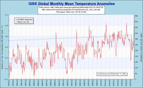
For October, the GISS metric is showing the hottest October on record, nearly 0.8C hotter than it was 40 years ago in 1978 (from here).

giss_global

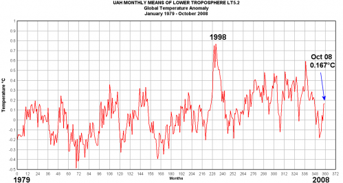
However, the satellites are showing no such thing, showing a much cooler October, and a far smaller warming trend over the last 40 years (from here)

uah_global

So which is right?  Well, the situation is not helped by the fact that the GISS metric is run by James Hansen, considered by skeptics to be a leading alarmist, and the UAH is run by John Christy, considered by alarmists to be an arch-skeptic.  The media generally uses the GISS data, so expect stories in the next day or so trumpeting “Hottest October Ever,” which the Obama administration will wave around as justification for massive economic interventions.  But by satellite it will only be the 10th or so hottest in the last 30, and probably cooler than most other readings this century.

It is really a very frustrating situation.  It is as if two groups in the 17th century had two very different sets of observations of planetary motions that resulted in two different theories of gravity,

Its amazing to me the scientific community doesn’t try to take this on.  If the NOAA wanted to do something useful other than just creating disaster pr0n, it could actually have a conference on the topic and even some critical reviews of each approach.  Why not have Christy and Hansen take turns in front of the group and defend their approaches like a doctoral thesis?  Nothing can replace surface temperature measurement before 1978, because we do not have satellite data before then.  But even so, discussion of earlier periods is important given issues with NOAA and GISS manual adjustments to the data.

Though I favor the UAH satellite data (and prefer a UAH – Hadley CRUT3 splice for a longer time history), I’ll try to present as neutrally as possible the pros and cons of each approach.

GISS Surface Temperature Record

+  Measures actual surface temperatures

+  Uses technologies that are time-tested and generally well-understood

+  Can provide a 100+ year history

– Subject to surface biases, including urban heat bias.  Arguments rage as to the size and correctability of these biases

– Coverage can range from dense to extremely spotty, with as little as 20KM and as much as 1000KM between measurement sites

– Changing technologies and techniques, both at sea and on land, have introduced step-change biases

– Diversity of locations, management, and technology makes it hard to correct for individual biases

– Manual adjustments to the data to correct errors and biases are often as large or larger than the magnitude of the signal (ie global warming) trying to be measured.  Further, this adjustment process has historically been shrouded in secrecy and not subject to much peer review

– Most daily averages based on average of high and low temperature, not actual integrated average

UAH Satellite Temperature Record

+  Not subject to surface biases or location biases

+  Good global coverage

+  Single technology and measurement point such that discovered biases or errors are easier to correct

–  Only 40 years of history

–  Still building confidence in the technology

–  Coverage of individual locations not continuous – dependent on satellite passes.

–  Not measuring the actual surface temperature, but the lower troposphere (debate continues as to whether these are effectively the same).

–  Single point of failure – system not robust to the failure of a single instrument.

–  I am not sure how much the UAH algorithms have been reviewed and tested by outsiders.

Update: Well, this is interesting.  Apparently the reason October was so different between the two metrics was because one of the two sources made a mistake that substantially altered reported temperatures.  And the loser is … the GISS, which apparently used the wrong Russian data for October, artificially inflating temperatures.  So long “hottest October ever,” though don’t hold your breath for the front-page media retraction.

Another Urban Heat Island Example

I do not claim that urban heat island effects are the only cause of measured surface warming — after all, satellites are largely immune to UHI and have measured a (small) warming trend since they began measuring temperature in 1979.

But I do think that the alarmist efforts to argue that UHI has no substantial, uncorrectable effect on surface temperature measurement is just crazy.  Even if one tries to correct for it, the magnitude can be so substantial (up to 10 degrees or more F) that even a small error in correcting for the effect yields big errors in trying to detect an underlying warming signal.

Just as a quick example, let’s say the urban heat island effect in a city can be up to 10 degrees F.  And, let’s say by some miracle you came up with a reliable approach to correct for 95% of this effect  (and believe me, no one has an approach this good).  This means that there would still be a 0.5F warming bias or error from the UHI effect, an amount roughly of the order of magnitude of the underlying warming signal we are trying to detect (or falsify).

When my son and I ran a couple of transects of the Phoenix area around 10PM one winter evening, we found the city center to be 7 to 10 degrees F warmer than the outlying rural areas.  Anthony Watts did a similar experiment this week in Reno (the similarity is not surprising, since he suggested the experiment to me in the first place).  He too found about a 10 degree F variation.  This experiment was a follow-on to this very complete post showing the range of issues with surface temperature measurement, via one example in Reno.

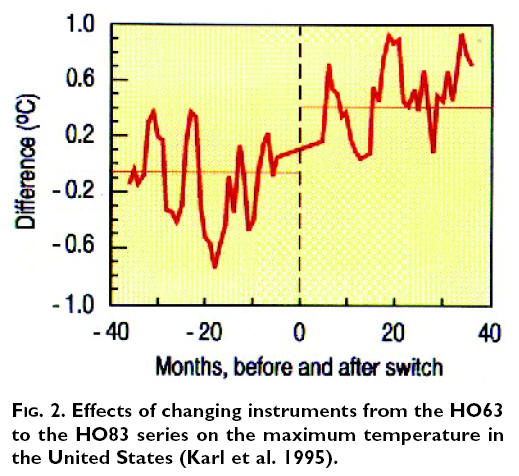
By the way, in the latter article he had this interesting chart with the potential upward bias added by an instrumentation switch at many weather stations

climate_station_move

This kind of thing happens in the instrumentation world, and is why numbers have to be adjusted from the raw data  (though these adjustments, even if done well, add error, as described above).  What has many skeptics scratching their heads is that despite this upward bias in the instrumentation switch, and the upward bias from many measurement points being near growing urban areas, the GISS and NOAA actually have an increasingly positive adjustment factor for the last couple of decades, not a negative one  (net of red, yellow, and purple lines here).   In other words, the GISS and NOAA adjustment factors imply that there is a net growing cooling bias in the surface temperature record in the last couple of decades that needs to be corrected.  This makes little sense to anyone whose main interest is not pumping up the official numbers to try to validate past catastrophic forecasts.

Update: The NOAA’s adjustment numbers imply a net cooling bias in station locations, but they do have a UHI correction component.  That number is about 0.05C, or 0.03F.  This implies the average urban heat island effect on measurement points over the last 50 years is less than 1/300th of the UHI effect we measured in Reno and Phoenix.  This seems really low, especially once one is familiar with the “body of work” of NOAA measurement stations as surveyed at Anthony’s site.

Why Does NASA Oppose Satellites? A Modest Proposal For A Better Data Set

One of the ironies of climate science is that perhaps the most prominent opponent of satellite measurement of global temperature is James Hansen, head of … wait for it … the Goddard Institute for Space Studies at NASA!  As odd as it may seem, while we have updated our technology for measuring atmospheric components like CO2, and have switched from surface measurement to satellites to monitor sea ice, Hansen and his crew at the space agency are fighting a rearguard action to defend surface temperature measurement against the intrusion of space technology.

For those new to the topic, the ability to measure global temperatures by satellite has only existed since about 1979, and is admittedly still being refined and made more accurate.  However, it has a number of substantial advantages over surface temperature measurement:

  • It is immune to biases related to the positioning of surface temperature stations, particularly the temperature creep over time for stations in growing urban areas.
  • It is relatively immune to the problems of discontinuities as surface temperature locations are moved.
  • It is much better geographic coverage, lacking the immense holes that exist in the surface temperature network.

Anthony Watt has done a fabulous job of documenting the issues with the surface temperature measurement network in the US, which one must remember is the best in the world.  Here is an example of the problems in the network.  Another problem that Mr. Hansen and his crew are particularly guilty of is making a number of adjustments in the laboratory to historical temperature data that are poorly documented and have the result of increasing apparent warming.  These adjustments, that imply that surface temperature measurements are net biased on the low side, make zero sense given the surfacestations.org surveys and our intuition about urban heat biases.

What really got me thinking about this topic was this post by John Goetz the other day taking us step by step through the GISS methodology for "adjusting" historical temperature records  (By the way, this third party verification of Mr. Hansen’s methodology is only possible because pressure from folks like Steve McIntyre forced NASA to finally release their methodology for others to critique).  There is no good way to excerpt the post, except to say that when its done, one is left with a strong sense that the net result is not really meaningful in any way.  Sure, each step in the process might have some sort of logic behind it, but the end result is such a mess that its impossible to believe the resulting data have any relevance to any physical reality.  I argued the same thing here with this Tucson example.

Satellites do have disadvantages, though I think these are minor compared to their advantages  (Most skeptics believe Mr. Hansen prefers the surface temperature record because of, not in spite of, its biases, as it is believed Mr. Hansen wants to use a data set that shows the maximum possible warming signal.  This is also consistent with the fact that Mr. Hansen’s historical adjustments tend to be opposite what most would intuit, adding to rather than offsetting urban biases).  Satellite disadvantages include:

  • They take readings of individual locations fewer times in a day than a surface temperature station might, but since most surface temperature records only use two temperatures a day (the high and low, which are averaged), this is mitigated somewhat.
  • They are less robust — a single failure in a satellite can prevent measuring the entire globe, where a single point failure in the surface temperature network is nearly meaningless.
  • We have less history in using these records, so there may be problems we don’t know about yet
  • We only have history back to 1979, so its not useful for very long term trend analysis.

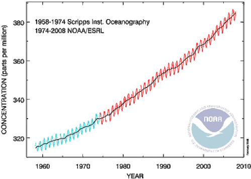
This last point I want to address.  As I mentioned above, almost every climate variable we measure has a technological discontinuity in it.  Even temperature measurement has one between thermometers and more modern electronic sensors.  As an example, below is a NOAA chart on CO2 that shows such a data source splice:

Atmosphericcarbondioxide

I have zero influence in the climate field, but I would never-the-less propose that we begin to make the same data source splice with temperature.  It is as pointless continue to rely on surface temperature measurements as our primary metric of global warming as it is to rely on ship observations for sea ice extent. 

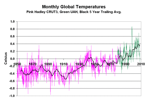
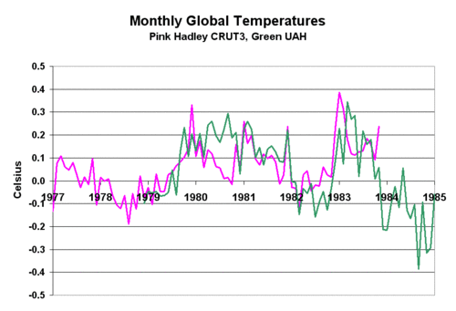
Here is the data set I have begun to use (Download crut3_uah_splice.xls ).  It is a splice of the Hadley CRUT3 historic data base with the UAH satellite data base for historic temperature anomalies.  Because the two use different base periods to zero out their anomalies, I had to reset the UAH anomaly to match CRUT3.  I used the first 60 months of UAH data and set the UAH average anomaly for this period equal to the CRUT3 average for the same period.  This added exactly 0.1C to each UAH anomaly.  The result is shown below (click for larger view)

Landsatsplice

Below is the detail of the 60-month period where the two data sets were normalized and the splice occurs.  The normalization turned out to be a simple addition of 0.1C to the entire UAH anomaly data set.  By visual inspection, the splice looks pretty good.

Landsatsplice2

One always needs to be careful when splicing two data sets together.  In fact, in the climate field I have warned of the problem of finding an inflection point in the data right at a data source splice.  But in this case, I think the splice is clean and reasonable, and consistent in philosophy to, say, the splice in historic CO2 data sources.

Creating Global Warming in the Laboratory

The topic of creating global warming at the computer workstation with poorly-justified "corrections" of past temperature records is one with which my readers should be familiar.  Some older posts on the topic are here and here and here.

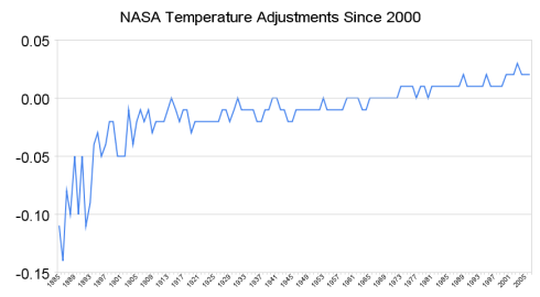
The Register updates this topic use March, 2008 temperature measurements from various sources.  They show that in addition to the USHCN adjustments we discussed here, the GISS overlays another 0.15C warming through further adjustments. 

Nasa_temperature_adjustments_since_

Nearly every measurement bias that you can imagine that changes over time tends to be an upward / warming bias, particularly the urban heat island effect my son and I measured here.  So what is all this cooling bias that these guys are correcting for?  Or are they just changing the numbers by fiat to match their faulty models and expensive policy goals?

Update:  Another great example is here, with faulty computer assumptions on ocean temperature recording substantially screwing up the temperature history record.