Category Archives: Current Weather

Lame, Desperate Climate Alarm Logic

Via Kevin Drum:

Chris Mooney reports today that there’s also a very simple reason: global warming has raised sea levels by about eight inches over the past century, and this means that when Sandy swept ashore it had eight extra inches of water to throw at us.….So that’s that. No shilly shallying. No caveats. “There is 100 percent certainty that sea level rise made this worse,” says sea level expert Ben Strauss. “Period.”

Hmm, OK.  First, to be clear, sea level rise over the last 100 years has been 17-20cm, which is 6.7-7.7 inches, which the author alarmingly rounded up to 8 inches.  But the real problem is the incredible bait and switch here.  They are talking about the dangers of anthropogenic global warming, but include the sea level rise from all warming effects, most of which occured long before we were burning fossil fuels at anywhere near current rates.  For example, almost half this rise was before 1950, where few argue that warming and sea level rise was due to man.  In fact, sea level rise is really a story of a constant 2-3mm a year rise since about 1850 as the world warms from the little ice age.  There has been no modern acceleration.

Graph—Global mean sea level: 1870–2007(source)

It is pretty heroic to blame all of a trend on an input that really only appeared significantly about 2/3 into the period on this chart.  By this chart, the warming since 1950, the period the IPCC blames warming mostly on man’s CO2, the sea level rise is only 10cm, or about 4 inches.  And to even claim four inches form CO2 since 1950 one would have to make the astonishing claim that whatever natural effect was driving sea levels higher since the mid-19th century suddenly halted at the exact same moment man began burning fossil fuels in earnest.    I’m not sure that the Sandy storm surge could even be measured to a precision of four inches or less.

Assuming three of the four inches are due to anthropogenic CO2, then the storm surge was 1.8%  higher due to global warming (taking 14 feet as the storm surge maximum, a number on which there is little agreement, confirming my hypothesis above that we are arguing in the noise).  Mooney’s argument is that damage goes up exponentially with surge height.  Granting this is true, this means that Sandy was perhaps 3.5% worse due to man-made higher sea levels.

So there you have your stark choice — you can shut down the global economy and throw billions of people in India and China back into horrendous poverty, or your 100-year storms will be 3,5% worse.  You make the call.

I would argue that one could find a far bigger contribution to Sandy’s nastiness in New York’s almost pathological refusal to accept in advance of Sandy that their city might be targeted by an Atlantic storm.  Huge percentages of the affected areas of the city are actually fill areas, and there is absolutely no evidence of sea walls or any sort of storm preparation.  I would have thought it impossible to find a seacoast city worse prepared for a storm than was New Orleans, but New York seems to have surpassed it.

As I wrote before, it is crazy to use Sandy as “proof” of a severe storm trend when in fact we are in the midst of a relative hurricane drought.  There is no evidence that the seas in Sandy’s storm track have seen any warming over the last century.

Summer of the Shark, Climate Edition

My new column is up, comparing coverage of this summer’s heat wave to “Summer of the Shark”

Before I discuss the 2012 global warming version of this process, let’s take a step back to 2001 and the “Summer of the Shark.”  The media hysteria began in early July, when a young boy was bitten by a shark on a beach in Florida.  Subsequent attacks received breathless media coverage, up to and including near-nightly footage from TV helicopters of swimming sharks.  Until the 9/11 attacks, sharks were the third biggest story of the year as measured by the time dedicated to it on the three major broadcast networks’ news shows.

Through this coverage, Americans were left with a strong impression that something unusual was happening — that an unprecedented number of shark attacks were occurring in that year, and the media dedicated endless coverage to speculation by various “experts” as to the cause of this sharp increase in attacks.

Except there was one problem — there was no sharp increase in attacks.  In the year 2001, five people died in 76 shark attacks.  However, just a year earlier, 12 people had died in 85 attacks.  The data showed that 2001 actually was  a down year for shark attacks.

This summer we have been absolutely bombarded with stories about the summer heat wave in the United States.  The constant drumbeat of this coverage is being jumped on by many as evidence of catastrophic man-made global warming….

What the Summer of the Shark needed, and what this summer’s US heatwave needs, is a little context.  Specifically, if we are going to talk about supposed “trends”, then we should look at the data series in question over time.  So let’s do so.

I go on to present a number of data series on temperatures, temperature maximums, droughts, and fires.   Enjoy.

Why Are Skeptics Piling on Irene Forecasters?

I am totally confused why a number of skeptic sites are piling on Irene forecasters who over-estimated the storm’s destructiveness.   Somehow, these sites seem to conflate alarm over Irene with alarm over global warming, and thus false Irene alarm somehow reduces the believeability of global warming forecasts.

This makes no sense.  Yes, the topics are vaguely related, but the models, the prediction process, even the people involved are totally different.  Heck, I heard Joe Bastardi, who I believe is a skeptic, right in there with everyone else last week warning the storm would be very, very dangerous.

The only element even marginally similar is the fact that there are strong incentives that might influence the forecasts.  News and weather outlets get better ratings by creating storm hype, the old joke being that the local news station has predicted ten of the last two natural disasters.  And politicians would certainly rather be caught out being too careful rather than too casual about impending storms.

Telling Half the Story 100% of the Time

By now, I think most readers of this site have seen the asymmetry in reporting of changes in sea ice extent between the Arctic and the Antarctic.  On the exact same day in 2007 that seemingly every paper on the planet was reporting that Arctic sea ice extent was at an “all-time” low, it turns out that Antarctic sea ice extent was at an “all-time” high.  I put “all-time” in quotes because both were based on satellite measurements that began in 1979, so buy “all-time” newspapers meant not the 5 billion year history of earth or the 250,000 year history of man or the 5000 year history of civilization but instead the 28 year history of space measurement.  Oh, that “all time”.

It turns out there is a parallel story with land-based ice and snow.  First some background

As most folks know, melting sea ice has no effect on world ocean heights — only melting of ice on land affects sea levels.   This land-based ice is distributed approximately as follows:

Antarctica:  89%

Greenland: 10%

Glaciers around the world: 1%

I won’t go into glaciers, in part because their effect is small, but suffice it to say they are melting, but they have been observed melting and retreating for 200 years, which makes this phenomenon hard to square with Co2 buildups over the last 50 years.

I am also not going to talk much about Greenland.  The implication of late has been that Greenland ice is melting fast and such melting is somehow unprecedented, so that it must be due to modern man.  This is of course slightly hard to square with the historical fact of how Greenland got its name, and the fact that it was warmer a thousand years ago than it is today.

But I am sure you have heard panic and doom in innumerable articles about 11% of the world’s land ice.   But what about the other 89%.  Crickets?

This may be why you never hear anything:

From World Climate Report: Antarctic Ice Melt at Lowest Levels in Satellite Era

Where are the headlines? Where are the press releases? Where is all the attention?

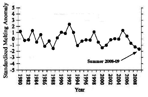
The ice melt across during the Antarctic summer (October-January) of 2008-2009 was the lowest ever recorded in the satellite history.

Such was the finding reported last week by Marco Tedesco and Andrew Monaghan in the journal Geophysical Research Letters:

A 30-year minimum Antarctic snowmelt record occurred during austral summer 2008–2009 according to spaceborne microwave observations for 1980–2009. Strong positive phases of both the El-Niño Southern Oscillation (ENSO) and the Southern Hemisphere Annular Mode (SAM) were recorded during the months leading up to and including the 2008–2009 melt season.

antarctica_icemelt

Figure 1. Standardized values of the Antarctic snow melt index (October-January) from 1980-2009 (adapted from Tedesco and Monaghan, 2009).

The silence surrounding this publication was deafening.

By the way, in case you think there may be some dueling methodologies here – ie that the scientists measuring melting in Greenland are professional real scientists while the guys doing the Antarctic work are somehow skeptic quacks, the lead author of this Antarctic study is the same guy who authored many of the Greenland melting studies that have made the press.  Same author.  Same methodology.  Same focus (on ice melting rates).  Same treatment in the press?   No way.  Publish the results only if they support the catastrophic view of global warming.

So — 11% of world’s land ice shrinking – Front page headlines.  89% of world’s land ice growing.  Silence.

UPDATE: Followup  here

Update #2 On GCCI Electrical Grid Disruption Chart

Update: Evan Mills, apparently one author of the analysis, responds and I respond back.

Steve McIntyre picks up my critique on the electrical grid disruption chart (here and here) and takes it further.  Apparently, this report (which I guess I should be calling the Climate Change Synthesis Report or CCSP) set rules for itself that all the work in the report had to be from peer-reviewed literature.  McIntyre makes a grab at the footnotes for this section of the report for any peer-reviewed basis, but comes up only with air.   He also references a hurricane chart in the report apparently compiled by the same person who compiled the grid outage report.  Roger Pielke rips up this hurricane report, and I have it on my list to address in a future post as well.

Update on GCCI Post #4: Grid Outage Chart

Update: Evan Mills, apparently one author of the analysis, responds and I respond back.

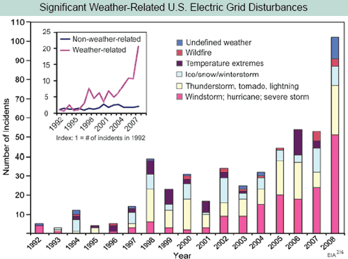
Yesterday I called into question the interpretation of this chart from the GCCI report where the report used electrical grid outages as a proxy for severe weather frequency:

electrical-outage1

I hypothesized:

This chart screams one thing at me:  Basis change.  Somehow, the basis for the data is changing in the period.  Either reporting has been increased, or definitions have changed, or there is something about the grid that makes it more sensitive to weather, or whatever  (this is a problem in tornado charts, as improving detection technologies seem to create an upward incidence trend in smaller tornadoes where one probably does not exist).   But there is NO WAY the weather is changing this fast, and readers should treat this whole report as a pile of garbage if it is written by people who uncritically accept this chart.

I had contacted John Makins of the EIA who owns this data set yesterday, but I was too late to catch him in the office.  He was nice enough to call me today.

He said that there may be an underlying upward trend out there (particularly in thunderstorms) but that most of the increase in this chart is from improvements in data gathering.  In 1997, the EIA (and Makins himself) took over the compilation of this data, which had previously been haphazard, and made a big push to get all utilities to report as required.  They made a second change and push for reporting in 2001, and again in 2007/2008.  He told me that most of this slope is due to better reporting, and not necessarily any underlying trend.   In fact, he said there still is some under-reporting by smaller utilities he wants to improve so that the graph will likely go higher in the future.

Further, it is important to understand the nature of this data.  The vast majority of weather disturbances are not reported to the EIA.  If the disturbance or outage remains local with no impact on any of the national grids, then it does not need to be reported.  Because of this definitional issue, reported incidents can also change over time due to the nature of the national grid.  For example, as usage of the national grid changes or gets closer to capacity, local disturbances might cascade to national issues where they would not have done so 20 years ago.  Or vice versa – better grid management technologies might keep problems local that would have cascaded regionally or nationally before.  Either of these would drive trends in this data that have no relation to underlying weather patterns.

At the end of the day, this disturbance data is not a good proxy for severe weather.  And I am left wondering at this whole “peer-reviewed science” thing, where errors like this pass into publication of major reports — an error that an amateur like myself can identify with one phone call to the guy listed by this data set on the web site.  Forget peer review, this isn’t even good basic editorial control  (apparently no one who compiled the report called Makins, and he was surprised today at the number of calls he was suddenly getting).

Postscript: Makins was kind enough to suggest some other data bases that might show what he believes to be a real increase in thunderstorm disturbances of electrical distribution grids.  He suggested that a number of state PUC’s keep such data, including the California PUC under their reliability section.  I will check those out, though it is hard to infer global climate trends from one state.

10 Acres of Melting = Global Warming

I must have had 50 people mail me various versions of the NY Times story on the citizens of Newtok, Alaska who had to abandon their homes due to melting permafrost that made their structures unstable.  Most of the emails came with a message such as “explain this away, skeptic boy.”

Generally I had two answers:

  1. Uh, it is kind of hard to deny that the Artic has warmed over the last 30 years, though that has leveled off in the last 10.  Climate changed naturally long before man began burning hydrocarbons.   One only has to consider the great cities of North Africa that have disappeared over the centuries as the area dried up to give the lie to the statement that “climate refugees” are a modern phenomenon.  Anyone ever hear about the Norsemen abandoning Greenland?
  2. I have been to the North Slope, and my dad was heavily involved in the planning for the Alaskan oil fields and pipeline.  And I can say with confidence that modern human habitations have to be very, very, very careful not to melt the permafrost both with their waste heat as well as by actions that strip insulating cover off the permafrost.

Greg Schiller covers this ground, and more, as he reveals that the real culprit in Newtok appears to be normal everyday riverbank erosion, and a state government that insisted on building a town in this particular location.

No Detectable Hurricane Trend

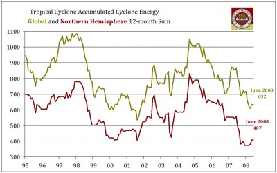
Hurricanes offer a difficult data set to work with.  Since there are so few, even small numerical changes year over year can lead to substantial percentage changes.  Also, random variations in landfall can change at least media perceptions of hurricane frequency.  That is why I have argued for a while that metrics like total cyclonic energy are better for looking at hurricane trends.  And, as you can see below, there has been no positive trend over the last 15 years or so:

Tc_ace_thumb

The Australian National Climate Center confirmed these findings:

Concern about the enhanced greenhouse effect affecting TC frequency
and intensity has grown over recent decades. Recently, trends in global
TC activity for the period 1970 to 2004 have been examined by Webster
et al. [2005]. They concluded that no global trend has yet emerged in the total number of tropical storms and hurricanes."…  For the 1981/82 to 2005/06 TC seasons, there are no apparent trends in the total numbers and cyclone days of TCs, nor in numbers and cyclone days of severe TCs with minimum central pressure of 970 hPa or lower.

A Reminder

As we know, alarmists have adopted the term "climate change" over "global warming," in large part since the climate is always changing for all manner of reasons, one can always find, well, climate change.   This allows alarmists in the media to point to any bit of weather in the tails for the normal distribution and blame these events on man-made climate change.

But here is a reminder for those who may be uncomfortable with their own grasp of climate science (don’t feel bad, the media goes out of its way not to explain things very well).  There is no mechanism that has been proven, or even credibly identified, for increasing levels of CO2 in the atmosphere to "change the climate" or cause extreme weather without first causing warming.  In other words, the only possible causality is CO2 –> warming –> changing weather patterns.  If we don’t see the warming, we don’t see the changing weather patterns. 

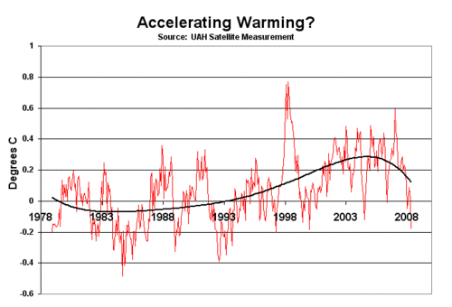
I feel the need to say this, because alarmists (including Gore) have adopted the tactic of saying that climate change is accelerating, or that they see the signs of accelerating climate change everywhere.  But for the last 10 years, we have not seen any warming.  Uah

So if climate change is in fact somehow "accelerating," then it cannot possibly be due to CO2.  I believe that they are trying to create the impression that somehow CO2 is directly causing extreme weather, which it does not, under any mechanism anyone has ever suggested.   

Yes, It’s Another Antarctic Ice Post

From a reader, comes yet another article claiming micro-climate variations on the Antarctic Peninsula are indicative of global warming.

New evidence has emerged that a large plate of floating ice shelf attached to Antarctica is breaking up, in a troubling sign of global warming, the European Space Agency (ESA) said on Thursday.

Images taken by its Envisat remote-sensing satellite show that Wilkins Ice Shelf is "hanging by its last thread" to Charcot Island, one of the plate’s key anchors to the Antarctic peninsula, ESA said in a press release.

"Since the connection to the island… helps stabilise the ice shelf, it is likely the breakup of the bridge will put the remainder of the ice shelf at risk," it said.

Wilkins Ice Shelf had been stable for most of the last century, covering around 16,000 square kilometres (6,000 square miles), or about the size of Northern Ireland, before it began to retreat in the 1990s.

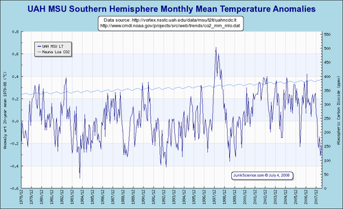
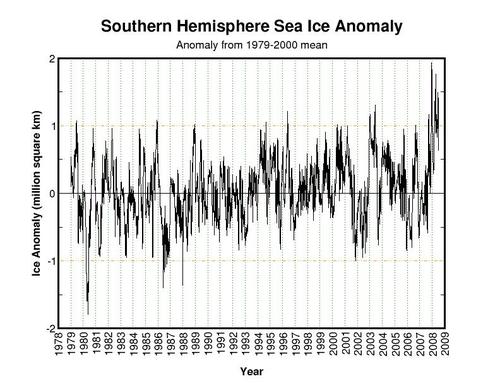
No, No, No.  The Antartic Peninsula’s climate is not indicative of the rest of Antarctica or the rest of the Southern Hemisphere, much less of the globe.  Here, one more time, is the missing context:

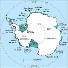
    1. The Antarctic Peninsula is a very small area that has very clearly been warming substantially over the last decades, but it represents only 2% of Antarctica 

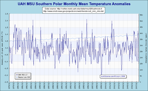
    2. The rest of Antarctica has seen flat and even declining temperatures, as has the entire southern hemisphere.  In fact, the Antarctic Peninsula is a very small area that is anomalous within the entire Southern Hemisphere, which makes it incredible that it so often is used as indicative of a global climate trend.

      Uahmsuspol

      Uahmsushem

    3. Antarctic sea ice extent is actually at the highest levels observed since we started watching it via satellite around 1979.  Ice may be shrinking around the Peninsula, but is net growing over the whole continent
      Currentanomsouth
    4. We have no clue how ice shelves behave over time spans longer than the 100 years we have watched them.  It may well be they go through long-term natural growth and collapse cycles.

Much more here.

Global Warming Reduces Tornadoes

In a recent story on global warming, ABC claimed that tornado frequency this year is running nearly twice that of last year and that this can be linked to global warming.   (HT Maggies Farm) Now, I would have tended to argue that year-over-year variations are probably not related to multi-decadal climate trends, but if ABC wants to so argue, I will go with it.

The only problem is that the first five months of 2008 have been the coolest since 1993 and has run well below the average temperature for the period from 1978-1990.   This while 2007 was one of the warmer Jan-May periods in recent memory.  In fact, average US temperatures were about a degree Celsius cooler in 2008 than in 2007:

UAH MSU temperature for USA (average anomaly)

Jan-May 2007:  .668 C

Jan-Apr 2008:  -.228 C

Difference:  .896 C

So, if one wants to posit that tornado variation in 2008 is a result of a long-term climate trend rather than natural variability, then one must assume that global cooling causes tornadoes to increase, and that in fact global warming would benefit mankind by decreasing tornado frequency.

The whole history of the global warming causes tornadoes claim is one of grossly bad science, most famously including Al Gore’s claim in that movie of his.  I debunked that claim here, demonstrating that the increase in measured tornadoes is a function solely of better measurement, not more tornadoes, something the NOAA has been careful to state as well.

Where did that Warming Go?

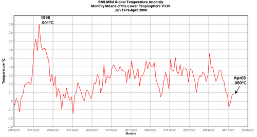
Though not particularly relevent to discussion one way or the other about long-term warming trends, world temperatures in April appear to again be relatively cool.  More intresting is the satellite-measured temperature trend for the last decade, which looks pretty flat (and this before shift of the PDO to its cool phase, probably this year).

Rssmsumonthlyanomzoom_042008

Global warming theory as reported by the last IPCC predicted that the most warming was predicted for the middle troposphere over the tropics.  Its hard to see any warming in this region even over the last 30 years.  With no apparent warming in the sourthern hemisphere, "global" warming seems to be limited in the last 30 years to the Northen Hemisphere outside the tropics, and even this warming has stopped over the last 10 years.

Global Warming Whining

Last year, the "hot" issue among global warming alarmists was that earlier, warmer springs were going to kill the maple syrup industry.

"You might be tempted to say, well that’s a bunch of baloney — global warming," said Mr. Morse, drilling his first tap holes this season in mid-February, as snow hugged the maples and Vermont braced for a record snowfall. "But the way I feel, we get too much warm. How many winters are we going to go with Decembers turning into short-sleeve weather, before the maple trees say, ‘I don’t like it here any more?’ "

There is no way to know for certain, but scientists are increasingly persuaded that human-caused global warming is changing climate conditions that affect sugaring….

"It appears to be a rather dire situation for the maple industry in the Northeast if conditions continue to go toward the predictions that have been made for global warming," said Tim Perkins, director of the Proctor Maple Research Center at the University of Vermont.

Dr. Perkins studied the records of maple syrup production over the last 40 years and found a fairly steady progression of the maple sugaring season moving earlier and earlier, and also getting shorter.

OK, I see, so warm winters hurt the maple sugar industry.  So this must have been a great season, right, since it was a really cold winter?  Wrong!

The weather this week will be key, but producers say the heavy snows this winter also are limiting production.

Moore said that at least 75 percent of his 5,000 trees are unreachable this week, still buried in snow. "I have trees that still have 3 feet of snow around them," he said. "It’s not looking good right now."Eric Ellis of Maine Maple Products of Madison, a company run by the Lariviere brothers that taps 50,000 trees in northern Somerset County, said the season in the north country hasn’t even begun. "It’s a week to 10 days late." Ellis, like Moore, is concerned that it may get too warm too quickly.

"We only made syrup one afternoon last week," he said. "The Skowhegan area is certainly below average." Somerset County has the distinction of being the highest-producing county in the country.

OK, so colder, longer winters are bad for maple syrup too.  I don’t remember anyone pointing this out last year when they were blaming global warming.

Temperatures in Antarctica

A week or so ago I lambasted the press for trying to portray the collapse of a small portion of an ice shelf on the Antarctic penninsula as evidence of accelerating global warming.  I argued that for decades there has indeed been a warming trend on the Penninsula  (less than 5% of Antarctic land area) but a cooling trend in the rest of the continent.  This implies that the ice shelf collapse either 1) means nothing, as ice shelves do collapse and re-grow fro mtime to time or 2) is an indicator of a local warming anomaly.  In other words, the conditions on the Antarctic Penninsula are not representative of the rest of Antarctica, much less the globe.

Today, Roger Pielke’s blog brings more evidence of how the Antarctic Penninsula is behaving differently from the rest of Antarctica:

Surface snowmelt in Antarctica in 2008, as derived from spaceborne passive microwave observations at 19.35 gigahertz, was 40% below the average of the period 1987–2007. The melting index (MI, a measure of where melting occurred and for how long) in 2008 was the second-smallest value in the 1987–2008 period, with 3,465,625 square kilometers times days (km2 × days) against the average value of 8,407,531 km2 × days (Figure 1a). Melt extent (ME, the extent of the area subject to melting) in 2008 set a new minimum with 297,500 square kilometers, against an average value of approximately 861,812 square kilometers. The 2008 updated melting index and melt extent trends over the whole continent, as derived from a linear regression approach, are –164,487 km2 × days per year (MI) and –11,506 square kilometers per year (ME), respectively.

Negative trends for the period 1987–2008 of the number of melting days (Figure 1b)
over the Antarctic Peninsula are observed at a rate down to –2 days per year for internal areas and about –0.7 days per year for coastal areas. Contrarily, positive trends (up to approximately +0.25 days per year) are observed on part of the Larsen Ice Shelf.

In East Antarctica, positive trends are observed over the Amery, West, Shackleton, and Voyeykov ice shelves, with values of up to +0.7 days per year for Shackleton and +0.8 days per year for Amery. Interestingly, the latter shows negative trends (down to –0.3 days per year) for internal areas but positive values for coastal areas.

Translation:  Most of Antarctica has seen a trend towards less ice melting over the last few decades, with 2008 setting minimum records.  The exception is around the ice shelves, which have seen an opposite trend.  These ice shelves represent a tiny, tiny fraction of the area of Antarctica, and are thought to be melting because the surrounding sea may have warmed a bit (though that is not certain).  Which all goes to show that weather is really complicated and it is totally facile to write that an ice shelf collapse is a sign of accelerating global warming.

… Or It Could Mean Nothing

Kevin Drum wrote:

CLIMATE CHANGE UPDATE….The Wilkins ice shelf is collapsing:

A chunk of Antarctic ice about seven times the size of Manhattan suddenly collapsed, putting an even greater portion of glacial ice at risk, scientists said Tuesday.

….British Antarctic Survey scientist David Vaughan attributed the melting to rising sea temperature due to global warming.

….Vaughan had predicted the Wilkins shelf would collapse about 15 years from now.

All the usual caveats apply. However, this is one more data point suggesting that global warming may be happening faster than our current models predict, not slower.

I responded in the comments section:

A few observations.

  • Global temperatures have been flat for 8-10 years, after being up substantially the decade previously.
  • Recent ocean measurement work as reported on NPR show ocean temps. over last 5-6 years to be flat to slightly down
  • 98% of Antarctica has cooled over the last decades and has built up ice pack — 2% has warmed (in the Antarctic Peninsula). I will leave it to the reader to guess where Al Gore sent his cameras
  • In August 2007, or about a half year ago, sea ice extent around Antarctica was the largest ever recorded (since measured by satellites in 1979). So, within the last 6-8 months, Antarctica had record sea ice buildup.

Given this backdrop, it is astounding that one could interpret the collapse of an ice sheet that happened faster than one scientist predicted as "accelerating global warming." I can’t think of any mechanism where the behavior of an ice shelf would be a more sensitive measure of the pace of global temperature change than would be the direct measurement of air and sea temperatures themselves.

There are two ways to interpret this ice sheet collapse that are far more "reality-based"

One, the collapse is a result of the fairly well-known and relatively isolated local/regional warming in the Antarctic Peninsula (where I believe this shelf is located). In other words, it signals a local phenomenon rather than a global one, or

Two, the scientist who originally predicted the date of the ice shelf collapse made an incorrect prediction. There is no particular loss of face in this – after all, such events are part of cycles that last long enough that, in many cases, we have not been able to observe even one entire cycle with modern tools. It would be the height of hubris to say that we understand and forecast these decadal and even longer cycles and events well enough to declare that deviation from forecast must represent a change in nature rather than our own poor understanding.

Update:  More here via Q&O