Forecasting

One of the defenses often used by climate modelers against charges that climate is simple to complex to model accurately is that “they do it all the time in finance and economics.”  This comes today from Megan McArdle on economic forecasting:

I find this pretty underwhelming, since private forecasters also unanimously think they can make forecasts, a belief which turns out to be not very well supported.  More than one analysis of these sorts of forecasts has found them not much better than random chance, and especially prone to miss major structural changes in the economy.   Just because toggling a given variable in their model means that you produce a given outcome, does not mean you can assume that these results will be replicated in the real world.  The poor history of forecasting definitionally means that these models are missing a lot of information, and poorly understood feedback effects.

Sounds familiar, huh?  I echoed these sentiments in a comparison of economic and climate forecasting here.

Why It Is Good to Have Two Sides of A Debate

With climate alarmists continuing to declare climate debate to be over and asking skeptics to just go away, we are reminded again why it is useful to have two sides in a debate.  Few people on any side of any question typically are skeptical of data that support their pet hypotheses.    So, in order to have a full range of skepticism and replication applied to all findings, it is helpful to have people passionately on both sides of a proposition.

I am reminded of this seeing how skeptics finally convinced the NOAA that one of its satellites had gone wonky, producing absurd data (e.g. Great Lakes temperatures in the 400-600F range).  Absolutely typically, the NOAA initially blamed skeptics for fabricating the data

NOAA’s Chuck Pistis went into whitewash mode on first hearing the story about the worst affected location, Egg Harbor, set by his instruments onto fast boil. On Tuesday morning Pistis loftily declared, “I looked in the archives and I find no image with that time stamp. Also we don’t typically post completely cloudy images at all, let alone with temperatures. This image appears to be manufactured for someone’s entertainment.”

Later he went on to own up to the problem, but not before implying at various times that the data is a) trustworthy  b) not trustworthy  c) placed online by hand with verification and d) posted online automatically with no human intervention.

This was the final NOAA position, which is absurd to me:

“NOTICE: Due to degradation of a satellite sensor used by this mapping product, some images have exhibited extreme high and low surface temperatures. “Please disregard these images as anomalies. Future images will not include data from the degraded satellite and images caused by the faulty satellite sensor will be/have been removed from the image archive.”

OK, so 600F readings will be thrown out, but how do we have any confidence the rest of the readings are OK.  Just because they may read in a reasonable range, e.g, 59F, the NOAA is just going to assume those readings are OK?

Just When I Thought I Had Seen the Worst Possible Peer-Reviewed Climate Work…

This is really some crazy-bad science in a new study by Welch et al on Asian rice yields purporting to show that they will be reduced by warmer weather.  This is an odd result on its face, given that rice yields have been increasing as the world has warmed over the last 50 years.

Now, it is possible that temperature-related drops in yields have been offset by even larger improvements in other areas that have increased yields, but one’s suspicion-meter is certainly triggered by the finding, especially since the press release on the study says that yields have already been cut 10-20% in some areas, flying in the face of broader yield data.

Willis Eschenbach dove into it, and found this amazing approach.  How this passed peer-review muster is just further evidence as to how asymmetrical peer review is in climate (ie if you have the “right” findings, they will pass all kinds of slop)

First, it covers a very short time span. The longest farm yield datasets used are only six years long (1994-99). Almost a fifth of the datasets are three years or less, and the Chinese data (6% of the total data) only cover two years (1998-1999)….

But whichever dataset they used, they are comparing a two year series of yields against a twenty-six year trend. I’m sorry, but I don’t care what the results of that comparison might be. There is no way to compare a two-year dataset with anything but the temperature records from that area for those two years. This is especially true given the known problems with the ground-station data. And it is doubly true when one of the two years (1998) is a year with a large El Niño.

In fact, he goes on to point out that simultaneous to the two-year trend in China showing yields falling  (I still can’t get over extrapolating from a 2 year farm yield trend) temperatures in China did very different things than their long-term averages might predict

For example, they give the trend for maximum temps in the winter (DecJanFeb) for the particular location in China (29.5N, 119.47E) as being 0.06°C per year, and the trend for spring (MarAprMay) as being 0.05°C per year (I get 0.05°/yr and 0.04°C/yr respectively, fairly close).

But from 1998 to 1999, the actual DJF change was +2.0°C, and the MAM change was minus 1.0°C (CRU TS Max Temperature dataset). As a result, they are comparing the Chinese results to a theoretical trend which has absolutely no relationship to what actually occurred on the ground.

Further, though Eschenbach only mentions it in passing, there likely is another large problem with the data.  The researchers do not mention what temperature station they are using data from, but if past global warming study methodology is any guide, the station could be hundreds of miles away from the farms studied.

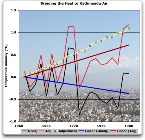
Computers are Causing Global Warming

At least, that is, in Nepal.  Willis Eschenbach has an interesting post looking into the claim that Nepal has seen one of the highest warming rates in the world (thus threatening Himalayan glaciers, etc etc).  It turns out there is one (1) GISS station in Nepal, and oddly enough the raw data shows a cooling trend.  Only the intervention of NASA computers heroically transforms a cooling trend into the strong warming trend we all know must really be there because Al Gore says its there and he got a Nobel Prize, didn’t he?

GISS has made a straight-line adjustment of 1.1°C in twenty years, or 5.5°C per century. They have changed a cooling trend to a strong warming trend … I’m sorry, but I see absolutely no scientific basis for that massive adjustment. I don’t care if it was done by a human using their best judgement, done by a computer algorithm utilizing comparison temperatures in India and China, or done by monkeys with typewriters. I don’t buy that adjustment, it is without scientific foundation or credible physical explanation.

At best that is shoddy quality control of an off-the-rails computer algorithm. At worst, the aforesaid monkeys were having a really bad hair day. Either way I say adjusting the Kathmandu temperature record in that manner has no scientific underpinnings at all. We have one stinking record for the whole country of Nepal, which shows cooling. GISS homogenizes the data and claims it wasn’t really cooling at all, it really was warming, and warming at four degrees per century at that

In updates to the post, Eschenbach and his readers track down what is likely driving this bizarre adjustment in the GISS methodology.