Explaining the Flaw in Kevin Drum’s (and Apparently Science Magazine’s) Climate Chart

Cross-Posted from Coyoteblog

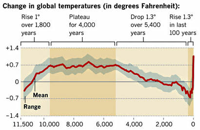
I won’t repeat the analysis, you need to see it here.  Here is the chart in question:

la-sci-climate-warming

My argument is that the smoothing and relatively low sampling intervals in the early data very likely mask variations similar to what we are seeing in the last 100 years — ie they greatly exaggerate the smoothness of history (also the grey range bands are self-evidently garbage, but that is another story).

Drum’s response was that “it was published in Science.”  Apparently, this sort of appeal to authority is what passes for data analysis in the climate world.

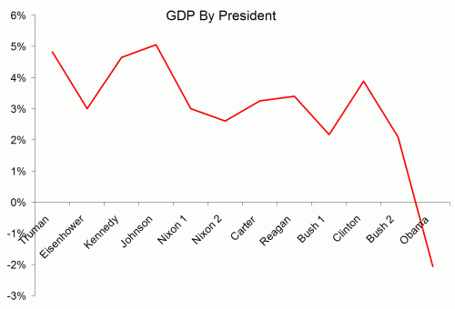
Well, maybe I did not explain the issue well.  So I found a political analysis that may help Kevin Drum see the problem.  This is from an actual blog post by Dave Manuel (this seems to be such a common data analysis fallacy that I found an example on the first page of my first Google search).  It is an analysis of average GDP growth by President.  I don’t know this Dave Manuel guy and can’t comment on the data quality, but let’s assume the data is correct for a moment.  Quoting from his post:

Here are the individual performances of each president since 1948:

1948-1952 (Harry S. Truman, Democrat), +4.82%
1953-1960 (Dwight D. Eisenhower, Republican), +3%
1961-1964 (John F. Kennedy / Lyndon B. Johnson, Democrat), +4.65%
1965-1968 (Lyndon B. Johnson, Democrat), +5.05%
1969-1972 (Richard Nixon, Republican), +3%
1973-1976 (Richard Nixon / Gerald Ford, Republican), +2.6%
1977-1980 (Jimmy Carter, Democrat), +3.25%
1981-1988 (Ronald Reagan, Republican), 3.4%
1989-1992 (George H. W. Bush, Republican), 2.17%
1993-2000 (Bill Clinton, Democrat), 3.88%
2001-2008 (George W. Bush, Republican), +2.09%
2009 (Barack Obama, Democrat), -2.6%

Let’s put this data in a chart:

click to enlarge


Look, a hockey stick , right?   Obama is the worst, right?

In fact there is a big problem with this analysis, even if the data is correct.  And I bet Kevin Drum can get it right away, even though it is the exact same problem as on his climate chart.

The problem is that a single year of Obama’s is compared to four or eight years for other presidents.  These earlier presidents may well have had individual down economic years – in fact, Reagan’s first year was almost certainly a down year for GDP.  But that kind of volatility is masked because the data points for the other presidents represent much more time, effectively smoothing variability.

Now, this chart has a difference in sampling frequency of 4-8x between the previous presidents and Obama.  This made a huge difference here, but it is a trivial difference compared to the 1 million times greater sampling frequency of modern temperature data vs. historical data obtained by looking at proxies (such as ice cores and tree rings).  And, unlike this chart, the method of sampling is very different across time with temperature – thermometers today are far more reliable and linear measurement devices than trees or ice.  In our GDP example, this problem roughly equates to trying to compare the GDP under Obama (with all the economic data we collate today) to, say, the economic growth rate under Henry the VIII.  Or perhaps under Ramses II.   If I showed that GDP growth in a single month under Obama was less than the average over 66 years under Ramses II, and tried to draw some conclusion from that, I think someone might challenge my analysis.  Unless of course it appears in Science, then it must be beyond question.

If You Don’t Like People Saying That Climate Science is Absurd, Stop Publishing Absurd Un-Scientific Charts

Reprinted from Coyoteblog

science a “myth”.  As is usual for global warming supporters, he wraps himself in the mantle of science while implying that those who don’t toe the line on the declared consensus are somehow anti-science.

Readers will know that as a lukewarmer, I have as little patience with outright CO2 warming deniers as I do with those declaring a catastrophe  (for my views read this and this).  But if you are going to simply be thunderstruck that some people don’t trust climate scientists, then don’t post a chart that is a great example of why people think that a lot of global warming science is garbage.  Here is Drum’s chart:

la-sci-climate-warming

The problem is that his chart is a splice of multiple data series with very different time resolutions.  The series up to about 1850 has data points taken at best every 50 years and likely at 100-200 year or more intervals.  It is smoothed so that temperature shifts less than 200 years or so in length won’t show up and are smoothed out.

In contrast, the data series after 1850 has data sampled every day or even hour.  It has a sampling interval 6 orders of magnitude (over a million times) more frequent.  It by definition is smoothed on a time scale substantially shorter than the rest of the data.

In addition, these two data sets use entirely different measurement techniques.  The modern data comes from thermometers and satellites, measurement approaches that we understand fairly well.  The earlier data comes from some sort of proxy analysis (ice cores, tree rings, sediments, etc.)  While we know these proxies generally change with temperature, there are still a lot of questions as to their accuracy and, perhaps more importantly for us here, whether they vary linearly or have any sort of attenuation of the peaks.  For example, recent warming has not shown up as strongly in tree ring proxies, raising the question of whether they may also be missing rapid temperature changes or peaks in earlier data for which we don’t have thermometers to back-check them (this is an oft-discussed problem called proxy divergence).

The problem is not the accuracy of the data for the last 100 years, though we could quibble this it is perhaps exaggerated by a few tenths of a degree.  The problem is with the historic data and using it as a valid comparison to recent data.  Even a 100 year increase of about a degree would, in the data series before 1850, be at most a single data point.  If the sampling is on 200 year intervals, there is a 50-50 chance a 100 year spike would be missed entirely in the historic data.  And even if it were in the data as a single data point, it would be smoothed out at this data scale.

Do you really think that there was never a 100-year period in those last 10,000 years where the temperatures varied by more than 0.1F, as implied by this chart?  This chart has a data set that is smoothed to signals no finer than about 200 years and compares it to recent data with no such filter.  It is like comparing the annualized GDP increase for the last quarter to the average annual GDP increase for the entire 19th century.   It is easy to demonstrate how silly this is.  If you cut the chart off at say 1950, before much anthropogenic effect will have occurred, it would still look like this, with an anomalous spike at the right (just a bit shorter).  If you believe this analysis, you have to believe that there is an unprecedented spike at the end even without anthropogenic effects.

There are several other issues with this chart that makes it laughably bad for someone to use in the context of arguing that he is the true defender of scientific integrity

  • The grey range band is if anything an even bigger scientific absurdity than the main data line.  Are they really trying to argue that there were no years, or decades, or even whole centuries that never deviated from a 0.7F baseline anomaly by more than 0.3F for the entire 4000 year period from 7500 years ago to 3500 years ago?  I will bet just about anything that the error bars on this analysis should be more than 0.3F, much less the range of variability around the mean.  Any natural scientist worth his or her salt would laugh this out of the room.  It is absurd.  But here it is presented as climate science in the exact same article that the author expresses dismay that anyone would distrust climate science.
  • A more minor point, but one that disguises the sampling frequency problem a bit, is that the last dark brown shaded area on the right that is labelled “the last 100 years” is actually at least 300 years wide.  Based on the scale, a hundred years should be about one dot on the x axis.  This means that 100 years is less than the width of the red line, and the last 60 years or the real anthropogenic period is less than half the width of the red line.  We are talking about a temperature change whose duration is half the width of the red line, which hopefully gives you some idea why I say the data sampling and smoothing processes would disguise any past periods similar to the most recent one.

Update:  Kevin Drum posted a defense of this chart on Twitter.  Here it is:  “It was published in Science.”   Well folks, there is climate debate in a nutshell.   An 1000-word dissection of what appears to be wrong with a particular analysis retorted by a five-word appeal to authority.