Mistaking Cyclical Variations for the Trend

I titled my very first climate video “What is Normal,” alluding to the fact that climate doomsayers argue that we have shifted aspects of the climate (temperature, hurricanes, etc.) from “normal” without us even having enough historical perspective to say what “normal” is.

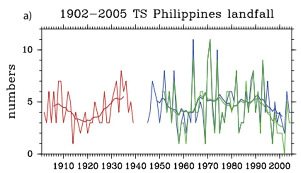
A more sophisticated way to restate this same point would be to say that natural phenomenon tend to show various periodicities, and without observing nature through the whole of these cycles, it is easy to mistake short term cyclical variations for long-term trends.

A paper in the journal Water Resources Research makes just this point using over 200 years of precipitation data:

We analyze long-term fluctuations of rainfall extremes in 268 years of daily observations (Padova, Italy, 1725-2006), to our knowledge the longest existing instrumental time series of its kind. We identify multidecadal oscillations in extremes estimated by fitting the GEV distribution, with approximate periodicities of about 17-21 years, 30-38 years, 49-68 years, 85-94 years, and 145-172 years. The amplitudes of these oscillations far exceed the changes associated with the observed trend in intensity. This finding implies that, even if climatic trends are absent or negligible, rainfall and its extremes exhibit an apparent non-stationarity if analyzed over time intervals shorter than the longest periodicity in the data (about 170 years for the case analyzed here). These results suggest that, because long-term periodicities may likely be present elsewhere, in the absence of observational time series with length comparable to such periodicities (possibly exceeding one century), past observations cannot be considered to be representative of future extremes. We also find that observed fluctuations in extreme events in Padova are linked to the North Atlantic Oscillation: increases in the NAO Index are on average associated with an intensification of daily extreme rainfall events. This link with the NAO global pattern is highly suggestive of implications of general relevance: long-term fluctuations in rainfall extremes connected with large-scale oscillating atmospheric patterns are likely to be widely present, and undermine the very basic idea of using a single stationary distribution to infer future extremes from past observations.

Trying to work with data series that are too short is simply a fact of life — everyone in climate would love a 1000-year detailed data set, but we don’t have it.  We use what we have, but it is important to understand the limitations.  There is less excuse for the media that likes to use single data points, e.g. one storm, to “prove” long term climate trends.

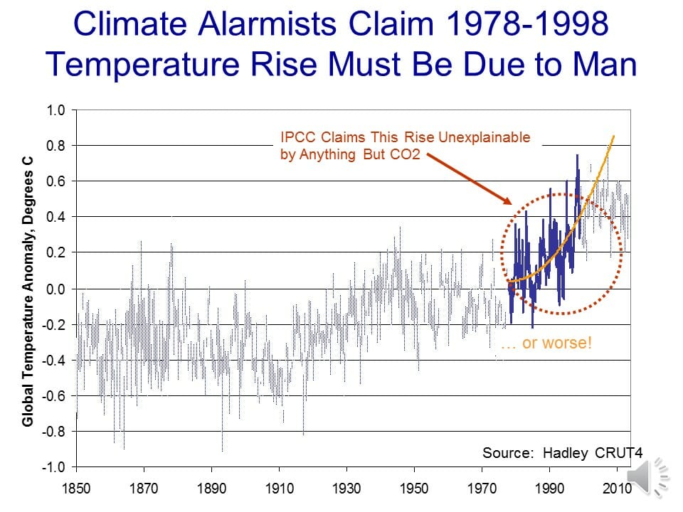
A good example of why this is relevant is the global temperature trend.  This chart is a year or so old and has not been updated in that time, but it shows the global temperature trend using the most popular surface temperature data set.  The global warming movement really got fired up around 1998, at the end of the twenty year temperature trend circled in red.

click to enlarge


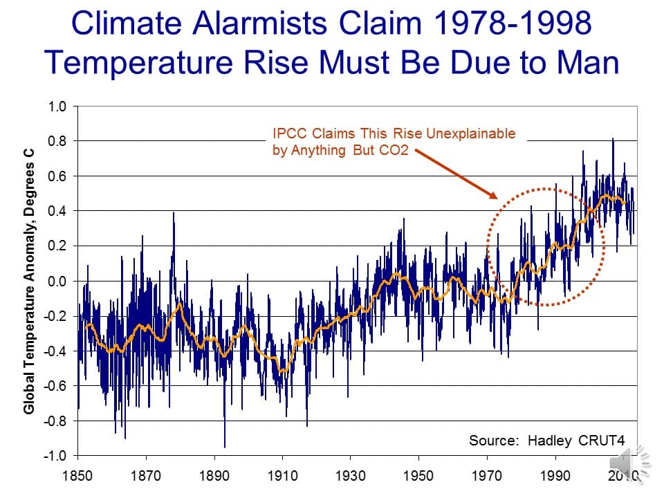
They then took the trends from these 20 years and extrapolated them into the future:

click to enlarge

But what if that 20 years was merely the upward leg of a 40-60 year cyclic variation?  Ignoring the cyclic functions would cause one to overestimate the long term trend.  This is exactly what climate models do, ignoring important cyclic functions like the AMO and PDO.

In fact, you can get a very good fit with actual temperature by modeling them as three functions:  A 63-year sine wave, a 0.4C per century long-term linear trend  (e.g. recovery from the little ice age) and a new trend starting in 1945 of an additional 0.35C, possibly from manmade CO2.Slide52

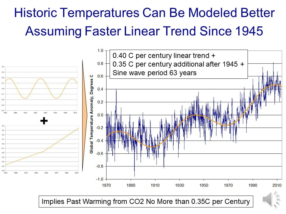
In this case, a long-term trend still appears to exist but it is exaggerated by only trying to measure it in the upward part of the cycle (e.g. from 1978-1998).


Typhoons and Hurricanes

(Cross-posted from Coyoteblog)

The science that CO2 is a greenhouse gas and causes some warming is hard to dispute.  The science that Earth is dominated by net positive feedbacks that increase modest greenhouse gas warming to catastrophic levels is very debatable.  The science that man’s CO2 is already causing an increase in violent and severe weather is virtually non-existent.

Seriously, of all the different pieces of the climate debate, the one that is almost always based on pure crap are the frequent media statements linking manmade CO2 to some severe weather event.

For example, Coral Davenport in the New York Times wrote the other day:

As the torrential rains of Typhoon Hagupit flood thePhilippines, driving millions of people from their homes, the Philippine government arrived at a United Nationsclimate change summit meeting on Monday to push hard for a new international deal requiring all nations, including developing countries, to cut their use of fossil fuels.

It is a conscious pivot for the Philippines, one of Asia’s fastest-growing economies. But scientists say the nation is also among the most vulnerable to the impacts of climate change, and the Philippine government says it is suffering too many human and economic losses from the burning of fossil fuels….

A series of scientific reports have linked the burning of fossil fuels with rising sea levels and more powerful typhoons, like those that have battered the island nation.

It is telling that Ms. Davenport did not bother to link or name any of these scientific reports.  Even the IPCC, which many skeptics believe to be exaggerating manmade climate change dangers, refused in its last report to link any current severe weather events with manmade CO2.

Roger Pielke responded today with charts from two different recent studies on typhoon activity in the Phillipines.  Spot the supposed upward manmade trend.  Or not:

kubotachan2009

c2789-wpac-50-10-weinkleetal


I am not a huge fan of landfalling cyclonic storm counts because whether they make landfall or not can be totally random and potentially disguise trends.  A better metric is the total energy of cyclonic storms, land-falling or not, where again there is no trend.

Via the Weather Underground, here is Accumulated Cyclonic Energy for the Western Pacific (lower numbers represent fewer cyclonic storms with less total strength):

ace-west-pacific


And here, by the way, is the ACE for the whole globe:

ace-global

Remember this when you see the next storm inevitably blamed on manmade global warming.  If anything, we are actually in a fairly unprecedented (in the last century and a half) hurricane drought.

Those Who Follow Climate Will Definitely Recognize This

This issue will be familiar to anyone who has spent time with temperature graphs.  We can ask ourselves if 1 degree of global warming is a lot, when it is small compared to seasonal variations, or even intra-day variation, you would find in most locations.  That is not a trick question.  It might be important, but certainly how important an audience  considers it may be related to how one chooses to graph it.  Take this example form an entirely unrelated field:

Last spring, Adnan sent me a letter about … something, I can’t even remember exactly what. But it included these two graphs that he’d drawn out in pencil. With no explanation. There was just a Post-it attached to the back of one of the papers that said: “Could you please hold these 2 pages until we next speak? Thank you.”

Here’s what he sent:

as_tea_graph_2_cropped
Price of tea at 7-11 

as_tea_graph1_crop_0
Price of tea at C-Mart 

This was curious. It crossed my mind that Adnan might be … off his rocker in some way. Or, more excitingly, that these graphs were code for some top-secret information too dangerous for him to send in a letter.

But no. These graphs were a riddle that I would fail to solve when we next spoke, a couple of days later.

Adnan: Now, so would you prefer, as a consumer, would you rather purchase at a store where prices are consistent or items from a store where the prices fluctuate?

Sarah: I would prefer consistency.

Adnan: That makes sense. Especially in today’s economy. So if you had to choose, which store would you say has more consistent prices?

Sarah: 7-11 is definitely more consistent.

Adnan: As compared to…?

Sarah: As compared to C-Mart, which is going way up and down.

Look again, Adnan said. Right. Their prices are exactly the same. It’s just that the graph of C-Mart prices is zoomed way in — the y-axis is in much smaller cost increments — so it looks like dramatic fluctuations are happening. And he made the pencil lines much darker and more striking in the C-Mart graph, so it looks more…sinister or something.