On Muller

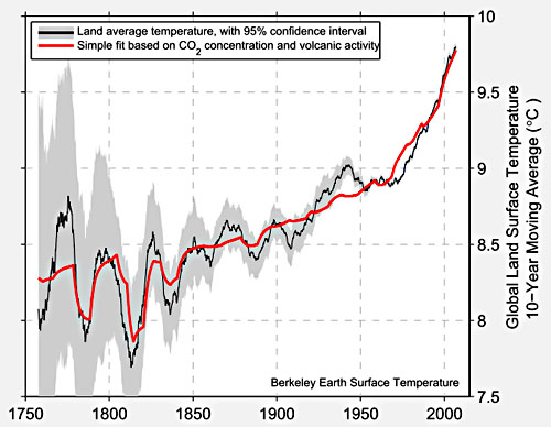
Kevin Drum approvingly posted this chart from Muller:
I applaud the effort to match theory to actual, you know, observations rather than model results.  I don’t have a ton of time to write currently, but gave some quick comments:

1.  This may seem an odd critique, but the fit is too good.  There is no way that in a complex, chaotic system only two variables explain so much of a key output.    You don’t have to doubt the catastrophic anthropogenic global warming theory to know that there are key variables that have important, measurable effects on world temperatures at these kind of timescales — ocean cycles come to mind immediately — which he has left out.   Industrial-produced cooling aerosols, without which most climate models can’t be made to fit history, are another example.  Muller’s analysis is like claiming that stock prices are driven by just two variables without having considered interest rates or earning in the analysis.

2.  Just to give one example critique of the quality of “science” being held up as an example, any real scientist should laugh at the error ranges in this chart.   The chart shows zero error for modern surface temperature readings.  Zero.  Not even 0.1F.    This is hilariously flawed.  Anyone who went through a good freshman physics or chemistry lab (ie many non-journalists) will have had basic concepts of errors drilled into them.  An individual temperature instrument probably has an error when perfectly calibrated of say 0.2F at best.  In the field, with indifferent maintenance and calibration, that probably raises to 0.5F.  Given bad instrument sitings, that might raise over 1F.  Now, add all those up, with all the uncertainties involved in trying to get a geographic average when, for example, large swaths of the earth are not covered by an official thermometer, and what is the error on the total?  Not zero, I can guarantee you.  Recognize that this press blitz comes because he can’t get this mess through peer review so he is going direct with it.

3. CO2 certainly has an effect on temperatures, but so do a lot of other things. The science that CO2 warms the Earth is solid. The science that CO2 catastrophically warms the Earth, with a high positive feedback climate system driven to climate sensitivities to CO2 of 3C per doubling or higher is not solid. Assuming half of past warming is due to man’s CO2 is not enough to support catastrophic forecasts. If half of past warming, or about .4C is due to man, that means climate sensitivity is around 1C, exactly the no-feedback number that climate skeptics have thought it was near for years. So additional past man-made warming has to be manufactured somehow to support the higher sensitivity, positive feedback cases.

Judith Curry has a number of comments, including links to what she considers best in class for this sort of historic reconstruction.

Update: Several folks have argued that the individual instrument error bars are irrelevant, I suppose because their errors will average. I am not convinced they average down to zero, as this chart seems to imply. But many of the errors are going to be systematic. For example, every single instrument in the surface average have manual adjustments made in multiple steps, from TOBS to corrections for UHI to statistical homogenization. In some cases these can be calculated with fair precision (e.g. TOBS) but in others they are basically a guess. And no one really knows if statistical homogenization approaches even make sense. In many cases, these adjustments can be up to several times larger in magnitude than the basic signal one is trying to measure (ie temperature anomaly and changes to it over time). Errors in these adjustments can be large and could well be systematic, meaning they don’t average out with multiple samples. And even errors in the raw measurements might have a systematic bias (if, for example, drift from calibration over time tended to be in one direction). Anthony Watt recently released a draft of a study I have not read yet, but seems to imply that the very sign of the non-TOBS adjustments is consistently wrong. As a professor of mine once said, if you are unsure of the sign, you don’t really know anything.

Assuming Your Conclusions

I haven’t had a chance to respond to Bill McKibben’s Rolling Stone article on global warming.  After hearing all the accolades for it, I assumed he had some new argument to offer.  I was amazed to find that there was absolutely nothing there.  Essentially, he assumes his conclusion.  He takes it as a proven given that temperature sensitivity to CO2 will be high, over ten degrees F for the likely CO2 increases we will see in the next century, which puts his “proven” climate sensitivity number higher than the range even in the last IPCC report.

Duh, if climate sensitivity is 11F per doubling of CO2 or whatever, we certainly have a big problem.  Spending a few thousand words saying that is totally worthless.  The only thing that matters is new evidence helping to pin down climate sensitivity, and more specifically feedbacks to initial greenhouse warming.

Ah, but its the risk you say?  Well, first, McKibben never talks of risk, this is all absolutely going to happen.  And second, if one were to discuss risks, one would also have to put value on cheap fossil fuels.   Rich nations like ours might be able to afford a changeover to other sources, but such a mandate as he desires would essentially throw back billions of people into subsistence poverty.  He talks about monetary values of the reserves being written off, as if the only cost will be to Exxon (and who cares about Exxon), but that fuel has real value to billions of people — so much so that every time prices tick up a tad, Exxon gets hauled in front of Congress to prove its not somehow holding back production.

By the way, if you want to know the cost of fossil fuel reduction, consider this.  Over the last four years, three dramatic things have happened:

  • The government has poured billions into alternate fuels, from Solyndra to ethanol
  • There has been a revolution in natural gas, shifting a lot of higher carbon coal to lower carbon natural gas
  • We have had the worst economy since the great depression

And still, we are missing the Kyoto Co2 targets.  And McKibben would argue that these are not aggressive enough.  So if Obama-type green energy spending in the hundreds of billions and a near depression only reduced our CO2 output by 5 or 10%, what will it cost to reduced it by McKibben’s 80%?

If you want to understand how McKibben can sound so sure and throw around scientific-sounding facts while missing the key scientific point, I recommend this article I wrote a while back at Forbes.  I am in the process of working on a longer video based on this article.

In the mean time, I watched a lot of this video, which was recommended to me, and it is pretty good at going deeper into the pseudo-science bait-and-switch folks like McKibben are doing:

Site Lockouts

I have been trying to lock down the site better because of some bad behavior over the last several weeks by some odd attempts to penetrate off-limits parts of the site.  If you feel like you were locked out in error, send me an email to the link on the header of the site with your approximate location (e.g. city) and the approximate time of hitting the site and I will unblock you.  Also, any info on the pages or files you were trying to access in vain when you were locked out would help me too.

In other news, I am still waiting for Disqus to get all our old comments loaded and back online.

Disqus Comments

First, I have not changed my comment policy – no moderation except for spam.   But I have decided to force some kind of log-in on comments.  I am going to try Disqus, and am specifically doing so during a quiet period in my blogging to have time to test it.  Note that for a day or so, comments may disappear.  I have them all archived, but it takes a while, apparently, to sync past comments with Disqus.  We shall see how things go.

Well, There is a First Time for Everything

In preparation for blogging more actively again here, I have been doing some security cleanup.  As part of that, I finally decided to delete my first comments ever.  I pride myself on leaving anything in the comments, on the theory that idiots just hurt their own cause by being idiots.  However, I deleted all the comments from the visitor who was using my name.   He/she is by no means the most obnoxious commenter out there, but the tone adopted does not at all match my tone in discussions.  If you see someone trying to spoof me again that I am missing, drop me an email at the link above.  I think I fixed email as well, which has not been working as well as it should.

Computer Generated Global Warming. Edit – Past Special – Add

Way back, I had a number of posts on surface temperature adjustments that seemed to artificially add warming to the historical record, here for example.  Looking at the adjustments, it seemed odd that they implied improving station location quality and reduced warming bias in the measurements, despite Anthony Watts work calling both assumptions into question.

More recently, Steve Goddard has been on a roll, looking at GISS adjustments in the US.   He’s found that the essentially flat raw temperature data:

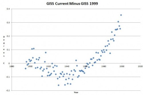
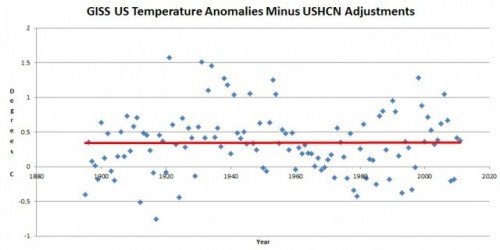
Has been adjusted upwards substantially to show a warming trend that is not in the raw data.  The interesting part is that most of this adjustment has been added in the last few years.  As recently as 1999, the GISS’s own numbers looked close to those above.   Goddard backs into the adjustments the GISS has made in the last few years:

So, supposedly, some phenomenon has that shape.  After all, surely the addition of this little hockey stick shaped data curve to the raw data is not arbitrary simply to get the answer they want, the additions have to represent the results of some heretofore unaccounted-for bias in the raw data.  So what is it?  What bias or changing bias has this shape?

Summer of the Shark, Climate Edition

My new column is up, comparing coverage of this summer’s heat wave to “Summer of the Shark”

Before I discuss the 2012 global warming version of this process, let’s take a step back to 2001 and the “Summer of the Shark.”  The media hysteria began in early July, when a young boy was bitten by a shark on a beach in Florida.  Subsequent attacks received breathless media coverage, up to and including near-nightly footage from TV helicopters of swimming sharks.  Until the 9/11 attacks, sharks were the third biggest story of the year as measured by the time dedicated to it on the three major broadcast networks’ news shows.

Through this coverage, Americans were left with a strong impression that something unusual was happening — that an unprecedented number of shark attacks were occurring in that year, and the media dedicated endless coverage to speculation by various “experts” as to the cause of this sharp increase in attacks.

Except there was one problem — there was no sharp increase in attacks.  In the year 2001, five people died in 76 shark attacks.  However, just a year earlier, 12 people had died in 85 attacks.  The data showed that 2001 actually was  a down year for shark attacks.

This summer we have been absolutely bombarded with stories about the summer heat wave in the United States.  The constant drumbeat of this coverage is being jumped on by many as evidence of catastrophic man-made global warming….

What the Summer of the Shark needed, and what this summer’s US heatwave needs, is a little context.  Specifically, if we are going to talk about supposed “trends”, then we should look at the data series in question over time.  So let’s do so.

I go on to present a number of data series on temperatures, temperature maximums, droughts, and fires.   Enjoy.