My Climate Plan, Wherein a Climate Skeptic Actually Advocates for A Carbon Tax

I am always amazed at how people like to draw conclusions about what I write merely from the title, without actually reading everything I wrote.  This is cross-posted from Coyote Blog, where I already am getting accusations of selling out.  Please read before judging.  I have proposed a carbon tax in a way that would be a net economic benefit even if one totally dismisses the threat of man-made global warming.

While I am not deeply worried about man-made climate change, I am appalled at all the absolutely stupid, counter-productive things the government has implemented in the name of climate change, all of which have costly distorting effects on the economy while doing extremely little to affect man-made greenhouse gas production.  For example:

Even when government programs do likely have an impact of CO2, they are seldom managed intelligently.  For example, the government subsidizes solar panel installations, presumably to reduce their cost to consumers, but then imposes duties on imported panels to raise their price (indicating that the program has become more of a crony subsidy for US solar panel makers, which is typical of these types of government interventions).  Obama’s coal power plan, also known as his war on coal, will certainly reduce some CO2 from electricity generation but at a very high cost to consumers and industries.  Steps like this are taken without any idea of whether this is the lowest cost approach to reducing CO2 production — likely it is not given the arbitrary aspects of the program.

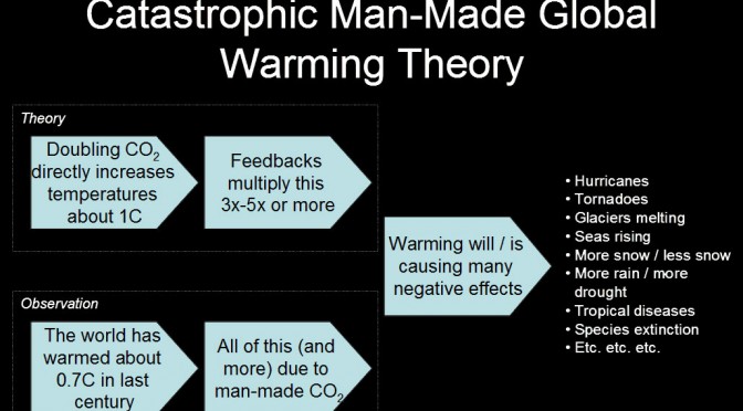
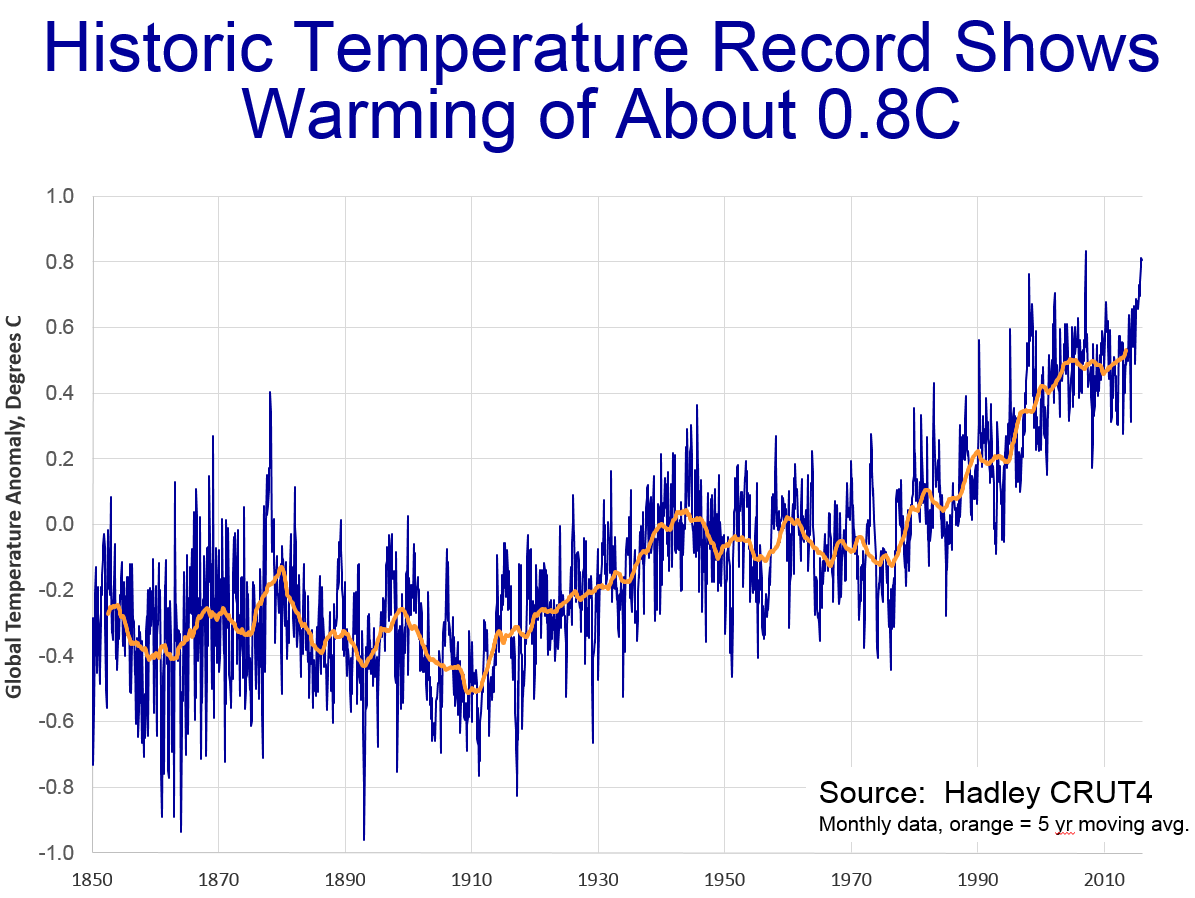
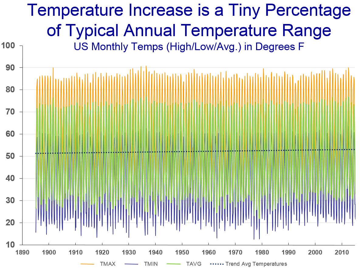
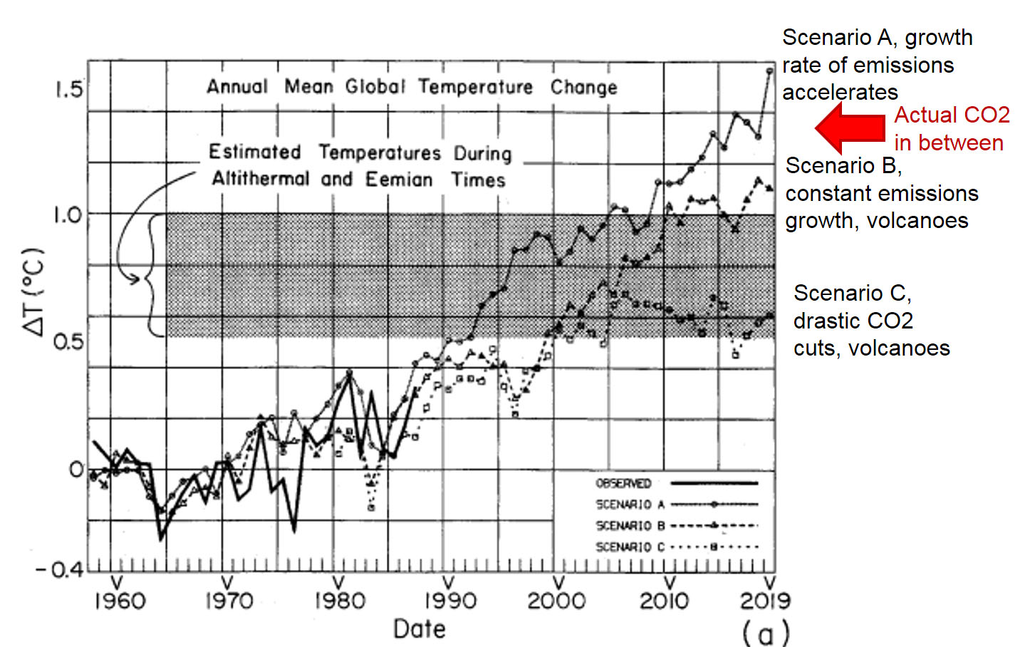
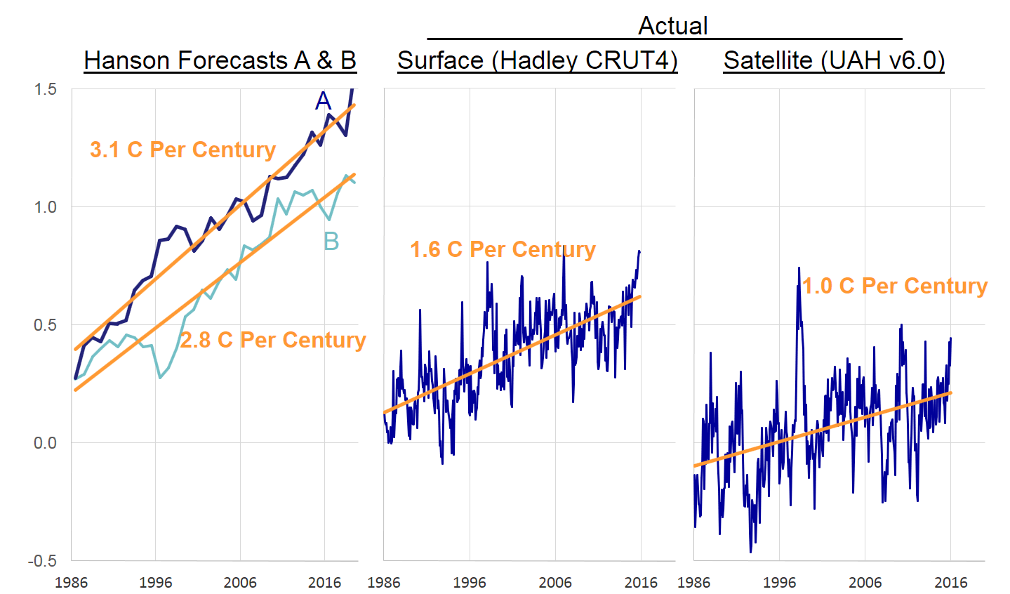
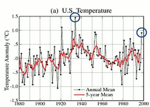
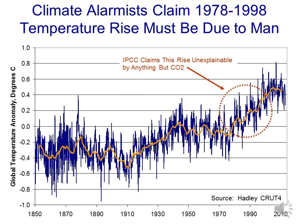
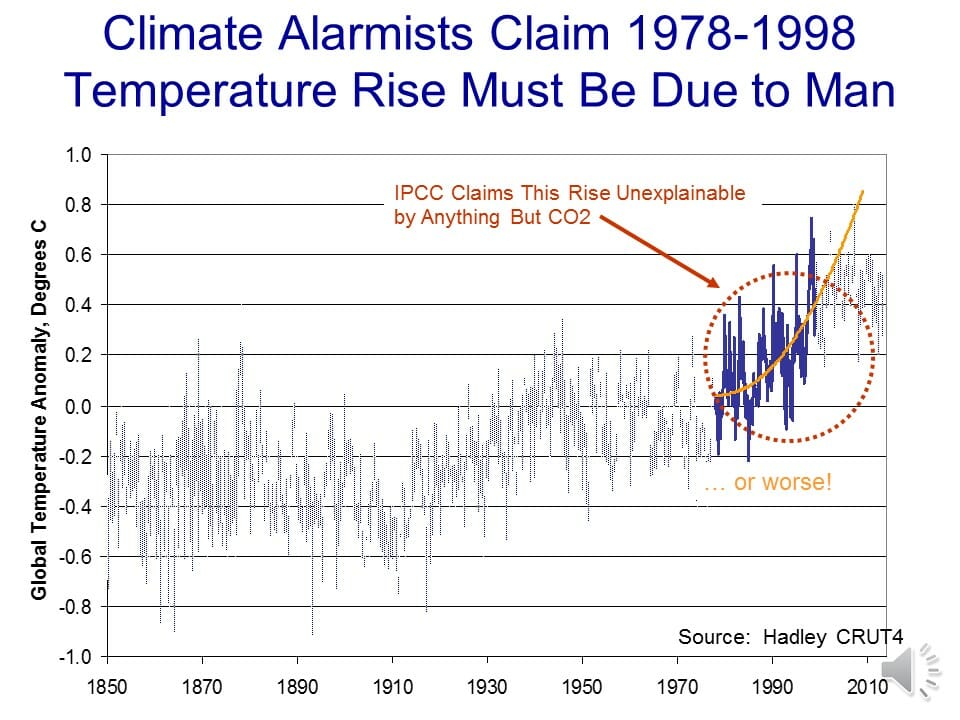
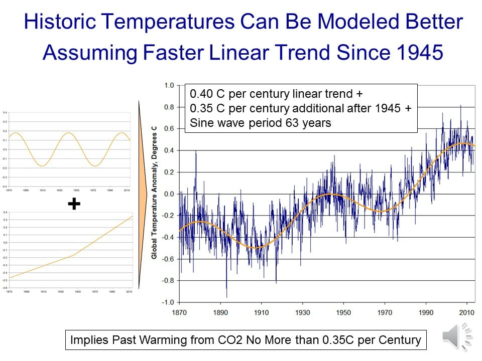
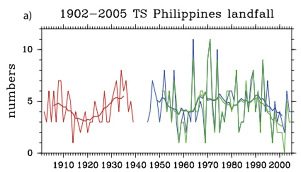
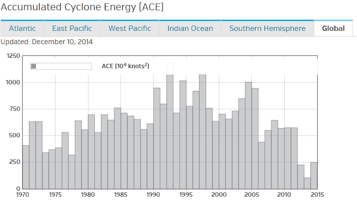
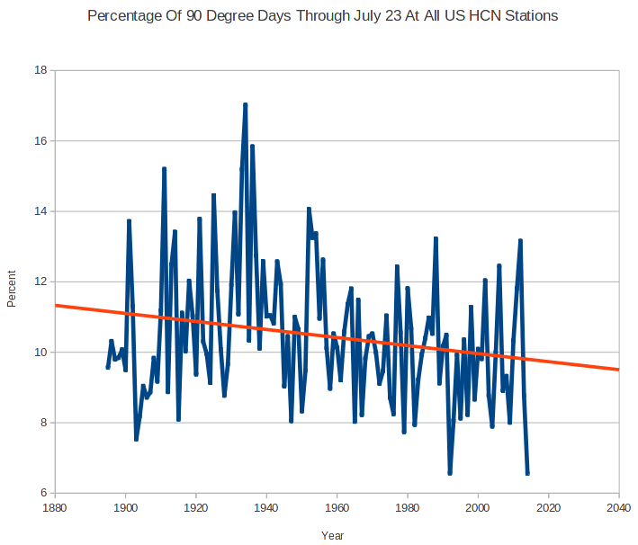
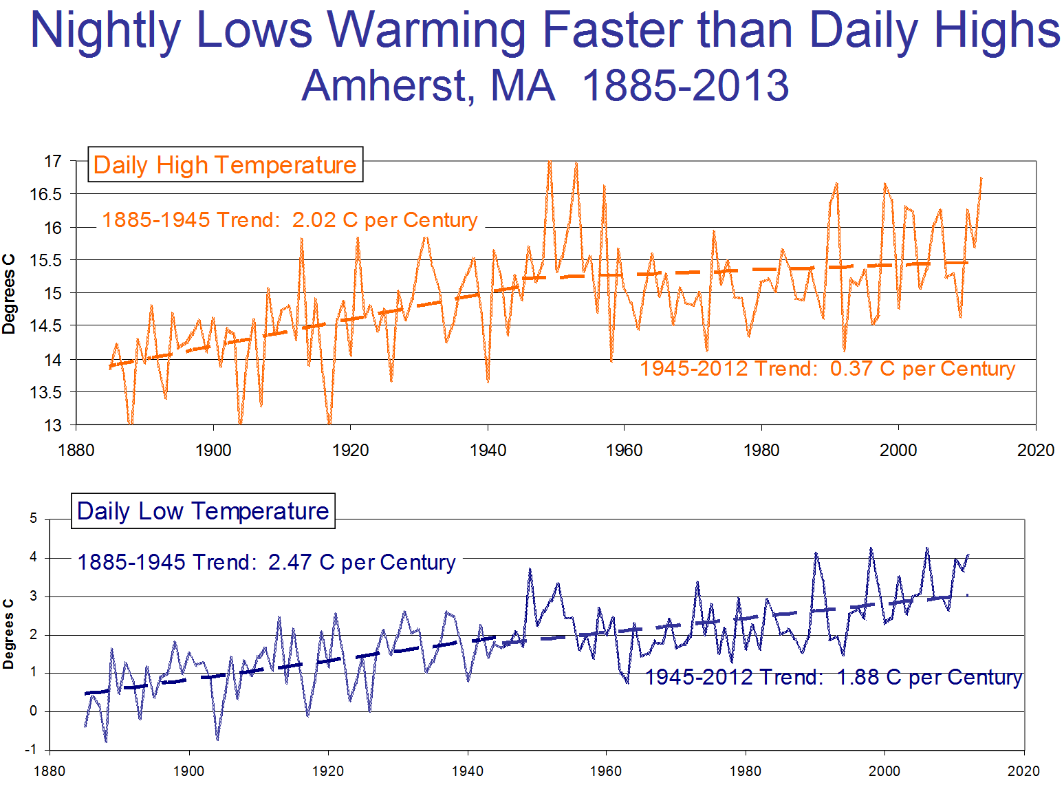
For years I have opposed steps like a Federal carbon tax or cap and trade system because I believe (and still believe) them to be unnecessary given the modest amount of man-made warming I expect over the next century.  I would expect to see about one degree C of man-made warming between now and 2100, and believe most of the cries that “we are already seeing catastrophic climate changes” are in fact panics driven by normal natural variation (most supposed trends, say in hurricanes or tornadoes or heat waves, can’t actually be found when one looks at the official data).

But I am exhausted with all the stupid, costly, crony legislation that passes in the name of climate change action.   I am convinced there is a better approach that will have more impact on man-made CO2 and simultaneously will benefit the economy vs. our current starting point.  So here goes:

The Plan

Point 1:  Impose a Federal carbon tax on fuel.

I am open to a range of actual tax amounts, as long as point 2 below is also part of the plan.  Something that prices CO2 between $25 and $45 a ton seems to match the mainstream estimates out there of the social costs of CO2.  I think methane is a rounding error, but one could make an adjustment to the natural gas tax numbers to take into account methane leakage in the production chain.   I am even open to make the tax=0 on biofuels given these fuels are recycling carbon from the atmosphere.

A Pigovian tax on carbon in fuels is going to be the most efficient possible way to reduce CO2 production.   What is the best way to reduce CO2 — by substituting gas for coal?   by more conservation?  by solar, or wind?  with biofuels?  With a carbon tax, we don’t have to figure it out.  Different approaches will be tested in the marketplace.  Cap and trade could theoretically do the same thing, but while this worked well in some niche markets (like SO2 emissions), it has not worked at all in European markets for CO2.   There has just been too many opportunities for cronyism, too much weird accounting for things like offsets that is hard to do well, and too much temptation to pick winners and losers.

Point 2:  Offset 100% of carbon tax proceeds against the payroll tax

Yes, there are likely many politicians, given their incentives, that would love a big new pool of money they could use to send largess, from more health care spending to more aircraft carriers, to their favored constituent groups.  But we simply are not going to get Conservatives (and libertarians) on board for a net tax increase, particularly one to address an issue they may not agree is an issue at all.   So our plan will use carbon tax revenues to reduce other Federal taxes.

I think the best choice would be to reduce the payroll tax.  Why?  First, the carbon tax will necessarily be regressive (as are most consumption taxes) and the most regressive other major Federal tax we have are payroll taxes.  Offsetting income taxes would likely be a non-starter on the Left, as no matter how one structures the tax reduction the rich would get most of it since they pay most of the income taxes.

There is another benefit of reducing the payroll tax — it would mean that we are replacing a consumption tax on labor with a consumption tax on fuel.  It is always dangerous to make gut-feel assessments of complex systems like the economy, but my sense is that this swap might even have net benefits for the economy — ie we might want to do it even if there was no such thing as greenhouse gas warming.   In theory, labor and fuel are economically equivalent in that they are both production raw materials.  But in practice, they are treated entirely differently by the public.   Few people care about the full productive employment of our underground fuel reserves, but nearly everybody cares about the full productive employment of our labor force.   After all, for most people, the primary single metric of economic health is the unemployment rate.  So replacing a disincentive to hire with a disincentive to use fuel could well be popular.

Point 3:  Eliminate all the stupid stuff

Oddly enough, this might be the hardest part politically because every subsidy, no matter how idiotic, has a hard core of beneficiaries who will defend it to the death — this the the concentrated benefits, dispersed cost phenomena that makes it hard to change many government programs.  But never-the-less I propose that we eliminate all the current Federal subsidies, mandates, and prohibitions that have been justified by climate change.  Ethanol rules and mandates, solar subsidies, wind subsidies, EV subsidies, targeted technology investments, coal plant bans, pipeline bans, drilling bans — it all should go.  The carbon tax does the work.

States can continue to do whatever they want — we don’t need the Feds to step on states any more than they do already, and I continue to like the 50 state laboratory concept.  If California wants to continue to subsidize wind generators, let them do it.  That is between the state and its taxpayers (and for those who think the California legislature is crazy, that is what U-Haul is for).

Point 4:  Revamp our nuclear regulatory regime

As much as alternative energy enthusiasts would like to deny it, the world needs reliable, 24-hour baseload power — and wind and solar are not going to do it (without a change in storage technology of at least 2 orders of magnitude in cost).  The only carbon-free baseload power technology that is currently viable is nuclear.

I will observe that nuclear power suffers under some of the same problems as commercial space flight — the government helped force the technology faster than it might have grown organically on its own, which paradoxically has slowed its long-term development.  Early nuclear power probably was not ready for prime time, and the hangover from problems and perceptions of this era have made it hard to proceed even when better technologies have existed.   But we are at least 2 generations of technology past what is in most US nuclear plants.  Small air-cooled thorium reactors and other technologies exist that could provide reliable safe power for over 100 years.  I am not an expert on nuclear regulation, but it strikes me that a regime similar to aircraft safety, where a few designs are approved and used over and over makes sense.  France, which has the strongest nuclear base in the world, followed this strategy.  Using thorium could also have the advantage of making the technology more exportable, since its utility in weapons production would be limited.

Point 5: Help clean up Chinese, and Asian, coal production

One of the hard parts about fighting CO2 emissions, vs. all the other emissions we have tackled in the past (NOx, SOx, soot/particulates, unburned hydrocarbons, etc), is that we simply don’t know how to combust fossil fuels without creating CO2 — CO2 is inherent to the base chemical reaction of the combustion.  But we do know how to burn coal without tons of particulates and smog and acid rain — and we know how to do it economically enough to support a growing, prosperous modern economy.

In my mind it is utterly pointless to ask China to limit their CO2 growth.  China has seen the miracle over the last 30 years of having almost a billion people exit poverty.  This is an event unprecedented in human history, and they have achieved it in part by burning every molecule of fossil fuels they can get their hands on, and they are unlikely to accept limitations on fossil fuel consumption that will derail this economic progress.  But I think it is reasonable to help China stop making their air unbreathable, a goal that is entirely compatible with continued economic growth.  In 20 years, when we have figured out and started to build some modern nuclear designs, I am sure the Chinese will be happy to copy these and start working on their CO2 output, but for now their Maslov hierarchy of needs should point more towards breathable air.

As a bonus, this would pay one immediate climate change benefit that likely would dwarf the near-term effect of CO2 reduction.  Right now, much of this soot from Asian coal plants lands on the ice in the Arctic and Greenland.  This black carbon changes the albedo of the ice, causing it to reflect less sunlight and absorb more heat.  The net effect is more melting ice and higher Arctic temperatures.  A lot of folks, including myself, think that the recent melting of Arctic sea ice and rising Arctic temperatures is more attributable to Asian black carbon pollution than to CO2 and greenhouse gas warming (particularly since similar warming and sea ice melting is not seen in the Antarctic, where there is not a problem with soot pollution).

Final Thoughts

At its core, this is a very low cost, even negative cost, climate insurance policy.  The carbon tax combined with a market economy does the work of identifying the most efficient ways to reduce CO2 production.   The economy benefits from the removal of a myriad of distortions and crony give-aways, while also potentially benefiting from the replacement of a consumption tax on labor with a consumption tax on fuel.  The near-term effect on CO2 is small (since the US is only a small part of the global emissions picture), but actually larger than the near-term effect of all the haphazard current programs, and almost certainly cheaper to obtain.  As an added benefit, if you can help China with its soot problem, we could see immediate improvements in probably the most visible front of man-made climate change:  in the Arctic.

Postscript

Perhaps the hardest thing to overcome in reaching a compromise here is the tribalism of modern politics.  I believe this is  a perfectly sensible plan that even those folks who believe man-made global warming is  a total myth ( a group to which I do not belong) could sign up for.  The barrier, though, is tribal.  I consider myself to be pretty free of team politics but my first reaction when thinking about this kind of plan was, “What?  We can’t let those guys win.  They are totally full of sh*t.  They are threatening to throw me in jail for my opinions.”

It was at this point I was reminded of a customer service story at my company.  I had a customer who was upset call me, and I ended up giving them a full-refund and a certificate to come back and visit us in the future.  I actually suspected there was more to the story, but I didn’t want a bad review.  The customer was happy, but my local manager was not.  She called me and said, “That was a bad customer!  He was lying to you.  How can you let him win like that?”   Does this sound familiar?  I think we fall into this trap all the time in modern politics, worried more about preventing the other team from winning than about doing the right thing.

Come See My Climate Talk on Wednesday Evening, February 24, at Claremont-McKenna College

I am speaking on Wednesday night at the Athenaeum at Claremont-McKenna College near Pomona on Wednesday, February 24.  It is open to the public and is free.  Come by a say hi if you are in the area.  You can just walk in to the presentation which begins at 6:45 but if you want to attend the pre-dinner at 5:30, there is a $20 charge and you need to reserve a spot by calling 909-621-8244.

I really hope if you are in the LA area you will come by.  The presentation is about 45 minutes plus a Q&A afterwards.

athmap_3

US Average Temperature Trends in Context

Cross-posted from Coyoteblog.

There was some debate a while back around about a temperature chart some Conservative groups were passing around.

Obviously, on this scale, global warming does not look too scary.  The question is, is this scale at all relevant?  I could re-scale the 1929 stock market drop to a chart that goes from Dow 0 to, say, Dow 100,000 and the drop would hardly be noticeable.  That re-scaling wouldn’t change the fact that the 1929 stock market crash was incredibly meaningful and had large impacts on the economy.  Kevin Drum wrote about the temperature chart above,

This is so phenomenally stupid that I figured it had to be a joke of some kind.

Mother Jones has banned me from commenting on Drum’s site, so I could not participate in the conversation over this chart.  But I thought about it for a while, and I think the chart’s author perhaps has a point but pulled it off poorly.  I am going to take another shot at it.

First, I always show the historic temperature anomaly on the zoomed in scale that you are used to seeing, e.g.  (as usual, click to enlarge)

click to enlarge

The problem with this chart is that it is utterly without context just as much as the previous chart.  Is 0.8C a lot or a little?  Going back to our stock market analogy, it’s a bit like showing the recent daily fluctuations of the Dow on a scale from 16,300 to 16,350.  The variations will look huge, much larger than either their percentage variation or their meaningfulness to all but the most panicky investors.

So I have started including the chart below as well.  Note that it is in Fahrenheit (vs. the anomaly chart above in Celsius) because US audiences have a better intuition for Fahrenheit, and is only for the US vs. the global chart above.  It shows the range of variation in US monthly averages, with the orange being the monthly average daily maximum temperature across the US, the dark blue showing the monthly average daily minimum temperature, and the green the monthly mean.  The dotted line is the long-term linear trend

click to enlarge

Note that these are the US averages — the full range of daily maximums and minimums for the US as a whole would be wider and the full range of individual location temperatures would be wider still.   A couple of observations:

  • It is always dangerous to eyeball charts, but you should be able to see what is well known to climate scientists (and not just some skeptic fever dream) — that much of the increase over the last 30 years (and even 100 years) of average temperatures has come not from higher daytime highs but from higher nighttime minimum temperatures.  This is one reason skeptics often roll their eyes as attribution of 15 degree summer daytime record heat waves to global warming, since the majority of the global warming signal can actually be found with winter and nighttime temperatures.
  • The other reason skeptics roll their eyes at attribution of 15 degree heat waves to 1 degree long term trends is that this one degree trend is trivial compared to the natural variation found in intra-day temperatures, between seasons, or even across years.  It is for this context that I think this view of temperature trends is useful as a supplement to traditional anomaly charts (in my standard presentation, I show this chart scale once and the standard anomaly chart scale further up about 30 times, so that utility has limits).

Revisiting (Yet Again) Hansen’s 1998 Forecast on Global Warming to Congress

I want to briefly revisit Hansen’s 1998 Congressional forecast.  Yes, I and many others have churned over this ground many times, but I think I now have a better approach.   The typical approach has been to overlay some actual temperature data set on top of Hansen’s forecast (e.g. here).  The problem is that with revisions to all of these data sets, particularly the GISS reset in 1999, none of these data sets match what Hansen was using at the time.  So we often get into arguments on where the forecast and actuals should be centered, etc.

This might be a better approach.  First, let’s start with Hansen’s forecast chart (click to enlarge).

hansen forecast

Folks have argued for years over which CO2 scenario best matches history.  I would argue it is somewhere between A and B, but you will see in a moment that it almost does not matter.    It turns out that both A and B have nearly the same regressed slope.

The approach I took this time was not to worry about matching exact starting points or reconciling difference anomaly base periods.  I merely took the slope of the A and B forecasts and compared it to the slope over the last 30 years of a couple of different temeprature databases (Hadley CRUT4 and the UAH v6 satellite data).

The only real issue is the start year.  The analysis is not very sensitive to the year, but I tried to find a logical start.  Hansen’s chart is frustrating because his forecasts never converge exactly, even 20 years in the past.  However, they are nearly identical in 1986, a logical base year if Hansen was giving the speech in 1988, so I started there.  I didn’t do anything fancy on the trend lines, just let Excel calculate the least squares regression.  This is what we get (as usual, click to enlarge).

click to enlarge

I think that tells the tale  pretty clearly.   Versus the gold standard surface temperature measurement (vs. Hansen’s thumb-on-the-scale GISS) his forecast was 2x too high.  Versus the satellite measurements it was 3x too high.

The least squares regression approach probably under-estimates that A scenario growth rate, but that is OK, that just makes the conclusion more robust.

By the way, I owe someone a thanks for the digitized numbers behind Hansen’s chart but it has been so many years since I downloaded them I honestly forgot who they came from.

Matt Ridley: What the Climate Wars Did to Science

I cannot recommend Matt Ridley’s new article strongly enough.  It covers a lot of ground be here are a few highlights.

Ridley argues that science generally works (in a manner entirely parallel to how well-functioning commercial markets work) because there are generally incentives to challenge hypotheses.  I would add that if anything, the incentives tend to be balanced more towards challenging conventional wisdom.  If someone puts a stake in the ground and says that A is true, then there is a lot more money and prestige awarded to someone who can prove A is not true than for the thirteenth person to confirm that A is indeed true.

This process breaks, however when political pressures undermine this natural market of ideas and switch the incentives for challenging hypotheses into punishment.

Lysenkoism, a pseudo-biological theory that plants (and people) could be trained to change their heritable natures, helped starve millions and yet persisted for decades in the Soviet Union, reaching its zenith under Nikita Khrushchev. The theory that dietary fat causes obesity and heart disease, based on a couple of terrible studies in the 1950s, became unchallenged orthodoxy and is only now fading slowly.

What these two ideas have in common is that they had political support, which enabled them to monopolise debate. Scientists are just as prone as anybody else to “confirmation bias”, the tendency we all have to seek evidence that supports our favoured hypothesis and dismiss evidence that contradicts it—as if we were counsel for the defence. It’s tosh that scientists always try to disprove their own theories, as they sometimes claim, and nor should they. But they do try to disprove each other’s. Science has always been decentralised, so Professor Smith challenges Professor Jones’s claims, and that’s what keeps science honest.

What went wrong with Lysenko and dietary fat was that in each case a monopoly was established. Lysenko’s opponents were imprisoned or killed. Nina Teicholz’s book  The Big Fat Surprise shows in devastating detail how opponents of Ancel Keys’s dietary fat hypothesis were starved of grants and frozen out of the debate by an intolerant consensus backed by vested interests, echoed and amplified by a docile press….

This is precisely what has happened with the climate debate and it is at risk of damaging the whole reputation of science.

This is one example of the consequences

Look what happened to a butterfly ecologist named Camille Parmesan when she published a paper on “ Climate and Species Range” that blamed climate change for threatening the Edith checkerspot butterfly with extinction in California by driving its range northward. The paper was cited more than 500 times, she was invited to speak at the White House and she was asked to contribute to the IPCC’s third assessment report.

Unfortunately, a distinguished ecologist called Jim Steele found fault with her conclusion: there had been more local extinctions in the southern part of the butterfly’s range due to urban development than in the north, so only the statistical averages moved north, not the butterflies. There was no correlated local change in temperature anyway, and the butterflies have since recovered throughout their range.  When Steele asked Parmesan for her data, she refused. Parmesan’s paper continues to be cited as evidence of climate change. Steele meanwhile is derided as a “denier”. No wonder a highly sceptical ecologist I know is very reluctant to break cover.

He also goes on to lament something that is very familiar to me — there is a strong argument for the lukewarmer position, but the media will not even achnowledge it exists.  Either you are a full-on believer or you are a denier.

The IPCC actually admits the possibility of lukewarming within its consensus, because it gives a range of possible future temperatures: it thinks the world will be between about 1.5 and four degrees warmer on average by the end of the century. That’s a huge range, from marginally beneficial to terrifyingly harmful, so it is hardly a consensus of danger, and if you look at the “probability density functions” of climate sensitivity, they always cluster towards the lower end.

What is more, in the small print describing the assumptions of the “representative concentration pathways”, it admits that the top of the range will only be reached if sensitivity to carbon dioxide is high (which is doubtful); if world population growth re-accelerates (which is unlikely); if carbon dioxide absorption by the oceans slows down (which is improbable); and if the world economy goes in a very odd direction, giving up gas but increasing coal use tenfold (which is implausible).

But the commentators ignore all these caveats and babble on about warming of “up to” four degrees (or even more), then castigate as a “denier” anybody who says, as I do, the lower end of the scale looks much more likely given the actual data. This is a deliberate tactic. Following what the psychologist Philip Tetlock called the “psychology of taboo”, there has been a systematic and thorough campaign to rule out the middle ground as heretical: not just wrong, but mistaken, immoral and beyond the pale. That’s what the word denier with its deliberate connotations of Holocaust denial is intended to do. For reasons I do not fully understand, journalists have been shamefully happy to go along with this fundamentally religious project.

The whole thing reads like a lukewarmer manifesto.  Honestly, Ridley writes about 1000% better than I do, so rather than my trying to summarize it, go read it.

Manual Adjustments in the Temperature Record

I have been getting inquiries from folks asking me what I think about stories like this one, where Paul Homewood has been looking at the manual adjustments to raw temperature data and finding that the adjustments actually reverse the trends from cooling to warming.  Here is an example of the comparisons he did:

Raw, before adjustments;

puertoraw


After manual adjustments

puertoadj2


I actually wrote about this topic a few months back, and rather than rewrite the post I will excerpt it below:

I believe that there is both wheat and chaff in this claim [that manual temperature adjustments are exaggerating past warming], and I would like to try to separate the two as best I can.  I don’t have time to write a well-organized article, so here is just a list of thoughts

  1. At some level it is surprising that this is suddenly news.  Skeptics have criticized the adjustments in the surface temperature database for years.
  2. There is certainly a signal to noise ratio issue here that mainstream climate scientists have always seemed insufficiently concerned about.  For example, the raw data for US temperatures is mostly flat, such that the manual adjustments to the temperature data set are about equal in magnitude to the total warming signal.  When the entire signal one is trying to measure is equal to the manual adjustments one is making to measurements, it probably makes sense to put a LOT of scrutiny on the adjustments.  (This is a post from 7 years ago discussing these adjustments.  Note that these adjustments are less than current ones in the data base as they have been increased, though I cannot find a similar chart any more from the NOAA discussing the adjustments)
  3. The NOAA HAS made adjustments to US temperature data over the last few years that has increased the apparent warming trend.  These changes in adjustments have not been well-explained.  In fact, they have not really be explained at all, and have only been detected by skeptics who happened to archive old NOAA charts and created comparisons like the one below.  Here is the before and after animation (pre-2000 NOAA US temperature history vs. post-2000).  History has been cooled and modern temperatures have been warmed from where they were being shown previously by the NOAA.  This does not mean the current version  is wrong, but since the entire US warming signal was effectively created by these changes, it is not unreasonable to act for a detailed reconciliation (particularly when those folks preparing the chart all believe that temperatures are going up, so would be predisposed to treating a flat temperature chart like the earlier version as wrong and in need of correction. 1998changesannotated
  4. However, manual adjustments are not, as some skeptics seem to argue, wrong or biased in all cases.  There are real reasons for manual adjustments to data — for example, if GPS signal data was not adjusted for relativistic effects, the position data would quickly get out of whack.  In the case of temperature data:
    • Data is adjusted for shifts in the start/end time for a day of measurement away from local midnight (ie if you average 24 hours starting and stopping at noon).  This is called Time of Observation or TOBS.  When I first encountered this, I was just sure it had to be BS.  For a month of data, you are only shifting the data set by 12 hours or about 1/60 of the month.  Fortunately for my self-respect, before I embarrassed myself I created a spreadsheet to monte carlo some temperature data and play around with this issue.  I convinced myself the Time of Observation adjustment is valid in theory, though I have no way to validate its magnitude  (one of the problems with all of these adjustments is that NOAA and other data authorities do not release the source code or raw data to show how they come up with these adjustments).   I do think it is valid in science to question a finding, even without proof that it is wrong, when the authors of the finding refuse to share replication data.  Steven Goddard, by the way, believes time of observation adjustments are exaggerated and do not follow NOAA’s own specification.
    • Stations move over time.  A simple example is if it is on the roof of a building and that building is demolished, it has to move somewhere else.  In an extreme example the station might move to a new altitude or a slightly different micro-climate.  There are adjustments in the data base for these sort of changes.  Skeptics have occasionally challenged these, but I have no reason to believe that the authors are not using best efforts to correct for these effects (though again the authors of these adjustments bring criticism on themselves for not sharing replication data).
    • The technology the station uses for measurement changes (e.g. thermometers to electronic devices, one type of electronic device to another, etc.)   These measurement technologies sometimes have known biases.  Correcting for such biases is perfectly reasonable  (though a frustrated skeptic could argue that the government is diligent in correcting for new cooling biases but seldom corrects for warming biases, such as in the switch from bucket to water intake measurement of sea surface temperatures).
    • Even if the temperature station does not move, the location can degrade.  The clearest example is a measurement point that once was in the country but has been engulfed by development  (here is one example — this at one time was the USHCN measurement point with the most warming since 1900, but it was located in an open field in 1900 and ended up in an asphalt parking lot in the middle of Tucson.)   Since urban heat islands can add as much as 10 degrees F to nighttime temperatures, this can create a warming signal over time that is related to a particular location, and not the climate as a whole.  The effect is undeniable — my son easily measured it in a science fair project.  The effect it has on temperature measurement is hotly debated between warmists and skeptics.  Al Gore originally argued that there was no bias because all measurement points were in parks, which led Anthony Watts to pursue the surface station project where every USHCN station was photographed and documented.  The net result was that most of the sites were pretty poor.  Whatever the case, there is almost no correction in the official measurement numbers for urban heat island effects, and in fact last time I looked at it the adjustment went the other way, implying urban heat islands have become less of an issue since 1930.  The folks who put together the indexes argue that they have smoothing algorithms that find and remove these biases.  Skeptics argue that they just smear the bias around over multiple stations.  The debate continues.
  5. Overall, many mainstream skeptics believe that actual surface warming in the US and the world has been about half what is shown in traditional indices, an amount that is then exaggerated by poorly crafted adjustments and uncorrected heat island effects.  But note that almost no skeptic I know believes that the Earth has not actually warmed over the last 100 years.  Further, warming since about 1980 is hard to deny because we have a second, independent way to measure global temperatures in satellites.  These devices may have their own issues, but they are not subject to urban heat biases or location biases and further actually measure most of the Earth’s surface, rather than just individual points that are sometimes scores or hundreds of miles apart.  This independent method of measurement has shown undoubted warming since 1979, though not since the late 1990’s.
  6. As is usual in such debates, I find words like “fabrication”, “lies”,  and “myth” to be less than helpful.  People can be totally wrong, and refuse to confront their biases, without being evil or nefarious.

To these I will add a #7:  The notion that satellite results are somehow pure and unadjusted is just plain wrong.  The satellite data set takes a lot of mathematical effort to get right, something that Roy Spencer who does this work (and is considered in the skeptic camp) will be the first to tell you.  Satellites have to be adjusted for different things.  They have advantages over ground measurement because they cover most all the Earth, they are not subject to urban heat biases, and bring some technological consistency to the measurement.  However, the satellites used are constantly dieing off and being replaced, orbits decay and change, and thus times of observation of different parts of the globe change [to their credit, the satellite folks release all their source code for correcting these things].   I have become convinced the satellites, net of all the issues with both technologies, provide a better estimate but neither are perfect.

Mistaking Cyclical Variations for the Trend

I titled my very first climate video “What is Normal,” alluding to the fact that climate doomsayers argue that we have shifted aspects of the climate (temperature, hurricanes, etc.) from “normal” without us even having enough historical perspective to say what “normal” is.

A more sophisticated way to restate this same point would be to say that natural phenomenon tend to show various periodicities, and without observing nature through the whole of these cycles, it is easy to mistake short term cyclical variations for long-term trends.

A paper in the journal Water Resources Research makes just this point using over 200 years of precipitation data:

We analyze long-term fluctuations of rainfall extremes in 268 years of daily observations (Padova, Italy, 1725-2006), to our knowledge the longest existing instrumental time series of its kind. We identify multidecadal oscillations in extremes estimated by fitting the GEV distribution, with approximate periodicities of about 17-21 years, 30-38 years, 49-68 years, 85-94 years, and 145-172 years. The amplitudes of these oscillations far exceed the changes associated with the observed trend in intensity. This finding implies that, even if climatic trends are absent or negligible, rainfall and its extremes exhibit an apparent non-stationarity if analyzed over time intervals shorter than the longest periodicity in the data (about 170 years for the case analyzed here). These results suggest that, because long-term periodicities may likely be present elsewhere, in the absence of observational time series with length comparable to such periodicities (possibly exceeding one century), past observations cannot be considered to be representative of future extremes. We also find that observed fluctuations in extreme events in Padova are linked to the North Atlantic Oscillation: increases in the NAO Index are on average associated with an intensification of daily extreme rainfall events. This link with the NAO global pattern is highly suggestive of implications of general relevance: long-term fluctuations in rainfall extremes connected with large-scale oscillating atmospheric patterns are likely to be widely present, and undermine the very basic idea of using a single stationary distribution to infer future extremes from past observations.

Trying to work with data series that are too short is simply a fact of life — everyone in climate would love a 1000-year detailed data set, but we don’t have it.  We use what we have, but it is important to understand the limitations.  There is less excuse for the media that likes to use single data points, e.g. one storm, to “prove” long term climate trends.

A good example of why this is relevant is the global temperature trend.  This chart is a year or so old and has not been updated in that time, but it shows the global temperature trend using the most popular surface temperature data set.  The global warming movement really got fired up around 1998, at the end of the twenty year temperature trend circled in red.

click to enlarge


They then took the trends from these 20 years and extrapolated them into the future:

click to enlarge

But what if that 20 years was merely the upward leg of a 40-60 year cyclic variation?  Ignoring the cyclic functions would cause one to overestimate the long term trend.  This is exactly what climate models do, ignoring important cyclic functions like the AMO and PDO.

In fact, you can get a very good fit with actual temperature by modeling them as three functions:  A 63-year sine wave, a 0.4C per century long-term linear trend  (e.g. recovery from the little ice age) and a new trend starting in 1945 of an additional 0.35C, possibly from manmade CO2.Slide52

In this case, a long-term trend still appears to exist but it is exaggerated by only trying to measure it in the upward part of the cycle (e.g. from 1978-1998).


Typhoons and Hurricanes

(Cross-posted from Coyoteblog)

The science that CO2 is a greenhouse gas and causes some warming is hard to dispute.  The science that Earth is dominated by net positive feedbacks that increase modest greenhouse gas warming to catastrophic levels is very debatable.  The science that man’s CO2 is already causing an increase in violent and severe weather is virtually non-existent.

Seriously, of all the different pieces of the climate debate, the one that is almost always based on pure crap are the frequent media statements linking manmade CO2 to some severe weather event.

For example, Coral Davenport in the New York Times wrote the other day:

As the torrential rains of Typhoon Hagupit flood thePhilippines, driving millions of people from their homes, the Philippine government arrived at a United Nationsclimate change summit meeting on Monday to push hard for a new international deal requiring all nations, including developing countries, to cut their use of fossil fuels.

It is a conscious pivot for the Philippines, one of Asia’s fastest-growing economies. But scientists say the nation is also among the most vulnerable to the impacts of climate change, and the Philippine government says it is suffering too many human and economic losses from the burning of fossil fuels….

A series of scientific reports have linked the burning of fossil fuels with rising sea levels and more powerful typhoons, like those that have battered the island nation.

It is telling that Ms. Davenport did not bother to link or name any of these scientific reports.  Even the IPCC, which many skeptics believe to be exaggerating manmade climate change dangers, refused in its last report to link any current severe weather events with manmade CO2.

Roger Pielke responded today with charts from two different recent studies on typhoon activity in the Phillipines.  Spot the supposed upward manmade trend.  Or not:

kubotachan2009

c2789-wpac-50-10-weinkleetal


I am not a huge fan of landfalling cyclonic storm counts because whether they make landfall or not can be totally random and potentially disguise trends.  A better metric is the total energy of cyclonic storms, land-falling or not, where again there is no trend.

Via the Weather Underground, here is Accumulated Cyclonic Energy for the Western Pacific (lower numbers represent fewer cyclonic storms with less total strength):

ace-west-pacific


And here, by the way, is the ACE for the whole globe:

ace-global

Remember this when you see the next storm inevitably blamed on manmade global warming.  If anything, we are actually in a fairly unprecedented (in the last century and a half) hurricane drought.

Those Who Follow Climate Will Definitely Recognize This

This issue will be familiar to anyone who has spent time with temperature graphs.  We can ask ourselves if 1 degree of global warming is a lot, when it is small compared to seasonal variations, or even intra-day variation, you would find in most locations.  That is not a trick question.  It might be important, but certainly how important an audience  considers it may be related to how one chooses to graph it.  Take this example form an entirely unrelated field:

Last spring, Adnan sent me a letter about … something, I can’t even remember exactly what. But it included these two graphs that he’d drawn out in pencil. With no explanation. There was just a Post-it attached to the back of one of the papers that said: “Could you please hold these 2 pages until we next speak? Thank you.”

Here’s what he sent:

as_tea_graph_2_cropped
Price of tea at 7-11 

as_tea_graph1_crop_0
Price of tea at C-Mart 

This was curious. It crossed my mind that Adnan might be … off his rocker in some way. Or, more excitingly, that these graphs were code for some top-secret information too dangerous for him to send in a letter.

But no. These graphs were a riddle that I would fail to solve when we next spoke, a couple of days later.

Adnan: Now, so would you prefer, as a consumer, would you rather purchase at a store where prices are consistent or items from a store where the prices fluctuate?

Sarah: I would prefer consistency.

Adnan: That makes sense. Especially in today’s economy. So if you had to choose, which store would you say has more consistent prices?

Sarah: 7-11 is definitely more consistent.

Adnan: As compared to…?

Sarah: As compared to C-Mart, which is going way up and down.

Look again, Adnan said. Right. Their prices are exactly the same. It’s just that the graph of C-Mart prices is zoomed way in — the y-axis is in much smaller cost increments — so it looks like dramatic fluctuations are happening. And he made the pencil lines much darker and more striking in the C-Mart graph, so it looks more…sinister or something.

When Climate Alarmism Limits Environmental Progress

One of my favorite sayings is that “years from now, environmentalists will look back on the current obsession with global warming and say that it did incredible harm to real environmental progress.”  The reason is that there are many environmental problems worse than the likely impact of man-made global warming that would cost substantially less money to solve. The focus on climate change has sucked all the oxygen out of every other environmental improvement effort.

The recent Obama climate discussions with China are a great example.  China has horrendous environmental problems that need to be solved long before they worry about CO2 production.

Take coal plants.  Coal plants produce a lot of CO2, but without the aid of modern scrubbers and such, they also produce SOx, NOx, particulates matter and all the other crap you see in the Beijing air.  The problem is that the CO2 production from a coal plant takes as much as 10-100x more money to eliminate than it takes to eliminate all the other bad stuff.

While economically rational technology exists to get rid of all the other bad stuff from coal (technology that is currently in use at most US coal plants), there is no reasonable technology to eliminate CO2 from coal.  The only option is to substitute things like wind and solar which are much more expensive, in addition to a number of other drawbacks.

What this means is that the same amount of money needed to replace a couple percent of the Chinese coal industry with carbon-less technologies could probably add scrubbers to all the coal plants.  Thus the same money needed to make an only incremental change in CO2 output would make an enormous change in the breath-ability of air in Chinese cities.

So if we care about the Chinese people, why are we pushing them to worry about CO2?

PS-  by the way, there have been a number of studies that have attributed a lot of the Arctic and Greenland ice melting to the albedo effect of coal combustion particulate matter from China deposited on the ice.  The same technology that would make Beijing air breathable might also reduce Arctic ice melts.

HydroInfra: Scam! Investment Honeypot for Climate Alarmists

Cross-posted from Coyoteblog.

I got an email today from some random Gmail account asking me to write about HyrdoInfra.  OK.  The email begins: “HydroInfra Technologies (HIT) is a Stockholm based clean tech company that has developed an innovative approach to neutralizing carbon fuel emissions from power plants and other polluting industries that burn fossil fuels.”

Does it eliminate CO2?  NOx?  Particulates?  SOx?  I actually was at the bottom of my inbox for once so I went to the site.  I went to this applications page.  Apparently, it eliminates the “toxic cocktail” of pollutants that include all the ones I mentioned plus mercury and heavy metals.  Wow!  That is some stuff.

Their key product is a process for making something they call “HyrdroAtomic Nano Gas” or HNG.  It sounds like their PR guys got Michael Crichton and JJ Abrams drunk in a brainstorming session for pseudo-scientific names.

But hold on, this is the best part.  Check out the description of HNG and how it is made:

Splitting water (H20) is a known science. But the energy costs to perform splitting outweigh the energy created from hydrogen when the Hydrogen is split from the water molecule H2O.

This is where mainstream science usually closes the book on the subject.

We took a different approach by postulating that we could split water in an energy efficient way to extract a high yield of Hydrogen at very low cost.

A specific low energy pulse is put into water. The water molecules line up in a certain structure and are split from the Hydrogen molecules.

The result is HNG.

HNG is packed with ‘Exotic Hydrogen’

Exotic Hydrogen is a recent scientific discovery.

HNG carries an abundance of Exotic Hydrogen and Oxygen.

On a Molecular level, HNG is a specific ratio mix of Hydrogen and Oxygen.

The unique qualities of HNG show that the placement of its’ charged electrons turns HNG into an abundant source of exotic Hydrogen.

HNG displays some very different properties from normal hydrogen.

Some basic facts:

  • HNG instantly neutralizes carbon fuel pollution emissions
  • HNG can be pressurized up to 2 bars.
  • HNG combusts at a rate of 9000 meters per second while normal Hydrogen combusts at a rate 600 meters per second.
  • Oxygen values actually increase when HNG is inserted into a diesel flame.
  • HNG acts like a vortex on fossil fuel emissions causing the flame to be pulled into the center thus concentrating the heat and combustion properties.
  • HNG is stored in canisters, arrayed around the emission outlet channels. HNG is injected into the outlets to safely & effectively clean up the burning of fossil fuels.
  • The pollution emissions are neutralized instantly & safely with no residual toxic cocktail or chemicals to manage after the HNG burning process is initiated.

Exotic Hyrdrogen!  I love it.  This is probably a component of the “red matter” in the Abrams Star Trek reboot.  Honestly, someone please tell me this a joke, a honeypot for mindless environmental activist drones.    What are the chemical reactions going on here?  If CO2 is captured, what form does it take?  How does a mixture of Hydrogen and Oxygen molecules in whatever state they are in do anything with heavy metals?  None of this is on the website.   On their “validation” page, they have big labels like “Horiba” that look like organizations thave somehow put their impremature on the study.  In fact, they are just names of analytical equipment makers.  It’s like putting “IBM” in big print on your climate study because you ran your model on an IBM computer.

SCAM!  Honestly, when you see an article written to attract investment that sounds sort of impressive to laymen but makes absolutely no sense to anyone who knows the smallest about of Chemistry or Physics, it is an investment scam.

But they seem to get a lot of positive press.  In my search of Google, everything in the first ten pages or so are just uncritical republication of their press releases in environmental and business blogs.   You actually have to go into the comments sections of these articles to find anyone willing to observe this is all total BS.   If you want to totally understand why the global warming debate gets nowhere, watch commenter Michael at this link desperately try to hold onto his faith in HydroInfra while people who actually know things try to explain why this makes no sens

Switching Back to Disqus

For a variety of reasons, I had to turn off Disqus a while back.  We are going back to it for comments.  Over the next few days you may see comments on old posts disappear and reappear.  If I don’t screw up, within 48 hours all existing comments should be back.

Reconciling Conflicting Climate Claims

Cross-posted from Coyoteblog

At Real Science, Steven Goddard claims this is the coolest summer on record in the US.

The NOAA reports that both May and June were the hottest on record.

It used to be the the media would reconcile such claims and one might learn something interesting from that reconciliation, but now all we have are mostly-crappy fact checks with Pinocchio counts.  Both these claims have truth on their side, though the NOAA report is more comprehensively correct.  Still, we can learn something by putting these analyses in context and by reconciling them.

The NOAA temperature data for the globe does indeed show May and June as the hottest on record.  However, one should note a couple of things

  • The two monthly records do not change the trend over the last 10-15 years, which has basically been flat.  We are hitting records because we are sitting on a plateau that is higher than the rest of the last century (at least in the NOAA data).  It only takes small positive excursions to reach all-time highs
  • There are a number of different temperature data bases that measure the temperature in different ways (e.g. satellite vs. ground stations) and then adjust those raw readings using different methodologies.  While the NOAA data base is showing all time highs, other data bases, such as satellite-based ones, are not.
  • The NOAA database has been criticized for manual adjustments to temperatures in the past which increase the warming trend.  Without these adjustments, temperatures during certain parts of the 1930’s (think: Dust Bowl) would be higher than today.  This was discussed here in more depth.  As is usual when looking at such things, some of these adjustments are absolutely appropriate and some can be questioned.  However, blaming the whole of the warming signal on such adjustments is just wrong — satellite data bases which have no similar adjustment issues have shown warming, at least between 1979 and 1999.

The Time article linked above illustrated the story of these record months with a video partially on wildfires.  This is a great example of how temperatures are indeed rising but media stories about knock-on effects, such as hurricanes and fires, can be full of it.  2014 has actually been a low fire year so far in the US.

So the world is undeniably on the warm side of average (I won’t way warmer than normal because what is “normal”?)  So how does Goddard get this as the coolest summer on record for the US?

Well, the first answer, and it is an important one to remember, is that US temperatures do not have to follow global temperatures, at least not tightly.  While the world warmed 0.5-0.7 degrees C from 1979-1999, the US temperatures moved much less.  Other times, the US has warmed or cooled more than the world has.  The US is well under 5% of the world’s surface area.  It is certainly possible to have isolated effects in such an area.  Remember the same holds true the other way — heat waves in one part of the world don’t necessarily mean the world is warming.

But we can also learn something that is seldom discussed in the media by looking at Goddard’s chart:

click to enlarge

First, I will say that I am skeptical of any chart that uses “all USHCN” stations because the number of stations and their locations change so much.  At some level this is an apples to oranges comparison — I would be much more comfortable to see a chart that looks at only USHCN stations with, say, at least 80 years of continuous data.  In other words, this chart may be an artifact of the mess that is the USHCN database.

However, it is possible that this is correct even with a better data set and against a backdrop of warming temperatures.  Why?  Because this is a metric of high temperatures.  It looks at the number of times a data station reads a high temperature over 90F.  At some level this is a clever chart, because it takes advantage of a misconception most people, including most people in the media have — that global warming plays out in higher daytime high temperatures.

But in fact this does not appear to be the case.  Most of the warming we have seen over the last 50 years has manifested itself as higher nighttime lows and higher winter temperatures.  Both of these raise the average, but neither will change Goddard’s metric of days above 90F.  So it is perfectly possible Goddard’s chart is right even if the US is seeing a warming trend over the same period.  Which is why we have not seen any more local all-time daily high temperature records set recently than in past decades.  But we have seen a lot of new records for high low temperature, if that term makes sense.  Also, this explains why the ratio of daily high records to daily low records has risen — not necessarily because there are a lot of new high records, but because we are setting fewer low records.  We can argue about daytime temperatures but nighttime temperatures are certainly warmer.

This chart shows an example with low and high temperatures over time at Amherst, MA  (chosen at random because I was speaking there).  Note that recently, most warming has been at night, rather than in daily highs.

Computer Models as “Evidence”

Cross-posted from Coyoteblog

The BBC has decided not to every talk to climate skeptics again, in part based on the “evidence” of computer modelling

Climate change skeptics are being banned from BBC News, according to a new report, for fear of misinforming people and to create more of a “balance” when discussing man-made climate change.

The latest casualty is Nigel Lawson, former London chancellor and climate change skeptic, who has just recently been barred from appearing on BBC. Lord Lawson, who has written about climate change, said the corporation is silencing the debate on global warming since he discussed the topic on its Radio 4 Today program in February.

This skeptic accuses “Stalinist” BBC of succumbing to pressure from those with renewable energy interests, like the Green Party, in an editorial for the Daily Mail.

He appeared on February 13 debating with scientist Sir Brian Hoskins, chairman of the Grantham Institute for Climate Change at Imperial College, London, to discuss recent flooding that supposedly was linked to man-made climate change.

Despite the fact that the two intellectuals had a “thoroughly civilized discussion,” BBC was “overwhelmed by a well-organized deluge of complaints” following the program. Naysayers harped on the fact that Lawson was not a scientist and said he had no business voicing his opinion on the subject.

Among the objections, including one from Green Party politician Chit Chong, were that Lawson’s views were not supported by evidence from computer modeling.

I see this all the time.  A lot of things astound me in the climate debate, but perhaps the most astounding has been to be accused of being “anti-science” by people who have such a poor grasp of the scientific process.

Computer models and their output are not evidence of anything.  Computer models are extremely useful when we have hypotheses about complex, multi-variable systems.  It may not be immediately obvious how to test these hypotheses, so computer models can take these hypothesized formulas and generate predicted values of measurable variables that can then be used to compare to actual physical observations.

This is no different (except in speed and scale) from a person in the 18th century sitting down with Newton’s gravitational equations and grinding out five years of predicted positions for Venus (in fact, the original meaning of the word “computer” was a human being who ground out numbers in just his way).  That person and his calculations are the exact equivalent of today’s computer models.  We wouldn’t say that those lists of predictions for Venus were “evidence” that Newton was correct.  We would use these predictions and compare them to actual measurements of Venus’s position over the next five years.  If they matched, we would consider that match to be the real evidence that Newton may be correct.

So it is not the existence of the models or their output that are evidence that catastrophic man-made global warming theory is correct.  It would be evidence that the output of these predictive models actually match what plays out in reality.  Which is why skeptics think the fact that the divergence between climate model temperature forecasts and actual temperatures is important, but we will leave that topic for other days.

The other problem with models

The other problem with computer models, besides the fact that they are not and cannot constitute evidence in and of themselves, is that their results are often sensitive to small changes in tuning or setting of variables, and that these decisions about tuning are often totally opaque to outsiders.

I did computer modelling for years, though of markets and economics rather than climate.  But the techniques are substantially the same.  And the pitfalls.

Confession time.  In my very early days as a consultant, I did something I am not proud of.  I was responsible for a complex market model based on a lot of market research and customer service data.  Less than a day before the big presentation, and with all the charts and conclusions made, I found a mistake that skewed the results.  In later years I would have the moral courage and confidence to cry foul and halt the process, but at the time I ended up tweaking a few key variables to make the model continue to spit out results consistent with our conclusion.  It is embarrassing enough I have trouble writing this for public consumption 25 years later.

But it was so easy.  A few tweaks to assumptions and I could get the answer I wanted.  And no one would ever know.  Someone could stare at the model for an hour and not recognize the tuning.

Robert Caprara has similar thoughts in the WSJ (probably behind a paywall)  Hat tip to a reader

The computer model was huge—it analyzed every river, sewer treatment plant and drinking-water intake (the places in rivers where municipalities draw their water) in the country. I’ll spare you the details, but the model showed huge gains from the program as water quality improved dramatically. By the late 1980s, however, any gains from upgrading sewer treatments would be offset by the additional pollution load coming from people who moved from on-site septic tanks to public sewers, which dump the waste into rivers. Basically the model said we had hit the point of diminishing returns.

When I presented the results to the EPA official in charge, he said that I should go back and “sharpen my pencil.” I did. I reviewed assumptions, tweaked coefficients and recalibrated data. But when I reran everything the numbers didn’t change much. At our next meeting he told me to run the numbers again.

After three iterations I finally blurted out, “What number are you looking for?” He didn’t miss a beat: He told me that he needed to show $2 billion of benefits to get the program renewed. I finally turned enough knobs to get the answer he wanted, and everyone was happy…

I realized that my work for the EPA wasn’t that of a scientist, at least in the popular imagination of what a scientist does. It was more like that of a lawyer. My job, as a modeler, was to build the best case for my client’s position. The opposition will build its best case for the counter argument and ultimately the truth should prevail.

If opponents don’t like what I did with the coefficients, then they should challenge them. And during my decade as an environmental consultant, I was often hired to do just that to someone else’s model. But there is no denying that anyone who makes a living building computer models likely does so for the cause of advocacy, not the search for truth.

Another Plea to Global Warming Alarmists on the Phrase “Climate Denier”

Cross-posted from Coyoteblog

Stop calling me and other skeptics “climate deniers“.  No one denies that there is a climate.  It is a stupid phrase.

I am willing, even at the risk of the obvious parallel that is being drawn to the Holocaust deniers, to accept the “denier” label, but it has to be attached to a proposition I actually deny, or that can even be denied.

As help in doing so, here are a few reminders (these would also apply to many mainstream skeptics — I am not an outlier)

  • I don’t deny that climate changes over time — who could?  So I am not a climate change denier
  • I don’t deny that the Earth has warmed over the last century (something like 0.7C).  So I am not a global warming denier
  • I don’t deny that man’s CO2 has some incremental effect on warming, and perhaps climate change (in fact, man effects climate with many more of his activities other than just CO2 — land use, with cities on the one hand and irrigated agriculture on the other, has measurable effects on the climate).  So I am not a man-made climate change or man-made global warming denier.

What I deny is the catastrophe — the proposition that man-made global warming** will cause catastrophic climate changes whose adverse affects will outweigh both the benefits of warming as well as the costs of mitigation.  I believe that warming forecasts have been substantially exaggerated (in part due to positive feedback assumptions) and that tales of current climate change trends are greatly exaggerated and based more on noting individual outlier events and not through real data on trends (see hurricanes, for example).

Though it loses some of this nuance, I would probably accept “man-made climate catastrophe denier” as a title.

** Postscript — as a reminder, there is absolutely no science that CO2 can change the climate except through the intermediate step of warming.   If you believe it is possible for CO2 to change the climate without there being warming (in the air, in the oceans, somewhere), then you have no right to call anyone else anti-science and you should go review your subject before you continue to embarrass yourself and your allies.

My Thoughts on Steven Goddard and His Fabricated Temperature Data Claim

Cross-posted from Coyote Blog.

Steven Goddard of the Real Science blog has a study that claims that US real temperature data is being replaced by fabricated data.  Christopher Booker has a sympathetic overview of the claims.

I believe that there is both wheat and chaff in this claim, and I would like to try to separate the two as best I can.  I don’t have time to write a well-organized article, so here is just a list of thoughts

  1. At some level it is surprising that this is suddenly news.  Skeptics have criticized the adjustments in the surface temperature database for years
  2. There is certainly a signal to noise ratio issue here that mainstream climate scientists have always seemed insufficiently concerned about.  Specifically, the raw data for US temperatures is mostly flat, such that the manual adjustments to the temperature data set are about equal in magnitude to the total warming signal.  When the entire signal one is trying to measure is equal to the manual adjustments one is making to measurements, it probably makes sense to put a LOT of scrutiny on the adjustments.  (This is a post from 7 years ago discussing these adjustments.  Note that these adjustments are less than current ones in the data base as they have been increased, though I cannot find a similar chart any more from the NOAA discussing the adjustments)
  3. The NOAA HAS made adjustments to US temperature data over the last few years that has increased the apparent warming trend.  These changes in adjustments have not been well-explained.  In fact, they have not really be explained at all, and have only been detected by skeptics who happened to archive old NOAA charts and created comparisons like the one below.  Here is the before and after animation (pre-2000 NOAA US temperature history vs. post-2000).  History has been cooled and modern temperatures have been warmed from where they were being shown previously by the NOAA.  This does not mean the current version  is wrong, but since the entire US warming signal was effectively created by these changes, it is not unreasonable to act for a detailed reconciliation (particularly when those folks preparing the chart all believe that temperatures are going up, so would be predisposed to treating a flat temperature chart like the earlier version as wrong and in need of correction.
    1998changesannotated
  4. However, manual adjustments are not, as some skeptics seem to argue, wrong or biased in all cases.  There are real reasons for manual adjustments to data — for example, if GPS signal data was not adjusted for relativistic effects, the position data would quickly get out of whack.  In the case of temperature data:
    • Data is adjusted for shifts in the start/end time for a day of measurement away from local midnight (ie if you average 24 hours starting and stopping at noon).  This is called Time of Observation or TOBS.  When I first encountered this, I was just sure it had to be BS.  For a month of data, you are only shifting the data set by 12 hours or about 1/60 of the month.  Fortunately for my self-respect, before I embarrassed myself I created a spreadsheet to monte carlo some temperature data and play around with this issue.  I convinced myself the Time of Observation adjustment is valid in theory, though I have no way to validate its magnitude  (one of the problems with all of these adjustments is that NOAA and other data authorities do not release the source code or raw data to show how they come up with these adjustments).   I do think it is valid in science to question a finding, even without proof that it is wrong, when the authors of the finding refuse to share replication data.  Steven Goddard, by the way, believes time of observation adjustments are exaggerated and do not follow NOAA’s own specification.
    • Stations move over time.  A simple example is if it is on the roof of a building and that building is demolished, it has to move somewhere else.  In an extreme example the station might move to a new altitude or a slightly different micro-climate.  There are adjustments in the data base for these sort of changes.  Skeptics have occasionally challenged these, but I have no reason to believe that the authors are not using best efforts to correct for these effects (though again the authors of these adjustments bring criticism on themselves for not sharing replication data).
    • The technology the station uses for measurement changes (e.g. thermometers to electronic devices, one type of electronic device to another, etc.)   These measurement technologies sometimes have known biases.  Correcting for such biases is perfectly reasonable  (though a frustrated skeptic could argue that the government is diligent in correcting for new cooling biases but seldom corrects for warming biases, such as in the switch from bucket to water intake measurement of sea surface temperatures).
    • Even if the temperature station does not move, the location can degrade.  The clearest example is a measurement point that once was in the country but has been engulfed by development  (here is one example — this at one time was the USHCN measurement point with the most warming since 1900, but it was located in an open field in 1900 and ended up in an asphalt parking lot in the middle of Tucson.)   Since urban heat islands can add as much as 10 degrees F to nighttime temperatures, this can create a warming signal over time that is related to a particular location, and not the climate as a whole.  The effect is undeniable — my son easily measured it in a science fair project.  The effect it has on temperature measurement is hotly debated between warmists and skeptics.  Al Gore originally argued that there was no bias because all measurement points were in parks, which led Anthony Watts to pursue the surface station project where every USHCN station was photographed and documented.  The net results was that most of the sites were pretty poor.  Whatever the case, there is almost no correction in the official measurement numbers for urban heat island effects, and in fact last time I looked at it the adjustment went the other way, implying urban heat islands have become less of an issue since 1930.  The folks who put together the indexes argue that they have smoothing algorithms that find and remove these biases.  Skeptics argue that they just smear the bias around over multiple stations.  The debate continues.
  5. Overall, many mainstream skeptics believe that actual surface warming in the US and the world has been about half what is shown in traditional indices, an amount that is then exaggerated by poorly crafted adjustments and uncorrected heat island effects.  But note that almost no skeptic I know believes that the Earth has not actually warmed over the last 100 years.  Further, warming since about 1980 is hard to deny because we have a second, independent way to measure global temperatures in satellites.  These devices may have their own issues, but they are not subject to urban heat biases or location biases and further actually measure most of the Earth’s surface, rather than just individual points that are sometimes scores or hundreds of miles apart.  This independent method of measurement has shown undoubted warming since 1979, though not since the late 1990’s.
  6. As is usual in such debates, I find words like “fabrication”, “lies”,  and “myth” to be less than helpful.  People can be totally wrong, and refuse to confront their biases, without being evil or nefarious.

Postscript:  Not exactly on topic, but one thing that is never, ever mentioned in the press but is generally true about temperature trends — almost all of the warming we have seen is in nighttime temperatures, rather than day time.  Here is an example from Amherst, MA (because I just presented up there).  This is one reason why, despite claims in the media, we are not hitting any more all time daytime highs than we would expect from a normal distribution.  If you look at temperature stations for which we have 80+ years of data, fewer than 10% of the 100-year highs were set in the last 10 years.  We are setting an unusual number of records for high low temperature, if that makes sense.

click to enlarge


The Thought Experiment That First Made Me A Climate Skeptic

Please check out my Forbes post today.  Here is how it begins:

Last night, the accumulated years of being called an evil-Koch-funded-anti-science-tobacco-lawyer-Holocaust-Denier finally caught up with me.  I wrote something like 3000 words of indignation about climate alarmists corrupting the very definition of science by declaring their work “settled”, answering difficult scientific questions with the equivalent of voting, and telling everyone the way to be pro-science is to listen to self-designated authorities and shut up.  I looked at the draft this morning and while I agreed with everything written, I decided not to publish a whiny ode of victimization.  There are plenty of those floating around already.

And then, out of the blue, I received an email from a stranger.  Last year I had helped to sponsor a proposal to legalize gay marriage in Arizona.  I was doing some outreach to folks in the libertarian community who had no problem with gay marriage (after all, they are libertarians) but were concerned that marriage licensing should not be a government activity at all and were therefore lukewarm about our proposition.  I suppose I could have called them bigots, or homophobic, or in the pay of Big Hetero — but instead I gathered and presented data on the number of different laws, such as inheritance, where rights and privileges were tied to marriage.  I argued that the government was already deeply involved with marriage, and fairness therefore demanded that more people have access to these rights and privileges.  Just yesterday I had a reader send me an email that said, simply, “you changed my mind on gay marriage.”  It made my day.  If only climate discussion could work this way.

So I decided the right way to drive change in the climate debate is not to rant about it but instead to continue to model what I consider good behavior — fact-based discussion and a recognition that reasonable people can disagree without that disagreement implying one or the other has evil intentions or is mean-spirited.

This analysis was originally published about 8 years ago, and there is no longer an online version.  So for fun, I thought I would reproduce my original thought experiment on climate models that led me to the climate dark side.

I have been flattered over time that folks like Matt Ridley have picked up on bits and pieces of this analysis.  See it all here.

Explaining the Flaw in Kevin Drum’s (and Apparently Science Magazine’s) Climate Chart

Cross-Posted from Coyoteblog

I won’t repeat the analysis, you need to see it here.  Here is the chart in question:

la-sci-climate-warming

My argument is that the smoothing and relatively low sampling intervals in the early data very likely mask variations similar to what we are seeing in the last 100 years — ie they greatly exaggerate the smoothness of history (also the grey range bands are self-evidently garbage, but that is another story).

Drum’s response was that “it was published in Science.”  Apparently, this sort of appeal to authority is what passes for data analysis in the climate world.

Well, maybe I did not explain the issue well.  So I found a political analysis that may help Kevin Drum see the problem.  This is from an actual blog post by Dave Manuel (this seems to be such a common data analysis fallacy that I found an example on the first page of my first Google search).  It is an analysis of average GDP growth by President.  I don’t know this Dave Manuel guy and can’t comment on the data quality, but let’s assume the data is correct for a moment.  Quoting from his post:

Here are the individual performances of each president since 1948:

1948-1952 (Harry S. Truman, Democrat), +4.82%
1953-1960 (Dwight D. Eisenhower, Republican), +3%
1961-1964 (John F. Kennedy / Lyndon B. Johnson, Democrat), +4.65%
1965-1968 (Lyndon B. Johnson, Democrat), +5.05%
1969-1972 (Richard Nixon, Republican), +3%
1973-1976 (Richard Nixon / Gerald Ford, Republican), +2.6%
1977-1980 (Jimmy Carter, Democrat), +3.25%
1981-1988 (Ronald Reagan, Republican), 3.4%
1989-1992 (George H. W. Bush, Republican), 2.17%
1993-2000 (Bill Clinton, Democrat), 3.88%
2001-2008 (George W. Bush, Republican), +2.09%
2009 (Barack Obama, Democrat), -2.6%

Let’s put this data in a chart:

click to enlarge


Look, a hockey stick , right?   Obama is the worst, right?

In fact there is a big problem with this analysis, even if the data is correct.  And I bet Kevin Drum can get it right away, even though it is the exact same problem as on his climate chart.

The problem is that a single year of Obama’s is compared to four or eight years for other presidents.  These earlier presidents may well have had individual down economic years – in fact, Reagan’s first year was almost certainly a down year for GDP.  But that kind of volatility is masked because the data points for the other presidents represent much more time, effectively smoothing variability.

Now, this chart has a difference in sampling frequency of 4-8x between the previous presidents and Obama.  This made a huge difference here, but it is a trivial difference compared to the 1 million times greater sampling frequency of modern temperature data vs. historical data obtained by looking at proxies (such as ice cores and tree rings).  And, unlike this chart, the method of sampling is very different across time with temperature – thermometers today are far more reliable and linear measurement devices than trees or ice.  In our GDP example, this problem roughly equates to trying to compare the GDP under Obama (with all the economic data we collate today) to, say, the economic growth rate under Henry the VIII.  Or perhaps under Ramses II.   If I showed that GDP growth in a single month under Obama was less than the average over 66 years under Ramses II, and tried to draw some conclusion from that, I think someone might challenge my analysis.  Unless of course it appears in Science, then it must be beyond question.

If You Don’t Like People Saying That Climate Science is Absurd, Stop Publishing Absurd Un-Scientific Charts

Reprinted from Coyoteblog

science a “myth”.  As is usual for global warming supporters, he wraps himself in the mantle of science while implying that those who don’t toe the line on the declared consensus are somehow anti-science.

Readers will know that as a lukewarmer, I have as little patience with outright CO2 warming deniers as I do with those declaring a catastrophe  (for my views read this and this).  But if you are going to simply be thunderstruck that some people don’t trust climate scientists, then don’t post a chart that is a great example of why people think that a lot of global warming science is garbage.  Here is Drum’s chart:

la-sci-climate-warming

The problem is that his chart is a splice of multiple data series with very different time resolutions.  The series up to about 1850 has data points taken at best every 50 years and likely at 100-200 year or more intervals.  It is smoothed so that temperature shifts less than 200 years or so in length won’t show up and are smoothed out.

In contrast, the data series after 1850 has data sampled every day or even hour.  It has a sampling interval 6 orders of magnitude (over a million times) more frequent.  It by definition is smoothed on a time scale substantially shorter than the rest of the data.

In addition, these two data sets use entirely different measurement techniques.  The modern data comes from thermometers and satellites, measurement approaches that we understand fairly well.  The earlier data comes from some sort of proxy analysis (ice cores, tree rings, sediments, etc.)  While we know these proxies generally change with temperature, there are still a lot of questions as to their accuracy and, perhaps more importantly for us here, whether they vary linearly or have any sort of attenuation of the peaks.  For example, recent warming has not shown up as strongly in tree ring proxies, raising the question of whether they may also be missing rapid temperature changes or peaks in earlier data for which we don’t have thermometers to back-check them (this is an oft-discussed problem called proxy divergence).

The problem is not the accuracy of the data for the last 100 years, though we could quibble this it is perhaps exaggerated by a few tenths of a degree.  The problem is with the historic data and using it as a valid comparison to recent data.  Even a 100 year increase of about a degree would, in the data series before 1850, be at most a single data point.  If the sampling is on 200 year intervals, there is a 50-50 chance a 100 year spike would be missed entirely in the historic data.  And even if it were in the data as a single data point, it would be smoothed out at this data scale.

Do you really think that there was never a 100-year period in those last 10,000 years where the temperatures varied by more than 0.1F, as implied by this chart?  This chart has a data set that is smoothed to signals no finer than about 200 years and compares it to recent data with no such filter.  It is like comparing the annualized GDP increase for the last quarter to the average annual GDP increase for the entire 19th century.   It is easy to demonstrate how silly this is.  If you cut the chart off at say 1950, before much anthropogenic effect will have occurred, it would still look like this, with an anomalous spike at the right (just a bit shorter).  If you believe this analysis, you have to believe that there is an unprecedented spike at the end even without anthropogenic effects.

There are several other issues with this chart that makes it laughably bad for someone to use in the context of arguing that he is the true defender of scientific integrity

  • The grey range band is if anything an even bigger scientific absurdity than the main data line.  Are they really trying to argue that there were no years, or decades, or even whole centuries that never deviated from a 0.7F baseline anomaly by more than 0.3F for the entire 4000 year period from 7500 years ago to 3500 years ago?  I will bet just about anything that the error bars on this analysis should be more than 0.3F, much less the range of variability around the mean.  Any natural scientist worth his or her salt would laugh this out of the room.  It is absurd.  But here it is presented as climate science in the exact same article that the author expresses dismay that anyone would distrust climate science.
  • A more minor point, but one that disguises the sampling frequency problem a bit, is that the last dark brown shaded area on the right that is labelled “the last 100 years” is actually at least 300 years wide.  Based on the scale, a hundred years should be about one dot on the x axis.  This means that 100 years is less than the width of the red line, and the last 60 years or the real anthropogenic period is less than half the width of the red line.  We are talking about a temperature change whose duration is half the width of the red line, which hopefully gives you some idea why I say the data sampling and smoothing processes would disguise any past periods similar to the most recent one.

Update:  Kevin Drum posted a defense of this chart on Twitter.  Here it is:  “It was published in Science.”   Well folks, there is climate debate in a nutshell.   An 1000-word dissection of what appears to be wrong with a particular analysis retorted by a five-word appeal to authority.

Update On My Climate Model (Spoiler: It’s Doing a Lot Better than the Pros)

Cross posted from Coyoteblog

In this post, I want to discuss my just-for-fun model of global temperatures I developed 6 years ago.  But more importantly, I am going to come back to some lessons about natural climate drivers and historic temperature trends that should have great relevance to the upcoming IPCC report.

In 2007, for my first climate video, I created an admittedly simplistic model of global temperatures.  I did not try to model any details within the climate system.  Instead, I attempted to tease out a very few (it ended up being three) trends from the historic temperature data and simply projected them forward.  Each of these trends has a logic grounded in physical processes, but the values I used were pure regression rather than any bottom up calculation from physics.  Here they are:

  • A long term trend of 0.4C warming per century.  This can be thought of as a sort of base natural rate for the post-little ice age era.
  • An additional linear trend beginning in 1945 of an additional 0.35C per century.  This represents combined effects of CO2 (whose effects should largely appear after mid-century) and higher solar activity in the second half of the 20th century  (Note that this is way, way below the mainstream estimates in the IPCC of the historic contribution of CO2, as it implies the maximum historic contribution is less than 0.2C)
  • A cyclic trend that looks like a sine wave centered on zero (such that over time it adds nothing to the long term trend) with a period of about 63 years.  Think of this as representing the net effect of cyclical climate processes such as the PDO and AMO.

Put in graphical form, here are these three drivers (the left axis in both is degrees C, re-centered to match the centering of Hadley CRUT4 temperature anomalies).  The two linear trends:

click to enlarge


And the cyclic trend:

click to enlarge

These two charts are simply added and then can be compared to actual temperatures.  This is the way the comparison looked in 2007 when I first created this “model”

click to enlarge

The historic match is no great feat.  The model was admittedly tuned to match history (yes, unlike the pros who all tune their models, I admit it).  The linear trends as well as the sine wave period and amplitude were adjusted to make the fit work.

However, it is instructive to note that a simple model of a linear trend plus sine wave matches history so well, particularly since it assumes such a small contribution from CO2 (yet matches history well) and since in prior IPCC reports, the IPCC and most modelers simply refused to include cyclic functions like AMO and PDO in their models.  You will note that the Coyote Climate Model was projecting a flattening, even a decrease in temperatures when everyone else in the climate community was projecting that blue temperature line heading up and to the right.

So, how are we doing?  I never really meant the model to have predictive power.  I built it just to make some points about the potential role of cyclic functions in the historic temperature trend.  But based on updated Hadley CRUT4 data through July, 2013, this is how we are doing:

click to enlarge


Not too shabby.  Anyway, I do not insist on the model, but I do want to come back to a few points about temperature modeling and cyclic climate processes in light of the new IPCC report coming soon.

The decisions of climate modelers do not always make sense or seem consistent.  The best framework I can find for explaining their choices is to hypothesize that every choice is driven by trying to make the forecast future temperature increase as large as possible.  In past IPCC reports, modelers refused to acknowledge any natural or cyclic effects on global temperatures, and actually made statements that a) variations in the sun’s output were too small to change temperatures in any measurable way and b) it was not necessary to include cyclic processes like the PDO and AMO in their climate models.

I do not know why these decisions were made, but they had the effect of maximizing the amount of past warming that could be attributed to CO2, thus maximizing potential climate sensitivity numbers and future warming forecasts.  The reason for this was that the IPCC based nearly the totality of their conclusions about past warming rates and CO2 from the period 1978-1998.  They may talk about “since 1950”, but you can see from the chart above that all of the warming since 1950 actually happened in that narrow 20 year window.  During that 20-year window, though, solar activity, the PDO and the AMO were also all peaking or in their warm phases.  So if the IPCC were to acknowledge that any of those natural effects had any influence on temperatures, they would have to reduce the amount of warming scored to CO2 between 1978 and 1998 and thus their large future warming forecasts would have become even harder to justify.

Now, fast forward to today.  Global temperatures have been flat since about 1998, or for about 15 years or so.  This is difficult to explain for the IPCC, since about none of the 60+ models in their ensembles predicted this kind of pause in warming.  In fact, temperature trends over the last 15 years have fallen below the 95% confidence level of nearly every climate model used by the IPCC.  So scientists must either change their models (eek!) or else they must explain why they still are correct but missed the last 15 years of flat temperatures.

The IPCC is likely to take the latter course.  Rumor has it that they will attribute the warming pause to… ocean cycles and the sun (those things the IPCC said last time were irrelevant).  As you can see from my model above, this is entirely plausible.  My model has an underlying 0.75C per century trend after 1945, but even with this trend actual temperatures hit a 30-year flat spot after the year 2000.   So it is entirely possible for an underlying trend to be temporarily masked by cyclical factors.

BUT.  And this is a big but.  You can also see from my model that you can’t assume that these factors caused the current “pause” in warming without also acknowledging that they contributed to the warming from 1978-1998, something the IPCC seems loath to do.  I do not know how the ICC is going to deal with this.  I hate to think the worst of people, but I do not think it is beyond them to say that these factors offset greenhouse warming for the last 15 years but did not increase warming the 20 years before that.

We shall see.  To be continued….