Anatomy of a False Panic

OK, here is a great example of the media blithely accepting panicky catsrophism where none is warranted (Link HT to Maggies Farm)

Scientists welcomed Ban Ki Moon to Antarctica with a glass of Johnny Walker Black Label served “on the rocks” with 40,000-year-old polar ice. But the researchers delivered an alarming message to the UN Secretary-General about a potential environmental catastrophe that could raise sea levels by six metres if an ice sheet covering a fifth of the continent crumbles.

The polar experts, studying the effects of global warming on the icy continent that is devoted to science, fear a repeat of the 2002 collapse of the Larsen B ice shelf. The 12,000-year-old shelf was 220 metres (720ft) thick and almost the size of Yorkshire.

“I was told by scientists that the entire Western Antarctica is now floating. That is a fifth of the continent. If it broke up, sea levels may rise as much as six metres,” Mr Ban said after being briefed at the Chilean, Uruguayan and South Korean bases during a day trip to King George Island, at the tip of the Antarctic Peninsula. …

Eduardo Frei Montalva Air Force Base, a year-round settlement of corrugated-iron cabins belonging to Chile, lies in one of the world’s worst “hot spots” – temperatures have been rising 0.5C (0.9F) a decade since the 1940s.

I don’t even know where to start with this.  So I will just fire off some bullets:

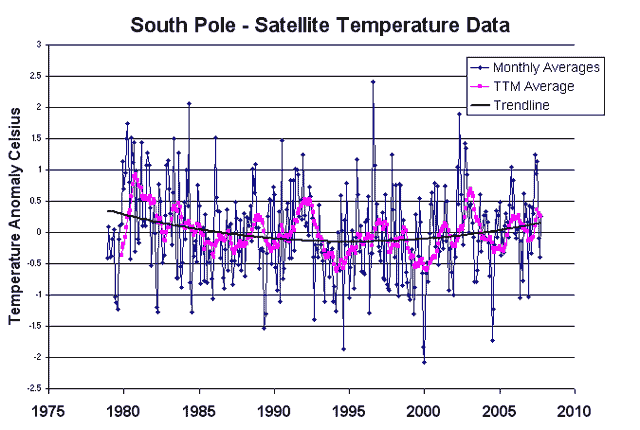
  • Over the last 30 years, satellites have found absolutely no warming trend in Antarctica  (from UAH via Steven Milloy):

South_pole_temperatures

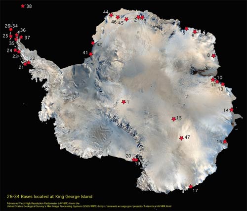
  • The tail is measuring the dog.  The Korean station couldn’t possibly be more irrelevent to measuring Antarctic temperatures.  It is on an island labelled 26-34 north of the tip of the Antarctic Penninsula.  This is a bit like measuring Colorado temperatures from Hawaii:

Antarcticastationsmap1s

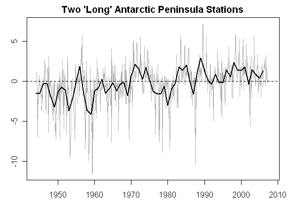
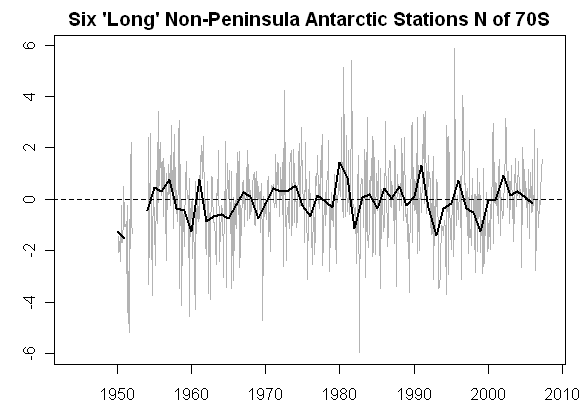
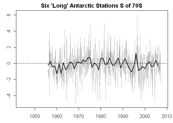
  • It is well known that the Antarctic Penninsula, representing 2% of Antactica’s area, is warming while the other 98% is cooling.  I discussed this more here.  Al Gore took the same disingenuous step in his movie of showing only the anomolous 2%.  The Antarctic Penninsula in the first graph below shows warming.  The rest of Antarctica shows none  (click to enlarge)

Antarc35_2 Antarc34 Antarc33_2

  • The IPCC predicts that with global warming, the Antarctic penninsula will see net melting while the rest of Antarctica will see net increases in ice.  The penninsula is affected more by the changing temperatures of sea currents in the surrounding seas than in global climate effects.  For most of Antarctica, temperatures will never concieveably warm enough to melt the ice sheets, since it is so cold even in the summer, and ice sheets are expected to expand as warming increases precipitation on the continent.
  • Scientists studying Antarctica have been there at most a few decades.  We know almost nothing about it or its histroy.  We certainly don’t know enough about "what is normal" to have any clue if activities on the Larson B ice shelf are anomolous or not.
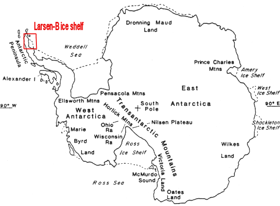
  • The UN Sec-gen said that this ice shelf represented a fifth of the continent.  Here, in actuality, is the Larsen ice shelf.  The red box below greatly exaggerates Larsen’s size, and Larsen-B is only a portion of the entire Larsen shelf.

Antarctic_map_larson_b

  • The statement that the entire Western Antarctic is floating is just absurd.  God knows what that is supposed to mean, but even if we ignore the word "floating", we can see from the map above we aren’t even talking about a significant portion of the Antarctic Pennninsula, much less of Western Antarctica.  Here are actual pictures of the 2002 event.  (by the way, if ice is really "floating", presumably in sea water, then it’s melting will have zero effect on ocean levels)
  • Such a feared collapse already happened 5 years ago, and sea levels did not budge.  But the next time it happens, sea levels are going to rise 20 feet??  Even the UN’s IPCC does not think sea levels will rise more than 8-12 inches in the next century due to their overblown temperature forecasts.

As always, you can consult my my book and my movie (both free online) for more details on all these topics.

Arizona Republic Hit Piece on Skeptics

My kids woke me up at 7:00 this morning (Yuk!) to tell me I was on the front page of the Arizona Republic.  I was quoted a couple of times in an article on climate change skeptics.   I have a couple of thoughts about an article that really has me depressed today.    If you want to know what I really think about climate, see my book and in my movie (both free online).

  • After interviews, I am always surprised at what the writers chose to quote, and this article is no exception. 
  • I spent most of the article trying to explain this simple data exercise, but I guess newspapers today are science-phobic and would rather write he-said-she-said articles than actually get into the numbers.  Unfortunately, the article leaves the impressions that we skeptics have problems with catastrophic global warming theory  "just because."
  • The article is not about the skeptics’ position, because it is not really stated.  In fact, more space is spent on refuting skeptics than is even given to skeptics themselves.  Here is the best test:  The skeptic’s position would have been better served by not publishing this mess at all.
  • Almost my entire discussion with the reporter was about the forecasts.  I said man is causing some warming, but there are simple tests to show it likely won’t be catastrophic.  I even said that it was the catastrophists tactic not to argue this point, but to shift the debate to whether warming exists at all, where they have a much stronger argument. Despite this whole discussion with the reporter, the reporter allowed the catastrophists to shift the debate again.  They want to argue whether things are warmer, where they are on strong ground, and not about how much it will warming the future and whether this will justify massive government intervention, where they are on weak ground.

This article really frustrates me, and may pretty much spell the end for my ever giving an interview on the subject again (I will do a podcast on Monday, which I will link soon, but that is different because they can’t edit me).  Despite it being an article about skeptics, the catastrophists are the only one that get any empirical evidence whatsoever into the article (however lame it may be).  This really ticked me off in particular:  I spent an hour giving specific empirical reasons why there were problems with forecasts and the theory.  The reporter then just printed a few quotes from me that made me look like an uninformed idiot, saying "just because."  Then they print this:

"There is clearly a group of thought that says because we’re not seeing debate now, it never happened in the scientific community," Huxman said. "That is simply wrong. It did happen, and it’s over. The debate now is over the idiosyncrasies, the internal workings."

Incredibly, they also credulously reprint the absurd Newsweek ad hominem attacks on skeptics

What also got my attention was the companion article on an ASU professor who is a climate skeptic.  Incredibly, in the whole article, not one sentence is dedicated to explaining why the professor is a skeptic.  What is the empirical evidence he relies on, or the analysis he finds most compelling?  We never find out.  All we get is an article on dueling motivations.  For example, the Republic writes:

Despite his notoriety as a hero of the skeptic crowd, Balling’s research and lifestyle contain some surprising contradictions.

He is in charge of climate studies at the Decision Center for a Desert City, an ambitious ASU program that looks at how drought will affect the Valley.

He’s a registered independent and lives a lifestyle that the hardiest environmental activist would recognize as green….

If there was a competition for living green, "put the cards on the table, and I’ll beat 99 percent of the faculty here," Balling said.

He avoids driving and  doesn’t own a cellphone.

He would even have liked to see Al Gore win the presidency in 2000.

So?  Why is this surprising?  Should we all naturally expect that skeptics all eat children for dinner?  And, of course, an article on a leading skeptic would not be complete without this:

Critics have assailed Balling’s ties to industries.

Balling received more than $679,000 in research funding from fossil-fuel-industry organizations between 1989 and 2002, according to figures provided by ASU. He served as a scientific adviser to the Greening Earth Society, a public-relations organization founded by the Western Fuels Association to promote the benefits of global warming.

Uh, OK.  Here is a Coyote Blog challenge:  Find me one article in a mainstream newspaper or news weekly that even once checks the sources of funding for climate catastrophists.  This focus on funding and motivation and political affiliation for skeptics only is scandalously asymmetric.  But take a quick look at the article – 85% of it is related to motivation, either how good his green credentials are or how much money he gets from oil companies – and not any discussion of what he actually thinks. 

This final bit is especially funny.  Think of all the wacko professors out there that are warmly accepted by their universities and the academic community.  We’re talking about folks all the way up to and including men who have gone to prison for torturing and murdering women.  But apparently having a climate skeptic on the faculty is just too much:

But his climate work has garnered the most national attention, which bothers some colleagues at ASU.

"For ASU, having Balling as such a prominent figure in the climate debate has been awkward, not so much because of his positions but because we have lacked scientists of similar stature whose work supports more widely held, opposing views," Jonathan Fink, director of ASU’s Global Institute of Sustainability, wrote in an e-mail. "Hence we have been viewed as somewhat of a fringe institution in the world of climate-change research."

Wow, its terrible to see such ill-repute brought to America’s #1 Party School.  And by the way, what the hell kind of strategy is this?  We want to make a name for ourselves in climate research, so to do so we think we should be just like all the other schools — that’s the way to differentiate ourselves!

I will post links to my podcast that is coming up Monday night.  After that, I am not sure.  I am pretty depressed about the state of the media on this issue.  I have a lot of interests and more than enough to do with my time that I may take a break from climate for a while.

Looks Like I Was Right

A few days ago, I wrote this about a recent academic hoax:

I have therefore come to the conclusion that this hoax is likely the work of global warming catastrophists.  My guess is that they wanted to make a point that skeptics were no such thing — that skeptics would bite like a hungry bass at such a lure as long as it supported their position.  And certain folks in political circles did so, at least for a few hours.   My presumption is that if we had all trumpeted this fake study, then our judgement on other issues would get called into question.  My sense is that catastrophists have convinced themselves with their own propaganda that skeptics are all motivated by political and financial agendas.  But most skeptics are really interested in the science, and are motivated by the real fear that we are at the cusp of embarking on some really poor, near tragic, policy decisions.

Apparently, via ICECAP and Roy Spencer, this guess was correct:

An anonymous Brit has now admitted in a brief interview that he wrote the fake global warming research paper which is claimed to have fooled some of us “global warming skeptics”. His stated purpose was to “expose the credulity and scientific illiteracy of many of the people who call themselves climate sceptics”.

I would argue that he has done just the opposite. Several of us (scientists and non-scientists alike) were able, within a matter of seconds to minutes, to identify the paper as a fake. We then spread the word, warning others of the hoax. Therefore, we showed that we do not, as the hoaxer claims, “believe almost anything if it lends support to their position”. We did exactly the opposite.

Remember how I ended the original post:

Now, if you really want to have fun, create a similar hoax the other way, supporting catastrophic man-made global warming.  You will probably make the NBC Nightly News.  It would be fun to try something really nutty and see if people buy it, like saying the oceans will rise 20 feet in the next century… oops, its already been done.  Al Gore made that claim, among other truly absurd statements, in his movie An Inconvinient Trust, for which he not only made the NBC Nightly News but he also won an Oscar and a Nobel Prize.

The Splice

To some extent, 1000-year temperature histories are moderately irrelevent to modern global warming discussions.  In fact, it is fairly amazing that the evidence of tree rings and such over 1000 years is discussed more than the instrumental record of the last 100, which tends to undercut most catastrophic warming forecasts.  However, catastrophists have attempted to use these past temperature reconstructions to make the argument that temperatures were incredibly stable and low right up to the point that man has made them higher and less stable in the last 100 years.  For this reason it is worth discussing them, if only to refute this conclusion.

I won’t go into a lengthy discussion of historical reconstructions, as I alread have in my book and in my movie (both free online).  In this post I just want to talk about one issue:  the splice.

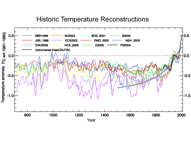
Below is the 1000-year temperature reconstruction (from proxies like tree rings and ice cores) in the Fourth IPCC Assessment.  It shows the results of twelve different studies, one of which is the Mann study famously named "the hockey stick."

S_1000years

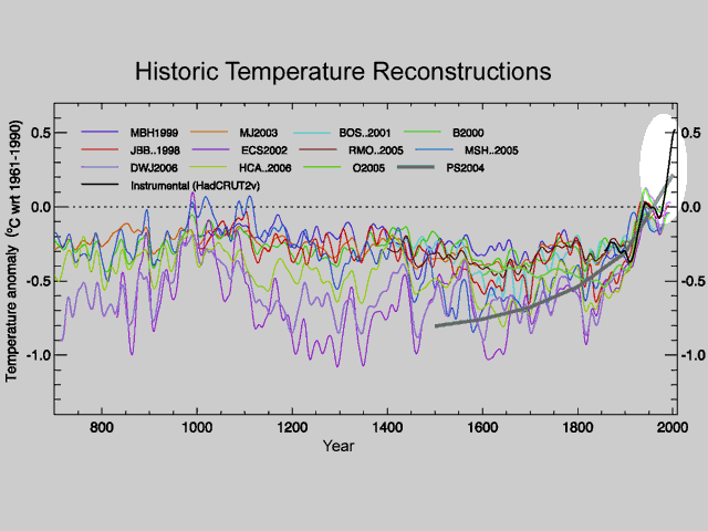
Among many issues, I pointed out the fact that this chart appends or splices the black line, actual measured temepratures, onto the colored lines, which are the historical temperature reconstructions from proxies. 

S_1000years_inflection_high

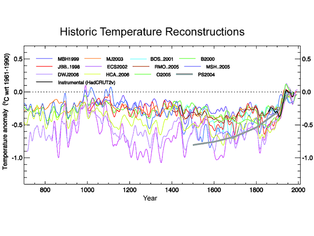
I made the point that this offended by scientific training:  When one gets an inflection point right at the place where two data sources are spliced, as is the case here, one should be suspicious that maybe the inflection is an artifact of mismatches in the data sources, and not representative of a natural phenomenon.  And, in fact, when one removes the black line from measured temperatures and looks at only proxies, the hockey stick shape goes away:

S_1000years_inflection

The other day I discovered that this inflection point is a fairly old criticism (no surprise, I never claim to be original).  Old enough, in fact, that Michael Mann and the folks at realclimate.org have fired back:

No researchers in this field have ever, to our knowledge, "grafted the thermometer record onto" any reconstruction. It is somewhat disappointing to find this specious claim (which we usually find originating from industry-funded climate disinformation websites) appearing in this forum.

The guys at realclimate are just so cute with the "industry-funded climate disinformation" attack — they remind me of the Soviets and how they used to blame everything on CIA plots.  I can say that 1) I recognized this problem on my very own after about 20 seconds of looking at the graph and 2) I have yet to recieve my check from the industry cabal.

It turns out, however, that this is wildly disingenuous.  What they mean is that none of the colored lines include gauge measures grafted onto older proxy data.  But I never really accused them of that.  Interestingly, Steve McIntyre argues that even this claim is wrong, and some of the colored lines do include spliced-on gauge measures.

But my point, which Mann has never refuted or addressed, is that whether the proxy lines themselves include grafted data or not, the proxy lines are NEVER shown to the public or to policy makers without the gauge temperature line added to the chart.  Have you ever seen the proxy lines as they are in my third chart above without the 20th century gauge temperature line?  If in policy discussions and media reports, this gauge temperature line is always included on the graphs in a way that it looks like an extention of the proxy series, then effectively they are grafting the data sets together in every discussion that really matters.

By the way, it is fairly easy to demonstrate that the proxy studies and the gauge temperature measurements do not represent consistent and therefore mergeable data sets.  Over hundreds of years, we have developped a lot of confidence that the linear thermal expansion of mercury in a glass tube is a good proxy for temperatures.  We have not, however, developped similar confidence in bristle cone pine tree rings, whose thickness can be influenced by everything from soil and atmospheric composition to precipitation.  Lets look at a closeup of the graph above:

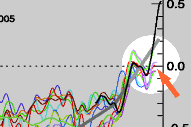
S_gwmovie_ff1

You can see that almost all of the proxy data we have in the 20th century is actually undershooting gauge temperature measurements.  Scientists call this problem divergence, but even this is self-serving.  It implies that the proxies have accurately tracked temperatures but are suddenly diverting for some reason this century.  What is in fact happening are two effects:

  1. Gauge temperature measurements are probably reading a bit high, due to a number of effects including urban biases
  2. Temperature proxies, even considering point 1, are very likely under-reporting historic variation.  This means that the picture they are painting of past temperature stability is probably a false one.

All of this just confirms that we cannot trust any conclusions we draw from grafting these two data sets together.

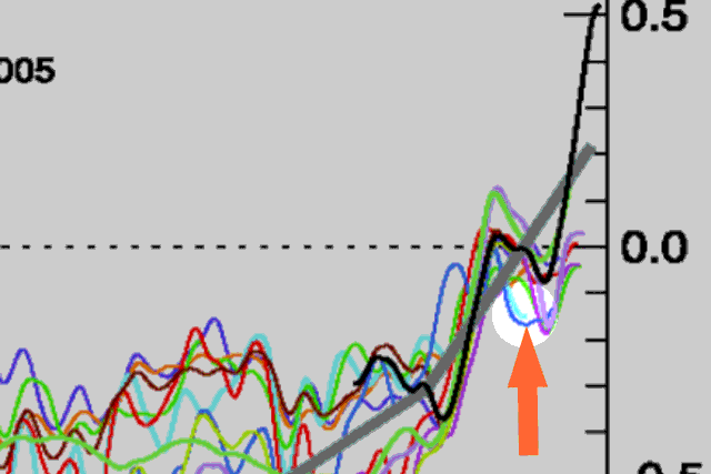
By the way, here is a little lesson about the integrity of climate science.  See that light blue line?  Here, let’s highlight it:

S_gwmovie_ff2

For some reason, the study’s author cut the data off around 1950.  Is that where his proxy ended?  No, in fact he had decades of proxy data left.  However, his proxy data turned sharply downwards in 1950.  Since this did not tell the story he wanted to tell, he hid the offending data by cutting off the line, choosing to conceal the problem rather than have an open scientific discussion about it.

The study’s author?  Keith Briffa, who the IPCC named to lead this section of their Fourth Assessment.

More discussion on this topic can be found in my book and in my movie (both free online). 

The State of Climate Science

No matter whether we agree with the conclusions of climate scientists or not, this kind of thing should worry everyone:

The idea that there would be inconsistent versions of something from Lonnie Thompson is not something that will surprise previous readers. Here is a collation of different “grey” versions of one of the components in the above graphic (Dunde). Dunde was drilled in 1987 and is a staple of multiproxy studies. It has about 3000 samples containing not just dO18 values but relevant dust and chemistry information. Thompson has refused to archive original sample data. I’ve made many efforts to get this data but have been rebuffed by Thompson himself, the National Science Foundation, Science magazine and the National Academy of Sciences (both in their capacity as publishers of PNAS and in their capacity as organizers of the Surface Temperatures panel). This is important data which cannot be duplicated by third parties – Thompson has an obligation to archive all sample information and NSF and the journals have an obligation to require him to archive it: none of them are living up to these obligations. Maybe Al Gore could ask him.

The results of different Thompson versions of Dunde make a spaghetti graph all by themselves. Note that one version with annual data ends at a very low value. This inconsistency is not isolated to Dunde – as you can see from perusing the posts in the Thompson category.


Dunde Versions. Heavy black – Yao et al 2006 (3 year rolling average); thin black – MBH98 (annual); red – PNAS 2006 (5-year averages); blue – Clim Chg 2003 (10-year averages); purple – Yang et al 2002 (values in 50 -year intervals); green – Crowley and Lowery 2000 (original in standardized format, re-fitted here for display by regression fit to MBH98).

What you see is a climate scientist  who refuses to release a critical experimental / observational data set to the broader community, while at various times releasing what appear to be wildly different versions of the data.

And this is frightening as well:

In 2003, Thompson took a new ice core at Bona Churchill. We haven’t heard anything about it. On previous occasions, e.g. here , I’ve predicted that 20th century values at this site would be lower than 19th century values – using the mining promotion philosophy that if Thompson had had “good” results, we’d have heard about them. The prediction has a little more teeth than that as dO18 values at nearby Mount Logan obtained and already published by Fisher et al went down in the 20th century.

Here, we see that Steve McIntyre is able to make reliable predictions of a climate scientist’s actions using the simple prediction heuristic "if the study does not end up getting published, it means that the results did not support the catastrophic man-made global warming proposition."  Call it, I gues, the Inconvinient experimental results.

Oh, and by the way — Thomson was the source of many of the temperature reconstructions, including the "hockey stick," shown by Gore in An Inconvinient Truth.

Single Best Reason Not to Panic About Climate

When I have only 60 seconds to explain why I dont think man-made global warming will be catastrophic enough to warrant massively expensive CO2 abatement programs, this is my argument:

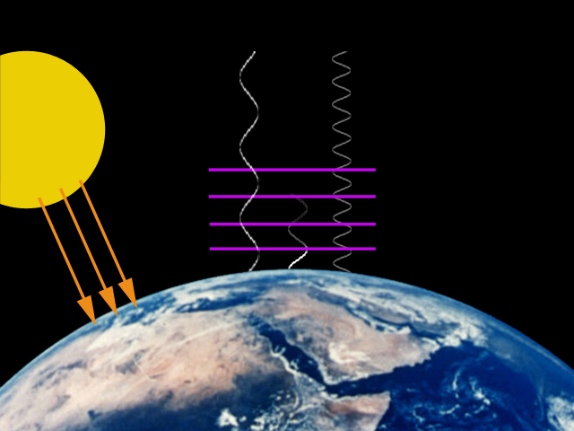
  1. CO2 does indeed absorb selected wavelengths of readiation returning to space from earth, having a warming effect on the atmosphere.  However, this effect is a diminishing return — each successive increment of CO2 concentrations will have a much smaller effect on temperatures than the previous increment.  Eventually, CO2 becomes nearly saturated in its ability to absorb radiation.  The effect is much like painting a red room with white paint.  The first coat covers a lot of red but some still shows through.  Each additional coat will make the room progressively whiter, but each successive coat will have a less noticeable effects than the previous coat, until the room is just white and can’t get any whiter  (the "layers" of CO2 are shown in pink below)
  2. First_layer  Fourth_layer_2

  3. In the 20th century, the UN IPCC claims Earth’s surface temperatures have increased by about a 0.6 degree Celsius (though there are some good reasons to think that biases in the installation of temperature instruments have exaggerated this apparent increase).  To be simple (and generous), let’s assume all this 0.6C increase is due to man-made greenhouse gasses.  Some may in fact have been due to natural effects, but some may also have been masked by man-made sulfate aerosols, so lets just call man-made warming to be 0.6C. 
  4. Since the beginning of the industrial revolution, it is thought that man has increased atmospheric CO2 concentrations from 0.028% of the atmosphere to 0.038% of the atmosphere.  Since scientists often talk about the effect of a doubling of CO2, this historic rise in CO2 is 36% of a doubling.
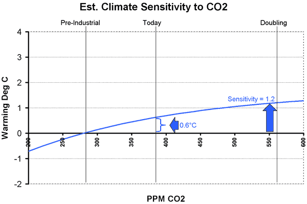
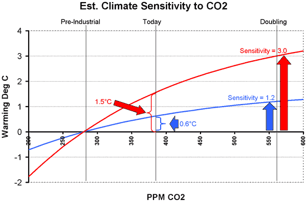
  5. Using simple math, we see that if temperatures have risen 0.6C due to 36% of a doubling, we might expect them to rise by 1.67C for a full doubling to 0.056% of the atmosphere.  But this assumes that the rise is linear — and we already said (and no one denies) that it is in fact a diminishing return relationship.  Using a truer form of the curve, a 0.6C historic rise for 36% of a doubling implies a full doubling would raise temperatures by about 1.2C, or about 0.6C more than we have seen to date (see chart below).   This means that the magnitude of global warming in the next century might be about what we have seen (and apparently survived) since 1900.
  6. Obviously, there is some kind of disconnect here.  The IPCC predicts temperature increases in the next century of 4-8 degrees C.  Big difference.  In fact, the IPCC predicts we will get a 0.5C rise in just 20 years, not 70-100.  Whereas we derived a climate sensitivity of 1.2 from empirical data, they arrive at numbers between 3 and 4 or even higher for sensitivity.  The chart below shows that to believe sensitivity is 3, we would have to have seen temperature rises due to man historically of 1.5C, which nobody believes. 

    So how do they get accelerating temperatures from what they admit to be a diminishing return relation between CO2 concentration and temperature? And for which there is no empirical evidence?  Answer:  Positive feedback.

  7. Almost every process you can think of in nature operates by negative feedback.  Roll a ball, and eventually friction and wind resistance bring it to a stop.  Negative feedback is a ball in the bottom of a bowl; positive feedback is a ball perched precariously at the time of a mountain. Positive feedback breeds instability, and processes that operate by positive feedback are dangerous, and usually end up in extreme states — these processes tend to "run away" like the ball rolling down the hill.  Nuclear fission, for example, is a positive feedback process.  We should be happy there are not more positive feedback processes on our planet.  Current man-made global warming theory, however, asserts that our climate is dominated by positive feedback.  The IPCC posits that a small increase in temperature from CO2 is multiplied 2,3,4 times or more by positive feedbacks like humidity and ice albedo.
  8. There are three problems with these assumptions about positive feedback.  One, there is no empirical evidence at all that positive feedbacks in climate dominate negative feedbacks.   The 20th century temperature numbers we discussed above show no evidence of these feedbacks.  Since we used empirical numbers to calculate the sensitivity, it is already net of any feedbacks. Two, the long-term temperature record demonstrates that positive feedbacks can’t dominate, because past increases in temperature and CO2 have not run away.  And three, characterizations of stable natural processes as being dominated by positive feedback should offend the intuition and common sense of any scientist.
  9. An expected 21st century increase of 0.5 or even 1 degree C does not justify the massive imposed government interventions that will be costly both in dollars and lost freedoms.  In particular, the developing world will be far better off hotter by a degree and richer than it would be cooler and poorer.  This is particularly true since sources like an Inconvenient Truth wildly exaggerate the negative effects of global warming.  There is no evidence tornadoes or hurricanes or disease or extinction are increasing as the world warms, and man-made warming advocates generally ignore any potential positive effects of warming.  As to rising sea levels, the IPCC predicts only a foot and a half of sea level rise even with 4 or more degrees of warming.  Sea level rise from a half to one degree of warming would be measured at most in inches.

OK, so that was more than 60 seconds.  But it is a lot less than 80 pages.  There is a lot of complexity behind every one of these statements.  If you are intrigued, or at least before you accuse me of missing something critical, see my longer paper on global warming skepticism first, where all these issues and much more (yes, including tree rings and cosmic rays) are discussed in more depth.  You can also watch my free climate movie.

Silly Climate Study Hoax

Earlier today I was forwarded an email about a climate study.  This was supposedly an excerpt:

Anyone who has read, say, one or more scientific papers know that this is not the usual language of academic papers.  The first line sounds more like a letter to Penthouse than a scientific paper (you know, the classic "I never thought something like this would happen to me, but last Saturday night…)  What caused me to delete the email (fortunately it was still in the trash so I could go back and find these quotes) was the line "findings in this paper could nt be more damaging to manmade global warming theory or the the thousands of climate scientists…"  No academic in his right mind would state his/her conclusions in this manner, and even if they did, not editor or advisor would let it slip by. 

The premise of the paper was apparently that something other than man (ie bacteria) was creating the CO2 that was causing global warming.  But that in fact does not really refute the core of man-made global warming theory.  The shakiest part of man-made global warming theory is that CO2 will really cause the dire temeprature rises that are often published (rather than much smaller increases on the order of 1C rather than 5C or more).  But the authors were accepting this part, and merely positing that something other than man was causing the CO2 rise.  But this makes no sense.   The 100 ppm rise of CO2 over the last 150 years may not be all due to man, but its pretty clear a lot of it is.  After all, if CO2 has risen from 280 to 380 ppm in the last 150 years, that is a trend that could only go back so far, unless there were such a thing as negative concentrations.

The rest gets even sillier:

We believe that academic intimidation of this kind contradicts the spirit of open enquiry in which scientific investigations should be conducted. We deplore the aggressive responses we encountered before our findings were published, and fear the reaction this paper might provoke. But dangerous as these findings are, we feel we have no choice but to publish.

That’s the kind of thing you post in your blog, not in the paper itself.   Climate does unfortunately see a lot of ad hominem attacks back and forth, but seldom in the academic papers themselves.

So I assumed that it was some ill-concieved hoax by a skeptic, though I could not really understand what point they were trying to make.  Positing such a thing, only to have it quickly shot down, could only hurt the skeptic position.  If a skeptic made the hoax, it was a stupid strategy.  The point is trying to bring clarity and real science back to a politicized scientific debate, and this just does the opposite.

I have therefore come to the conclusion that this hoax is likely the work of global warming catastrophists.  My guess is that they wanted to make a point that skeptics were no such thing — that skeptics would bite like a hungry bass at such a lure as long as it supported their position.  And certain folks in political circles did so, at least for a few hours.   My presumption is that if we had all trumpeted this fake study, then our judgement on other issues would get called into question.  My sense is that catastrophists have convinced themselves with their own propaganda that skeptics are all motivated by political and financial agendas.  But most skeptics are really interested in the science, and are motivated by the real fear that we are at the cusp of embarking on some really poor, near tragic, policy decisions.

Now, if you really want to have fun, create a similar hoax the other way, supporting catastrophic man-made global warming.  You will probably make the NBC Nightly News.  It would be fun to try something really nutty and see if people buy it, like saying the oceans will rise 20 feet in the next century… oops, its already been done.  Al Gore made that claim, among other truly absurd statements, in his movie An Inconvinient Trust, for which he not only made the NBC Nightly News but he also won an Oscar and a Nobel Prize. 

Retreating Glaciers

No global warming catastrophe movie is complete without scenes of melting glaciers.  And it is true that many (but by no means all) of the world’s large glaciers have retreated over the last century.  The implication is that this retreat is due to man.

The reason I titled my climate video "What is Normal?" is because I am facinated with the hubris we have of observing climate for just a few decades, but suddenly declaring we know what is a "normal" or "abnormal" climate.  Such may be the case with retreating glaciers.

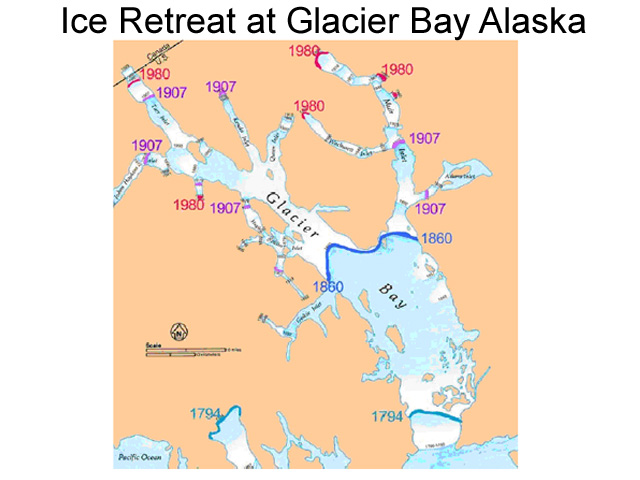
This is a picture published in Alaska Geographic Magazine, plotting the retreat of the famous glacier at Glacier Bay, Alaska.

Glacier1

As you can see, the vast majority of the retreat occured between 1794 and 1907, before man is generally blamed with substantially affecting the climate with CO2.  Yes, we have seen some retreats in the last 50 years, but in this context they look much more like a continuation of a natural trend than any new man-made phenomenon.  In fact, to claim that recent retreats are man-made, one would have to argue that the natural forces driving glacier retreats since 1794 would have had to halt around 1950, coincidently exactly when man’s impact began.  This kind of coincident occurance isn’t impossible, but certainly fails any Occam’s Razor smell test.

Let’s All Be Like India!

Never have I seen a global warming catastrophist help make it clear what potential costs were are facing in trying to roll back CO2 emissions (emphasis added):

Mr Stern, the former chief economist of the World Bank, sends out a very clear message: “We need to cut down the total amount of carbon emissions by half by 2050.” At current levels, the per capita global emissions stand at 7 tonnes, or a total of 40-45 gigatonnes. At this rate, global temperatures could rise by 2.5-3 degrees by then. But to reduce the per capita emissions by half in 2050, most countries would have to be carbon neutral. For instance, the US currently has, at 20-25 tonnes, per capita emissions levels that are three times the global average.

The European Union’s emission levels stand at 10-15 tonnes per capita. China is at about 3-4 tonnes per capita and India, at 1 tonne per capita, is the only large-sized economy that is below the desired carbon emission levels of 2050. “India should keep it that way and insist that the rich countries pay their share of the burden in reducing emissions,” says Mr Stern.

It is fabulous to see a global warming action supporter making my case for me.  In short, he is saying that India should stay the way it is (poor) and everyone else in the world needs to devolve until they are just like India (poor).  I have often said that aspiring to a slightly cooler but substantially poorer world makes no sense, and here we see the choice starkly.

By the way, it is always worth a moment to reality check any warming forecast you see in print, in this case a forecast of 2.5-3 degrees C by 2050.

Historically, we have seen a rise of 0.6 degrees at the same time CO2 concentrations have risen by 100ppm, though not all of this 0.6 degrees is due to CO2.  Recently, CO2 has been rising at 1.5-2 ppm per year.  Let’s assume that from now until 2050, it accelerates and rises on average 3 ppm per year, which is probably high.  This gives us a high-side estimate of 3 x 42 years = 126 ppm more.  So historically, 100 ppm caused something less than 0.6 degrees but going forward, 126 ppm more will cause 2.5-3 degrees?  Do you see how crazy and unsubantiable this is?  Particularly since the relationshio of CO2 to radiation absorbtion, and thus to temperature, is a diminishing one, such that the next 100 ppm should cause less warming than the last 100 ppm. 

Yeah, I know, it’s more complicated (dimming and feedback, etc).  But the ultimate answer considering this greater complexity is still the same.  The more complex answer is discussed in slightly longer form here, and in much longer form in my film and my book (both free online).

Signal to Noise Ratio in Measuring Temperature

Well, posting has a been a bit light for what I hope is now a fairly obvious reason:  I have been working overtime just to get my climate video published.  Now that the video is out, I can get back to my backlog of climate material I want to post.

For a while, I have been fascinated with the topic of signal to noise ratio in climate measurement.  For most purposes, the relevent "signal" we are trying to tease out is the amount of warming we have seen over the last decades or century.  The "noise" consists of measurement inacuracies and biases.

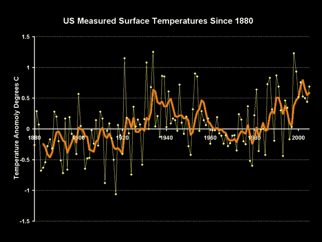
Here are the NASA GISS numbers for US temperature over the last century or so:

Adjust1

The warming trend is hard to read, with current temperatures relatively elevated vs. the last 120 years but still lower than the peaks of the 1930’s.  But we can learn something by going below the surface of these numbers.

These numbers, and in fact all numbers you will ever see in the press, are not the raw instrument measurements – they include a number of manual adjustments made by climate scientists to correct for both time of observation as well as changing quality of the measurement site itself.  These numbers include adjustments both from the NOAA, which maintains the US Historical Climate Network on which the nubmers are based, and from NASA’s GISS.  All of these numbers are guesstimates at best.

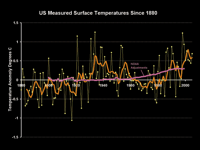
Though the GISS is notoriously secretive about revealing much about its temperature correction and aggregation methodologies, but the NOAA reveals theirs here.  The sum total of these adjustments are shown on the following chart in purple:

Adjust2

There are a couple observations we can make about these adjustments.  First, we can be relatively astonished that the sign on these adjustments is positive.  The positive sign implies that modern temerpature measurement points are experiencing some sort of cooling bias vs. history which must be corrected with a positive add-on.  It is quite hard to believe that creeping urbanization and poor site locations, as documented for example here, really net to a cooling bias rather than a warming bias (also see Steve McIntyre’s recut of the Peterson urban data here).

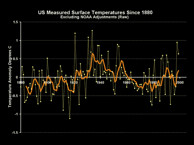
The other observation we can make is that the magnitude of these adjustments are about the same size as the warming signal we are trying to measure.  Backing into the raw temperature measurements by subtracting out these adjustments, we get this raw signal:

Adjust3

When we back out these adjustments, we see there is basically no warming signal at all.  Another way of putting this is that the entirety of the warming signal in the US is coming not from actual temeprature measurements, but from adjustments of sometimes dubious quality being made by scientists back in their offices.  Even if these adjustments are justifiable, and some like the time of observation adjustment are important, the fact is that the noise in the measurement is at least as large as the signal we are trying to measure, which should substantially reduce our confidence that we really know what is going on.

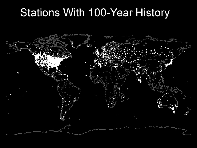
Postscript:  Yes, I know the US is just one part of the world.  But the US is the one part of the world with the best, highest quality temperature measurement system.  If signal to noise ratios are low here, then how bad are they in the rest of the world?  After all, we in the US do have some rural sites with 100 year temperature measurement histories.  No one in 1900 was measuring temperatures in rural Africa or China or Brazil.

World_100_yr_history_2

More Ways to View My Climate Video

There has been a lot of interest in my new climate video.  Already we have nearly 450 1400 views at Google video and over 200 800 downloads of the video.  I am now releasing the video on DVD and through YouTube.

I have had several requests for a DVD version rather than an online version or file.  For a limited time, through December 31, 2007, I will send a DVD of my video What is Normal?  A Critique of Catastrophic Man-Made Global Warming Theory to anyone who sends me a stamped self-addressed envelope.  The DVD plus a standard CD mailer weigh about 3.3 OZ, so you will need $1.31 postage in the US.  Send your request to "Climate Video, c/o Warren Meyer, 11811 N. Tatum Blvd #4095, Phoenix, AZ, 85253"

Also, in response to popular demand, I have release the video on YouTube.  YouTube requires that all videos be under 10 minutes, so I have broken the film into six parts.  If you want to just preview a portion, the second half of the fourth film and the first half of the fifth are probably the most critical.

A Youtube Playlist for the film is here.  This is a cool feature I have not used before, but will effectively let you run the parts end to end, making the 50-minute video more or less seamless. 

The individual parts are:

Climate Video Part 1:  Introduction; how greenhouse gases work; historical climate reconstructions
Climate Video Part 2:  Historical reconstructions; problems with proxies
Climate Video part 3:  How much warming is due to man; measurement biases; natural cycles in climate
Climate Video Part 4:  Role of the sun; aerosols and cooling; climate sensitivity; checking forecasts against history
Climate Video Part 5:  Positive and negative feedback;  hurricanes.
Climate Video Part 6:  Melting ice and rising oceans; costs of CO2 abatement; conclusions.

You may still stream the entire climate film from Google Video here. (the video will stutter between the 12 and 17 second marks, and then should run fine)

You may download a 258MB full resolution Windows Media version of the film by right-clicking here.

You may download a 144MB full resolution Quicktime version of the film by right-clicking here.

Climate Video Release!

My first climate movie, What is Normal?  A Critique of Catastrophic Man-Made Global Warming Theory is now available for free download.  If you have the bandwidth, I encourage you to download the full 640×480 version as Windows Media Video, but be forewarned that the file is 258MB.  This is actually a pretty small file for a 50+ minute movie, and the full resolution version looks much nicer than the streaming version.

Right-Click Here to Download Climate Movie in Full Resolution

Update:  Right-Click here for full resolution 144MB .mov quicktime version of Climate Movie

Make sure you turn up your volume — I think I recorded this with a pretty low audio level.

If you are bandwidth-challenged, or you can’t view a .WMV file, you may stream the video from Google video or download a reduced resolution version here.  Unfortunately, to make the video stream effectively, the resolution is cut to 320×240, but having watched it, it actually still looks surprisingly good streamed. 

Note, on the streaming version, the video stutters between the 12 and 17 second marks in the movie, but runs fine after that.  By the way, thanks to all the commenters who gave me some good alternatives to using my own fairly week narration voice.  I decided for this first release I wanted to see what I could achieve with a pure solo effort.  Many thanks to Adobe Premier Elements, which made this effort possible.

Finally, you can stream the reduced resolution Google video version below:

New Global Warming Video Release

Please check back Monday morning, as I will be releasing my new video, "What is Normal:  A Critique of Catastrophic Man-Made Global Warming Theory."  As with my global warming book, which began as a ten page summary and ended up as an 85-page manuscript, the video started at a goal of 15 minutes and eventually ended up at 50 minutes.  However, unlike other global warming-related videos I will not name, it is all climate science, with no self-congratulatory segments on my childhood.

CO2 and Drought

One of the sloppier predictions about global warming is that is will cause massive droughts, and certainly we have seen this line of reasoning over the last week as the media attempts to hang the blame for Southern California fire damage on CO2, when in fact most of the blame lies on rapid home construction in areas known to have a high fire danger.

I suppose the layman’s logic is as follows:  Well, it is usually hot when we have droughts, and it is hot in deserts, so therefore if the world gets hotter, we will have droughts and deserts.  Of course, this logic is silly, but is none-the-less prevenlent (does no one remember that rain forests are hot too?)

In fact, one almost certain effect of global warming will be an increase in the evaporation rate of the oceans.  Megatons more water is put into the sky as temperatures of the air and oceans rise.  Presumably, much of this water will fall as rain somewhere, so it would probably be more logical to guess that warming would cause more rain rather than less.

As Steven Malloy points out, as temperatures have risen about 0.6C over the last century, rainfall in the US and Southern California have actually increased:

During the period 1900-2005, precipitation seems to have actually increased in areas above 30 degrees north latitude — including California and the rest of the U.S. — according to the most recent assessment from the United Nations’ Intergovernmental Panel on Climate Change.

This does not mean, of course, that droughts haven’t occurred in North America over the last 100 years, but it doesn’t support a link between rising global temperature and increased drought.

Examining the occurrence of drought in southern California since 1900 is also illuminating.

According to data maintained by the federal National Climatic Data Center, drought conditions are no stranger to southern California.

During the period 1900 to 2005, moderate-to-severe drought conditions occurred in Southern California during 34 of those 106 years — that is, about one-third of the time.

Comparing the southern California drought record against the global temperature record reveals the following:

— During the period 1900-1940, when most of the 20th century’s one-degree Fahrenheit temperature increase occurred, there were 7 years of moderate-to-severe drought.

— During the period 1941-1975, when global temperatures cooled, giving rise to concerns of a looming ice age, there were 11 years of moderate-to-severe drought.

— During the period 1976 to 1990, when global temperatures rose back to the 1940 level, there were 8 years of moderate-to-severe drought.

— Since 1991, when global temperatures rose slightly past the 1940 levels, there have been 7 years of drought.

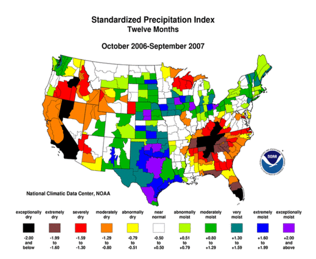
In fact, just last week I posted drought maps that showed that while Southern California has had drought conditions over the last year…

Spi12_200709_pg

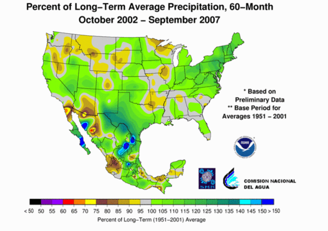
…they have had absolutely average rainfall over the last five years and Northa America has been downright soggy:

Usnmx20070960monpctpcppg

On Monday, I will be releasing my climate video tentatively titled "What is Normal?"  A recurring theme in that video is our current inability to accept extremes in the weather as "normal,"  which in fact they are.

Climate Exaggeration

There is nothing unique about the following, but I include it as an example of the unbelieveable exaggerations that are being bandied about concerning climate.  I was doing some research on the Salton Sea for a post at Coyote Blog and ran accross this letter from the California Audobon Society.  It says, in part:

Although there is uncertainty about what the precise impacts will be, there is no longer legitimate scientific disagreement about the fact that the climate is changing and that those changes will accelerate over the next century.

One of the classic rhetorical tricks is to say "it cannot be denied that" followed by two statements.  The first statement will in fact be undeniable, setting up the reader to blindly accept the second, which is much more contentious.  In this case, there is indeed no doubt that Climate is changing.  Climate is always changing, else we would still have glaciers in Minnesota.  However, it is far, far from given that the changes will "accelerate" in the next century.  In fact, the relationship between CO2 and warming is in fact a diminishing return, making "acceleration" difficult in all but a looney universe dominated by positive feedbacks.

But the real whopper comes in the next paragraph:

According to recent analyses, California is projected to experience temperature increases of at least 4-8 degrees Fahrenheit (if global emissions are significantly curtailed) and more likely temperature increases of 9-18 degrees Fahrenheit (current emissions path) over the next centur

Really?  First absolutely impossible to reconcile 9-18 degree F with the approximately 1F (0.6C) warming we have seen in the last century.  CO2 rose 100ppm in the last century and produced 1F, but adding another 200ppm in the next century will produce 9-18F??  This implies an upward sloping curve that is exactly opposite of the relationship everyone agrees CO2 and warming have.  18F implies almost two degrees a decade, a huge number considering the warming over the last decade has been close to zero and no decade has had warming of more than about 0.3F.  Further, I am sure the Sierra Club found someone who actually produced such a study, but the IPCC "consensus", which I think is exaggerated, calls for only about 4-6F increases in the next century.  Five degrees F is probably bad enough, do they really have to outright exaggerate?

Next Solar Cycle Looks Very Weak

Via Anthony Watts:

“All Quiet Alert” – That sounds like an oxymoron, and maybe it is, but the sun is extremely quiet right now, so much in fact that the Solar Influences Data Center in Belgium has issued an “All quiet alert” on October 5th. Since then, the sunspot number has remained at zero.

The sun is blank–no sunspots.

There is talk about of an extended solar minimum occurring, or perhaps a recurrence of a Dalton or Maunder type minimum. There are signs that the sun’s activity is slowing. The solar wind has been decreasing in speed, and this is yet another indicator of a slowing in the suns magnetic dynamo. Below are near real-time (updated hourly)dials of Solar Wind speed, Solar Wind Density, and Interplanetary Magnetic Field. …

One thing is certain, based on past climate history and solar history, if in fact the suns magnetic activity slows, or collapses and we enter a prolonged period of little or no sunspot activity, we’ll see a global cooling trend.

It is still too early to tell, but pretty interesting none-the-less.

Global Warming Video

Anthony Watt has a pointer to a nice presentation in four parts on YouTube by Bob Carter made at a public forum in Australia.  He walks through some of the skeptics’ issues with catastrophic man-made global warming theory.

What caught my attention, though, were the pictures Mr. Carter shows in his presentation about about 1:30 into part 4.  Because I took the pictures he shows, down at the University of Arizona, as part of Mr. Watts project to document temperature measurement stations.  Kind of cool to see someone I don’t know in a country I have (sadly) never visited using a small bit of my work.  Part 4 is below, but you can find links to all four parts here.

Coming soon, my own home-brewed video effort on global warming and climate.  Right now it runs about 45 minutes, and I’m in the editing stages, mainly trying to make the narration match what is on the screen.

Cross-posted from Coyote Blog