
Cross posted from Coyoteblog
In this post, I want to discuss my just-for-fun model of global temperatures I developed 6 years ago. But more importantly, I am going to come back to some lessons about natural climate drivers and historic temperature trends that should have great relevance to the upcoming IPCC report.
In 2007, for my first climate video, I created an admittedly simplistic model of global temperatures. I did not try to model any details within the climate system. Instead, I attempted to tease out a very few (it ended up being three) trends from the historic temperature data and simply projected them forward. Each of these trends has a logic grounded in physical processes, but the values I used were pure regression rather than any bottom up calculation from physics. Here they are:
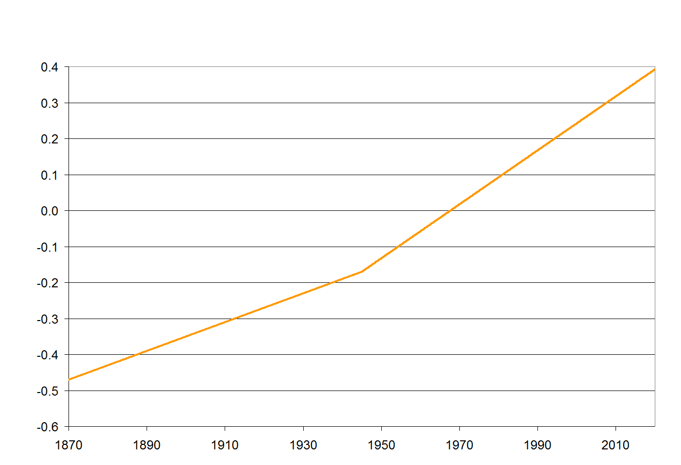
- A long term trend of 0.4C warming per century. This can be thought of as a sort of base natural rate for the post-little ice age era.
- An additional linear trend beginning in 1945 of an additional 0.35C per century. This represents combined effects of CO2 (whose effects should largely appear after mid-century) and higher solar activity in the second half of the 20th century (Note that this is way, way below the mainstream estimates in the IPCC of the historic contribution of CO2, as it implies the maximum historic contribution is less than 0.2C)
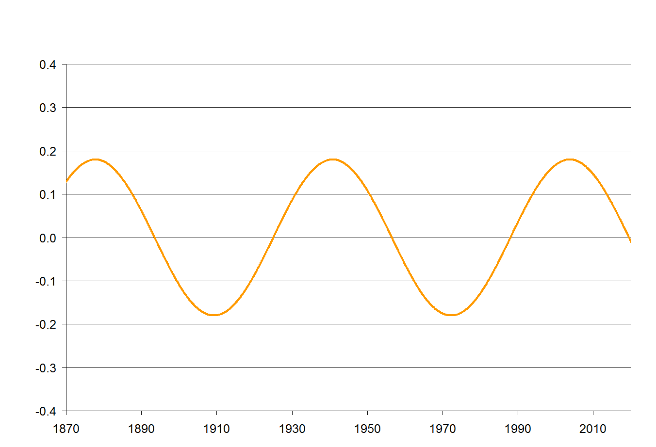
- A cyclic trend that looks like a sine wave centered on zero (such that over time it adds nothing to the long term trend) with a period of about 63 years. Think of this as representing the net effect of cyclical climate processes such as the PDO and AMO.
Put in graphical form, here are these three drivers (the left axis in both is degrees C, re-centered to match the centering of Hadley CRUT4 temperature anomalies). The two linear trends:
And the cyclic trend:
These two charts are simply added and then can be compared to actual temperatures. This is the way the comparison looked in 2007 when I first created this “model”
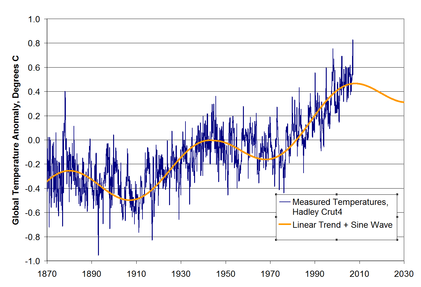
The historic match is no great feat. The model was admittedly tuned to match history (yes, unlike the pros who all tune their models, I admit it). The linear trends as well as the sine wave period and amplitude were adjusted to make the fit work.
However, it is instructive to note that a simple model of a linear trend plus sine wave matches history so well, particularly since it assumes such a small contribution from CO2 (yet matches history well) and since in prior IPCC reports, the IPCC and most modelers simply refused to include cyclic functions like AMO and PDO in their models. You will note that the Coyote Climate Model was projecting a flattening, even a decrease in temperatures when everyone else in the climate community was projecting that blue temperature line heading up and to the right.
So, how are we doing? I never really meant the model to have predictive power. I built it just to make some points about the potential role of cyclic functions in the historic temperature trend. But based on updated Hadley CRUT4 data through July, 2013, this is how we are doing:
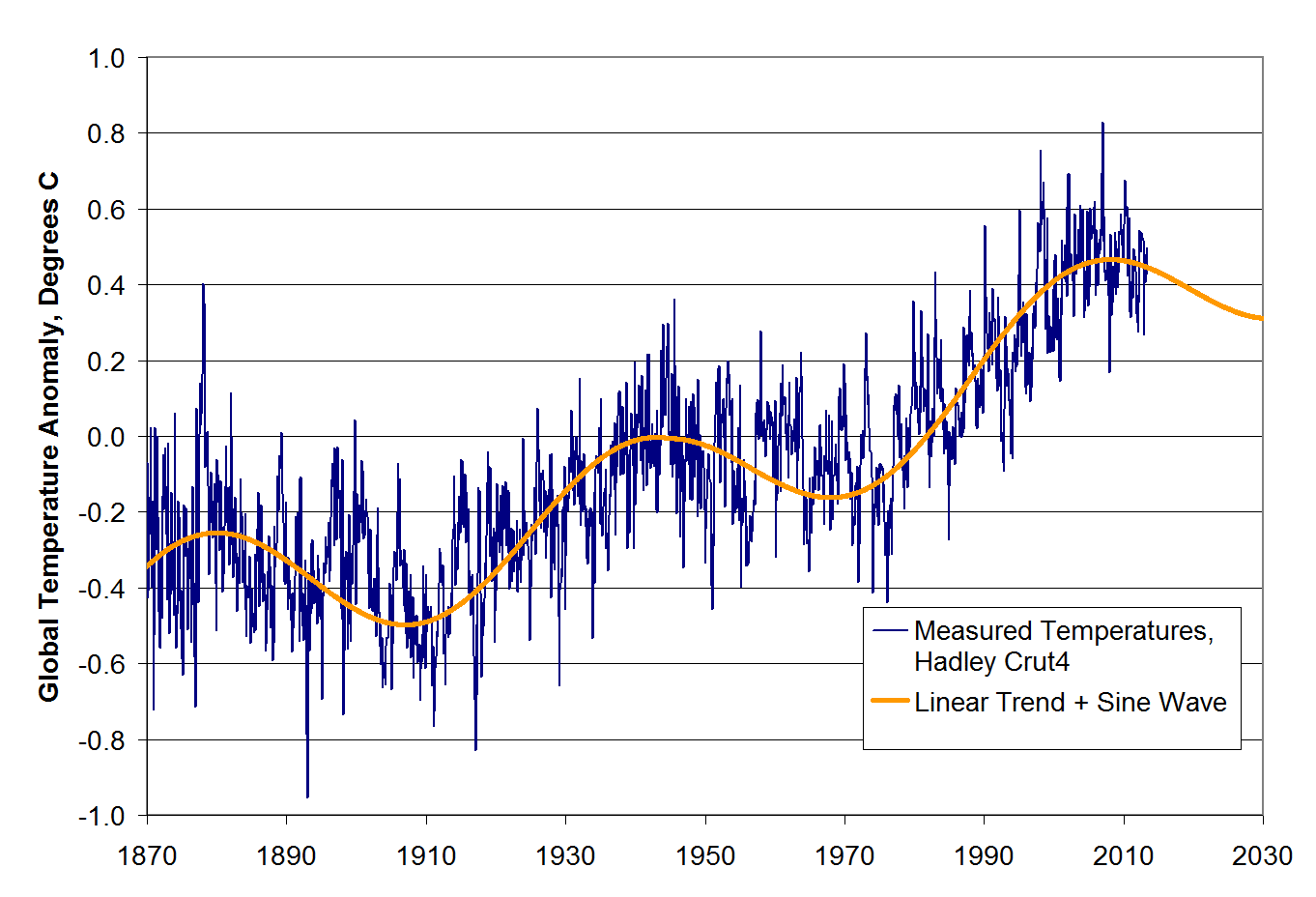
Not too shabby. Anyway, I do not insist on the model, but I do want to come back to a few points about temperature modeling and cyclic climate processes in light of the new IPCC report coming soon.
The decisions of climate modelers do not always make sense or seem consistent. The best framework I can find for explaining their choices is to hypothesize that every choice is driven by trying to make the forecast future temperature increase as large as possible. In past IPCC reports, modelers refused to acknowledge any natural or cyclic effects on global temperatures, and actually made statements that a) variations in the sun’s output were too small to change temperatures in any measurable way and b) it was not necessary to include cyclic processes like the PDO and AMO in their climate models.
I do not know why these decisions were made, but they had the effect of maximizing the amount of past warming that could be attributed to CO2, thus maximizing potential climate sensitivity numbers and future warming forecasts. The reason for this was that the IPCC based nearly the totality of their conclusions about past warming rates and CO2 from the period 1978-1998. They may talk about “since 1950”, but you can see from the chart above that all of the warming since 1950 actually happened in that narrow 20 year window. During that 20-year window, though, solar activity, the PDO and the AMO were also all peaking or in their warm phases. So if the IPCC were to acknowledge that any of those natural effects had any influence on temperatures, they would have to reduce the amount of warming scored to CO2 between 1978 and 1998 and thus their large future warming forecasts would have become even harder to justify.
Now, fast forward to today. Global temperatures have been flat since about 1998, or for about 15 years or so. This is difficult to explain for the IPCC, since about none of the 60+ models in their ensembles predicted this kind of pause in warming. In fact, temperature trends over the last 15 years have fallen below the 95% confidence level of nearly every climate model used by the IPCC. So scientists must either change their models (eek!) or else they must explain why they still are correct but missed the last 15 years of flat temperatures.
The IPCC is likely to take the latter course. Rumor has it that they will attribute the warming pause to… ocean cycles and the sun (those things the IPCC said last time were irrelevant). As you can see from my model above, this is entirely plausible. My model has an underlying 0.75C per century trend after 1945, but even with this trend actual temperatures hit a 30-year flat spot after the year 2000. So it is entirely possible for an underlying trend to be temporarily masked by cyclical factors.
BUT. And this is a big but. You can also see from my model that you can’t assume that these factors caused the current “pause” in warming without also acknowledging that they contributed to the warming from 1978-1998, something the IPCC seems loath to do. I do not know how the ICC is going to deal with this. I hate to think the worst of people, but I do not think it is beyond them to say that these factors offset greenhouse warming for the last 15 years but did not increase warming the 20 years before that.
We shall see. To be continued….
IPCC vs Contrarians
http://www.skepticalscience.com/pics/IPCCvsContrarians.gif
Here is what the professionals have come up with.
http://www.skepticalscience.com/graphics.php?g=72
When plugging in the words of the contrarians into the models, you can see how far off they are.
The temperature trend calculator shows a warming trend in all data sets in 19 years.
The author of the blog uses .75*C/century but you can easily see that there are much higher
trends with a minimum of 1.22*C globally, with a maximum of 3.24 *C/century over land.
Increase of temperature over land is stronger than on a global basis. Our author isn’t bringing
this to our attention. Scientists are telling that later this century global warming will accelerate.
http://www.skepticalscience.com/trend.php
…………………………….1998t…to.2012…………………… 1993 to 2012
giss Trend: 0.95 ±1.61 °C/century (2σ)……..….Trend:1.88 ±1.07 °C/century (2σ)
NOAA Trend: 0.43 ±1.49 °C/century (2σ)………Trend:1.45 ±1.02 °C/century (2σ)
hadcrut v3 Trend: -0.05 ±1.55 °C/century (2σ)Trend:1.32 ±1.14 °C/century (2σ)
hadcrut v4 Trend: 0.83 ±1.72 °C/century (2σ)..Trend:1.78 ±1.11 °C/century (2σ
Best land Trend: 1.59 ±3.84 °C/century (2σ)….Trend:3.24 ±2.26 °C/century (2σ)
NOAA Land Trend: 1.24 ±2.52 °C/century (2σ).Trend:2.86 ±1.60 °C/century (2σ)
rss Trend: -0.41 ±2.73 °C/century (2σ)…………..Trend:1.22 ±1.76 °C/century (2σ)
UAH Trend: 0.54 ±2.89 °C/century (2σ)………….Trend:1.83 ±1.79 °C/century (2σ)
co2 is a green house gas. We are finally doing something about it.
http://e360.yale.edu/digest/us_places_co2_limits__on_new_coal-fired_power_plants/3957/?utm_source=feedburner&utm_medium=feed&utm_campaign=Feed%3A+YaleEnvironment360+%28Yale+Environment+360%29
The EPA regulations, which the coal industry vows to challenge in court, will require new coal plants to emit fewer than 1,100 pounds of carbon dioxide per megawatt hour, considerably lower than the average 1,800 pounds of CO2 per megawatt hour currently produced by coal-fired power plants. Such limits would require the new plants to deploy carbon capture and storage (CCS) technology, which has not been used on a wide scale. The difficulty of using CCS technology will be at the heart of lawsuits challenging the EPA move, coal industry officials say. McCarthy said Friday that the EPA will announce CO2 limits next June on existing coal-fired power plants.
Contrarians say you won’t get any warming during the negative phase of the PDO, just like last time. Give up, kool-aid drinker. If you haven’t got people convinced by now, you never will.
Coyote blog thinks they know it better than the IPCC? A blog is proving the scientists wrong. How interesting. Boy the scientists missed that one.
There is the emotional way or the science way of reasoning. Can you show the science wrong?
I have shown there is a warming trend. Can you show otherwise?
Gee, now why would all of those main stream media outlets and climate scientists be discussing the warming hiatus right now? All they had to do was call you. Let’s see if I have this right, if no year has been warmer than 1998 in the last 15 years, as per the satellites, than you think we’re still warming. Sorry, rational people don’t see it that way. We also see that the 73 global climate models that the infamous IPCC uses are all failures at forecasting. You have not come close to providing evidence for a rational policy to change the world’s climate yet. Check in again in the 2030’s when warming resumes.
http://en.wikipedia.org/wiki/Instrumental_temperature_record#Warmest_years
http://en.wikipedia.org/wiki/Instrumental_temperature_record#Warmest_decades
Warmest years 1. 2010 2. 2005 3. 1998
Warmest decade 2000 -2009
The trend calculator shows from a previous post that we are still trending upward stronger than the author of coyote blog shows..
There are natural variations in the ocean cycles. The atmosphere only represents 2.3% of the energy of the earth warming. 90% is going into the oceans.
From the graph below you can see that there are cycles of mild cooling before warming kicks in again.
“There are natural variations in the ocean cycles.” LOL. Yeah, cycles that your models are completely unable to incorporate. Models that James Hansen didn’t even know about in 1988 when he testified so hysterically before Congress. Your models are unable to deal with ENSO, cloud formation, solar activity, precipitation and ice. Other than that they work fine.
You give us a hypothesis that cannot be falsified. Do you wonder why you were handed the talking point “The heat is there, it’s decided to hide in the ocean depths?” Because it’s stopped warming! The clown that came up with that incredible CYA is Kevin Trenberth, a “climate scientist” famously quoted in the Climategate emails as calling it a “travesty” that they couldn’t find the missing heat.
Surface temps are not as warm as they were in the Medieval, Roman, or Minoan Warm Periods. The slow, gentle warming we have enjoyed since Nature ended the Little Ice age has greatly benefited mankind and is well within natural parameters. Don’t mess with a good thing.
BTW, this blog and Coyote blog are owned by Warren Meyer. His friends call him Warren. You can call him Mr. Meyer. For once in your life, question authority and read what the man has to say. here’s an example concerning your “ocean heat” official “climate change” talking point…
http://www.climate-skeptic.com/wp-content/uploads/2012/04/ocean-heat.gif
Start with the upper right hand links and learn something. He’s already seen everything SS has to offer. You can reciprocate.
Oops. Hansen didn’t know about a certain ocean cycle called the Pacific Decadel Oscillation. It wasn’t discovered until 1996. The science is never settled, ya know.
https://www.youtube.com/watch?v=047vmL6Q_4g&feature=player_embedded#t=0
You find the heat if you put the thermometer in the right place.
Have you a peer reviewed paper here?
Can you tell me where the temperature data on this chart comes from? Is it RSS, UAH, HadCRUT or GISS? …
Let me tell you, it is HadCRUT ….
the only one of the four ACTUAL monthly global temperature estimates that DOESN’T have 1998 as the highest temperature by some distance … talk about cherry picking the data !!
http://blogs.news.com.au/heraldsun/andrewbolt/index.php/heraldsun/comments/suzuki_revealed_as_complete_know_nothing_by_very_first_question_on_qa/
If Bob Tisdale has this correct why is he only presenting this to deniers, rather than the science community at large.
Is he being honest about the red line representing the models versus actual. Deniers are famous for being dishonest. How can you trust your own sources to be true, when they are so often and so easily debunked by amateurs like myself?
And then you throw a politically motivated sight at me which uses more politically motivated data to keep you happy that AGW is a hoax.
The trend calculator’s job is to show what the data is telling us whether trending up, down, or neutral. If you notice that there are two trending down and 6 trending up at 14 years. Fair enough. At 19 years all are trending up.
Is that a reason then that climate change theory based on co2 is wrong as you and the rest of this site would have it?
http://www.skepticalscience.com/trend.php
…………………………….1998t…to.2012…………………… 1993 to 2012
giss Trend: 0.95 ±1.61 °C/century (2σ)……..….Trend:1.88 ±1.07 °C/century (2σ)
NOAA Trend: 0.43 ±1.49 °C/century (2σ)………Trend:1.45 ±1.02 °C/century (2σ)
hadcrut v3 Trend: -0.05 ±1.55 °C/century (2σ)Trend:1.32 ±1.14 °C/century (2σ)
hadcrut v4 Trend: 0.83 ±1.72 °C/century (2σ)..Trend:1.78 ±1.11 °C/century (2σ
Best land Trend: 1.59 ±3.84 °C/century (2σ)….Trend:3.24 ±2.26 °C/century (2σ)
NOAA Land Trend: 1.24 ±2.52 °C/century (2σ).Trend:2.86 ±1.60 °C/century (2σ)
rss Trend: -0.41 ±2.73 °C/century (2σ)…………..Trend:1.22 ±1.76 °C/century (2σ)
UAH Trend: 0.54 ±2.89 °C/century (2σ)………….Trend:1.83 ±1.79 °C/century (2σ)
Is he being dishonest when he draws a line as he has done which indicates a 0.6 degree rise in temperature since 1970 ? Well, in 2007 the IPCC stated that global temperature has risen by 0.177 per decade in the last 30 years, so that would be 0.53 .. pretty close … although of course if you take 40 years of data into account then it is actually only 0.5 degrees in 40 years …….but that is not the point.
The point is ( or more accurately ARE )
1) there is no “denier” or “Alarmist” who doesn’t think CO2 is a greenhouse gas
2) Informed people on both sides recognise that without feedbacks, a DOUBLING of CO2 would create a steady state global temperature increase of between 1 and 1.5 degrees
3) It is the feedback systems / mechanisms which are in question. The “Alarmist” camp think that there are positive feedbacks and the “Denier” camp think that there are negative feedbacks. As yet, both are completely theoretical. However, observation would suggest negative feedback is more likely, as temperatures are steady or declining
4) Deniers look at the fact that there is NO assessment or understanding whatsoever of baseline NATURAL climate variation on which to base the idea that “most” of the current warming is down to man made CO2 emissions.
I dare Mr. Meyers to peer review his findings.
Here are the REAL AR4 predictions made in 2000.
http://www.cgd.ucar.edu/ccr/strandwg/CCSM3_AR4_Experiments.html
Here is the actual temperature since 2000.
http://www.woodfortrees.org/plot/hadcrut4gl/from:2000/to/plot/hadcrut4gl/from:2000/to/trend
slope = 0.00367397 per year
Adding in the PDO and sunspot warming from 1990 to 2000 is cheating.
Ask his buddies to do it like Mike Mann ?
There are both pos and neg feedbacks. Water vapor is the fastest and strongest pos feedback making up most of the warming beyond carbon dioxide warming.
http://en.wikipedia.org/wiki/Climate_change_feedback
1 Positive
1.1 Carbon cycle feedbacks
1.1.1 Arctic methane release
1.1.1.1 Methane release from melting permafrost peat bogs
1.1.1.2 Methane release from hydrates
1.1.2 Abrupt increases in atmospheric methane
1.1.3 Decomposition
1.1.4 Peat decomposition
1.1.5 Rainforest drying
1.1.6 Forest fires
1.1.7 Desertification
1.1.8 CO2 in the oceans
1.1.9 Modelling results
1.1.9.1 Implications for climate policy
1.2 Cloud feedback
1.3 Gas release
1.4 Ice-albedo feedback
1.5 Water vapor feedback
2 Negative
2.1 Carbon cycle
2.1.1 Le Chatelier’s principle
2.1.2 Chemical weathering
2.1.3 Net Primary Productivity
2.2 Lapse rate
2.3 Blackbody radiation
http://www.woodfortrees.org/plot/gistemp/from:1980/to:2013/trend/plot/gistemp/from:1980/to:2013
1980 to 2013 and I’m getting around .15*C/decade or about 1.5*C/century
Funny, that neither China nor India will be subscribing to these kinds of regulations. CO2 emissions have fallen in the US. Additionally, even the IPCC has been forced to reduce the amount of climate sensitivity to CO2. You’re barking up the wrong tree.
Those are bogus numbers. Even Phil Jones admitted in 2012 that HadCrut has shown no global warming since 1995. RSS trends are actually negative since 1988. Skeptical Science cannot be relied upon to give accurate information. You might as well get your info from ALGORE.
You really wasted your time. No one outside of your 4 man circle jerk buys your data. Not even Dr Hansen and Dr Phil Jones. Give it up.
This is the same Josh Willis who totally messed up heat ocean content in 2003? Yes, the heat remains hidden deep in the ocean, where no one can find it. But, it’s there. I must be there.
When one cannot win a debate, always fall back upon a call to authority. No one calls it peer review, anymore. Pal review is more accurate.
http://www.reuters.com/article/2013/06/18/us-china-carbon-trading-idUSBRE95H03M20130618
China is going to change.
Climate sensitivity did not change significantly.
hadcrut v4 Trend: 0.83 ±1.72 °C/century (2σ)..Trend:1.78 ±1.11 °C/century (2σ
If you look and study the picture a little, you will notice that this trend calculator is based on Foster and Rahmstorf 2011. They do climatology for a living. If you can show better and correctly than I have done, lets have it.
In all the hoopla of no warming for the last 15 years, I can show on this and many other data sets, there is a slight warming trend in that short of a time.
These are three highly professional data sets averaged out. This graph has shown up all over the world. You are welcome to prove it wrong. Go for it.
http://www.skepticalscience.com/graphics.php?g=47
The data (green) are the average of the NASA GISS, NOAA NCDC, and HadCRUT4 monthly global surface temperature anomaly datasets from January 1970 through November 2012, with linear trends for the short time periods Jan 1970 to Oct 1977, Apr 1977 to Dec 1986, Sep 1987 to Nov 1996, Jun 1997 to Dec 2002, and Nov 2002 to Nov 2012 (blue), and also showing the far more reliable linear trend for the full time period (red
Educate me JP. Got a source? Or is this just another denier rant that is really false.
Pal review is what the fossil fuel sponsored deniers have used. Peer review is the foundation of science. That is why fossil fuel sponsored denial has been quickly weeded out.
I didn’t match the numbers above, but here is just 3 more years and the warming becomes a lot more significant. How much hope do you have in spite of the evidence of global warming? The data bears out we are warming.
Will you please do a post about the IPCC report now that it has come out? I’m interested to hear your take on it.