
Years ago, when I was studying engineering in college, I had a professor who used to "joke" (remember, these are engineers, so the bar for the word "joke" is really low) that when he wanted to prove something, it was a real benefit to have only one data point. That way, he said, you could plot a trend in any direction with any slope you wanted through the point. Once you had two or three or more data points, your flexibility was ruined.
I am reminded of this in many global warming articles in the press today. Here is one that caught my eye today on Tom Nelson’s blog. There is nothing unusual about it, it just is the last one I saw:
Byers said he has decided to run because he wants to be able to look at his children in 20 or 30 years and be able to say that he took action to try to address important challenges facing humanity. He cited climate change as a “huge” concern, noting that this was driven home during a trip he took to the Arctic three weeks ago.
“The thing that was most striking was how the speed of climate change is accelerating—how it’s much worse than anyone really wants to believe,” Byers said. “To give you a sense of this, we flew over Cumberland Sound, which is a very large bay on the east coast of Baffin Island. This was three weeks ago; there was no ice.”
Do you see the single data point: Cumberland Sound three weeks ago had no ice. Incredibly, from this single data point, he not only comes up with a first derivative (the world is warming) but he actually gets the second derivative from this single data point (change is accelerating). Wow!
We see this in other forms all the time:
-
We had a lot of flooding in the Midwest this year
-
There were a lot of tornadoes this year
-
Hurricane Katrina was really bad
-
The Northwest Passage was navigable last year
-
An ice shelf collapsed in Antarctica
-
We set a record high today in such-and-such city
I often criticize such claims for their lack of any proof of causality (for example, linking this year’s floods and tornadoes to global warming when it is a cooler year than most of the last 20 seems a real stretch).
But all of these stories share another common problem – they typically are used by the writer to make a statement about the pace and direction of change (and even the acceleration of this change), something that is absolutely scientifically impossible to do from a single data point. As it turns out, we often have flooding in the Midwest. Neither tornadoes nor hurricanes have shown any increasing trend over the past decades. The Northwest Passage has been navigable a number of years in the last century. During the time of the ice shelf collapse panic, Antarctica was actually setting 30-year record highs for sea ice extent. And, by simple math, every city on average should set a new 100-year high temperature record every 100 days, and this is even before considering the urban heat island effect’s upward bias on city temperature measurement.
Postscript: Gee, I really hate to add a second data point to the discussion, but from Cyrosphere Today, here is a comparison of the Arctic sea ice extent today and exactly 20 years ago (click for a larger view)

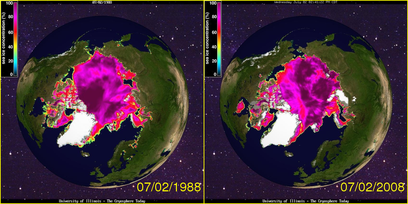
The arrow points to Cumberland Sound. I will not dispute Mr. Byers personal observations, except to say that whatever condition it is in today, there seems to have been even less ice there 20 years ago.
To be fair, sea ice extent in the Arctic is down about a million square kilometers today vs. where it was decades ago (though I struggle to see it in these maps), while the Antarctic is up about a million, so the net world anomaly is about zero right now.
I wonder if anybody would be interested in a couple of messages I sent to family and friends earlier today (before I had seen this article).
quote 1 Subject: Correction [about the fact that the snow is not yet cleared in places–Glacier Park in this case, I had thought the article said Yellowstone]
I told somebody this had happened in Yellowstone….
http://newsbusters.org/blogs/noel-sheppard/2008/07/03/global-warming-update-snow-blocks-key-road-montana-park
Tioga and Glacier Point opened in May.
http://www.nps.gov/yose/planyourvisit/tioga.htm
unquote
quote 2 Subject: By the way
If you are of the opinion that things like pass closing dates or pass opening dates proves something, look at the clear pattern here:
http://www.nps.gov/yose/planyourvisit/tiogaopen.htm
unquote
And the arctic being a million sq. miles smaller today says nothing about what caused the shrinkage, i.e natural causes or human.
We also know that the global temperature today is at most a couple of tenths of a degree C different (i.e. not even beyond statistical uncertainty) than it was 20 years ago when Hansen launched the AGW hysteria.
This is a good post on the folly of using anecdotes when arguing climate change. I see people wrecklessly resorting to anecdotes on both sides of the issue.
To be fair, sea ice extent in the Arctic is down about a million square kilometers today…
So does this mean fewer episodes of Ice Road Truckers?
Methinks thou protests too much.
In this case, the phrase “driven home” does not correspond to deriving a conclusion from one point. It is equivalent to saying “for example.”
Of course, the his overall conclusion is pretty silly.
I note your comment that the Northwest Passage has been navigable a number of times in the last century. I am inclined to believe that, but just want to know the references for that claim as I have had an ongoing discussion with a friend to that effect, and would like to point him in that direction.
Seems odd that so many are claiming that for the “first time in recorded history”, the Northwest Passage has become ice-free”, when the extent of the records goes back to all of……1972???
Seems like the records, as usual, are a bit lacking!
What John Moore said. It’s like saying “Environmentalists are getting sillier every day. To give you a sense of what state we’re in already, James Hansen is now equating business owners with war criminals.”
Actually, now that I read it again…
“this was driven home during a trip he took to the Arctic three weeks ago. The thing that was most striking was how the speed of climate change is accelerating.”
It’s clear he’s saying that he observed things during his trip that he considered evidence of accelerating climate change. So even if the single example was not the totality of his evidence, it’s still a mighty small set of data points.
The St Roch, a wooden sailing schooner (with auxillary engine) navigated NWP in 1942 from west to east (Vancouver BC to Halifax NS) and returned in 1944. Amundsen did it 38 years earlier. St Roch is a little ship, just over 100ft long. Too big to portage and certainly not an ice-breaker. So the passage must have been ice-free enough to permit her to pass. See wikipedia at:
http://en.wikipedia.org/wiki/St._Roch.
I believe Shell oil navigated a tanker through there around 1965 as an experiment.
btw. Cumberland Sound is at only at 65N. It is completely unremarkable that it was ice free even early in the summer. Davis straight is right next door and over 600,000 tons of wheat pass that way annually from Churchill going to ports all over the world. The port is navigable from late May through early September with open water all the way through Davis Strait into Hudsons Bay. There is persistent pan ice and growlers that create navigation hazards but the seaway is navigable (with due care) by ordinary ships operating at their normal speeds.
What is the big surprise that the ice moves around and isn’t where the observers say it should be?
Regards
Paul Thomas
Doug Lofland,
I posted this at my forum just last week.
Here is the direct source that I got it from:
http://tomnelson.blogspot.com/2008/04/more-on-northwest-passage.html
I posted the following at the McIntyre and Marohasy websites:
The English link to information about the model is below, and you may find it interesting.
ALFRED-WEGENER-INSTITUTE in Germany says Arctic sea ice very likely will not reach last year’s level.
http://www.awi.de/de/aktuelles_und_presse/pressemitteilungen/detail/item/sea_ice_extend/
Some of the highlights in English:
1. There’s almost a 100% chance the Arctic Ocean will have less ice than it did in 2005, the year with the 2nd lowest recorded ice amount.
2. The chances that the Arctic sea ice will reach last year’s record levels are only about 8%.
3. Exact predictions are not possible because short-term variations in ice extent depend greatly on atmospheric conditions, especially wind, cloud cover and air temperature.
4.To make this year’s estimate, Dr. Rüdiger Gerdes and his team have used atmospheric data from the last 20 years and fed them into an Alfred-Wegener-Institut developed Ocean Sea Ice MODEL.
About the MODEL – in English:
http://www.awi.de/de/forschung/fachbereiche/klimawissenschaften/arctic_sea_ice_in_summer_2008_an_outlook/
The Cryosphere photos do not show a key point. The area with multi-year, thick sea ice has dropped greatly since the 1980s. If the north pole does melt out this year, it will be because the pack ice over it now is just 6 months old and thin, only 1 meter thick.
“The area with multi-year, thick sea ice has dropped greatly since the 1980s.”
Do you have a cite for that? Because it sounds like a warmist epicycle to me.
dreamin,
You could start with ClimateAudit, who have a post on this subject up at the top of the page at the moment.
A quick glance at the Cryosphere Today graphs indicates that the North pole ice area ‘normally’ varies between 15m sq km in March down to 5m sq km in September. (Last year it went from a high of 13.5m sq km to 3m sq km.) So it would appear that you normally only get 30% of the ice surviving, and 70% of the ice is new every year anyway. This year the peak was about 14m sq km, but this time only 15% of that is old ice instead of 30%. There’s a difference of about 2m sq km, and if you take McIntyre’s figures and suppose 75%-30% = 45% more of that is going to melt, you can expect an additional 1m sq km of melt because of the ice’s age, relative to the long term average.
But if you put proper error bars on that, the number is probably worthless.
“every city on average should set a new 100-year high temperature record every 100 days”
Actually, a city should see its 100-year high temps broken more frequently than every 100 days.
In any given year, the probability of not breaking a 100-year record is 1-(1/100) or 0.99. So the probability of not breaking a 100-year record in any given n-year period is 0.99**n.
We should expect those 100-year records to be broken about every 69 years because 0.99**69 is 0.4998–less than one half.
Of course, this only strengthens Climate-Skeptic’s point.
In 1944, the RCMPV “St Roch” sailed from Halifax to Vancouver, via the NWP, in some 86 days. It would indicate that the Passage chosen was ice-free tha summer.
The oil tanker which attempted the NWP was the SS Manhatten. However both her trips were made with the assistance of Canadian Coast Guard icebreakers.
Cheers
To be fair, sea ice extent in the Arctic is down about a million square kilometers today vs. where it was decades ago (though I struggle to see it in these maps)
It’s difficult to see because a lot of the color spectrum is shades of purple and blue, so visually it all blurs together. Also, you have arbitrarily picked two points in time for comparison, so you can’t see any larger trends at work.
This is a better picture from the same site.
while the Antarctic is up about a million, so the net world anomaly is about zero right now.
Do you have a source for the Antarctic having gained ice?
Tim,
“Do you have a source for the Antarctic having gained ice?”
See the bottom of the Cryosphere Today front page.
Tim Herzog,
Here is Cyrosphere’s graph on Antarctic’s ice area:
http://arctic.atmos.uiuc.edu/cryosphere/IMAGES/current.365.south.jpg
Of course, there is a wealth of graphs available at
http://arctic.atmos.uiuc.edu/cryosphere/IMAGES/
Although individuals at Cyrosphere tend to be a bit more accepting of AGW fears than skeptical, their data since 1979 are well accepted by both Skeptics and pro-AGW adherents. (I do recognize that some Cyrosphere’s revisions have raised a few eyebrows by those who monitor Cyrosphere’s output closely.)
Neverthless, I believe one can be skeptical of the 1900 to 2007 graph that you posted from them for several reasons. First, there was no legitimate / consistant way to monitor ice extent before 1979. Second, the stability from 1900 to 1970 is suspect given PDOs, AMOs, ENSOs, etc. Third (to my knowledge) the methodology to develop pre-1979 estimates is not widely accepted. Fourth, ancedotal observations tend to contradict this graph such as passages through the Northwest Passage and local descriptions of open water — see http://wattsupwiththat.wordpress.com/2008/03/16/you-ask-i-provide-november-2nd-1922-arctic-ocean-getting-warm-seals-vanish-and-icebergs-melt/
Steveo: thanks for your points.
Granting for a second all of your point (I’m not a climatologist or an expert on this data set): it seems like they are really all the same point, that the data pre-1979 may be suspect, or at least not as good as that point on.
The graph from 1980 on still shows a consistent downward trend, most pronounced in spring and summer, but also in the annual, and certainly since 1995.
Tim Herzog:
Yes, there is a downward trend in the last two or three decades, and one would expect this downward trend with positive phases of the PDO and AMO. It would not be surprising that ice was also low in the past when PDO and AMO were in positive phases. In addition to PDO & AMO, Arctic ice has to deal with soot and perhaps underwater volcanic activities in the last couple of decades. Some observers also contend that increasing invasion of brush on the arctic tundra has reduce the albedo effect. Note that all these factors tend to reduce the ice area without any impact from increasing CO2 levels.
David, Climate-Skeptic is right when he says: “every city on average should set a new 100-year high temperature record every 100 days”
You are correct when you calculate that the 50% probability of breaking the record is reached in 69 days, but this is only the same as the mean time if the probability mass function is symmetrical – which it is clearly not in this case. This is a binomial calculation: so the expected mean of 100 observations = np = 100*.01=1. (If we want to get more technical, we would need to adjust for autocorrellation as a binomial distribution requires independent events while daily temperatures are path dependent)