Eleven Inacuracies

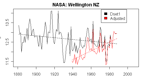
A British Court, in response to a lawsuit aimed at blocking the showing of an Inconvinient Truth in British schools because it constituted political propoganda rather than good science, found 11 inacuracies in the film that the court said made the film of questionable educational value.  I could name a few others, but this is not a bad list:

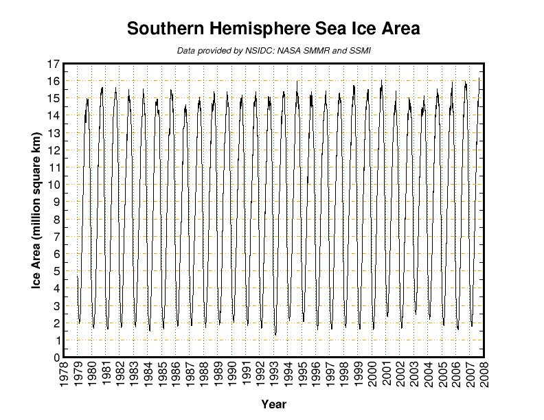
  • he film claims that melting snows on Mount Kilimanjaro evidence global warming. The Government’s expert was forced to concede that this is not correct.
  • The film suggests that evidence from ice cores proves that rising CO2 causes temperature increases over 650,000 years. The Court found that the film was misleading: over that period the rises in CO2 lagged behind the temperature rises by 800-2000 years.
  • The film uses emotive images of Hurricane Katrina and suggests that this has been caused by global warming. The Government’s expert had to accept that it was "not possible" to attribute one-off events to global warming.
  • The film shows the drying up of Lake Chad and claims that this was caused by global warming. The Government’s expert had to accept that this was not the case.
  • The film claims that a study showed that polar bears had drowned due to disappearing arctic ice. It turned out that Mr Gore had misread the study: in fact four polar bears drowned and this was because of a particularly violent storm.
  • The film threatens that global warming could stop the Gulf Stream throwing Europe into an ice age: the Claimant’s evidence was that this was a scientific impossibility.
  • The film blames global warming for species losses including coral reef bleaching. The Government could not find any evidence to support this claim.
  • The film suggests that the Greenland ice covering could melt causing sea levels to rise dangerously. The evidence is that Greenland will not melt for millennia.
  • The film suggests that the Antarctic ice covering is melting, the evidence was that it is in fact increasing.
  • The film suggests that sea levels could rise by 7m causing the displacement of millions of people. In fact the evidence is that sea levels are expected to rise by about 40cm over the next hundred years and that there is no such threat of massive migration.
  • The film claims that rising sea levels has caused the evacuation of certain Pacific islands to New Zealand. The Government are unable to substantiate this and the Court observed that this appears to be a false claim.
  • Trillions of Dollars, Tenths of a Degree

    One of my frustrations in arguing that anthropogenic global warming forecasts are exaggerated is that people usually respond, "well, we should do something anyway just in case."  As if the cost of abatement were nearly free.  But the one thing we know is that any meaningul abatement of CO2 production will be extraordinarily costly to the world economy, and will have real and predicatable impacts on poverty and development. 

    We are perhaps fooled by past efforts at reducing pollution, where we have greatly improved air and water quality when we wanted to.  The elimination of SO2 pollution is one example.  But the difference is that these ancillary pollutants were not fundamental to the combustion process.  Hydrocarbons + O2 ==> CO2 + H2O.   Key pollutants we have fought in the past — ozone, SO2, NO2 — are not core to the combustion process.  They can be managed through cleaner fuels, some filtering, and better control of the combustion process itself.  CO2 is different.  There is no practical way to filter it cheaply.  The only real way to eliminate it is not to burn hyrdrocarbons.

    As a result, small improvements in CO2 levels require enormous investments:

    Last July, this column reported that the latest global warming bill — the Low Carbon Economy Act of 2007, introduced by Sens. Jeff Bingaman, D-N.M. and Arlen Specter, R-Pa. — would cost taxpayers more than $1 trillion in its first 10 years and untold trillions of dollars in subsequent decades.

    This week, the EPA sent its analysis of the bill’s impact on climate to Bingaman and Specter. Now we can see what we’d get for our money, and we may as well just build a giant bonfire with the cash and enjoy toasting marshmallows over it.

    For reference purposes, the current level of carbon dioxide in the atmosphere is about 380 parts per million. The EPA estimates that if no action is taken to curb CO2 emissions, the atmospheric concentration of CO2 would be 718 ppm by 2095.

    If the Bingaman-Specter bill were implemented, however, the EPA estimates that CO2 levels would be 695 ppm — a whopping reduction of 23 ppm….

    Although the EPA didn’t pursue its analysis that far, figuring out the implications are readily doable using the assumptions and formulas of the United Nations’ Intergovernmental Panel on Climate Change. Under the no-action scenario (718-to-695 ppm), the IPCC formulas indicate that the multitrillion-dollar Bingaman-Specter bill might reduce average global temperature by 0.13 degrees Celsius.

    Under the maximum regulation scenario (514-to-491 ppm), Bingaman-Specter might reduce average global temperature by 0.18 degrees Celsius. Actual temperature reductions are likely to be less since these estimates rely on the IPCC’s alarmist-friendly assumptions and formulas.

    By the way, the figure of 718ppm by 2095 is wildly overstated.  CO2 increased about 90ppm in the last 120 years, and it take wildly aggresive forecats to have it increase by 340ppm in the next 75-80 years.  More on that topic here.

    Wind Patterns May Be Responsible for Arctic Sea Ice Loss

    From the NASA webs site, with a hat tip to the Reference Frame:

    A new NASA-led study found a 23-percent loss in the extent of the Arctic’s thick, year-round sea ice cover during the past two winters. This drastic reduction of perennial winter sea ice is the primary cause of this summer’s fastest-ever sea ice retreat on record and subsequent smallest-ever extent of total Arctic coverage. …

    Nghiem said the rapid decline in winter perennial ice the past two years was caused by unusual winds. "Unusual atmospheric conditions set up wind patterns that compressed the sea ice, loaded it into the Transpolar Drift Stream and then sped its flow out of the Arctic," he said. When that sea ice reached lower latitudes, it rapidly melted in the warmer waters.

    "The winds causing this trend in ice reduction were set up by an unusual pattern of atmospheric pressure that began at the beginning of this century," Nghiem said.

    The Arctic Ocean’s shift from perennial to seasonal ice is preconditioning the sea ice cover there for more efficient melting and further ice reductions each summer. The shift to seasonal ice decreases the reflectivity of Earth’s surface and allows more solar energy to be absorbed in the ice-ocean system.

    Climate is complicated, so there may still be more to the phenomenon than we understand today, but certainly this is a more satisfying answer the "global warming" since Antarctic sea ice was hitting a 30 year high at the same time Arctic ice was at a 30-year low.

    One of my favorite topics in climate discussion is "what is normal?"  We have observed climate really intensely for maybe 30 years, and with any kind of reliable measurements for no more than about a hundred years.  So given that climate moves in hundred thousand and million year cycles, how can we be sure our reference point, given 30 years of observation, is really "normal."  One funny aspect of this is how often the headline has been flashed over the last few weeks that Arctic ice is at an "all-time" low.  Really?  You mean the lowest it has been in the 6 billion year history of earth?  Well, no, just the lowest since 1979 when we started measuring by sattelite.  (For those without a calculator, "since 1979" is really only 0.0000005% of "all-time.")

    Update:  Anthony Watt has much more

    Are Pirates Behind Global Warming?

    The LA Times had a great article on correlations and causations:

    AGITTARIANS are 38% more likely to break a leg than people of other star signs — and Leos are 15% more likely to suffer from internal bleeding. So says a 2006 Canadian study that looked at the reasons residents of Ontario province had unplanned stays in the hospital.

    Leos, Sagittarians: There’s no need to worry. Even the study’s authors don’t believe their results.

    They’re illustrating a point — that a scientific approach used in many human studies often leads to findings that are flat-out wrong.

    Such studies make headlines every day, and often, as the public knows too well, they contradict each other. One week we may hear that pets are good for your health, the next week that they aren’t. One month, cellphone use causes brain cancer; the next month, it doesn’t.

    “It’s the cure of the week or the killer of the week, the danger of the week,” says Dr. Barry Kramer, associate director for disease prevention at the National Institutes of Health in Bethesda, Md. It’s like treating people to an endless regimen of whiplash, he says.

    Take the case of just one item: coffee. Drinking two or three cups per day can triple the risk of pancreatic cancer, according to a 1981 study. Not so, concluded a larger follow-up study published in 2001.

    Coffee reduces the risk of colorectal cancer, found a 1998 study. Not so, according to one published later, in 2005.

    “I’ve seen so many contradictory studies with coffee that I’ve come to ignore them all,” says Donald Berry, chair of the department of biostatistics at the University of Texas MD Anderson Cancer Center in Houston.

    I wrote about some similar examples in my guide to global warming, in the chapter on the dangers of modelling based on past regression data:

    How is it possible that a model that accurately represents the past fails to accurately predict the future?  Financial modelers, like climate modelers, look to history in building their models.  Again, like climate modelers, they rely both on theory (e.g. higher interest rates should generally mean lower stock prices) as well as observed correlations in the historic data set.  The problem they meet, the problem that every modeler meets but most especially the climate modeler, is that while it is easy to use various analysis tools to find correlations in the data, there is often nothing that will tell you if there is really a causal relationship, and which way the causality runs. For example, one might observe that interest rates and exchange rates move together.  Are interest rate changes leading to exchange rate adjustments, or vice versa?  Or, in fact, are they both caused by a third variable?  Or is their observed correlation merely coincidence?

    It was once observed that if an old AFL football team wins the Superbowl, a bear market will ensue on Wall Street in the next year, while an NFL team victory presaged a bull market.  As of 1997, this correlation held for 28 of the last 31 years, a far better prediction record than that of any Wall Street analyst.  But of course this correlation was spurious, and in the next 4 years it was wrong every time.  Had someone built a financial model on this indicator, it would have looked great when he ran it against history, but he would have lost his shirt using it. 

    Want a better prediction record?  For seventeen straight US presidential election cycles, from 1936 to 2000, the winner of the election was accurately predicted by…the Washington Redskins.  In particular, if the Redskins won their last home game before the election, the party that occupies the White House holds it in the election.  Otherwise, if the Redskins lose, the opposition party wins.  Seventeen in a row!  R-squared of one!  Success against odds of 131,072:1 of guessing all 17 right. But of course, the input was spurious, and in 2004, soon after this relationship made the rounds of the Internet, the algorithm failed.

    Note that the historic relationship between football and elections is much stronger than the historic relationship between global warming and CO2.  In the last 12 decades, CO2 levels and temepratures have only moved in the same direction in half the decades. 

    Finally, as promised in the title of this post, here is the stunning relationship between global warming and the number of pirates in the world, via the Conspiracy to Keep You Poor and Stupid:

    200760920pirate

    Don’t Confuse Children with Facts

    In other posts, I have discussed the 800-year lag between temperature and CO2 in the ice core histories.  For those not aware of the issue, ice core data, like that shown by Al Gore in An Inconvinient Truth, initially showed a very strong and compelling correlation between CO2 and temperature.  Not only did CO2 look like a driver of climate, it looked like the driver.  But Gore is very careful how he presents this chart in his movie (one of his Really Big Charts).  The reason is that by the time of the movie, better instrumentation and lab procedure had shown that temperature increases in the ice core data actually preceeded CO2 increases by 800 or more years.  CO2 was being increased by heating of the oceans and outgassing of CO2 from them, not the other way around.

    The Science and Public Policy Institute has found a pretty glaring fabrication in Laurie David’s global warming propoganda book for kids.  The book shows kids this graph:

    Graph1

    Pretty compelling.  Every 75,000 years or so there is a CO2 spike, followed by a temperature spike.  But the SPPI folks found something interesting by going back to the original source:  Laurie David has reversed the legend.  They have called the red line CO2, when in fact it is temperature, and vice versa, reversing the causality back the way she apparently wants it.

    Graph2

    SPPI goes back to David’s source just to make sure, and yes, the original study behind the chart confirms that temeprature rises before CO2.

    On page 103 of their book, David and Gordon cite the work of Siegenthaler et al. (2005), for their written and graphical contention that temperature lags CO2. However, Siegenthaler et al. clearly state the opposite:

    “The lags of CO2 with respect to the Antarctic temperature over glacial terminations V to VII are 800, 1600, and 2800 years, respectively, which are consistent with earlier observations during the last four glacial cycles.”

    (Siegenthaler et al., 2005, Science, vol. 310, 1313-1317)

    Oops.  Are lies OK if they are "for the children?"

    It Has To Be Man’s Fault. We’re Just Not Sure How

    No, I am not going to get into ozone depletion theory.  While the science of anthropogenic ozone depletion has some uncertainties, the costs of abatement are radically lower, by order of magnitude, than for CO2-caused warming.  This changes the cost-benefit ration of action radically, resulting in it making more sense to take action on CFC’s "on the come" or "just in case" than is the case for CO2.

    However, I just could not resist the last paragraph below from Nature, via Hit and Run (emphasis added):

    The rapid photolysis of Cl2O2 is a key reaction in the chemical model of ozone destruction developed 20 years ago2 (see graphic). If the rate is substantially lower than previously thought, then it would not be possible to create enough aggressive chlorine radicals to explain the observed ozone losses at high latitudes, says Rex. The extent of the discrepancy became apparent only when he incorporated the new photolysis rate into a chemical model of ozone depletion. The result was a shock: at least 60% of ozone destruction at the poles seems to be due to an unknown mechanism, Rex told a meeting of stratosphere researchers in Bremen, Germany, last week….

    Nothing currently suggests that the role of CFCs must be called into question, Rex stresses. "Overwhelming evidence still suggests that anthropogenic emissions of CFCs and halons are the reason for the ozone loss. But we would be on much firmer ground if we could write down the correct chemical reactions."

    Exxon Was Only Offering $10,000

    Recently, Newsweek staked out the position that a) Much of global warming skepticism is tainted because Exxon was paying $10,000 honarariums for skeptical articles and b) James Hansen is a man we can all trust and is above reproach and untainted by bias.

    Oops:

    How many people, for instance, know that James Hansen, a man billed as a lonely "NASA whistleblower" standing up to the mighty U.S. government, was really funded by Soros’ Open Society Institute , which gave him "legal and media advice"?

    That’s right, Hansen was packaged for the media by Soros’ flagship "philanthropy," by as much as $720,000, most likely under the OSI’s "politicization of science" program.

    That may have meant that Hansen had media flacks help him get on the evening news to push his agenda and lawyers pressuring officials to let him spout his supposedly "censored" spiel for weeks in the name of advancing the global warming agenda.

    Hansen even succeeded, with public pressure from his nightly news performances, in forcing NASA to change its media policies to his advantage. Had Hansen’s OSI-funding been known, the public might have viewed the whole production differently. The outcome could have been different.

    Look, I don’t really care if Hansen took private money freely given to espouse his global warming opinions.  However, I am tired of skeptics taking media pot-shots for being "tainted" and "biased" for being funded at levels that are orders of magnitude lower than are climate catastrophists.  As I pointed out in the post linked above, James Hansen, Al Gore & Co. are to skeptics in terms of funding as is Hillary Clinton is to Mike Gravel in campaign contributions.  Never before can I remember the side getting outspent 1000:1 being the one targeted for being tainted by money.  Maybe we can stop and put real scientific scrutiny on James Hansen’s work.

    Duh

    From Megan McArdle:

    Matt may be right that I haven’t harangued people about climate change recently, so here goes: dude, if you’re still a climate change skeptic, it’s time for a rethink. When the science correspondent for Reason magazine comes over to the reality of anthropogenic global warming, it’s safe to say that the skeptics have lost the debate. Not only the vast majority of the scientific community, but even most of the hard-core skeptics at conservative magazines, have abandonned the hope that we are not warming up the climate.

    There’s still debate about the effects of the warming, and what we should do about it. But there’s not much question that it’s happening.

    Duh.  The vision of the skeptic community denying that the world is warming at all is a straw man created by the climate catastrophists to avoid arguing about the much more important point in her second paragraph.  What I can’t understand is McArdle’s, and many intelligent people I meet, seeming unintrest in the degree of man-made impact.

    The chief debate really boils down to those of us who think that climate sensitivity to CO2 is closer to 1C (ie the degrees the world will warm with a doubling of CO2 concentrations from pre-industrial levels) and those who think that the sensitivity is 3-5C or more.  The lower sensitivity implies a warming over the next century of about a half degree C, or about what we saw in the last century.  The higher numbers represesent an order of magnitude more warming in the next century.  The lower numbers imply a sea level rise measured in inches.  The higher numbers imply a rise of 1-2 feet  (No one really know where Al Gore gets his 20 foot prediction in his movie).  The lower numbers we might not even notice.  The higher numbers will certainly cause problems.

    The other debate is whether the cost of CO2 abatement should even be considered.  I have talked to many people who say the costs are irrelevent – Gaia must come first.  But steps to make any kind of dent in CO2 production with current technologies will have a staggering impact on the world economy.  For example, there are a billion Asians poised to finally to enter the middle class who we will likely consign back to poverty with an aggresive CO2 reduction program.  With such staggering abatement costs, it matters how bad the effects of man-made global warming will be. 

    There are many reasons a 1.0 climate sensivity is far more defensible than the higher sensitivities used by catastrophists.  My argument a lower climate sensitivity and therefore a less aggresive posture on CO2 is here.  Cross-posted at Coyote Blog.

    Update: Sure, we skeptics debate the degree of past warming, but it really can’t be denied the earth is warmer than 100 years ago.  The problem catastrophists have with defending their higher climate sensitivities is that these sensitivities imply that we should have seen much more warming over the past 100 years, as much as 1.5C or more instead of about 0.6C.  These scientists have a tendency to try to restate historical numbers to back their future forecast accuracy.  We skeptics fight them on this, but it does not mean we are trying to deny warming at all, just make sure the science is good as to the magnitude.

    One other thought – everyone should keep two words in mind vis a vis CO2 and its effect on temperature:  Diminishing Return.  Each new molecule of CO2 has less impact on temperature than the last one.  Only by positing a lot of weird, unlikely, and unstable positive feedbacks in the climate can scientists reach these higher sensitivity numbers (more here).  A good economist would laugh if they understood the assumptions that were being made in the catastrophic forecasts that are being used to influence government action.

    Is James Hansen the Largest Source of Global Warming?

    On this blog and at Coyote Blog, we have focused a lot of attention on the adjustment processes used by NOAA and James Hansen of NASA’s GISS to "correct" historical temperatures.  Steve McIntyre has unearthed what looks like a simply absurd example of the lenghts Hansen and the GISS will go to tease a warming signal out of data that does not contain it. 

    Wellin56b

    The white line is the measured temperatures in Wellington, New Zealand before Hansen’s team got hold of the data.  The red is the data that is used in the world-wide global warming numbers after Hansen had finished adjusting it.  The original flat to downward trend is entirely consistent with sattelite temeprature measurement that shows the southern hemisphere not to be warming very much or at all.

    What do these adjustments imply?  Well, Hansen has clearly reduced temperatures down in the forties while keeping them about the same in 1980.  Why?  Well, the only possible reason would be if there was some kind of warming bias in 1940 in Wellington that did not exist in 1980.  It implies that things like urban effects, heat retention by asphalt, and heat sources like cars and air conditioners were all more prevelent in 1940 New Zealand than in 1980.  However, unless Wellington has gone through some back to nature movement I have not heard about, this is absurd.  Nearly without exception, if measurement points experience changing biases in our modern world, it is upwards over time with urbanization, not downwards as implied in this chart.

    Postscript:  A perceptive reader might ask whether Hansen perhaps has specific information about this measurement point.  Maybe its siting has improved over time?  However, Hansen has to date absolutely rejected the effort made by folks like surfacestations.org to document specific biases in measurement sites via individual site surveys.  Hansen is in fact proud that he makes his adjustments knowing nothing about the sites in question, but only using statistical methods (of very dubious quality) to correct using other local measurement sites. 

    No Warming in Antarctica

    Last week we saw how Antarctic ice is advancing, but somehow this never makes the news despite huge coverage of Arctic ice retreats.

    One good reason for this may well be that there has been no measured warming in Antarctica over the last 50 years.

    Antarc33b

    Steve McIntyre summarizes

    As I’ve discussed elsewhere (and readers have observed), IPCC AR4 has some glossy figures showing the wonders of GCMs for 6 continents, which sounds impressive until you wonder – well, wait a minute, isn’t Antarctica a continent too? And, given the theory of “polar amplification”, it should really be the first place that one looks for confirmation that the GCMs are doing a good job. Unfortunately IPCC AR4 didn’t include Antarctica in their graphics. I’m sure that it was only because they only had 2000 or so pages available to them and there wasn’t enough space for this information.

    We’re All Saved! State Treasurers Are on the Case

    Thank God, we are now going to all be safe from global warming.  From a speech to the National Association of State Treasurers:

    Continued leadership from state treasurers on global warming will be essential to ensure that we address the scale and urgency of climate risk—and capture the vast economic possibilities that lie ahead as the world transitions to a clean energy future.

    Translation:  Expect global warming to be used an the new excuse to raise taxes. 

    Actually, the speaker is referring to an action by the NY Attorney General demanding certain companies put disclosures in their investment materials about the future economic harms from global warming.

    Temperature Measurement Integrity

    If you aren’t worried about the integrity of historical temperature data under the care of folks like James Hansen, then you will be after reading this at Climate Audit.

    Since August 1, 2007, NASA has had 3 substantially different online versions of their 1221 USHCN stations (1221 in total.) The third and most recent version was slipped in without any announcement or notice in the last few days – subsequent to their code being placed online on Sept 7, 2007. (I can vouch for this as I completed a scrape of the dset=1 dataset in the early afternoon of Sept 7.)

    We’ve been following the progress of the Detroit Lakes MN station and it’s instructive to follow the ups and downs of its history through these spasms. One is used to unpredictability in futures markets (I worked in the copper business in the 1970s and learned their vagaries first hand). But it’s quite unexpected to see similar volatility in the temperature “pasts”.

    For example, the Oct 1931 value (GISS dset0 and dset1 – both are equal) for Detroit Lakes began August 2007 at 8.2 deg C; there was a short bull market in August with an increase to 9.1 deg C for a few weeks, but its value was hit by the September bear market and is now only 8.5 deg C. The Nov 1931 temperature went up by 0.8 deg (from -0.9 deg C to -0.1 deg C) in the August bull market, but went back down the full amount of 0.8 deg in the September bear market. December 1931 went up a full 1.0 deg C in the August bull market (from -7.6 deg C to -6.6 deg C) and has held onto its gains much better in the September bear market, falling back only 0.1 deg C -6.7 deg C.

    Note the volatility of historic temperature numbers.  Always with a steady bias – recent temepratures are adjusted up, older temperatures are adjusted down, giving a net result of more warming.  By the way, think about what these adjustments mean — adjusting recent temperatures down means that our growing urban society and hot cities are somehow introducing a recent cooling bias in measurement.  And adjusting older temepratures down means that in the more rural society of 50 years ago we had more warming biases than we have today.  Huh?

    Court Throws Out California Global Warming Suit

    Via Q&O:

    A federal judge on Monday tossed out a lawsuit filed by California that sought to hold the world’s six largest automakers accountable for their contribution to global warming. District Judge Martin Jenkins in San Francisco handed California Attorney General Jerry Brown’s environmental crusade a stinging rebuke when he ruled that it was impossible to determine to what extent automakers are responsible for global-warming damages in California. The judge also ruled that keeping the lawsuit alive would threaten the country’s foreign policy position.

    I would also add that it is impossible to determine how much CO2 has affected warming, or what weather effects might be the result of such warming or just from normal variation.  Further, while areas like the Arctic are clearly warming, it is not at all clear that the US has experienced much warming in the last century.

    Less than Meets the Eye in Peer-Reviewed Studies

    This comes out of the medical field but sounds about right for climate (WSJ$, emphasis added)

    Dr. Ioannidis is an epidemiologist who studies research methods at the University of Ioannina School of Medicine in Greece and Tufts University in Medford, Mass. In a series of influential analytical reports, he has documented how, in thousands of peer-reviewed research papers published every year, there may be so much less than meets the eye.

    These flawed findings, for the most part, stem not from fraud or formal misconduct, but from more mundane misbehavior: miscalculation, poor study design or self-serving data analysis. "There is an increasing concern that in modern research, false findings may be the majority or even the vast majority of published research claims," Dr. Ioannidis said. "A new claim about a research finding is more likely to be false than true."

    The hotter the field of research the more likely its published findings should be viewed skeptically, he determined….

    Statistically speaking, science suffers from an excess of significance. Overeager researchers often tinker too much with the statistical variables of their analysis to coax any meaningful insight from their data sets. "People are messing around with the data to find anything that seems significant, to show they have found something that is new and unusual," Dr. Ioannidis said.

    Reciting the Litturgy

    In a number of past posts over at Coyote Blog, I have noticed the phenomenon of published studies whose data does nothing to bolster the theory of anthropogenic global warming adding in a line or two in the article saying that "of course the author’s support anthorpogenic global warming theory" in the same way movies routinely assure audiences that "no animals were hurt in the filiming of this movie."

    Here is one example:  If you have seen An Inconvinient Truth, then you may remember a Really Big Chart shown by Gore with 650,000 years of temperature history.  In case you missed it, here is the data, derived from ice cores:

    The red line is CO2 concentrations, while the black line is a proxy for temperatures.  When it first came out, it was compelling evidence that CO2 was not only a major driver of temperature, it may be the main driver.  However, followup work showed that when you zoom in on the scale, the temperature in each spike starts rising 800 years before the CO2 rises, implying instead that temperature is driving CO2 (via outgassing from oceans) rather than the other way around.  Many call this problem the 800-year lag.  Anyway, the scientists who discovered this 800-year lag felt compelled to add this line to their publication.  They said the team

    … is still in full agreement with the idea that CO2 plays, through its greenhouse effect, a key role in amplifying the initial orbital forcing …

    You can just see the fear.  Please, don’t take our climate funding away.  We didn’t mean to find this evidence.  We’re sorry.  We’re still believers.  Another example here.

    Anyway, this week Steven Milloy has an even more stark example:

    Veizer reluctantly told me the "text" of the Nature study, that is, the above-quoted conclusion, represented a "compromise" between the study’s disagreeing authors where Veizer’s side apparently did all the compromising for reasons that had little to do with the science.

    While Veizer didn’t want to elaborate on the politics of the Nature study, he told me "not to take the tone of the paper as the definitive last word."…

    There’s another point worth spotlighting in all this. It seems that the politics of global warming including the multibillion-dollar-funding of global warming research resulted in the publication in a prestigious science journal of a "compromise" conclusion that is not supported by the study’s own data.

    "Science should never be adjusted to fit policy," was the reprimand the U.S. Environmental Protection Agency received from its own Science Advisory Board in 1992. But that’s exactly what seems to be happening to climate science. It’s a situation reminiscent of George Orwell’s "1984," in which Ministry of Truth worker Winston Smith wonders if the State could get away with declaring that "two and two made five."

    Who’s wondering now? A recent series of reports from the Science and Public Policy Institute spotlights problems with the peer review process of the United Nations Intergovernmental Panel on Climate Change (IPCC) and efforts to create the illusion of scientific consensus on global warming.

    Grading US Temperature Measurement Sites

    Anthony Watts has initiated a nationwide effort to photo-document the climate stations in the US Historical Climate Network (USHCN).  His database of documented sites continues to build at SurfaceStations.org.  Some of my experiences contributing to his effort are here and here.

    Using criteria and a scoring system devised years ago based on the design specs of the USHCN and use in practice in France, he has scored the documented stations as follows, with 1 being a high-conforming site and 5 being a site with many local biaes and issues.  (Full criterea here)

    Crnrating

    Note that category 3-5 stations can be expected to exhibit errors from 1-5 degrees C, which is huge both because these stations make up 85% of the stations surveyed to date and because this error is so much greater than the "signal."  The signal we are trying to use the USHCN to detect is global warming, which over the last century is currently thought to be about 0.6C.  This means that the potential error may be 2-8 times larger than the signal.  And don’t expect these errors to cancel out.  Because of the nature of these measurement problems and biases, almost all of these errors tend to be in the same direction – biasing temperatures higher – creating a systematic error that does not cancel out.  Also note that though this may look bad, this situation is probably far better than the temperature measurement in the rest of the world, so things will only get worse when Anthony inevitably turns his attention overseas.

    Yes, scientists try to correct for these errors, but so far they have done so statistically without actually inspecting the individual installations.  And Steve McIntyre is doing a lot of work right now demonstrating just how haphazard these measurement correction currently are, though there is some recent hope that things may improve.

    Antarctic Sea Ice at Record High

    It is almost impossible to avoid stories about Arctic sea at the lowest recorded level.  The National Geographic, who should know better, had the temerity to headline "Arctic Ice at All-Time Low".  All-time?  Really?  In the 6 billion year history of the earth, this is the least ice ever in the Arctic?  Well, no, it’s the least since we have started measuring it.  So when was that?  Only since about 1979 when we had sattelites that could make this measurement.  OK, so its the least ice in about 25-30 years.

    To a one, scientists and media making this observation about Arctic sea ice use it as a leading indicator of catastrophic global warming.  The National Geographic even suggests it is evidence that we are at a tipping point, or a cusp of rapid acceleration of warming.

    There is little doubt the Arctic has been warming the last 30 years or so, but some doubt whether it is warmer even than the 1940’s.  Be that as it may, last I checked there were two poles with sea ice.  It’s funny no one ever mentions the South Pole.  Do you think that they just forgot?  Or could it be that the facts don’t conviniently fit the storyline?  Luboš Motl picks up the story:

    Some analysts have speculated that the new record could be evidence of global warming. But is it? Even though it may sound very complicated, it turns out that the Earth is round. At the global scale, there is not one polar region but, in fact, two. There is also sea ice on the Southern Hemisphere. It turns out that the Antarctic sea ice area reached 16.2 million squared kilometers in 2007 – a new absolute record high since the measurements started in 1979

    The data is here:

    Currentareasouths

    If you watched An Inconvinient Truth, you will be saying, "this can’t be right."  In that movie, Al Gore and company showed compelling films of melting and warming in Antarctica.  Well, it turns out that most of Antarctica is seeing more snowfall and ice formation and the same or colder temperatures, but one small area, about 2% of the landmass on the Antarctic penninsula, is seeing warming.  Guess which area the movie chose to focus on? 

    Even if the Antarctic were warming, most climate scientists expect snow and ice pack to increase there, not decrease.  Yes, warmer weather melts ice, but Antarctica is so freaking cold a few degrees are no more likely to melt ice than steel is to melt in the Arizona sunshine.  But warmer weather does vaporize more water, which is expected to fall as snowpack in Antarctica.  That is why despite Al Gore’s claims that oceans will rise 20 feet or more, serious scientists don’t expect much more than a foot, even with warming numbers far higher than I think are credible.  That’s because ice melting in Greenland and other glaciers is offset by increasing snow pack in Antarctica  (melting sea ice has no effect on ocean levels, since the ice floats, for the same reason that ice melting in your glass of water will not cause the glass to overflow).

    By the way, since we are talking about retreating ice, here is a picture showing the retreat of the Glaciers at beautiful Glacier Bay, Alaska.Image054

    So most of the retreat of the glaciers occured between 1794 and 1907, which is fairly hard to correlate with man’s use of fossil fuels or global CO2 levels.

    USA Only 2% of Earth’s Surface, But…

    Several weeks ago, NASA was forced to restate downwards recent US temperature numbers due to an error found by Steve McIntyre (and friends).  The restatement reinforced the finding that the US really has not had much warming over the last 100 years.  James Hansen, emporer of the NASA data for whom the rest of us are just "court jesters" dismissed both the restatement and the lack of warming trend in the US as irrelevent because the US only makes up about 2% of the world’s surface. 

    This is a fairly facile statement, and Hansen has to know it.  Three quarters of the earth’s surface is water for which we have no real long term temperature record of any quality.  Large masses like Antarctica, South America, and Africa have very few places where temperature has been measured for any long period of time.  In fact, via Anthony Watts, here is the world map of temperature measurement points that have data for all of the 20th century (of whatever quality):

    Ghcn1900_4

    So the US is irrelevent, is it?  There is some danger in trying to eyeball such things, but I would say that the US is about one-half to one-third of the world’s landmass that has continuous temperature coverage.  I won’t get into this today, but for all the quality issues that have been identified in US measurements (particularly upwards urban biases) these problems are much greater in the rest of the world.

    Further to Hansen’s point that the US does not matter, here is a quote from Hansen last week (emphasis added)

    Another favorite target of those who would raise doubt about the reality of global warming is the lack of quality data from South America and Africa, a legitimate concern. You will note in our maps of temperature change some blotches in South America and Africa, which are probably due to bad data. Our procedure does not throw out data because it looks unrealistic, as that would be subjective. But what is the global significance of these regions of exceptionally poor data? As shown by Figure 1, omission of South America and Africa has only a tiny effect on the global temperature change. Indeed, the difference that omitting these areas makes is to increase the global temperature change by (an entirely insignificant) 0.01C.

    Look at the map!  He is now saying that the US, South America, and Africa are irrelevent to world temperatures.  And with little ocean coverage and almost no coverage in Antarctica before 1960, what are we left with?  What does matter?  How is he weighting his temperature aggregations if none of these matter?  Fortunately, the code is finally in the open, so we may find out.