Surface Temperature Measurement Bias

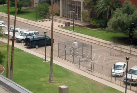
Frequent readers will know that I have argued for a while that substantial biases exist in surface temperature records.  For example, I participated in a number of measurement site photo surveys, and snapped this picture of the measurement station in Tucson that has gotten so much attention:

Tucson1

Global warming catastrophists do not want to admit this bias, because it would undermine their headlines-grabbing forecasts.  In particular, they have spent the last year or two bragging that their climate models must be right because they do such a good job of predicting history.  So what becomes of this argument if it is demonstrated that the "history" to which their models correlate so well is wrong?  (In fact, their models correlate with history only because they are fudged and plugged to do so, as described here).

Ross McKitrick, a Canadian economist, performs a fairly simple and compelling test on recent surface temperature records.  The chief suspected source of bias is from urbanization.  The weather station above has existed in Tucson in one form or another for 100 years.  When it was first in place, it sat in a rural setting near a small town characterized by horses and dirt roads.  Now it sits in an asphalt parking lot near cars and buildings, a block away from a power station, in the center of a town of a half million people.

McKitrick looked at the statistical correlation between economic growth and local temperature records.  What he found was that where there was growth, there was warming;  where there was less growth, there was less warming.  He has demonstrated that the surface temperature warming signal correlates strongly with urbanization and growth:

Our new paper presents a new, larger data set with a more complete set of socioeconomic indicators. We showed that the spatial pattern of warming trends is so tightly correlated with indicators of economic activity that the probability they are unrelated is less than one in 14 trillion. We applied a string of statistical tests to show that the correlation is not a fluke or the result of biased or inconsistent statistical modelling. We showed that the contamination patterns are largest in regions experiencing real economic growth. And we showed that the contamination patterns account for about half the surface warming measured over land since 1980.

The half figure is an interesting one.  For years, it has been known that satellite temperature records, which look at the whole surface of the earth, both land and sea, have been showing only about half the warming as the surface temerpature records.  McKitrick’s work seems to show that the difference may well be in urban contamination of the surface data.

So how has the IPCC reacted to his work?  For years, the IPCC ignored his work and his comments on their reports.  Finally, in the last IPCC report they responded:

McKitrick and Michaels (2004) and [Dutch meteorologists] de Laat and Maurellis (2006) attempted to demonstrate that geographical patterns of warming trends over land are strongly correlated with geographical patterns of industrial and socioeconomic development, implying that urbanization and related land surface changes have caused much of the observed warming. However, the locations of greatest socioeconomic development are also those that have been most warmed by atmospheric circulation changes (Sections 3.2.2.7 and 3.6.4), which exhibit large-scale coherence. Hence, the correlation of warming with industrial and socioeconomic development ceases to be statistically significant. In addition, observed warming has been, and transient greenhouse-induced warming is expected to be, greater over land than over the oceans (Chapter 10), owing to the smaller thermal capacity of the land.

So the IPCC argues that yes, areas of high industrial and socioeconomic development do show more warming, but that is not because of urban biases on measurement but because of "atmospheric circulation changes" that happen to warm these same urban areas.  Now, this is suspicious, since Occam’s Razor would tell us to assume the most obvious result, that urbanization puts upwards bias on temperature readings, rather than on natural circulation patterns that happen to coincide with urban areas. 

But it is more than suspicious.  It is a complete fabrication.  The report, particularly at the cited sections, has nothing about these circulation patterns either showing that they coincide with areas of economic growth or that they tend to preferentially warm these areas.   And does this answer really make any sense anyway?  A recent study in California showed warming in the cities, but not in the rural areas.  Does the IPCC really want to argue that wind patterns are warming just LA and San Francisco but not areas just 100 miles away? 

A Brief Window into How the IPCC Does Science

I thought I had blogged on this topic of seal level measurement previously, but after reading this from Q&O and looking back, I see that I never posted anything.

As a brief background:

Dr. Nils-Axel Mörner is the head of the Paleogeophysics and Geodynamics department at Stockholm University in Sweden. He is past president (1999-2003) of the INQUA Commission on Sea Level Changes and Coastal Evolution, and leader of the Maldives Sea Level Project. Dr. Mörner has been studying the sea level and its effects on coastal areas for some 35 years. He was interviewed by Gregory Murphy on June 6 for EIR

Climate scientists are notoriously touchy about non-climate folks "meddling" in their profession, but they have no such qualms when they venture off into statistics or geology or even astrophysics without much knowlege of what they are doing.  This story is telling, as told by Dr. Mörner:

Another way of looking at what is going on is the tide gauge. Tide gauging is very complicated, because it gives different answers for wherever you are in the world. But we have to rely on geology when we interpret it. So, for example, those people in the IPCC [Intergovernmental Panel on Climate Change], choose Hong Kong, which has six tide gauges, and they choose the record of one, which gives 2.3 mm per year rise of sea level. Every geologist knows that that is a subsiding area. It’s the compaction of sediment; it is the only record which you shouldn’t use. And if that figure is correct, then Holland would not be subsiding, it would be uplifting.

And that is just ridiculous. Not even ignorance could be responsible for a thing like that. So tide gauges, you have to treat very, very carefully. Now, back to satellite altimetry, which shows the water, not just the coasts, but in the whole of the ocean. And you measure it by satellite. From 1992 to 2002, [the graph of the sea level] was a straight line, variability along a straight line, but absolutely no trend whatsoever. We could see those spikes: a very rapid rise, but then in half a year, they fall back again. But absolutely no trend, and to have a sea-level rise, you need a trend.

Then, in 2003, the same data set, which in their [IPCC’s] publications, in their website, was a strai-ght line—suddenly it changed, and showed a very strong line of uplift, 2.3 mm per year, the same as from the tide gauge. And that didn’t look so nice. It looked as though they had recorded something; but they hadn’t recorded anything. It was the original one which they had suddenly twisted up, because they entered a “correction factor,” which they took from the tide gauge. So it was not a measured thing, but a figure introduced from outside. I accused them of this at the Academy of Sciences in Moscow —I said you have introduced factors from outside; it’s not a measurement. It looks like it is measured from the satellite, but you don’t say what really happened. And they ans-wered, that we had to do it, because otherwise we would not have gotten any trend!

That is terrible! As a matter of fact, it is a falsification of the data set. Why? Because they know the answer. And there you come to the point: They “know” the answer; the rest of us, we are searching for the answer. Because we are field geologists; they are computer scientists. So all this talk that sea level is rising, this stems from the computer modeling, not from observations. The observations don’t find it!

Observer Technology Bias in Hurricane Counts

A while back, I demonstrated how apparent increases in tornadoes in the US is entirely attributable to doppler radar and more storm observation points rather than any actual increase in tornadoes.  When one corrects for this measurement change, say by limiting the count only to very large tornadoes that were unlikely to escape detection even with older technology, the tornado count has actually gone down.

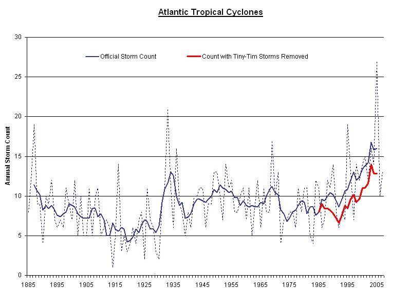
Steve McIntyre points out that the same effect exists for hurricanes.  In the early 1900’s, whole storms could easily be missed if no ship crossed paths with the storm and the storm never made landfall.  Better technology (e.g. satellites) bias current hurricane numbers upwards, but by how much.  In his post, he has a count of named Atlantic storms in just the last 20 years that would likely have escaped detection fifty years ago.  How many were there?

Frankly I was surprised. There are 52 storms on the list.That’s 52 out of the 252 storms in the official record, or 20% of the total. That’s 20% of the modern storms which lack a single classical (ship or shore) report of storm winds. Wow.

The obvious question is: how can one compare these satellite- and aircraft-based storms, which left no ship or shore evidence, with pre-1945 records which were based solely on ship and shore observations?

The result is a significant bias.  Below, he has only removed these 52 storms from the last 20 years.  Others post-WWII but before 1980 would have to be removed.  One can observe that nearly all of the increase in storms in the last half century seems to be due to this measurement bias, and not to, say, global warming:

1130073 click for larger version

Its the Cities, Stupid

New study conducted in California (emphasis added):

We investigated air temperature patterns in California from 1950 to 2000. Statistical analyses were used to test the significance of temperature trends in California subregions in an attempt to clarify the spatial and temporal patterns of the occurrence and intensities of warming. Most regions showed a stronger increase in minimum temperatures than with mean and maximum temperatures. Areas of intensive urbanization showed the largest positive trends, while rural, non-agricultural regions showed the least warming. Strong correlations between temperatures and Pacific sea surface temperatures (SSTs) particularly Pacific Decadal Oscillation (PDO) values, also account for temperature variability throughout the state. The analysis of 331 state weather stations associated a number of factors with temperature trends, including urbanization, population, Pacific oceanic conditions and elevation. Using climatic division mean temperature trends, the state had an average warming of 0.99°C (1.79°F) over the 1950–2000 period, or 0.20°C (0.36°F) decade.

Southern California had the highest rates of warming, while the NE Interior Basins division experienced cooling. Large urban sites showed rates over twice those for the state, for the mean maximum temperatures, and over 5 times the state’s mean rate for the minimum temperatures. In comparison, irrigated cropland sites warmed about 0.13°C [per decade] annually, but near 0.40°C for summer and fall minima. Offshore Pacific SSTs warmed 0.09°C decadefor the study period.

So, warming has occured mainly in the urban areas, while the least developped regions have cooled.  Increase of minimum temperatures rathern than daily maximum’s could be a result of CO2, but is more likely a signature of urban heat islands.  In particular, look at Anthony’s map in the linked article.  Notice the red dots for hotter areas and the cool dots for cooler areas.  The red dots are all on… cities.  The blue dots are all in the countryside.  You make the call — urban heat or greenyhouse effect.

Climate Models Match History Because They are Fudged

When catastrophist climate models were first run against history, they did not even come close to matching.  Over the last several years, after a lot of time under the hood, climate models have been tweaked and forced to match historic warming observations pretty closely.  A prominent catastrophist and climate modeller finally asks the logical question:

One curious aspect of this result is that it is also well known [Houghton et al., 2001] that the same models that agree in simulating the anomaly in surface air temperature differ significantly in their predicted climate sensitivity. The cited range in climate sensitivity from a wide collection of models is usually 1.5 to 4.5 deg C for a doubling of CO2, where most global climate models used for climate change studies vary by at least a factor of two in equilibrium sensitivity.

The question is: if climate models differ by a factor of 2 to 3 in their climate sensitivity, how can they all simulate the global temperature record with a reasonable degree of accuracy. Kerr [2007] and S. E. Schwartz et al. (Quantifying climate change–too rosy a picture?, available at www.nature.com/reports/climatechange, 2007) recently pointed out the importance of understanding the answer to this question. Indeed, Kerr [2007] referred to the present work and the current paper provides the ‘‘widely circulated analysis’’ referred to by Kerr [2007]. This report investigates the most probable explanation for such an agreement. It uses published results from a wide variety of model simulations to understand this apparent paradox between model climate responses for the 20th century, but diverse climate model sensitivity.

One wonders how it took so long for supposedly trained climate scientists right in the middle of the modelling action to ask an obvious question that skeptics have been asking for years (though this particular guy will probably have his climate decoder ring confiscated for brining this up).  The answer seems to be that rather than using observational data, modellers simply make man-made forcing a plug figure, meaning that they set the man-made historic forcing number to whatever number it takes to make the output match history. 

Gee, who would have guessed?  Well, actually, I did, though I guessed the wrong plug figure.  I did, however, guess that one of the key numbers was a plug for all the models to match history so well:

I am willing to make a bet based on my long, long history of modeling (computers, not fashion).  My guess is that the blue band, representing climate without man-made effects, was not based on any real science but was instead a plug.  In other words, they took their models and actual temperatures and then said "what would the climate without man have to look like for our models to be correct."  There are at least four reasons I strongly suspect this to be true:

  1. Every computer modeler in history has tried this trick to make their models of the future seem more credible.  I don’t think the climate guys are immune.
  2. There is no way their models, with our current state of knowledge about the climate, match reality that well. 
  3. The first time they ran their models vs. history, they did not match at all.  This current close match is the result of a bunch of tweaking that has little impact on the model’s predictive ability but forces it to match history better.  For example, early runs had the forecast run right up from the 1940 peak to temperatures way above what we see today.
  4. The blue line totally ignores any of our other understandings about the changing climate, including the changing intensity of the sun.  It is conveniently exactly what is necessary to make the pink line match history.  In fact, against all evidence, note the blue band falls over the century.  This is because the models were pushing the temperature up faster than we have seen it rise historically, so the modelers needed a negative plug to make the numbers look nice.

Here is one other reason I know the models to be wrong:  The climate sensitivities quoted above of 1.5 to 4.5 degrees C are unsupportable by history.  In fact, this analysis shows pretty clearly that 1.2 is about the most one can derive for sensitivity from our past 120 years of experience, and even that makes the unreasonable assumption that all warming for the past century was due to CO2.

Cooler, but with a Worse Environment

As a follow-up to my post on the problems with a cooler but poorer world, let’s look at a likely scenario of a cooler world with a worse environment.

Al Gore is a huge supporter of biofuels, and particularly corn-based ethanol, as a "solution" to global warming.  In fact, Al Gore claims that in addition to inventing the Internet, he "saved" corn-based ethanol (from a pro-ethanol site):

Vice-President Al Gore
Third Annual Farm Journal Conference, December 1, 1998
http://clinton3.nara.gov/WH/EOP/OVP/speeches/farmj.html

"I was also proud to stand up for the ethanol tax exemption when it was under attack in the Congress — at one point, supplying a tie-breaking vote in the Senate to save it. The more we can make this home-grown fuel a successful, widely-used product, the better-off our farmers and our environment will be."

It is good to know that when the economic and environmental toll from our disastrous subsidization of corn ethanol is finally tallied, we will know where to send the bill.  HT: Tom Nelson

And it fact, Al Gore’s ethanol support is putting him in opposition to… leading environmentalists.

Environmentalists are warning against expanding the production of biofuels, noting the proposed solution to global warming is actually causing more harm than it is designed to alleviate. Experts report biodiesel production, in particular, is causing the destruction of virgin rainforests and their rich biodiversity, as well as a sharp rise in greenhouse gas emissions.

Opponents of biofuels read like a Who’s Who of environmental activist groups. The Worldwatch Institute, World Conservation Union, and the global charity Oxfam warn that by directing food staples to the production of transport fuels, biofuels policy is leading to the starvation and further impoverishment of the world’s poor.

On November 15, Greenpeace’s Rainbow Warrior unfurled a large banner reading "Palm Oil Kills Forests and Climate" and blockaded a tanker attempting to leave Indonesia with a cargo full of palm oil. Greenpeace, which warns of an imminent "climate bomb" due to the destruction of rich forests and peat bogs that currently serve as a massive carbon sink, reports groups such as the World Wildlife Fund, Conservation International, and Flora and Fauna International have joined them in calling for an end to the conversion of forests to croplands for the production of biofuels

"The rush to address speculative global warming concerns is once again proving the law of unintended consequences," said James M. Taylor, senior fellow for environment policy at The Heartland Institute. "Biofuels mandates and subsidies are causing the destruction of forests and the development of previously pristine lands in a counterproductive attempt to improve the environment.

"Some of the world’s most effective carbon sinks are being destroyed and long-stored carbon is now being released into the atmosphere in massive quantities, merely to make wealthy Westerners feel like they are ‘doing something’ to address global warming. The reality is, they are making things worse," Taylor noted.

Why Cooler but Poorer is the Wrong Choice

A lot of folks are sitting around in Bali this week trying to figure out how they can sell the rest of us on a cooler but poorer world.  Cooler but poorer is the name I and others put on a world that may be a few tenths of a degree cooler from less CO2, but certainly will be trillions of dollars poorer through expensive government mandates and restrictions on economic growth.

The fact is that small changes in economic growth rates have a much, much greater effect on human well-being than small changes in temperatures:  (HT to Tom Nelson, who is trying to make himself the Glen Reynolds of global warming skepticism.)

Their report suggests that a central plank in the global warming argument – that it will result in a big increase in deaths from weather-related disasters – is undermined by the facts. It shows deaths in such disasters peaked in the 1920s and have been declining ever since.

Average annual deaths from weather-related events in the period 1990-2006 – considered by scientists to be when global warming has been most intense – were down by 87% on the 1900-89 average. The mortality rate from catastrophes, measured in deaths per million people, dropped by 93%.

The report by the Civil Society Coalition on Climate Change, a grouping of 41 mainly free-market bodies, comes on the eve of an international meeting on climate change in Bali.

Indur Goklany, a US-based expert on weather-related catastrophes, charted global deaths through the 20th century from “extreme” weather events.

Compared with the peak rate of deaths from weather-related events in the 1920s of nearly 500,000 a year, the death toll during the period 2000-06 averaged 19,900. “The United Nations has got the issues and their relative importance backward,” Goklany said.

The number of deaths had fallen sharply because of better warning systems, improved flood defences and other measures. Poor countries remained most vulnerable.