
A reader wrote me a while back and asked if I could explain how I thought the sun could be a major driver of climate when temperature and solar metrics appear to have “diverged” as in the following two charts:

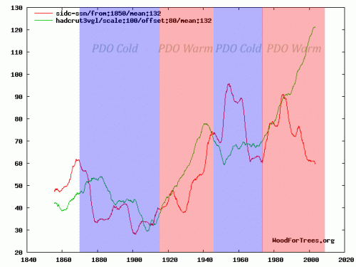
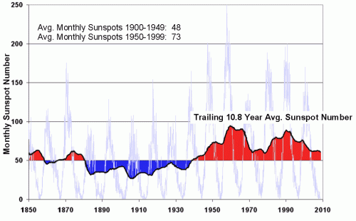
In both charts, red is the solar metric (TSI in the first chart, sunspot number in the second). The other line, either blue or green, is a global temperature metric. In both cases, we see a sort of step change in solar output, with the first half of the century at one plateau and the second half on a higher plateau. This chart of sunspot numbers may better illustrate this:
I had three answers for the reader:
- In any sufficiently chaotic and complicated system, no one variable is going to consistently regress perfectly with another variable. CO2 does not line up with temperature any better.
- There are non-solar factors at work. As I have said on any number of occasions, I agree that the greenhouse effect of CO2 exists and will add about 1C for each doubling of CO2. What I disagree with is the proposition that the Earth’s climate is dominated by positive feedback that multiplies this temperature increase 3-5 or more times. The PDO cycle is another example of a process that affects global temperatures.
- One should not necessarily expect a linear temperature increase to be driven by a linear increase in the sun’s output. I will illustrate this with a simplistic example, and then invite further comment. I believe the following is a correct illustration of one heat source -> temperature phenomenon. If so, wouldn’t we expect something similar with step-change increases in the sun’s output, and doesn’t this chart look a lot like the charts with which I began the post?

In addition to your three comments, I would have two more. First, we are not sure that TSI is what we should measure for the sun’s impact. Open-minded scientists also are wondering about solar winds, cosmic ray flux, clould inducements, and other solar phenomenon. It is not clear that TSI variation is the best estimate of the sun’s impact on climate change. Second, it has recently been suggested that estimates of TSI post 1983 have been understated. I guess if the IPCC can claim that it is more likely that historic observations are wrong than the models are wrong, then skeptics can make a similar claim about TSI! 🙂
Perhaps I have misunderstood your example with the stovepot, but actually, the temperature of water would stay constantly under 100 Degree Celsius, because of the chemical change from fluid to gas. Though water vapor temperature would be quite high. Shouldn’t that be a simple exercise in how energy saturation in a system can be reached and influence the systems workings?
And that the effect is actually a feedback of rising temperature and thus a “forcing” that keeps the water relatively cool (under a specific temperature).
Doesn’t the divergence correlate with the demise of the USSR and its rural temperature stations?
Max: Read the unlabeled water temperature as the water temperature not reaching 100C yet. Just as we don’t know exactly what the stove’s “Hi” setting is, other than the stove is more active than at the other setting.
David: Sun-temperature correlation is the topic. Not the temperature correlations with USSR, baby boomers, televisions, Canada geese, microprocessors, or climate studies. (With more time, I could find more things which have altered during similar periods.)
Here’s a paper agreeing with ” An Inquirer”, stating that total magnetic activity rather than sunspot number alone, is a better indicator of temperatures on Earth.
http://sait.oat.ts.astro.it/MSAIt760405/PDF/2005MmSAI..76..969G.pdf
“CO2 does not line up with temperature any better”, you say. Look at this graph. Tell us whether you think the blue line or the green line tracks the temperatures (red line) more closely.
Your point 2 doesn’t make sense. All forcings trigger feedbacks, including solar. Even if you pretend that feedbacks don’t exist, you still can’t get any graph of solar activity to look like the temperature graph. And even if you pretend that you can make a graph of solar forcing look like the temperature graph and that greenhouse gases don’t exist, given the magnitude of the solar forcing (<0.25W/m²), you would derive a climate sensitivity much higher than any sensible study derives – that is, you would require much stronger feedbacks than those that you already can’t bring yourself to believe in.
And point three… oh dear. Your stove graph is ludicrous. You expect anyone to take it seriously? Inventing a graph to describe what you think might happen to something is a bit of a weird way to try to prove that global warming isn’t happening.
Once again you show how thoroughly inadequate your thought processes are. You don’t understand science; and yet you you expose your ignorance to the world, regularly. Why?
max-
his graph holds for temperatures under 100c. obviously, the water would plateau there. but as the earth is nowhere near saturation in terms of the heat it could hold, tracking temperatures below a saturation point seems to be the relevant example.
his point is that is you leave the stove at a higher level, the water will keep heating even though the stove is not getting hotter. up an input into a radiative balance equation to a new constant level, and the temperature will rise until a new equilibrium is reached.
When you consider that warmer does more than heat things up on earth, for instance more plants grow the warmer it gets, the warmer it becomes the higher the water vapor in the atmosphere becomes — It’s not a simple system. Someday we might very well understand it.
Where else does earth get warmth except from the sun?
Computer models are not science.
Lest any one be deceived, “Hunter” has thrown up a deceiving graph. He likely knows what he is doing, but in case it is not obvious, I will mention a couple of points. The graph starts in 1960 when temperatures started recovering from their mid-century low points. The graph only includes history only when GMT has generally increased, leaving off the prior years when temperatures decreased. You would not get such a visual impact of a match if previous decades where included. And you could get a similar match by plotting income, or cumulative World Series games, or Elvis sightings to HadCrut. Also, speaking of income, the HadCrut is influenced by economic growth; to what extent is somewhat debatable. But it would be interesting to graph temperatures over oceans as measured by satellite versus CO2 levels. (Such a graph would include only 30 years of data.)
“An Inquirer”, you’re an idiot. The graph starts when the Mauna Loa CO2 data starts. How could it start earlier? But let’s look at the earlier years anyway, shall we? As a homework exercise, you can look up the ice core CO2 data and plot where the CO2 curve would continue. Describe, please, how solar activity correlates with temperatures, based on this extended graph, and how CO2 correlates.
Mid-century low points? What a bizarre concept. Tell us which was warmer – 1940-1970, or 1900-1930.
“you could get a similar match by plotting income, or cumulative World Series games, or Elvis sightings to HadCrut” – based on that, I presume that you believe there is no physical means by which CO2 can affect global temperatures. If that’s your belief, you’re a retard. If that’s not your belief, then what’s your point?
“HadCrut is influenced by economic growth” – unless satellite global temperature measurements are also influenced in the same way, then no, it isn’t.
A bit more honest version of Jennihuntist’s graph here. I’ve corrected Jennihuntist’s fear of 2008 and the warm period in the 30s and 40s, and reduced the absurd smoothing and scaling that made the sunspot cycle look insignificant, and hid the yearly variation of CO2.
Hunter: How can you lump solar in with other “forcings?” Other than heat from radioactivity in the Earth, the Sun is the supplier of our heat, not a “forcing.” Water vapor might properly be called a forcing, but to call the Sun one is avoiding the obvious.
Jim – try reading an IPCC report, and you may learn what the definition of forcing is, in a climatological context. It looks to me like you’ve misunderstood it completely.
Anyone – here’s a little exercise for you. Download three data sets – firstly a temperature one. Hadcrut, GISS, UAH or RSS – it makes no difference. Then a total solar irradiance one. PMOD or ACRIM, again, it makes no difference. Finally, a CO2 one. Mauna Loa or global average, it makes no difference.
Plot a scatter graph – temperature anomaly against TSI. Is there a correlation, visually? And mathematically?
Plot another scatter graph – temperature anomaly against CO2 concentration. Is there a correlation, visually? And mathematically?
Given that this is a community of deniers, I reckon the chances of anyone even trying this, let alone reporting what they find, are round about zero. Presuming that no-one proves me wrong, I’ll tell you in a couple of days.
Hunter: I believe it is you who miss the point. The point is that it is the Sun that is the primary source of heat. It warms the Earth. If the Sun suddenly stopped shining, it wouldn’t matter if the atmosphere was 100% CO2, the Earth would still get very cold. Lumping the primary source of energy in with water vapor is misleading.
You’re very confused, Hunter. Who is lumping anything in with anything? Why don’t you get a grip and read what’s being written? Get an adult to help you if necessary.
How about you do the little exercise I proposed? Tell us the result. It shouldn’t take you more than twenty minutes, if you get a grown-up to help you.
Hunter: Plot your CO2 with a graph which starts at zero, not at 300 some; the CO2 line will more closely resemble your flat solar plot. Or show only any five-year period and see if there’s still a resemblance. Fiddling with the characteristics of graphs to create a visual similarity is irrelevant if there is no relationship between the things being represented.
Hunter,
should I read the part of the IPCC report where the Administrators spout their religion, where their acolytes pervert science, or the sections where actual scientists disagreed with the Administrators??
It is pretty pathetic as the IPCC was organized with the task of identifying AGW and determining what to do about it. They have no other point of existence. Their next full report, in the middle of full blown negative natural cycles, should be a real side buster!!!!
I don’t see why we can’t settle this one way or another. I’m a biologist, but it seems to me that the total bolometric energy entering the atmosphere from both the day and night side has to be nearly exactly equal to the energy leaving. Otherwise in a few hundred days we would boil or freeze. The only thing CO2 can do is reset the thermostat, so that by this criterion feedback has to be negative; at least in this range of temperatures it has to be negative, otherwise we would have large swings in temperatures with the slightest change in insolation as, e.g., when we have a solar eclipse. Also, Isn’t it true that the modelers all claim that because CO2 molecules absorb and heat up when certain frequencies of infrared hit them, that where the centered integral of this occurs has to be in the mid troposphere at low latitudes. This makes sense. And, if CO2 is doing anything, it has to show this in this particular patch of air. Continued study of this region of the troposphere until this is proved one way or another seems critical to me. Everyone seems to have different answers here at the present time.
Then, of course, we will have to show that this CO2 heating is significant compared with the natural insolation variation from the sun and from space. I guess internal heat from radio-decay of the earth is not important. I hope. I don’t think these endless graphs and correlations mean anything much as they do not tell us causes, but sometime we have to agree upon which came first the heating or the CO2.
Scooter – instead of making idiotic demands for meaningless graphs, you can actually plot them yourself. Do come back to us with the results, won’t you? By the way, ‘climate’ is something that can’t be measured over five years. Fuckwitted morons often do have trouble with this point.
dnaxy – your terminology is confused. Reaching a new radiative balance is not a feedback.
“otherwise we would have large swings in temperatures with the slightest change in insolation as, e.g., when we have a solar eclipse” – did you know that there are large swings in temperature twice a day? Did you know that the change in insolation during a solar eclipse is -1360W/m²? That’s not really very small, is it?
Hunter is a flat-out liar, and nothing he says needs to be addressed in any way. Statements such as:
you pretend that feedbacks don’t exist
and
Inventing a graph to describe what you think might happen to something is a bit of a weird way to try to prove that global warming isn’t happening
are deliberate, carefully crafted lies meant not only to forward his own agenda, but to undermine reason and logic themselves as tools in this discussion. Anything he says is not argument, it is not information, it is just a meaningless string of not-quite-random words denoting nothing. Even if some statement he makes does happen to correspond to a fact, his saying it is no more “correct” than a stopped clock being right twice a day – you still can’t use that clock to tell time.
His statements aren’t even wrong, they are just empty, as if he argued that “mimsey were the borogroves”. You can respond that “no, borogroves are not mimsey”, but then what you’re doing is not discussion, it is not debate, it is just throwing noises at each other.
Hunter could probably better spend his/her time on sifting through all the tree ring temperature proxies to see if any of them stand any chance of revealing past temperatures. After all, the ring width can vary with the amount of sunlight, carbon dioxide levels, temperature, nitrogen oxides levels, precipitation, and the number of roosting birds that poop around it each year.
On the issue of graphing the correlation between CO2 and GMT, I have not previously seen Global Warming Pessimists stop the historic trend in the 1960s, regardless of when the Mauna Loa CO2 data starts. (In the same vein, I do not see skeptics questioning that we are warmer than we were 200 years ago.) The issue about the graph is that there is a very nice correlation between CO2 and estimated GMT from 1965 to 2005, just as there is nice correlation between GMT and traditionally-measured TSI from 1885 to 1985. However, the nice correlation breaks down as you go forward for TSI, and it also breaks down as you go backward for CO2. That is the essence of Warren’s original claim that “CO2 does not line up with temperature any better.” I do not see anyone claiming that “sidc-snn” has a great match with temperature. Likewise, if you look at the Central England Temperature which stretches back for centuries, you also see a very poor match between CO2 and temperature. (If you look at ice core data, you see that major temperatures changes precede CO2 changes – not vice versa – and the science behind that observation is well understood.)
To get a good fit between CO2 and temperature, modelers need to introduce other variables, particularly aerosols. I doubt that anyone on this blog have studied the data sources and procedures of using aerosols more than I have. That presumption could be wrong, and I would not hesitate to learn more, but my conclusion is that the choices of aerosol data and relationships are conveniently chosen to get a good CO2 fit. And my conclusion is not an isolated one among others who have audited the process.
Considering graphs of correlations on temperature, I would refer you to
http://wattsupwiththat.com/2008/01/25/warming-trend-pdo-and-solar-correlate-better-than-co2/
That thread has some decent graphs on correlations to temperatures. Among the graphs, an intriguing one seems to suggest a break in the correlation between CO2 and temperature in the last 15 years. Of course, we do not get excited about a 15 year trend, but maybe we should also watch our excitement about a 40 year trend.
Given the posts on this blog, it appears that at least one poster has only a surface understanding of the four major measures of GMT, and he has made some erroneous claims about them in the past. HadCrut is not adjusted for UHI, and GISS’s adjustments are controversial and often perverse. GISS is not independent of UAH and RSS because GISS uses satellite measurements for ocean temperatures, thus helping to reach a closer match for the past 30 years. One could make GISS to look like the outlier of the four, and one could make UAH look like the outlier, or could you argue that all four are quite similar; I tend favor the last interpretation for the last thirty years, especially given the positive PDO and AMO phases. A key problem that I have with GISS is its cooling of historic temperatures – those older than 30 years.
It should not need repeating, but given one poster’s comments, we shall repeat it: skeptics do not reject the reality of greenhouse gases nor the laboratory results that doubling pre-industrial CO2 level would lead to about a 1 degree C increase. What is disputed is the size and direction of the feedbacks, whether CO2 inducements swamp natural variations, and whether CO2 increases lead to catastrophic consequences. The science on these issues is not settled.
What monstrous stupidity from An Inquirer. Really, you’re embarrassing yourself. By quoting that preposterous Watts article, you show that you, like many or even most deniers, do not realise that there is a difference between the US and the world.
“there is nice correlation between GMT and traditionally-measured TSI from 1885 to 1985” – untrue. Plot a scatter chart to see this. Or just look at the first figure, with particular reference to 1915, where temperature rises precede solar activity increases.
“nice correlation … breaks down as you go backward for CO2” – untrue. Plot a scatter chart to see this.
“I do not see anyone claiming that “sidc-snn” has a great match with temperature” – look at the second graph in the post. Are you blind, or stupid, or both?
“if you look at the Central England Temperature which stretches back for centuries, you also see a very poor match between CO2 and temperature” – untrue
“a break in the correlation between CO2 and temperature in the last 15 years” – untrue
“GISS’s adjustments are controversial” – only among yapping idiots.
“we shall repeat it” – are you schizophrenic, or just affecting some kind of spokesman attitude?
“skeptics do not reject the reality of greenhouse gases” – there are many flavours of idiot, and there are plenty ‘skeptics’ who do. If you want to coordinate all your mental deficiencies, have words with ‘Scooter’ above, for one.
Hunter – your bad tempered, unnecessary and unscientific rudeness do nothing to help your case but I imagine, like so many alarmists, it makes you feel better to insult those you cannot persuade with your ‘evidence’ or convince with your arguments. You also obviously know nothing about the science but are merely adept at cut’n’paste from alarmist websites.
The answer to the apparent divergence is quite straightforward. Avoiding euphemisms like ‘adjustments’ and ‘controversial’, let’s call a spade a spade: the post 1975 GISS data is valueless, having been massaged, altered, modified, what you will, by the idiot Hansen and his merry band of propagandists to bolster their discredited theories and blatantly political demands. No mystery at all.
People who refuse to understand basic physics can’t really be persuaded to accept any argument that conflicts with their ideology, no matter how persuasive. Not a single person on this forum has ever changed their mind, even a fraction. What you describe as bad tempered, unnecessary and unscientific rudeness, Septic, is in fact just calling a spade a spade.
If post-1975 GISS is useless, then it’s remarkable that it <a href=”http://www.woodfortrees.org/plot/hadcrut3vgl/from:1978/offset:-0.1/plot/gistemp/from:1978/offset:-0.2/plot/uah/plot/rss”agrees so well with Hadcrut, RSS and even the creationist denialist dataset, UAH, isn’t it?
It’s the same old same old. Refer to the “scientific consensus”. Confuse the basic physics with the much more uncertain hypotheses on feedbacks, and accuse your opponents of exactly what you’re engaging in yourself.
I notice Hunter does not mention the diversion between satellite and near surface stations for the last several years, nor the fact of no statistically meaningful warming in the satellite data from 1979-1997; about .03C/dec. And of course UHI, lack of spatial coverage, land use change and micro-site issues have no effect on data quality 🙂
Rather than bastardizing linear regression by applying it no non-linear data (as warmologists do with stratospheric “cooling” that hasn’t occurred since 1994), go ahead, don’t take my word for it. Plot the data from UAH or RSS through 1997 and see what it shows, although UAH is the more accurate of the two.
Then plot from 1997-2001, then 2001 to present.
Hodrick-Prescott Excel plug-in is a handy tool for seeing what’s really going on.
Now the bigger question is what caused this ‘step change’ from 1997 to 2001, and better still, why did everything to to with warming halt after 2001? No volcanoes to blame.
See for yourselves:
http://www.mediafire.com/imageview.php?quickkey=4mukmnymujx&thumb=4
Apparently the spam bots intercepted the first attempt:
I notice Hunter does not mention the diversion between satellite and near surface stations for the last several years, nor the fact of no statistically meaningful warming in the satellite data from 1979-1997; about .03C/dec. And of course UHI, lack of spatial coverage, land use change and micro-site issues have no effect on data quality 🙂
Rather than bastardizing linear regression by applying it no non-linear data (as warmologists do with stratospheric “cooling” that hasn’t occurred since 1994), go ahead, don’t take my word for it. Plot the data from UAH or RSS through 1997 and see what it shows, although UAH is the more accurate of the two.
Then plot from 1997-2001, then 2001 to present.
Hodrick-Prescott Excel plug-in is a handy tool for seeing what’s really going on.
Now the bigger question is what caused this ‘step change’ from 1997 to 2001, and better still, why did everything to to with warming halt after 2001? No volcanoes to blame.
See for yourselves:
‘http://www.mediafire.com/imageview.php?quickkey=4mukmnymujx&thumb=4’
From the first post:
A reader wrote me a while back and asked if I could explain how I thought the sun could be a major driver of climate when temperature and solar metrics appear to have “diverged” as in the following two charts:…….
This conclusion follows not – from the premise. Inverting and asserting positively we have:
Such and such a climate sensitivity combined with solar irradiance yields a curve with divergence as shown.
But this is no more solved than the prior proposition. Thus the premises need restating and precise clarification. What is the right question?
DG: What is X axis?
I thought Inquirer’s explanation was excellent. Thanks for that.
Hunter said: “Not a single person on this forum has ever changed their mind, even a fraction”.
I changed mine, from believer to sceptic, over a period of time, starting with the Hockey Stick debacle.
don’t feed the troll.
i know it’s tempting and he can be very provocative when he starts calling everyone idiots and makes wild factual and scientific misstatements.
he still fails to understand that a pot of eater on a stove will continue warming even if exposed to constant heat (until equilibrium obviously).
he has lost this argument several times before.
just let it go. he’s a distraction and a disruption. you will not get anything useful or civil out of him.
water that is, “eater” is a typo.
“…until equilibrium obviously…” – oh well done sir! Admittedly most primary school children would have worked that one out before you, but at least you’re one step ahead of ‘climate skeptic’, and his wonderful figure showing the water temperature zooming off, apparently towards infinity.
If either of you think that your risible pan analogies offer any insight at all into the climate system, you’re even more mentally backward than I ever gave you credit for.
The way GISS adjusts the raw data is the reason the slope at the end of the curve has such a large upward trend to it. The raw data does not have anywhere near the large upward trend the adjusted data does. The adjustments done to the GISS data are essentially undocumented and are not based on any real world study or data. In short, the GISS adjusted data is scientifically meaningless.
Mhaze,
The y axis is temp. Chart is from the more accurate creationist denialist data set (UAH) http://vortex.nsstc.uah.edu/data/msu/t2lt/uahncdc.lt
I wonder if Hunter realizes RSS was found to have a warm bias in their data and that Tamino (every warmer’s idol) acknowledged, reluctantly of course, after being “educated” by Douglass and Herman over at Empty Mind. Conducting his business-as-usual tactics (faulty analysis, ad hominen, personal attacks etc.) was not wise in that instance.
Has anyone figured out where the tropical troposphere hot spot is hiding? No heat “in the pipeline” either.
BTW, after proofreading my previous post, the word “diversion” should be “divergence”.
Well said Morganovich.
As a frequent lurker, if not poster, I have to say that Hunter’s arguments make more sense. I am particularly intrigued by the suggestion that deniers all accept that Co2 is a greenhouse gas, and that adding large amounts of it to the atmosphere should cause warming. I can well remember when lots of sceptics were denying this, as well as denying that ANY warming was happening. Slowly but surely, over the years they have changed their arguments. It won’t be long before the all agree with the science, but then say that we have waited too long to do anything, and we have to adapt. Maybe that’s their intention!
san-
i think you would be hard pressed to back up those statements using evidence from this site.
morganovich. I sort of agree. But you now very rarely hear sceptics argue for no warming etc….not just on this site. They just all argue against attribution or for low sensitivity. Arguing for the latter shows an ignorance of the palaeo record.
while there are almost certainly a few oddballs out there, i don’t think that many scientists skeptical of AGW have argued that the world is not warmer now than in 1850. on balance, it seems to me that the more outrageous claims have generally come from the warming side (arctic free of ice in 5 years, 12 foot sea level rises, warmest climate for thousands of years)
looked at on a a paleoclimate basis, it’s still quite cold right now. this is still an ice age. even in the last 1000 years, there is a great deal of evidence that the medieval warm period was warmer than today. the roman optimum was warmer than that, and the holocene optimum was far warmer than either and persisted for 1000’s of years.
rather than more “skeptics” coming to accept AGW claims, i think it’s actually going the other way with more scientists coming around to a larger role for natural variability and lower CO2 sensitivities.
Oh, yes, all the deniers here are such a sophisticated bunch aren’t they? They all accept the fact that more CO2=warmer earth, don’t they? We can see this from a post in this very thread, talking about the CO2/temperature graphs:
“there is no relationship between the things being represented”
And of course that lovely chart of pan temperature is the height of sophisticated denialism. I really have never seen such a pathetically childlike attempt to argue by someone obviously way, way out of their depth. It’s pretty funny seeing all the other idiots lapping it up though.
morganovich – interesting that you don’t trust any reconstruction that says now is hotter than historical periods, but you do trust any reconstruction that says historical periods were warmer than now. Pray tell, what is your source which tells us with unquestionable accuracy the temperature over the last 15,000 years? Or did you perhaps just make up “facts” that suit your beliefs?
rocket-
i’d recommend perusing this:
http://www.co2science.org/data/mwp/mwpp.php
it indexes scores of studies.
no 15,000 year proxy is beyond question, but many, such as mann’s can be conclusively demonstrated to be inaccurate. the vast majority (particularly of a higher quality) show a world of comparable warmth in the 1300’s and in other periods.
further there are numerous confirmatory historical record (like growing wine in london, farms emerging from greenland and european glaciers etc) that back up notions that the MWP existed and had less ice and warmer temps than currently prevail.
what record of temperatures showing current temperatures to be the highest in the last several thousand do you feel is credible?
Oh yes! You’re all such reasonable people. Of course you accept that CO2 is a greenhouse gas! Anyone who doesn’t is an oddball. So whoever said this is an idiot, not to be trusted by any of you reasonable sceptics:
“it is highly unlikely that future increases in the air’s CO2 content will produce any global warming”
I wonder if morganovich can tell us where I got that quote from?
It’s rather obvious that his criterion for believing climate reconstructions is simply whether or not they show what he thinks they should.
Just eyeballing the graphs above, the temperature rise appears to start before the step change in solar output. So in regards to point #3, I would say, no, they don’t look the same and the analogy is not very convincing.
http://www.springerlink.com/content/au9x40l201105273/fulltext.pdf?page=1
Abstract Evidence is presented that the recent worldwide
land warming has occurred largely in response to a
worldwide warming of the oceans rather than as a direct
response to increasing greenhouse gases (GHGs) over land.
Atmospheric model simulations of the last half-century
with prescribed observed ocean temperature changes, but
without prescribed GHG changes, account for most of the
land warming. The oceanic influence has occurred through
hydrodynamic-radiative teleconnections, primarily by
moistening and warming the air over land and increasing
the downward longwave radiation at the surface. The
oceans may themselves have warmed from a combination
of natural and anthropogenic influences.
How many times can SW solar radiation be counted (as a perpetuum mobile) to warm the oceans. Hmmm?
Alas, the sun cannot have anything to do with “global” warming (on any planet), can it?
http://www.agu.org/pubs/crossref/2009/2008GL036307.shtml
The ACRIM-gap (1989.5–1991.75) continuity dilemma for satellite TSI observations is resolved by bridging the satellite TSI monitoring gap between ACRIM1 and ACRIM2 results with TSI derived from Krivova et al.’s (2007) proxy model based on variations of the surface distribution of solar magnetic flux. ‘Mixed’ versions of ACRIM and PMOD TSI composites are constructed with their composites’ original values except for the ACRIM gap, where Krivova modeled TSI is used to connect ACRIM1 and ACRIM2 results. Both ‘mixed’ composites demonstrate a significant TSI increase of 0.033 %/decade between the solar activity minima of 1986 and 1996, comparable to the 0.037 % found in the ACRIM composite. The finding supports the contention of Willson (1997) that the ERBS/ERBE results are flawed by uncorrected degradation during the ACRIM gap and refutes the Nimbus7/ERB ACRIM gap adjustment Fröhlich and Lean (1998) employed in constructing the PMOD.
further
“This finding has evident repercussions for climate change and solar physics. Increasing TSI between 1980 and 2000 could have contributed significantly to global warming during the last three decades [Scafetta and West, 2007, 2008]. Current climate models [Intergovernmental Panel on Climate Change, 2007] have assumed that the TSI did not vary significantly during the last 30 years and have therefore underestimated the solar contribution and overestimated the anthropogenic contribution to global warming.”
Hi morganovich. There really isn’t any credible evidence that the whole world was warmer in the MWP….this is likely to have been a regional effect. Soon and Balliunas tried hard to prove it and made a real pig’s ear of their paper. If die-hard sceptics, using dodgy methodology can’t make the argument stick, I’d give up on the MWP!
Even if the MWP was warm, it would say nothing about the current attribution, nor the likely impacts with 6 billion plus people, nor the effects of C02 on ocean acidification etc etc. I wouldn’t take much notice of c02 science either. They have used several of my papers as support for their agenda and completely misinterpreted the message. I wonder why?
Hunter is right: there are still lots of sceptics who deny the basic science. I guess we have to lump them into the creationist/flat earth groups.
san-
go look at the site i linked in my earlier post. indexes the peer reviewed and published MWP studies. they are from all over the globe, and easily 80-90% conclude that the MWP was as warm or warmer, perhaps quite significantly today. this is backed up by a fair bit of historical data as well.
assuming you accept proxy data at all (and if you don’t, how can you argue anything at all about the MWP?) why would these results (of which there are maybe 200) not be valid?
also:
what did they mis-characterize? i’d be interested to see that. they are very transparent in their methodology and provide copies of the abstracts of all the papers they cite which are from scores of different researchers.