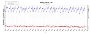
The chart below is from the Cryosphere Today and shows the sea ice anomaly for the short period of time (since 1979) we have been able to observe it by satellite. The chart is large so you need to click the thumbnail below to really see it:
OK, now looking at the anomaly in red, what do you see:
- A trend in sea ice consistent with a 100+ year warming trend?
- A sea ice extent that is remarkably stable except for an anomaly over the last three years which now appears to be returning to normal?
The media can only see #1. I may be crazy, but it sure looks like #2 to me.


I’d really like to know what was going on in the early and middle 1970’s but I guess there no way to estimate that.
The pattern looks like is changed characters in the middle 1990’s (with respect to the 1980’s).
But we are talking one or two solar cycles (depending on how you count them–see discussions at Mr. Watt’s (Watts’?) place.) and that is not nearly enough to be talking about patterns at all.
Do you have the raw data set? I’d love to see what happens when it gets run through a five or ten year rolling average i.e an α filter.
Thanks for the data. Lots of things need doing tho. First, lots of the data was not accessible, at least to me. Second, data from 1999 to 2003 are missing in lots of other cases. Third, no data after 2003 is available. Fourth, lots of science data crunching & statistics is needed of this individual data. Fifth, your opinion of the data is that there is no upward increase in temperatures. My opinion is there MAY be a slight upward turn. Without data crunching, we can’t know the outcome. & we have to have the last few years(or even the last 8 years of data in numerous cases).
I do give you an A for effort in trying to eliminate the effects of heat islands.