
Roger Pielke Jr has gone back to the first IPCC assessment to see how the IPCC is doing on its long-range temperature forecasting. He had to dign back into his own records, because the IPCC seems to be taking its past reports offline, perhaps in part to avoid just this kind of scrutiny. Here is what he finds:

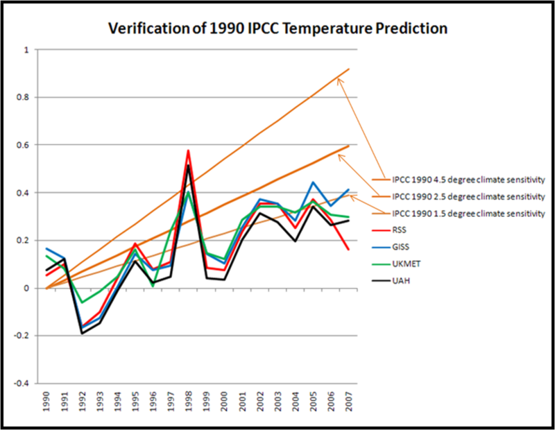
The colored lines are various measures of world temperature. Only the GISS, which maintains a surface temerpature rollup that is by far the highest of any source, manages to eek into the forecast band at the end of the period. The two satellite measures (RSS and UAH) seldom even touch the forecast band except in the exceptional El Nino year of 1998. Pielke comments:
On the graph you will also see the now familiar temperature records from two satellite and two surface analyses. It seems pretty clear that the IPCC in 1990 over-forecast temperature increases, and this is confirmed by the most recent IPCC report (Figure TS.26), so it is not surprising.
Which is fascinating, for this reason: In essence, the IPCC is saying that we know that past forecasts based on a 1.5, much less a 2.5, climate sensitivity have proven to be too high, so in our most recent report we are going to base our forecast on … a 3.0+!!
This is blatant confirmation of biased statistical stupidity, which is legally prohibited in virtually every single other professional field, including and especially investments:
1) Past performance is not an indicator of future returns, and
2) Simple investments:
“The fee table includes an example that will help you compare costs among different funds by showing you the costs associated with investing a hypothetical $10,000 over a 1-, 3-, 5-, and 10-year period.”
This constitutes fraud, is highly prosecutable, and should result in jail terms for those who predict fraudulent returns. Or atmospheric volatility.
Signed,
I would be more than happy to be a statistical expert witness to put climate “scientists” in jail.
Sorry, Here’s the better quote:
“Except in limited circumstances, funds also must include a table that sets forth returns-both before and after taxes-for the past 1-, 5-, and 10-year periods.”
http://www.sec.gov/answers/mfprospectustips.htm
No climate model, IPCC or otherwise, has ever adhered to this criterion.
Given the inherent variability of temperature (including the autocorrelation) what does this “failure to meet a prediction” mean statistically (in terms of a hypothesis test)? If we looked ONE YEAR OUT, would a failure or a success mean anything? So what does it mean 17 years out?
If we don’t define it mathematically, we are just showing pretty pictures and laughing at it. Please, don’t reply that the “other side does it”. Just answer the question.
Helloooooo! Anyone home there!?!?
Helllloooooo!
What, no answer? Crappy, crappy science…
If you can’t describe it with numbers, it’s not science. Come on. Drop the McKinsey lying with charts and actually analyze an issue instead of trying to prove a day one hypothesis (i.e. bias).
In ADDITION to the concern of volatility versus trend (from before), there is a question as to the change is expected to be broadly linear or increasing in rate over the century period.