As I write this, I realize I go a long time without getting to climate. Stick with me, there is an important climate point.
The process goes by a number of names, but multi-variate regression is a mathematical technique (really only made practical by computer processing power) of determining a numerical relationship between one output variable and one or more other input variables.
Regression is absolutely blind to the real world — it only knows numbers. What do I mean by this? Take the famous example of Washington Redskins football and presidential elections:
For nearly three quarters of a century, the Redskins have successfully predicted the outcome of each and every presidential election. It all began in 1933 when the Boston Braves changed their name to the Redskins, and since that time, the result of the team’s final home game before the election has always correctly picked who will lead the nation for the next four years.
And the formula is simple. If the Redskins win, the incumbent wins. If the Redskins lose, the challenger takes office.
Plug all of this into a regression and it would show a direct, predictive correlation between Redskins football and Presidential winners, with a high degree of certainty. But we denizens of the real world would know that this is insane. A meaningless coincidence with absolutely no predictive power.
You won’t often find me whipping out nuggets from my time at the Harvard Business School, because I have not always found a lot of that program to be relevant to my day-to-day business experience. But one thing I do remember is my managerial economics teacher hammering us over and over with one caveat to regression analysis:
Don’t use regression analysis to go on fishing expeditions. Include only the variables you have real-world evidence really affect the output variable to which you are regressing.
Let’s say one wanted to model the historic behavior of Exxon stock. One approach would be to plug in a thousand or so variables that we could find in economics data bases and crank the model up and just see what comes out. This is a fishing expedition. With that many variables, by the math, you are almost bound to get a good fit (one characteristic of regressions is that adding an additional variable, no matter how irrelevant, always improves the fit). And the odds are high you will end up with relationships to variables that look strong but are only coincidental, like the Redskins and elections.
Instead, I was taught to be thoughtful. Interest rates, oil prices, gold prices, and value of the dollar are all sensible inputs to Exxon stock price. But at this point my professor would have a further caveat. He would say that one needs to have an expectation of the sign of the relationship. In other words, I should have a theory in advance not just that oil prices affect Exxon stock price, but whether we expect higher oil prices to increase or decrease Exxon stock price. In this he was echoing my freshman physics professor, who used to always say in the lab — if you are uncertain about the sign of a relationship, then you don’t really understand the process at all.
So lets say we ran the Exxon stock price model expecting higher oil prices to increase Exxon stock price, and our regression result actually showed the opposite, a strong relationship but with the opposite sign – higher oil prices seem to correlate better with lower Exxon stock price. So do we just accept this finding? Do we go out and bet a fortune on it tomorrow? I sure wouldn’t.
No, what we do instead is take this as sign that we don’t know enough and need to research more. Maybe my initial assumption was right, but my data is corrupt. Maybe I was right about the relationship, but in the study period some other more powerful variable was dominating (example – oil prices might have increased during the 1929 stock market crash, but all the oil company stocks were going down for other reasons). It might be there is no relation between oil prices and Exxon stock prices. Or it might be I was wrong, that in fact Exxon is dominated by refining and marketing rather than oil production and actually is worse off with higher oil prices. But all of this points to needed research – I am not going to write an article immediately after my regression results pop out and say “New Study: Exxon stock prices vary inversely with oil prices” without doing more work to study what is going on.
Which brings us to climate (finally!) and temperature proxies. We obviously did not have accurate thermometers measuring temperature in the year 1200, but we would still like to know something about temperatures. One way to do this is to look at certain physical phenomenon, particularly natural processes that result in some sort of annual layers, and try to infer things from these layers. Tree rings are the most common example – tree ring widths can be related to temperature and precipitation and other climate variables, so that by measuring tree ring widths (each of which can be matched to a specific year) we can infer things about climate in past years.
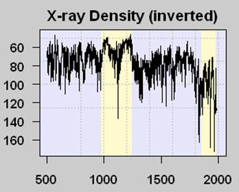
There are problems with tree rings for temperature measurement (not the least of which is that more things than just temperature affect ring width) so scientists search for other “proxies” of temperature. One such proxy are lake sediments in certain northern lakes, which are layered like tree rings. Scientists had a theory that the amount of organic matter in a sediment layer was related to the amount of growth activity in that year, which in term increased with temperature (It is always ironic to me that climate scientists who talk about global warming catastrophe rely on increased growth and life in proxies to measure higher temperature). Because more organic matter reduces x-ray density of samples, an inverse relationship between X-ray density and temperature could be formulated — in this case we will look at the Tiljander study of lake sediments. Here is one core result:

The yellow band with lower X-ray density (meaning higher temperatures by the way the proxy is understood) corresponds pretty well with the Medieval Warm Period that is fairly well documented, at least in Europe (this proxy is from Finland). The big drop in modern times is thought by most (including the original study authors) to be corrupted data, where modern agriculture has disrupted the sediments and what flows into the lake, eliminating its usefulness as a meaningful proxy. It doesn’t mean that temperatures have dropped lately in the area.
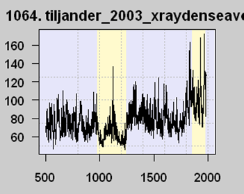
But now the interesting part. Michael Mann, among others, used this proxy series (despite the well-know corruption) among a number of others in an attempt to model the last thousand years or so of global temperature history. To simplify what is in fact more complicated, his models regress each proxy series like this against measured temperatures over the last 100 years or so. But look at the last 100 years on this graph. Measured temperatures are going up, so his regression locked onto this proxy and … flipped the sign. In effect, it reversed the proxy. As far as his models are concerned, this proxy is averaged in with values of the opposite sign, like this:

A number of folks, particularly Steve McIntyre, have called Mann on this, saying that he can’t flip the proxy upside down. Mann’s response is that the regression doesn’t care about the sign, and that its all in the math.
Hopefully, after our background exposition, you see the problem. Mann started with a theory that more organic material in lake sediments (as shown by lower x-ray densities) correlated with higher temperatures. But his regression showed the opposite relationship — and he just accepted this, presumably because it yielded the hockey stick shape he wanted. But there is absolutely no physical theory as to why our historic understanding of organic matter deposition in lakes should be reversed, and Mann has not even bothered to provide one. In fact, he says he doesn’t even need to.
This mistake (fraud?) is even more egregious because it is clear that the jump in x-ray values in recent years is due to a spurious signal and corruption of the data. Mann’s algorithm is locking into meaningless noise, and converting it into a “signal” that there is a hockey stick shape to the proxy data.
As McIntyre concludes:
In Mann et al 2008, there is a truly remarkable example of opportunistic after-the-fact sign selection, which, in addition, beautifully illustrates the concept of spurious regression, a concept that seems to baffle signal mining paleoclimatologists.
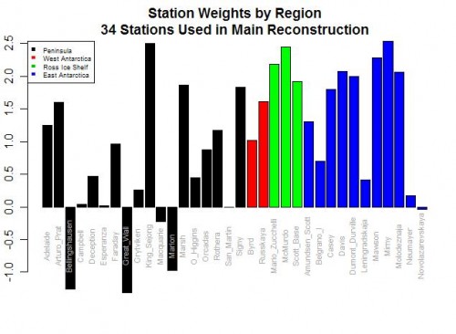
Postscript: If you want an even more absurd example of this data-mining phenomenon, look no further than Steig’s study of Antarctic temperatures. In the case of proxies, it is possible (though unlikely) that we might really reverse our understanding of how the proxy works based on the regression results. But in Steig, they were taking individual temperature station locations and creating a relationship between them to a synthesized continental temperature number. Steig used regression techniques to weight various thermometers in rolling up the continental measure. But five of the weights were negative!!

As I wrote then,
Do you see the problem? Five stations actually have negative weights! Basically, this means that in rolling up these stations, these five thermometers were used upside down! Increases in these temperatures in these stations cause the reconstructed continental average to decrease, and vice versa. Of course, this makes zero sense, and is a great example of scientists wallowing in the numbers and forgetting they are supposed to have a physical reality. Michael Mann has been quoted as saying the multi-variable regression analysis doesn’t care as to the orientation (positive or negative) of the correlation. This is literally true, but what he forgets is that while the math may not care, Nature does.

