So Much For That Whole Commitment To Science We Were Promised

From the Guardian:

Today’s release of the study, titled Global Climate Change Impacts in the United States, was overseen by a San Francisco-based media consulting company…

The nearly 200-page study was scrubbed of the usual scientific jargon, and was given a high-profile release by Obama’s science advisor, John Holdren, and the head of the National Oceanic and Atmospheric Administration (NOAA), Jane Lubchenco.

Wow, that’s sure how I learned to handle a scientific report back when I was studying physics – scrub it of the science and give it to an activist PR firm!   Do you need any more evidence that climate science has become substantially dominated by post-modernist scientists, where ideological purity and staying on message is more important than actually having the science right?

I saw a draft of this report last year, but I am still trying to download this new version.  I expect to be sickened.  Here is a taste of where they are coming down:

If today’s generation fails to act to reduce the carbon emissions that cause global warming, climate models suggest temperatures could rise as much as 11F by the end of the century.

11F is about 6.1C.  I don’t know if they get this by increasing the CO2 forecast or by increasing the sensitivity or both, but it is vastly higher than the forecasts even of the over-apocalyptic IPCC.  I think one can fairly expect two things, though — 1) More than 2/3 of this warming will be due to positive feedback effects rather than Co2 acting alone and 2) There will be little or no discussion of the evidence that such positive feedback effects actually dominate the climate.

Apparently the report will make up for having all the science stripped out by spending a lot of time on gaudy worst case scenarios:

That translates into catastrophic consequences for human health and the economy such as more ferocious hurricanes in coastal regions – in the Pacific as well as the Atlantic, punishing droughts to the south-west, and increasingly severe winter storms in the north-east and around the Great Lakes.

The majority of North Carolina’s beaches would be swallowed up by the sea. New England’s long and snowy winters might be cut short to as little as two weeks. Summers in Chicago could be a time of repeated deadly heat waves. Los Angelenos and residents of other big cities will be choking because of deteriorating air quality.

Future generations could face potential food shortages because of declining wheat and corn yields in the breadbasket of the mid-west, increased outbreaks of food poisoning and the spread of epidemic diseases.

This strikes me as roughly equivilent to turning in a copy of Lucifer’s Hammer in response to a request for a scientific study of the physics of comets.

Is it “Green” or Is It Just Theft?

This is reprinted from my other blog.  I usually confine my posts on this blog to issues with the science of global warming rather than policy issues, but I know I get a lot of folks with science backgrounds here and I would honestly like to see if there is something in this I am missing:

From Greenlaunches.com (via Engadget) comes a technology that I have written about before to leech energy from cars to power buildings:

shoppers_car

Now when you shop, your can be responsible to power the supermarket tills. As in with the weight of your vehicles that run over the road plates the counter tills can be given power. How? Well, at the Sainsbury’s store in Gloucester, kinetic plates which were embedded in the road are pushed down every time a vehicle passes over them. Due to this a pumping action is initiated through a series of hydraulic pipes that drive a generator. These plates can make up to 30kw of green energy in one hour which is enough to power the store’s checkouts.

The phrase “there is no such thing as a free lunch” applies quite well in physics.  If the system is extracting energy from the movement of the plates, then something has to be putting at least as much energy into moving the plates.  That source of energy is obviously the car, and it does not come free.  The car must expend extra energy to roll over the plates, and this energy has to be at least as great (and due to losses, greater) than the energy the building is extracting from the plates.  Either the car has to expend energy to roll up onto an elevated plate to push it down, or else if the plates begin flush, then it has to expend energy to pull itself out of the small depression where it has pushed down the plate.

Yes, the are small, almost unmeasurable amounts of energy for the car, but that does not change the fact that this system produces energy by stealing or leeching it from cars.  It reminds me of the scheme in the movie “Office Space” when they were going to steal money by rounding all transactions down to the nearest cent and taking the fractional penny for themselves.  In millions of transactions, you steal a lot but no one transaction really notices.

I have seen this idea so many times now portrayed totally uncritically that I am almost beginning to doubt my sanity.  Either a) the media and particular green advocates have no real understanding of science or b) I am missing something.  In the latter case, commenters are free to correct me.

By the way, if I am right, then this technology is a net loss on the things environmentalists seem to care about.  For example, car engines are small and much less efficient at converting combustion to usable energy than a large power station.  This fact, plus the energy losses in the system, guarantee that installation of this technology increases rather than decreases CO2 production.

Postscript: One of the commenters on my last post on this topic included a link to this glowing article about a “green family” that got rid of their refrigerator:

About a year ago, though, she decided to “go big” in her effort to be more environmentally responsible, she said. After mulling the idea over for several weeks, she and her husband, Scott Young, did something many would find unthinkable: they unplugged their refrigerator. For good.

How did they do it?  Here was one of their approaches:

Ms. Muston now uses a small freezer in the basement in tandem with a cooler upstairs; the cooler is kept cold by two-liter soda bottles full of frozen water, which are rotated to the freezer when they melt. (The fridge, meanwhile, sits empty in the kitchen.)

LOL.  We are going to save energy from not having a refrigerator by increasing the load on our freezer.  Good plan.  Here is how another woman achieved the same end:

Ms. Barnes decided to use a cooler, which she refilled daily during the summer with ice that she brought home from an ice machine at her office.

Now that’s going green!  Don’t using electricity at home to cool your groceries, steal it from work!

Update: The one place one might get net energy recovery is in a location where cars have to be breaking anyway, say at a stop sign or on a downhill ramp of a garage.  The plates would be extracting speed/energy from the car, but the car is already shedding this energy via heat from its brakes.  Of course, this is no longer true as we get more hybrids with dynamic breaking, since the cars themselves are recovering some of the braking energy.  Also, I have never seen mention in any glowing article about this technology that placement is critical to having the technology make any sense, so my guess is that they are not being very careful.

Its all About the Feedback

If frequent readers get any one message from this site, it should be that the theory of catastrophic global warming from CO2 is actually based on two parallel and largely unrelated theories:

  1. That CO2 acts as a greenhouse gas and can increase global temperatures as concentrations increase
  2. That the earth’s climate is dominated by strong positive feedback that multiplies the effect of #1 3,4,5 times or more.

I have always agreed with #1, and I think most folks will accept a number between 1-1.2C for a doubling of CO2 (though a few think its smaller).  #2 is where the problem with the theory is, and it is no accident that this is the area least discussed in the media.  For more, I refer you to this post and this video.  (higher resolution video here, clip #3).

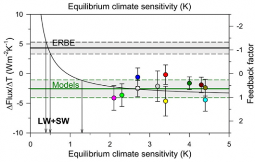
In my video and past posts, I have tried to back into the feedback fraction f that models are using.  I used a fairly brute force approach and came up with numbers between 0.65 and 0.85.  It turns out I was pretty close.  Dr Richard Lindzen has this chart showing the feedback fractions f used in models, and the only surprise to me is how many use a number higher than 1 (such numbers imply runaway reactions similar to nuclear fission).

lindzen_graph_icccjune09

Lindzen thinks the true number is closer to -1, which is similar to the number I backed into from temperature history over the last 100 years.  This would imply that feedback actually works to reduce the net effect of greenhouse warming, from a sensitivity of 1.2 to one something like 0.6C per doubling.

How to Manufacture the Trend You Want

I thought this post by Steve McIntyre at Climate Audit was pretty amazing, even by the standards of climate science.

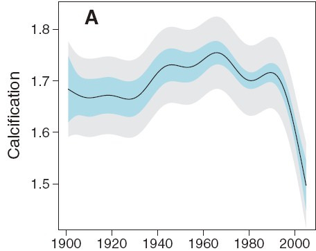
We begin with a felt need by fear mongers to link CO2 and global warming to bad stuff, in this case a decline of growth or calcification rates on the Great Barrier Reef.  So, abracadabra, some scientist-paladins generate this, which is eaten up by the media:

de_ath_figure2a

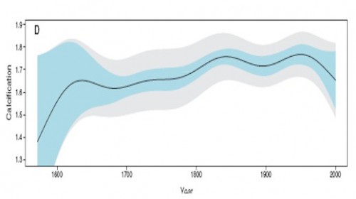
Wow, that looks bad.  And if we stop there, we can write a really nice front-page article full of doom and gloom.  Or we can do some actual science.  First, lets pull back and look at a longer trend:

de_ath_figure2d

Hmmm.   That looks kind of different.  Like the recent decline is by no means unprecedented, and that in fact one might call the 1850-1950 levels, rather than the recent drop, the anomaly.  This latter is a tough question, of course, in all of climate science.  Just what is normal?

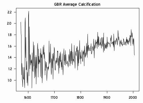
Anyway, we can go further.  McIntyre notices the plot looks awfully smooth.  What if we were to move out of USA Today mode and look at the raw data rather than a pleasantly smooth graph.  This is what we would see:

calcification_ts

Wow, that looks really different.  That must be some amazing smoothing algorithm they used.  Because what I see is a generally increasing trend in reef growth, with a single low number in 2005.  Rather than being some change in slope in the whole trend, as portrayed in the smoothing, this is a single one-year low data point.  (It turns out there are several smoothing approaches one can take that put inordinate value on the end point — this was a trick first found in Mann’s hockey stick trying to make hay of the 1998 high temperature anomaly).

I think just looking at the raw data would cause any reasonable person to shake their head and determine that the author’s were grossly disingenuous in their smoothing and conclusions.  But, as they say on TV, “Wait, there’s more.”

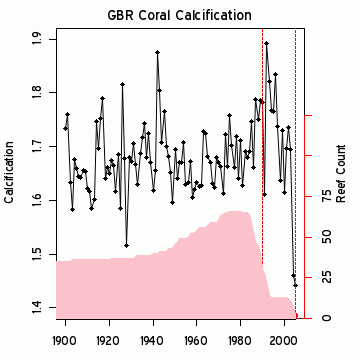
Because it turns out the 2005 drop seems to be less a function of any real drop but in fact due to serious gaps in the data set.  The black line is a close-up of the raw growth data, while the pink area is the size of the measurement data set used, with its scale on the right.

calcification_ts1900

Just by the strangest of coincidences, the large drop in 2005 occurs at the same time the number of data points in the data set drops down to 2!  While most of the data has been driven by measurement of 40 or more reefs, the key two years that drive the entire conclusion come from just 2 reefs?  This is the worst possible science.  Most real scientists would have dropped out the last several years and probably would have dropped all the data since about 1990.   Or else go out and get themselves some more freaking data.   It is easily possible, in fact quite likely, that the 2005 drop was due to mix, as high growth measurement site were dropped out of the data set, leaving only lower growth sites in the average.  These changes in mix say absolutely nothing about underlying growth rates.

I am just visually integrating the pink curve, but its reasonable to guess that there are about 600 measurements in the post 1980 period when the averaged trend in the first chart above turns down.  Somehow these guys have come up with a methodology that allows 4-5 measurements in 2004-5 to grossly outweigh the other 600 and pull the whole curve down.  Unless there is something I do not understand, this borders on outright fraud.  This can’t be accidental – the authors simply had to understand the game they were playing here.

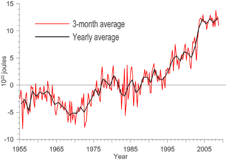
Update: Here is another interesting one — An apparent increase spike in ocean heat content:

ocean_heat_spike

Just coincidentally turns out to exactly coincide with a change in the source for the data.  The jump occurs exactly at the splice between two data sets.  And everyone just blithely accepts this jump as a physical fact??

ocean_heat_spike2

This is particularly hard to accept, as the ARGO data set (the newer data) has shown flat to declining ocean heat content since the day it was turned on.  So what is the justification for the spike at the splice?

Forgetting About Physical Reality

Sometimes in modeling and data analysis one can get so deep in the math that one forgets there is a physical reality those numbers are supposed to represent.  This is a common theme on this site, and a good example was here.

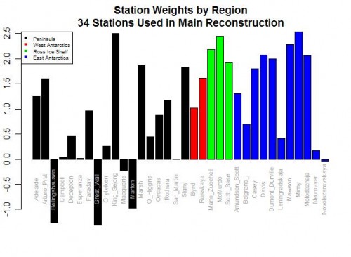
Jeff Id, writing at Watts Up With That, brings us another example from Steig’s study on Antarctic temperature changes.  In this study, one step Steig takes is to reconstruct older, pre-satellite continental temperature  averages from station data at a few discrete stations.  To do so, he uses more recent data to create weighting factors for the individual stations.  In some sense, this is basically regression analysis, to see what combination of weighting factors times station data since 1982 seems to be fit with continental averages from the satellite.

Here are the weighting factors the study came up with:

bar-plot-station-weights

Do you see the problem?  Five stations actually have negative weights!  Basically, this means that in rolling up these stations, these five thermometers were used upside down!  Increases in these temperatures in these stations cause the reconstructed continental average to decrease, and vice versa.  Of course, this makes zero sense, and is a great example of scientists wallowing in the numbers and forgetting they are supposed to have a physical reality.  Michael Mann has been quoted as saying the multi-variable regression analysis doesn’t care as to the orientation (positive or negative) of the correlation.  This is literally true, but what he forgets is that while the math may not care, Nature does.

For those who don’t follow, let me give you an example.  Let’s say we have market prices in a number of cities for a certain product, and we want to come up with an average.  To do so, we will have to weight the various local prices based on sizes of the city or perhaps populations or whatever.  But the one thing we can almost certainly predict is that none of the individual city weights will be negative.  We won’t, for example, ever find that the average western price of a product goes up because one component of the average, say the price in Portland, goes down.  This flies in the face of our understanding of how an arithmetic average should work.

It may happen that in a certain time periods, the price in Portland goes down in the same month as the Western average went up, but the decline in price in Portland did not drive the Western average up — in fact, its decline had to have actually limited the growth of the Western average below what it would have been had Portland also increased.   Someone looking at that one month and not understanding the underlying process might draw the conclusion that prices in Portland were related to the Western average price by a negative coefficient, but that conclusion would be wrong.

The Id post goes on to list a number of other failings of the Steig study on Antarctica, as does this post.  Years ago I wrote an article arguing that while the GISS and other bodies claim they have a statistical method for eliminating individual biases of measurement stations in their global averages, it appeared to me that all they were doing was spreading the warming bias around a larger geographic area like peanut butter.  Steig’ study appears to do the same thing, spreading the warming from the Antarctic Peninsula across the whole continent, in part based on its choice to use just three PC’s, a number that is both oddly small and coincidentally exactly the choice required to get the maximum warming value from their methodology.

Perils of Modeling Complex Systems

I thought this article in the NY Times about the failure of models to accurately predict the progression of swine flu cases was moderately instructive.

In the waning days of April, as federal officials were declaring a public health emergency and the world seemed gripped by swine flu panic, two rival supercomputer teams made projections about the epidemic that were surprisingly similar — and surprisingly reassuring. By the end of May, they said, there would be only 2,000 to 2,500 cases in the United States.

May’s over. They were a bit off.

On May 15, the Centers for Disease Control and Prevention estimated that there were “upwards of 100,000” cases in the country, even though only 7,415 had been confirmed at that point.

The agency declines to update that estimate just yet. But Tim Germann, a computational scientist who worked on a 2006 flu forecast model at Los Alamos National Laboratory, said he imagined there were now “a few hundred thousand” cases.

We can take at least two lessons from this:

  • Accurately modeling complex systems is really, really hard.  We may have hundreds of key variables, and changes in starting values or assumed correlation coefficients between these variables can make enormous differences in model results.
  • Very small changes in assumptions about processes that compound or have exponential growth make enormous differences in end results.  I think most people grossly underestimate this effect.  Take a process that starts at an arbitrary value of “100” and grows at some growth rate each period for 50 periods.    A growth rate of 1% per period yields an end value of  164.  A growth rate just 1 percentage point higher of 2% per period yields a final value of  269.    A growth rate of 3% yield a final value of 438.  In this case, if we miss the growth rate by just a couple of percentage points, we miss the end value by a factor of three!

Bringing this back to climate, we must understand that the problem of forecasting disease growth rates is grossly, incredibly more simple than forecasting future temperatures.  These guys missed the forecast my miles of a process that is orders of magnitude more amenable to forecasting than is climate.  But I am encouraged by this:

Both professors said they would use the experience to refine their models for the future.

If only climate scientists took this approach to new observations.