
The table of contents for the rest of this paper, A Layman’s Guide to Anthropogenic Global Warming (AGW) is here. Free pdf of this Climate Skepticism paper is here and print version is sold at cost here.
We have gotten well into this paper, and we still have not discussed what is perhaps the most problematic aspect of AGW research: the computer models.
If an economist came up with a computer model that he claimed could predict the market value of every house in the world in the year 2106 within $1,000, would you believe him? No, you would say he was nuts — there is way too much uncertainty and complexity. Climate, of course, is not the same as housing prices. It is in fact, much, much more complex and more difficult to predict. There is nothing wrong with trying to predict the complex and chaotic. But there is a certain sense of hubris in believing that one has succeeded with the kind of 95% certainty figures used by the IPCC.
All climate forecasting models are created by a pretty insular and incestuous climate science community that seems to compete to see who can come up with the most dire forecast. Certainly there are financial incentives to be as aggressive as possible in forecasting climate change, since funding dollars tend to get channeled to those who are the most dramatic. The global warming community spends a lot of time with ad hominem attacks on skeptics, usually accusing them of being in the pay of oil and power companies, but they all know that their own funding in turn would dry up rapidly if they were to show any bit of skepticism in their own work.
The details of these models is beyond the scope of this paper. However, it is important to understand how they work in broad outlines.
The modelers begin with certain assumptions about climate that they build into the model. For example, the computers themselves don’t somehow decide if CO2 is a more important forcing on the climate than solar activity – the modelers, by the assumptions the feed into the model, decide these things. The models return the result that CO2 is the most important driver of climate in the coming century because their programmers built them with that assumption, not because the model somehow sorts through different inputs and comes up with the key drivers on its own.
Because the models have been built to test man’s possible impact on the climate via greenhouse gas emissions, they begin with an econometric forecast of world economic growth, and, based upon assumptions about fuel sources and efficiencies, they convert this economic growth into emissions forecasts. The models generally contain subroutines that calculate, again based upon a variety of assumptions, how man-made CO2 plus other inputs will change the atmospheric CO2 concentration. Then, via assumptions about climate sensitivity to CO2 and various feedback loops programmed in, the models will create forecasts of temperatures, precipitation, etc. These models, depending on their complexity, will show regional variations in many of these variables. Finally, the models are tuned so that they better match history, in theory making them more accurate for the future.
One should note that while the IPCC asked modelers to look at a series of different cases, the only substantial difference between these cases is the volume of CO2 and other greenhouse gasses produced. In other words, the only sensitivity the IPCC seriously modeled was on levels of CO2. No other contingency – e.g. potential variations in global temperature sensitivity to CO2, solar output, land use – were considered. This should give you an idea of how hard-wired the anthropogenic causation is in the IPCC process.
In this section, I will begin by discussing the models’ basic assumptions about the climate. I will then discuss the econometric forecasts they are founded on, the assumptions about CO2 sensitivity and feedback processes, and finally model tuning and their ability to match history.
The Dangers in Modeling Complex Systems
At any one time, thousands of people are being paid literally millions of dollars on Wall Street to try to model the behavior of various stock indices and commodity prices. The total brain power and money power thrown over the last 50 years at trying to build an accurate predictive model for financial markets literally dwarfs, by a factor of 100 or more, the cumulative resources spent to date on long-term climate modeling. Financial markets are incredibly complex, and they are driven by hundreds of variables. Interest rates, corporate profits, loan default rates, mortgage refinance rates, real estate prices, GDP growth, exchange rates, etc. all tend to drive the behavior of financial markets. And no one has cracked the code. Sure, some people have built successful short-term trading models, but people have mostly lost their shirts when they have tried to make long-term bets based on computer financial models that beautifully matched history but failed to accurately predict the future.
How is it possible that a model that accurately represents the past fails to accurately predict the future? Financial modelers, like climate modelers, look to history in building their models. Again, like climate modelers, they rely both on theory (e.g. higher interest rates should generally mean lower stock prices) as well as observed correlations in the historic data set. The problem they meet, the problem that every modeler meets but most especially the climate modeler, is that while it is easy to use various analysis tools to find correlations in the data, there is often nothing that will tell you if there is really a causal relationship, and which way the causality runs. For example, one might observe that interest rates and exchange rates move together. Are interest rate changes leading to exchange rate adjustments, or vice versa? Or, in fact, are they both caused by a third variable? Or is their observed correlation merely coincidence?
It was once observed that if an old AFL football team wins the Superbowl, a bear market will ensue on Wall Street in the next year, while an NFL team victory presaged a bull market. As of 1997, this correlation held for 28 of the last 31 years, a far better prediction record than that of any Wall Street analyst. But of course this correlation was spurious, and in the next 4 years it was wrong every time. Had someone built a financial model on this indicator, it would have looked great when he ran it against history, but he would have lost his shirt using it.
Want a better prediction record? For seventeen straight US presidential election cycles, from 1936 to 2000, the winner of the election was accurately predicted by…the Washington Redskins. In particular, if the Redskins won their last home game before the election, the party that occupies the White House holds it in the election. Otherwise, if the Redskins lose, the opposition party wins. Seventeen in a row! R-squared of one! Success against odds of 131,072:1 of guessing all 17 right. But of course, the input was spurious, and in 2004, soon after this relationship made the rounds of the Internet, the algorithm failed.
This is why we spent so much time in the previous chapter on evaluating historic correlations between CO2 and temperature. Because the models are built on an assumption that not only is temperature strongly correlated with CO2, but that temperature is historically highly stable without this outside anthropogenic forcing. If there are problems with this assumed causation, which we saw there are, then there in turn are major inherent problems with the models themselves. As climate scientist Syun-Ichi Akasofu of the International Arctic Research Center at University of Alaska Fairbanks wrote:
The computers are “taught” that the temperature rise during the last hundred years is due mostly to the greenhouse effect. If the truth is that only about 10% of the present warming is caused by the greenhouse effect, the computer code must be rewritten
Do Model Outputs Constitute Scientific Proof?
Remember what I said earlier: The models produce the result that there will be a lot of anthropogenic global warming in the future because they are programmed to reach this result. In the media, the models are used as a sort of scientific money laundering scheme. In money laundering, cash from illegal origins (such as smuggling narcotics) is fed into a business that then repays the money back to the criminal as a salary or consulting fee or some other type of seemingly legitimate transaction. The money he gets back is exactly the same money, but instead of just appearing out of nowhere, it now has a paper-trail and appears more legitimate. The money has been laundered.
In the same way, assumptions of dubious quality or certainty that presuppose AGW beyond the bounds of anything we have see historically are plugged into the models, and, shazam, the models say that there will be a lot of anthropogenic global warming. These dubious assumptions, which are pulled out of thin air, are laundered by being passed through these complex black boxes we call climate models and suddenly the results are somehow scientific proof of AGW. The quality hasn’t changed, but the paper trail looks better, at least in the press. The assumptions begin as guesses of dubious quality and come out laundered at “settled science.” Climate Scientists Garth Paltridge wrote:
It needs to be understood that any reasonable simulation even of present climate requires computer models to be tuned. They contain parameters (that is, pieces of input information) whose numerical values are selected primarily to give the right answer about today’s climate rather than because of some actual measurement. This was particularly so in the mid-eighties. The problem with tuning is that it makes any prediction of conditions different from those of the present far less believable. Even today the disease of "tuneable parameters" is still rampant in climate models, although fairly well hidden and not much spoken of in polite society. The scientifically-inclined reader might try sometime asking a climate researcher just how many such parameters there are in his or her latest model. The reader will find there are apparently lots of reasons why such a question is ridiculous, or if not ridiculous then irrelevant, and if not irrelevant then unimportant. Certainly the enquirer will come away having been made to feel foolish.
Econometrics and CO2 Forecasts
The IPCC has never been able to choose a particular climate model it thinks is best. Instead, it aggregates ten or twelve of them and averages their results, hoping that if there are errors in the climate models, they will average out somehow (forgetting that systematic errors don’t average out, as we discussed earlier in the context of historic temperature reconstructions). The one thing the IPCC does do to bring some order to all this is to establish baseline econometric and emissions scenarios for all the teams to feed into the front end of their models. That way, for a given forecast case, they know variation in model output is due to differing climate-related assumptions rather than differing economic assumptions.
But a funny thing happens when one tries to make an economic growth forecast for 100-year periods, as the IPCC has: Very small changes in assumptions make enormous differences. Here is a simple example. An economy that grows by 3% per year will be 19x larger in 100 years. However, if that economy were to grow instead by 4% rather than 3%, it will be 51x larger in 100 years. So a change in the growth rate by one percentage point yields a final size nearly 2.7 times larger. The same is true with forecasting CO2 growth – a very small change in assumptions can lead to very large differences in absolute production.
After release of the 3rd IPCC report in 2001, researchers Ian Castles, formerly the head of Australia’s national office of statistics, and David Henderson of the Westminster Business School and formerly the chief economist of the OECD, decided to scrutinize the IPCC’s economic assumptions. They found that the IPCC had made a fundamental mistake in crafting their econometrics, one that caused all of their economic growth estimates (and therefore estimates of CO2 production) to be grossly overestimated. Based on the IPCC assumptions, South Africa ends up with a GDP per capita far in excess of the United States by the year 2100. Incredibly, the IPCC numbers imply that Algeria, Argentina, Libya, Turkey, and North Korea will all pass the US in per capita income by the end of the century.
Beyond making it clear that there is an element of the absurd in the IPCC’s economic forecasting approach, these errors tend to inflate CO2 forecasts in two ways. First, CO2 forecasts are raised because, in the models, larger economies produce more CO2. Second, though, the models assume different rates for CO2 production per unit of GDP for each country. Most of the countries the IPCC shows growing so fast – Algeria, South Africa, Libya, North Korea, etc. – have lower than average CO2 efficiencies (i.e. higher than average CO2 production per unit of GDP), so excess growth assumptions in these countries has a disproportionate impact on projected CO2 emissions. By the way, it would be interesting to see if the IPCC is using marginal rather than average rates. For example, France has a very low average rate of CO2 per unit of GDP because of its nukes, but its marginal growth is met mostly with fossil fuels.
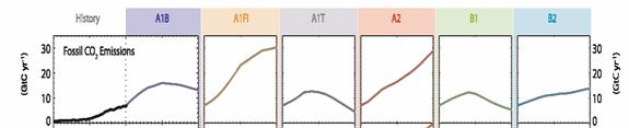
I can’t say whether these same mistakes exist in the 2007 4th Assessment. However, since the IPCC flatly rejected Castles and Henderson’s critique, it is likely the same methodology was used in 2007 as in 2001. For example, here are the CO2 emissions forecasts from the 4th assessment – notice most all of them have a step-change increase in slope between history and the future. Just look at the jump across the dotted line in lead case A1B, and several are even steeper.
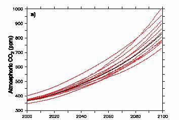
So what does this mean? Remember, small changes in growth rate make big differences in end values. For example, below are the IPCC fourth assessment results for CO2 concentration. If CO2 concentrations were to increase at about the same rate as they are today, we would expect an end value in 2100 of between 520 and 570 ppm, as opposed to the IPCC numbers below where the projection mean is over 800 in 2100. The difference is in large part in the economic growth forecasts.
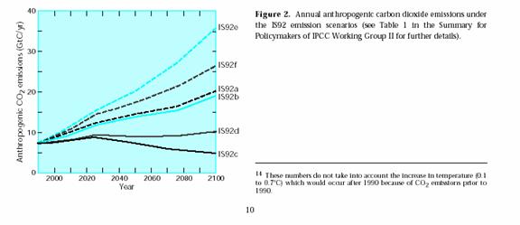
Since it is not at all clear that the IPCC has improved its forecasting methodology over the past years, it is instructive as one final exercise to go back to the 1995 emissions scenarios in the 2nd assessment. Though the scale is hard to read, one thing is clear – only 10 years later we are well below most of the forecasts, including the lead forecast is92a (this over-forecasting has nothing to do with Kyoto, the treaty’s impact has been negligible, as will be discussed later). One can be assured that if the forecasts are already overstated after 10 years, they will be grossly overstated in 100.
Climate Sensitivity and the Role of Positive Feedbacks
As discussed earlier, climate sensitivity generally refers to the expected reaction of global temperatures to a arbitrary change in atmospheric CO2 concentration. In normal usage, it is usually stated as degrees Celsius of global warming from a doubling in CO2 concentrations from pre-industrial levels (approx 280 ppm to 560 ppm). The IPCC and most AGW supporters put this number at about 3.5 to 4.0 degrees C.
But wait – earlier I said the number was probably more like 1.0C, and that it was a diminishing return. Why the difference? Well, it has to do with something called feedback effects.
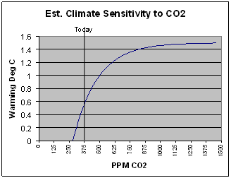
Before I get into these, let’s think about a climate sensitivity of 4 degrees C, just from a historical standpoint. According to the IPCC, CO2 has increased by about 100ppm since 1880, which is about 36% of the way to a doubling. Over this same time period, global temperatures have increased about 0.7C. Since not even the most aggressive AGW supporter will attribute all of this rise to CO2 levels, let’s be generous and credit CO2 with 0.5C. So if we are 36% of the way to a doubling, and giving CO2 credit for 0.5 degrees, this implies that the sensitivity is probably not more than 1.4 degrees C. And we only get a number this high if we assume a linear relationship – remember that CO2 and temperature are a diminishing return relation (chart at right), so future CO2 has less impact on temperature than past CO2, so 1.4 would be at the high end. In fact, using the logarithmic relationship we saw before, 0.5 degrees over 36% of the doubling would imply a sensitivity around 1.0. So, based on history, we might expect at worst another 0.5C from warming over the next century.
Most AGW supporters would argue that the observed sensitivity over the last 30 years has been suppressed by dimming/sulfate aerosols. However, to get a sensitivity of 4.0, one would have to assume that without dimming, actual warming would have been about 2.0C. This means that for the number 4.0 to be right,
1. Absolutely nothing else other than CO2 has been causing warming in the last 50 years AND
2. Sulfate aerosols had to have suppressed 75% of the warming, or about 1.5C, numbers far larger than I have seen anyone suggest. Remember that the IPCC classifies our understanding of this cooling effect, if any, as “low”
But in fact, even the IPCC itself admits that its models assume higher sensitivity than the historically observed sensitivity. According to the fourth IPCC report, a number of studies have tried to get at the sensitivity historically (going back to periods where SO2 does not cloud the picture). Basically, their methodology is not much different in concept than the back of the envelope calculations I made above.
These are shown in a) below, which shows a probability distribution of what sensitivity is (IPCC4 p. 798). Note many of the highest probability values of these studies are between 1 and 2. Also note that since CO2 content is, as the IPCC has argued, higher than it has been in recorded history, any sensitivities calculated on historical data should be high vs. the sensitivity going forward. Now, note that graph c) shows how a number of the climate models calculate sensitivity. You can see that their most likely values are consistently higher than any of the historical studies from actual data. This means that the climate models are essentially throwing out historical experience and assuming that sensitivity is 1.5 to 2 times higher going forward, despite the fact a diminishing return relationship says it should be lower.
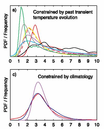
Sensitivity, based on History
Sensitivity that is built into the models (Sorry, I still have no idea what “constrained by climatology” means, but the text of the report makes it clear that these sensitivities popped out of climate models
So how do these models get to such high sensitivities? The answer, as I have mentioned, is positive feedback.
Let me take a minute to discuss positive feedbacks. This is something I know a fair amount about, since my specialization at school in mechanical engineering was in control theory and feedback processes. Negative feedback means that when you disturb an object or system in some way, forces tend to counteract this disturbance. Positive feedback means that the forces at work tend to reinforce or magnify a disturbance.
You can think of negative feedback as a ball sitting in the bottom of a bowl. Flick the ball in any direction, and the sides of the bowl, gravity, and friction will tend to bring the ball back to rest in the center of the bowl. Positive feedback is a ball balanced on the pointy tip of a mountain. Flick the ball, and it will start rolling faster and faster down the mountain, and end up a long way away from where it started with only a small initial flick.
Almost every process you can think of in nature operates by negative feedback. Roll a ball, and eventually friction and wind resistance bring it to a stop. There is a good reason for this. Positive feedback breeds instability, and processes that operate by positive feedback are dangerous, and usually end up in extreme states. These processes tend to "run away." I can illustrate this with an example: Nuclear fission is a positive feedback process. A high energy neutron causes the fission reaction, which produces multiple high energy neutrons that can cause more fission. It is a runaway process, and it is dangerous and unstable. We should be happy there are not more positive feedback processes on our planet.
Since negative feedback processes are much more common, and since positive feedback processes almost never yield a stable system, scientists assume that processes they meet are negative feedback until proven otherwise. Except in climate, it seems, where everyone assumes positive feedback is common.
In global warming models, water vapor plays a key role as both a positive and a negative feedback loop to climate change. Water vapor is a far more powerful greenhouse gas than CO2, so its potential strength as a feedback mechanism is high. Water comes into play because CO2 driven warming will put more water vapor in the atmosphere, because greater heat will vaporize more water. If this extra vapor shows up as more humid clear air, then this in turn will cause more warming as the extra water vapor absorbs more energy and accelerates warming. However, if this extra water vapor shows up as clouds, the cloud cover will tend to reflect energy back into space and retard temperature growth.
Which will happen? Well, nobody knows. The IPCC4 report admits to not even knowing the sign of water’s impact (e.g whether water is a net positive or negative feedback) in these processes. And this is just one example of the many, many feedback loops that scientists are able to posit but not prove. And climate scientists are coming up with numerous other positive feedback loops. As one author put it:
Regardless, climate models are made interesting by the inclusion of "positive feedbacks" (multiplier effects) so that a small temperature increment expected from increasing atmospheric carbon dioxide invokes large increases in water vapor, which seem to produce exponential rather than logarithmic temperature response in the models. It appears to have become something of a game to see who can add in the most creative feedback mechanisms to produce the scariest warming scenarios from their models but there remains no evidence the planet includes any such effects or behaves in a similar manner.
Note that the majority of the warming in these models appears to be from these feedback processes. Though it is hard to pick it out exactly, section 8.6 of the fourth IPCC report seems to imply these positive feedback processes increase temperature 2 degrees for every one degree from CO2. This explains how these models get from a sensitivity of CO2 alone of about 1.0 to 1.5 degrees to a sensitivity of 3.5 or more degrees – it’s all in the positive feedback.
 So, is it reasonable to assume these feedback loops? First, none have really been proven empirically, which does not of course necessarily make them wrong. . In our daily lives, we generally deal with negative feedback: inertia, wind resistance, friction are all negative feedback processes. If one knew nothing else, and had to guess if a natural process was governed by negative or positive feedback, Occam’s razor would say bet on negative. Also, we will observe in the next section that when the models with these feedbacks were first run against history, they produced far more warming than we have actually seen (remember the analysis we started this section with – post-industrial warming implies 1-1.5 degrees sensitivity, not four).
Perhaps most damning is to ask, if this really is such a heavily positive feedback process, what stops it? Remember the chart from earlier (show again at the right), showing the long-term relationship of CO2 and warming. Also remember that the data shows, and even AGW supporters acknowledge, that temperature rises led CO2 rises by about 800 years. Their explanation is that “something” caused the temperature to start upwards. This higher temperature, as it warmed the oceans, caused CO2 to outgas from the oceans to the atmosphere. Then, this new CO2 caused the warming to increase further. In other words, outgassing CO2 from the oceans was a positive feedback to the initial temperature perturbation. In turn, the IPCC argues there are various other positive feedbacks that multiply the effect of the additional warming from the CO2. This is positive feedback layered on positive feedback. It would be like barely touching the accelerator and having the car start speeding out o f control.
So the question is, if global temperature is built on top of so many positive feedbacks and multipliers, what stops temperature form rising once it starts? Why didn’t the Earth become Venus in any of these events? Because, for whatever else it means, the chart above is strong evidence that temperature does not run away.
I have seen two suggestions, neither of which is compelling. The first is that the oceans ran out of CO2 at some point. But that makes no sense. We know that the oceans have far more CO2 than could ever be liberated entirely to the atmosphere today, and besides, the record above seems to claim that CO2 in the atmosphere never really got above there it was say in 1880.
The second suggestion is based on the diminishing return relationship of CO2 to temperature. At some point, as I have emphasized many times, CO2’s ability to absorb infrared energy is saturated, and incremental quantities have little effect. But note in the IPCC chart above, CO2 on the long time scale never gets as high as it is today. If you argue that CO2’s absorption ability was saturated in earlier events, then you have to argue that it is saturated today, and that incremental CO2 will have no further warming effect, which AGW supporters are certainly NOT arguing. Any theory based on some unknown negative feedback has to deal with the same problem: If one argues that this negative feedback took over at the temperature peaks (in black) doesn’t one also have to argue that it should be taking over now at our current temperature peak? The pro-AGW argument seems to depend on an assumption of negative feedbacks in the past that for some reason can’t be expected to operate now or in the future. Why?
In fact, we really have not seen any evidence historically of these positive feedback multipliers. As I demonstrated at the beginning of this chapter, even assigning as much as 0.5C of the 20th century temperature increase to CO2 only implies a sensitivity just over 1.0, which is about what we would expect from CO2 alone with no feedbacks. This is at the heart of problems with AGW theory – There is no evidence that climate sensitivity to CO2 is anywhere near large enough to justify the scary scenarios spun by AGW supporters nor to justify the draconian abatement policies they advocate.
My tendency is to conclude that in fact, positive feedbacks do not dominate climate, just as they do not dominate any long-term stable system. Yes, certain effects can reasonably be said to amplify warming (ice albedo is probably one of them) but there must exist negative feedbacks that tend to damp out temperature movements. Climate models will never be credible, and will always overshoot, until they start building in these offsetting forcings.
Climate Models had to be aggressively tweaked to match history
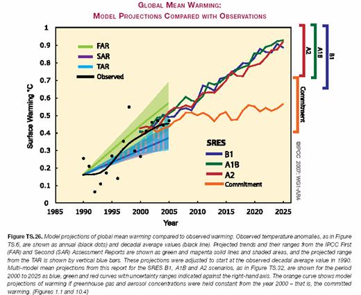
A funny thing happened when they first started running climate models with high CO2 sensitivities in them against history: The models grossly over-predicted historic warming. Again, remember our previous analysis – historical warming implies a climate sensitivity between 1 and 1.5. It is hard to make a model based on a 3.5 or higher sensitivity fit that history. So it is no surprise that one can see in the IPCC chart below that the main model cases are already diverging in the first five years of the forecast period from reality, just like the Superbowl predictors of the stock market failed four years in a row. If the models are already high by 0.05 degree after five years, how much will they overshoot reality over 100 years?
In a large sense, this is why the global climate community has latched onto the global dimming / aerosols hypothesis so quickly and so strongly. The possible presence of a man-made cooling element in the last half of the 20th century, even one that the IPCC fourth report ranks our understanding of as “low,” gives modelers a valuable way to explain why their models are overstating history. The aerosols hypothesis is valuable for two reasons:
· Since SO2 is prevalent today, but is expected to go down in the future, it allows modelers to forecast much higher warming and climate sensitivity in the future than has been observed in the past.
· Our very lack of understanding of the amount, if any, of such aerosol cooling is actually an advantage, because it allows modelers to set the value of such cooling at whatever value they need to make their models work
I know the last statement seems unfair, but in reading the IPCC and other reports, it appears to me that aerosol cooling values are set in exactly this way – as what we used to call a “plug” figure between actual temperatures and model output. While this may seem a chancy and fairly circular reasoning, it makes sense for scientists because they trust their models. They really believe the outputs are correct, such that any deviation is not attributed to their assumptions about CO2 or climate sensitivity, but to other man-made effects.
But sulfates are not the only plug being used to try to make high sensitivity models match a lower sensitivity past. You can see this in the diagram below from the fourth IPCC report. This is their summary of how their refined and tweaked models match history.
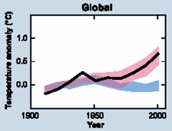 The blue band is without anthropogenic effects. The pink band is with anthropogenic effects, including warming CO2 and cooling aerosols. The black line is measured temperatures (smoothed out of course).
You can see the pink band which represents the models with anthropogenic effects really seems to be a lovely fit, which should make us all nervous. Climate is way too chaotic a beast to be able to model this tightly. In fact, given uncertainties and error bars on our historical temperature measurements, climate scientists are probably trumpeting a perfect fit here to the wrong data. I am reminded again of a beautiful model for presidential election results with a perfect multi-decadal fit based on the outcome of NFL football games.
But ignoring this suspiciously nice fit, take a look at the blue bar. This is what the IPCC models think the climate would be doing without anthropogenic effects (both warming CO2 and cooling sulfates, for example). With the peaked shape (which should actually be even more pronounced if they had followed the mid-century temperature peak to its max) they are saying there is some natural effect that is warming things until 1950 and then turns off and starts cooling, coincidently in the exact same year that anthropogenic effects start taking off. I challenge you to read the IPCC assessment, all thousand or so pages, and find anywhere in that paper where someone dares to say exactly what this natural effect was, or why it turned off exactly in 1950.
The reality is that this natural effect is another plug. There is no actual empirical data to back up the blue line (in fact, as we will see in the alternate theories section, there is good empirical data that this blue band is wrong). Basically, climate scientists ran their models against history, and found that even with their SO2 plug, they still didn’t match well – they were underestimating early century warming and over-estimating late century warming. Remember that the scientists believe their models and their assumptions about a strong CO2 effect, so they have modeled the non-anthropogenic effect by running their models, tuning them to historical actuals, and then backing out the anthropogenic forcings to see what is left. What is left, the plug figure, is the blue line.
Already, the models used by the IPCC tend to overestimate past warming even if all past warming is attributable to anthropogenic causes. If anthropogenic effects explain only a fraction of past warming, then the current models are vastly overstated, good for stampeding the populous into otherwise unpopular political control over the economy, but of diminished scientific value.
The note I will leave you with is this: Do not gain false confidence in the global climate models when they show you charts that their outputs run backwards closely match history. This is an entirely circular argument, because the models have been built, indeed forced, to match history, with substantial plug figures added like SO2 effects and non-anthropogenic climate trends, effects for which there are no empirical numbers.
The table of contents for the rest of this paper, A Layman’s Guide to Anthropogenic Global Warming (AGW) is here. Free pdf of this Climate Skepticism paper is here and print version is sold at cost here.