Steve McIntyre explains the “trick” referred to in the CRU emails. The trick is subtle, which allows the scientists to weasel out, saying things that are technically true but in essence false and misleading.
Most of the proxy series are smoothed in some way. Most smoothing algorithms adjust a data point by averaging in data both forwards and backwards in the series. A simple algorithm puts high weights on nearby data points in this averaging and relatively lower weights on data points further away.
The problem occurs when the series reaches its end. There are not points forward in the data series to average. By the last point in the series, fully half the data necessary for smoothing does not exist. There are various techniques for handling this, all of which have trade-offs and compromises (at the end of the day, you can’t create a signal when there is no data, no matter how clear one’s math tends to be).
The trick involved taking instrumental temperature records and using these records to provide data after the end point for smoothing purposes. This tends to force the smoothed curves upwards at the end, when there is no such data in the proxy trend to substantiate this. The perpetrators of this trick can argue with a semi-straight face that they did not “graft” the instrumental temperature record onto the data, but the instrumental temperature records does in fact affect the data series by contributing as much as half of the data for the smoothed curve in the end years.
Another Problem
I have always considered the “we-don’t-graft” claim disingenuous for another reason. This is driven in large part because I have spent a lot of time not just manipulating data, but thinking about the most effective ways to represent it in graphical form.
To this end, I have always thought that while folks like Mann and Briffa have not technically grafted the instrumental data, they have effectively done so in their graphical representations — which is the form in which 99.9% of the population have consumed their data.
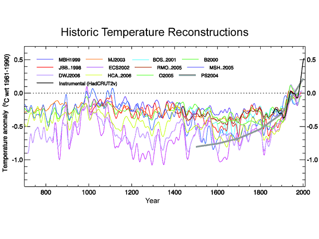
Below is the 1000-year temperature reconstruction (from proxies like tree rings and ice cores) in the Fourth IPCC Assessment. It shows the results of twelve different studies, one of which is the Mann study famously named “the hockey stick.”
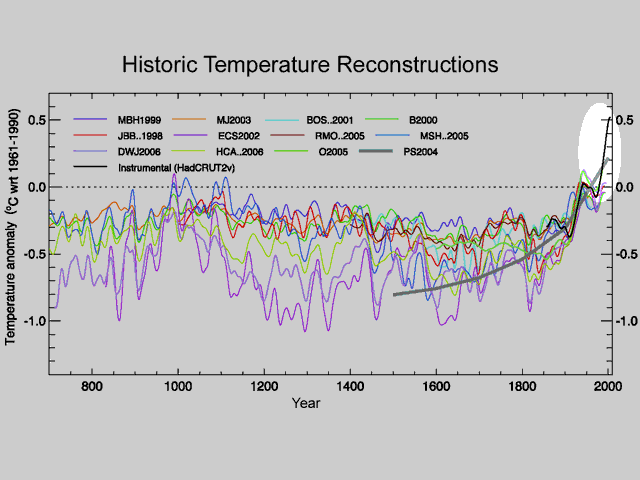
All the colored lines are the proxy (tree ring, ice cores, sediments, etc) study results. The black line is the instrumental temperature record from the Hadley CRU. There is no splice here – they have not joined proxy to instrument. But they have effectively done so by overlaying the lines on top of each other. The visual impact that says hockey stick is actually driven by this overlay.
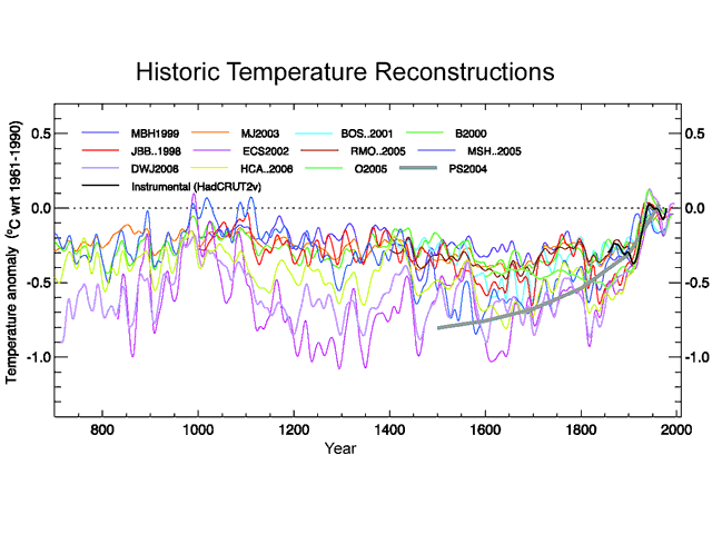
To prove it, lets remove the black instrumental temperature line as well as the gray line which I think is some kind of curve fitted to all of the above. This is what we get:
Pretty different visual impact, huh? The hockey stick is gone. So in fact, the visual image of a hockey stick is driven by the overlay of the instrumental record on the proxies. The hockey stick inflection point occurs right at the point the two lines join, raising the distinct possibility the inflection is due to incompatibility of the two data sources rather than a natural phenomenon.


I have a simple take on the trick to hide the decline, which I arrived at by graphing the data in email 0939154709, which showed me exactly how much the proxy data diverged from temperatures post 1960:
* We are told that the tree ring data is a good proxy for temperature
* But the proxy data post 1960 has a trend opposite to temperature records, so much so that the “climate scientists” discard them.
* By doing so they have just falsified their own claim that tree ring data = good proxy for temperature.
* Consequently, all pre-1960 proxy data can be discounted.
C’mon Ben, they’re *climate scientists*!!
Since we’re talking about climate here, your logic is only valid if YOU are a *climate scientist*.
Get with the program. Jeez.
Thank you, very informative post.
You might look at the “(a) instrumental temperatures” figure atop the HTR one at AR4 – fig 6.10, page 467. More scary than the recons is the real “records” of four (4!) European stations. I suppose this is meant to make the proxologists seem conservative!
I point this out because I would like to see someone like you (or any other stats-smart persons) take it on. The signif. rise occurs at 1970. Grafting? Excuse, stations moved? Tweaked with “the mean of adjacent existing values”? Plus it is only four stations, might be easy to analyze…if the data still exists!
Table 6.1 says it comes from Jones, et al 2003, “Average of central England, De Bilt, Berlin and Uppsala”. Period “1721-2004”
Communication from Jones:
“””They relatemostly to issues with Ch 6. Maybe you can add a couple of them.They relate to the issues of:
– making full use of the instrumental records to compare with proxy records
– changes in seasonality
– was the few hundred years before 1850 always colder than the post 1920 period.
The first 2 are the longest European records. The period I’m interested in is the rise up from the late 17th century to the 1730s and then the year 1740. No volcanoes for 20-30 year period may be a factor, solar also, but nothing explains 1740. It is not just in CET. 1730s at CET and De Bilt is the warmest decade until the 1990s. Producing these sorts of things in proxy data is a key.”””
http://www.eastangliaemails.com/emails.php?eid=517&filename=1115294935.txt
1730’s warmest decade? See any of that here?
http://www.ncdc.noaa.gov/paleo/pubs/ipcc2007/fig610.html
Hm. Maybe Berlin and Uppsala had the coldest decade then, to balance it out.
Good luck. If not worthy of study, maybe a blog post about the 1730’s?
Yes, the published graph all looks graphically manipulated to produce an illusion that screams out, “All these divergent roads ultimately converge, and lead us all to…HERE.”
I’ve had it up to here with liars and “value-adders” to data, I really have.
Australian Government has STOLEN 100% of all the claims it makes under KYOTO !
Peter Spencer (farmer) currently on day 23 of hunger strike in protest that after 200 Court appearances he is still PREVENTED from presenting his evidence requiring COMPENSATION to the farmers whose land and rights have been taken without any COMPENSATION !
This story must be told now !
Massive embarrassment should be achieved in Copenhagen because of this !
It is a National; Disgrace !
Please HELP ! ! !