Update#2: Evan Mills, apparently one author of the analysis, responds and I respond back.
UPDATE: I obtained more information from the EIA. My hypothesis below is correct. Update here.
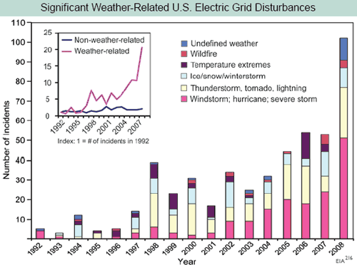
For this next post, I skip kind of deep into the report because Kevin Drum was particularly taken with the power of this chart from page 58.

I know that skepticism is a lost art in journalism, so I will forgive Mr. Drum. But in running a business, people put all kinds of BS analyses in front of me trying to get me to spend my money one way or another. And so for those of us for whom data analysis actually has financial consequences, it is a useful skill to be able to recognize a steaming pile of BS when one sees it. (Update: I regret the snarky comment about Kevin Drum — though I disagree with him a lot, he is one of the few folks on either side of the political aisle who is willing to express skepticism for studies and polls even when they support his position. Mr. Drum has posted an update to his original post after I emailed him this information).
First, does anyone here really think that we have seen a 20-fold increase in electrical grid outages over the last 15 years but no one noticed? Really?
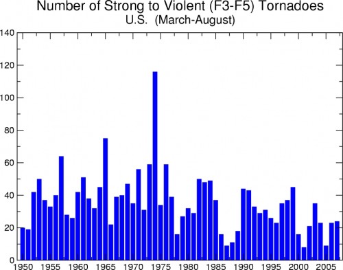
Second, let’s just look at some of the numbers. Is there anyone here who thinks that if we are seeing 10-20 major outages from thunderstorms and tornadoes (the yellow bar) in the last few years, we really saw ZERO by the same definition in 1992? And 1995? And 1996? Seriously? This implies there has been something like a 20-fold increase in outages from thunderstorms and tornadoes since the early 1990’s. But tornado activity, for example, has certainly not increased since the early 1990’s and has probably decreased (from the NOAA, a co-author of the report):
All the other bars have the same believability problem. Take “temperature extremes.” Anyone want to bet that is mostly cold rather than mostly hot extremes? I don’t know if that is the case, but my bet is the authors would have said “hot” if the data had been driven by “hot.” And if this is proof of global warming, then why is the damage from cold and ice increasing as fast as other severe weather causes?
This chart screams one thing at me: Basis change. Somehow, the basis for the data is changing in the period. Either reporting has been increased, or definitions have changed, or there is something about the grid that makes it more sensitive to weather, or whatever (this is a problem in tornado charts, as improving detection technologies seem to create an upward incidence trend in smaller tornadoes where one probably does not exist). But there is NO WAY the weather is changing this fast, and readers should treat this whole report as a pile of garbage if it is written by people who uncritically accept this chart.
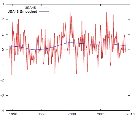
Postscript: By the way, if I want to be snarky, I should just accept this chart. Why? Because here is the US temperature anomaly over the same time period (using the UAH satellite data as graphed by Anthony Watt, degrees C):
From 1998 to today, when the electrical outage chart was shooting up, the US was actually cooling slightly!
This goes back to the reason why alarmists abandoned the “global warming” term in favor of climate change. They can play this bait and switch, showing changes in climate (which always exist) and then blaming them on CO2. But there is no mechanism ever proposed by anyone where CO2 can change the climate directly without going through the intermediate step of warming. If climate is changing but we are not seeing warming, then the change can’t be due to CO2. But you will never see that fact in this helpful government propaganda piece.


Glad you’re back and on point. I’m doing a short series for Examiner.com on this report. Rather than just steal huge chunks of your posts (which I unintentionally did to Roger Pielke Jr.), would you like to engage on this as an interview? We could do it by email or even in the comments section here.
Right on brother!This report is completely biased.It makes the same old predictions that we’ve heard before. You know, oceans rising, glaciers melting, storms getting bigger, droughts getting drier, crops growing better…oh wait scratch that last one…But the same problem remains: these are all evidence of climate change but not evidence that C02 is the cause. Or that humans are the cause. Claiming that C02 is the cause does not make it so. It is up to the AGW Believers to show the skeptics that C02 controls the climate, do this and they’ll be on board. No more fake pictures of polar bears and flooded Manhattan thanks, these are not proof.
Oh by the way: In the UN IPCC’s 3rd report they state “In climate research and modeling, we should recognize that we are dealing with a coupled non-linear chaotic system, and therefore that the long-term prediction of future climate states is not possible.” In other words they say that it is not possible to make future long-term predictions of climate. So if it impossible, how does one produce a study full of long term predictions like this one?
It sounds like this “report” is just a regurgitated form of Algore’s movie.
Warren,
One random possibility for an increase in reported electrical generation/distribution outages is that electrical equipment has greatly evolved from massive wires and mechanical switches to integrated circuits and microprocessor-controlled systems. The newer systems are inherently more sensitive to upsets, and able to report them, and they will generally only be hardened to the degree that it is cost effective to do so, as survivable and quickly recoverable outages may be more cost effective than zero upset system designs.
Regards, Don
Warren, I was initially discouraged to see the report, but given what initially appears to be the propagandistic nature and the paucity of the science, I am now predicting that within a couple of months the report will be dismantled piece by piece until even the alarmists distance themselves from significant portions of the document. You heard it here first.
The decision to approach these issues on a propaganda level through a PR firm will turn out to have been a significant strategic blunder by the administration.
As always, one ~must~ remember: The effect can ~never~ overcome the cause.
Our local weather cartel has now announced that our ‘monsoon season’ will now be from June 15th- Sept.30th and to heck with what weather patterns might have to do with it. It seems kind of Orwellian to me. I live in S/W USA. It seems only months ago they were debating how it was not a monsoon at all and now they say it is like a baseball season and begins and ends by a calendar.
In all fairness Duh One said that we would see: “This is the moment the oceans stop rising, etc. smarmy blarney…..”
Hope he can control this, I’d hate to hafta start wearing a Parka here in SoCal!!
‘we are dealing with a coupled non-linear chaotic system.’
Or not. Lorenz, who developed the mathematical theory of chaos to deal with weather, said he did not know whether climate was chaotic or not. (In the Danz Lectures.)
It isn’t. It’s antichaotic. That is, if mathematical chaos means that small changes to inputs can have unpredictably large outputs, then Earth climate demonstrates over several billion years that even large changes in inputs have predictably small changes in outputs.
Nice catch, Mr. Meyer.
Electric ‘Grid’ Problem?
‘scuse me?
A count of simple ‘Outage’ incidents/reports or –
– actual ‘Grid’ (literally: “Intertie problems”, including synchronization, load/dispatch coordination, reactive power, voltage support etc) Problems?
It’s one or the other (or separate reports) … but NOT both.