Yes, It’s Another Antarctic Ice Post

From a reader, comes yet another article claiming micro-climate variations on the Antarctic Peninsula are indicative of global warming.

New evidence has emerged that a large plate of floating ice shelf attached to Antarctica is breaking up, in a troubling sign of global warming, the European Space Agency (ESA) said on Thursday.

Images taken by its Envisat remote-sensing satellite show that Wilkins Ice Shelf is "hanging by its last thread" to Charcot Island, one of the plate’s key anchors to the Antarctic peninsula, ESA said in a press release.

"Since the connection to the island… helps stabilise the ice shelf, it is likely the breakup of the bridge will put the remainder of the ice shelf at risk," it said.

Wilkins Ice Shelf had been stable for most of the last century, covering around 16,000 square kilometres (6,000 square miles), or about the size of Northern Ireland, before it began to retreat in the 1990s.

No, No, No.  The Antartic Peninsula’s climate is not indicative of the rest of Antarctica or the rest of the Southern Hemisphere, much less of the globe.  Here, one more time, is the missing context:

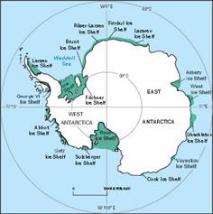
    1. The Antarctic Peninsula is a very small area that has very clearly been warming substantially over the last decades, but it represents only 2% of Antarctica 

    2. The rest of Antarctica has seen flat and even declining temperatures, as has the entire southern hemisphere.  In fact, the Antarctic Peninsula is a very small area that is anomalous within the entire Southern Hemisphere, which makes it incredible that it so often is used as indicative of a global climate trend.

      Uahmsuspol

      Uahmsushem

    3. Antarctic sea ice extent is actually at the highest levels observed since we started watching it via satellite around 1979.  Ice may be shrinking around the Peninsula, but is net growing over the whole continent
      Currentanomsouth
    4. We have no clue how ice shelves behave over time spans longer than the 100 years we have watched them.  It may well be they go through long-term natural growth and collapse cycles.

Much more here.

In Search of Honesty

Both major presidential candidates have endorsed CO2 abatement targets for the US, with Obama advocating for the most stringent — the "20 by 50" target by which the US would reduce CO2 emissions by 80% in the next 40 years.

Given that they support such targets, the candidates’ public positions on gasoline prices should be something like this:

Yeah, I know that $4 gas is painful.  But do you know what?  Gas prices are going to have to go a LOT higher for us to achieve the CO2 abatement targets I am proposing, so suck it up.  Just to give you a sense of scale, the Europeans pay nearly twice as much as we do for gas, and even at those levels, they are orders of magnitude short of the CO2 abatement I have committed us to achieve.  Since late 2006, gas prices in this country have doubled, and demand has fallen by perhaps 5%.  That will probably improve over time as people buy new cars and change behaviors, but it may well require gasoline prices north of $20 a gallon before we meet the CO2 goal I have adopted.  So get ready.

You have heard Obama and McCain say this?  Yeah, neither have I.  At least Obama was consistent enough not to adopt McCain’s gas tax holiday idea.  But it’s time for some honesty here, not that I really expect it. 

We need to start being a lot clearer about the real costs of CO2 abatement and stop this mindless "precautionary principle" jargon that presupposes that there are no costs to CO2 abatement.  When proponents of the precautionary principle say "Well, CO2 abatement is like insurance — you buy insurance on your house, don’t you," I answer, "Not if the insurance costs more than the cost to replace the house, I don’t."

Climate Blogs That Don’t Necessarily Accept “The Consensus”

Via Tom Nelson and Climate Debate Daily

William M. Briggs
Climate Audit
Climate Change Facts
Climate Change Fraud
Climate Police
Climate Resistance
Climate Scam
Climate Science
CO2 Science
Friends of Science
Global Climate Scam
Global Warming Heretic
Global Warming Hoax
Global Warming Skeptic
GlobalWarming.org
Greenie Watch
Bruce Hall
Warwick Hughes
Lucia Liljegren
Jennifer Marohasy
Warren Meyer
Maurizio Morabito
Luboš Motl
Tom Nelson
Newsbusters climate
Planet Gore
Roger Pielke Sr.
Fred Singer
David Stockwell
Philip Stott
Anthony Watts
World Climate Report

Map of Pain Created by CO2 Abatement Efforts

Government treaties and legislation will of necessity increase the cost of energy substantially.  It will also indirectly increase the cost of food and other staples, as fertilizer, equipment, and transportation costs rise.  This is not to mention the substantial rise in food costs that will continue as long as governments continue their misguided efforts to promote and subsidize food-based ethanol as a global warming solution. 

I found the map below in another context at economist Mark Perry’s site.  It shows the percentage of the average person’s income that is spent on food, fuel, and drink, with low percentages in green and high percentages in red.  However, this could easily be a map of the pain created by CO2 abatement efforts, with the most pain felt in red and the least in green.  In fact, this map actually underestimates the pain in yellow-red areas, as is does not factor in the lost development potential and thus lost future income from CO2 abatement efforts.

Foodfuelmap

Update on food prices:

Biofuels have caused a 75 per cent increase in world food prices, a new report suggests.

The rise is far greater than previous estimates including a US Government claim that plant-derived fuels contribute less than three per cent to food price hikes.

According to reports last night, a confidential World Bank document indicates the true extent of the effect of biofuels on prices at a crucial time in the world’s negotiations on biofuel policy.

Rising food prices have been blamed for pushing 100 million people beneath the poverty line. The confidential report, based on a detailed economic analysis of the effect of biofuels, will put pressure on the American and European governments, which have turned to biofuels in attempts to reduce the greenhouse gases associated with fossil fuels and to reduce their reliance on oil imports.

The report says: "Without the increase in biofuels, global wheat and maize stocks would not have declined appreciably and price increases due to other factors would have been moderate."

Extrapolating From One Data Point

Years ago, when I was studying engineering in college, I had a professor who used to "joke"  (remember, these are engineers, so the bar for the word "joke" is really low) that when he wanted to prove something, it was a real benefit to have only one data point.  That way, he said, you could plot a trend in any direction with any slope you wanted through the point.  Once you had two or three or more data points, your flexibility was ruined.

I am reminded of this in many global warming articles in the press today.  Here is one that caught my eye today on Tom Nelson’s blog.  There is nothing unusual about it, it just is the last one I saw:

Byers said he has decided to run because he wants to be able to look at his children in 20 or 30 years and be able to say that he took action to try to address important challenges facing humanity. He cited climate change as a “huge” concern, noting that this was driven home during a trip he took to the Arctic three weeks ago.

“The thing that was most striking was how the speed of climate change is accelerating—how it’s much worse than anyone really wants to believe,” Byers said. “To give you a sense of this, we flew over Cumberland Sound, which is a very large bay on the east coast of Baffin Island. This was three weeks ago; there was no ice.”

Do you see the single data point:  Cumberland Sound three weeks ago had no ice.  Incredibly, from this single data point, he not only comes up with a first derivative (the world is warming) but he actually gets the second derivative from this single data point (change is accelerating).  Wow!

We see this in other forms all the time:

  • We had a lot of flooding in the Midwest this year
  • There were a lot of tornadoes this year
  • Hurricane Katrina was really bad
  • The Northwest Passage was navigable last year
  • An ice shelf collapsed in Antarctica
  • We set a record high today in such-and-such city

I often criticize such claims for their lack of any proof of causality  (for example, linking this year’s floods and tornadoes to global warming when it is a cooler year than most of the last 20 seems a real stretch). 

But all of these stories share another common problem – they typically are used by the writer to make a statement about the pace and direction of change (and even the acceleration of this change), something that is absolutely scientifically impossible to do from a single data point.  As it turns out, we often have flooding in the Midwest.  Neither tornadoes nor hurricanes have shown any increasing trend over the past decades.  The Northwest Passage has been navigable a number of years in the last century.  During the time of the ice shelf collapse panic, Antarctica was actually setting 30-year record highs for sea ice extent.  And, by simple math, every city on average should set a new 100-year high temperature record every 100 days, and this is even before considering the urban heat island effect’s upward bias on city temperature measurement.

Postscript:  Gee, I really hate to add a second data point to the discussion, but from Cyrosphere Today, here is a comparison of the Arctic sea ice extent today and exactly 20 years ago (click for a larger view)

Deetmp7873arrow

The arrow points to Cumberland Sound.  I will not dispute Mr. Byers personal observations, except to say that whatever condition it is in today, there seems to have been even less ice there 20 years ago.

To be fair, sea ice extent in the Arctic is down about a million square kilometers today vs. where it was decades ago (though I struggle to see it in these maps), while the Antarctic is up about a million, so the net world anomaly is about zero right now. 

The Date You Should Die

A while back I wrote about a disgusting little online game sponsored by the Australian government via the ABC.  It appears that this game is being promoted in the public schools as well:

Professor Schpinkee’s “date one should die” exercise is meant to be a “fun” experience for primary students of public schools associated with the Australian Sustainability Schools Initiative.” According to a 2007 Schools Environment newsletter, written by the government sustainability officer in New South Wales and sent to schools in this program, teachers are encouraged to lead children to the Australian Broadcasting Corporation’s Planet Slayer website and use Professor Schpinkee’s Greenhouse Calculator. The newsletter refers to the calculator as a “great game for kids.”

My original post has screenshots and more description.  Via Tom Nelson