
Note this chart used by Andrew Revkin:

The description of the chart is as follows:
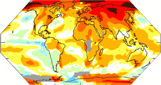
Map shows areas in 2007 that were warmer (reds) and colder (blues) than the mean annual temperature from 1951-1980. (Credit: NASA/GISS)
It is said that a picture is worth a thousand words. Let me see if I can come up with a thousand words as to what is wrong with this picture.
-
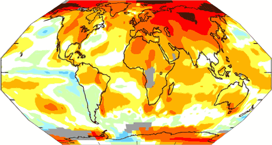
Every school kid knows that this sort of projection of the world greatly exaggerates the size of the poles and Greenland. Since most of the red here is at the poles, then visually its impact is exaggerated. For example, the top row of pixels at the top which constitute a fair percentage of the map actually represent a tiny plot of land at the pole. That row of pixels represents an area at least 10x smaller than does the row of pixels at the equator. I don’t have with me at work a good graphical tool to apply a spherical transform to the map, so I approximated it with a couple of linear skews. This would be a more realistic map, except it still exaggerates the area at the pole (see here to confirm it is a decent approximation)

Flip your eyes between the two of them — already we see a huge visual difference in impression. (Update: better version here, using a tool from the GISS no less!)
- The coloring in and of itself makes a point. The whole world has warmed a half degree or less in this period, but the dark red makes it look sizzling
- Here is the next trick — if you want to make a strong impression of growth, make sure to find the low point in the historical record and compare to that. So, lets look at history:

Hey, what do you know? 1950 to 1980 represents a low point in the trend. Since they were trying to make a point about warming accelerating, then it might have made more sense to look at the warming since, say, 1998 — ie over the last decade. Unfortunately, that chart would be all blue, since temperatures throughout this century have been lower than 1998.
- There are four most frequently cited academic rollups of world-wide temperature anomaly. They are: GISS (surface), HadCrut3 (surface), RSS (satellite) and UAH (satellite). Their current values are all shown here. So, does the NY Times (and other catastrophists) take the average? The median value? No, silly. They take the outlier which shows far more warming than the other three, which is the GISS.
- The GISS surface measurement system is rife with errors. But the one I want to mention here is that, outside of the US, the temperature measurement points are very spotty. Some points in the ocean are over 1000 miles from a thermometer, but still are colored on this chart (yes, there is some grey I suppose for "no data" but that gray should be a lot more prevalent. ) If you only plotted data for 250km squares where the GISS actually has the data do make this comparison, without the mythical extrapolation into unmeasured areas, the chart should look like this:

How did they fill in all that grey area? You tell me because Hansen certainly isn’t talking.
- I am no longer going to accept any climate scientist as a serious scientist (and not just a biased mouthpiece) who insists on using the faulty and patchy surface temperature record over satellite measurement. As I said previously:
Satellite temperature measurement makes immensely more sense – it has full coverage (except for the poles) and is not subject to local biases. Can anyone name one single reason why the scientific community does not use the satellite temps as the standard EXCEPT that the "answer" (ie lower temperature increases) is not the one they want? Consider the parallel example of measurement of arctic ice area. My sense is that before satellites, we got some measurements of arctic ice extent from fixed observation stations and ship reports, but these were spotty and unreliable. Now satellites make this measurement consistent and complete. Would anyone argue to ignore the satellite data for spotty surface observations? No, but this is exactly what the entire climate community seems to do for temperature.
-
Some of the data is just plain bogus on the chart, part of the GISS/Hansen "higher must be right" approach to measuring temperature. The Satellites show Antarctica cooling:

The surface temperature record shows the same thing

There is one area warming – the relatively small Antarctic Peninsula. It should be orange in the map above (and is) but the rest of the orange in Antarctica is a mystery. Though this would not be the first time people tried to extrapolate Antarctic trends from the tip of this peninsula (Gore did it in his movie and 60 minutes did it the other day). This is a bit like measuring US temperature trends from Key West. More on Antarctica here. By the way, the GISS chart without all the extrapolation that I show only has the hot area on the penninsula. All the other hot zones comes from, where? James Hansen’s imagination?


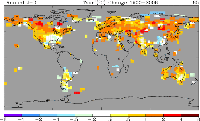
Update: Here is a similar map by satellite, which avoids the coverage issues as well as urban and other surface measurement biases. The story here is much more interesting, particularly the very different experience between north and south, something not predicted by greenhouse gas theory. One can see that there has definitely been warming, but mostly concentrated at the north pole.

Here is the last monthly image, for December, 2007:

Update: I have been getting a lot of new readers of late, including a number of commenters who disagree with me fairly strongly. Welcome. Here are some general thoughts:
- Excepting some ads for Viagra and cell phones, I have never and will never delete a comment on this site. Folks are welcome to fill up the comment threads with contrary opinions. For those distrustful of the motives of skeptics, may I observe that sites like RealClimate cannot make this claim and routinely flush comments that don’t agree with the local prevailing doctrine, so make of that what you will.
- I almost never respond to comments in the comment thread itself. I like to think about and digest the comments for a while, and then incorporate them or respond to them in later posts. Trying to respond in real time in comment threads results in flame wars, not reasoned discussion.
- Unlike many skeptics, I accept that atmospheric CO2 produced by man can warm the earth. The IPCC and most climate scientists believe that the greenhouse gas effect alone may warm the earth about a degree over the rest of this century, an amount that would be a nuisance rather than catastrophic, and likely lost in the random noise of natural variations.
- However, I do not believe the earth’s climate is dominated by strong positive feedbacks and tipping points. It is this feedback hypothesis in climate models that multiplies warming to 3-4-5 degrees or more over the next century. In climate models, the catastrophe comes from feedback, not greenhouse effects, and I think this is a bad hypothesis. Believers in catastrophic warming have an interesting problem reconciling Mann’s hockey stick, which points to incredible stability in temperatures, with a hypothesis of very high positive feedback, which should make temperatures skittish and volatile. I also think that the hypothesis that aerosols are masking substantial amounts of warming is weak, and appears to be more wishful thinking to bail out model builders than solid science (while there is some cooling effect, the area of effect is local and shouldn’t have a substantial effect on global averages).
- I think the surface temperature record as embodied in the GISS analysis is a joke. I cannot respect scientists who eschew obviously superior satellite measurements for the half-assed surface temperature record just because it doesn’t give them the answer they want to here. The fact that the leader in fighting for surface temeprature measurement over satellites is James Hansen of NASA’s Goddard Institute for Space Studies is the ultimate dark irony. It’s like Bill Gates campaiging for increased abacus use in schools.
- I have built models of complex systems for years. I have been guilty many times of allowing seamingly reasonable assumptions to compound into meaningless results. Unfortunately and embarassingly, I have also been guilty of tweaking, plugging, and tuning models to better match history in order to build confidence in their future predictions. I see all too many of these same behaviors amoung climate modellers.
The red patch over alberta’s oil patch is interesting. Any chance that the temperature measurements are affected by the tar sand extraction operations which need to generate massive quantities of heat and steam to separate the oil from the sand? Nah – its got to be caused by too much CO2 in the upper troposphere.
I would be interested to see a geographic plot of Russia’s oil operations and compare it to the temperature charts as well. I would bet that there is a correlation.
Good work. What is amazing about Hansen’s disregard of satellite temp is the fact that sea ice analysis was considered grossly inaccurate until a 2001 paper by Hansen.
I find it strange that you claim that 1951-1980 was a ‘low point in the trend’, when your graph clearly shows temperatures then to be significantly higher than the 1880-1950 average and significantly lower than those from 1980-present.
Stranger still that you suggest it would be better to use the global temperature in 1998 as a reference point. Either you’re not aware that that year saw an extremely strong El Niño, raising global temperatures 0.2°C above the long term trend, or you are deliberately trying to mislead your readers. And perhaps you’re not aware that 2005 was warmer, globally, than 1998, even without the effect of a strong El Niño.
Another strange statement: different experience between north and south, something not predicted by greenhouse gas theory. Again, you must either be ignorant of the predictions of climate models or deliberately seeking to mislead. Because the North Pole is surrounded by land, and the South Pole by water, the two hemisphere behave very differently, and climate models in fact predict that polar amplification in the north will occur much more quickly than in the south, in response to greenhouse gas forcing.
Warren knows the choice of 1998 would be unreasonable for different reasons. He used it as an example to illustrate how the choice of starting point affects the impression given by the images.
Your argument wrt the models is deceptive. Some of the models do show slower SH warming but others show faster SH warming. See this link here: http://www.climateaudit.org/?p=2665
Note that Hansen’s Scenario B is widely used by alarmists as an example of how “accurate” the models are so you can’t dismiss this model ‘not representative’.
Frankly, there are so many different models with so many different scenarios that one can argue that any possible weather outcome is ‘predicted’ by one of the models. So a claim that the ‘models predict x’ does not mean much without more context.
If a point like that was being made, why didn’t he say that that was the point being made?
Hansen’s 1988 projections were very impressive, given the resources that were available at the time. Globally, they have been surprisingly accurate. But remember, in 1988 the ZX spectrum was still rather a popular home computer. The PC I am typing on now has a processor over 1000 times faster, and has 15 million times the storage capacity of a ZX spectrum. Modelling codes today are vastly more sophisticated than they were in 1988. If you think that Hansen’s 1988 model is ‘representative’ of all models then you can’t have any idea of what is happening in the field today.
No, you couldn’t argue that any possible outcome is predicted by some model or other. Try finding a model which can account for the current warming without anthropogenic forcing. Try finding a model which does not predict that increasing CO2 causes warming.
Hansen’s 1988 projections are the only projections that we can actually validate against real data and the real data suggests that the projections over estimated the effect of CO2. The discrepancy is even worse when you look at the regional distribution of the warming.
More recent models do ‘predict’ slower trends in the SH because they were developed after this trend became too obvious to ignore. The ability to “predict” the recent past is not a measure of model accuracy.
I said any possible weather outcome – it does not make a difference whether it warms or cools AGW alarmists will be able to produce a model that ‘predicted’ it. Invalidating the models would take a massive cooling event like the solar minimum. That is why claiming that a weather event X is predicted by a model is meaningless without the specifics of the model and a look at what other predictions the same model made (i.e. was it right on one point but wrong on everything else?)
Why do you think that projections published 20 years ago are the only ones that can be validated against real data? You think climate modellers just gave up after Hansen? And if a 20 year old model didn’t get its projections exactly right over the whole globe, that means what exactly? Tell me, what warming did Hansen predict over the 1984 baseline by 2008, and what has actually happened? What is the difference between the two? What is the error on the measured temperature?
No serious climate scientist attributes individual weather events to global warming. You must have got the wrong end of a stick somewhere.
According the alarmists 10 years of weather data are not sufficient to declare that GW has stopped. This declaration also means that 10 years of data cannot be used to validate climate models. Any model that is less than 10 years old has nothing useful to contribute to the discussion because we have no way to know whether it has any connection with reality.
The differences in the regional temps are significant because gross errors in the regional temps suggest that any correlation between the actual global temp and the model is more likely a fluke rather than a meaningful prediction.
For example, I could cook up a model that predicts ice sheets forming in the Sahara but balances that with tropical temperatures in the Artic. I assume you agree that this model would be obviously junk even if it happened to get the average global temperature correct. I don’t see how you can argue that Hansen’s model is any better given the gross errors in the regional temperature predictions.
Lastly, placing the error bars on the temperature measurements and model estimates is a prudent thing to do. Unfortuanately, the error bars are so large that they do not provide any statistically meaningful validation of the model even when the do overlap. That said, if we look at the predicated vs. reality we see that the actual temps consistently end up lower than the predicted temps. This suggests that a systematic error exists even if the magnitude of this error is hard to calculate due to measurement errors. More significantly, the gap grows as time goes on.
So you are one of the people who thinks that the magnitude of the 1998 El Nino means that global warming has stopped, are you? Anyone with even a basic knowledge of statistics knows that you can’t derive a trend from the outliers. What has happened to the five year running mean temperature over the last decade? Has it risen or fallen?
If you think that Hansen’s model is no better than one which predicts ice in the Sahara and tropical temperatures at the pole, then I don’t know what to say except that you couldn’t be more wrong and you must be fundamentally misunderstanding how to compare models with reality.
So, models cannot be validated because of the error bars, but despite that you think you can say the projections were wrong? Interesting approach.
“RW”… “El Nino” is a convection current and, unless basic calorimetry physics has been redefined since I was at school, cannot create heat – just redistribute it.
I’m not sure what point you are making. Are you suggesting that it’s just coincidence that global temperatures rise when there is an El Niño?
There has been no statistically significant trend in the MSU LT or HadCrut data in the last 10 years when we should be seeing a trend of at least 0.2 degC/dec. Global warming has effectively stopped. This is a fact.
If 10 years of data is not sufficient when it comes to determining whether GW is really going on or not then 10 years of data is not sufficient to determine whether the models are accurate reflections of reality. This means that any models that are less than 10 years old have nothing useful to contribute because they have not been validated against reality.
My ice sheets in the sahara model illustrates why regional climates matter. It is not enough to get the right answer for the wrong reasons. I had that point drilled into me at university – I am surprised you didn’t. Hansen’s model got the regional temperature distributions wrong which means that his predictions for the average global temp are likely a fluke even if they did manage to extrapolate the rising trend from the 80s. He did not need a model to do that – he could have done it with a ruler.
You should learn about a concept called systematic error. It is possible to detect a systematic error even if the error bars on the datasets are large. For example, if the actual temps are always lower than the the predicted temps then that is a sign of a systematic error that cannot be ignored simply because the data points are ‘within the 95% confidence interval’. If measurement error was really to blame for the difference then the temps should be randomly scattered above and below the predicted temps.
“RW: Are you suggesting that it’s just coincidence that global temperatures rise when there is an El Niño?”
No. What I’m suggesting is that there’s a basic systemic flaw in the method of attributing “global temperature” that biases the results towards the northern hemisphere. If heat is moved from south to north by an ocean current, the increase in “gross” temperature in the north should be balanced out by a matching decrease in the south, else you’re in breach of the first law of thermodynamics.
No, Raven, it is not a fact that global warming has stopped. You are being fooled by the major upward anomaly of 1998, or perhaps deliberately trying to misrepresent it. Any ten year trend will have only marginal statistical significance due to random weather variations.
No, your Saharan ice sheets illustrate nothing because anyone could see that a model that predicted this had no bearing in reality.
No, your interpretation of Hansen compared to reality is not correct. You know that A, B and C were ‘scenarios’, right? So you have to compare the assumptions made in each scenario with reality, before you can consider whether the temperature predictions were accurate, right? Have you done your basic research and compared estimates of actual forcing with what was assumed in each scenario?
Jeff: no, it doesn’t work like that. Hot weather in the north doesn’t have to mean cold weather in the south. The internal variability of the climate system does not breach the laws of thermodynamics. What makes the atmosphere hotter in an El Niño event is the greater surface area of ocean covered by warm water. In La Niña events, the warm water only covers a small area, thus warming less of the atmosphere. There is no systematic flaw in measuring temperatures in the way you suggest.
RW says:
“Any ten year trend will have only marginal statistical significance due to random weather variations.”
Excellent. Then you must agree that climate models that are less that 10 years old cannot possibily be evaluated because of random whether variations. This is why I say the only models that are really worth looking at are Hansen’s 1988 model and maybe a few that went in to creating the IPCC 1990 and 1992 reports. The more recent “new and improved” models won’t be that interesting until 2025.
I choose a deliberately absurd example to demonstrate that models with no connection to reality could produce results that seem valid. But the question becomes: how do we know whether Hansen’s model has any connection with reality? I am saying that evaluating the regional predictions are a useful metric. A model that is completely wrong on the regional temps obviously has no connection to reality no matter what scientific theory underpins its construction.
I am fully aware of the differences between the scenarios and that the actual forcings have come out considerably less than assumed in scenarios A. What is most interesting is that the actual forcings now exceed the values assumed in scenario C yet the actual temps are below Scenario C. BTW – Scenario C is what Hansen said we should expect if the world capped CO2 emissions by 2000 through agressive regulation. This makes it the fact that we are below the predictions for Scenario C even more interesting.
I can see that your position is one of wilful ignorance by your repeated claim that a model predicting ice in the Sahara would be as ‘valid’ as Hansen’s 1988 projections. No point bashing my head against a brick wall trying to explain things to someone who doesn’t want not to be dense, is there? Suffice to say that you don’t really have a firm grip on the science, and it’s clear that you’ve decided what position you hold, regardless of the actual data.
RW,
I see that you either have a big problem with reading comprehesion or your are simply trying to create a smoke screen to hide the lack of a counter argument.
Here is what I wrote:
“I choose a deliberately absurd example to demonstrate that models with no connection to reality could produce results that seem valid. But the question becomes: how do we know whether Hansen’s model has any connection with reality? I am saying that evaluating the regional predictions are a useful metric. A model that is completely wrong on the regional temps obviously has no connection to reality no matter what scientific theory underpins its construction.”
I did not say that my admittedly absurd model was as valid as Hansen’s. I simply pointed out that getting the average global temperature sort of right is not a meaning measure of the relevance of the model.
Why don’t you answer the question? What makes you think that a model which gets the regional temperature trends wrong represents reality?
Yes, you did say that your absurd model was as valid as Hansen’s. Do I really need to remind you? Well, here it is: I could cook up a model that predicts ice sheets forming in the Sahara but balances that with tropical temperatures in the Artic. I assume you agree that this model would be obviously junk even if it happened to get the average global temperature correct. I don’t see how you can argue that Hansen’s model is any better
Presumably you think that if a model predicts temperatures that differ from more than reality by a certain amount, then they are ‘wrong’ and completely worthless, no matter by how much they exceed your arbitrary quality threshold. Can you tell us what this threshold is?
RW says:
“Presumably you think that if a model predicts temperatures that differ from more than reality by a certain amount, then they are ‘wrong’ and completely worthless, no matter by how much they exceed your arbitrary quality threshold. Can you tell us what this threshold is?”
Your response is astounding. Haven’t you heard of correlation coefficients and similar numerical measures which are used to assess the worth of a dataset? Do you really believe that model should be considered worthwhile even if it produces results which have no relationship to reality?
You are the one who considers ice in the Sahara an equally wrong prediction to everything in Hansen 1988. That suggests an extreme lack of knowledge on your part of how to assess the value of a model.
RW says:
“You are the one who considers ice in the Sahara an equally wrong prediction to everything in Hansen 1988. That suggests an extreme lack of knowledge on your part of how to assess the value of a model.”
Do you realize that anyone reading this thread will look at your responses and wonder if you have a reading comprehesion problem? I explained the reason for my previous comments in my subsequent posts is an way that should be clear to any reader.
Why don’t you tell us what statistical tests should be done to determine if Hansen’s model has any connection to reality? I think that comparing regional distribution of predictions to actual temperatures is good way to do it and that it is obvious that the regional correlation is not great.
Interestingly enough, the satellite “trend” map is perfectly compatible with the IPCC’s own, overwhelmingly European, actual findings
http://omniclimate.wordpress.com/2007/12/21/global-warming-may-be-just-european/
Raven: ‘comparing regional distribution of predictions’ is not a statistical test.
You still haven’t specified the maximum difference with observations beyond which you consider a model ‘wrong’. You still think that Hansen’s projections are as wrong as if they had predicted ice caps in the Sahara. That is simply laughable.
RW – you’re an idiot, and you make your side look bad. That’s the short version.
The long version is that “comparing regional distribution of predictions” is a perfectly valid statistical test, inasmuch as “comparing global temperature to predictions” is a perfectly valid statistical test. A test is statistical when it is based on – gasp – statistics. And if a model predicts distribution A, with an average Av, and reality produces distribution B, with average Av, THE MODEL IS STILL CRAP. It’s the DISTRIBUTION from which the average was derived – it is absolutely meaningless that the two happen to correlate, because they are imperfect representations of a larger dataset. Yes, when you strip away 99% of the actual data, Hansen’s predictions correlate. That is, again, meaningless – we could strip away data that shows that his predictions were absolutely correct in, say, Detroit. Finding one data item in a set of hundreds and saying IT matches doesn’t validate your model. That was Raven’s entire point, and you are obsessing over his hyperbole, because you have absolutely no ground to stand on when it comes to what he was actually saying.
Adirian – you’re obviously stupid, and you’re rude as well. ‘Compare’ is a statistical test? Which statistics, exactly, are you describing when you say ‘comparing’ is a statistical test?
It is not the comparison that is the statistics, the comparison is what the statistics achieve. The test is how that comparison measures up. In the case of averages, it is a very simple, and very lossy, statistic that is used. In the case of regional distribution, it is a very complex but much less lossy approach. The comparison is then to simply see where in the distribution of the projection, which is usually but not always a normal distribution, reality falls. In the case of regional comparisons, you have hundreds of comparisons, to see how well the model predicted behavior – and you then do an additional statistic to see whether the distribution of those distributions fell into an arbitrary region of expected values. (The usual arbitrary region is the 95% range, although precise sciences use much higher numbers.) The reason you do the second step is because outliers are expected, and what you are actually interested in is how well the model performed as a whole, rather than how it performed in, say, Detroit. Hansen’s model failed this test, and failed miserably – the regional distributions of temperature were wildly off of his predictions, and it merely happens that the average of them – a single data point out of thousands – aligned.
Comparing the averages would be skipping the entire intermediary step of statistics, and, instead of seeing whether the regional distributions were approximately normal (or otherwise as distribution may be expected), you condense the distributions to a single data point, and compare THAT. As Raven accurately put it, an ice age in the Sahara and boiling temperatures in the Arctic would pass that test just as well – that is, it would perform PRECISELY AS WELL FOR THIS TEST AS HANSEN’S MODEL – because it is a lossy comparison. He wasn’t saying that it would be just as accurate a representation of reality.
If you want to argue with anyone about statistics, you might invest some time in a course.
If you want to have a sensible discussion, you might try not being an obnoxious twerp.
Now you’ve admitted that ‘comparing’ is not an adequate description of a statistical test, and you’ve had a go at describing an actual statistical test. Then, though, you claim that Hansen’s model failed this test, and failed miserably – care to provide a link to the paper or papers in which this test has been applied?
The individual playing at trying to argue semantics is accusing me of being an obnoxious twerp? How delightfully entertaining. I’m glad to see you’ve realized you can’t win that particular game with me, however, and have moved on to demanding evidence. (Incidentally, regarding semantic arguments – if “comparison” doesn’t describe a statistical test, I also failed entirely to describe an actual statistical test. An actual test description would involve more math than I care to write out. I implied a statistical test using a great many words, an implication which is much simpler stated as a “comparison,” where the context implies a statistical comparison, rather than some other form of comparison.)
And no, I don’t really care to provide a link. Hunting through research papers doesn’t sound like a good use of my evening right now, particularly for a test that would take much less time to reproduce in Excel than to locate, or at least would once you’ve tabularized the data. So you can claim victory over me, if you actually care to, but you’ve still effectively lost your argument with Raven.
Incidentally, it would be a wasted effort anyways – if the model is good, the predictions shouldn’t bear too much similarity to reality, for the simple and expedient reason that the predictions of greenhouse gas levels in any of the three scenarios Hansen produced simply don’t match up to reality, in each case at least one of the major three diverging significantly from prediction. Garbage in, garbage out, no matter how good the model. A retrofit of the original temperature model with modern GhG data would be a much better indicator of its accuracy, and to my knowledge, that hasn’t been done.
If you don’t care to provide a link to evidence that you’re quoting, then I have to assume you’re just making it up.
Wow RW, you’re an idiot. In the future, if you don’t want to look like an idiot, try answering some questions…
Isaac Crawford
Blogging in Yemen
http://www.isaharr.com
Wow Isaac, that’s a really insightful contribution to the debate! What a clever fellow you must be, to post spam masquerading as moronic comments like that.
RW, in case I hadn’t made it painfully obvious enough, I wasn’t interested in the argument between you and I, I was interested in the argument between you and Raven. I already told you you could assume you had won our argument, because I really didn’t and don’t care to have that argument.
I’ll discuss my arguments with Raven with Raven, and not you, thanks.
It seems to me, that RWs plan is to distract everyone from the actual point.
Create a big argument, and muddy the waters.
Go on RW please reply to me, so I can ignore you.
And please, lets remember “the debate is over” ROFL
Can we get back to talking about science now please.
Great work guys.