Scientists have a concept called climate sensitivity which refers to the amount of global warming in degrees Celsius we might expect from a doubling of CO2 concentrations from a pre-industrial 280ppm to 560ppm (we are currently at about 380ppm today and will reach 560ppm between 2065 and 2100, depending on how aggressive a forecast you want to adopt).
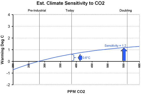
A simple way to estimate sensitivity is from experience over the past century. At the same time CO2 has gone up by 100ppm, global temperatures have gone up by at most 0.6 Celsius (from the 4th IPCC report). I actually believe this number is over-stated due to uncorrected urban effects and other surface temperature measurement issues, but let’s assume 0.6ºC. Only a part of that 0.6ºC is due to man – some is likely do to natural cyclical effects, but again to avoid argument, let’s assume man’s CO2 has heated the earth 0.6 Celsius. From these data points, we can project forward:
As you can see, the projection is actually a diminishing curve. For reasons I will not go into again (you can read much more in this post) this relationship HAS to be a diminishing curve. It’s a fact accepted by everyone. True climate consensus. We can argue about the slope and exact shape, but I have chosen midpoint values from a reasonable range. The answer is not that sensitive to different assumptions anyway. Even a linear extrapolation, which is clearly wrong scientifically, would only yield a sensitivity projection a few tenths of a degree higher.
What we arrive at is a sensitivity of about 1.2 degrees Celsius for a CO2 doubling (where the blue line crosses 560ppm). In other words, we can expect another 0.6ºC increase over the next century, about the same amount we experienced (and most of us failed to notice) over the last century.
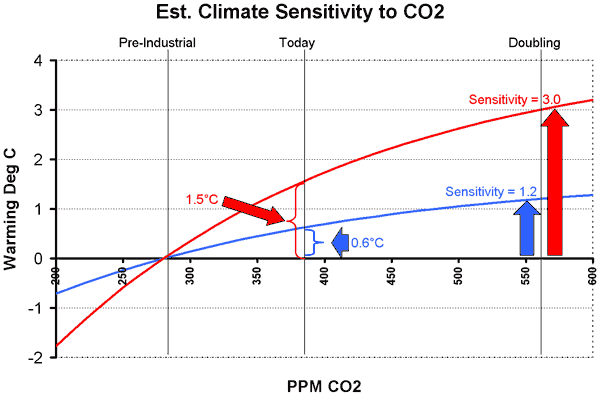
But, you are saying, global warming catastrophists get so much higher numbers. Yes they do, with warming as high as 9-10C in the next century. In fact, most global warming catastrophists believe the climate sensitivity is at least 3ºC per doubling, and many use estimates as high as 5ºC or 6ºC. Do these numbers make sense? Well, let’s draw the same curve for a sensitivity of 3ºC, the low end of the catastrophists’ estimates, this time in red:
To get a sensitivity of 3.0ºC, one has to assume that global warming due solely to man’s CO2 (nothing else) would have to be 1.5ºC to date (where the red line intersects the current concentration of 380ppm). But no one, not the IPCC or anyone else, believes measured past warming has been anywhere near this high. So to believe the catastrophic man-made global warming case, you have to accept a sensitivity three or more times higher than historical empirical data would support. Rather than fighting against climate consensus, which is how we are so often portrayed, skeptics in fact have history and empirical data on our side. For me, this second chart is the smoking gun of climate skepticism. We have a lot of other issues — measurement biases, problems with historical reconstructions, role of the sun, etc — but this chart highlights the central problem — that catastrophic warming forecasts make no sense based on the last 100+ years of actual data.
Global warming catastrophists in fact have to argue against historical data, and say it is flawed in two ways: First, they argue there are positive feedbacks in climate that will take hold in the future and accelerate warming; and second, they argue there are other anthropogenic effects, specifically sulphate aerosols, that are masking man-made warming. Rather than just repeat myself (and in the interest in proving I can actually be succinct) I will point you to this post, the second half of which deals in depth with these two issues.
As always, you can find my Layman’s Guide to Skepticism about Man-made Global Warming here. It is available for free in HTML or pdf download, or you can order the printed book that I sell at cost.


Warren,
I find that your new blog cannot be read without using the view ‘Largest’ text size in IE6 or using at least 140% magnification in Opera. The black background just overwhelms smaller text.
Regards, Don
To be fair to the alarmists, it is also possible that a sensitivity of 3.0C is being obscured by time delay, a separate factor than the masking of negative anthropogenic factors such as aerosols.
Perhaps deep ocean water takes decades to reach a new warmer equilibrium. Or perhaps the melting of all arctic ice in summer will lower albedo enough to cause significantly more warming. (Arctic ice trends for the past 3 decades are somewhat alarming, although the limited older data may indicate comparable open water around 1930.)
That said, I agree that the key argument of sensitivity is the simplest and clearest way to understand the issue. Further, it has seemed to me that if Mann et al were right with the “hockey stick”, and temperatures had been very stable for 1300 years, that would be significant evidence against the strongly positive feedbacks which the alarmists’ faith relies upon even as they also hold on faith the hockey stick itself.
I like these graphs, they are quite a bit easier to follow than most of the graphs I have seen posted on environmentalist websites. Reason being is that, over the past 100 years or so the average temperature has only risen between less than 1 degree Celsius and and three degrees depending on the chart you are looking at. However, the graphs show this jump as being astronomical because of the size of the grid squares so that they can compare temperature rise to CO2 rise. In other words the increase looks a lot greater than it actually was. Though in Al Gore’s graph, the actual temperatures in Celsius has been left out, leaving the viewer to assume the heat increases were extremely significant increases.
The other problem with Global Warming is the actual term “Global Warming”. While in some parts of the world it is indeed hotter it is actually cooler in other parts of the world. Hasn’t the Northern United States been experiencing colder than usual weather? If it’s Global Warming, I expect the changes to be Global, not isolated to certain areas. If it’s a global climate shift, well that doesn’t sound to me like something to worry about, as these things happen. At one time Egypt was a jungle. Go figure? It seems to me this is more like people trying to not cope with the fact that there are many things in this world we have little to no control over. The Sun being one of them.