Temperature History

Linear Regression Doesn't Work if the Underlying Process is not Linear

Normally, I would have classified the basic premise of Craig Loehle's recent paper, as summarized at Climate Audit, as a blinding glimpse of the obvious.  Unfortunately, the climate science world is in desperate need of a few BGO's, so the paper is timely.  I believe his premise can be summarized as follows:

  1. Many historical temperature reconstructions, like Mann's hockey stick, use linear regressions to translate tree ring widths into past temperatures
  2. Linear regressions don't work when the underlying relationship, here between tree rings and temperature, is not linear.

The relationship between tree ring growth and temperature is almost certainly non-linear.  For example, tree ring growth does not go up forever, linearly, with temperature.  A tree that grows 3mm in a year at 80F and 4mm at 95F is almost certainly not going to grow 6mm at 125F. 

However, most any curve, over a sufficiently narrow range, can be treated as linear for the purposes of most analyses.  The question here is, given the relationship between tree ring growth and temperatures, do historical temperatures fall into such a linear region?  I think it is increasingly obvious the answer is "no," for several reasons:

  1. There is simply not very good, consistent data on the behavior of tree ring growths with temperature from folks like botanists rather than climate scientists.  There is absolutely no evidence whether we can treat ring widths as linear with temperatures over a normal range of summer temperatures.
  2. To some extent, folks like Mann (author of the hockey stick) are assuming their conclusion.  They are using tree ring analysis to try to prove the hypothesis that historic temperatures stayed in a narrow band (vs. current temperatures that are, they claim, shooting out of that band).  But to prove this, they must assume that temperatures historically remained in a narrow band that is the linear range of tree ring growth.  Essentially, they have to assume their conclusion to reach their conclusion.
  3. There is strong evidence that tree rings are not very good, linear measurements of temperature due to the divergence issue.  In short -- Mann's hockey stick is only hockey stick shaped if one grafts the surface temperature record onto the tree ring history.  Using only tree ring data through the last few decades shows no hockey stick.  Tree rings are not following current rises in temperatures, and so it is likely they underestimate past rises in temperature.  Much more here.

  4. Loehle's pursues several hypotheticals, and demonstrates that a non-linear relationship of tree rings to temperature would explain the divergence problem and would make the hockey stick a completely incorrect reconstruction.

NOAA Adjustments

Anthony Watts has an interesting blink comparisonbetween the current version of history from the GISS and their version of history in 1999.  It is amazing that all of the manual adjustments they add to the raw data constantly have the effect of increasing historical warming.  By continuing to adjust recent temperatures up, and older temperatures down, they are implying that current measurement points have a cooling bias vs. several decades ago.  REALLY?  This makes absolutely no sense given what we now know via Anthony Watt's efforts to document station installation details at surfacestations.org.

I created a blink comparison a while back that was related but slightly different.  I created a blink comparison to show the effect of NOAA manual adjustments to the raw temperature data. 

Blink_noaa   

My point was not that all these adjustments were unnecessary (the time of observation adjustment is required, though I have always felt it to be exaggerated).  But all of the adjustments are upwards, even those for station quality.  The net effect is that there is no global warming signal in the US, at least in the raw data.  The global warming signal emerges entirely from the manual adjustments.  Which causes one to wonder as to the signal to noise ratio here.  And increases the urgency to get more scrutiny on these adjustments.

It only goes through 2000, because I only had the adjustment numbers through 2000.  I will see if I can update this.

Lipstick on a Pig

Apparently, Michael Mann is yet again attempting a repackaging of his hockey stick work.  The question is, has he re-worked his methodologies to overcome the many statistical issues third parties have had with his work, or is this more like AirTran changing its name from ValuJet to escape association in people's mind with its 1996 plane crash?

Well, Steve McIntyre is on the case, and from first glance, the new Mann work seems to be the same old mish-mash of cherry-picked proxies, bizarre statistical methods, and manual tweaking of key proxies to make them look the way Mann wants them to look.  One thing I had never done was look at all the component proxies of the temperature reconstructions all in one place.  At the link above, Steve has all the longer ones in a animated GIF.  It is really striking how a) almost none of them have a hockey stick shape and b) even the few that do have HS shapes typically show the warming trend beginning in 1800, not in the late 19th century CO2 period. 

If you would like to eyeball all 1209 of the proxies Mann begins with (before he starts cherry picking), they are linked here.  I really encourage you to click through to one of the five animations, just to get  a feel for it.  As someone who has done a lot of data analysis, it is just staggering that he can get a hockey stick out of these and claim that it is in some way statistically significant.  It is roughly equivalent to watching every one of your baseball team's games, seeing them lose each one, and then being told that they have the best record in the league.  It makes no sense.

The cherry-picking is just staggering, though you have to read the McIntyre articles as a sort of 2-3 year serial to really get the feel of it.  However, this post gives one a feel of how Mann puts a thin statistical-sounding veneer to cover his cherry-picking, but at the end of the day, he has basically invented a process that takes about a thousand proxy series and kicks out all but the 484 that will generate a hockey stick.

Update:  William Briggs finds other problems with Mann's new analysis:

The various black lines are the actual data! The red-line is a 10-year running mean smoother! I will call the black data the real data, and I will call the smoothed data the fictional data. Mann used a “low pass filter” different than the running mean to produce his fictional data, but a smoother is a smoother and what I’m about to say changes not one whit depending on what smoother you use.

Now I’m going to tell you the great truth of time series analysis. Ready? Unless the data is measured with error, you never, ever, for no reason, under no threat, SMOOTH the series! And if for some bizarre reason you do smooth it, you absolutely on pain of death do NOT use the smoothed series as input for other analyses! If the data is measured with error, you might attempt to model it (which means smooth it) in an attempt to estimate the measurement error, but even in these rare cases you have to have an outside (the learned word is “exogenous”) estimate of that error, that is, one not based on your current data.

If, in a moment of insanity, you do smooth time series data and you do use it as input to other analyses, you dramatically increase the probability of fooling yourself! This is because smoothing induces spurious signals—signals that look real to other analytical methods. No matter what you will be too certain of your final results! Mann et al. first dramatically smoothed their series, then analyzed them separately. Regardless of whether their thesis is true—whether there really is a dramatic increase in temperature lately—it is guaranteed that they are now too certain of their conclusion.

and further:

The corollary to this truth is the data in a time series analysis is the data. This tautology is there to make you think. The data is the data! The data is not some model of it. The real, actual data is the real, actual data. There is no secret, hidden “underlying process” that you can tease out with some statistical method, and which will show you the “genuine data”. We already know the data and there it is. We do not smooth it to tell us what it “really is” because we already know what it “really is.”

Update:  I presume it is obvious, but the commenter "mcIntyre" has no relation that I know of to the "mcintyre" quoted and referred to in the post.  As a reminder of my comment policy, 1) I don't ban or delete anything other than outright spam and 2) I strongly encourage everyone who agrees with me to remain measured and civil in your tone -- everyone else is welcome to make as big of an ass out of him or herself as they wish.

By the way, to the commenter named "mcintyre,"  I have never ever seen the other McIntyre (quoted in this post) argue that CO2 does not act as a greenhouse gas.  He spends most of his time arguing that the statistical methods used in certain historic temperature reconstructions (e.g. Mann's hockey stick but also 20th century instrument rollup's like the GISS global temperature anamoly) are flawed.  I have read his blog for 3 years now and can honestly say I don't know what his position on the magnitude of future anthropogenic warming is.  Mr. McIntyre is apparenlty not alone -- Ian Jolliffe holds the opinion that the reputation of climate science is being hurt by the statistical sloppiness in certain corners of dendro-climatology.

Global Warming "Fingerprint"

Many climate scientists say they see a "fingerprint" in recent temperature increases that they claim is distinctive and makes current temperature increases different from past "natural" temperature increases. 

So, to see if we are all as smart as the climate scientists, here are two 51-year periods from the 20th century global temperature record as provided by the Hadley CRUT3.  Both are scaled the same (each line on the y-axis is 0.2C, each x-axis division is 5 years) -- in fact, both are clips from the exact same image.  So, which is the anthropogenic warming and which is the natural? 

  Periodb       Perioda_3

One clip is from 1895 to 1946 (the"natural" period) and one is from 1957 to present  (the supposedly anthropogenic period). 

If you have stared at these charts long enough, the el Nino year of 1998 has a distinctive shape that I recognize, but otherwise these graphs look surprisingly similar.  If you are still not sure, you can find out which is which here.

Backcasting with Computer Climate Models

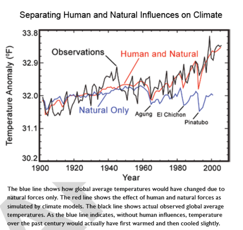
I found the chart below in the chapter Global Climate Change of the NOAA/NASA CCSP climate change report. (I discuss this report more here). I thought it was illustrative of some interesting issues:
Temp

The Perfect Backcast

What they are doing is what I call "backcasting," that is, taking a predictive model and running it backwards to see how well it preforms against historical data.  This is a perfectly normal thing to do.

And wow, what a fit.  I don't have the data to do any statistical tests, but just by eye, the red model output line does an amazing job at predicting history.  I have done a lot of modeling and forecasting in my life.  However, I have never, ever backcast any model and gotten results this good.  I mean it is absolutely amazing.

Of course, one can come up with many models that backcast perfectly but have zero predictive power

A recent item of this ilk maintains that the results of the last game played at home by the NFL's Washington Redskins (a football team based in the national capital, Washington, D.C.) before the U.S. presidential elections has accurately foretold the winner of the last fifteen of those political contests, going back to 1944. If the Redskins win their last home game before the election, the party that occupies the White House continues to hold it; if the Redskins lose that last home game, the challenging party's candidate unseats the incumbent president. While we don't presume there is anything more than a random correlation between these factors, it is the case that the pattern held true even longer than claimed, stretching back over seventeen presidential elections since 1936.

And in fact, our confidence in the climate models based on their near-perfect back-casting should be tempered by the fact that when the models first were run backwards, they were terrible at predicting history.  Only a sustained effort to tweak and adjust and plug them has resulted in this tight fit  (we will return to the subject of plugging in a minute).

In fact, it is fairly easy to demonstrate that the models are far better at predicting history than they are at predicting the future.  Like the Washington Redskins algorithm, which failed in 2004 after backcasting so well, climate models have done a terrible job in predicting the first 10-20 years of the future.  This is the reason that neither this nor any other global warming alarmist report every shows a chart grading how model forecasts have performed against actual data:  Because their record has been terrible.  After all, we have climate model forecasts data all the way back from the late 1980's -- surely 20+ years is enough to get a test of their performance.

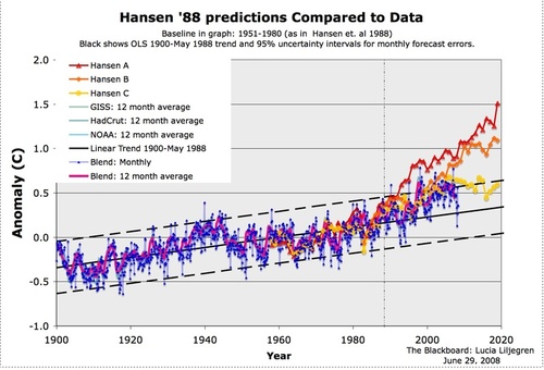
Below is the model forecasts James Hansen, whose fingerprints are all over this report, used before Congress in 1988 (in yellow, orange, and red), with a comparison to the actual temperature record (in blue).  (source)
Hansenlineartrend

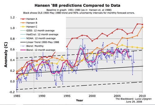
Here is the detail from the right side:
Hansencomparedrecent

You can see the forecasts began diverging from reality even as early as 1985.  By the way, don't get too encouraged by the yellow line appearing to be fairly close -- the Hansen C case in yellow was similar to the IPCC B1 case which hypothesizes strong international CO2 abatement programs which have not come about.  Based on actual CO2 production, the world is tracking, from a CO2 standpoint, between the orange and red lines.  However, temperature is no where near the predicted values.

So the climate models are perfect at predicting history, but begin diverging immediately as we move into the future.  That is probably why the IPCC resets its forecasts every 5 years, so they can hit the reset button on this divergence.  As an interesting parallel, temperature measurements of history with trees have very similar divergence issues when carried into the future.

What the Hell happened in 1955?

Looking again at the backcast chart at the top of this article, peek at the blue line.  This is what the models predict to have been the world temperature without man-made forcings.  The blue line is supposed to represent the climate absent man.  But here is the question I have been asking ever since I first started studying global warming, and no one has been able to answer:  What changed in the Earth's climate in 1955?  Because, as you can see, climate forecasters are telling us the world would have reversed a strong natural warming trend and started cooling substantially in 1955 if it had not been for anthropogenic effects.

This has always been an issue with man-made global warming theory.  Climate scientists admit the world warmed from 1800 through 1955, and that most of this warming was natural.  But somehow, this natural force driving warming switched off, conveniently in the exact same year when anthropogenic effects supposedly took hold.  A skeptical mind might ask why current warming is not just the same natural trend as warming up to 1955, particularly since no one can say with any confidence why the world warmed up to 1955 and why this warming switched off and reversed after that.

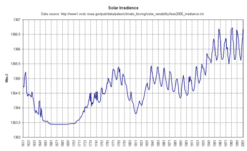
Well, lets see if we can figure it out.  The sun, despite constant efforts by alarmists to portray it is climactically meaningless, is a pretty powerful force.  Did the sun change in 1955? (click to enlarge)
Irradiance

Well, it does not look like the sun turned off.  In fact, it appears that just the opposite was happening -- the sun hit a peak around 1955 and has remained at this elevated level throughout the current supposedly anthropogenic period.

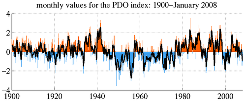
OK, well maybe it was the Pacific Decadal Oscillation?  The PDO goes through warm and cold phases, and its shifts can have large effects on temperatures in the Northern Hemisphere.
Pdo_monthly

Hmm, doesn't seem to be the PDO.  The PDO turned downwards 10 years before 1955.  And besides, if the line turned down in 1955 due to the PDO, it should have turned back up in the 1980's as the PDO went to its warm phase again. 

So what is it that happened in 1955.  I can tell you:  Nothing. 

Let me digress for a minute, and explain an ugly modeling and forecasting concept called a "plug".  It is not unusual that when one is building a model based on certain inputs (say, a financial model built from interest rates and housing starts or whatever) that the net result, while seemingly logical, does not get to what one thinks the model should be saying.  While few will ever admit it, I have been inside the modeling sausage factory for enough years that it is common to add plug figures to force a model to reach an answer one thinks it should be reaching -- this is particularly common after back-casting a model.

I can't prove it, any more than this report can prove the statement that man is responsible for most of the world's warming in the last 50 years.  But I am certain in my heart that the blue line in the backcasting chart is a plug.  As I mentioned earlier, modelers had terrible success at first matching history with their forecasting models.  In particular, because their models showed such high sensitivity of temperature to CO2 (this sensitivity has to be high to get catastrophic forecasts) they greatly over-predicted history. 

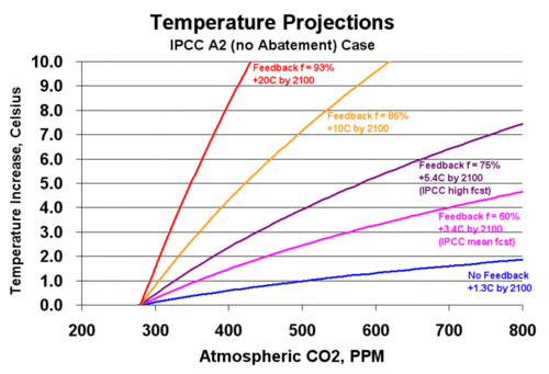
Here is an example.  The graph below shows the relationship between CO2 and temperature for a number of sensitivity levels  (the shape of the curve was based on the IPCC formula and the process for creating this graph was described here).
Agwforecast1

The purple lines represent the IPCC forecasts from the fourth assessment, and when converted to Fahrenheit from Celsius approximately match the forecasts on page 28 of this report.  The red and orange lines represent more drastic forecasts that have received serious consideration.  This graph is itself a simple model, and we can actually backcast with it as well, looking at what these forecasts imply for temperature over the last 100-150 years, when CO2 has increased from 270 ppm to about 385 ppm.
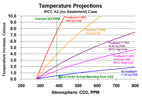
Agwforecast2

The forecasts all begin at zero at the pre-industrial number of 270ppm.  The green dotted line is the approximate concentration of CO2 today.  The green 0.3-0.6C arrows show the reasonable range of CO2-induced warming to date.  As one can see, the IPCC forecasts, when cast backwards, grossly overstate past warming.  For example, the IPCC high case predicts that we should have see over 2C warming due to CO2 since pre-industrial times, not 0.3 or even 0.6C

Now, the modelers worked on this problem.   One big tweak was to assign an improbably high cooling effect to sulfate aerosols.  Since a lot of these aerosols were produced in the late 20th century, this reduced their backcasts closer to actuals.  (I say improbably, because aerosols are short-lived and cover a very limited area of the globe.  If they cover, say, only 10% of the globe, then their cooling effect must be 1C in their area of effect to have even a small 0.1C global average effect).

Even after these tweaks, the backcasts were still coming out too high.  So, to make the forecasts work, they asked themselves, what would global temperatures have to have done without CO2 to make our models work?  The answer is that if the world naturally were to have cooled in the latter half of the 20th century, then that cooling could offset over-prediction of temperatures in the models and produce the historic result.  So that is what they did.  Instead of starting with natural forcings we understand, and then trying to explain the rest  (one, but only one, bit of which would be CO2), modelers start with the assumption that CO2 is driving temperatures at high sensitivities, and natural forcings are whatever they need to be to make the backcasts match history.

By the way, if you object to this portrayal, and I will admit I was not in the room to confirm that this is what the modelers were doing, you can do it very simply.  Just tell me what substantial natural driver of climate, larger in impact that the sun or the PDO, reversed itself in 1955.

A final Irony

I could go on all day making observations on this chart, but I would be surprised if many readers have slogged it this far.  So I will end with one irony.  The climate modelers are all patting themselves on the back for their backcasts matching history so well.  But the fact is that much of this historical temperature record is fraught with errors.  Just as one example, measured temperatures went through several large up and down shifts in the 40's and 50's solely because ships were switching how they took sea surface temperatures (engine inlet sampling tends to yield higher temperatures than bucket sampling).  Additionally, most surface temperature readings are taken in cities that have experienced rapid industrial growth, increasing urban heat biases in the measurements.  In effect, they have plugged and tweaked their way to the wrong target numbers!  Since the GISS and other measurement bodies are constantly revising past temperature numbers with new correction algorithms, it will be interesting to see if the climate models magically revise themselves and backcast perfectly to the new numbers as well.

More on "the Splice"

I have written that it is sometimes necesary to splice data gathered from different sources, say when I suggested splicing satellite temperature measurements onto surface temperature records.

When I did so, I cautioned that there can be issues with such splices.  In particular, one needs to be very, very careful not to make too much of an inflextion in the slope of the data that occurs right at the splice.  Reasonable scientific minds would wonder if that inflection point was an artifact of the changes in data source and measurement technology, rather than in the underlying phenomenon being measured.  Of course, climate sceintists are not reasonable, and so they declare catastrophic anthropogenic global warming to be settled science based on an inflection in temperature data right at a data source splice (between tree rings and thermometers).  More here.

Hockey Stick: RIP

I have posted many times on the numerous problems with the historic temperature reconstructions that were used in Mann's now-famous "hockey stick."   I don't have any problems with scientists trying to recreate history from fragmentary evidence, but I do have a problem when they overestimate the certainty of their findings or enter the analysis trying to reach a particular outcome.   Just as an archaeologist must admit there is only so much that can be inferred from a single Roman coin found in the dirt, we must accept the limit to how good trees are as thermometers.  The problem with tree rings (the primary source for Mann's hockey stick) is that they vary in width for any number of reasons, only one of which is temperature.

One of the issues scientists are facing with tree ring analyses is called "divergence."  Basically, when tree rings are measured, they have "data" in the form of rings and ring widths going back as much as 1000 years (if you pick the right tree!)  This data must be scaled -- a ring width variation of .02mm must be scaled in some way so that it translates to a temperature variation.  What scientists do is take the last few decades of tree rings, for which we have simultaneous surface temperature recordings, and scale the two data sets against each other.  Then they can use this scale when going backwards to convert ring widths to temperatures.

But a funny thing happened on the way to the Nobel Prize ceremony.  It turns out that if you go back to the same trees 10 years later and gather updated samples, the ring widths, based on the scaling factors derived previously, do not match well with what we know current temperatures to be. 

The initial reaction from Mann and his peers was to try to save their analysis by arguing that there was some other modern anthropogenic effect that was throwing off the scaling for current temperatures (though no one could name what such an effect might be).  Upon further reflection, though, scientists are starting to wonder whether tree rings have much predictive power at all.  Even Keith Briffa, the man brought into the fourth IPCC to try to save the hockey stick after Mann was discredited, has recently expressed concerns:

There exists very large potential for over-calibration in multiple regressions and in spatial reconstructions, due to numerous chronology predictors (lag variables or networks of chronologies – even when using PC regression techniques). Frequently, the much vaunted ‘verification’ of tree-ring regression equations is of limited rigour, and tells us virtually nothing about the validity of long-timescale climate estimates or those that represent extrapolations beyond the range of calibrated variability.

Using smoothed data from multiple source regions, it is all too easy to calibrate large scale (NH) temperature trends, perhaps by chance alone.

But this is what really got me the other day.  Steve McIntyre (who else) has a post that analyzes each of the tree ring series in the latest Mann hockey stick.  Apparently, each series has a calibration period, where the scaling is set, and a verification period, an additional period for which we have measured temperature data to verify the scaling.  A couple of points were obvious as he stepped through each series:

  1. Each series individually has terrible predictive ability.  Each were able to be scaled, but each has so much noise in them that in many cases, standard T-tests can't even be run and when they are, confidence intervals are huge.  For example, the series NOAMER PC1 (the series McIntyre showed years ago dominates the hockey stick) predicts that the mean temperature value in the verification period should be between -1C and -16C.  For a mean temperature, this is an unbelievably wide range.  To give one a sense of scale, that is a 27F range, which is roughly equivalent to the difference in average annual temperatures between Phoenix and Minneapolis!  A temperature forecast with error bars that could encompass both Phoenix and Minneapolis is not very useful.
  2. Even with the huge confidence intervals above, the series above does not verify!  (the verification value is -.19).  In fact, only one out of numerous data series individually verifies, and even this one was manually fudged to make it work.

Steve McIntyre is a very careful and fair person, so he allows that even if none of the series individually verify or have much predictive power, they might when combined.  I am not a statistician, so I will leave that to him to think about, but I know my response -- if all of the series are of low value individually, their value is not going to increase when combined.  They may accidentally in mass hit some verification value, but we should accept that as an accident, not as some sort of true signal emerging from the data. 

Weighting Sample Sites in Mann's Hockey Stick

Posting has been light, because I have been very busy at work and because I just have not seen that much science of late that was interesting to report, and there is only so much of the political yada yada on the subject of climate I can stomach.

But I learned something the other day in this post by Steve McIntyre.  He as a nice way of cutting through all the BS about various statistical transforms that are used to create Mann's hockey stick chart when he writes:

Whenever there is any discussion of principal components or some such multivariate methodology, readers should keep one thought firmly in their minds: at the end of the day - after the principal components, after the regression, after the re-scaling, after the expansion to gridcells and calculation of NH temperature - the entire procedure simply results in the assignment of weights to each proxy. This is a point that I chose to highlight and spend some time on in my Georgia Tech presentation. The results of any particular procedural option can be illustrated with the sort of map shown here - in which the weight of each site is indicated by the area of the dot on a world map. Variant MBH results largely depend on the weight assigned to Graybill bristlecone chronologies - which themselves have problems (e.g. Ababneh.)

Pcsht44

In effect, while Mann used 50,60 proxy sets, just four determined about 90% of the answer.  Often, Mann has been challenged by historians who argue that the historical written record stands in opposition to his proxy work, since the historical record is clear about a Medieval warm period (where grapes were grown further north than they are today and Greenland was green) and a little ice age (where rivers froze that seldom froze before or since).  Mann has always responded that written records are limited to Europe and north Africa, while his hockey stick is global, but this chart tends to put the lie to that assertion.  And that is before we even discuss how bad trees are as thermometers.

Something I Have Been Saying for a While

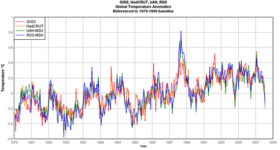
While I am big proponent of the inherent superiority of satellite temperature measurement over surface temperature measurement (at least as currently practiced), I have argued for a while that the satellite and surface temperature measurement records seem to be converging, and in fact much of the difference in their readings is based on different base periods used to set the "zero" anomoly. 

I am happy to see Anthony Watt has done this analysis, and he does indeed find that, at least for the last 20 years or so, that the leading surface and satellite temperature measurement systems are showing about the same number for warming (though by theory I think the surface readings should be rising a bit slower, if greenhouse gasses are the true cause of the warming).  The other interesting conclusion is that the amount of warming over the last 20 years is very small, and over the last ten years is nothing.

Gisshaduahrss_global_anomaly_refto_

Warming and Civilization

I am taking a course in the history of the High Middle Ages in Europe, say between 1000AD and 1300.  One of the demographic drivers of the Middle Ages is the fact that population, while flat before 1000 and declining after 1300, actually doubled in Europe between 1000 and 1300.  One of the key drivers was a very warm period that caused agriculture to flourish.

The funny part was listening to the professor try to present this section to today's audience.  He had to keep saying "I know you may find this hard to believe, but warming was very beneficial to European civilization."  It was clear the audience was so programmed to think warming=bad, that listeners had a hard time accepting the historical fact that warming created a boom, including a population boom, in Middle Age Europe.

Trees Make Bad Thermometers

OK, I would have assumed that the title for this post was obvious to all:  There are a lot of reasons that trees don't make very good thermometers.  Now, that is not a criticism of climate archaeologists who use tree rings to infer the historical temperature record.  Sometimes, we have to work with what we have.  Historians are the first to admit that coins are not the best way to deduce history, but sometimes coins are all we have.

But when historians rely on imperfect evidence, there generally is an understanding that the historical record created from this evidence is tentative and subject to error.  Unfortunately, some climate scientists have lost this perspective when it comes to tree-ring analyses, such as Mann's hockey stick.  They tend to bury the fact that:

“There are reasons to believe that tree ring data may not capture long-term climate changes (100+ years) because tree size, root/shoot ratio, genetic adaptation to climate, and forest density can all shift in response to prolonged climate changes, among other reasons.” Furthermore, Loehle notes “Most seriously, typical reconstructions assume that tree ring width responds linearly to temperature, but trees can respond in an inverse parabolic manner to temperature, with ring width rising with temperature to some optimal level, and then decreasing with further temperature increases.” Other problems include tree responses to precipitation changes, variations in atmospheric pollution levels, diseases, pest outbreaks, and the obvious problem of enrichment that comes along with ever higher levels of atmospheric carbon dioxide. Trees are not simple thermometers!

When the tree-ring folks like Mann first did their analyses, they calibrated tree ring growth over recent decades with the recent historical temperature record, and then projected this calibration backwards on history.  But, as noted in the quote above, there is a lot of evidence that these calibration factors may not be linear over time.  And in fact, the few people that have gone back and resampled Mann's trees have found that their growth diverges substantially from predicted values - in other words, the relationship between tree ring growth and temperature is not constant. 

Now, this does not make Mann and his peers bad scientists.  They were trying their best to reconstruct history, they tried one methodology, but then evidence mounted that this methodology is flawed.  What makes them potentially bad scientists is their reaction to the negative evidence.  Once evidence of the divergence problem was raised, scientists have simply ceased resampling trees.  Their focus hs become defending their original approach, rather than improving it based on new information.

Often, new approaches require new people, as in this case:

Loehle gathered as many non-tree ring reconstructions as possible for places throughout the world (Figure 1). There are dozens of very interesting ways to peer into the climatic past of a location, and Loehle included borehore temperature measurements, pollen remains, Mg/Ca ratios, oxygen isotope data from deep cores or from stalagmites, diatoms deposited on lake bottoms, reconstructed sea surface temperatures, and so on. Basically, he grabbed everything available, so long as it did not rely on trees.

And he got this plot for a temperature reconstruction:

Loehle_fig3

Only time will tell if this approach holds up better than tree rings, but it does better match the annecdotal history we have, including a Medieval warm period where Greenland was, you  know, green and a little ice age in the 17th century.  Like Mann, Loehle's first version had some statistical and procedural errors.  Unlike Mann, Loehle reworked the whole analysis when these errors were pointed out.

Its the Cities, Stupid

New study conducted in California (emphasis added):

We investigated air temperature patterns in California from 1950 to 2000. Statistical analyses were used to test the significance of temperature trends in California subregions in an attempt to clarify the spatial and temporal patterns of the occurrence and intensities of warming. Most regions showed a stronger increase in minimum temperatures than with mean and maximum temperatures. Areas of intensive urbanization showed the largest positive trends, while rural, non-agricultural regions showed the least warming. Strong correlations between temperatures and Pacific sea surface temperatures (SSTs) particularly Pacific Decadal Oscillation (PDO) values, also account for temperature variability throughout the state. The analysis of 331 state weather stations associated a number of factors with temperature trends, including urbanization, population, Pacific oceanic conditions and elevation. Using climatic division mean temperature trends, the state had an average warming of 0.99°C (1.79°F) over the 1950–2000 period, or 0.20°C (0.36°F) decade.

Southern California had the highest rates of warming, while the NE Interior Basins division experienced cooling. Large urban sites showed rates over twice those for the state, for the mean maximum temperatures, and over 5 times the state’s mean rate for the minimum temperatures. In comparison, irrigated cropland sites warmed about 0.13°C [per decade] annually, but near 0.40°C for summer and fall minima. Offshore Pacific SSTs warmed 0.09°C decadefor the study period.

So, warming has occured mainly in the urban areas, while the least developped regions have cooled.  Increase of minimum temperatures rathern than daily maximum's could be a result of CO2, but is more likely a signature of urban heat islands.  In particular, look at Anthony's map in the linked article.  Notice the red dots for hotter areas and the cool dots for cooler areas.  The red dots are all on... cities.  The blue dots are all in the countryside.  You make the call -- urban heat or greenyhouse effect.

Why Historic Proxy Studies Matter

Over the last several years, there has been quite a bit of debate in climate circles over historical temperature reconstructions from various "proxies" like ice cores and tree ring widths.  The debate really heated up a few years back when Michael Mann introduced, and the climate catastrophists at the UN IPCC adopted, the hockey stick chart.  Until that time, both scientists and historians agreed that there was good evidence for a period in the Middle Ages with temperatures as warm or warmer than today (thus the name "Greenland" and not "Glacierland") and a period known as the Little Ice Age in the 17th to 19th centuries that was quite frosty.  Mann attempted to refute this view, using data mainly from bristlecone pine tree rings, that the temperature history over the last 1000 years was in fact quite stable, at least until man started producing CO2.  (I was not writing on climate at the time, but I always wondered if any editor availed himself of the "Mann blames Man" headline.)

But why do these temperature reconstructions matter?  Aren't we more concerned with the temperature in 2050 than in 1050?  Yes and no.  To really do any kind of job at predicting future temperatures, we need more than egghead computer models tweaked in some scientist's office.  What we really need are good empirical studies about the sensitivity of temperature to different variables.

We can see the importance of historical proxies in the recent study by Scafetta and West (pdf) which looked at historical correlations between solar activity and temperatures.  The authors performed their analysis multiple times, both using "flat" historical reconstructions like Mann's and other reconstructions (e.g. Moberg) which show more historical variability.  The authors concluded (emphasis added):

Climate is relatively insensitive to solar changes if a temperature reconstruction showing little preindustrial variability is adopted. In this scenario most of the global warming since 1900 has to be interpreted as anthropogenically induced. On the other hand, if a secular temperature showing large preindustrial variability is adopted, such as MOBERG05, the climate is found to be very sensitive to solar changes and a significant fraction of the global warming that occurred during last century should be solar induced. If ACRIM satellite composite is adopted the Sun might have further contributed to the recent global warming.

Some thoughts:

  • So, which results should we rely on?  The ones using Mann's data or the ones using Moberg's?  Well, even the catastrophists at the IPCC have abandoned Mann in favor of Moberg, so one should assume the conclusions in bold are very much in play.
  • Either way, don't panic!  Even if all the 0.6C warming in the last century was due to CO2, simple math says that we should not expect more than about 1 degree more warming over the next century  (calculation here).  If the sun caused half of that 0.6C, then you can cut future warming forecasts in half.
  • Mann's work is full of errors, both statistical and otherwise.  Beginning with McIntyre and McKittrick, and proceeding to many major scientists, his work has been discredited, though he does keep trying to save the thin branch (probably from a bristlecone pine!) he has crawled out on, but he refuses to fix even basic scribal errors pointed out in his first study.  I discuss more of the problems with Mann and other similar proxy studies, including the divergence problem, here.
  • Both CO2 Science and Climate Audit have more on historical proxy studies and their problems than you can ever digest.
  • Though it doesn't make the front pages, there are still good common sense peer-reviewed studies that show the Medieval Warm Period and Little Ice Age that we could expect from narrative historical records.  One such is Loehle, Via Climate Audit  (temperature anomaly over last 2000 years or so, via proxies):

Loehle9

  • Steven Milloy, via Tom Nelson, has much more on the sun as the primary driver of climate.
  • You can view the section of my global warming film on historical proxies below.  The proxy part starts around 3:00 minutes in (or -5:30 from the end if it is shown that way)


More on the Medieval Warm Period

Loehle, Via Climate Audit  (temperature anomaly over last 2000 years or so, via proxies):

Loehle9

If your are interested in temperature proxies, check out the CA post.  It has what I have never seen before, a gallery of graphs of all the individual proxies that go into the summary/average above.  Lots of noise is my chief observation.

The Splice

To some extent, 1000-year temperature histories are moderately irrelevent to modern global warming discussions.  In fact, it is fairly amazing that the evidence of tree rings and such over 1000 years is discussed more than the instrumental record of the last 100, which tends to undercut most catastrophic warming forecasts.  However, catastrophists have attempted to use these past temperature reconstructions to make the argument that temperatures were incredibly stable and low right up to the point that man has made them higher and less stable in the last 100 years.  For this reason it is worth discussing them, if only to refute this conclusion.

I won't go into a lengthy discussion of historical reconstructions, as I alread have in my book and in my movie (both free online).  In this post I just want to talk about one issue:  the splice.

Below is the 1000-year temperature reconstruction (from proxies like tree rings and ice cores) in the Fourth IPCC Assessment.  It shows the results of twelve different studies, one of which is the Mann study famously named "the hockey stick."

S_1000years

Among many issues, I pointed out the fact that this chart appends or splices the black line, actual measured temepratures, onto the colored lines, which are the historical temperature reconstructions from proxies. 

S_1000years_inflection_high

I made the point that this offended by scientific training:  When one gets an inflection point right at the place where two data sources are spliced, as is the case here, one should be suspicious that maybe the inflection is an artifact of mismatches in the data sources, and not representative of a natural phenomenon.  And, in fact, when one removes the black line from measured temperatures and looks at only proxies, the hockey stick shape goes away:

S_1000years_inflection

The other day I discovered that this inflection point is a fairly old criticism (no surprise, I never claim to be original).  Old enough, in fact, that Michael Mann and the folks at realclimate.org have fired back:

No researchers in this field have ever, to our knowledge, "grafted the thermometer record onto" any reconstruction. It is somewhat disappointing to find this specious claim (which we usually find originating from industry-funded climate disinformation websites) appearing in this forum.

The guys at realclimate are just so cute with the "industry-funded climate disinformation" attack -- they remind me of the Soviets and how they used to blame everything on CIA plots.  I can say that 1) I recognized this problem on my very own after about 20 seconds of looking at the graph and 2) I have yet to recieve my check from the industry cabal.

It turns out, however, that this is wildly disingenuous.  What they mean is that none of the colored lines include gauge measures grafted onto older proxy data.  But I never really accused them of that.  Interestingly, Steve McIntyre argues that even this claim is wrong, and some of the colored lines do include spliced-on gauge measures.

But my point, which Mann has never refuted or addressed, is that whether the proxy lines themselves include grafted data or not, the proxy lines are NEVER shown to the public or to policy makers without the gauge temperature line added to the chart.  Have you ever seen the proxy lines as they are in my third chart above without the 20th century gauge temperature line?  If in policy discussions and media reports, this gauge temperature line is always included on the graphs in a way that it looks like an extention of the proxy series, then effectively they are grafting the data sets together in every discussion that really matters.

By the way, it is fairly easy to demonstrate that the proxy studies and the gauge temperature measurements do not represent consistent and therefore mergeable data sets.  Over hundreds of years, we have developped a lot of confidence that the linear thermal expansion of mercury in a glass tube is a good proxy for temperatures.  We have not, however, developped similar confidence in bristle cone pine tree rings, whose thickness can be influenced by everything from soil and atmospheric composition to precipitation.  Lets look at a closeup of the graph above:

S_gwmovie_ff1

You can see that almost all of the proxy data we have in the 20th century is actually undershooting gauge temperature measurements.  Scientists call this problem divergence, but even this is self-serving.  It implies that the proxies have accurately tracked temperatures but are suddenly diverting for some reason this century.  What is in fact happening are two effects:

  1. Gauge temperature measurements are probably reading a bit high, due to a number of effects including urban biases
  2. Temperature proxies, even considering point 1, are very likely under-reporting historic variation.  This means that the picture they are painting of past temperature stability is probably a false one.

All of this just confirms that we cannot trust any conclusions we draw from grafting these two data sets together.

By the way, here is a little lesson about the integrity of climate science.  See that light blue line?  Here, let's highlight it:

S_gwmovie_ff2

For some reason, the study's author cut the data off around 1950.  Is that where his proxy ended?  No, in fact he had decades of proxy data left.  However, his proxy data turned sharply downwards in 1950.  Since this did not tell the story he wanted to tell, he hid the offending data by cutting off the line, choosing to conceal the problem rather than have an open scientific discussion about it.

The study's author?  Keith Briffa, who the IPCC named to lead this section of their Fourth Assessment.

More discussion on this topic can be found in my book and in my movie (both free online). 

Example of A Temperature Proxy

Many of you have probably read about the disputes over temeprature histories like Mann's hockey stick chart.  I thought you might be interested in how some of these 1000-year long proxies are generated.  There are several different approaches, but one that Mann relied a great deal on is measuring tree rings in bristle cone pine trees.  Here is a picture of a researcher taking a core from a very old tree that is then sent to a lab to have it's ring widths measured. 

Alm4

In theory, these ring widths are directly proportional to annual temepratures, but there are a lot of questions about whether this is really true.  Other factors, like changing precipitation patterns, might also affect ring widths, and there may be reasons why the scale could change over time.  Remember, we only have a few decades, at most, of good temperature data to scale growth in a tree that goes back over a thousand years.  In fact, scientists are finding that, more recently, tree ring proxy data for current growth is diverging from surface temperature data, meaning either that surface temperature data is flawed or that they don't really understand how to scale tree ring data yet.  Interestingly, and as a sign of the health of climate science, researchers have reacted to this problem by ... not updating tree ring proxy databases for recent years.  That's one way to handle data that threatens your hypothesis -- just refuse to collect it.  Much more on proxy histories here.

Is James Hansen the Largest Source of Global Warming?

On this blog and at Coyote Blog, we have focused a lot of attention on the adjustment processes used by NOAA and James Hansen of NASA's GISS to "correct" historical temperatures.  Steve McIntyre has unearthed what looks like a simply absurd example of the lenghts Hansen and the GISS will go to tease a warming signal out of data that does not contain it. 

Wellin56b

The white line is the measured temperatures in Wellington, New Zealand before Hansen's team got hold of the data.  The red is the data that is used in the world-wide global warming numbers after Hansen had finished adjusting it.  The original flat to downward trend is entirely consistent with sattelite temeprature measurement that shows the southern hemisphere not to be warming very much or at all.

What do these adjustments imply?  Well, Hansen has clearly reduced temperatures down in the forties while keeping them about the same in 1980.  Why?  Well, the only possible reason would be if there was some kind of warming bias in 1940 in Wellington that did not exist in 1980.  It implies that things like urban effects, heat retention by asphalt, and heat sources like cars and air conditioners were all more prevelent in 1940 New Zealand than in 1980.  However, unless Wellington has gone through some back to nature movement I have not heard about, this is absurd.  Nearly without exception, if measurement points experience changing biases in our modern world, it is upwards over time with urbanization, not downwards as implied in this chart.

Postscript:  A perceptive reader might ask whether Hansen perhaps has specific information about this measurement point.  Maybe its siting has improved over time?  However, Hansen has to date absolutely rejected the effort made by folks like surfacestations.org to document specific biases in measurement sites via individual site surveys.  Hansen is in fact proud that he makes his adjustments knowing nothing about the sites in question, but only using statistical methods (of very dubious quality) to correct using other local measurement sites. 

No Warming in Antarctica

Last week we saw how Antarctic ice is advancing, but somehow this never makes the news despite huge coverage of Arctic ice retreats.

One good reason for this may well be that there has been no measured warming in Antarctica over the last 50 years.

Antarc33b

Steve McIntyre summarizes

As I’ve discussed elsewhere (and readers have observed), IPCC AR4 has some glossy figures showing the wonders of GCMs for 6 continents, which sounds impressive until you wonder - well, wait a minute, isn’t Antarctica a continent too? And, given the theory of “polar amplification”, it should really be the first place that one looks for confirmation that the GCMs are doing a good job. Unfortunately IPCC AR4 didn’t include Antarctica in their graphics. I’m sure that it was only because they only had 2000 or so pages available to them and there wasn’t enough space for this information.

Visits (Coyote Blog + Climate Skeptic)

Powered by TypePad