Warming Forecasts

Steve Chu: "Climate More Sensitive Than We Thought"

The quote in the title comes from Obama's nominee to become energy secretary, Steven Chu.  Specifically,

Chu's views on climate change would be among the most forceful ever held by a cabinet member. In an interview with The Post last year, he said that the cost of electricity was "anomalously low" in the United States, that a cap-and-trade approach to limiting greenhouse gases "is an absolutely non-partisan issue," and that scientists had come to "realize that the climate is much more sensitive than we thought."

I will leave aside of why hard scientists typically make bad government officials (short answer:  they have a tendency towards hubris in their belief in a technocrats ability to optimize complex systems.  If one thinks they can assign a 95% probability that a specific hurricane is due to man-made CO2, against the backdrop of the unimaginable chaos of the Earth's climate, then they will often have similar overconfidence in regulating the economy and/or individual behavior).

However, I want to briefly touch on his "more sensitive" comment.

Using assumptions from the last IPCC report, we can disaggregate climate forecasts into two components:  the amount of warming from CO2 alone, and the multiplication of this warming by feedbacks in the climate.  As I have pointed out before, even by the IPCC's assumptions, most of the warming comes not from CO2 alone, but from assumed quite large positive feedbacks.

Feedback1   

This is based on the formula used by the IPCC (which may or may not be exaggerated)

T = F(C2) – F(C1) Where F(c) = Ln(1+1.2c+0.005c2+0.0000014c3)

Plotting this formula, we get the blue no-feedback line above (which leads to about a degree of warming over the next century).  We then apply the standard feedback formula of Multiplier = 1/(1-feedback%)  to get the other lines with feedback.  It requires a very high 60% positive feedback number to get a 3C per century rise, close to the IPCC base forecast, and nutty 87% feedback to get temperature rises as high as 10C, which have been quoted breathlessly in the press.  It is amazing to me that any natural scientist can blithely accept such feedback numbers as making any sense at all, particularly since every other long-term stable natural process is dominated by negative rather than positive feedback.

By saying that climate is "more sensitive than we thought" means essentially that Mr. Chu and others are assuming higher and higher levels of positive feedback.  But even the lower feedback numbers are almost impossible to justify given past experience.  If we project these sensitivity numbers backwards, we see:

Feedback2 

The higher forecasts for the future imply that we should have seen 2-4C of warming over the last century, which we clearly have not.  Even if all the past warming of the last century is attributable to man's CO2  (a highly unlikely assumption) past history only really justifies the zero feedback case  (yes, I know about damping and time delays and masking and all that -- but these adjustments don't come close to closing the gap).

In fact, there is good evidencethat at most, man's CO2 is responsible for about half the past warming, or 0.3-0.4C.  But if that is the case, as the Reference Frame put it:

The authors looked at 750 years worth of the local ice core, especially the oxygen isotope. They claim to have found a very strong correlation between the concentration of this isotope (i.e. temperature) on one side and the known solar activity in the epoch 1250-1850. Their data seem to be precise enough to determine the lag, about 10-30 years. It takes some time for the climate to respond to the solar changes.

It seems that they also have data to claim that the correlation gets less precise after 1850. They attribute the deviation to CO2 and by comparing the magnitude of the forcings, they conclude that "Our results are in agreement with studies based on NH temperature reconstructions [Scafetta et al., 2007] revealing that only up to approximately 50% of the observed global warming in the last 100 years can be explained by the Sun."...

Note that if 0.3 °C or 0.4 °C of warming in the 20th century was due to the increasing CO2 levels, the climate sensitivity is decisively smaller than 1 °C. At any rate, the expected 21st century warming due to CO2 would be another 0.3-0.4 °C (the effect of newer CO2 molecules is slowing down for higher concentrations), and this time, if the solar activity contributes with the opposite sign, these two effects could cancel.

Not surprisingly, then, given enough time to measure against them, alarmist climate forecasts, such as James Hansen's below, tend over-estimate actual warming.  Which is probably why the IPCC throws out their forecasts and redoes them every 5 years, so no one can call them on their failures (click to enlarge chart below)

Hansen 

Because, at the end of the day, for whatever reason, warming has slowed or stopped over the last 10 years, even as CO2 concentrations have increased faster than ever in the modern period.  So it is hard to say what physical evidence one can have that tenperature sensitivity to CO2 is increasing.

No_acceleration

Polar Amplification

Climate models generally say that surface warming on the Earth from greenhouse gasses should be greater at the poles than at the tropics.  This is called "polar amplification."  I don't now if the models originally said this, or if it was observed that the poles were warming more so it was thereafter built into the models, but that's what they say now.  This amplification is due in part to how climate forcings around the globe interact with each other, and in part due to hypothesized positive feedback effects at the poles.  These feedback effects generally center around increases in ice melts and shrinking of sea ice extents, which causes less radiative energy to be reflected back into space and also provides less insulation of the cooler atmosphere from the warmer ocean.

In response to polar amplification, skeptics have often shot back that there seems to be a problem here, as while the North Pole is clearly warming, it can be argued the South Pole is cooling and has seen some record high sea ice extents at the exact same time the North Pole has hit record low sea ice extents.

Climate scientists now argue that by "polar amplification" they really only meant the North Pole.  The South Pole is different, say some scientists (and several comm enters on this blog) because the larger ocean extent in the Southern Hemisphere has always made it less susceptible ot temperature variations.  The latter is true enough, though I am not sure it is at all relevant to this issue.  In fact, per this data from the Cryosphere today, the seasonal change in sea ice area is larger in the Antarctic than the Arctic, which might argue that the south should see more sea ice extent.  Anyway, even the realclimate folks have never doubted it applied to the Antarctic, they just say it is slow to appear.

Anyway, I won't go into the whole Antarctic thing more (except maybe in a postscript) but I do want to ask a question about Arctic amplification.  If the amplification comes in large part due to decreased albedo and more open ocean surface, doesn't that mean most of the effect should be visible in summer and fall?  This would particularly be our expectation when we recognize that most of the recent anomaly in sea ice extent in the Arctic has been in summer.  I will repeat this chart just to remind you:

AMSRE_Sea_Ice_Extent


You can see that July-August-September are the biggest anomaly periods.  I took the UAH temperature data for the Arctic, and did something to it I had not seen before -- I split it up into seasons.  Actually, I split it up into quarters, but these come within 8 days or so of matching the seasons.  Here is what I found (I used 5 year moving averages because the data is so volatile it was hard to eyeball a trend;  I also set each of the 4 seasonal anomalies individually to zero using the period 199-1989 as the base period)

 North-pole-by-season 

I see no seasonal trend here.  In fact, winter and spring have the highest anomalies vs. the base period, but the differences are so small currently as to be insignificant.  If polar amplification were occurring and the explanation for the North Pole warming more than the rest of the Earth (by far) over the last 30 years, shouldn't I see it in the seasonal data.  I am honestly curious, and would like comments.

Postscript:  Gavin Schmidt (who else) and Eric Steig have an old article in RealClimate if you want to read their Antarctic apologia.   It is kind of a funny article, if one asks himself "how many of the statements do they make discounting Antarctic cooling are identical to the ones skeptics use in reverse?  Here are a couple of gems:

It is important to recognize that the widely-cited “Antarctic cooling” appears, from the limited data available, to be restricted only to the last two decades

Given that this was written in 2004, he means restricted to 1984-2004.  Unlike global warming? By the way, he would see it for much longer than 20 years if these NASA scientists were not so hostile to space technologies (ie satellite measurement)

  South-pole  

It gets better.  They argue:

Additionally, there is some observational evidence that atmospheric dynamical changes may explain the recent cooling over parts of Antarctica. .

Thompson and Solomon (2002) showed that the Southern Annular Mode (a pattern of variability that affects the westerly winds around Antarctica) had been in a more positive phase (stronger winds) in recent years, and that this acts as a barrier, preventing warmer air from reaching the continent.

Interestingly, these same guys now completely ignore the same type finding when it is applied to North Pole warming.  Of course, this finding was made by a group entire hostile to folks like Schmidt at NASA. It comes from.... NASA

A new NASA-led study found a 23-percent loss in the extent of the Arctic's thick, year-round sea ice cover during the past two winters. This drastic reduction of perennial winter sea ice is the primary cause of this summer's fastest-ever sea ice retreat on record and subsequent smallest-ever extent of total Arctic coverage. ...

Nghiem said the rapid decline in winter perennial ice the past two years was caused by unusual winds. "Unusual atmospheric conditions set up wind patterns that compressed the sea ice, loaded it into the Transpolar Drift Stream and then sped its flow out of the Arctic," he said. When that sea ice reached lower latitudes, it rapidly melted in the warmer waters

I think I am going to put this into every presentation I give.  They say:

First, short term observations should be interpreted with caution: we need more data from the Antarctic, over longer time periods, to say with certainly what the long term trend is. Second, regional change is not the same as global mean change.

Couldn't agree more.  Practice what you preach, though.  Y'all are the same guys raising a fuss over warming on the Antarctic Peninsula and the Lassen Ice Shelf, less than 2% of Antarctica which in turn is only a small part of the globe.

I will give them the last word, from 2004:

 In short, we fully expect Antarctica to warm up in the future.

Of course, if they get the last word, I get the last chart (again from those dreaded satellites - wouldn't life be so much better at NASA without satellites?)

South-pole-recent 

Update:  I ran the same seaonal analysis for may different areas of the world.  The one area I got a strong seasonal difference that made sense was for the Northern land areas above the tropics. 

No-exotropics 

This is roughly what one would predict from CO2 global warming (or other natural forcings, by the way).  The most warming is in the winter, when reduced snow cover area reduces albedo and so provides positive feedback, and when cold, dry night air is thought to be more sensitive to such forcings. 

For those confused -- the ocean sea ice anomaly is mainly in the summer, the land snow/ice extent anomaly will appear mostly in the winter.

Computer Models

Al Gore has argued that computer models can be trusted to make long-term forecasts, because Wall Street has been using such models for years.  From the New York Times:

In fact, most Wall Street computer models radically underestimated the risk of the complex mortgage securities, they said. That is partly because the level of financial distress is “the equivalent of the 100-year flood,” in the words of Leslie Rahl, the president of Capital Market Risk Advisors, a consulting firm.

But she and others say there is more to it: The people who ran the financial firms chose to program their risk-management systems with overly optimistic assumptions and to feed them oversimplified data. This kept them from sounding the alarm early enough.

Top bankers couldn’t simply ignore the computer models, because after the last round of big financial losses, regulators now require them to monitor their risk positions. Indeed, if the models say a firm’s risk has increased, the firm must either reduce its bets or set aside more capital as a cushion in case things go wrong.

In other words, the computer is supposed to monitor the temperature of the party and drain the punch bowl as things get hot. And just as drunken revelers may want to put the thermostat in the freezer, Wall Street executives had lots of incentives to make sure their risk systems didn’t see much risk.

“There was a willful designing of the systems to measure the risks in a certain way that would not necessarily pick up all the right risks,” said Gregg Berman, the co-head of the risk-management group at RiskMetrics, a software company spun out of JPMorgan. “They wanted to keep their capital base as stable as possible so that the limits they imposed on their trading desks and portfolio managers would be stable.”

Tweaking model assumptions to get the answer you want from them?  Unheard of!

Measuring Climate Sensitivity

As I am sure most of my readers know, most climate models do not reach catastrophic temperature forecasts from CO2 effects alone.  In these models, small to moderate warming by CO2 is multiplied many fold by assumed positive feedbacks in the climate system.  I have done some simple historical analyses that have demonstrated that this assumption of massive positive feedback is not supported historically.

However, many climate alarmists feel they have good evidence of strong positive feedbacks in the climate system.  Roy Spencer has done a good job of simplifying his recent paper on feedback analysis in this article.  He looks at satellite data from past years and concludes:

We see that the data do tend to cluster along an imaginary line, and the slope of that line is 4.5 Watts per sq. meter per deg. C. This would indicate low climate sensitivity, and if applied to future global warming would suggest only about 0.8 deg. C of warming by 2100.

But he then addresses the more interesting issue of reconciling this finding with other past studies of the same phenomenon:

Now, it would be nice if we could just stop here and say we have evidence of an insensitive climate system, and proclaim that global warming won't be a problem. Unfortunately, for reasons that still remain a little obscure, the experts who do this kind of work claim we must average the data on three-monthly time scales or longer in order to get a meaningful climate sensitivity for the long time scales involved in global warming (many years).

One should always before of a result where the raw data yield one result but averaged data yields another.  Data averaging tends to do funny things to mask physical processes, and this appears to be no exception here.  He creates a model of the process, and finds that such averaging always biases the feedback result higher:

Significantly, note that the feedback parameter line fitted to these data is virtually horizontal, with almost zero slope. Strictly speaking that would represent a borderline-unstable climate system. The same results were found no matter how deep the model ocean was assumed to be, or how frequently or infrequently the radiative forcing (cloud changes) occurred, or what the specified feedback was. What this means is that cloud variability in the climate system always causes temperature changes that "look like" a sensitive climate system, no matter what the true sensitivity is.

In short, each time he plugged low feedback into the model, the data that emerged mimicked that of a high feedback system, with patterns very similar to what researchers have seen in past feedback studies of actual temperature data. 

Interestingly, the pattern is sort of a circular wandering pattern, shown below:Simplemodelradiativeforcing

I will have to think about it a while -- I am not sure if it is a real or spurious comparison, but the path followed by his model system is surprisingly close to that in the negative feedback system I modeled in my climate video, that of a ball in the bottom of a bowl given a nudge (about 3 minutes in).

5% Chance? No Freaking Way

Via William Biggs, Paul Krugman is quoting a study that says there is a 5% chance man's CO2 will raise temperatures 10C and a 1% chance man will raise global temperatures by 20 Celsius.  The study he quotes gets these results by applying various statistical tests to the outcomes from the IPCC climate models.

I am calling Bullshit.

There are any number of problems with the Weitzman study that is the basis for these numbers, but I will address just two.

The more uncertain the models, the more certain the need for action?

The first problem is in looking at the tail end (e.g. the last 1 or 5 percent) of a distribution of outcomes for which we don't really know the mean and certainly don't know the standard deviation.  In fact, the very uncertainty in the modeling and lack of understanding of the values of the most basic assumptions in the models creates an enormous standard deviation.  As a result, the confidence intervals are going to be huge, such that about every imaginable value may be within them. 

In most sciences, outsiders would use the fact of these very wide confidence intervals to deride the findings, arguing that the models were close to meaningless and they would be reluctant to make policy decisions based on these iffy findings.  Weitzman, however, uses this ridiculously wide range of potential projections and total lack of certainty to increase the pressure to take policy steps based on the models, by cleverly taking advantage of the absurdly wide confidence intervals to argue that the tail way out there to the right spells catastrophe.  By this argument, the worse the models and the more potential errors that exist, then the wider the distribution of outcomes and therefore the greater the risk and need for government action.  The less we understand anthropogenic warming, the more vital it is that we take immediate, economy-destroying action to combat it.  Following this argument to its limit, the risks we know nothing about are the ones we need to spend the absolute most money on.  By this logic, the space aliens we know nothing about out there pose an astronomical threat that justifies immediate application of 100% of the world's GDP to space defenses. 

My second argument is simpler:  Looking at the data, there is just no freaking way. 

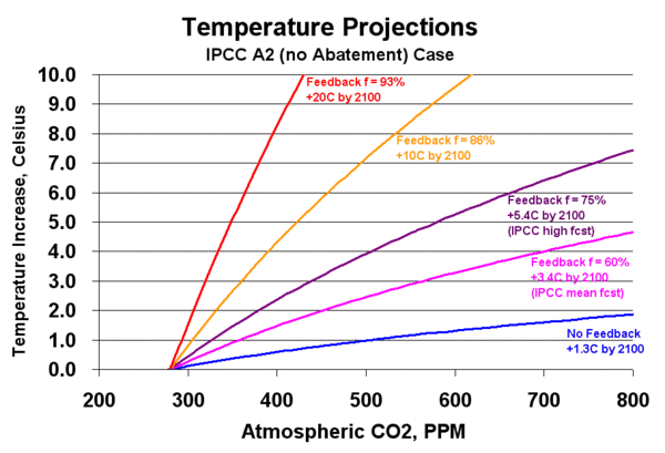
In the charts below, I have given climate alarmists every break.  I have used the most drastic CO2 forecast (A2) from the IPCC fourth assessment, and run the numbers for a peak concentration around 800ppm.  I have used the IPCC's own formula for the effect of CO2 on temperatures without feedback  (Temperature Increase = F(C2) - F(C1) where F(c)=Ln (1+1.2c+0.005c^2 +0.0000014c^3) and c is the concentration in ppm).  Note that skeptics believe that both the 800ppm assumption and the IPCC formula above overstate warming and CO2 buildup, but as you will see, it is not going to matter.

The other formula we need is the feedback formula.  Feedback multiplies the temperature increase from CO2 alone by a factor F, such that F=1/(1-f), where f is the percentage of the original forcing that shows up as first order feedback gain (or damping if negative).

The graph below shows various cases of temperature increase vs. CO2 concentration, based on different assumptions about the physics of the climate system.  All are indexed to equal zero at the pre-industrial CO2 concentration of about 280ppm.

So, the blue line below is the temperature increase vs. CO2 concentration without feedback, using the IPCC formula mentioned above.  The pink is the same formula but with 60% positive feedback (1/[1-.6] = a 2.5 multiplier), and is approximately equal to the IPCC mean for case A2.  The purple line is with 75% positive feedback, and corresponds to the IPCC high-side temperature increase for case A2.  The orange and red lines represent higher positive feedbacks, and correspond to the 10C 5% case and 20C 1% case in Weitzman's article.  Some of this is simplified, but in all important respects it is by-the-book based on IPCC assumptions.

Agwforecast1

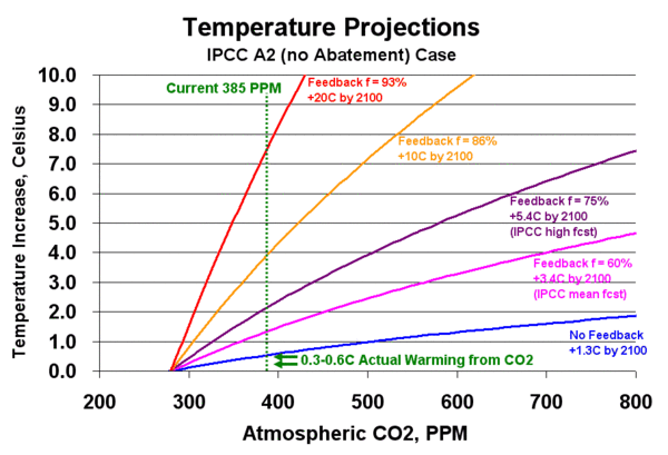
OK, so what does this tell us?  Well, we can do something interesting with this chart.   We have actually moved part-way to the right on this chart, as CO2 today is now at 385ppm, up from the pre-industrial 280ppm.  As you can see, I have drawn this on the chart below.  We have also seen some temperature increase from CO2, though no one really knows what the increase due to CO2 has been vs. the increase due to the sun or other factors.  But the number really can't be much higher than 0.6C, which is about the total warming we have recorded in the last century, and may more likely be closer to 0.3C.  I have drawn these two values on the chart below as well.

Agwforecast2

Again, there is some uncertainty in a key number (e.g. the amount of historic warming due to CO2) but you can see that it really doesn't matter.  For any conceivable range of past temperature increases due to the CO2 increase from 280-385 ppm, the numbers are no where near, not even within an order of magnitude, of what one would expect to have seen if the assumptions behind the other lines were correct.  For example, if we were really heading to a 10C increase at 800ppm, we would have expected temperatures to have risen in the last 100 years by about 4C, which NO ONE thinks is even remotely the case.  And if there is zero chance historic warming from man-made CO2 is anywhere near 4C, then there is zero (not 5%, not 1%) chance future warming will hit 10C or 20C.

In fact, experience to date seems to imply that warming has been under even the no feedback case.  This should not surprise anyone in the physical sciences.  A warming line on this chart below the no feedback line would imply negative feedback or damping in the climate system.  And, in fact, most long term stable physical systems are dominated by such negative feedback and not by positive feedback.  In fact, it is hard to find many natural processes except for perhaps nuclear fission that are driven by positive feedbacks as high as one must assume to get the 10 and 20C warming cases.  In short, these cases are absurd, and we should be looking closely at whether even the IPCC mean case is overstated as well.

What climate alarmists will argue is that these curves are not continuous.  They believe that there is some point out there where the feedback fraction goes above 100%, and thus the gain goes infinite, and the temperature runs away suddenly.  The best example is fissionable material being relatively inert until it reaches critical mass, when a runaway nuclear fission reaction occurs. 

I hope all reasonable people see the problem with this.  The earth, on any number of occasions, has been hotter and/or had higher CO2 concentrations, and there is no evidence of this tipping point effect ever having occurred.  In fact, climate alarmists like Michael Mann contradict themselves by arguing (in the infamous hockey stick chart) that temperatures absent mankind have been incredibly stable for thousands of years, despite numerous forcings like volcanoes and the Maunder Minimum.  Systems this stable cannot reasonably be dominated by high positive feedbacks, much less tipping points and runaway processes.

Postscript:  I have simplified away lag effects and masking effects, like aerosol cooling.  Lag effects of 10-15 years barely change this analysis at all.  And aerosol cooling, given its limited area of effect (cooling aerosols are short-lived and so are geographically limited in area downwind of industrial areas) is unlikely to be masking more than a tenth or two of warming, if any.  The video below addresses all these issues in more depth, and provides more step-by-step descriptions of how the charts above were created

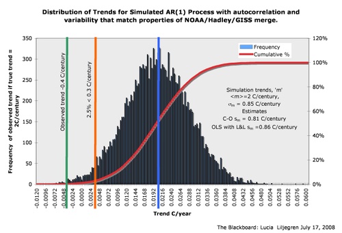
Update:  Lucia Liljegren of the Blackboard has created a distribution of the warming forecasts from numerous climate models and model runs used by the IPCC, with "weather noise" similar to what we have seen over the last few decades overlaid on the model mean 2C/century trend. The conclusion is that our experience in the last century is unlikely to be solely due to weather noise masking the long-term trend.  It looks like even the IPCC models, which are well below the 10C or 20C warming forecasts disused above, may themselves be too high.  (click for larger version)

Trendhistogramipccjune2008

While Weitzman was looking at a different type of distribution, it is still interesting to observe that while alarmists are worried about what might happen out to the right at the 95% or 99% confidence intervals of models, the world seems to be operating way over to the left.

Testing the IPCC Climate Forecasts

Of late, there has been a lot of discussion about the validity of the IPCC warming forecasts because global temperatures, particularly when measured by anyone but the GISS, have been flat to declining and have in any case been well under the IPCC median projections. 

There has been a lot of debate about the use of various statistical tests, and how far and for how long temperatures need to run well below the forecast line before the forecasts can be considered to be invalid.  Beyond the statistical arguments, part of the discussion has been about the actual physical properties of the system (is there a time delay?  is heat being stored somewhere?)  Part of the discussion has been just silly  (IPCC defenders have claimed the forecasts had really, really big error bars, such that they can argue the forecasts are still valid while at the same time calling into question their utility).

Roger Pielke offers an alternative approach to validating these forecasts.  For quite a while, he has argued that measuring the changes in ocean heat content is a better way to look for a warming signal than to try to look at a global surface temperature anomaly.  He argues:

Heat, unlike temperature at a single level as used to construct a global average surface temperature trend, is a variable in physics that can be assessed at any time period (i.e. a snapshot) to diagnose the climate system heat content. Temperature  not only has a time lag, but a single level represents an insignificant amount of mass within the climate system.

What he finds is a hell of a lot of missing heat.  In fact, he finds virtually none of the heat that should have been added over the last four years if IPCC estimates of forcing due to CO2 are correct.

Are Climate Models Falsifiable?

From Maurizio Morabito:

The issue of model falsifiability has already been a topic on the NYT’s “Tierney Lab”, daring to ask this past January questions such as “Are there any indicators in the next 1, 5 or 10 years that would be inconsistent with the consensus view on climate change?” and “Are there any sorts of weather trends or events that would be inconsistent [with global warming}?“.

And what did Gavin Schmidt reply on RealClimate? No, and no:

this subject appears to have been raised from the expectation that some short term weather event over the next few years will definitively prove that either anthropogenic global warming is a problem or it isn’t. As the above discussion should have made clear this is not the right question to ask. Instead, the question should be, are there analyses that will be made over the next few years that will improve the evaluation of climate models?

No “short-term weather event over the next few years” could ever disprove that “anthropogenic global warming“. And observations (events) and their analyses, in the RealClimate world, are only interesting to “improve the models“.

Convinient.  Convinient, that is, if you are after a particular answer rather than the correct answer.

The Benefits of Warming

The next alarmist study that considers possible benefits of global warming along with its downsides will be the first.  Many of us have observed that, historically, abundance has always been associated with warmer periods and famine with cooler periods.  To this end, note this:  (via Tom Nelson)

Rain, wind and cold weather have Eastern Iowa farmers stuck and waiting to start the planting season.

Many farmers tell TV9 they're ready to go but the weather this year simply won't cooperate.

In 2007, many Eastern Iowa farmers began planting corn by the middle of April. This year, it'll take several weeks of sun and much warmer temperatures to even think about working in soggy fields. And getting a later start can present some problems.

More on Climate Feedback

On a number of occasions, I have emphasized that the key scientific hypothesis that drives catastrophic warming forecasts is not greenhouse gas theory, but is the theory that the climate is dominated by strong positive feedbacks:

The catastrophe comes, not from a mere 1 degree of warming, but from the multiplication for this warming 3,4,5 times or more by hypothesized positive feedback effects in the climate.   Greenhouse gas theory gives us warming numbers we might not even be able to find amidst the natural variations of our climate;  it is the theory of strong positive climate feedback that gives us the apocalypse.

So when I read the interview with Jennifer Marohasy, I was focused less on the discussion of how world temperatures seemed sort of flat over the last 10 years  (I have little patience with climate alarmists focusing on short periods of time to "prove" a long term climate trend, so I try not to fall in the same trap).  What was really interesting to me was this:

The [NASA Aqua] satellite was only launched in 2002 and it enabled the collection of data, not just on temperature but also on cloud formation and water vapour. What all the climate models suggest is that, when you've got warming from additional carbon dioxide, this will result in increased water vapour, so you're going to get a positive feedback. That's what the models have been indicating. What this great data from the NASA Aqua satellite ... (is) actually showing is just the opposite, that with a little bit of warming, weather processes are compensating, so they're actually limiting the greenhouse effect and you're getting a negative rather than a positive feedback."

Up to this point, climate scientists who argued for strong positive feedback have relied mainly on numbers from hundreds of thousands of years ago, of which our understanding is quite imperfect.  I have long argued that more recent, higher quality data over the last 50-100 years seems to point to feedback that is at best zero and probably negative [also see video here and here].  Now we have better data from the satellite NASA launched in part to test the strong positive feedback hypothesis that in fact feedback may be negative.  This means that instead of multiplying a climate sensitivity of 1 (from CO2 alone) to numbers of 3 or more with feedback, as the IPCC argued, a climate sensitivity of 1 from CO2 may actually be reduced to a net sensitivity well less than 1.  This would imply warming from CO2 over the next century of less than 1C, an amount likely lost in the noise of natural variations and hardly catastrophic.

Marohasy: "That's right ... These findings actually aren't being disputed by the meteorological community. They're having trouble digesting the findings, they're acknowledging the findings, they're acknowledging that the data from NASA's Aqua satellite is not how the models predict, and I think they're about to recognise that the models really do need to be overhauled and that when they are overhauled they will probably show greatly reduced future warming projected as a consequence of carbon dioxide."

The Catastrophe Comes from Feedback

I am going to be out enjoying some snow skiing this week, but I will leave you with a thought that was a prominent part of this video

The catastrophe that Al Gore and others prophesy as a result of greenhouse gasses is actually not, even by their admission, a direct result of greenhouse gas emissions.  Even the IPCC believes that warming directly resulting from manmade CO2 emissions is on the order of 1 degree C for a doubling of CO2 levels in the atmosphere (and many think it to be less). 

The catastrophe comes, not from a mere 1 degree of warming, but from the multiplication for this warming 3,4,5 times or more by hypothesized positive feedback effects in the climate.   Greenhouse gas theory gives us warming numbers we might not even be able to find amidst the natural variations of our climate;  it is the theory of strong positive climate feedback that gives us the apocalypse.

So, In a large sense, the proposition that we face environmental Armageddon due to CO2 rests not on greenhouse gas theory, which is pretty well understood, but on the theory that our climate system is dominated by strong positive feedbacks.  This theory of positive feedback is almost never discussed publicly, in part because it is far shakier and less understood than greenhouse gas theory.  In fact, it is very probable that we have the sign, much less the magnitude, of major feedback effects wrong.  But if we are considering legislation to gut our economies in order to avoid a hypothesized climate catastrophe, we should be spending a lot more time putting scrutiny on this theory of positive feedback, rather than just greenhouse gas theory.

Tom Nelson quotes an email from S. Fred Singer that states my position well:

I believe a fair statement is that the GH [greenhouse] effect of CO2 etc must exist (after all, CO2 is a GH gas and is increasing) but we cannot detect it in the record of temp patterns.

So we must conclude that its contribution to climate change is swamped by natural changes.

Why do models suggest a much larger effect? Because they all incorporate a positive feedback from WV [water vapor], which in actuality is more likely to be negative. Empirical evidence is beginning to support this explanation.

Interesting

This is interesting, but yet to be reproduced by others:

"Runaway greenhouse theories contradict energy balance equations," Miskolczi states.  Just as the theory of relativity sets an upper limit on velocity, his theory sets an upper limit on the greenhouse effect, a limit which prevents it from warming the Earth more than a certain amount.

How did modern researchers make such a mistake? They relied upon equations derived over 80 years ago, equations which left off one term from the final solution.

Miskolczi's story reads like a book. Looking at a series of differential equations for the greenhouse effect, he noticed the solution -- originally done in 1922 by Arthur Milne, but still used by climate researchers today -- ignored boundary conditions by assuming an "infinitely thick" atmosphere. Similar assumptions are common when solving differential equations; they simplify the calculations and often result in a result that still very closely matches reality. But not always.

So Miskolczi re-derived the solution, this time using the proper boundary conditions for an atmosphere that is not infinite. His result included a new term, which acts as a negative feedback to counter the positive forcing. At low levels, the new term means a small difference ... but as greenhouse gases rise, the negative feedback predominates, forcing values back down.

My scientific intuition has always rebelled at the thought of runaway positive feedback.

By the way, James Hansen has claimed that he is being censored at NASA by the Bush Administration, and that the government should not interfere with scientists work.  So how did he react to this work?

NASA refused to release the results.  Miskolczi believes their motivation is simple.  "Money", he tells DailyTech.  Research that contradicts the view of an impending crisis jeopardizes funding, not only for his own atmosphere-monitoring project, but all climate-change research.  Currently, funding for climate research tops $5 billion per year.

Miskolczi resigned in protest, stating in his resignation letter, "Unfortunately my working relationship with my NASA supervisors eroded to a level that I am not able to tolerate.  My idea of the freedom of science cannot coexist with the recent NASA practice of handling new climate change related scientific results."

I argued a while back that Hansen should do the same if he thought he was being censored.  Certainly you do not have to convince this libertarian of the contradiction between a government agency and the concept of free scientific inquiry.

New Climate Short: Don't Panic -- Flaws in Catastrophic Global Warming Forecasts

After releasing my first climate video, which ran over 50 minutes, I had a lot of feedback that I should aim for shorter, more focused videos.  This is my first such effort, setting for myself the artificial limit of 10 minutes, which is the YouTube limit on video length.

While the science of how CO2 and other greenhouse gases cause warming is fairly well understood, this core process only results in limited, nuisance levels of global warming. Catastrophic warming forecasts depend on added elements, particularly the assumption that the climate is dominated by strong positive feedbacks, where the science is MUCH weaker. This video explores these issues and explains why most catastrophic warming forecasts are probably greatly exaggerated.


You can also access the YouTube video here, or you can access the same version on Google video here.

If you have the bandwidth, you can download a much higher quality version by right-clicking either of the links below:

I am not sure why the quicktime version is so porky.  In addition, the sound is not great in the quicktime version, so use the windows media wmv files if you can.  I will try to reprocess it tonight.  All of these files for download are much more readable than the YouTube version (memo to self:  use larger font next time!)

This is a companion video to the longer and more comprehensive climate skeptic video "What is Normal -- a Critique of Catastrophic Man-Made Global Warming Theory."

Grading the IPCC Forecasts

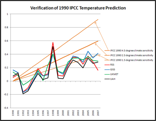
Roger Pielke Jr has gone back to the first IPCC assessment to see how the IPCC is doing on its long-range temperature forecasting.  He had to dign back into his own records, because the IPCC seems to be taking its past reports offline, perhaps in part to avoid just this kind of scrutiny.  Here is what he finds:

1990_ipcc_verification_2

The colored lines are various measures of world temperature.  Only the GISS, which maintains a surface temerpature rollup that is by far the highest of any source, manages to eek into the forecast band at the end of the period.  The two satellite measures (RSS and UAH) seldom even touch the forecast band except in the exceptional El Nino year of 1998.  Pielke comments:

On the graph you will also see the now familiar temperature records from two satellite and two surface analyses. It seems pretty clear that the IPCC in 1990 over-forecast temperature increases, and this is confirmed by the most recent IPCC report (Figure TS.26), so it is not surprising.

Which is fascinating, for this reason:  In essence, the IPCC is saying that we know that past forecasts based on a 1.5, much less a 2.5, climate sensitivity have proven to be too high, so in our most recent report we are going to base our forecast on ... a 3.0+!!

They are Not Fudge Factors, They are "Flux Adjustments"

Previously, I have argued that climate models can duplicate history only because they are fudged.  I understand this phenomenon all too well, because I have been guilty of it many times.  I have built economic and market models for consulting clients that seem to make sense, yet did not backcast history very well, at least until I had inserted a few "factors" into them.

Climate modelers have sworn for years that they are not doing this.  But Steve McIntyre finds this in the IPCC 4th Assessment:

The strong emphasis placed on the realism of the simulated base state provided a rationale for introducing ‘flux adjustments’ or ‘flux corrections’ (Manabe and Stouffer, 1988; Sausen et al., 1988) in early simulations. These were essentially empirical corrections that could not be justified on physical principles, and that consisted of arbitrary additions of surface fluxes of heat and salinity in order to prevent the drift of the simulated climate away from a realistic state.

Boy, that is some real semantic goodness there.  We are not putting in fudge factors, we are putting in "empirical corrections that could not be justified on physical principles" that were "arbitrary additions" to the numbers.  LOL.

But the IPCC only finally admits this because they claim to have corrected it, at least in some of the models:

By the time of the TAR, however, the situation had evolved, and about half the coupled GCMs assessed in the TAR did not employ flux adjustments. That report noted that ‘some non-flux adjusted models are now able to maintain stable climatologies of comparable quality to flux-adjusted models’

Let's just walk on past the obvious question of how they define "comparable quality" or why scientists are comfortable when multiple models using different methodologies, several of which are known to be wrong, come up with nearly the same exact answer.  Let's instead be suspicious that the problem of fudging has not gone away, but likely has just had its name changed again, as climate scientists are likely tuning the models but with tools other than changes to flux values.  But climate models have hundreds of other variables that can be fudged, and, remembering this priceless quote...

"I remember my friend Johnny von Neumann used to say, 'with four parameters I can fit an elephant and with five I can make him wiggle his trunk.'" A meeting with Enrico Fermi, Nature 427, 297; 2004.

We should be suspicious.  But we don't just have to rely on our suspicions, because the IPCC TAR goes on to essentially confirm my fears:

(1.5.3) The design of the coupled model simulations is also strongly linked with the methods chosen for model initialisation. In flux adjusted models, the initial ocean state is necessarily the result of preliminary and typically thousand-year-long simulations to bring the ocean model into equilibrium. Non-flux-adjusted models often employ a simpler procedure based on ocean observations, such as those compiled by Levitus et al. (1994), although some spin-up phase is even then necessary. One argument brought forward is that non-adjusted models made use of ad hoc tuning of radiative parameters (i.e., an implicit flux adjustment).

Update:  In another post, McIntyre points to just one of the millions of variables in these models and shows how small changes in assumptions make huge differences in the model outcomes.  The following is taken directly from the IPCC 4th assessment:

The strong effect of cloud processes on climate model sensitivities to greenhouse gases was emphasized further through a now-classic set of General Circulation Model (GCM) experiments, carried out by Senior and Mitchell (1993). They produced global average surface temperature changes (due to doubled atmospheric CO2 concentration) ranging from 1.9°C to 5.4°C, simply by altering the way that cloud radiative properties were treated in the model. It is somewhat unsettling that the results of a complex climate model can be so drastically altered by substituting one reasonable cloud parameterization for another, thereby approximately replicating the overall intermodel range of sensitivities.

Overestimating Climate Feedback

I can never make this point too often:  When considering the scientific basis for climate action, the issue is not the warming caused directly by CO2.  Most scientists, even the catastrophists, agree that this is on the order of magnitude of 1C per doubling of CO2 from 280ppm pre-industrial to 560ppm (to be reached sometime late this century).  The catastrophe comes entirely from assumptions of positive feedback which multiplies what would be nuisance level warming to catastrophic levels.

My simple analysis shows positive feedbacks appear to be really small or non-existent, at least over the last 120 years.  Other studies show higher feedbacks, but Roy Spencer has published a new study showing that these studies are over-estimating feedback.

And the fundamental issue can be demonstrated with this simple example: When we analyze interannual variations in, say, surface temperature and clouds, and we diagnose what we believe to be a positive feedback (say, low cloud coverage decreasing with increasing surface temperature), we are implicitly assuming that the surface temperature change caused the cloud change — and not the other way around.

This issue is critical because, to the extent that non-feedback sources of cloud variability cause surface temperature change, it will always look like a positive feedback using the conventional diagnostic approach. It is even possible to diagnose a positive feedback when, in fact, a negative feedback really exists.

I hope you can see from this that the separation of cause from effect in the climate system is absolutely critical. The widespread use of seasonally-averaged or yearly-averaged quantities for climate model validation is NOT sufficient to validate model feedbacks! This is because the time averaging actually destroys most, if not all, evidence (e.g. time lags) of what caused the observed relationship in the first place. Since both feedbacks and non-feedback forcings will typically be intermingled in real climate data, it is not a trivial effort to determine the relative sizes of each.

While we used the example of random daily low cloud variations over the ocean in our simple model (which were then combined with specified negative or positive cloud feedbacks), the same issue can be raised about any kind of feedback.

Notice that the potential positive bias in model feedbacks can, in some sense, be attributed to a lack of model “complexity” compared to the real climate system. By “complexity” here I mean cloud variability which is not simply the result of a cloud feedback on surface temperature. This lack of complexity in the model then requires the model to have positive feedback built into it (explicitly or implicitly) in order for the model to agree with what looks like positive feedback in the observations.

Also note that the non-feedback cloud variability can even be caused by…(gasp)…the cloud feedback itself!

Let’s say there is a weak negative cloud feedback in nature. But superimposed upon this feedback is noise. For instance, warm SST pulses cause corresponding increases in low cloud coverage, but superimposed upon those cloud pulses are random cloud noise. That cloud noise will then cause some amount of SST variability that then looks like positive cloud feedback, even though the real cloud feedback is negative.

I don’t think I can over-emphasize the potential importance of this issue. It has been largely ignored — although Bill Rossow has been preaching on this same issue for years, but phrasing it in terms of the potential nonlinearity of, and interactions between, feedbacks. Similarly, Stephen’s 2005 J. Climate review paper on cloud feedbacks spent quite a bit of time emphasizing the problems with conventional cloud feedback diagnosis.

More on Feedback

James Annan, more or less a supporter of catastrophic man-made global warming theory, explains how typical climate sensitivities (of the order of magnitude of 3 or more) used by catastrophists are derived (in an email to Steve McIntyre)  As a reminder, climate sensitivity is the amount of temperature rise we would expect on earth from a doubling of CO2 from pre-industrial 280ppm to 560ppm.

If you want to look at things in the framework of feedback analysis, there’s a pretty clear explanation in the supplementary information to Roe and Baker’s recent Science paper. Briefly, if we have a blackbody sensitivity S0 (~1C) when everything else apart from CO2 is held fixed, then we can write the true sensitivity S as

S = S0/(1- Sum (f_i))

where the f_i are the individual feedback factors arising from the other processes. If f_1 for water vapour is 0.5, then it only takes a further factor of 0.17 for clouds (f_2, say) to reach the canonical S=3C value. Of course to some extent this may look like an artefact of the way the equation is written, but it’s also a rather natural way for scientists to think about things and explains how even a modest uncertainty in individual feedbacks can cause a large uncertainty in the overall climate sensitivity.

This is the same classic feedback formula I discussed in this prior article on feedback.  And Dr. Annan basically explains the origins of the 3C sensitivity the same way I have explained it to readers in the past:  Sensitivity from CO2 alone is about 1C (that is S0) and feedback effects from things like water vapour and clouds triples this to three.  The assumption is that the climate has very strong positive feedback.

Note the implications.  Without any feedback, or feedback that was negative, we would not expect the world to heat up much more than a degree with a doubling of CO2, of which we have already seen perhaps half.  This means we would only experience another half degree of warming in the next century or so.  But with feedbacks, this half degree of future warming is increased to 2.5 or 3.0 or more degrees.  Essentially assumptions about feedback are what separates trivial nuisance levels of warming from forecasts that are catastrophic. 

Given this, it is instructive to see what Mr. Annan has to say in the same email about our knowledge of these feedbacks:

The real wild card is in the behaviour of clouds, which have a number of strong effects (both on albedo and LW trapping) and could in theory cause a large further amplification or suppression of AGW-induced warming. High thin clouds trap a lot of LW (especially at night when their albedo has no effect) and low clouds increase albedo. We really don’t know from first principles which effect is likely to dominate, we do know from first principles that these effects could be large, given our current state of knowledge. GCMs don’t do clouds very well but they do mostly (all?) suggest some further amplification from these effects. That’s really all that can be done from first principles.

In other words, scientists don't even know the SIGN of the most important feedback, ie clouds.  Of course, in a rush to build the most alarming model, they all seem to rush to the assumption that it is positive.  So, yes, if the feedback is a really high positive number (something that is very unlikely in natural, long-term stable physical processes) then we get a climate catastrophe.  Of course if it is small or negative, we don't get one at all. 

My Annan points to studies he claims shows climate sensitivity net of feedbacks in the past to be in the 2-3C range.  Note that these are studies of climate changes tens or hundreds of thousands of years ago, as recorded imperfectly in ice and other proxies.  The best data we have is of course for the last 120 years when we have measured temperature with thermometers rather than ice crystals, and the evidence of this data points to a sensitivity of at most about 1C net of feedbacks.

So to summarize:

  • Climate sensitivity is the temperature increase we might expect with a doubling of CO2 to 560 ppm from a pre-industrial 280ppm
  • Nearly every forecast you have ever seen assumes the effect of CO2 alone is about a 1C warming from this doubling.  Clearly, though, you have seen higher forecasts.  All of the "extra" warming in these forecasts come from positive feedback.  So a sensitivity of 3C would be made up of 1C from CO2 directly that is tripled by positive feedbacks.  A sensitivity of 6 or 8 still starts with the same 1C but has even higher feedbacks
  • Most thoughtful climate scientists will admit that we don't know what these feedbacks are -- in so many words, modelers are essentially guessing.  Climate scientists don't even know the sign (positive or negative) much less the magnitude.  In most physical sciences, upon meeting such an unknown system that has been long-term stable, scientists will assume neutral to negative feedback.  Climate scientists are the exception -- almost all their models assume strong positive feedback.
  • Climate scientists point to studies of ice cores and such that serve as proxies for climate hundreds of thousands of years ago to justify positive feedbacks.  But for the period of history we have the best data, ie the last 120 years, actual CO2 and measured temperature changes imply a sensitivity net of feedbacks closer to 1C, about what a reasonable person would assume from a stable process not dominated by positive feedbacks.

Hadley: 99+% Chance Climate Sensitivity is Greater than 2

Climate sensitivity to CO2 is typically defined as the amount of warming that would be caused by CO2 levels rising from pre-industrial 280ppm to a doubled concentration at 460ppm.  Via Ron Bailey, here is what Hadley presented at Bali today:

Hadley climate models project that if atmospheric concentrations of GHG were stabilized at 430 ppm, we run a 63 percent chance that the earth's eventual average temperature would exceed 2 degrees Celsius greater than pre-industrial temperatures and 10 percent chance they would rise higher than 3 degrees Celsius. At 450 ppm, the chances rise to 77 percent and 18 percent respectively. And if concentrations climb to 550 ppm, the chances that average temperatures would exceed 2 degrees Celsius are 99 percent and are 69 percent for surpassing 3 degrees Celsius.

I encourage you to check out this post wherein I struggle, based on empirical data, to get a sensitivity higher than 1.2, and even that is only achieved by assuming that all 20th century warming is from CO2, which is unlikely.  A video of the same analysis is below:

However, maybe this is good news, since many climate variables in 2007, including hurricane numbers and global temperatures, came out in the bottom 1 percentile of predicted outcomes from climate models.

Climate Models Match History Because They are Fudged

When catastrophist climate models were first run against history, they did not even come close to matching.  Over the last several years, after a lot of time under the hood, climate models have been tweaked and forced to match historic warming observations pretty closely.  A prominent catastrophist and climate modeller finally asks the logical question:

One curious aspect of this result is that it is also well known [Houghton et al., 2001] that the same models that agree in simulating the anomaly in surface air temperature differ significantly in their predicted climate sensitivity. The cited range in climate sensitivity from a wide collection of models is usually 1.5 to 4.5 deg C for a doubling of CO2, where most global climate models used for climate change studies vary by at least a factor of two in equilibrium sensitivity.

The question is: if climate models differ by a factor of 2 to 3 in their climate sensitivity, how can they all simulate the global temperature record with a reasonable degree of accuracy. Kerr [2007] and S. E. Schwartz et al. (Quantifying climate change–too rosy a picture?, available at www.nature.com/reports/climatechange, 2007) recently pointed out the importance of understanding the answer to this question. Indeed, Kerr [2007] referred to the present work and the current paper provides the ‘‘widely circulated analysis’’ referred to by Kerr [2007]. This report investigates the most probable explanation for such an agreement. It uses published results from a wide variety of model simulations to understand this apparent paradox between model climate responses for the 20th century, but diverse climate model sensitivity.

One wonders how it took so long for supposedly trained climate scientists right in the middle of the modelling action to ask an obvious question that skeptics have been asking for years (though this particular guy will probably have his climate decoder ring confiscated for brining this up).  The answer seems to be that rather than using observational data, modellers simply make man-made forcing a plug figure, meaning that they set the man-made historic forcing number to whatever number it takes to make the output match history. 

Gee, who would have guessed?  Well, actually, I did, though I guessed the wrong plug figure.  I did, however, guess that one of the key numbers was a plug for all the models to match history so well:

I am willing to make a bet based on my long, long history of modeling (computers, not fashion).  My guess is that the blue band, representing climate without man-made effects, was not based on any real science but was instead a plug.  In other words, they took their models and actual temperatures and then said "what would the climate without man have to look like for our models to be correct."  There are at least four reasons I strongly suspect this to be true:

  1. Every computer modeler in history has tried this trick to make their models of the future seem more credible.  I don't think the climate guys are immune.
  2. There is no way their models, with our current state of knowledge about the climate, match reality that well. 
  3. The first time they ran their models vs. history, they did not match at all.  This current close match is the result of a bunch of tweaking that has little impact on the model's predictive ability but forces it to match history better.  For example, early runs had the forecast run right up from the 1940 peak to temperatures way above what we see today.
  4. The blue line totally ignores any of our other understandings about the changing climate, including the changing intensity of the sun.  It is conveniently exactly what is necessary to make the pink line match history.  In fact, against all evidence, note the blue band falls over the century.  This is because the models were pushing the temperature up faster than we have seen it rise historically, so the modelers needed a negative plug to make the numbers look nice.

Here is one other reason I know the models to be wrong:  The climate sensitivities quoted above of 1.5 to 4.5 degrees C are unsupportable by history.  In fact, this analysis shows pretty clearly that 1.2 is about the most one can derive for sensitivity from our past 120 years of experience, and even that makes the unreasonable assumption that all warming for the past century was due to CO2.

More on Feedback

(cross-posted from Coyote Blog)

Kevin Drum links to a blog called Three-Toed Sloth in a post about why our climate future may be even worse than the absurdly cataclysmic forecasts we are getting today in the media.  Three-Toed Sloth advertises itself as "Slow Takes from the Canopy of the Reality-Based Community."  His post is an absolutely fabulous example how one can write an article where most every line is literally true, but the conclusion can still be dead wrong because one tiny assumption at the beginning of the analysis was incorrect  (In this case, "incorrect" may be generous, since the author seems well-versed in the analysis of chaotic systems.  A better word might be "purposely fudged to make a political point.")

He begins with this:

The climate system contains a lot of feedback loops.  This means that the ultimate response to any perturbation or forcing (say, pumping 20 million years of accumulated fossil fuels into the air) depends not just on the initial reaction, but also how much of that gets fed back into the system, which leads to more change, and so on.  Suppose, just for the sake of things being tractable, that the feedback is linear, and the fraction fed back is f.  Then the total impact of a perturbation I is

J + Jf + Jf2 + Jf3 + ...

The infinite series of tail-biting feedback terms is in fact a geometric series, and so can be summed up if f is less than 1:

J/(1-f)

So far, so good.  The math here is entirely correct.  He goes on to make this point, arguing that if we are uncertain about  f, in other words, if there is a distribution of possible f's, then the range of the total system gain 1/(1-f) is likely higher than our intuition might first tell us:

If we knew the value of the feedback f, we could predict the response to perturbations just by multiplying them by 1/(1-f) — call this G for "gain".  What happens, Roe and Baker ask, if we do not know the feedback exactly?  Suppose, for example, that our measurements are corrupted by noise --- or even, with something like the climate, that f is itself stochastically fluctuating.  The distribution of values for f might be symmetric and reasonably well-peaked around a typical value, but what about the distribution for G?  Well, it's nothing of the kind.  Increasing f just a little increases G by a lot, so starting with a symmetric, not-too-spread distribution of f gives us a skewed distribution for G with a heavy right tail.

Again all true, with one small unstated proviso I will come back to.  He concludes:

In short: the fact that we will probably never be able to precisely predict the response of the climate system to large forcings is so far from being a reason for complacency it's not even funny.

Actually, I can think of two unstated facts that undermine this analysis.  The first is that most catastrophic climate forecasts you see utilize gains in the 3x-5x range, or sometimes higher (but seldom lower).  This implies they are using an f of between .67 and .80.  These are already very high numbers for any natural process.  If catastrophist climate scientists are already assuming numbers at the high end of the range, then the point about uncertainties skewing the gain disproportionately higher are moot.  In fact, we might tend to actually draw the reverse conclusion, that the saw cuts both ways.  His analysis also implies that small overstatements of f when the forecasts are already skewed to the high side will lead to very large overstatements of Gain.

But here is the real elephant in the room:  For the vast, vast majority of natural processes, f is less than zero.  The author has blithely accepted the currently unproven assumption that the net feedback in the climate system is positive.  He never even hints at the possibility that that f might be a negative feedback rather than positive, despite the fact that almost all natural processes are dominated by negative rather than positive feedback.  Assuming without evidence that a random natural process one encounters is dominated by negative feedback is roughly equivalent to assuming the random person you just met on the street is a billionaire.  It is not totally out of the question, but it is very, very unlikely.

When one plugs an f in the equation above that is negative, say -0.3, then the gain actually becomes less than one, in this case about 0.77.  In a negative feedback regime, the system response is actually less than the initial perturbation because forces exist in the system to damp the initial input.

The author is trying to argue that uncertainty about the degree of feedback in the climate system and therefore the sensitivity of the system to CO2 changes does not change the likelihood of the coming "catastrophe."  Except that he fails to mention that we are so uncertain about the feedback that we don't even know its sign.  Feedback, or f, could be positive or negative as far as we know.  Values could range anywhere from -1 to 1.  We don't have good evidence as to where the exact number lies, except to observe from the relative stability of past temperatures over a long time frame that the number probably is not in the high positive end of this range.  Data from climate response over the last 120 years seems to point to a number close to zero or slightly negative, in which case the author's entire post is irrelevant.   In fact, it turns out that the climate scientists who make the news are all clustered around the least likely guesses for f, ie values greater than 0.6.

Incredibly, while refusing to even mention the Occam's Razor solution that f is negative, the author seriously entertains the notion that f might be one or greater.  For such values, the gain shoots to infinity and the system goes wildly unstable  (nuclear fission, for example, is an f>1 process).  In an f>1 world, lightly tapping the accelerator in our car would send us quickly racing up to the speed of light.  This is an ABSURD assumption for a system like climate that is long-term stable over tens of millions of years.  A positive feedback f>=1 would have sent us to a Venus-like heat or Mars-like frigidity eons ago.

A summary of why recent historical empirical data implies low or negative feedback is here.  You can learn more on these topics in my climate video and my climate book.  To save you the search, the section of my movie explaining feedbacks, with a nifty live demonstration from my kitchen, is in the first three and a half minutes of the clip below:

Reality Checking the Forecasts

At the core of my climate video is a reality check on catastrophic warming forecasts, which demonstrates, as summarized in this post, that warming over the next century can't be much more than a degree if one takes history as a guide.  The Reference Frame has a nice summary:

Well, we will probably surpass 560 ppm of CO2. Even if you believe that the greenhouse effect is responsible for all long-term warming, we have already realized something like 1/2 (40-75%, depending on the details of your calculation) of the greenhouse effect attributed to the CO2 doubling from 280 ppm to 560 ppm. It has led to 0.6°C of warming. It is not a hard calculation that the other half is thus expected to lead to an additional 0.6°C of warming between today and 2100.

Other derivations based on data that I consider rationally justified lead to numbers between 0.3°C and 1.4°C for the warming between 2000 and 2100. Clearly, one needs to know some science here. Laymen who are just interested in this debate but don't study the numbers by technical methods are likely to offer nothing else than random guesses and prejudices, regardless of their "ideological" affiliation in the climate debate.

Global Warming Video

Anthony Watt has a pointer to a nice presentation in four parts on YouTube by Bob Carter made at a public forum in Australia.  He walks through some of the skeptics' issues with catastrophic man-made global warming theory.

What caught my attention, though, were the pictures Mr. Carter shows in his presentation about about 1:30 into part 4.  Because I took the pictures he shows, down at the University of Arizona, as part of Mr. Watts project to document temperature measurement stations.  Kind of cool to see someone I don't know in a country I have (sadly) never visited using a small bit of my work.  Part 4 is below, but you can find links to all four parts here.

Coming soon, my own home-brewed video effort on global warming and climate.  Right now it runs about 45 minutes, and I'm in the editing stages, mainly trying to make the narration match what is on the screen.

Cross-posted from Coyote Blog

Reality Checking Global Warming Forecasts

It turns out to be quite easy to do a simple but fairly robust reality check of global warming forecasts, even without knowing what a "Watt" or a "forcing" is.   Our approach will be entirely empirical, based on the last 100 years of climate history.  I am sensitive that we skeptics not fall into the 9/11 Truther syndrome of arguing against a coherent theory from isolated anomalies.  To this end, my approach here is holistic and not anomaly driven.  What we will find is that, extrapolating from history, it is almost impossible to get warming numbers as high as those quoted by global warming alarmists.

Climate Sensitivity

The one simple concept you need to understand is "climate sensitivity."  As used in most global warming literature, climate sensitivity is the amount of global warming that results from a doubling in atmospheric CO2 concentrations.   Usually, when this number is presented, it refers to the warming from a doubling of CO2 concentrations since the beginning of the industrial revolution.  The pre-industrial concentration is generally accepted as 280ppm (0.028% of the atmosphere) and the number today is about 380ppm, so a doubling would be to 560ppm.

As a useful, though not required, first step before we begin, I encourage you to read the RealClimate simple "proof" for laymen that the climate sensitivity is 3ºC, meaning the world will warm 3 degrees C with a doubling of CO2 concentrations from their pre-industrial level.  Don't worry if you don't understand the whole description, we are going to do it a different, and I think more compelling, way (climate scientists are a bit like the Wizard of Oz -- they are afraid if they make things too simple someone might doubt they are a real wizard).  3ºC is a common number for sensitivity used by global warming hawks, though it is actually at the low end of the range that the UN IPCC arrived at in their fourth report.  The IPCC (4th report, page 798) said that the expected value is between 3ºC and 4ºC and that there was a greater chance the sensitivity was larger than 6ºC than that it was 1.5ºC or less.  I will show you why I think it is extraordinarily unlikely that the number is greater even than 1.5ºC.

Our Approach

We are going to derive the sensitivity (actually a reasonable range for sensitivity) for ourselves in three steps.  First, we will do it a simple way.  Then, we will do it a slightly harder but more accurate way.  And third, we will see what we would have to assume to get a number anywhere near 3ºC.  Our approach will be entirely empirical, using past changes in CO2 and temperature to estimate sensitivity.  After all, we have measured CO2 going up by about 100 ppm.  That is about 36% of the way towards a doubling from 280 to 560.  And, we have measured temperatures -- and though there are a lot of biases in these temperature measurements, these measurements certainly are better than our guesses, say, of temperatures in the last ice age.  Did you notice something odd, by the way, in the RealClimate derivation?  They never mentioned measured sensitivities in the last 100 years -- they jumped all the way back to the last ice age.  I wonder if there is a reason for that?

A First Approximation

OK, let's do the obvious.  If we have experienced 36% of a doubling, then we should be able to take the historic temperature rise from CO2 for the same period and multiply it by 2.8 (that's just reciprocal of 36%) and derive the temperature increase we would expect for a full doubling.

The problem is that we don't know the historic temperature rise solely form CO2.  But we do know how to bound it.  The IPCC and most global warming hawks place the warming since 1900 at about 0.6ºC.  Since no one attributes warming before 1900 to man-made CO2  (it did warm, but this is attributed to natural cyclical recovery from the little ice age) then the maximum historic man-made warming is 0.6ºC.  In fact, all of that warming is probably not from CO2.  Some probably is from continued cyclical warming out of the little ice age.  Some, I believe strongly, is due to still uncorrected biases, particularly of urban heat islands, in surface temperature data. 

But let's for a moment attribute, unrealistically, all of this 0.6ºC to man-made CO2 (this is in fact what the IPCC does in their report).   This should place an upper bound on the sensitivity number.  Taking 0.6ºC times 2.8 yields an estimated  climate sensitivity of  1.7ºC.  Oops.  This is about half of the RealClimate number or the IPCC number! And if we take a more realistic number for man-made historic warming as 0.4ºC, then we get a sensitivity of 1.1ºC.  Wow, that's a lot lower! We must be missing something important!  It turns out that we are, in this simple analysis, missing something important.  But taking it into account is going to push our sensitivity number even lower.

A Better Approximation

What we are missing is that the relation between CO2 concentration and warming is not linear, as implied in our first approximation.  It is a diminishing return.  This means that the first 50 ppm rise in CO2 concentrations causes more warming than the next 50 ppm, etc.  This effect has often been compared to painting a window.  The first coat of paint blocks out a lot of light, but the window is still translucent.  The next coat blocks out more light, but not as much as the first.  Eventually, subsequent coats have no effect because all the light is already blocked.  CO2 has a similar effect on warming.  It only absorbs certain wavelengths of radiation returning to space from earth.  Once the absorption of those wavelengths is saturated, extra CO2 will do almost nothing. (update:  By the way, this is not some skeptic's fantasy -- everyone in climate accepts this fact).

So what does this mean in English?  Well, in our first approximation, we assumed that 36% of a CO2 doubling would yield 36% of the temperature we would get in a doubling.  But in reality, since the relationship is a diminishing return, the first 36% of a CO2 doubling will yield MORE than 36% of the temperature increase you get for a doubling.  The temperature increase is front-loaded, and diminishes going forward.   An illustration is below, with the linear extrapolation in red and the more realistic decreasing exponential extrapolation in blue.

Sensitivity

The exact shape and equation of this curve is not really known, but we can establish a reasonable range of potential values.  For any reasonable shapes of this curve, 36% of a CO2 doubling (where we are today) equates to from 43% to 63% of the final temperature increase over a doubling.  This would imply that a multiplier between 2.3 and 1.6 for temperature extrapolation  (vs. 2.8 derived above for the straight linear extrapolation above) or a climate sensitivity of 1.4ºC to 1.0ºC if man-made historic warming was 0.6ºC and a range of 0.9ºC to 0.6ºC for a man-made historic warming of 0.4ºC.  I tend to use the middle of this range, with a multiplier of about 1.9 and a man-made historic warming of 0.5ºC to give a expected sensitivity of 0.95ºC, which we can round to 1ºC. 

This is why you will often hear skeptics cite numbers closer to 1ºC rather than 3ºC for the climate sensitivity.   Any reasonable analysis of actual climate experience over the last 100 years yields a sensitivity much closer to 1ºC than 3ºC.  Most studies conducted before the current infatuation with showing cataclysmic warming forecasts came up with this same 1ºC, and peer-reviewed work is still coming up with this same number

So what does this mean for the future?  Well, to predict actual temperature increases from this sensitivity, we would have to first create a CO2 production forecast and, you guessed it, global warming hawks have exaggerated that as well.  The IPCC says we will hit the full doubling to 560ppm around 2065 (Al Gore, incredibly, says we will hit it in the next two decades).  This means that with about 0.5C behind us, and a 3 sensitivity, we can expect 2.5C more warming in the next 60 years.  Multiply that times exaggerated negative effects of warming, and you get instant crisis.

However, since actual CO2 production is already below IPCC forecasts, we might take a more reasonable date of 2080-2100 for a doubling to 560.  And, combining this with our derived sensitivity of 1ºC (rather than RealClimate's 3ºC) we will get 0.5C more warming in the next 75-100 years.  This is about the magnitude of warming we experienced in the last century, and most of us did not even notice.

I know you are scratching you head and wondering what trick I pulled to get numbers so much less than the scientific "consensus."  But there is no trick, all my numbers are empirical and right out of the IPCC reports.  In fact, due to measurement biases and other climate effects that drive warming, I actually think the historic warming from CO2 and thus the sensitivity is even lower, but I didn't want to confuse the message. 

So what are climate change hawks assuming that I have not included?  Well, it turns out they add on two things, neither of which has much empirical evidence behind it.  It is in fact the climate hawks, not the skeptics, that need to argue for a couple of anomalies to try to make their case.

Is Climate Dominated by Positive Feedback?

Many climate scientists argue that there are positive feedbacks in the climate system that tend to magnify and amplify the warming from CO2.  For example, a positive feedback might be that hotter climate melts sea ice and glaciers, which reduces the reflectiveness of the earth's surface, which causes more sunlight to be absorbed, which warms things further.  A negative feedback might be that warmer climate vaporizes more water which forms more clouds which blocks sunlight and cools the earth. 

Climate scientists who are strong proponents of catastrophic man-made warming theory assume that the climate is dominated by positive feedbacks.  In fact, my reading of the IPCC report says that the climate "consensus" is that net feedback in the climate system is positive and tends to add 2 more degrees of temperature for every one added from CO2.  You might be thinking - aha - I see how they got a sensitivity of 3ºC:  Your 1ºC plus 2ºC in feedback equals 3ºC. 

But there is a problem with that.  In fact, there are three problems with this.  Here they are:

  1. We came up with our 1ºC sensitivity empirically.  In other words, we observed a 100ppm past CO2 increase leading to 0.5ºC measured temperature increase which implies 1ºC sensitivity.  But since this is empirical, rather than developed from some set of forcings and computer models, then it should already be net of all feedbacks.  If there are positive feedbacks in the system, then they have been operating and should be part of that 1ºC.
  2. There is no good scientific evidence that there is a large net positive feedback loop in climate, or even that the feedback is net positive at all.  There are various studies, hypotheses, models, etc., but no proof at all.  In fact, you can guess this from our empirical data.  History implies that there can't be any large positive feedbacks in the system or else we would have observed higher temperatures historically.  In fact, we can go back in to the distant historical record (in fact, Al Gore showed the chart I am thinking of in An Inconvenient Truth) and find that temperatures have never run away or exhibited any sort of tipping point effect.
  3. The notion that a system like climate, which has been reasonably stable for millions of years, is dominated by positive feedback should offend the intuition of any scientist.  Nature is dominated in large part by negative feedback processes.  Positive feedback processes are highly unstable, and tend to run away to a distant endpoint.  Nuclear fission, for example, is a positive feedback process

Do aerosols and dimming imply a higher sensitivity?

Finally, the last argument that climate hawks would employ is that anthropogenic effects, specifically emission of SO2 aerosols and carbon black, have been reflecting sunlight and offsetting the global warming effect.  But, they caution, once we eliminate these pollutants, which we have done in the West (only to be offset in China and Asia) temperatures will no longer be suppressed and we will see the full extent of warming.

First, again, no one really has any clue the magnitude of this effect, or even if it is an effect at all.  Second, its reach will tend to be localized over industrial areas (since their presence in the atmosphere is relatively short-lived), whereas CO2 acts worldwide.  If these aerosols and carbon black are concentrated say over 20% of the land surface of the world, this means they are only affecting the temperature over 5% of the total earth' s surface.  So its hard to argue they are that significant.

However, let's say for a moment this effect does exist.  How large would it have to be to argue that a 3.0ºC climate sensitivity is justified by historical data?  Well, taking 3.0ºC and dividing by our derived extrapolation multiplier of 1.9, we get required historic warming due to man's efforts of 1.6ºC.  This means that even if all past 0.6ºC of warming is due to man (a stretch), then aerosols must be suppressing a full 1ºC of warming.   I can't say this is impossible, but it is highly unlikely and certainly absolutely no empirical evidence exists to support any number like this. Particularly since dimming effects probably are localized, you would need as much as 20ºC suppression in these local areas to get a 1ºC global effect.  Not very likely.

Why the number might even be less

Remember that when we calculated sensitivity, we needed the historical warming due to man's CO2.  A simple equation for arriving at this number is:

Warming due to Man's CO2 = Total Historic Measured Warming - Measurement Biases - Warming from other Sources + Warming suppressed by Aerosols

This is why most skeptics care if surface temperature measurements are biased upwards or if the sun is increasing in intensity.  Global warming advocates scoff and say that these effects don't undermine greenhouse gas theory.  And they don't.  I accept greenhouse gases cause some warming.  BUT, the more surface temperature measurements are biased upwards and the more warming is being driven by non-anthropogenic sources, the less that is being caused by man.  And, as you have seen in this post, the less warming caused by man historically means less that we will see in the future.  And while global warming hawks want to paint skeptics as "deniers", we skeptics want to argue the much more interesting question "Yes, but how much is the world warming, and does this amount of warming really justify the costs of abatement, which are enormous."


As always, you can find my Layman's Guide to Skepticism about Man-made Global Warming here.  It is available for free in HTML or pdf download, or you can order the printed book that I sell at cost.  My other recent posts about climate are here.
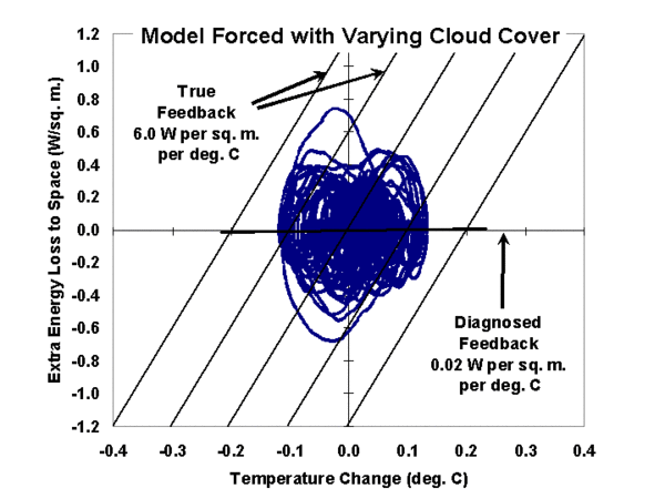
Visits (Coyote Blog + Climate Skeptic)

Powered by TypePad